Essem Design Product Catalogue 2018 by Bedow
Opinion by Richard Baird Posted 1 June 2018
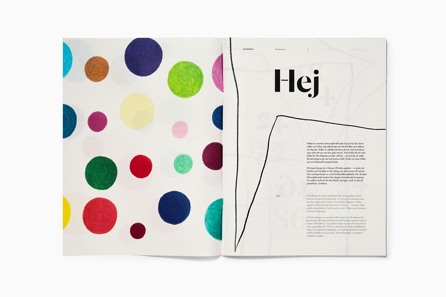
In 2014 Bedow worked with Essem Design, a Swedish manufacturer of artisanal hallway products and furniture, to develop a new graphic identity. This included logotype, adverts, catalogue, product sheet and stationery design. The concept was based around the simple gesture “Hej—Hej då”, hello and goodbye in Swedish and a reference to the most common phrase used in the hallway.
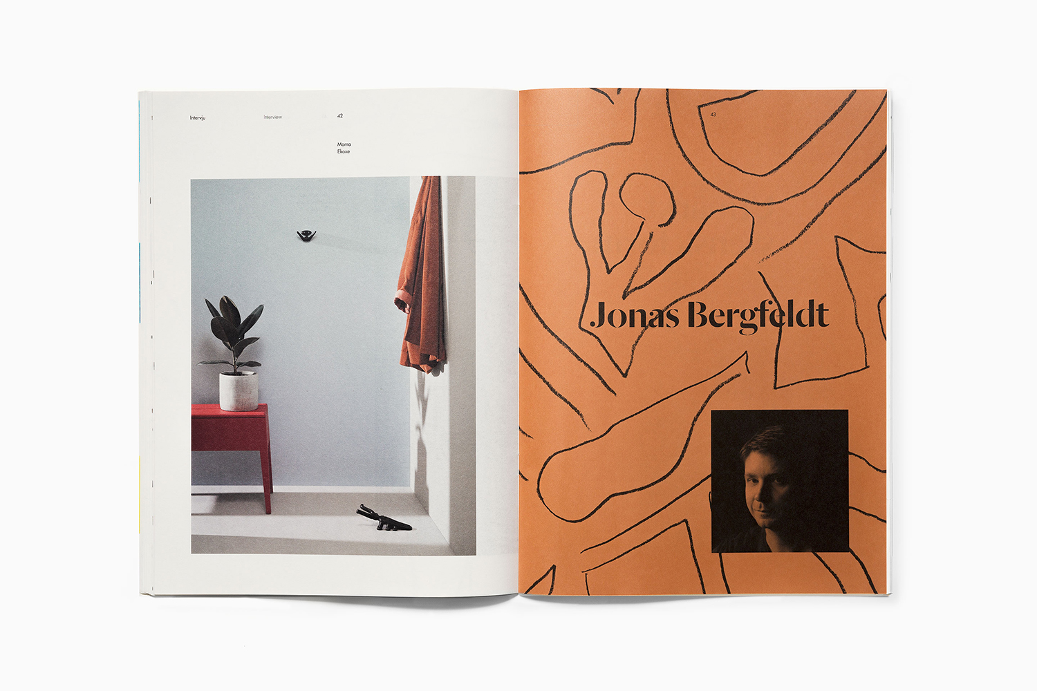
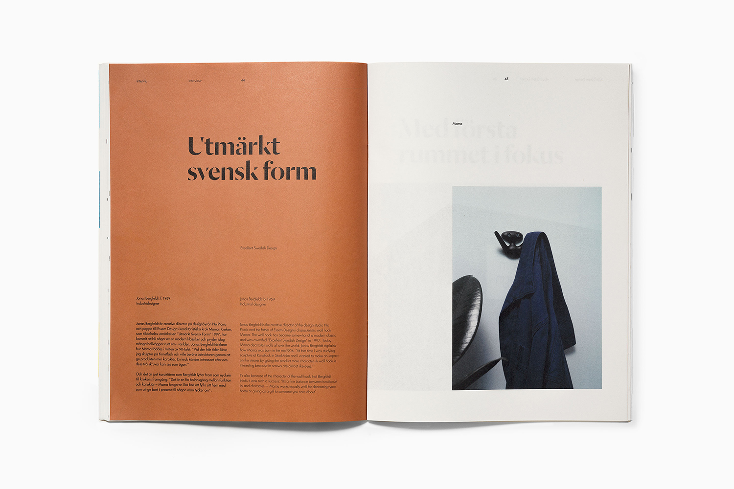
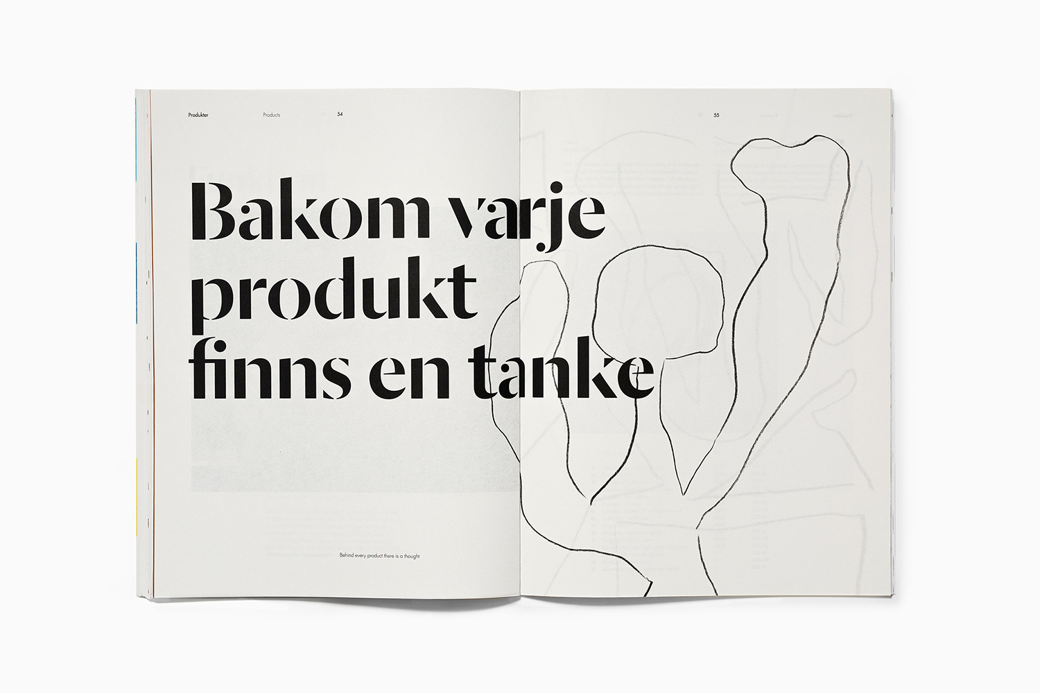
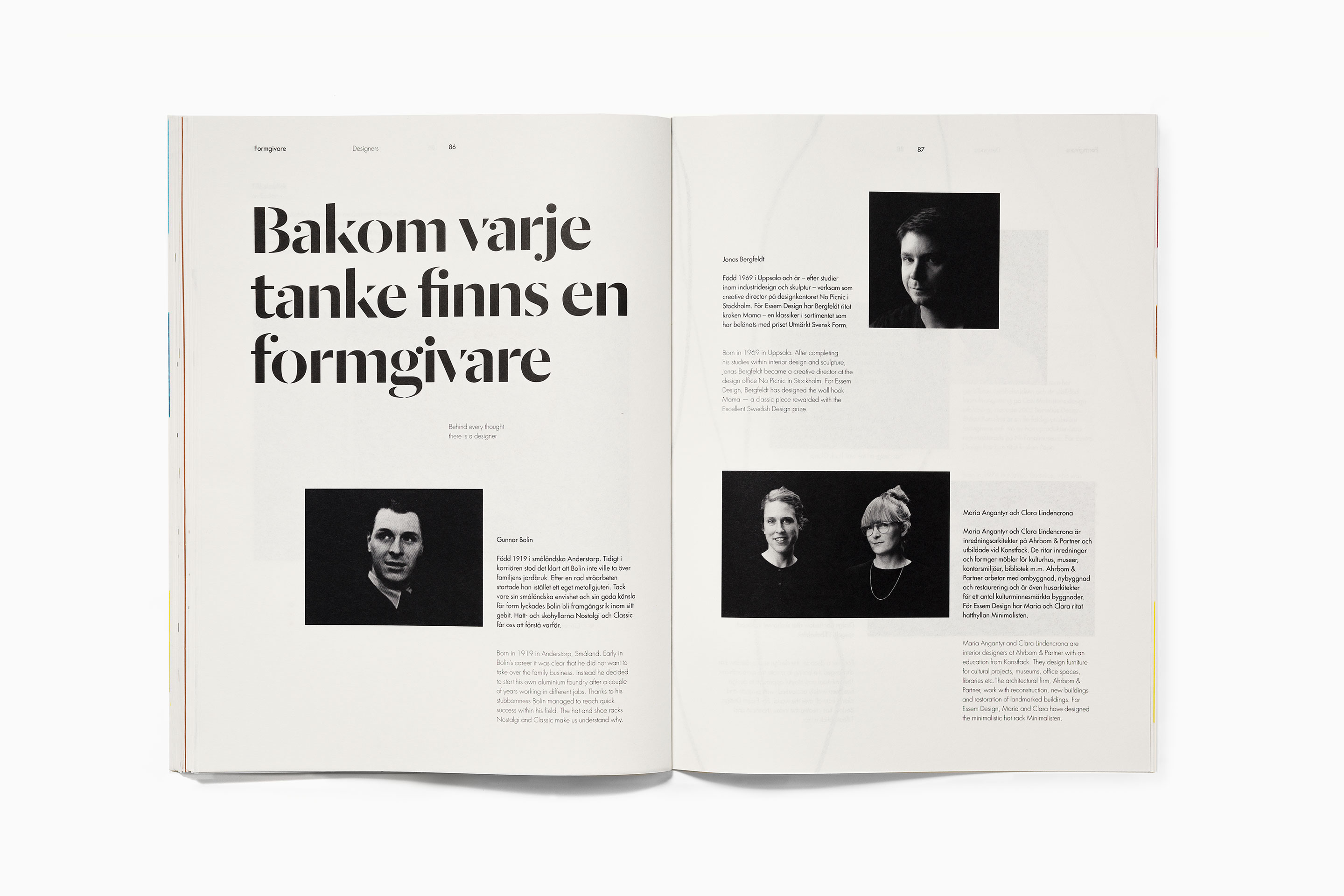
This verbal gesture was visualised using Commercial Type’s Dala Moa, paired with Futura, and played out across a brochure and stationery set of white and unbleached papers. The result balanced a playful and personable expression with the functional and crafted. This is expanded on and further explored throughout Essem Design’s 2018 product catalogue, also designed by Bedow, in the approach to art direction, colour, form and illustration.
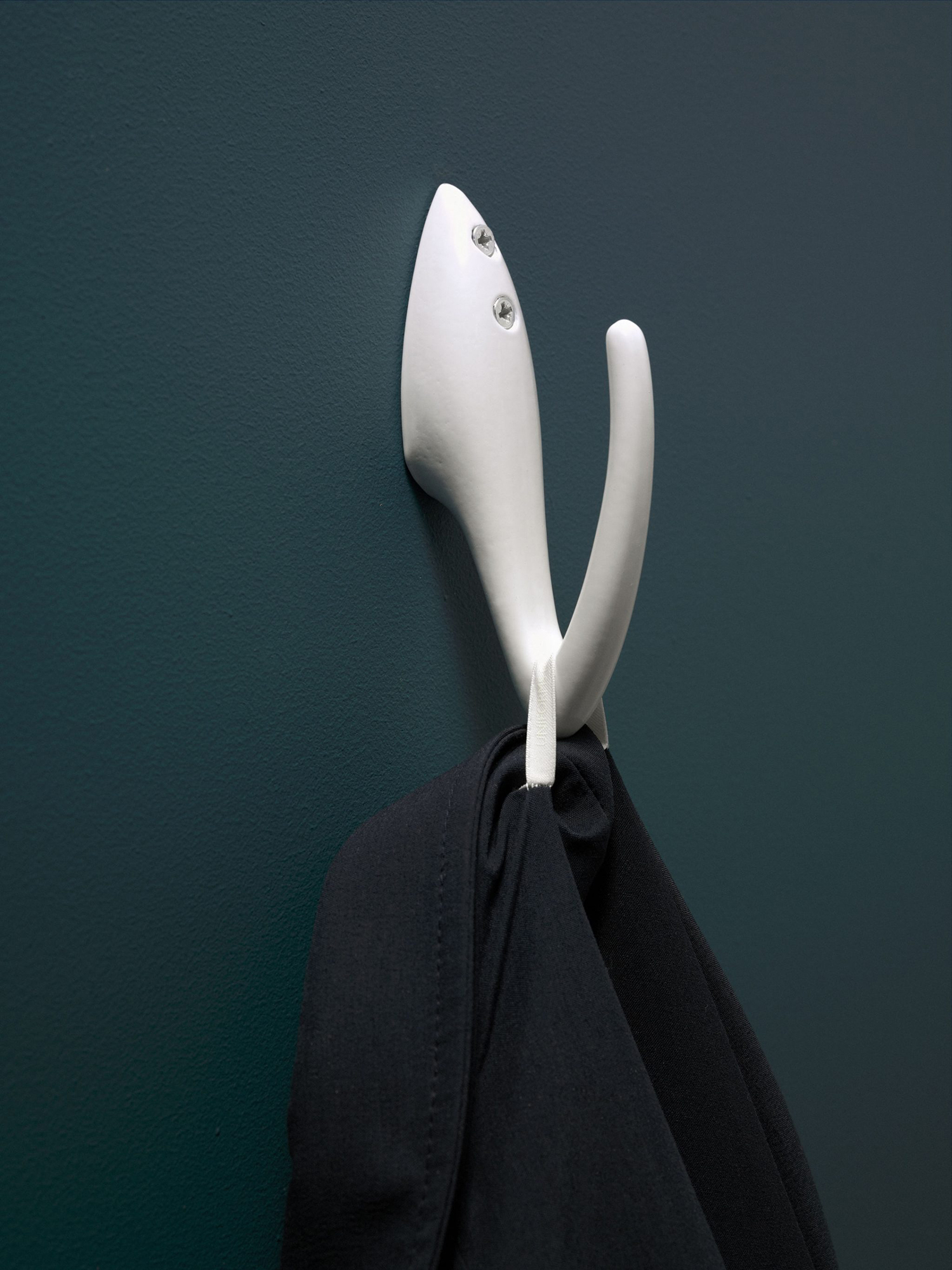
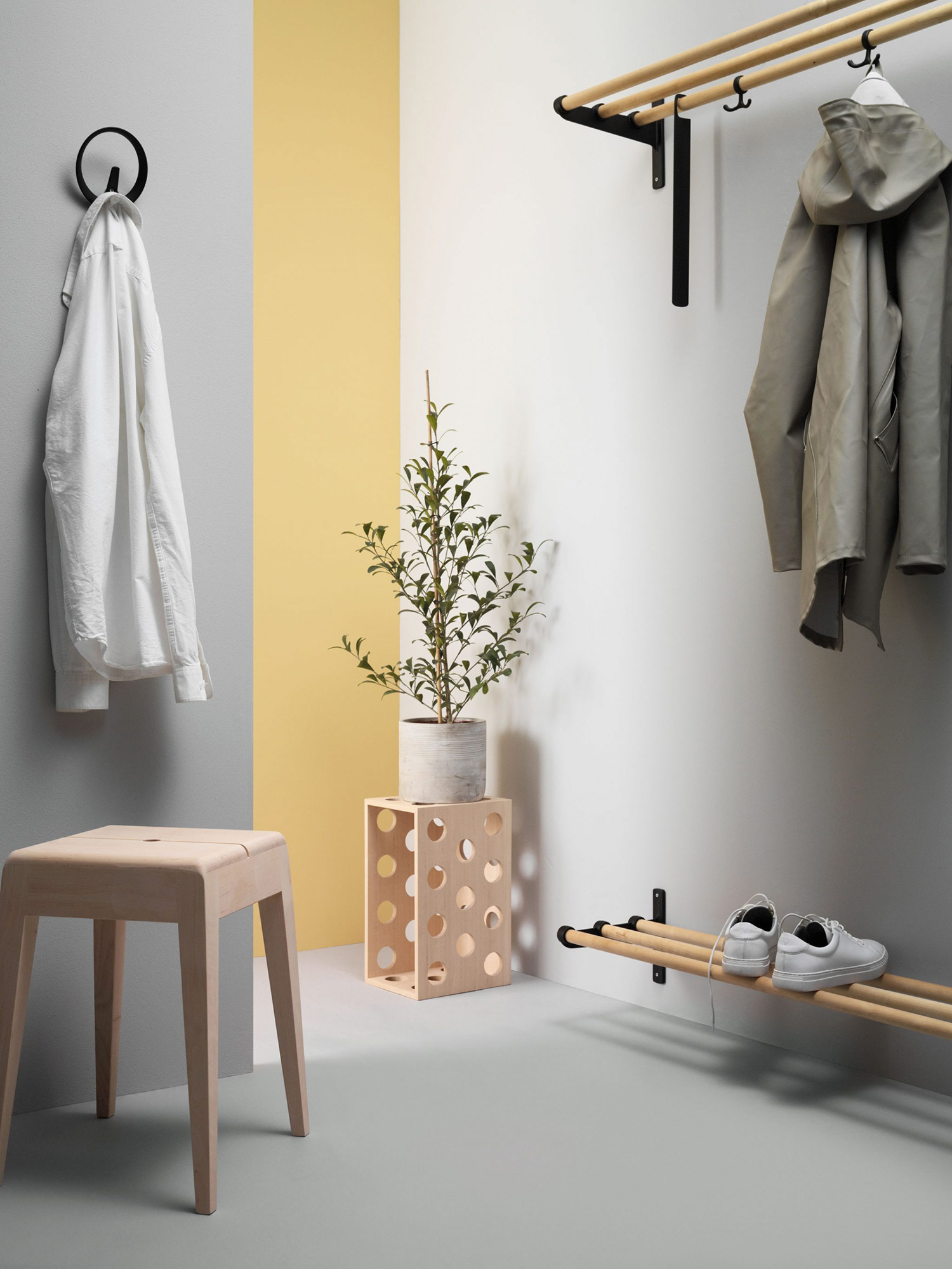
Essem Design’s products are distinctive in form, colour, composition and tactility. There is a stylistic character and borderline sculptural quality to many of these, yet a material simplicity and obvious and intuitive usefulness in form language.
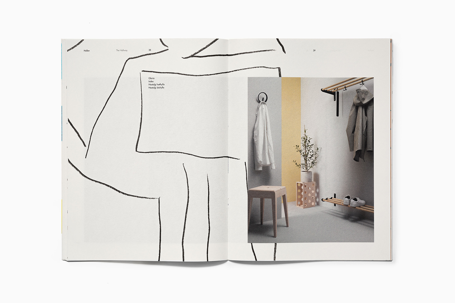
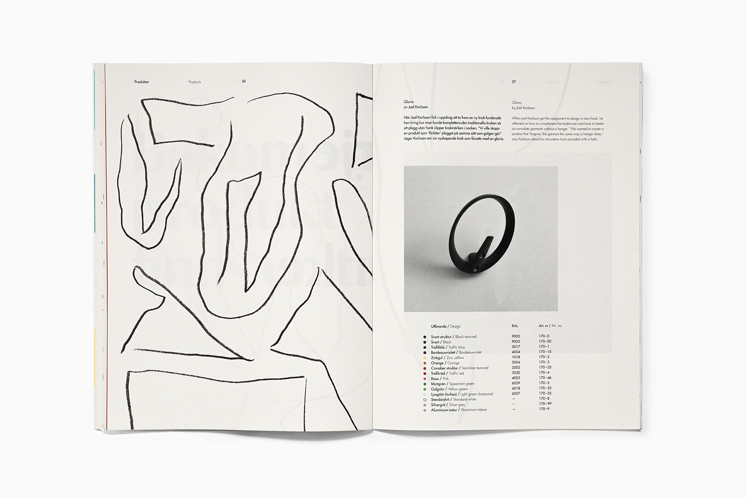
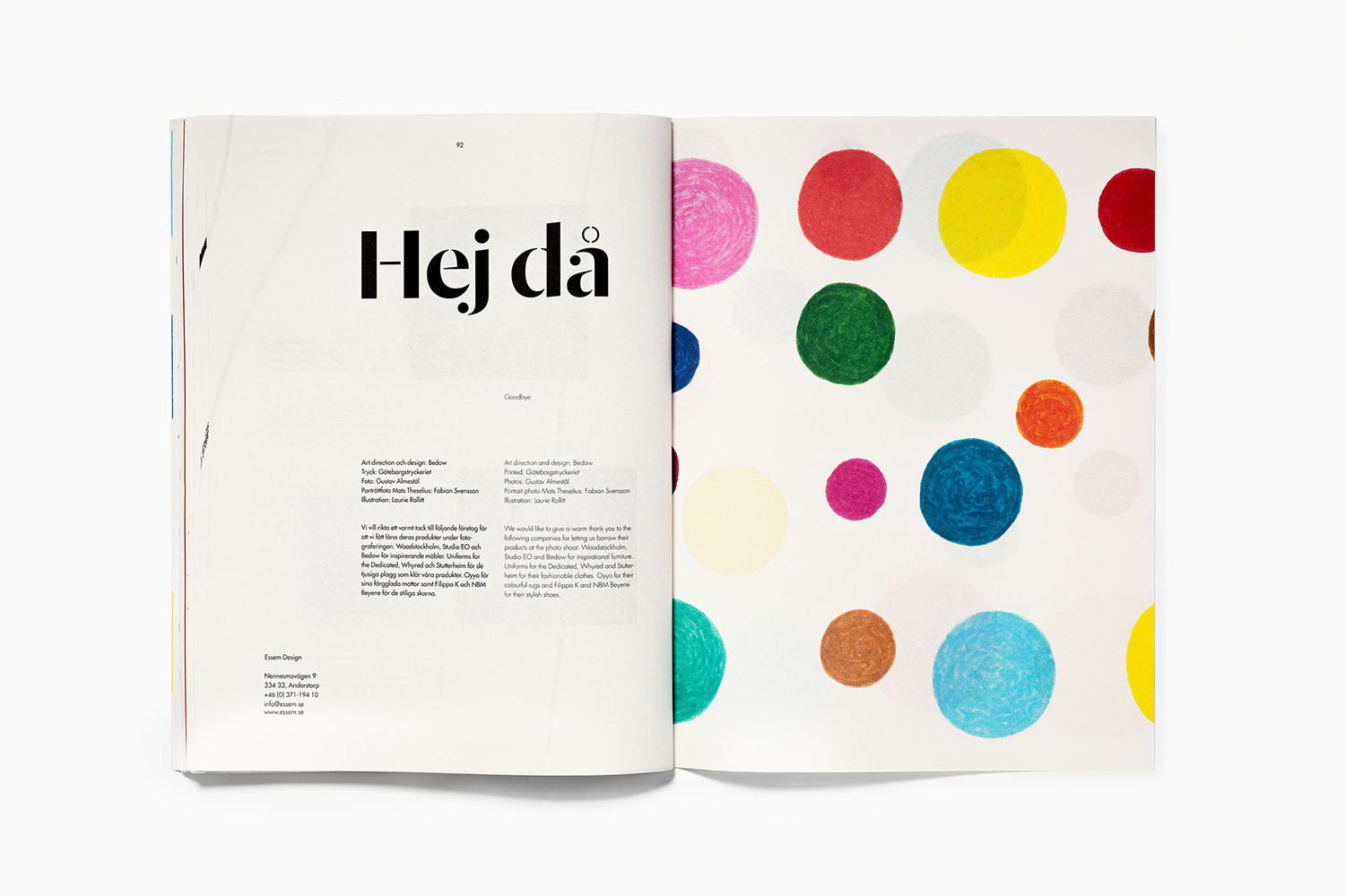
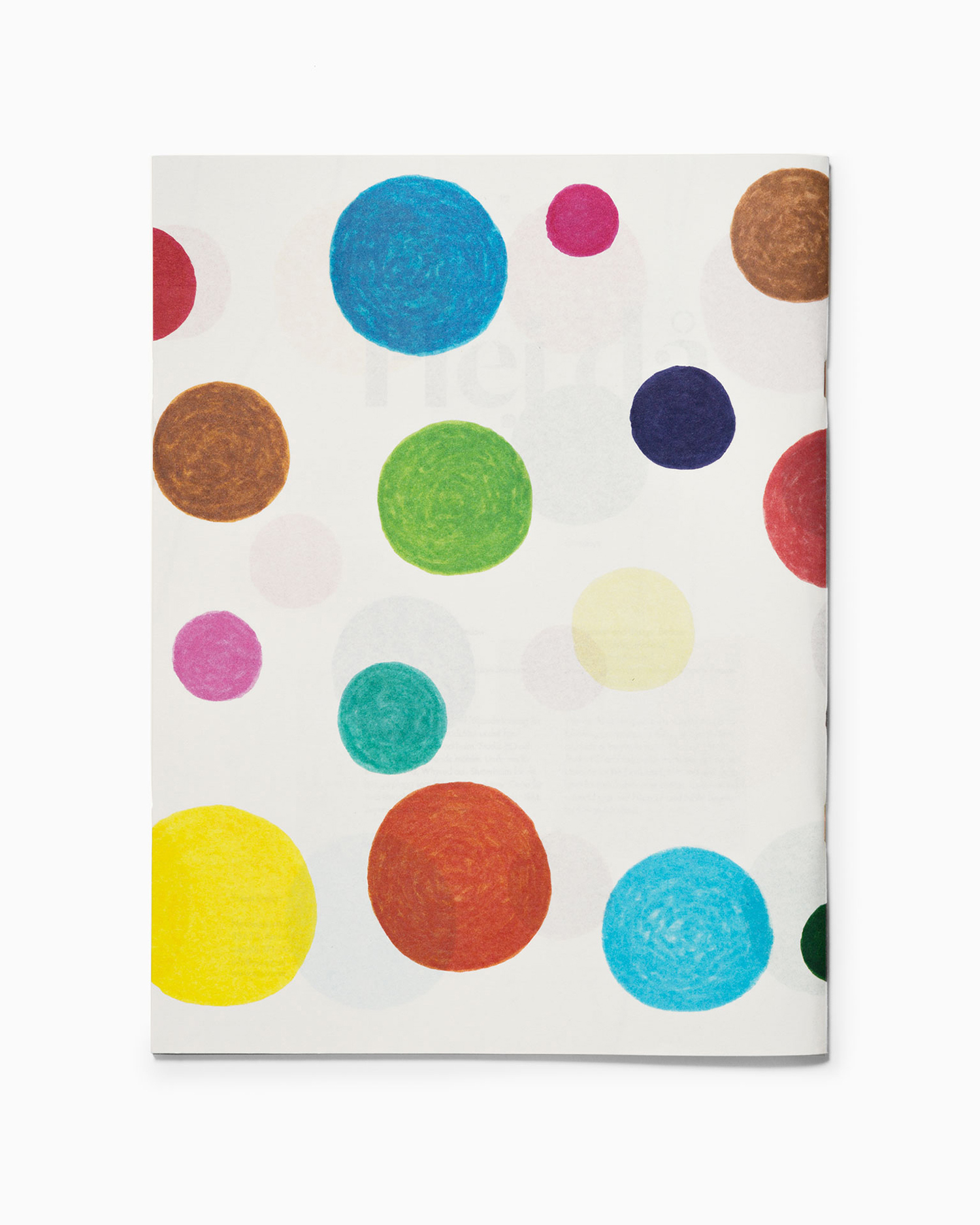
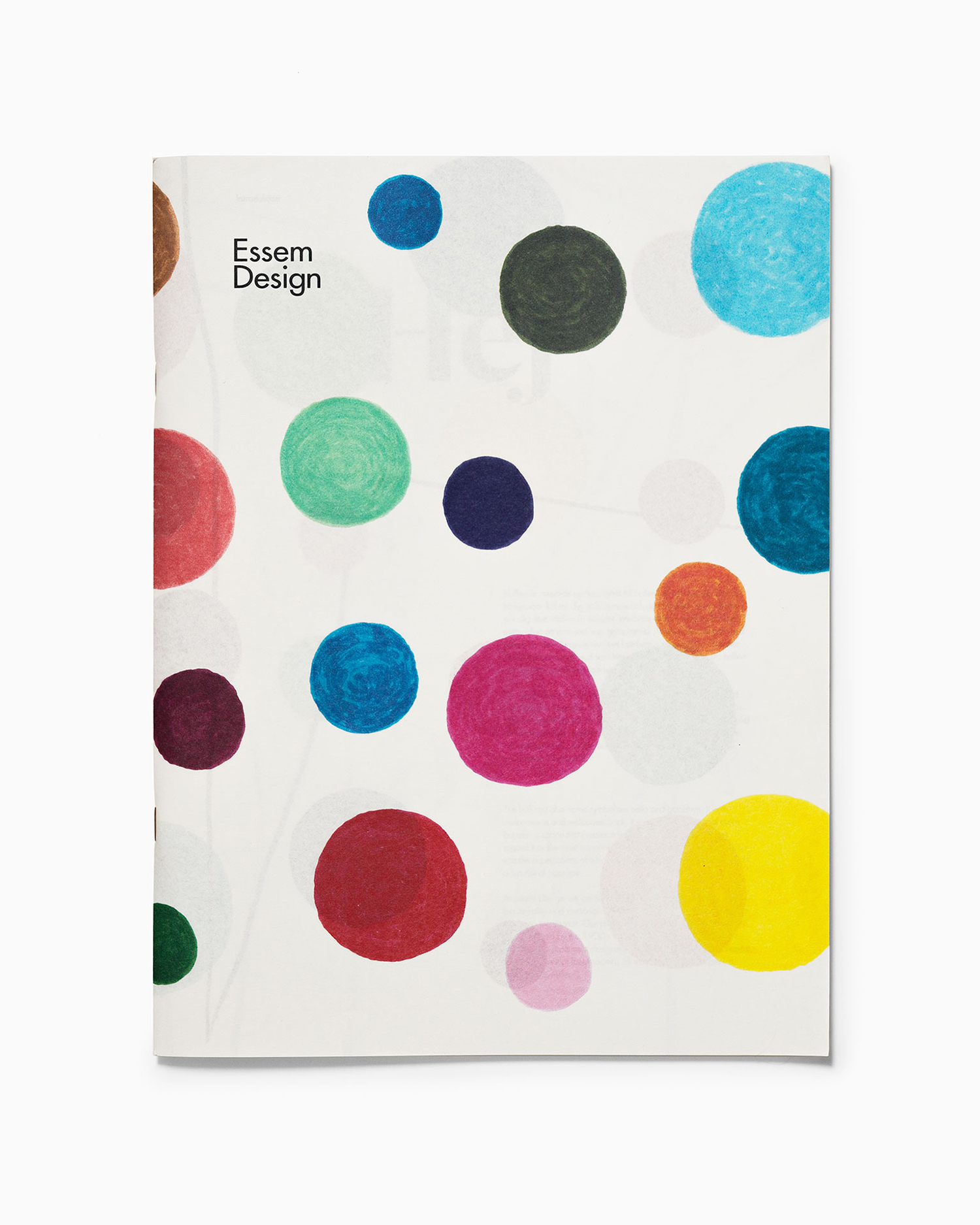
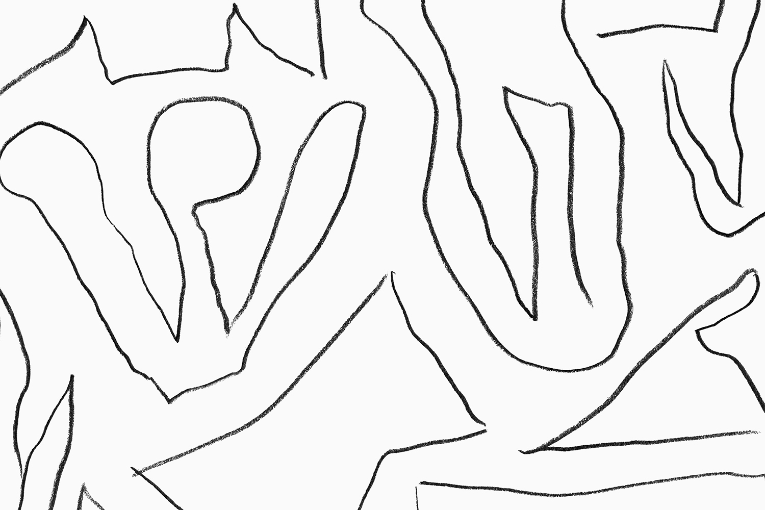
Play and function is the essential spirit of the brand and the 2018 catalogue explores this in a more immediate, emotional and communicative way through the juxtaposition of irregular lines and colourful hand-drawn circles alongside modern art direction and Essem Design’s identity system of Dala Moa, Futura, grids and plenty of white space.

Cover immediately expresses a youthful spirit through colour, form and the texture of the tool, yet manages to do this with a consideration that avoids the childish. The irregular lines and illustrations serve to root end product with its origins, that moment pencil hits paper, when there is very little intervention between creative thought and its materialisation. This connection introduces a layer of intangible value beyond an aesthetic appeal and visual distinction.
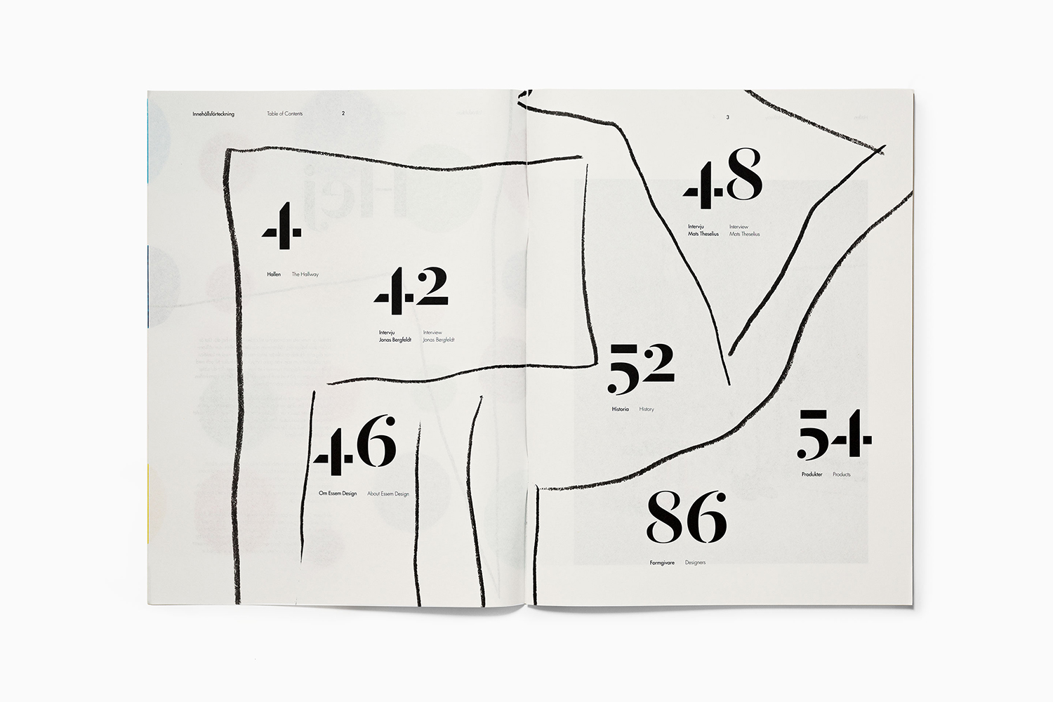
Form and utility coalesce in graphic gestures that convey a creativity spontaneity. Consideration is also given to space and arrangement, a simple gesture of thoughtfulness and restraint. By following this up with situational art direction, photographed by Gustav Almestål, an interesting dialogue is established between creative play and usefulness, that this critical relationship is not lost through process and production constraint, but retained, right up until the final manufacture of the product. Occasionally the two literally intersect within a spread, interact in the layering of fine paper, or fluctuate between pages.
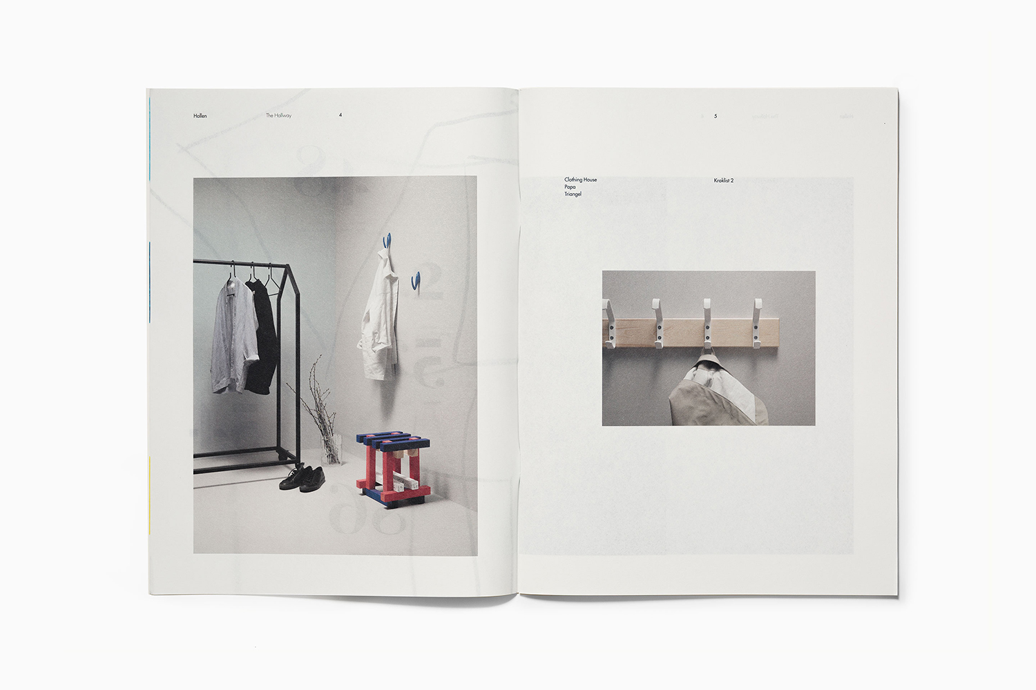
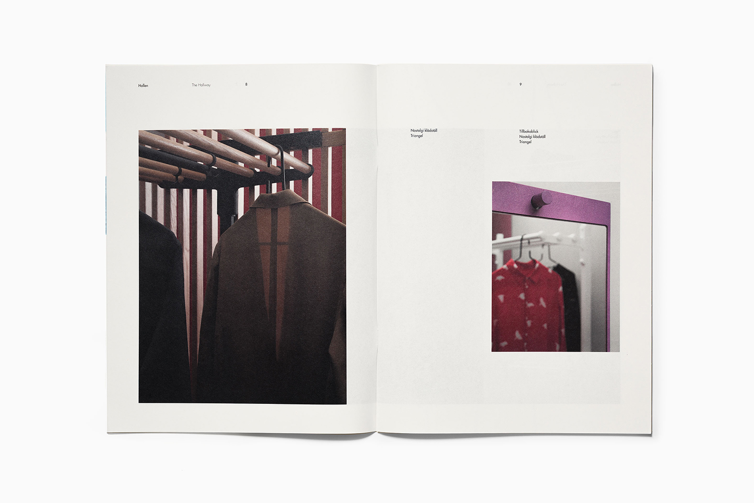
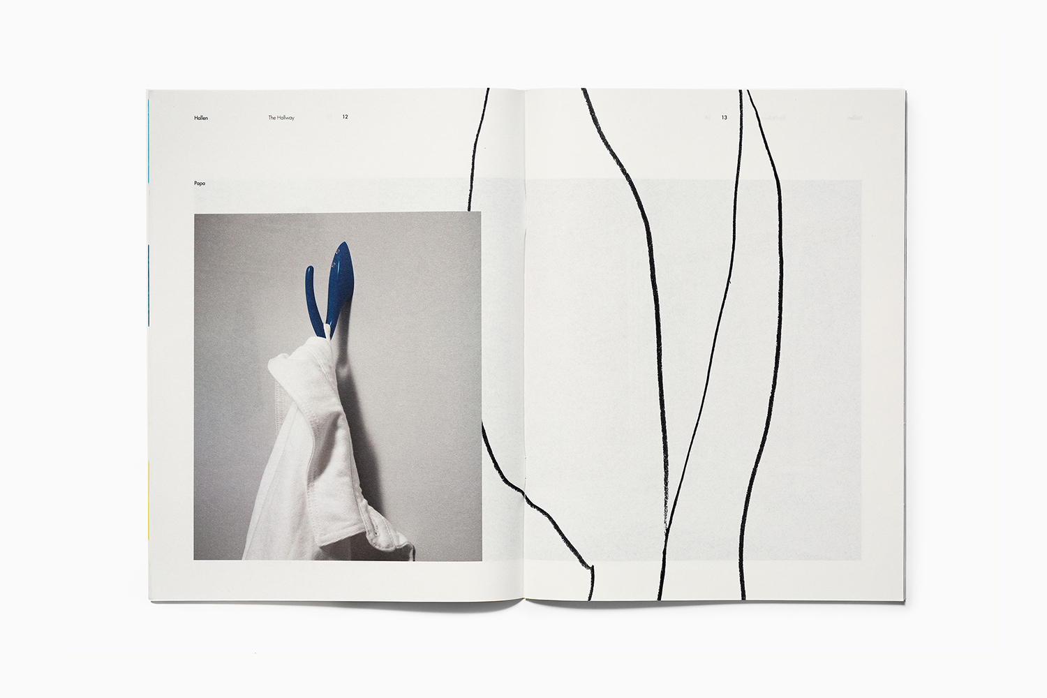
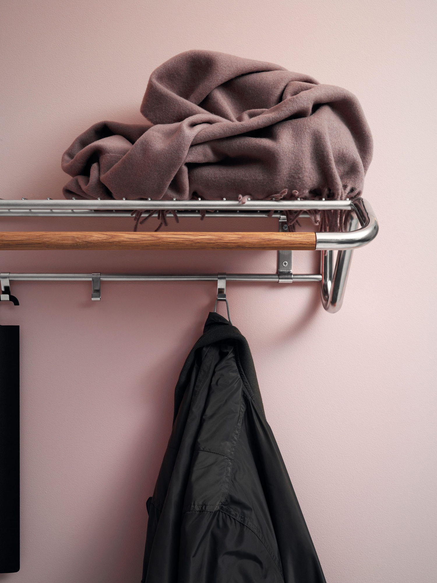
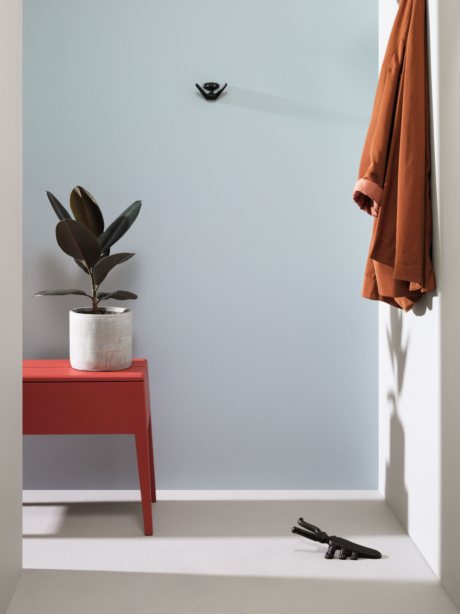
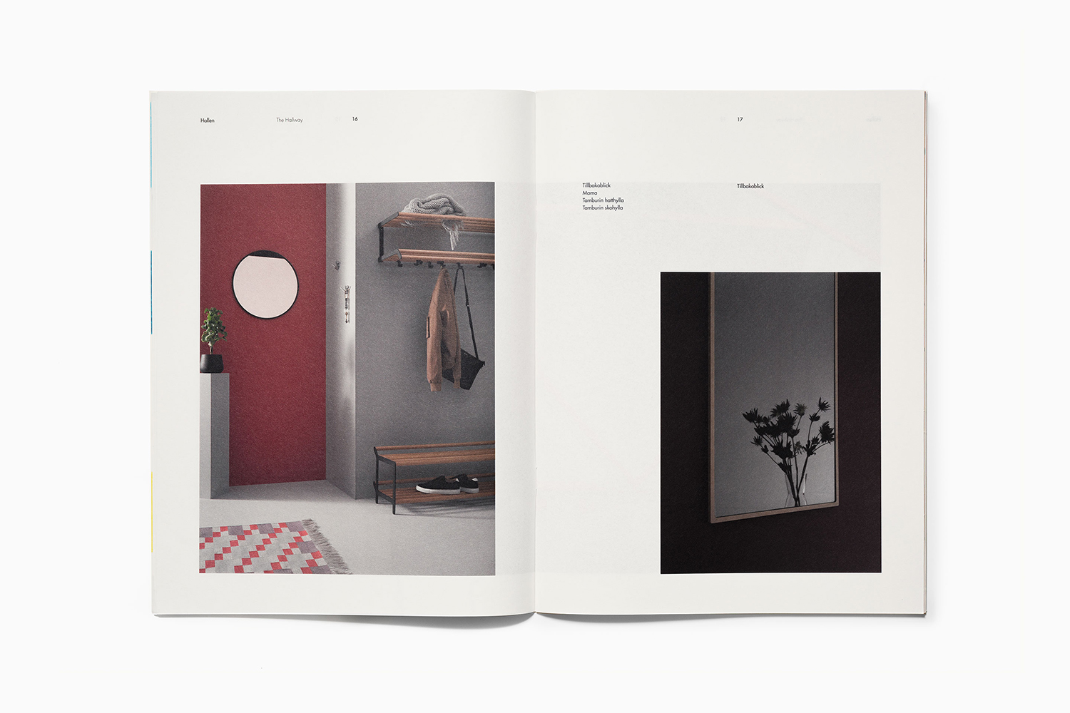
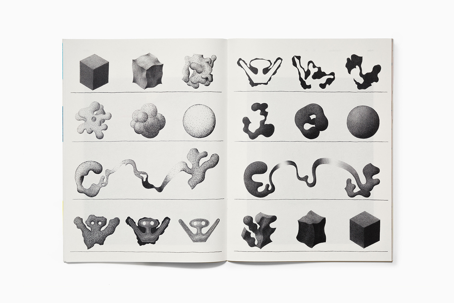
Other highlights include sequential illustrations, the shaping of raw materials into products, and waste materials reclaimed, recast and reused, and the material qualities of the catalogue, a thin paper that calls to mind and leverages the qualities of a sketchbook. More work by Bedow on BP&O.
Design: Bedow. Photography: Gustav Almestål. Illustration: Laurie Rollitt. Opinion: Richard Baird. Fonts: Dala Moa & Futura
