Illustration
Creative Spark’s bold, no nonsense identity for hair loss brand Leo
Leo is billed as a “hair rejuvenation brand”, founded by duo Jason Saks (who carries the rather sweet, and quite funny job title of Director of Hair Loss) and his son Joe, with the broad aim to make hair loss feel “less isolating and less complicated”. According to Manchester-based design agency Creative Spark, which has created the superb new identity,...
Pumpkin by Kuba & Friends
Another week, another branding project for those – love them or loathe them – ‘pet parents’. I honestly thought we were post-pet-parent, but seemingly we’re still very much in the midst of that icky phrasing – the “live, love, laugh” of dogs, a sort of endless bottomless brunch with the #girlies. I’m an ‘elder millennial’, but it all seems disgustingly,...
Cute, curious and cuddly
Fitness and health tracking apps are not generally known for their sense of fun. The likes of MyFitnessPal, while great in terms of functionality, for the most part, keep the design stuff resolutely serious, no-nonsense, and perfunctory. Meanwhile the likes of Strava elicit joy through very few things, the main one being when people decide to run in a shape...
Diggin’ it
Just when you thought we were approaching a post-pet-parent era, a brand comes along and proves very much otherwise. Thankfully, though, while pet parenting seems to be alive and well; fingers crossed we’ve left behind the whole rather icky “fur baby” days of things like dog bandanas that read, “My Mom is Sooooo Obsessed with Me”; or dog nail varnish;...
Big Cartel by How&How
Big Cartel launched in 2005 as a low-cost, easily customisable ecommerce platform specifically aimed at artists and other creatives. In the two decades since, the platform has quietly revolutionised what it is to be an independent maker, powering more than $2.5 billion in sales from ceramicists, jewellery designers, illustrators, and the occasional medieval tapestry revivalist. But as the marketplace for,...
Sigma by Stockholm Design Lab
You could argue that there’s a fair few similarities in terms of Japan and Sweden’s approach to design, and the aesthetics of life more generally. Both are known often for a specific kind of minimalism – a tastefulness that eschews fluff, luxuriates in crisp whites and keeps its edges, everything in its right place, rules and order and form following...
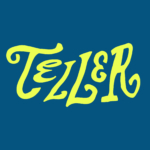
Teller by Werklig
The social and cultural activity of sharing stories has been, and continues to be, an essential part of human experience. Storytelling contributes to the cohesion of, and sometimes control over, individuals and groups, preserving and passing on knowledge, and instilling moral values. Many of us live by the values and knowledge established over thousands of years through stories. With improvisation...
Ambassaden by Bleed
Designed by Finnish-American architect Eero Saarinen, the Ambassaden’s angular modernist stature holds a striking presence in the heart of Oslo. When it opened in 1959, it functioned as the US embassy until its closure in the early 2000s. Fast-forward to today – the building has been reopened and its programming altered. It now operates as a multi-functional space that includes...
Hip Pop by Robot Food
Running a design blog sharpens your eye for category conventions. Stick with it long enough, though, and you’ll start to see those conventions unravel. What once felt fixed begins to flex. This creates a challenge for writing about design: you’re constantly assessing the landscape, but that landscape is always shifting. Take minimalism, for example. Once the dominant aesthetic of the...
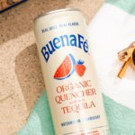
Buena Fé by Saint Urbain
Buena Fé is the first 100% organic tequila-based cocktail-in-a-can, and is made in Jalisco, Mexico, the ‘birthplace of tequila’, where the spirit was first distilled. The drink is made with 100% Blue Weber Blanco tequila, which means that all the alcohol in Buena Fé comes from the agave plant. Unlike your short Margarita, or shortish Paloma, these ready-to-drink cocktails are...
Bettr by Anak
Between the late 2000s and the early 2010s, the coffee industry turned its attention to ‘craft’, elevating the beverage to a gourmet offering. When it came to brand storytelling, flavour notes, provenance and sustainability became key components. These features came to define what’s now known as ‘third-wave coffee’, which pre-dates the gamified science-infused ‘fourth-wave coffee’ movement in terms of textures...
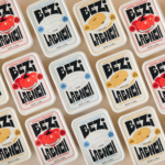
Bezi by Red Antler
Bezi was founded by Ilay Karateke – an Istanbul-raised, New York-based, ex-McKinsey consultant turned cheesemaker – and Hasan Bahcivan – a Berkeley-trained engineer from one of Turkey’s largest and most legacied cheesemaking families. Both grew up in large families, with their lives punctuated by big family-style meals shared with friends and neighbours. Labneh, a Middle Eastern spreadable cheese, was ever...