OfficeUS Manual by Pentagram
Opinion by Richard Baird Posted 30 July 2018
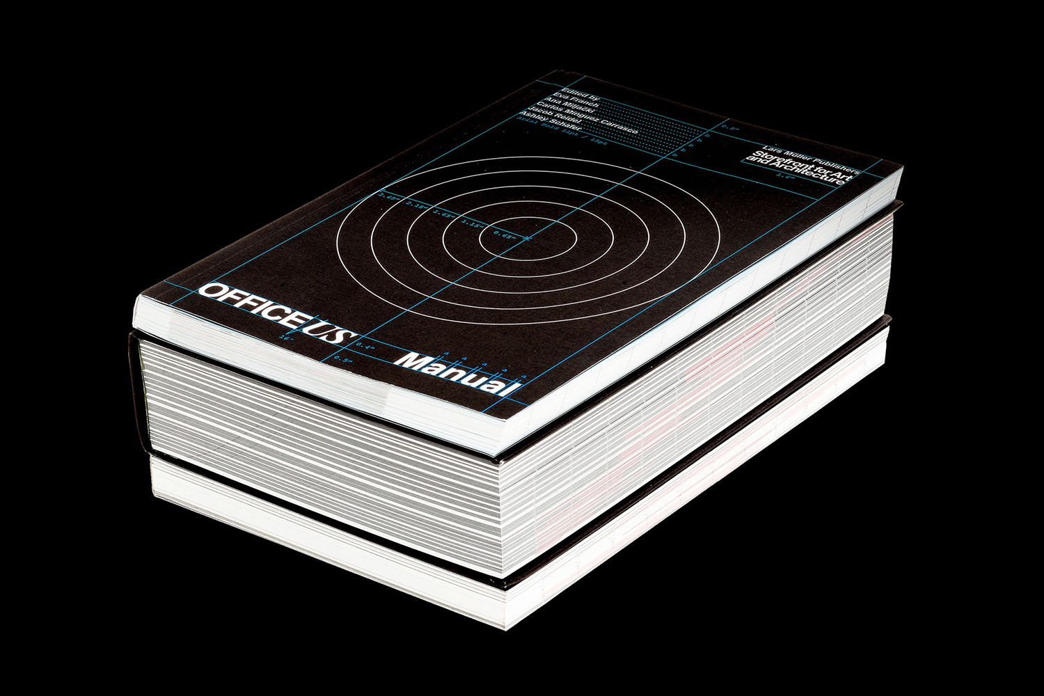
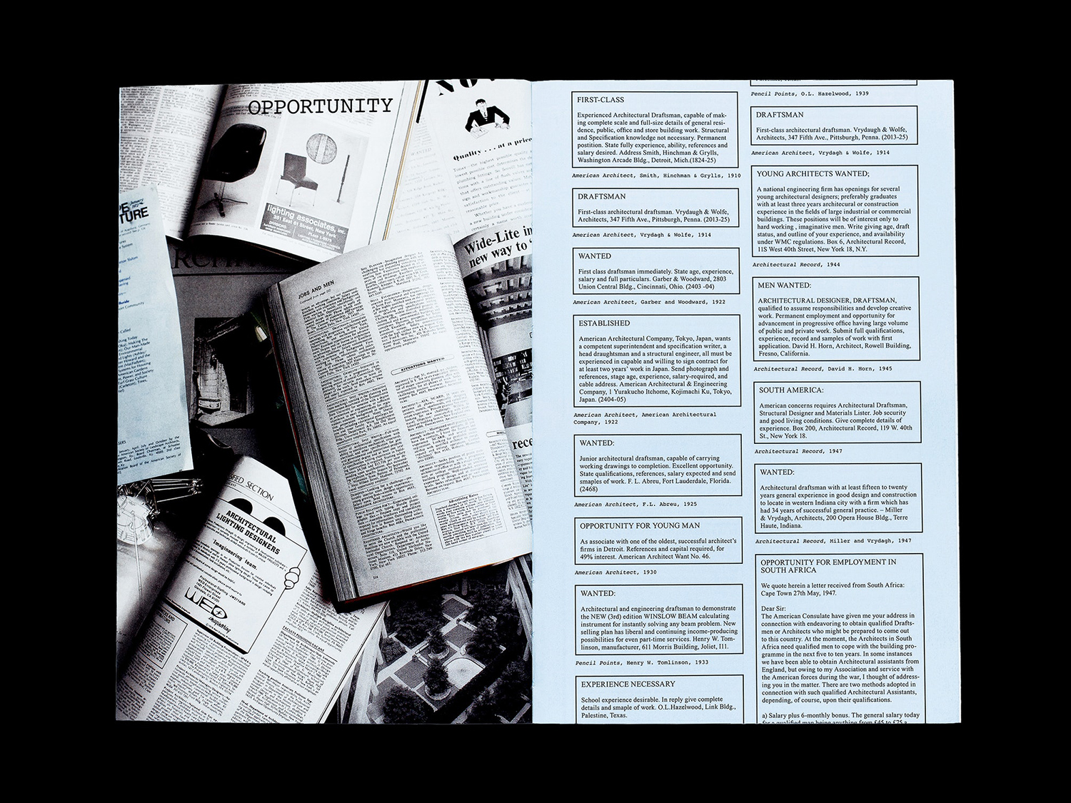
OfficeUS Manual is a guide to the American architectural workplace over the past century. It is the third book in the OfficeUS series which deals with the development of international US architectural practices, and offers insight into the office life of these over the past 100 years; how they have changed and remained the same. It does this through the compiling and presentation of job listings, timesheets and estimates, work furniture and reception areas, office hours and benefits.
The book is marked by its approach; a balance of criticality, conviviality and deadpan documentation, in its mix of isolated objects, technical drawings and iconography, contemporary reflections by more than fifty architects, artists and writers, and a scope that covers the meta, macro and micro.
The book was edited by Eva Franch, Ana Miljački, Carlos Mínguez Carrasco, Jacob Reidel and Ashley Schafer and published by Lars Müller Publishers. It is a paperback measuring 160 × 240mm, made up of 288 pages featuring 461 illustrations and was designed by Pentagram partner Natasha Jen and team.
Meta–Although this article primarily takes a look at the design of the book, it is worth touching upon content and how this shapes material object. Although content within the finite space of a printed object is by its very nature highly curatorial, the degree to which this is visually immediate and apparent varies greatly. Here, it is at the forefront and very present, a necessity to bring to order a huge amount of information, and the potential to offer commentary and humour in selection, arrangement and juxtaposition.
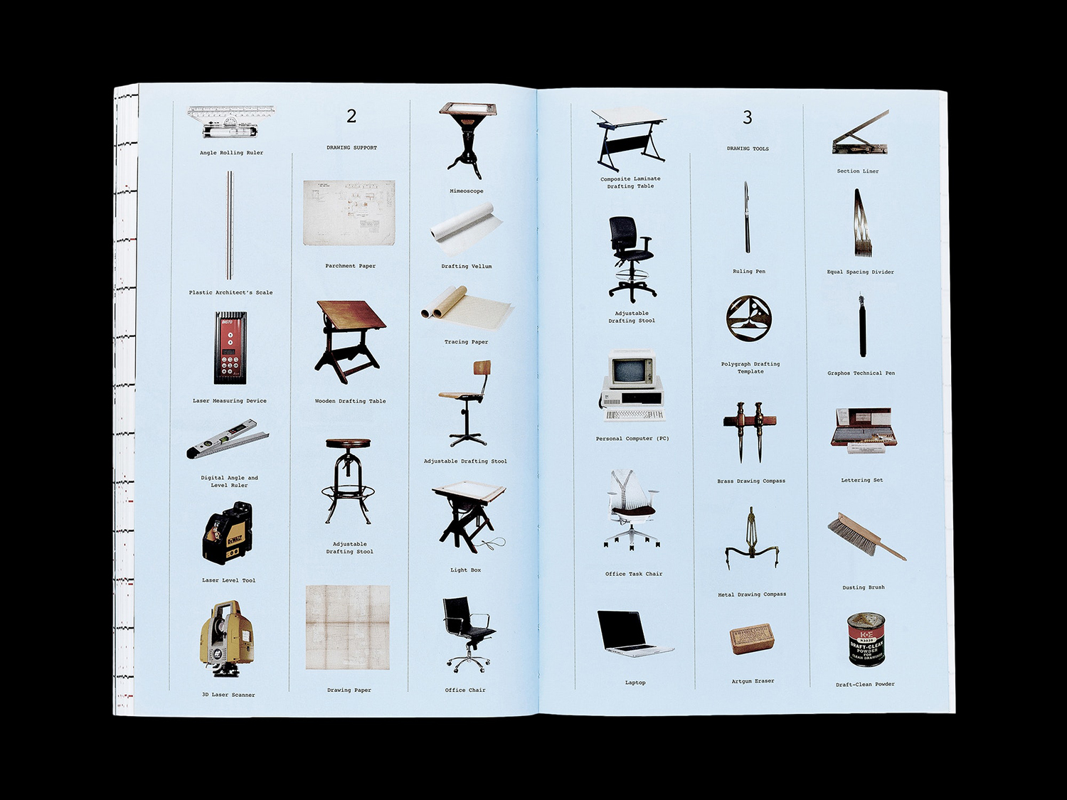
In the decontextualisation of many of the artefacts that populated and facilitated architectural practice the book employs a deconstructive visual language of isolated objects and redrawn imagery in dialogue with one another (past and present, similarity and disparity) to highlight the increasingly codified nature of architectural practice; not just the tools that helped shape the built environment but the furniture and language that shaped the day to day lives and the interior minds of the people working in these offices.
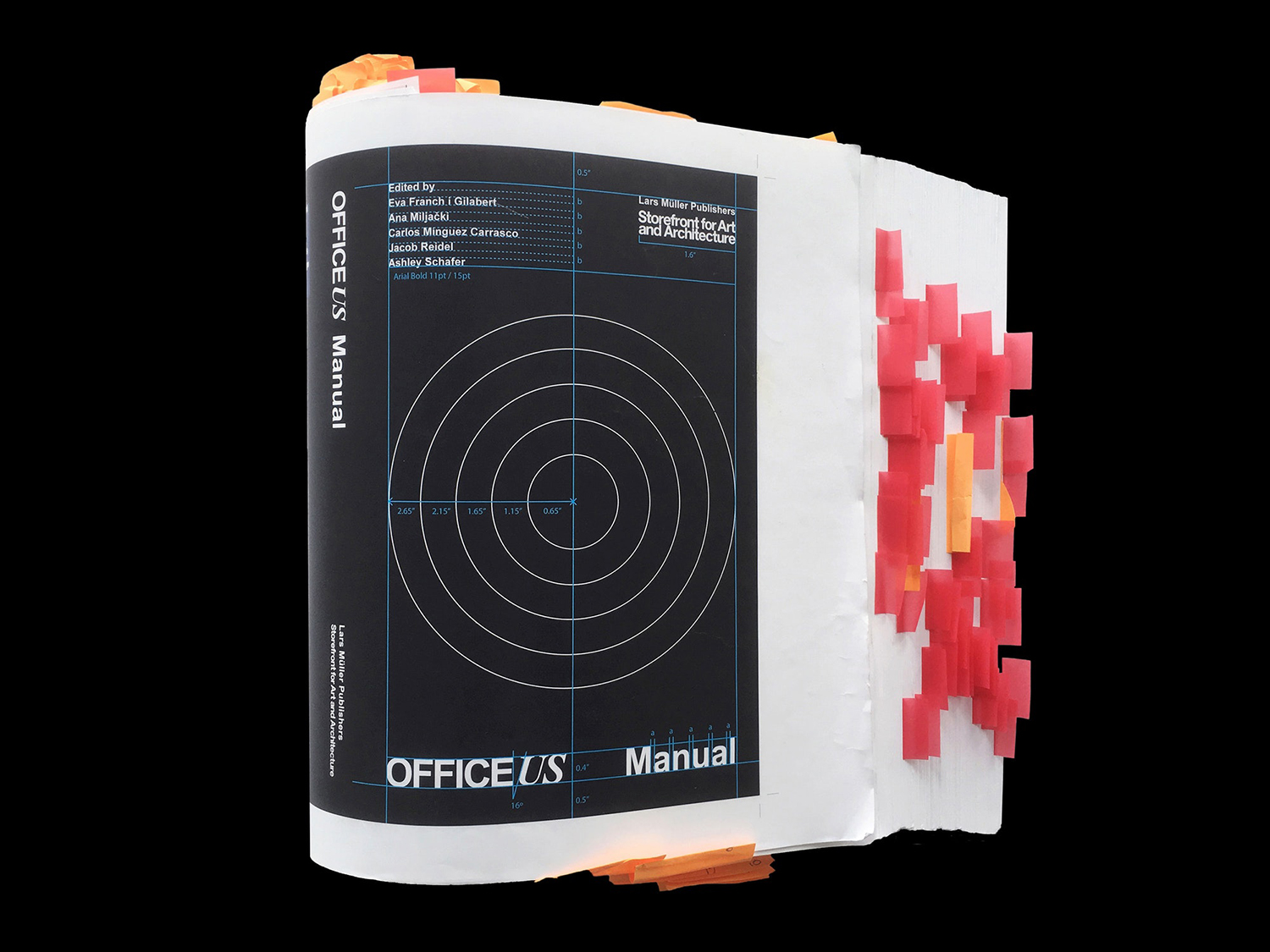
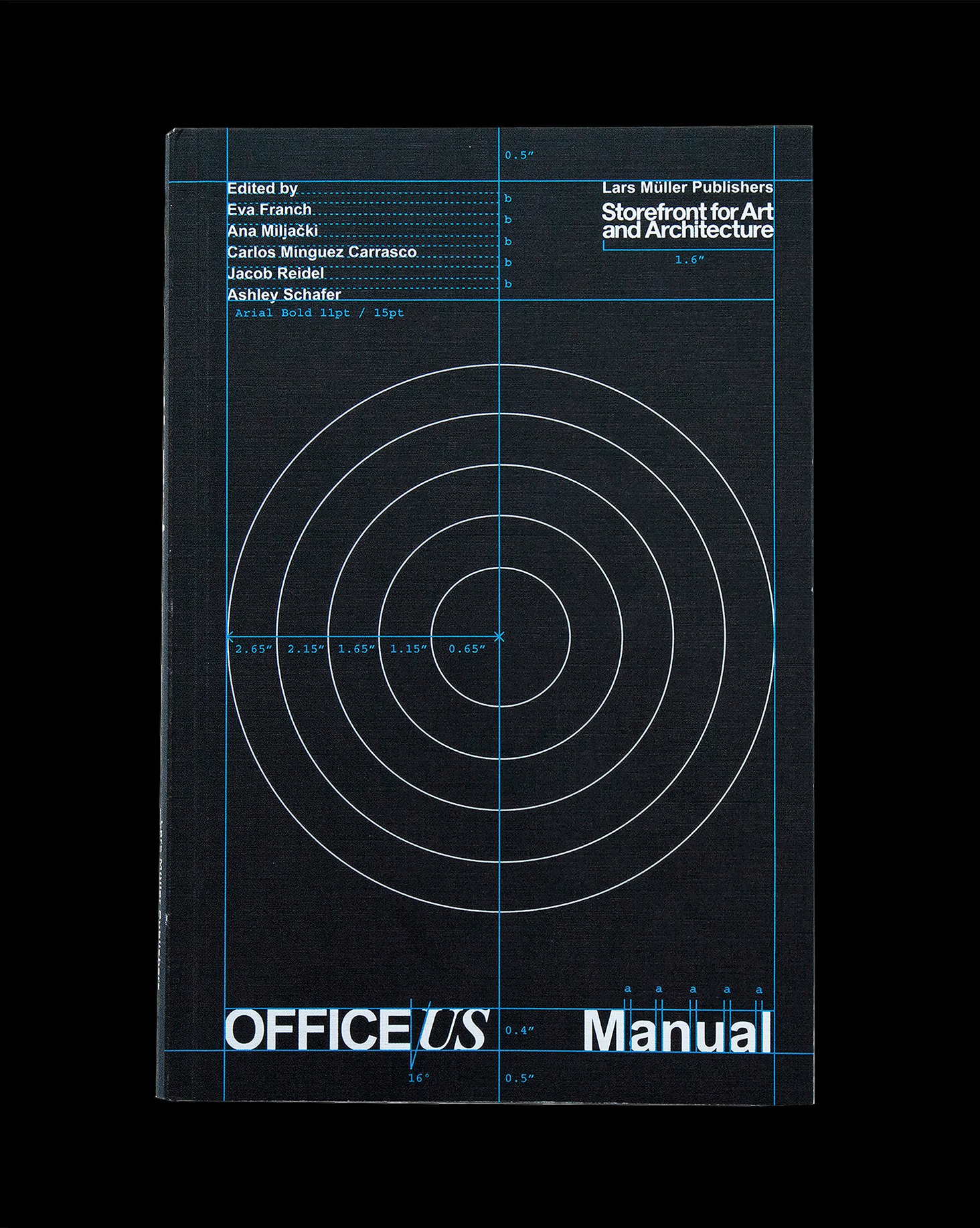
Cover design functions well to set the tone of the book. In its facsimile of mid-century architecture and design publications, in the visibility of grids, guides and the implication of wear and tear, in the choice of type and layout, it captures two points in time, a period aesthetic and utility, and the appealing nature of that period aesthetic and desire for design manuals today. It is both authentic and inauthentic concurrently, much like the redrawing of plans for the book. And in this way, it expresses the intention to be a genuine attempt at interrogating a period whilst not taking itself too seriously. This is essential, as in the curatorial nature of the book, in its finite pages, it could only ever tell a specific and subjective story, offer a partial rather than complete and objective overview. Also check out Mies In London and Platform 10: Live Feed.
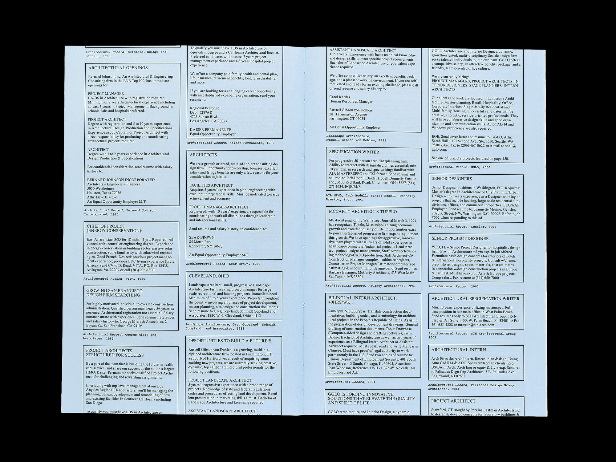
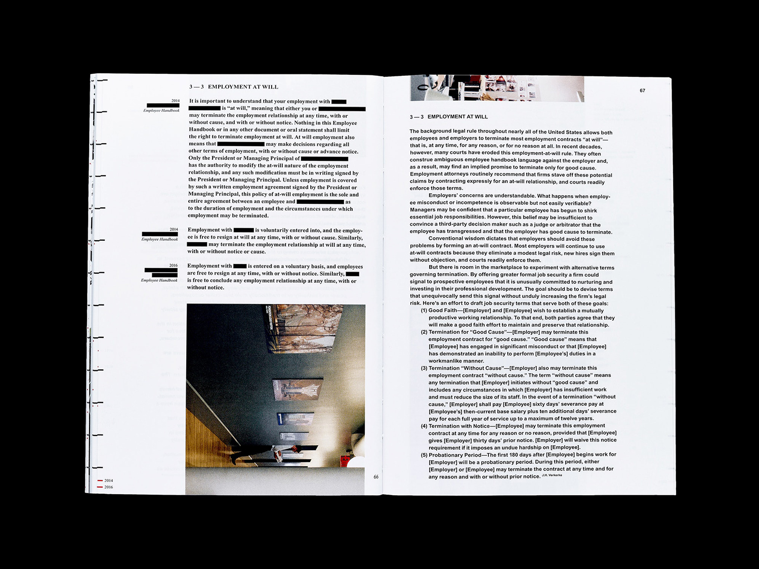
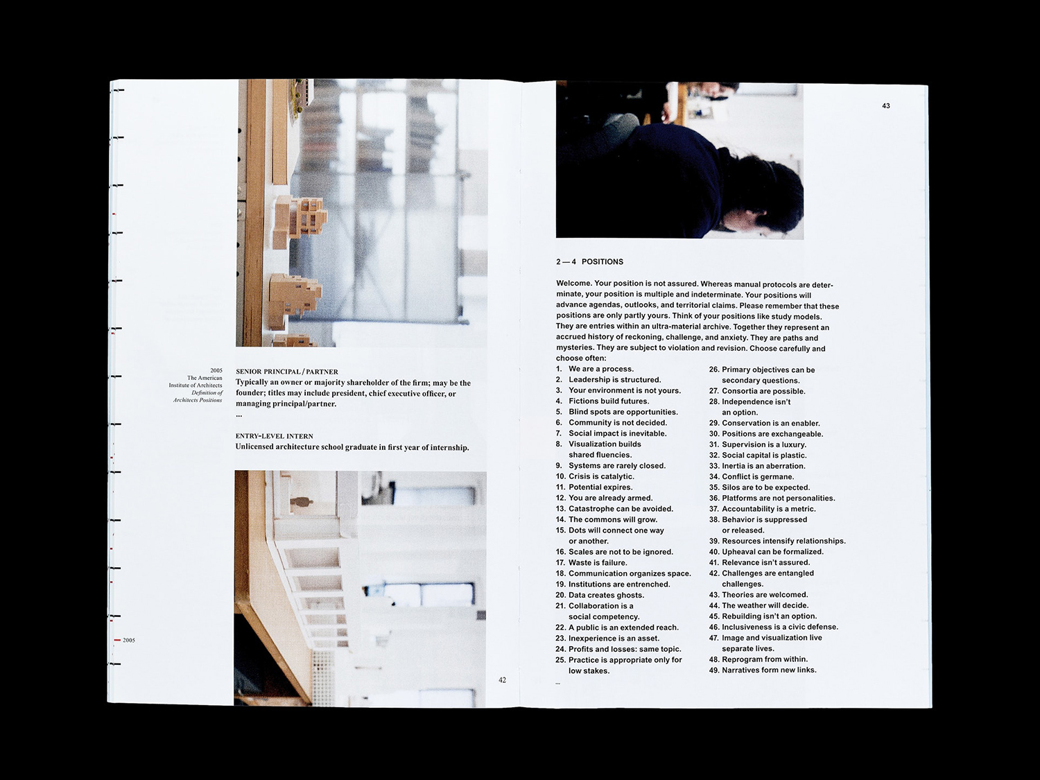
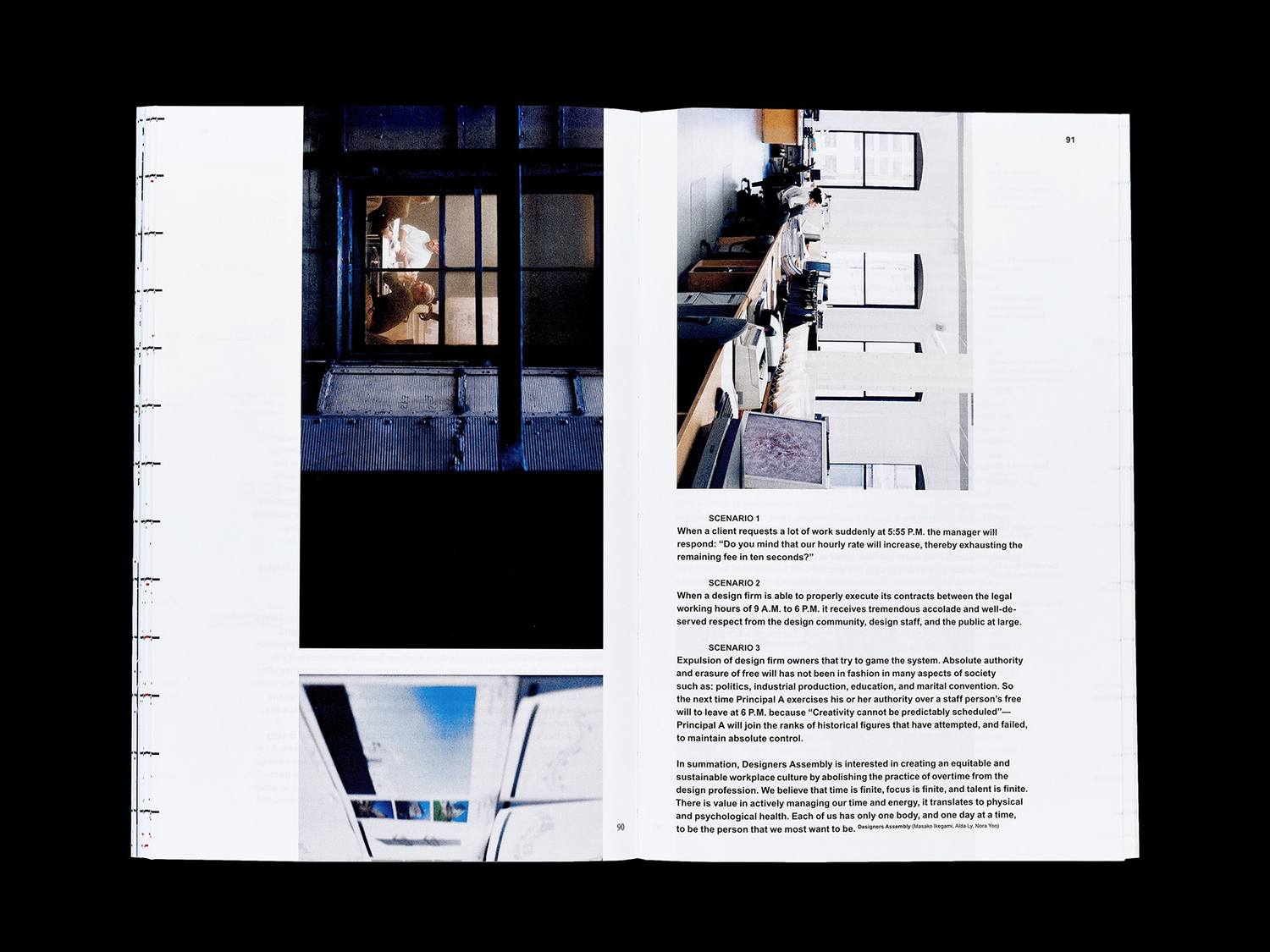
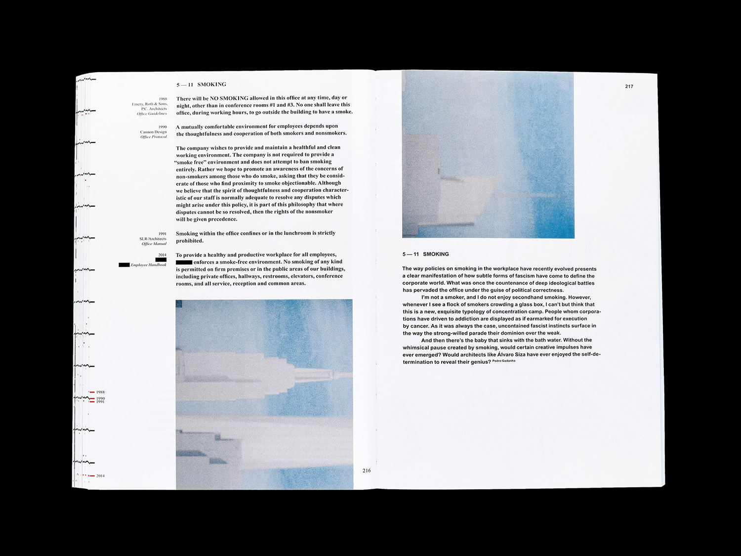
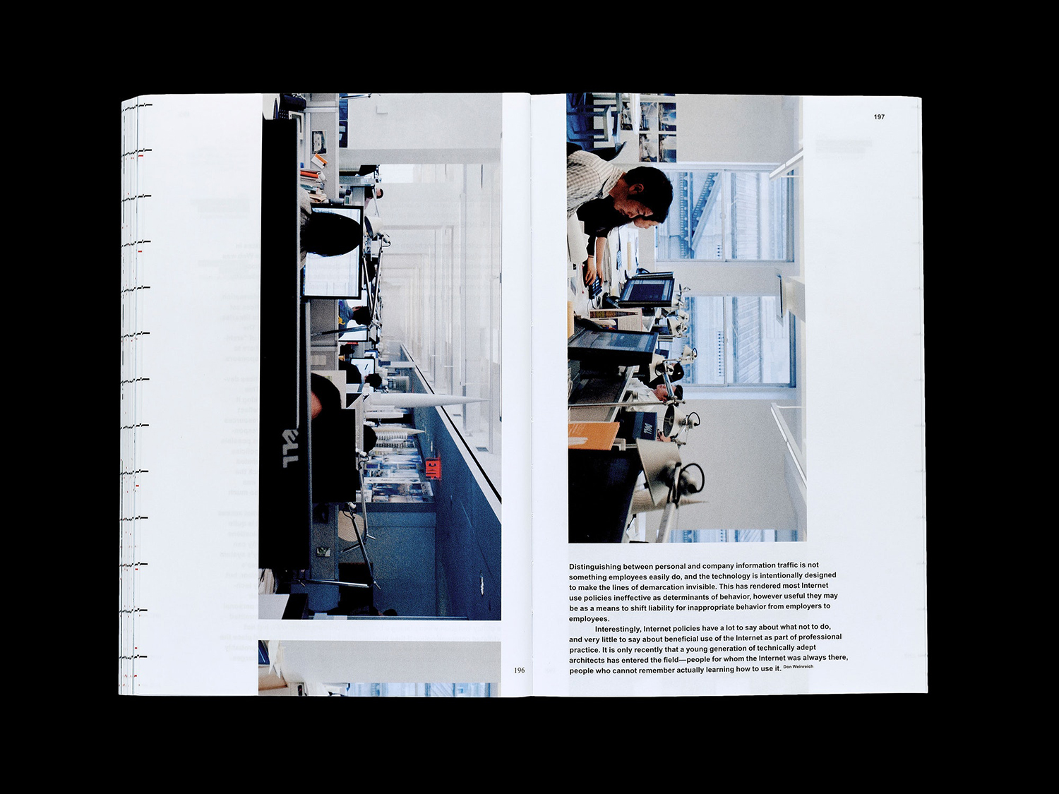
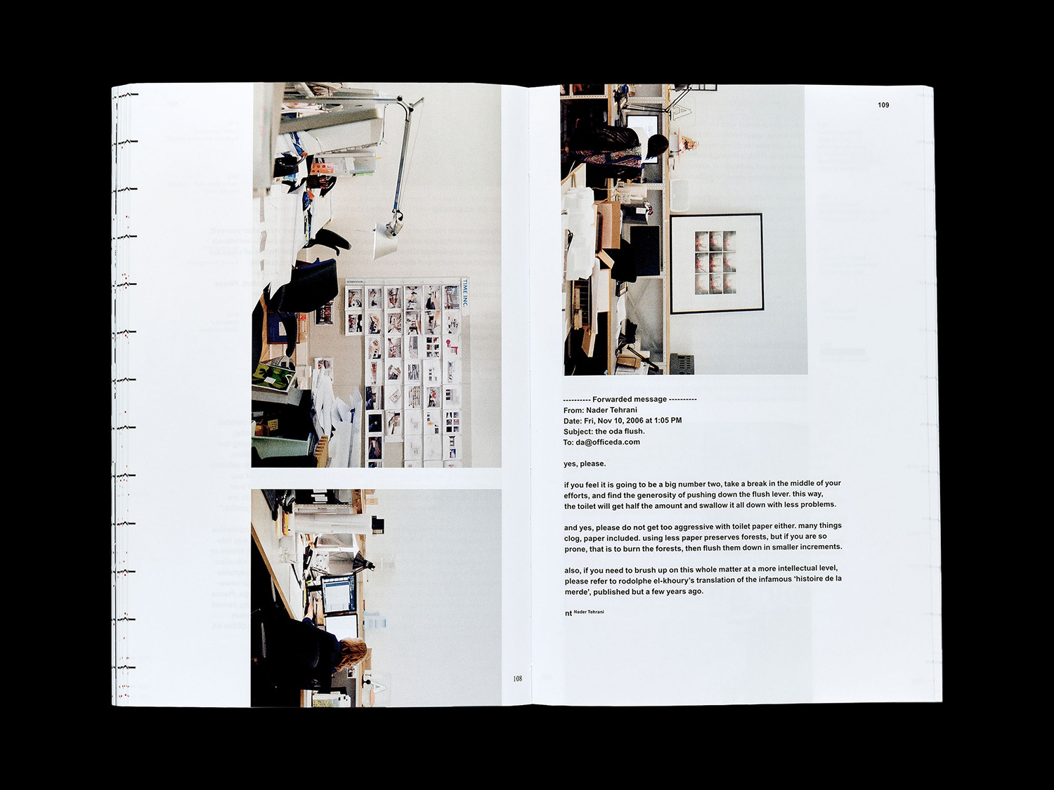
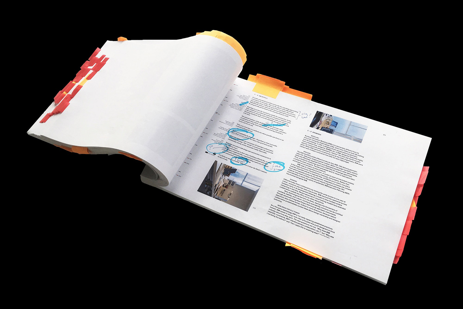
A critical component of the book is its temporal nature, the way that architectural practice became ever more codified, and how this proliferated architectural methodology and studio spaces, from the largest to the smallest of offices over time. This passage of time is expressed graphically in the bleed and cropping of photography and text, the implication being one of a continuous roll of paper, cut at intervals and bound. It is a simple but intelligible gesture that is conceptual, stylistic and functional, bringing to order a lot of different artefacts and information.
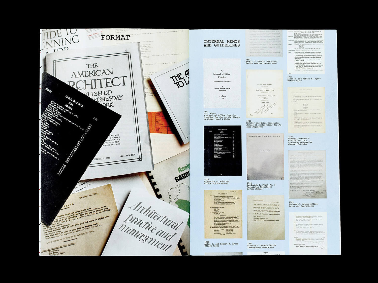
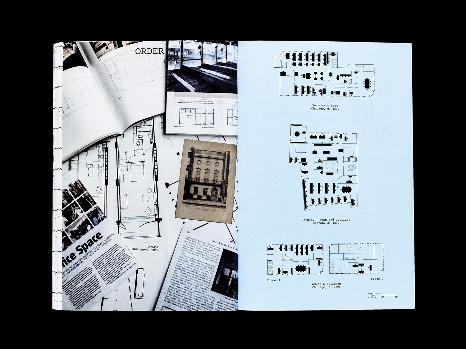
Macro–The cropping of images and text also serves to express something of the retrieval of information, loose documents bound in a moment into a singular material intention. It is perhaps worth mentioning that in curatorial practice, a story is shaped by the publisher, editor and designer. In the cleaning up of documents, in their arrangement, a narrative and specific objective is established and satisfied.
The finite space economy of print, the economic potential of the manual demands that there be a resolution. In this case, fixed points in time. In this finality, in the selection of material, the period and industry can be deconstructed and reassembled, commonalities and dissimilarities identified and made acute.
The possibility to jump back and forth between pages and time is the tool in which to reveal these, augmented by essay. The book, as such, in its sequential nature, in its material interaction, feels like a suitable format in which to play with the passage of time and the often material nature of the documents presented within the book.
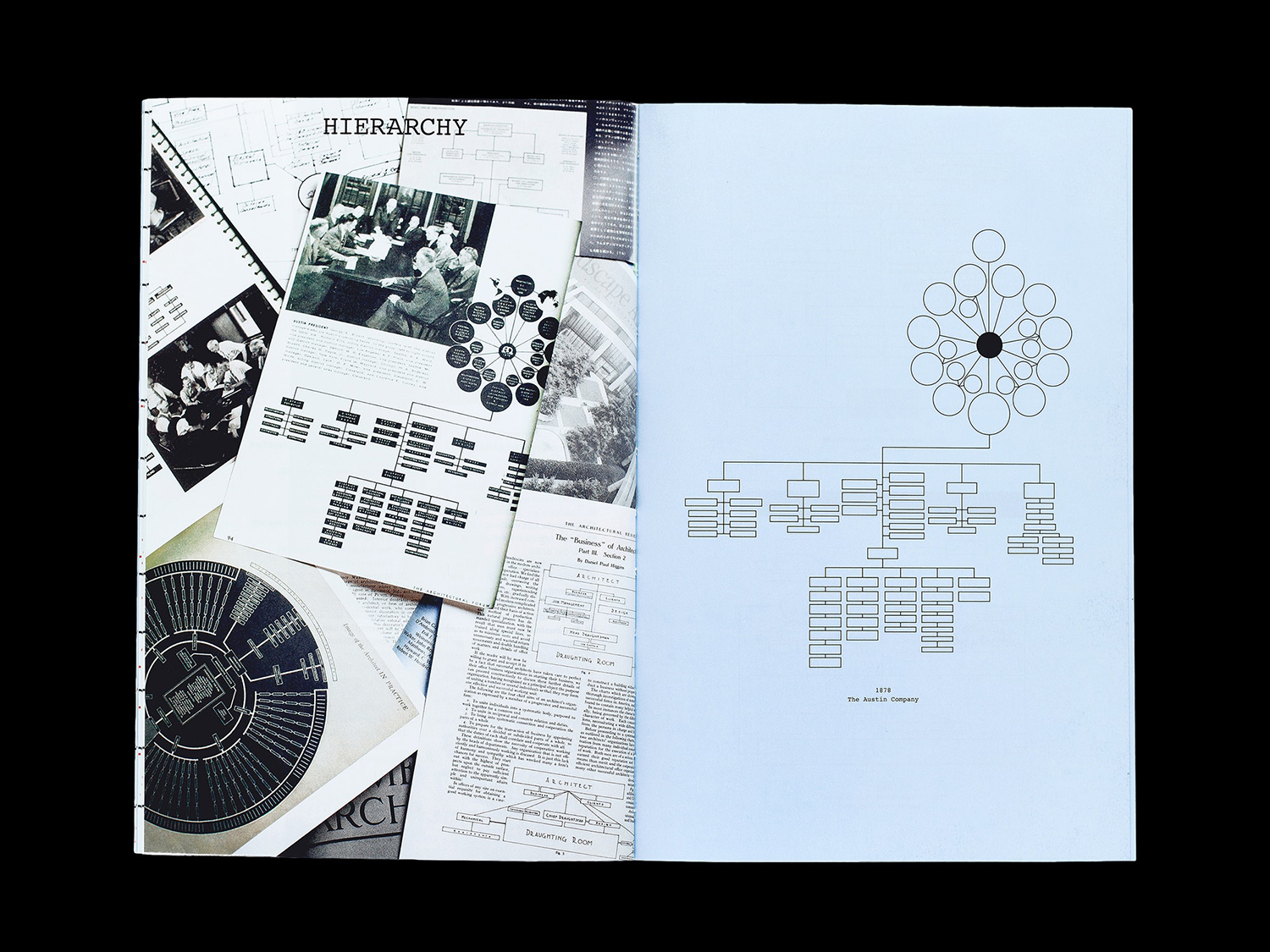
Micro–There are some useful contrasts used throughout. Piles of books and pages of individual images create a dialogue between the practice of sourcing and documenting. The staggered placement of documented pages and texts neatly deliver a sense of motion and implied sequence to book. This left-right approach also seeks to delineate between past and present and furthered by the use of Times New Roman and Arial, a blunt but effective visual cue that fall neatly into the visual language of the book.
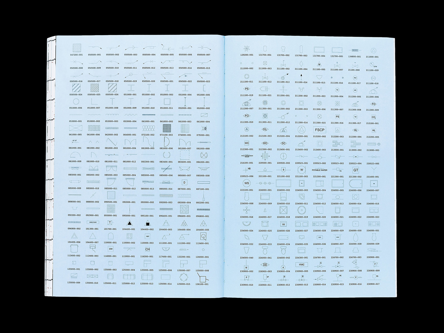
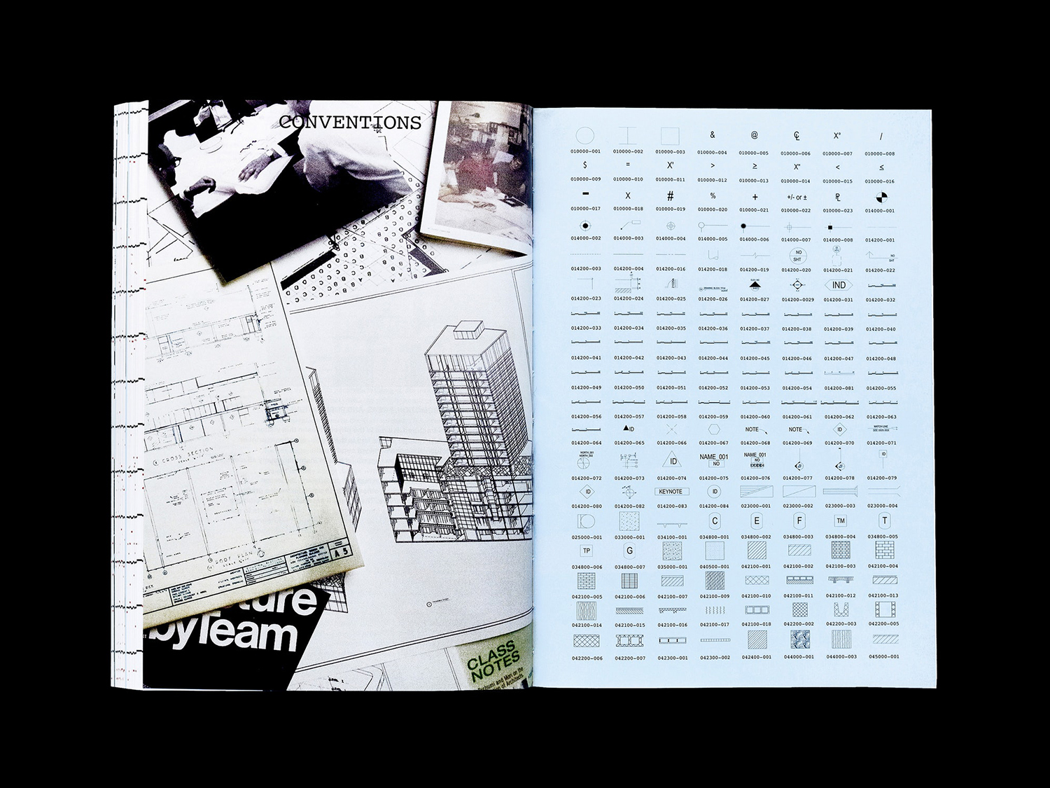
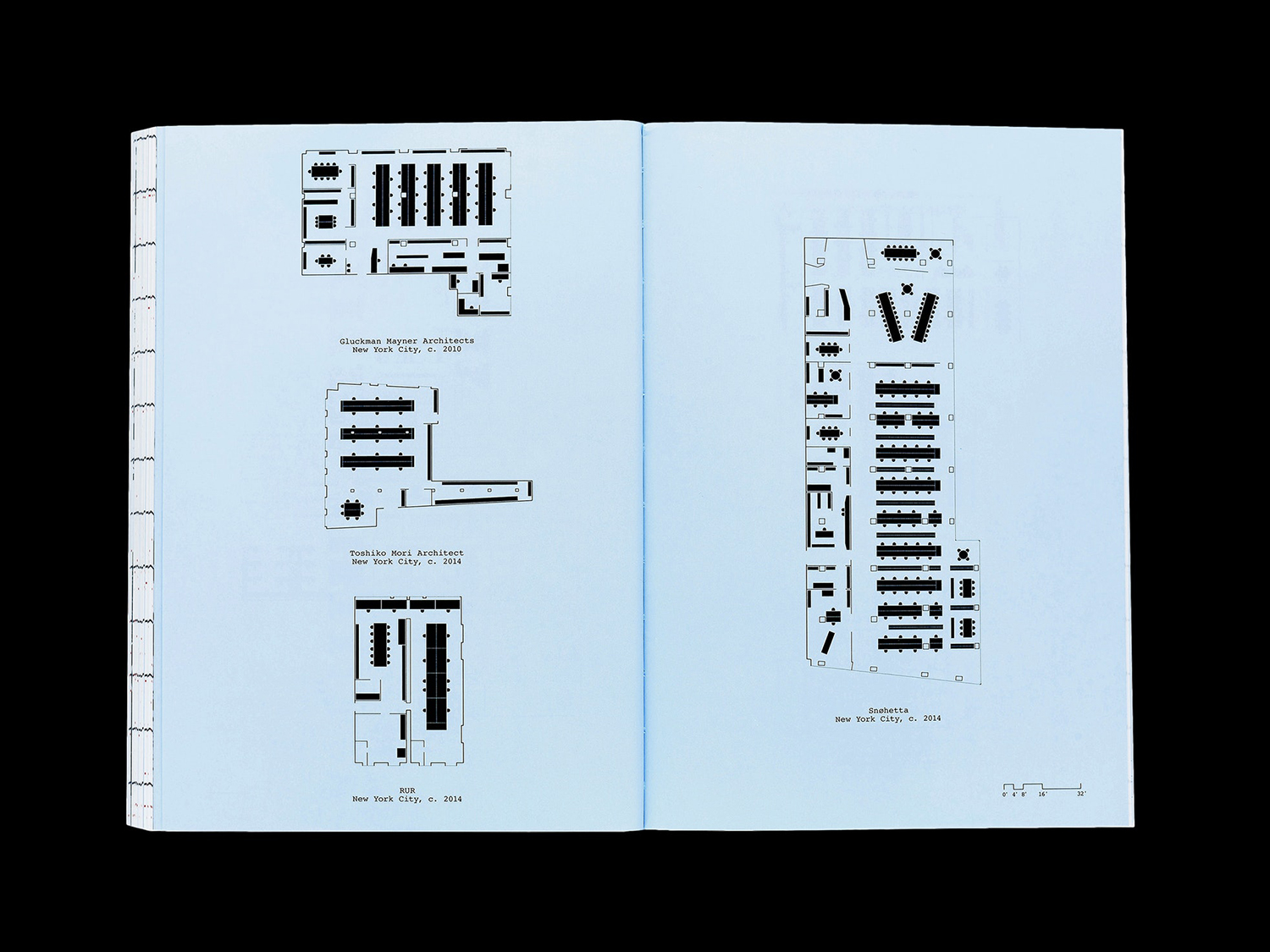
Isolated diagrams drawn from documents, absent their information, aestheticise architectural methodology and iconography. These draws to light the beauty of information, hierarchies and flow, either as a singular expression like plans and diagrams or in their decontextualisation and collective presentation such as plan icons. Colour is used effectively to codify the content of the book. Blue pages functioning as a way to mark the curatorial moments, the hand of the curator and the imposition of the designer in the cleaning up and redrawing of plans, but also provides useful visual breaks and the segmentation of content.
There are a variety of ideas and visual expressions at play here, yet these feel rooted in some clear intentions; comparison, the passage of time, and an attempt to offer serious commentary alongside a touch of silliness. As such, it finds a balance between a genuine curiosity and an element of entertainment. An accessible entry point for the curious. More work by Pentagram on BP&O.
Design: Pentagram. Partner In Charge: Natasha Jen. Project Team: Jang Hyun Han, Joseph Han, Maurann Stein, Boqin Peng & Ji Park. Opinion: Richard Baird.
