Morris+Company by Bob Design
Opinion by Richard Baird Posted 7 August 2018
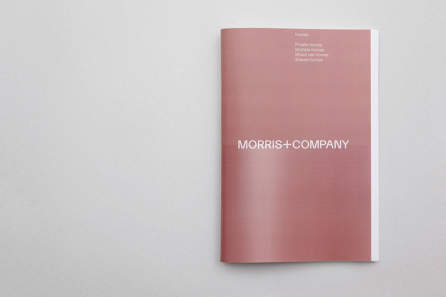
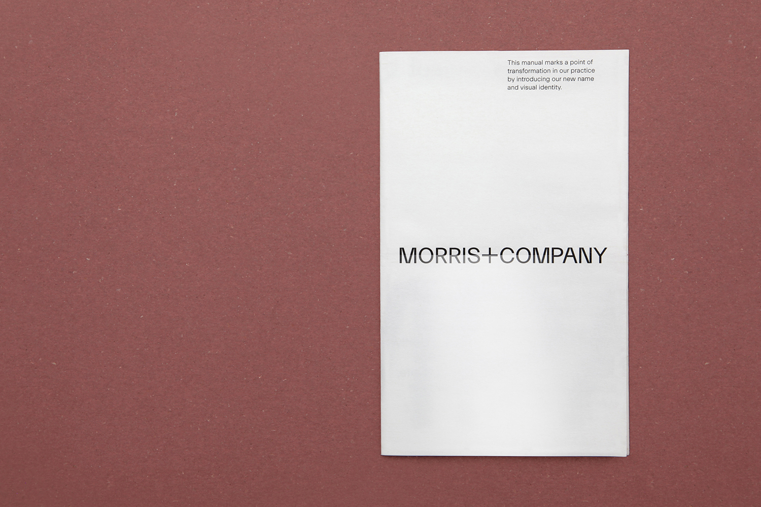
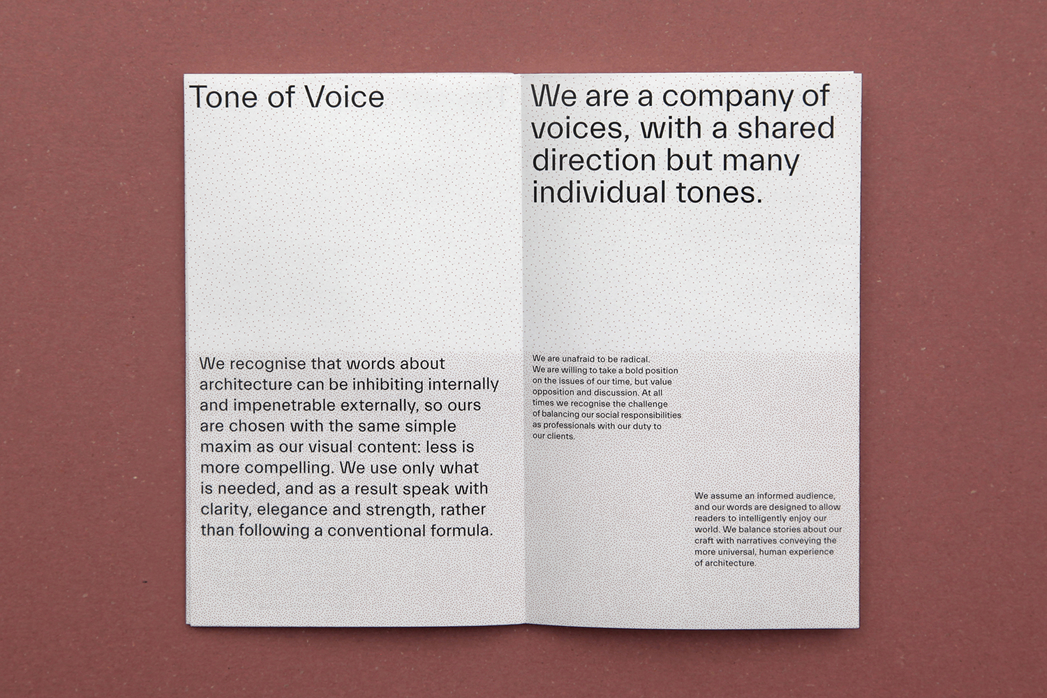
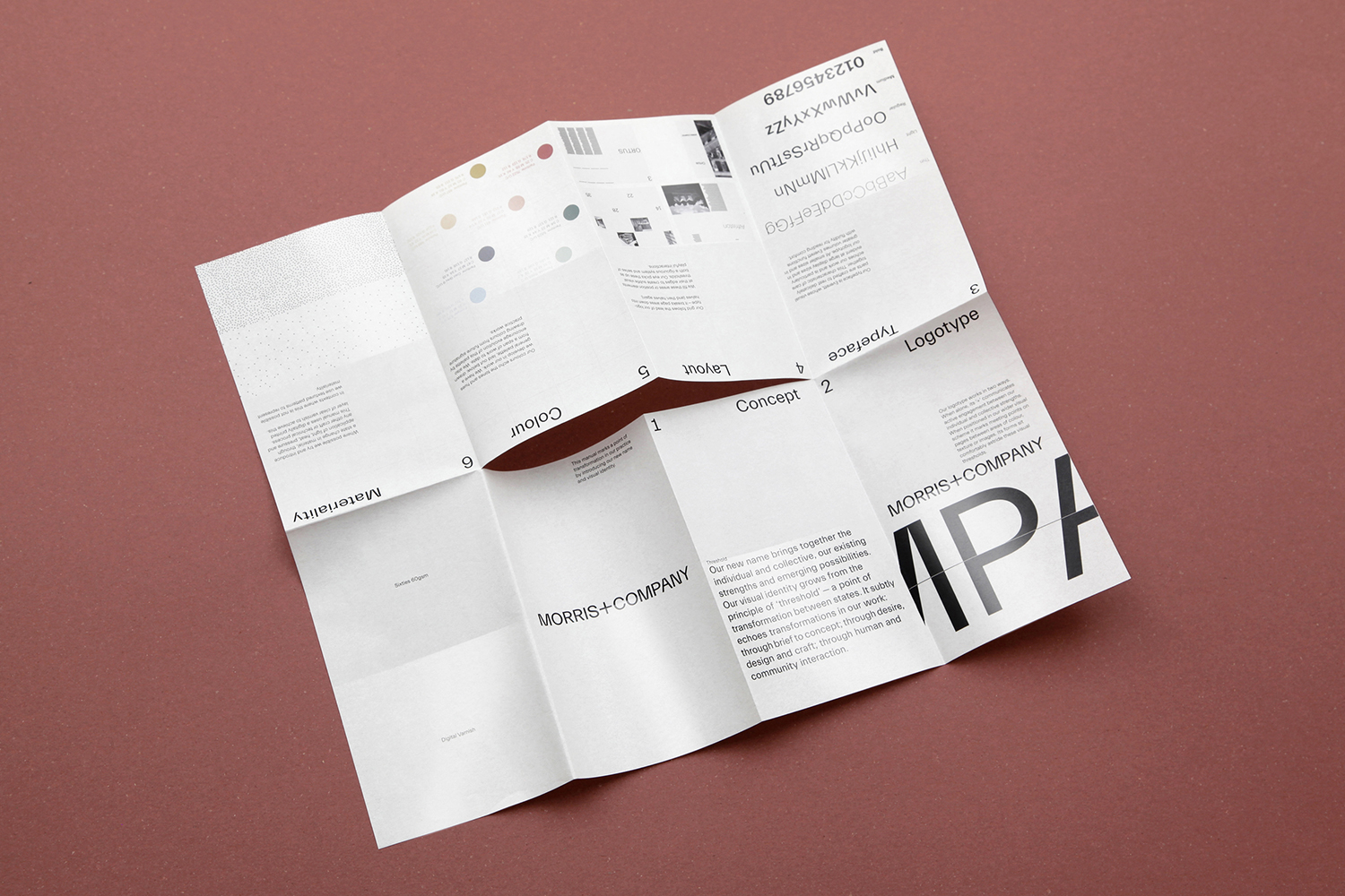
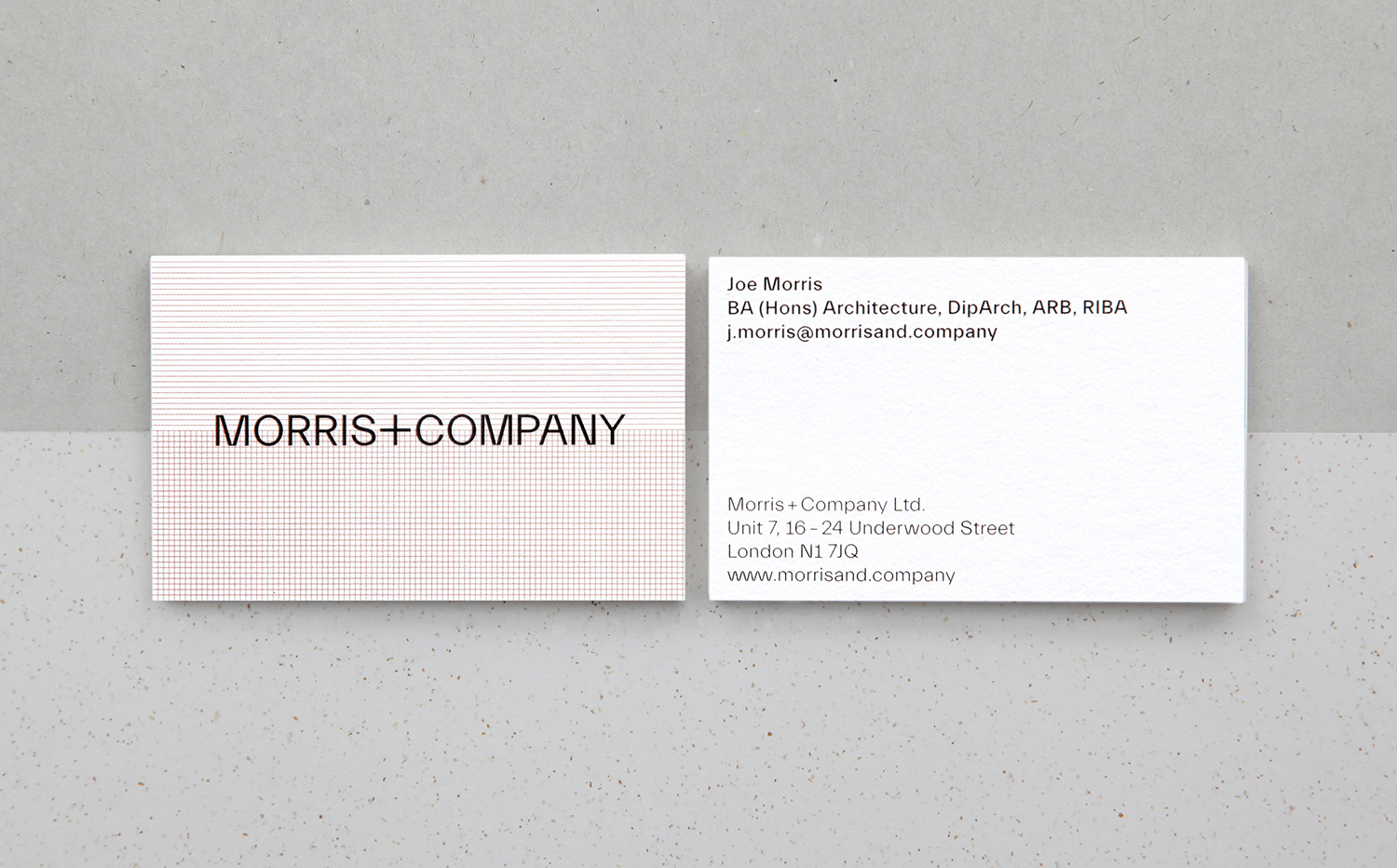
Morris+Company dovetails the individual strengths of founder Joe Morris and the talents of a wider company of designers. This is expressed by a recent renaming, moving from Duggan Morris Architects to Morris+Company, and throughout the studio’s new graphic identity, designed by Bob Design. This is codified within a brand guidelines document of type, imagery, texture, pattern, words (by Emma Keyte) print finish and material experimentation implemented across signage, tote bags, stationery, business cards, brochure and website.
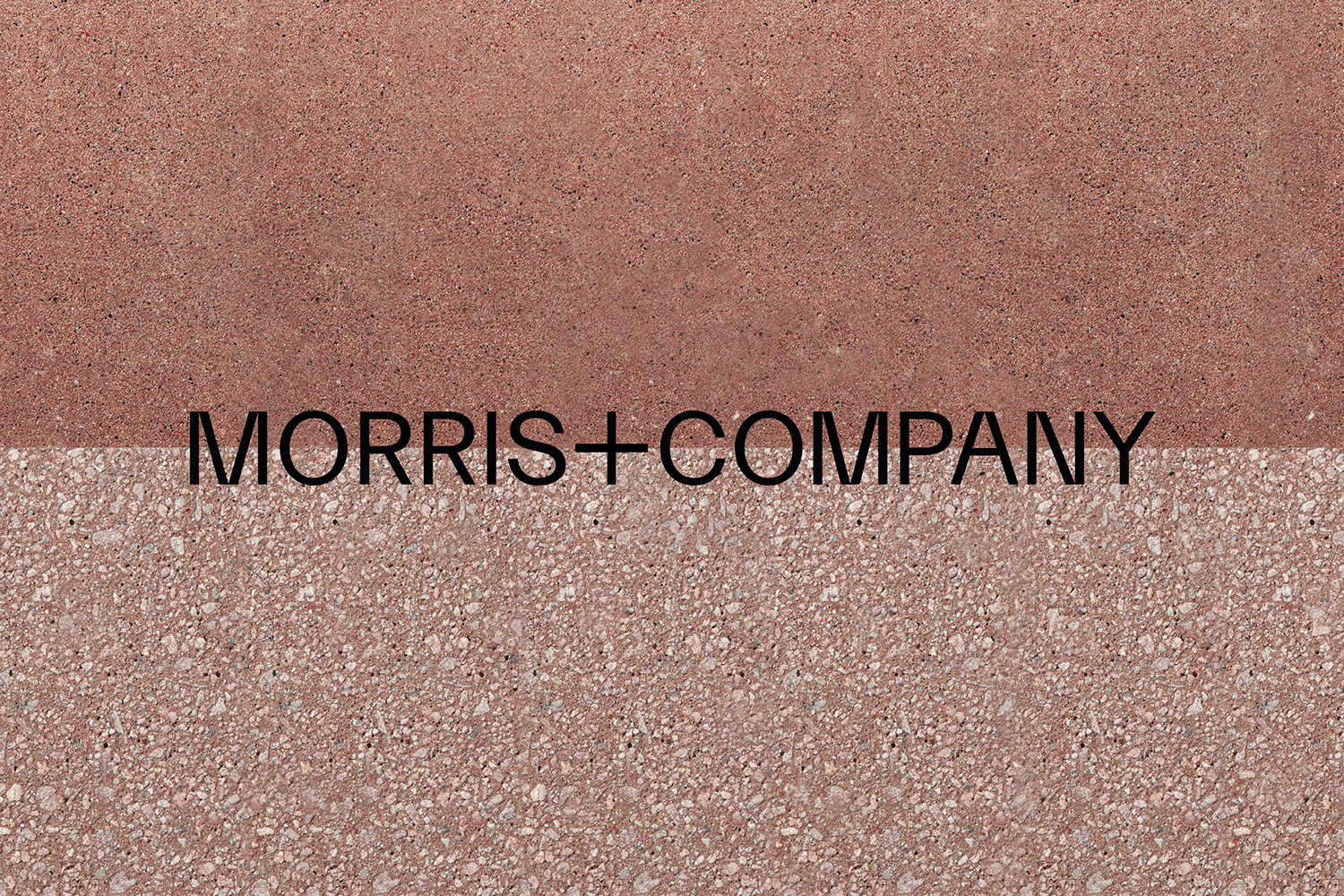
Naming and graphic identity bring to light a new strategic direction for the architecture studio. A move towards a more democratic and collective approach and responsibility, rather than continuing to build a practice around a singular identity. Bob Design describe their brief as one that needed to distil and articulate this collaborative creative spirit of an architectural office reassembled.
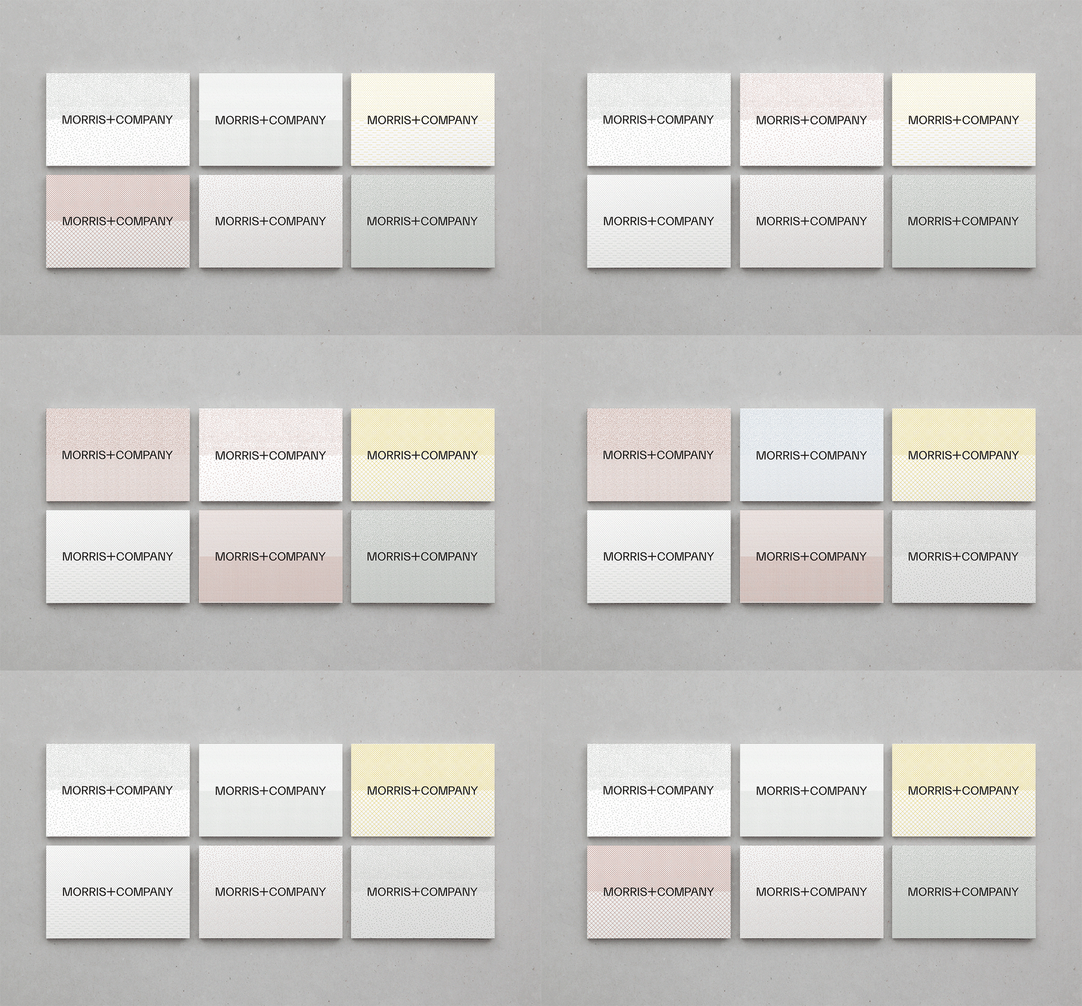
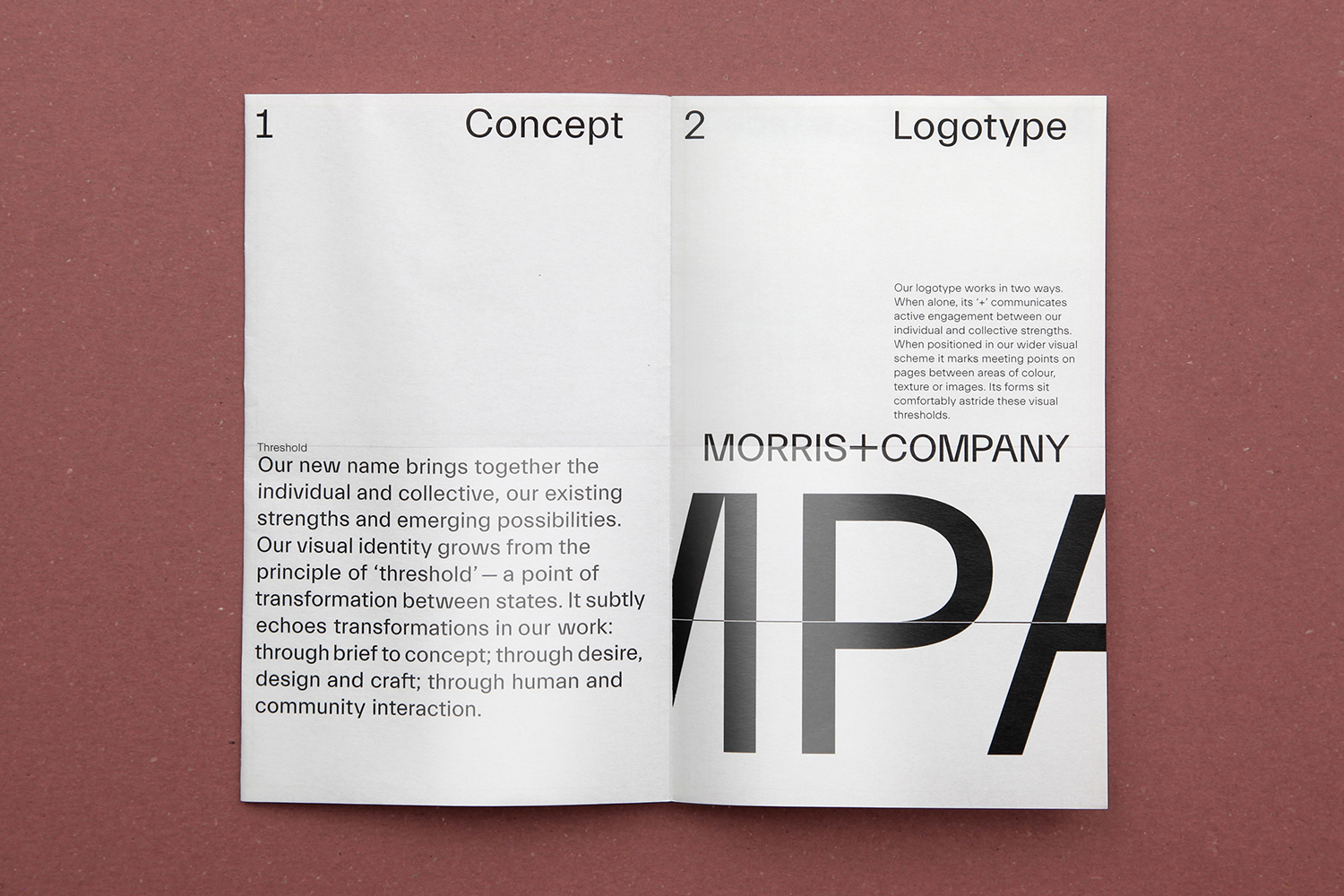
In the same spirit of collective action that underpins the new office’s work, Bob Design began development with workshops to establish a central premise, this emerged in the form of thresholds—a point of transformation or change between states, which is in symmetry with the transformation that happens during an architectural brief.
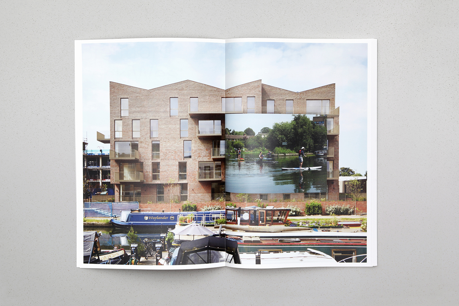
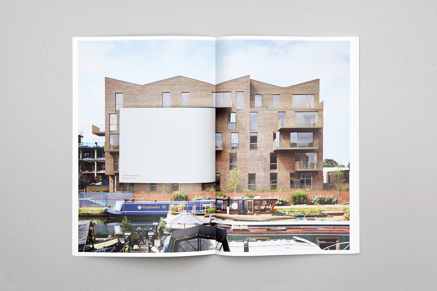
This change of state and collective action is represented by ‘+’. which sits central to the new name, and is then built out into a framework for a graphic and material identity where images and colour meet, materials are bisected and pages are punctuated by cuts and inserts.
Where many architectural identities are characterised by their restraint, few assets, a preference for visible grids, light and shadow play, Bob Design’s work for Morris+Company is rich in non-portfolio imagery, implied texture and a visual language of literal and implied intersections and thresholds.
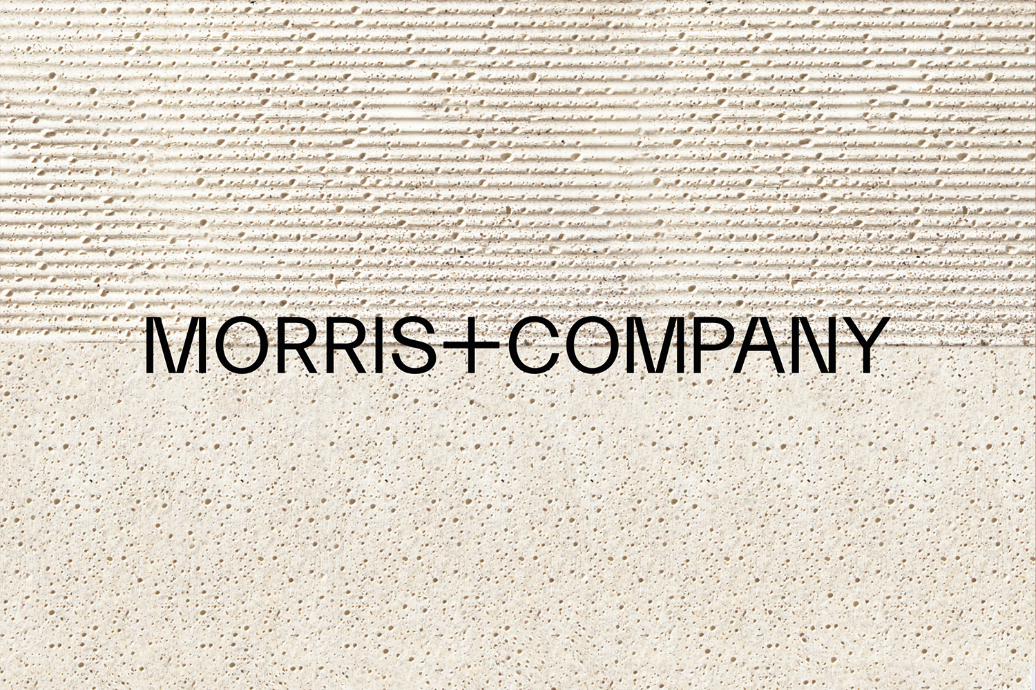
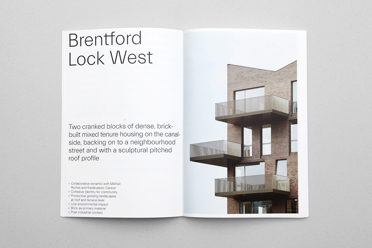
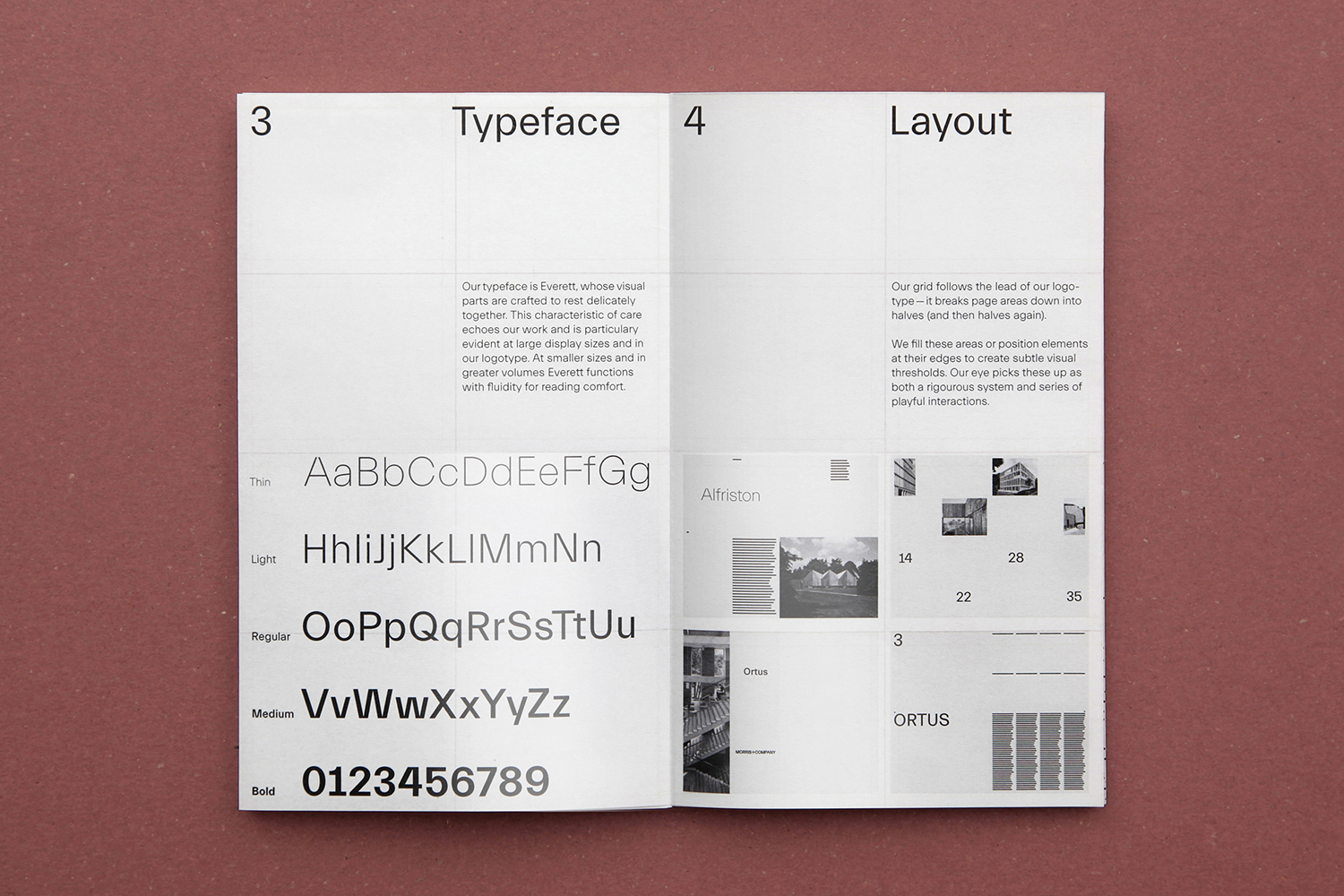
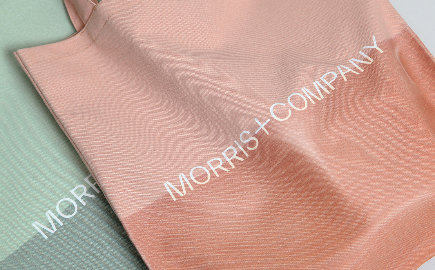
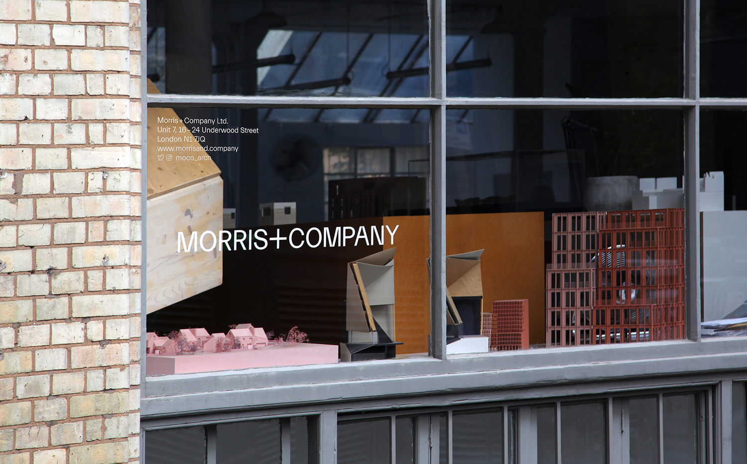
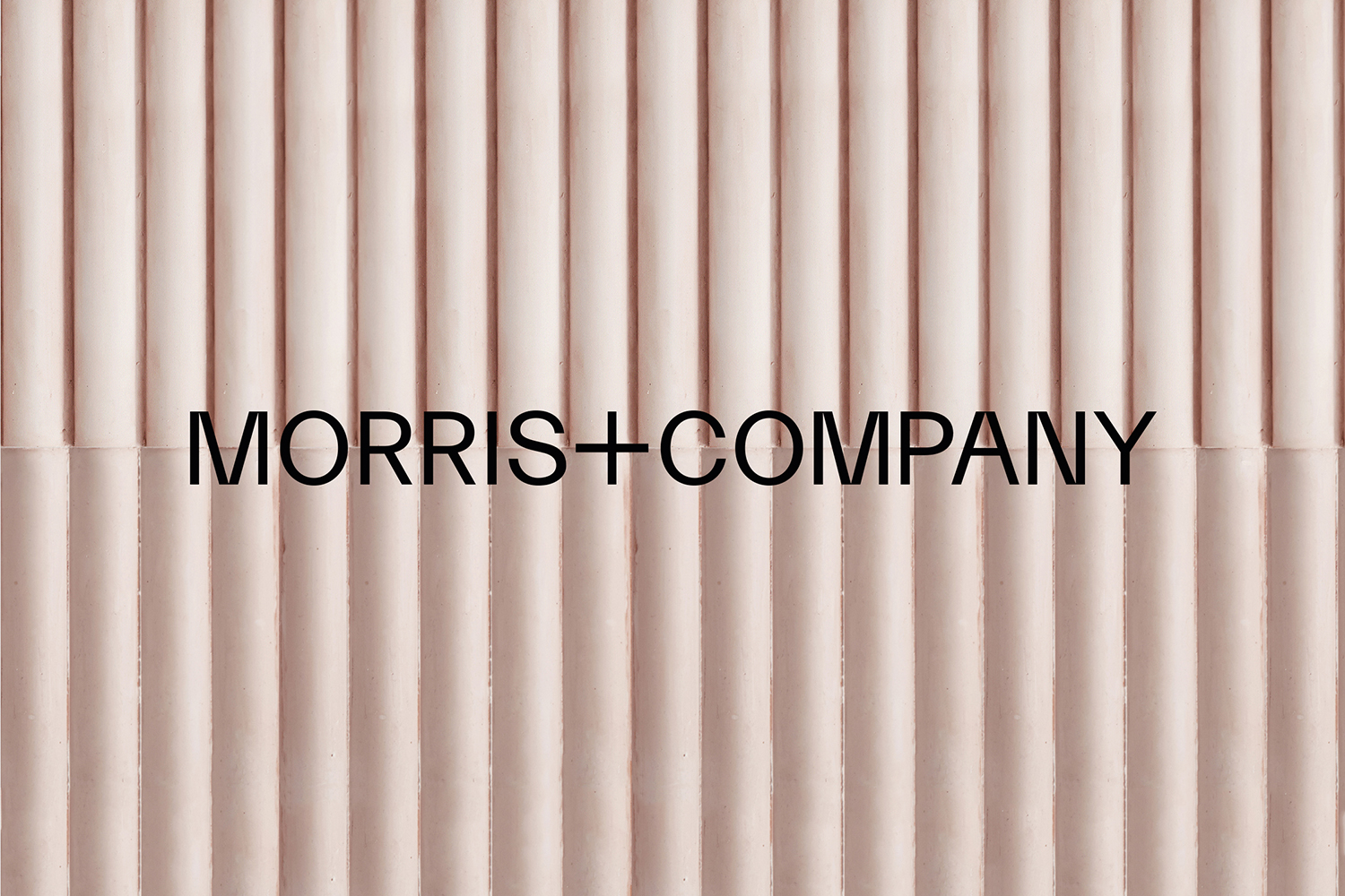
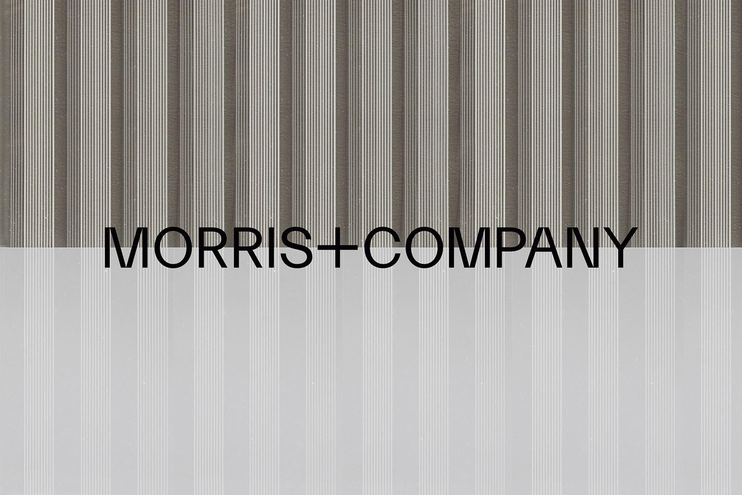
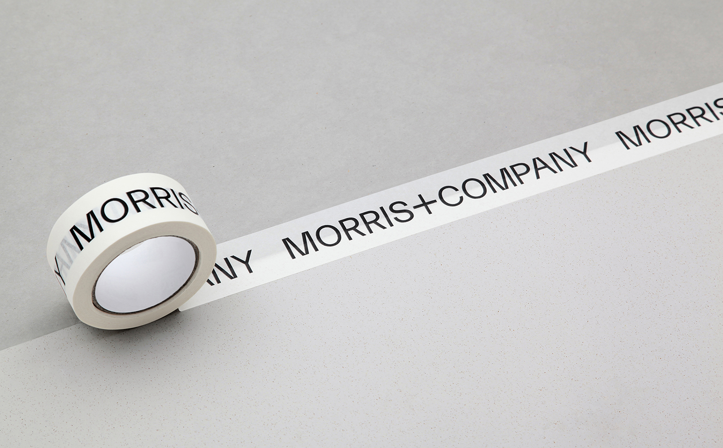
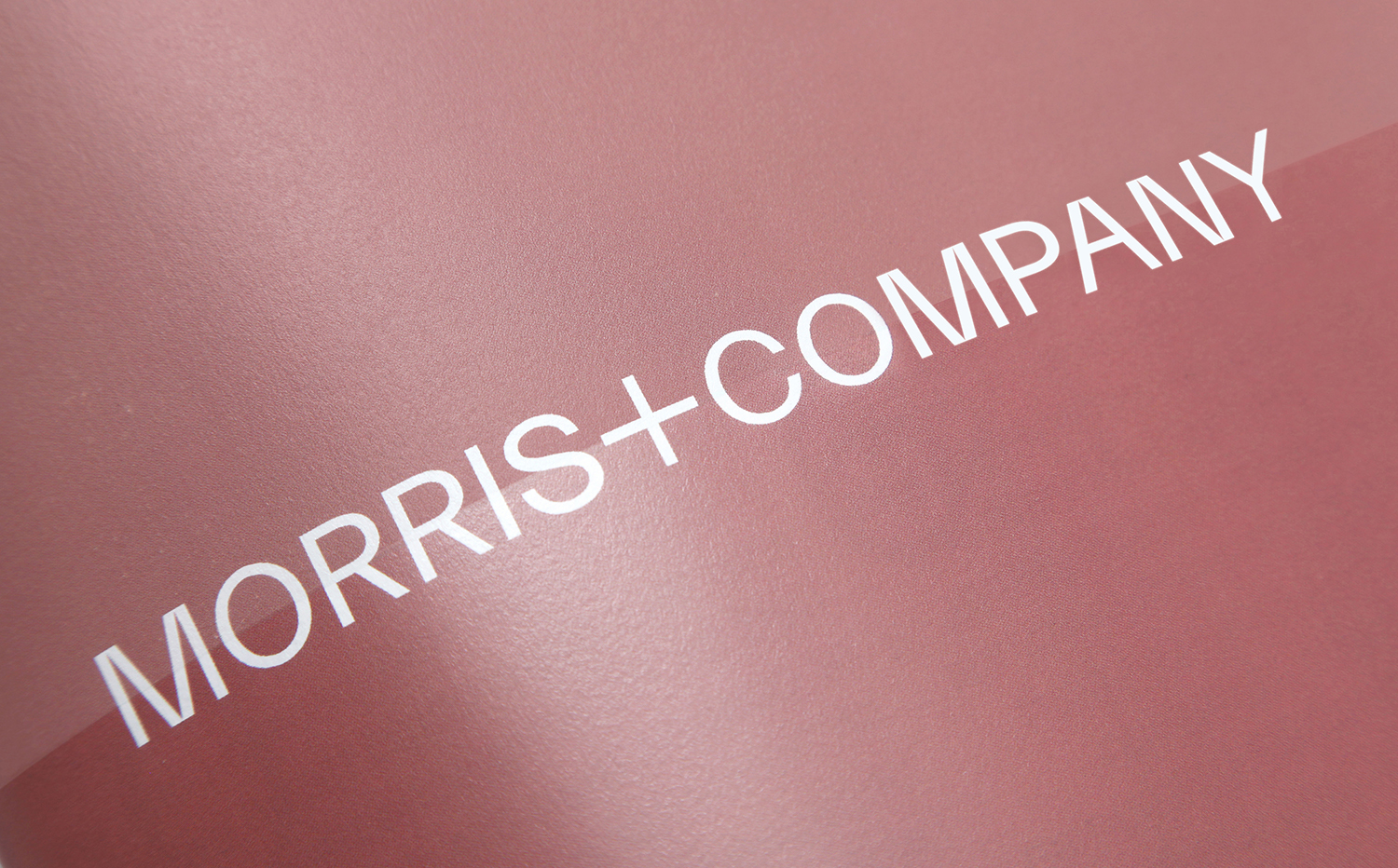
Logotype and accompanying typeface—Everett by Nolan Paparelli—establishes a central bridge between material, colour and graphic thresholds. Its singular line weight, consistent cap height and baseline establish strong horizontal lines, a bridge between the two parts of the name, but also across material and metaphorical boundaries. It holds up as a singular gesture across white space, or resting on top of texture photography and, in its shapes, the meeting of lines and architectural qualities. immediately conveys a structural sensitivity.
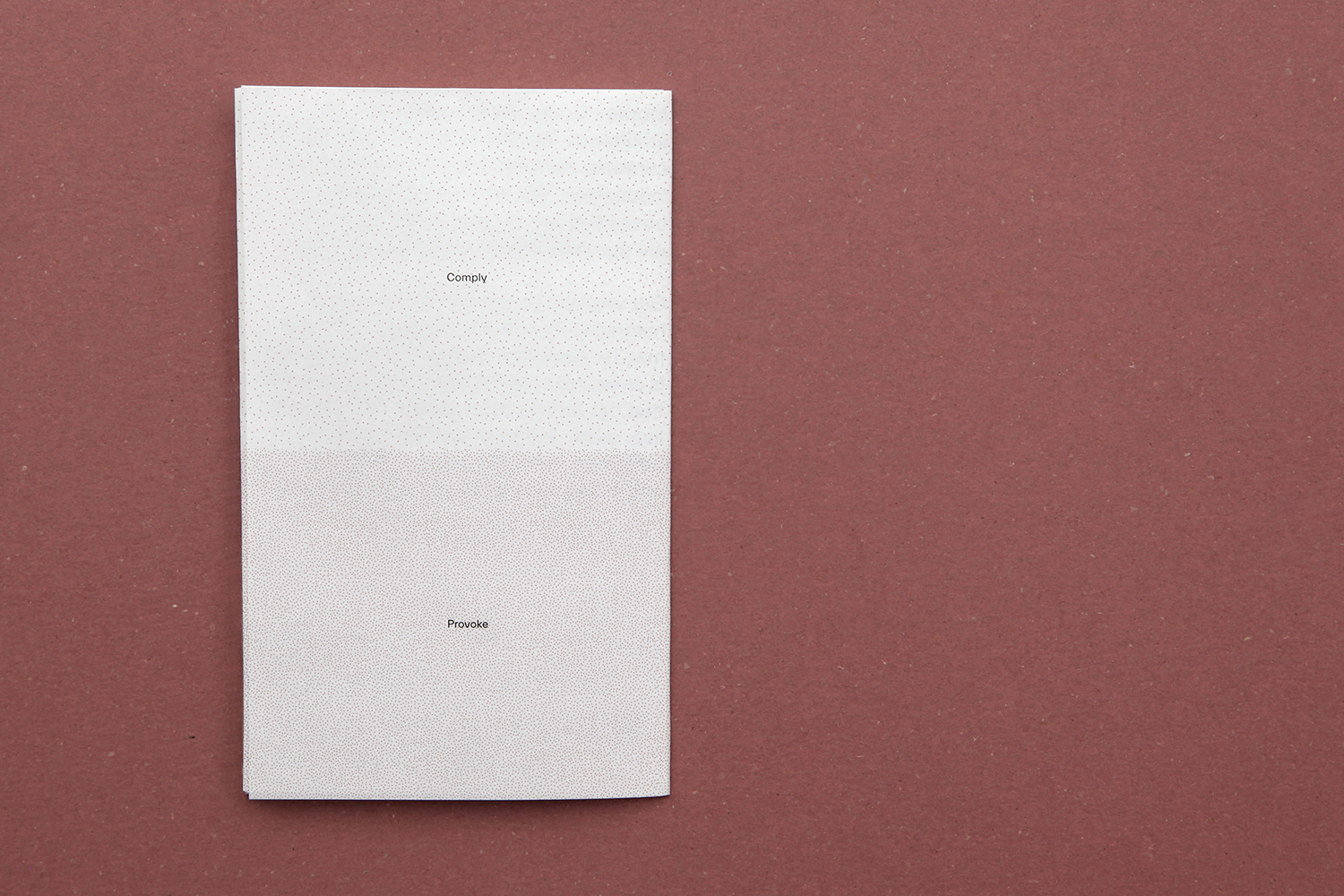
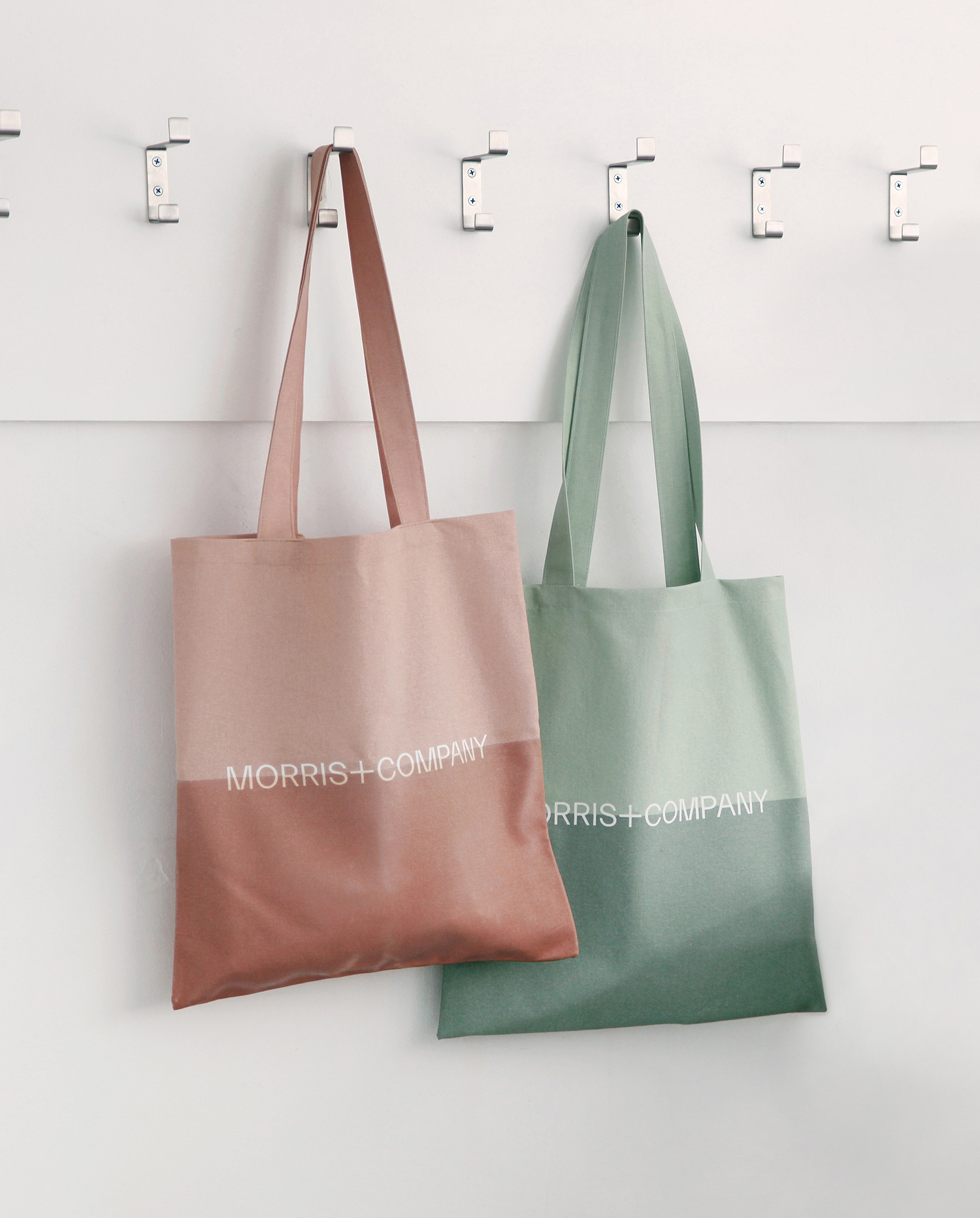
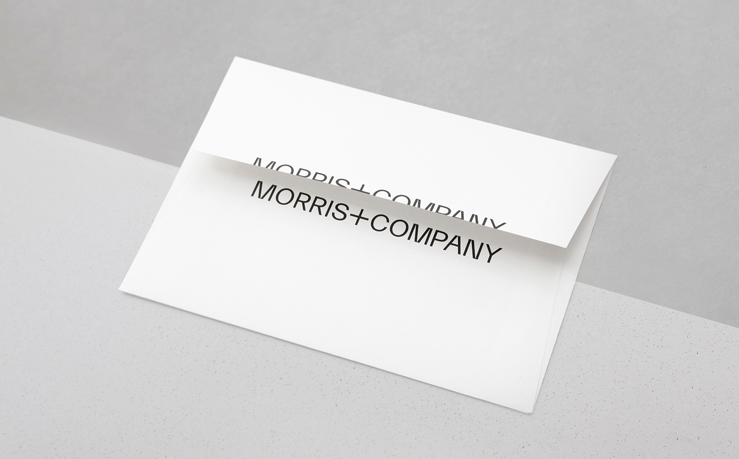
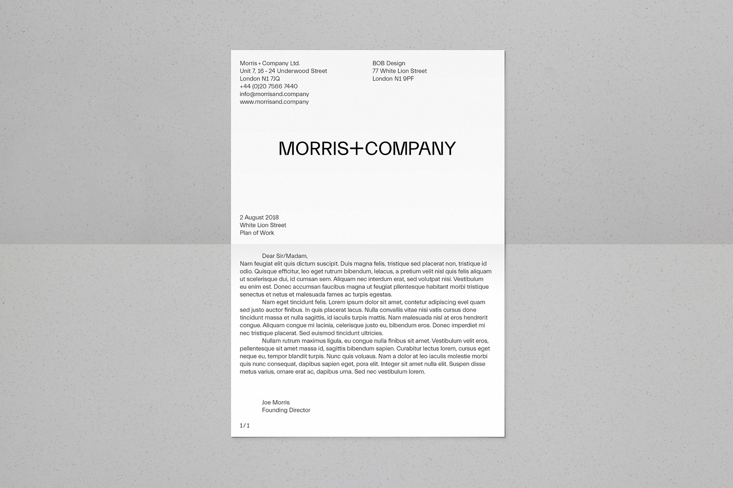
Small details such as the logotype running over the edge of envelopes, or in conjunction with the folds of head paper or bisected horizontally by a print finish bring a materiality to the concept of thresholds. This is further explored in the dipping tote bags in latex to achieve an intersection of natural and waterproofed surfaces, the part-treating of a metal street sign partially oxidating over time (time being a critical part of architectural understanding) as well as sun-bleaching paper stock for invitations and small cuts across brand guidelines.
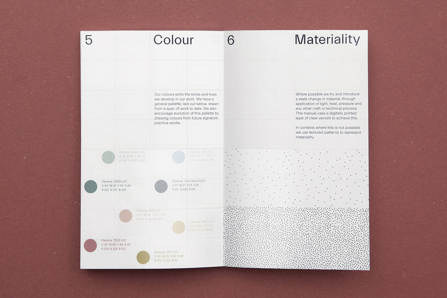
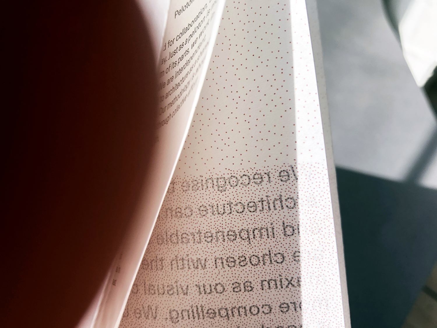
These are small, often singular and isolated gestures, moments of experimentation, displays of material and time sensitivity. Identity does not hinge on these but is augmented by these expressions, it builds a material and graphic language that is distinctive and fully embraced, where there is often the desire to be reductive, to frame portfolio imagery with plenty of space. Where there are not occasions for material play, patterns represent materiality through density.
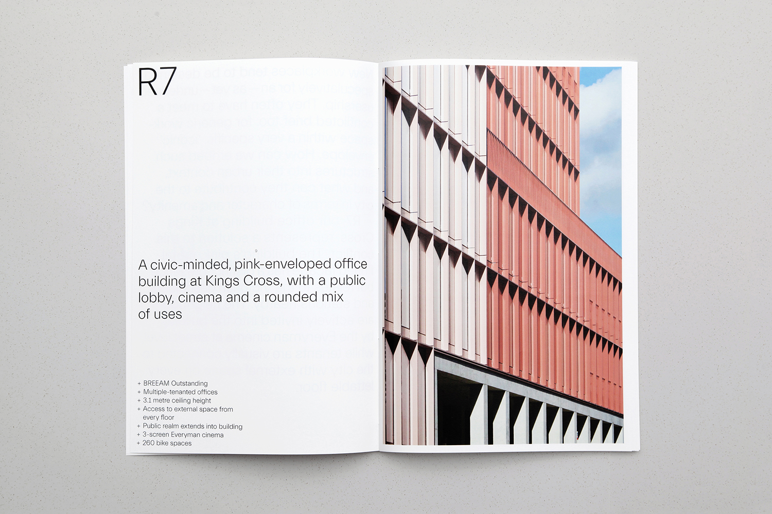
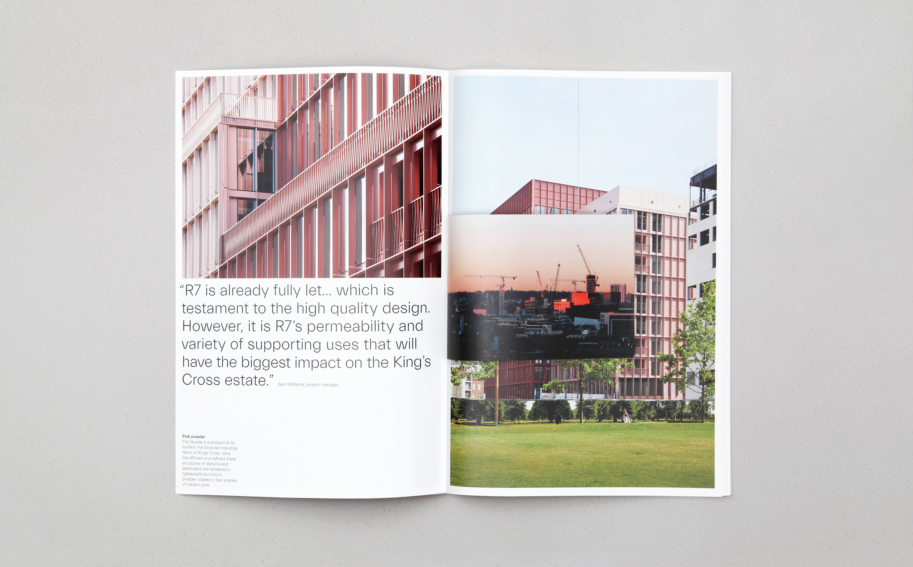
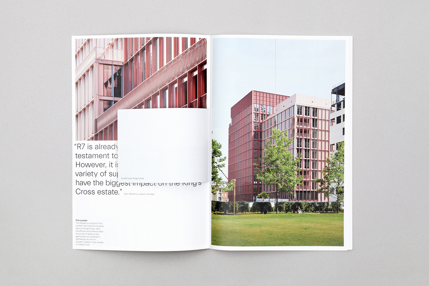
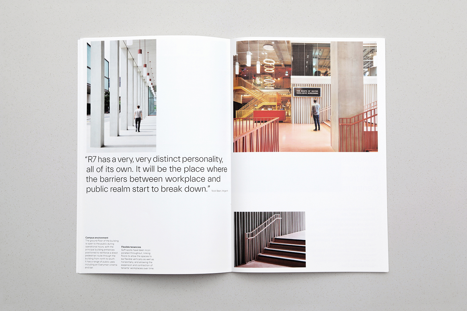
Online, website structure is defined by the placement and utility of the ‘+’. This marks the threshold between the two halves of the screen, as well as acting as a central navigation device. Augmented by motion and transition this functions to divide factual and static information on the left from the more ephemeral and subjective material to the right. This makes its way into print with a similar structure and continuity established by the arrangement of hand-bound booklets, with the ephemeral marked by small centrally placed inserts over grid-based pages that again play with thresholds.
Although threshold is a singular word, there is a universal multiplicity to it, and an idiosyncrasy within the context of architectural practice. This is matched by the extent of its manifestation throughout Morris+Company’s identity, in the balancing of the implied and immediate, the literal and metaphorical, the stylistic and functional. There is an abundance of ideas here, some of which draw on some architectural identity conventions, yet these are balanced and thoughtful, they speak of and marked by a range of thinking; conceptual and material, without ever feeling excessive.
Design: Bob Design. Copywriting: Emma Keyte at Free. Website Build: BONG. Opinion: Richard Baird. Fonts Used: Everitt.
