Skinsmiths by Akin
Opinion by Richard Baird Posted 13 August 2018

Ki Sunscreen was developed by national skincare clinic Caci to protect against the harsh New Zealand sun, and the skin damage and premature ageing that UVA and UVB rays can cause. This is been expanded into a larger and broader range of skin treatments and renamed Skinsmiths. The range is made from the latest generation of ingredients proven to protect and those that help to control oils and maintain a matt finish. This balance of clinical effectiveness and cosmetic mindfulness is expressed by its graphic identity, created by Auckland studio Akin, in the meeting of a bold black logotype and in the material interaction and contrast between uncoated paper and distinctive glossy print finish.

BP&O reviewed Akin’s work for Caci back in 2017 when the product range was limited to sunscreen. To coincide with renaming and product expansion Akin returned to review and develop their earlier work. The concept remains the same (and transferable), yet the quality of its print production has vastly improved.
Akin finds a smart balance between a typographical immediacy and an interesting visual and material language. This effectively communicates its positioning as a practical protective product and one that also has a cosmetic component.
Type forms a basic and concise foundation. It establishes a strong, contemporary visual impact from a distance; in weight, proportion on pack and arrangment of words. It leverages, through the absence of embellishment and choice of ink, a well-established sense of clinical effectiveness, within the context of skincare. This is not unusual, however, this initial impression is followed up by a more distinctive graphic and material detail.


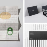
The material qualities of packaging are the highlight. The relationship between print finish—a layer of white—and the clinicality of typeface Mark and black ink is satisfying in its simplicity, appropriateness and universal visual langauge. There is a neat combination of blocking and the more organic dissipating and transitory quality of the white. This moves into the uncoated surfaces of the substrate, a clear reference to the eventual matt finish of the cream. A simple ink-based overprint translates the material qualities of box onto the tubes and establishes a continuity.

Akin draws an interesting and unusual stylistic impact from a universal experience with creams, and finds a good balance between bold initial impression and a subtle detail up close in the interplay between the graphic and the material, founded on the clinical and cosmetic positioning of brand.
Design: Akin. Opinion: Richard Baird. Fonts: Mark