Innsbruck International, Biennial of the Arts by Studio Mut
Opinion by Richard Baird Posted 20 September 2018
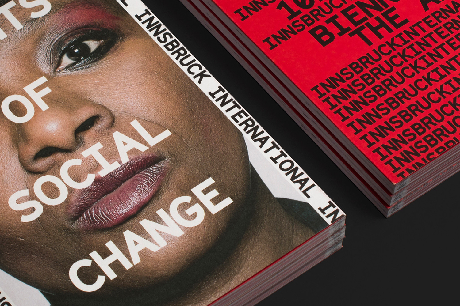
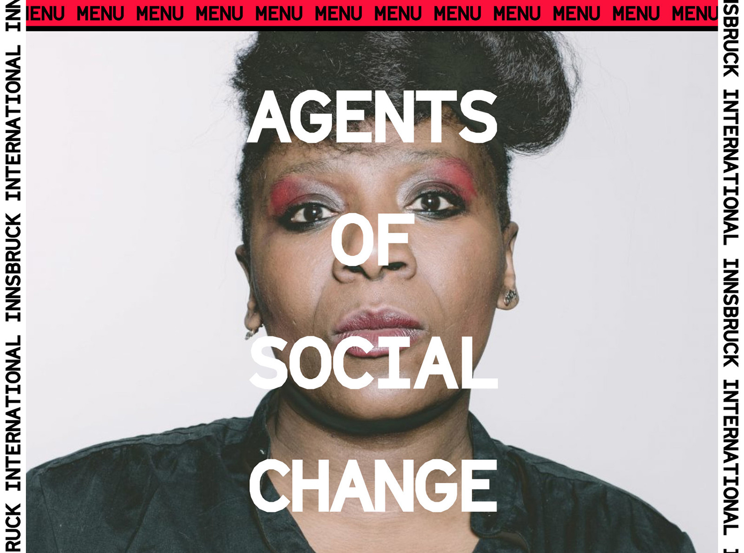
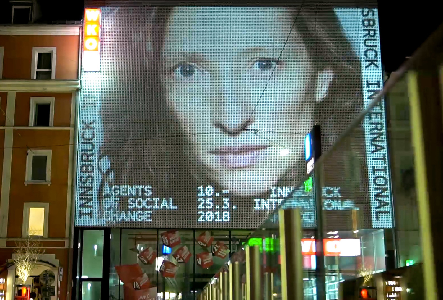
Innsbruck International, Biennial of the Arts is a 16-day event set over 10 locations presenting the work of over 20 international artists who are invited to make use of Innsbruck’s historical and contemporary venues. Together, these works reach across the wide spectrum of the visual arts; from painting and sculpture, film and sound to performances and installations. Although events of this kind are, by their very nature, politically charged; the worldviews of a few artists presented to an international audience, the 2018 event brought this right to the forefront under the theme of “Agents Of Social Change”. Capturing the spirit of this Italians Studio Mut developed a graphic identity for the 2018 Biennial that included posters, advertising, programmes, brochures and website. This is marked by a visual language of both the personable and mechanical, motion and pause, yet, united by an immediacy and urgency.
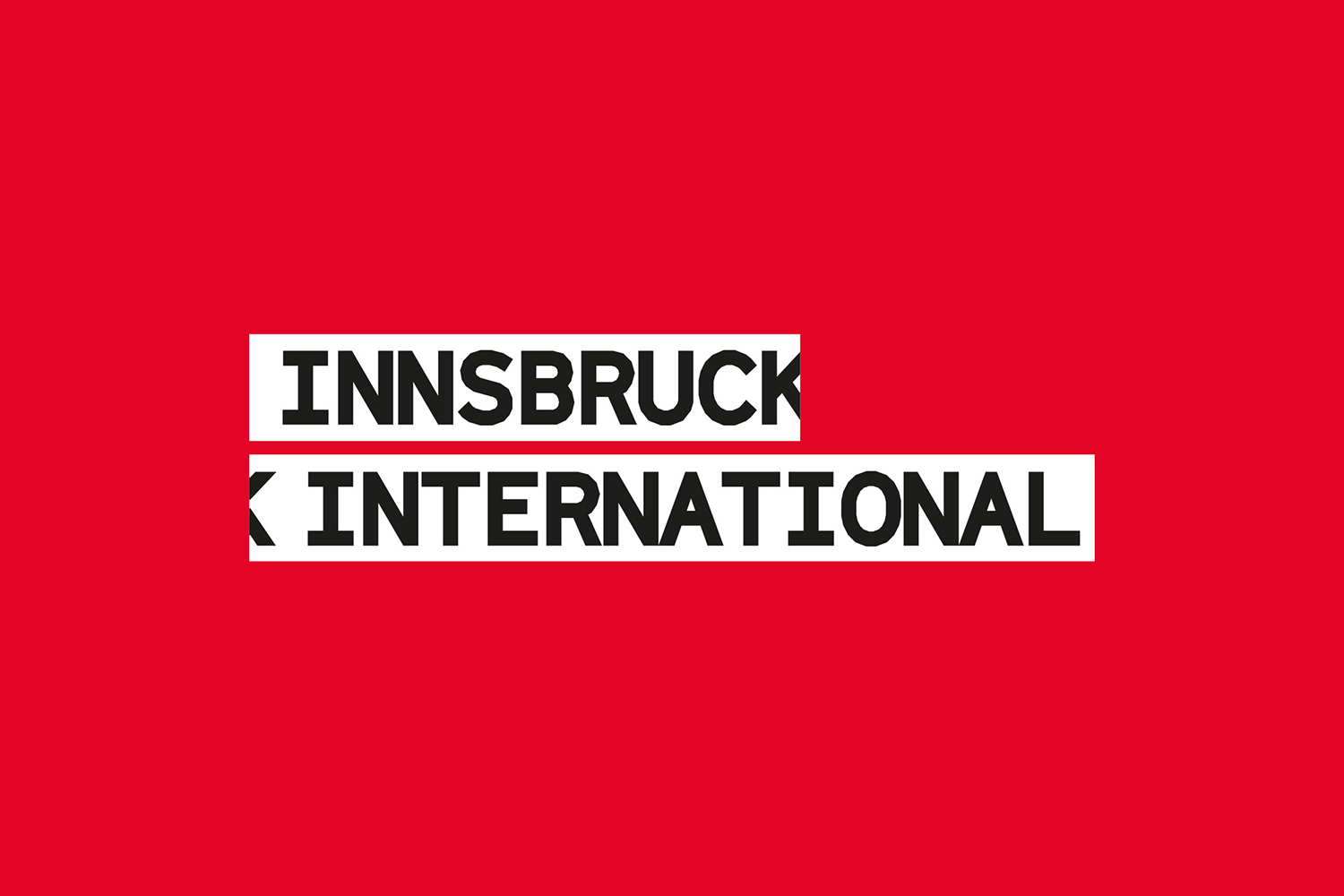
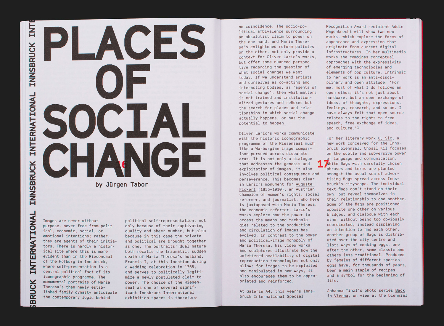
Studio Mut’s response feels very much an active participant of the Biennial rather than just a framework in which to present the event. Colour, the proportionality of type and the prominence of portraiture is very much a provocation. It is a response to moment, a sentiment and spirit, an expression of human agency. While the work has an unforgiving and challenging busyness to it, the visual language is effective, and the mode and techniques used concise and intelligible.
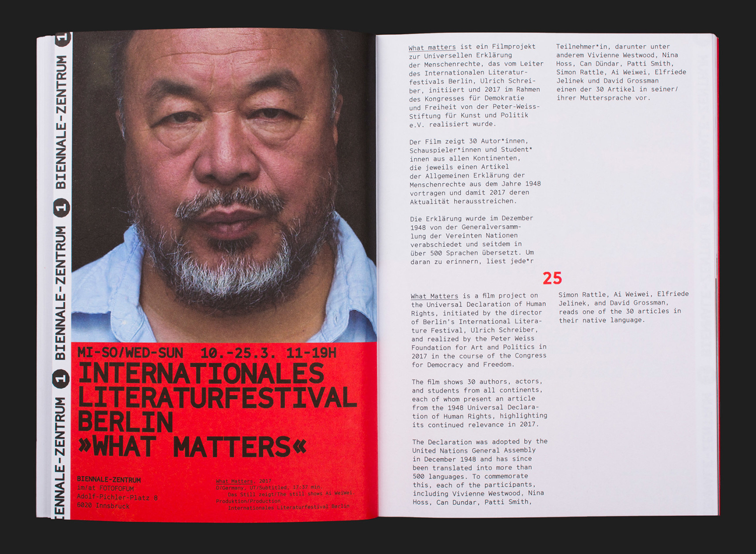
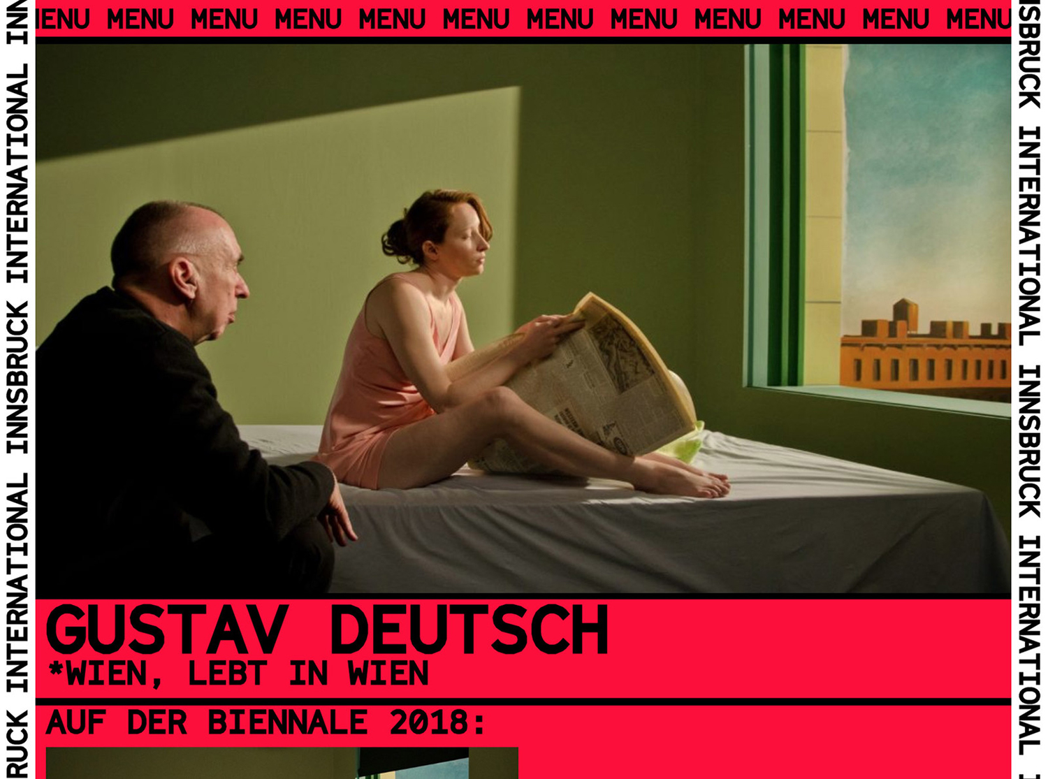
Imagery; a series of portraits, marked by their unflinching eye contact, the immediacy of close crops and a stillness, present voice, identity and reflection as key motifs. This is furthered by their diversity and distinctiveness, in the absent hand and imposition of the digital technician, perhaps some colour grading. The beauty of these is that they hold a potential and nuance, a space in which to invite the reader to participate. Defiance, a question posed or a challenge could be read between each face.
Providing contrast is the approach to type and the relationship and dialogue between type and image. The titles and imposition of type across the portraits give a unified voice to closed mouths and diverse faces. Typesetting elevates language in a number of situations. There is often an uncomfortable grid to the arrangement and interaction of type, but for good reason, creating the impression of discomfort, the jostling of voices and a perpetual restlessness and potential for change.
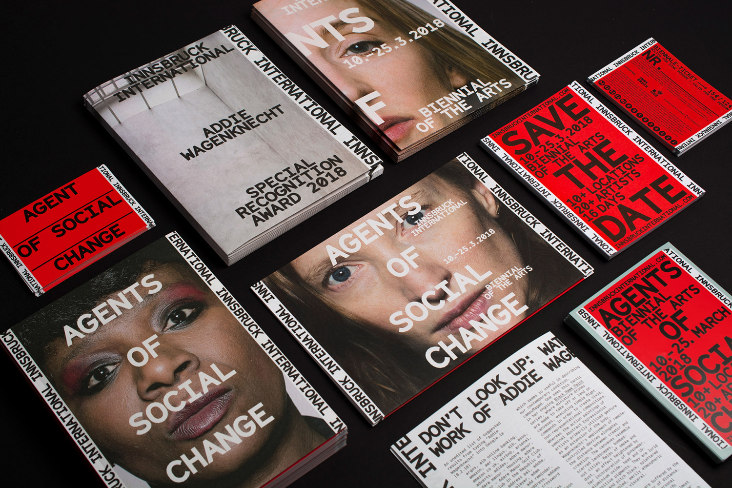
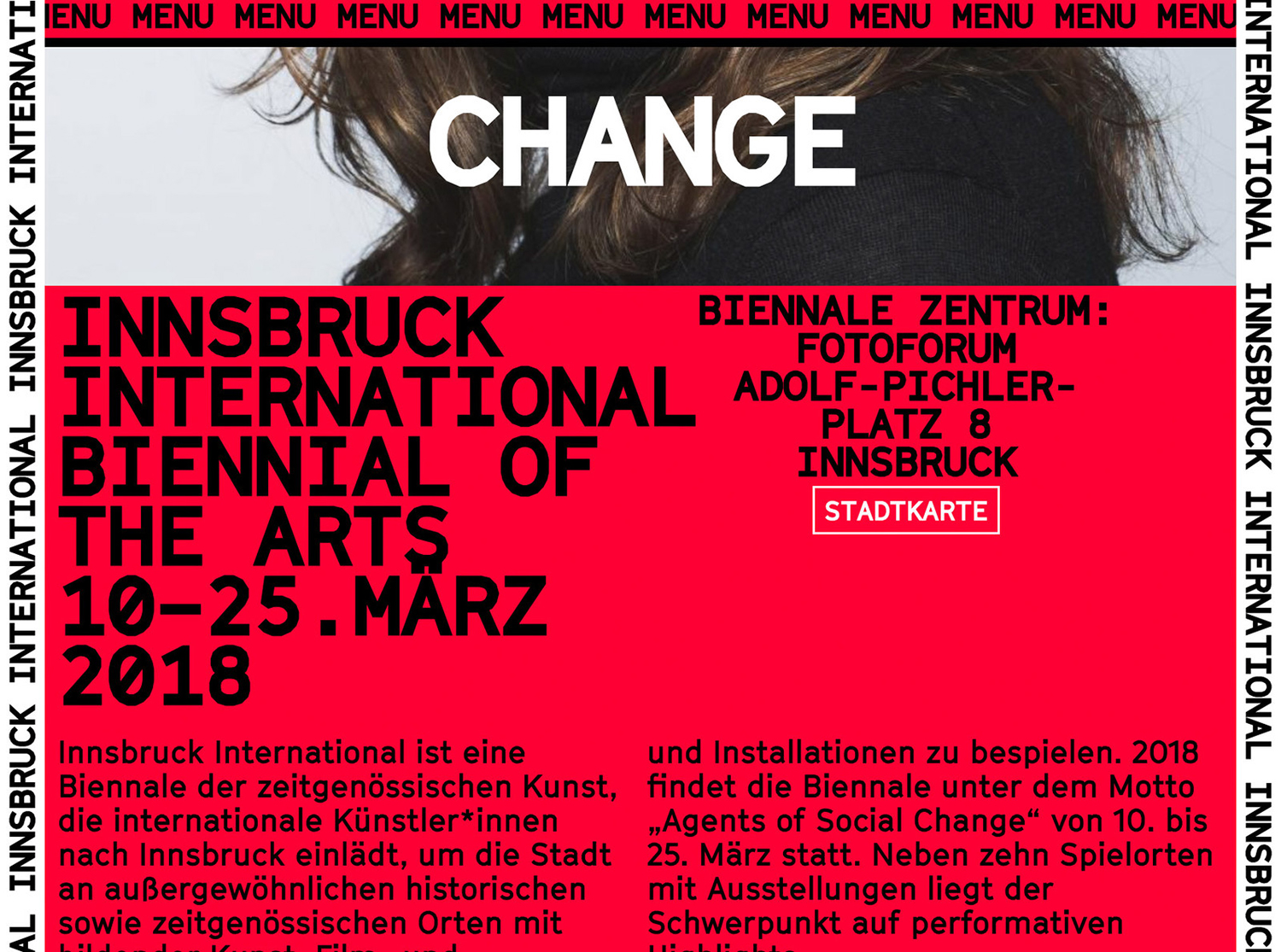
Other highlights include colour; a high contrast mix of black, white and red, a confluence of immediate messaging and the visual language of emergency and urgency, think fire extinguishers and warning signs. This, of course, also serves to catch the eye within an open, grey urban environment, and within the small space of the screen.
The ephemeral nature and the reconfiguration of each new biennial means that these types of events have a critical relationship with time. There is a measurable time between events, and each event is very much a reaction to a moment and a sentiment between these. Where brand identity typically seeks longevity (again time, but extended periods, and a product of economic necessity), the biennial’s identity and its themes exist in and react to a clearly defined period with a beginning and end, and thus can withstand review. A biennial identity, particularly one with art and identity as central themes, is an observation (time) followed by a provocation (artistic response).
The passage of time emerges in the ticker-type-like scrolling of text, the bi-directional scrolling of the website, and the cropping of text, which is then effectively distilled in a simple wordmark. The implication here is one of transience, perpetual motion, and the oppositional. The material and graphic response is compelling, it delivers impact, but the ideas, the implications elevate the work, infusing it with a rich subcontextual value.
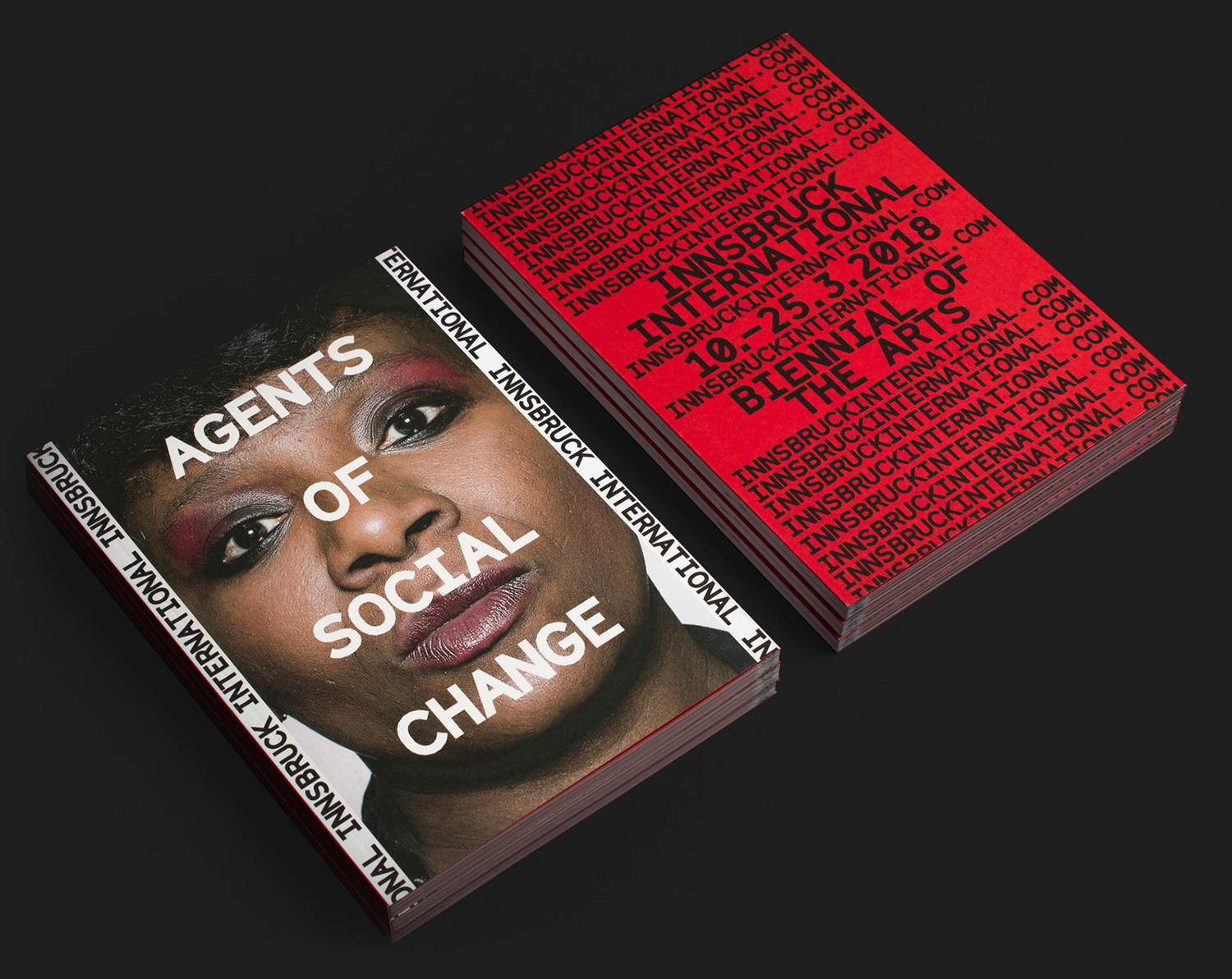
Further elements augment messaging and visual language. Particularly typesetting and typestyle. Both headlines and body copy explore the antithesis of the human images used in the mechanical monospaced and the shapes of GrilliType’s Cinetype, referencing cinema subtitling machine, a pleasant duality of the mechanised voice and the visual arts. Repetition serves graphic communication well as a tool for emphasising and reinforcement, but also a visual texture and graphic recognition and continuity across different assets, digital and material.
These techniques are fairly universal in the Western-world. Some are ubiquitous yet corralled together to deliver something of a distinctive graphic language of now, of action, of voice and identity. This feels fitting for the mode, format and theme of the Biennial, its spatial and temporal nature, its framework for individual and collective voices, culture transmission and the variety of methods in which this is achieved. More work by Studio Mut on BP&O.
Design: Studio Mut. Opinion: Richard Baird. Fonts: GT Cinetype.
