Tatau by Inhouse
Opinion by Richard Baird Posted 21 September 2018
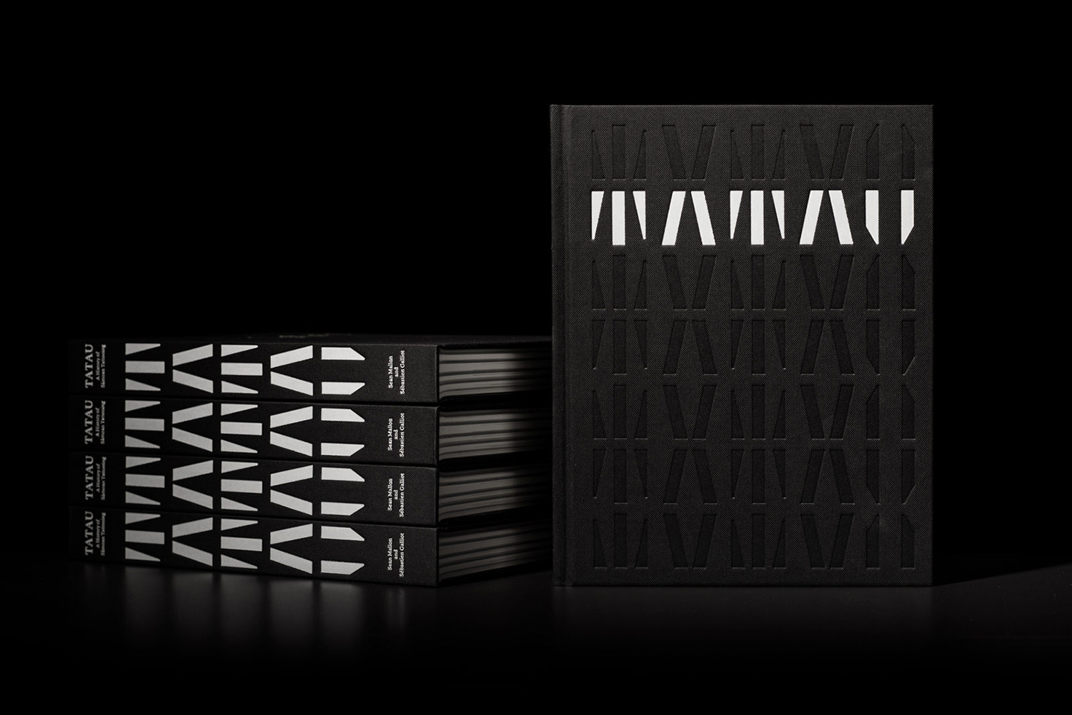
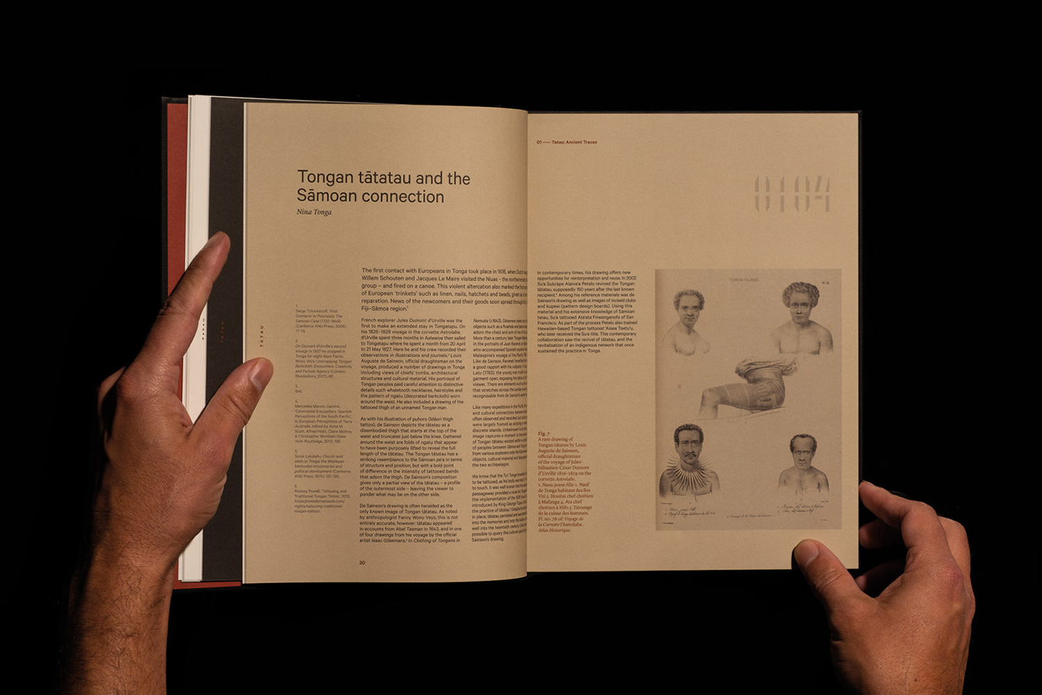
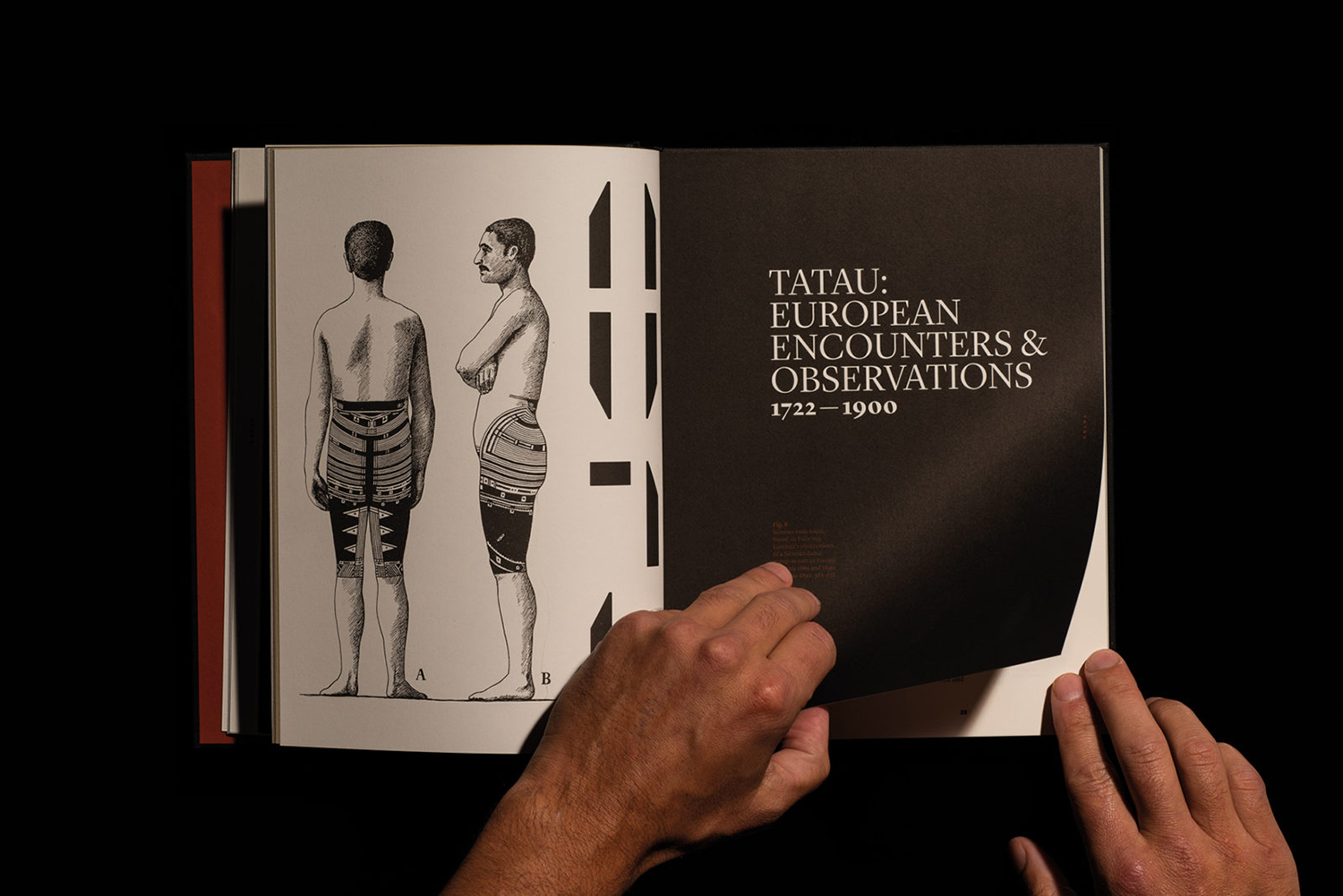
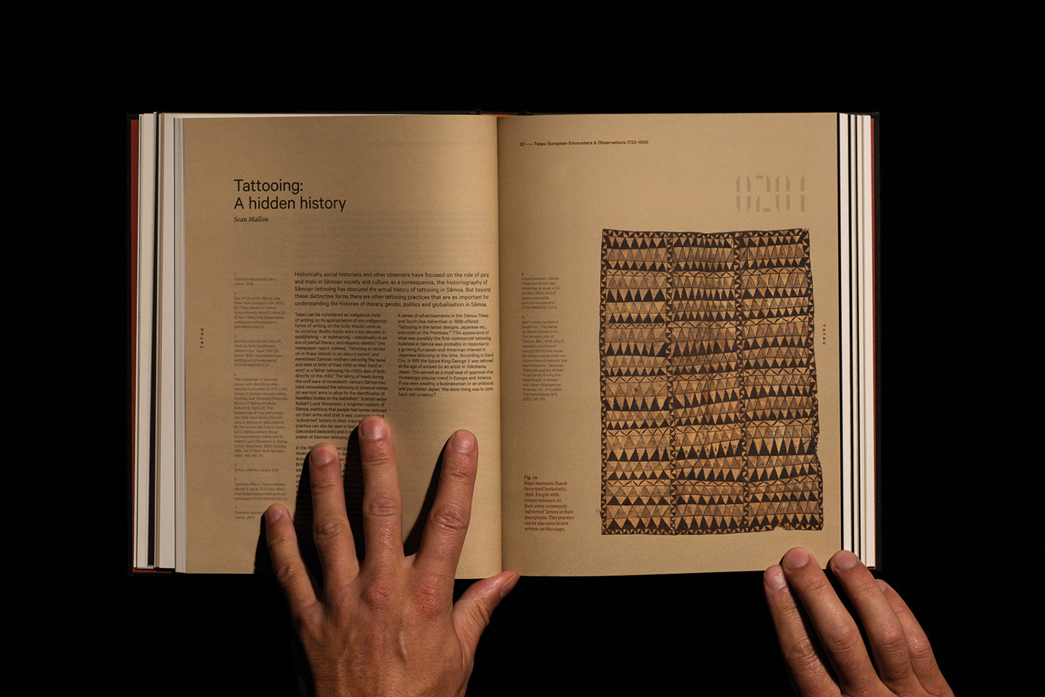
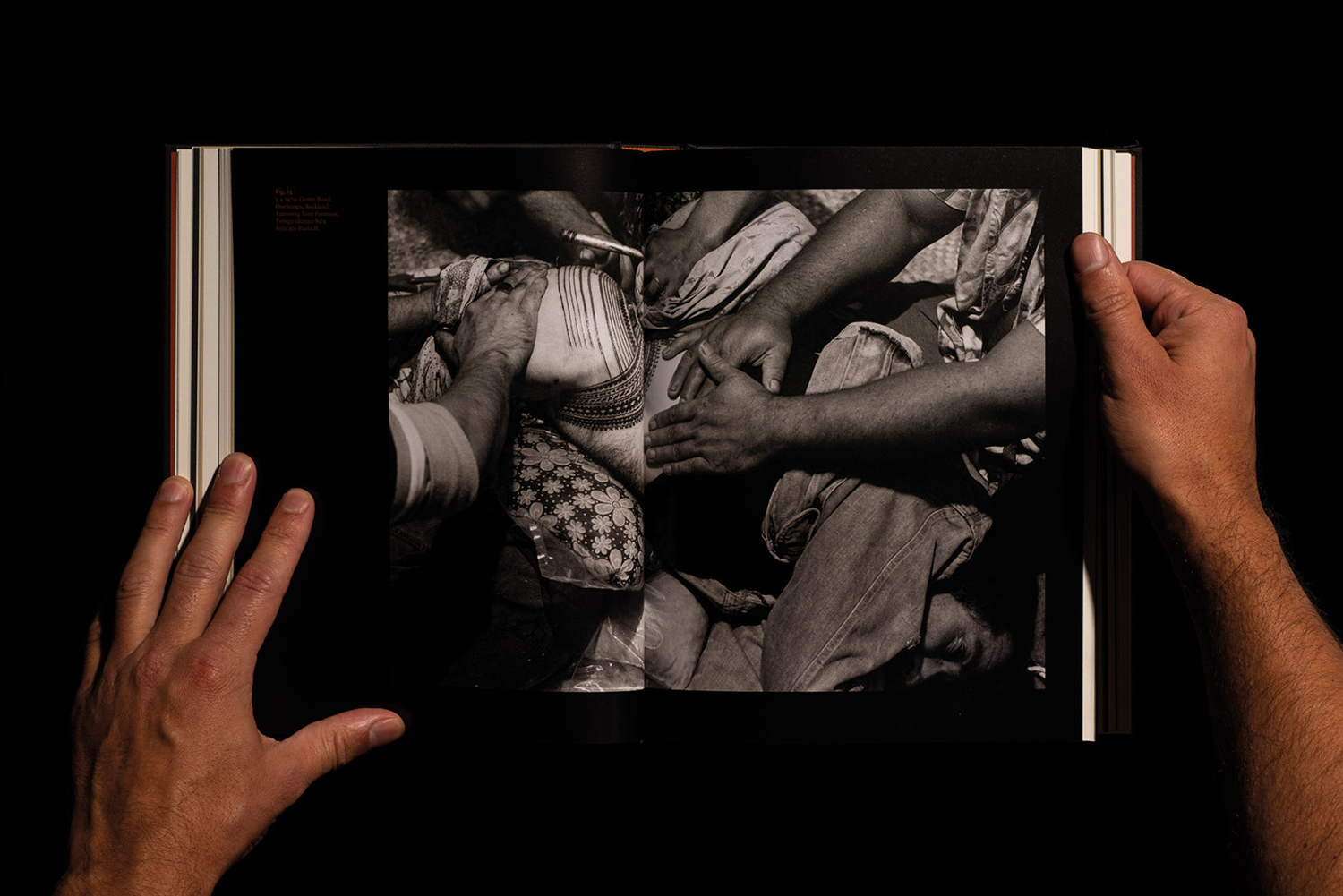
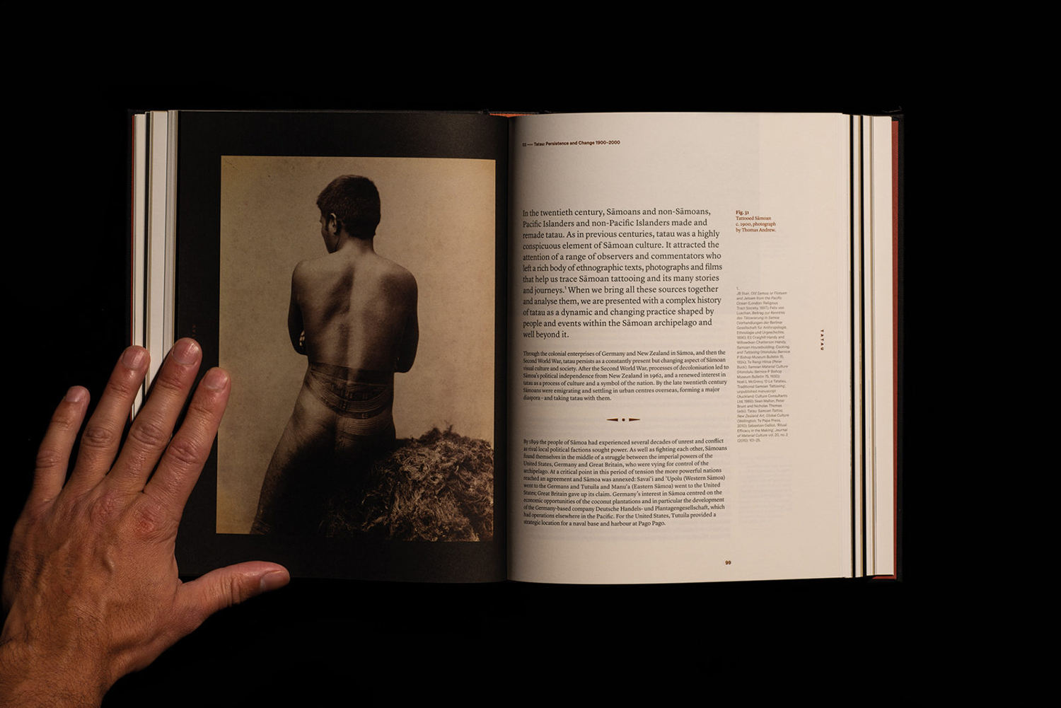
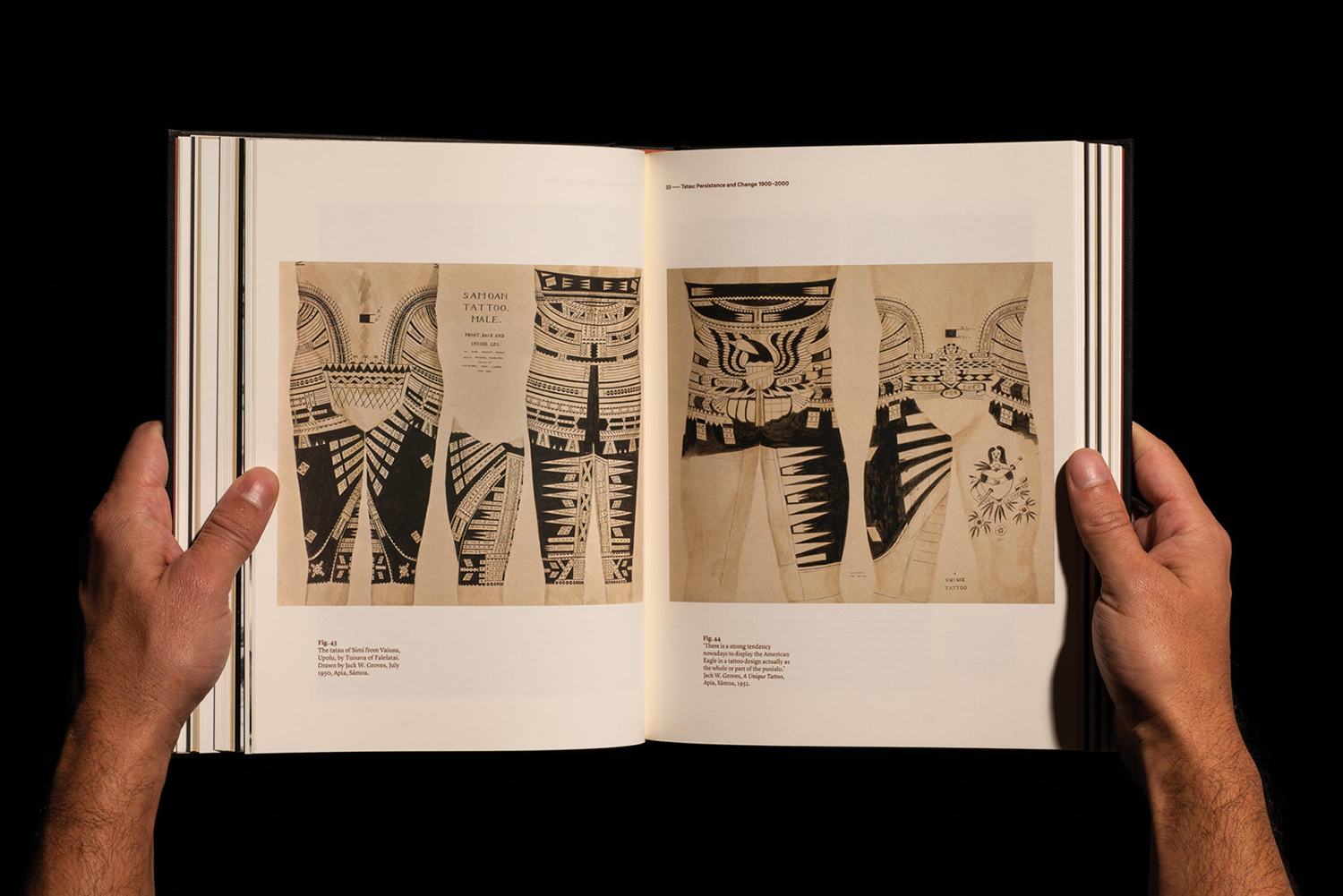
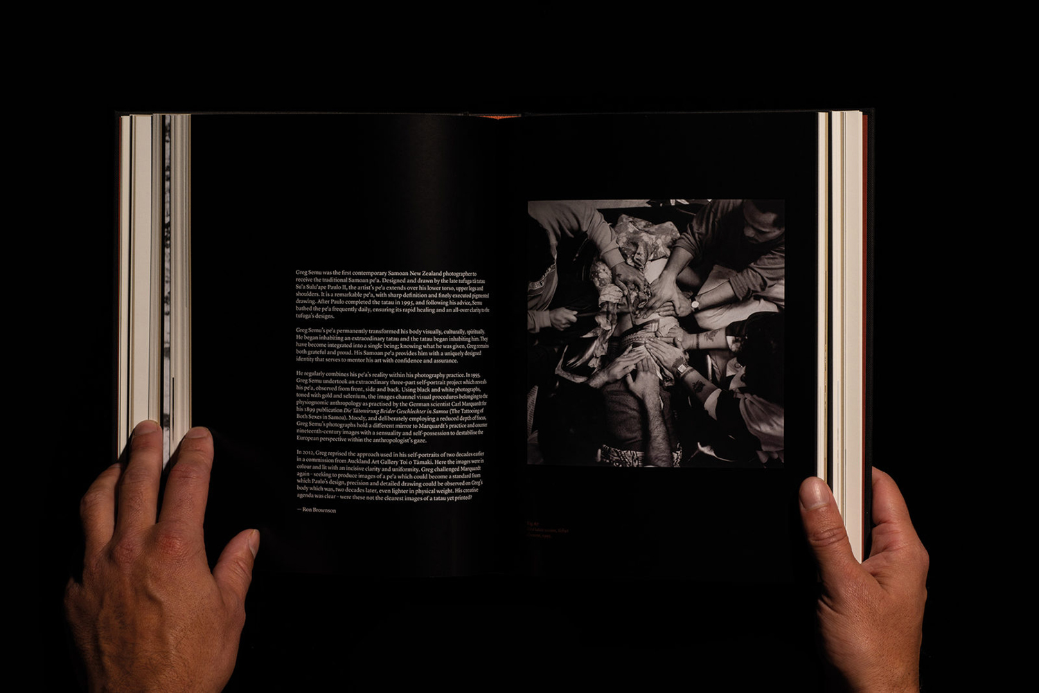
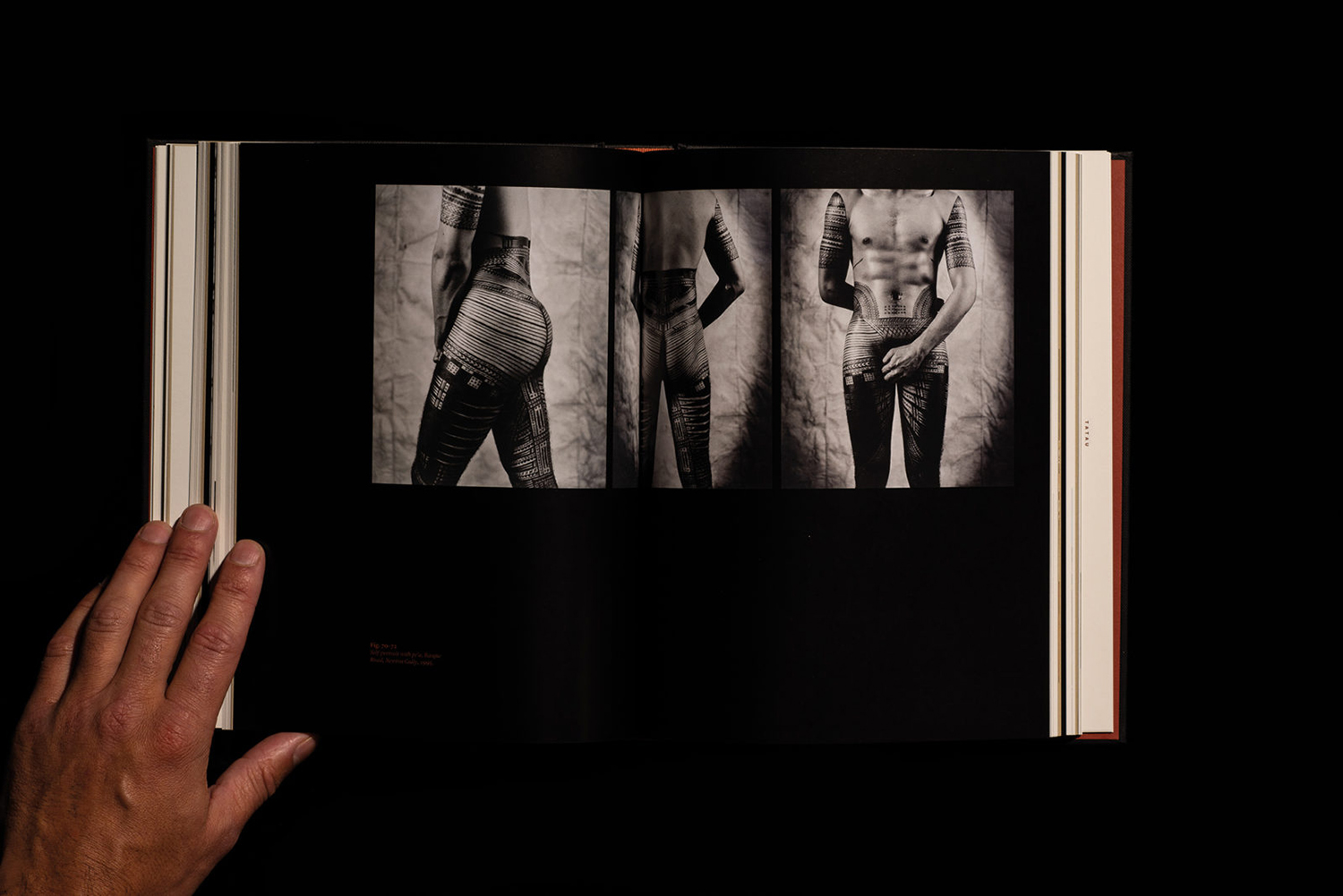
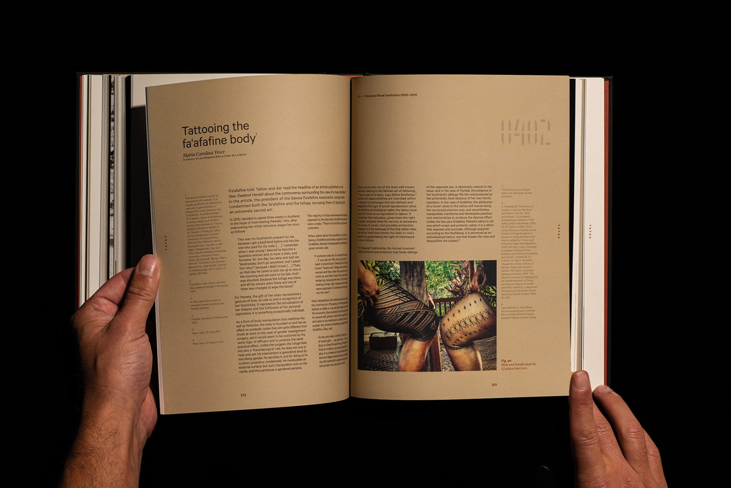
Tatau chronicles the rich cultural history of Sāmoan tattooing, from its beginnings 3,000 years ago to the practices of today. Tatau takes the form of a 320 page hardback book (255 x 200mm) illustrated with historical photographs from the nineteenth, twentieth and twenty-first-century, diagrams, film stills and images of posters and related artefacts. These were brought together by Sean Mallon and Sébastien Galliot, and set alongside texts that explore how Sāmoan tattooing has been shaped and reshaped over an extended period by regional and international forces, with graphic and editorial design by New Zealand-based studio Inhouse. The book features a distinctive debossed cover, custom typeface and a reversible half jack with examples of contemporary male and female tatau by photographer Greg Semu.

Tatau serves as an overview and history. It moves from images and artefacts of ancient tatau to those that characterise modern day practice. Time is neatly bookended and subject matter, which has been reshaped over time, quantified, documented and then explored through text and image, augmented by layout, colour and typesetting.
The book explores the themes of transfiguration and cultural transmission within the context of tattooing. In documenting the movement of the practice across geographical borders and across cultural thresholds, in the revealing of its persistence and reconfiguration through time and its potential to both demarcate and resolve, the modern graphic appeal but also cross-cultural divisiveness of tattoos offers a seductive chronological entry point into the politics of the body. The design of the book acknowledges this in its bold cover and in the presentation of image and text.
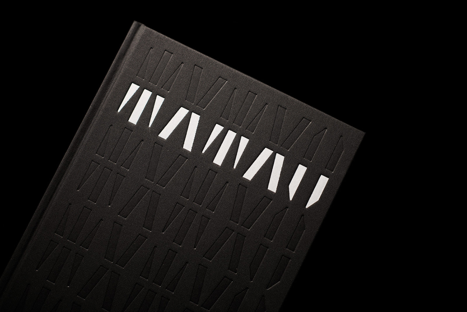
The book’s cover neatly observes and interprets the commonalities between the distant past and the present in the intersection of modernist geometric and modular stencil letterforms, and the shark tooth, a motif prevalent in Samoan tatau. Shape, modularity, and repetition further this relationship between antiquity and modernity, whilst also fulfilling practical objectives, the catching of the eye, communicative inference and immediate visual language.
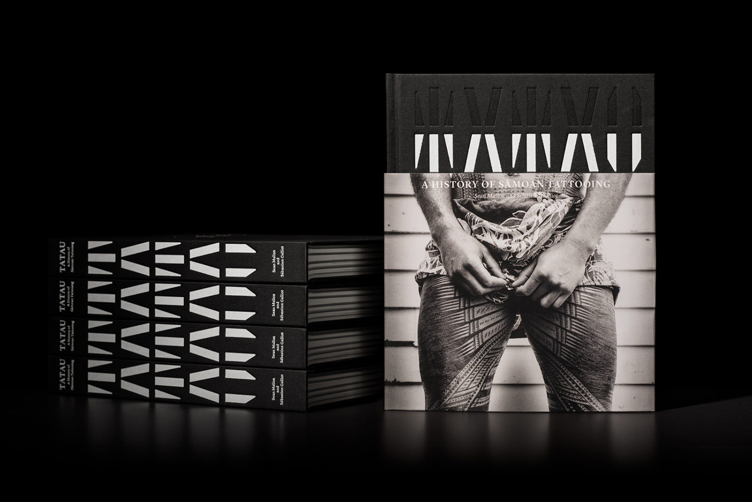
Custom type is thoughtful and visually striking, yet it is the dialogue created between this and the half cover that really stands out. The imagery shot by Greg Semu introduces a clear anthropological component to the graphic language of the cover. And in these images, completes the picture. It goes further. In its reversible black and white cover of male and female models with very different tattoos the half cover touch upon identity, and in the bisection of the graphic book cover, serves as a metaphor for covering up, the hidden, divisional and socio-cultural provocations of tattooing.
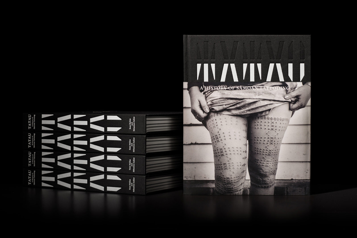
The impression and imposition of ink on skin is pleasantly materialised as black and white foils debossed onto the surface of the book cover. This balance of striking form and tactility serves to catch the eye and deliver detail up close, but in a way that is rooted in the theme. The custom stencil typeface finds a smart synergy with the content but with enough difference to stand out from, frame and sequence content.
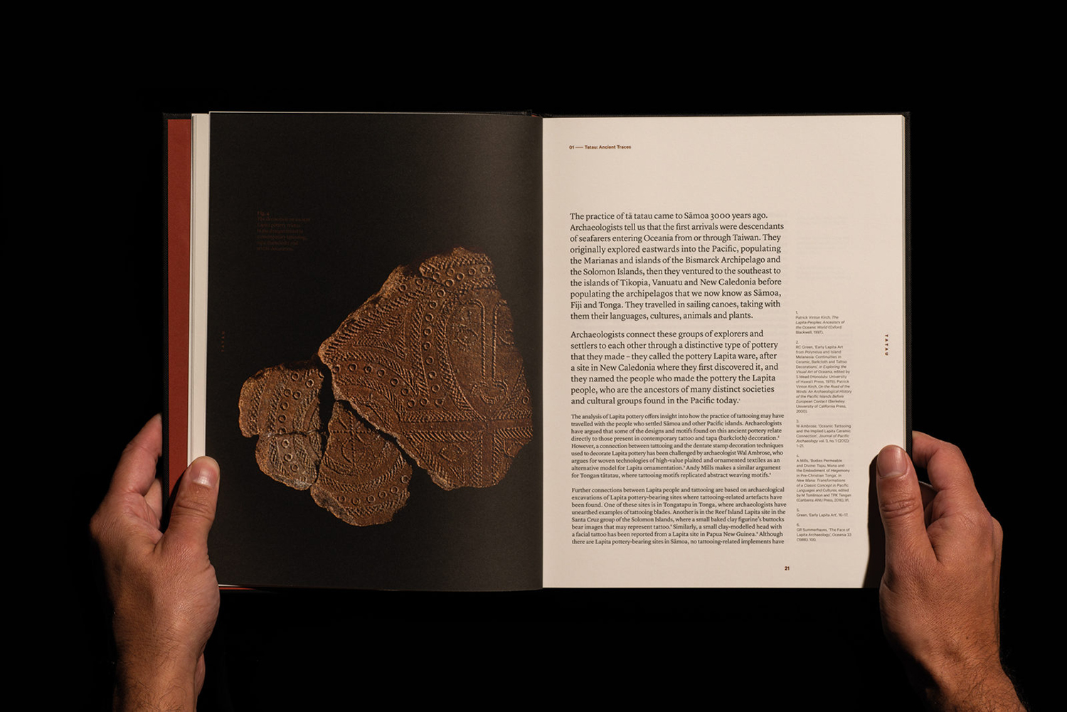
Interior pages, their layouts, colour, dialogue between image and text furthers the implication of chronology, the passage of time, the reshaping of tattooing as the practice crosses cultural boundaries and geographical thresholds. Layouts and colour bring a visual credibility, particularly in the approach to referencing; the formality of an academic text, but with the large images of an art book. This balance of aesthetic pleasure and contextual richness within the framework of archival is satisfying. The strong graphic impression and design craft of cover, and the approach to the design of interior pages appear as an effective distillation and augmentation of this relationship between image and text, the anthropological and the aesthetic, individual expression and collective identity.
The extended period that the book covers, the high ink coverage of Sāmoan tattooing is matched by the colour, volume and robustness of the book, the book becomes an inanimate materialisation of an animate cultural practice, and itself an artefact of its time through design. More work by Inhouse on BP&O.
Design: Inhouse. Photographs: Greg Semu. Opinion: Richard Baird.
