The Maitland by Studio Brave
Opinion by Richard Baird Posted 17 October 2018
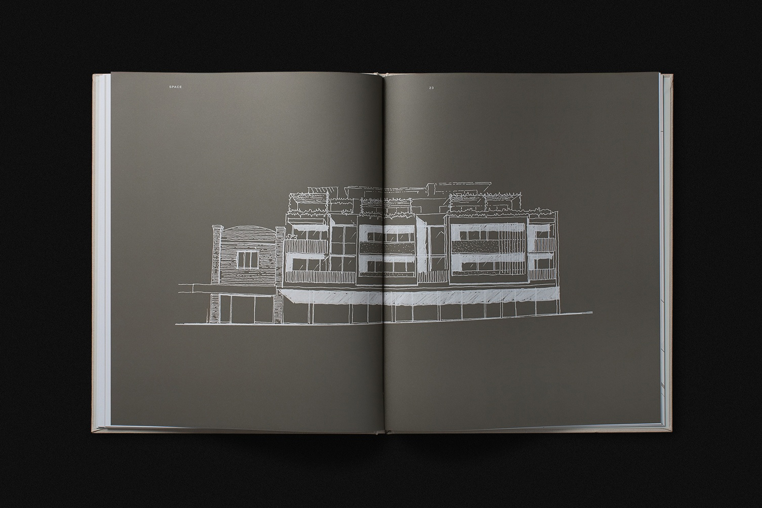
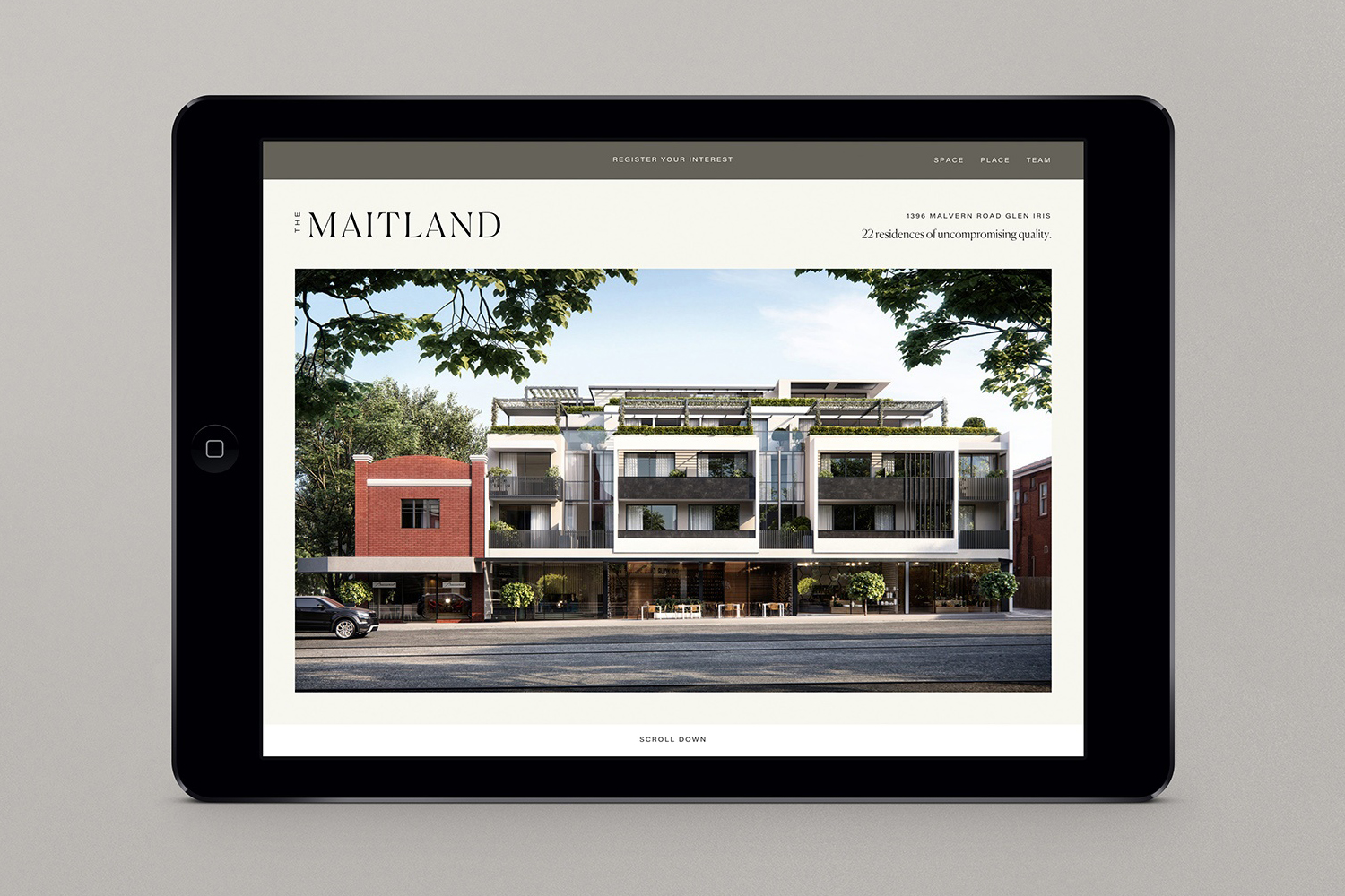
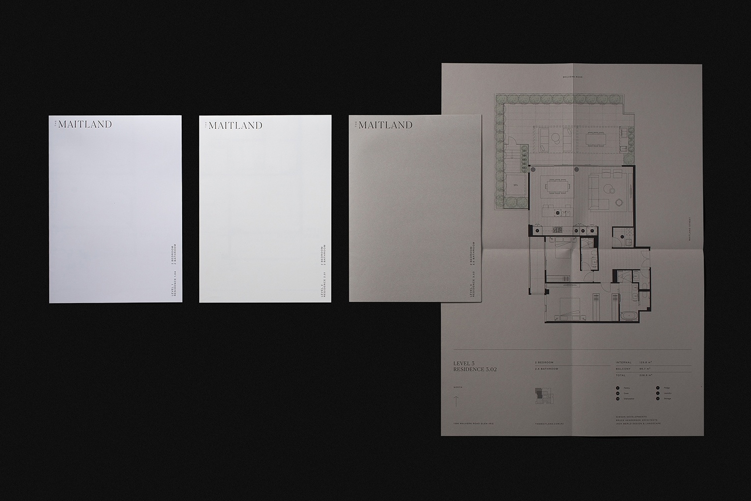
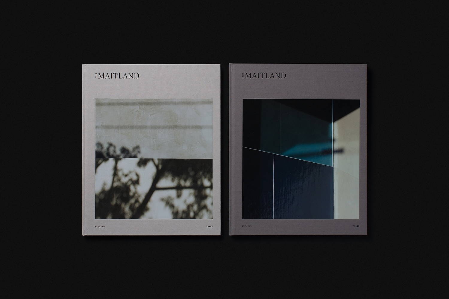
The Maitland is a luxury 22 apartment residential property development from Gibson Developments located on Malvern Road in Glen Iris, a suburb of Melbourne, Australia. It is marked by an architectural, interior and landscape design language—created by Bruce Henderson (architecture), Charlotte Henderson (interiors) and Jack Merlo (landscape)—of colour, texture and form that connect it intimately to the neighbourhood and its leafy streets. This connection is the foundation of The Maitland’s graphic identity and marketing campaign, designed by Studio Brave, presented as two documents; Space and Place.
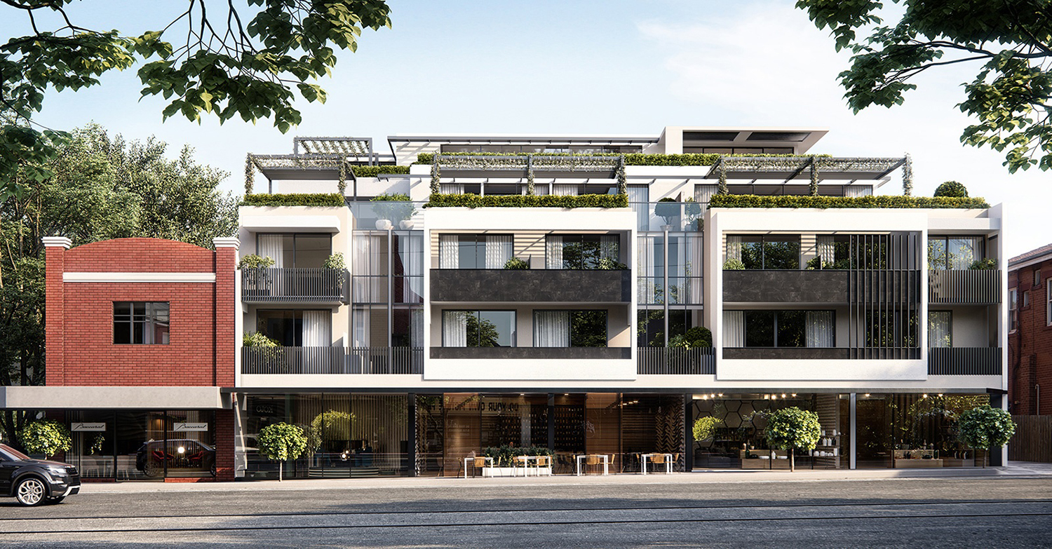
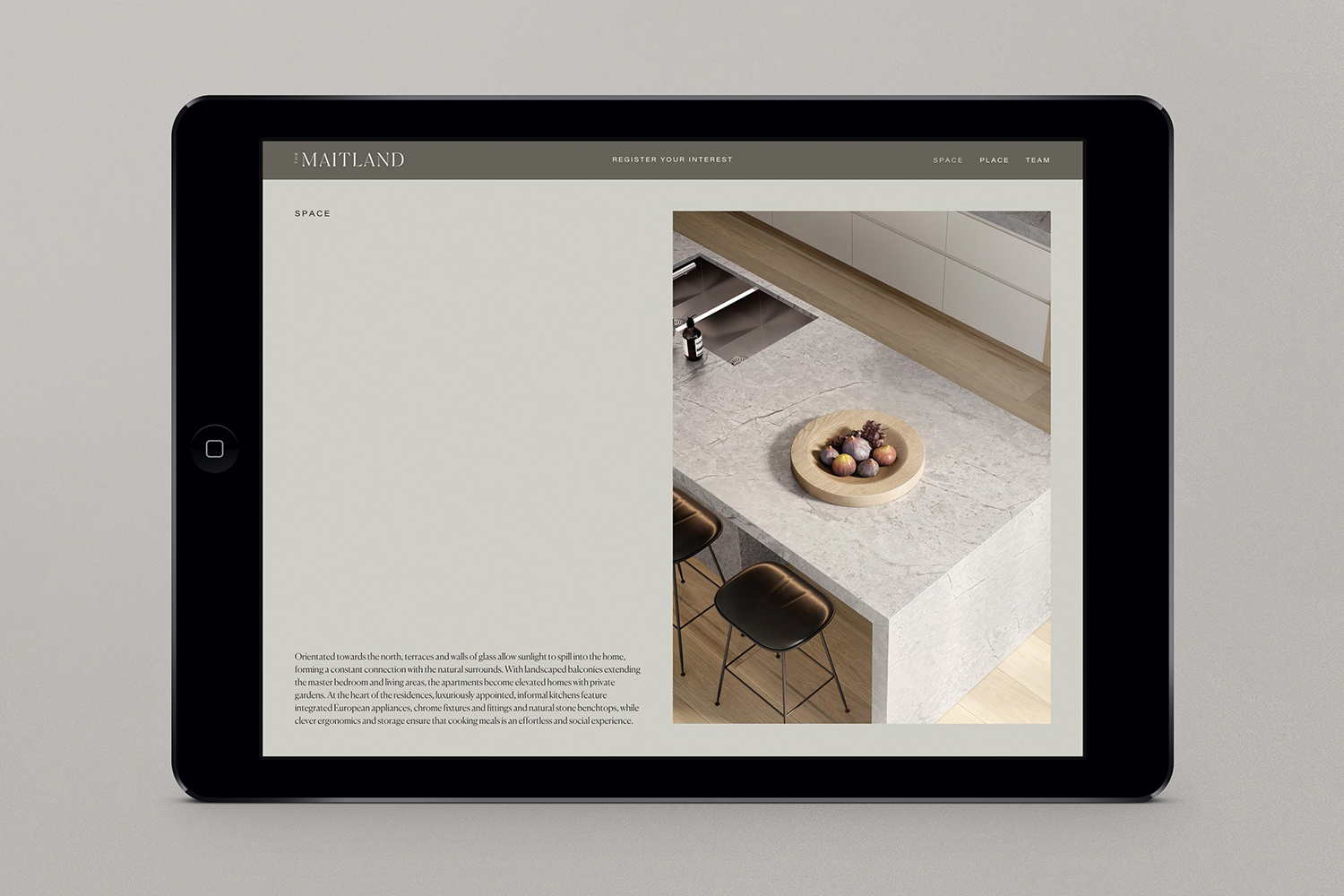
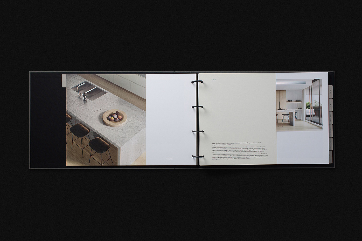
The Maitland is distinguished locally by the lowering of the threshold between interior space, architectural structure and urban typology. Its northwards orientation and walls of glass allow sunlight to fill the interiors within and make the exterior leafy environment a critical part of living space. The diminishing of boundaries (perceptual rather than the actual) continues in the landscaping of balconies and in the texture of interior walls, as well as the use of a range of natural materials. Alongside these considerations the apartments offer a high-level of luxury in their sensitivity to space, ergonomics, storage, furnishing, fixtures and finishing.
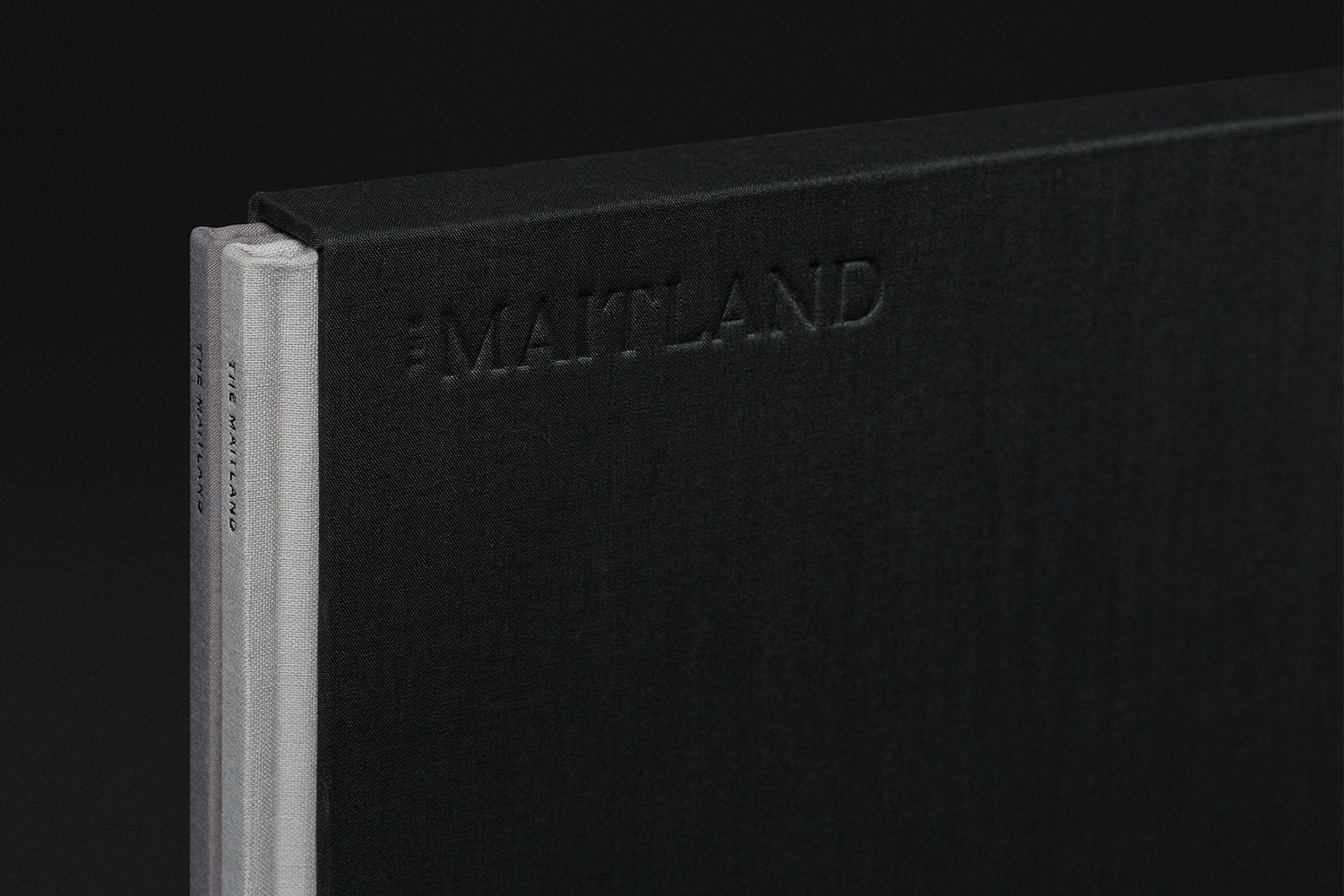
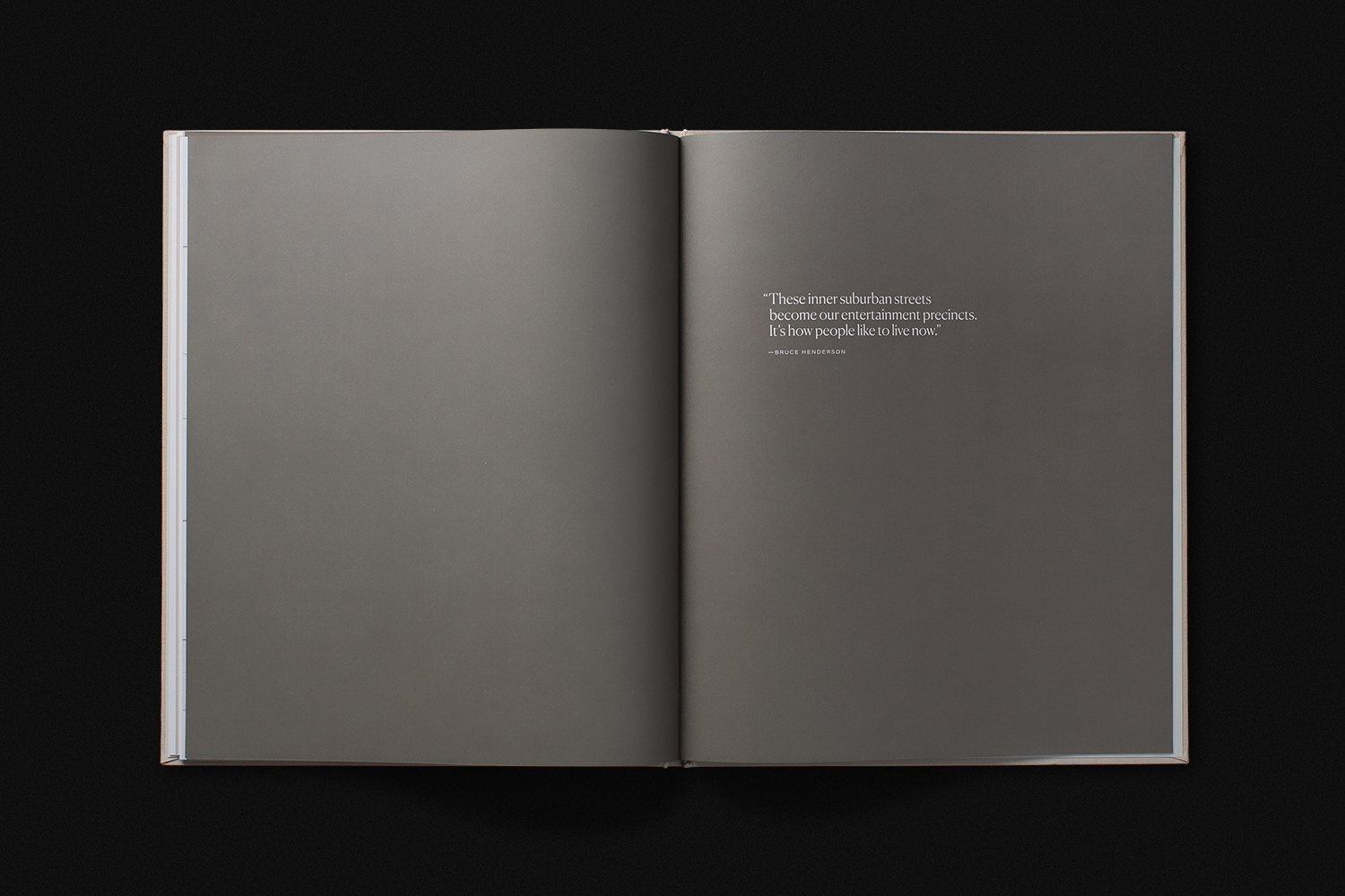
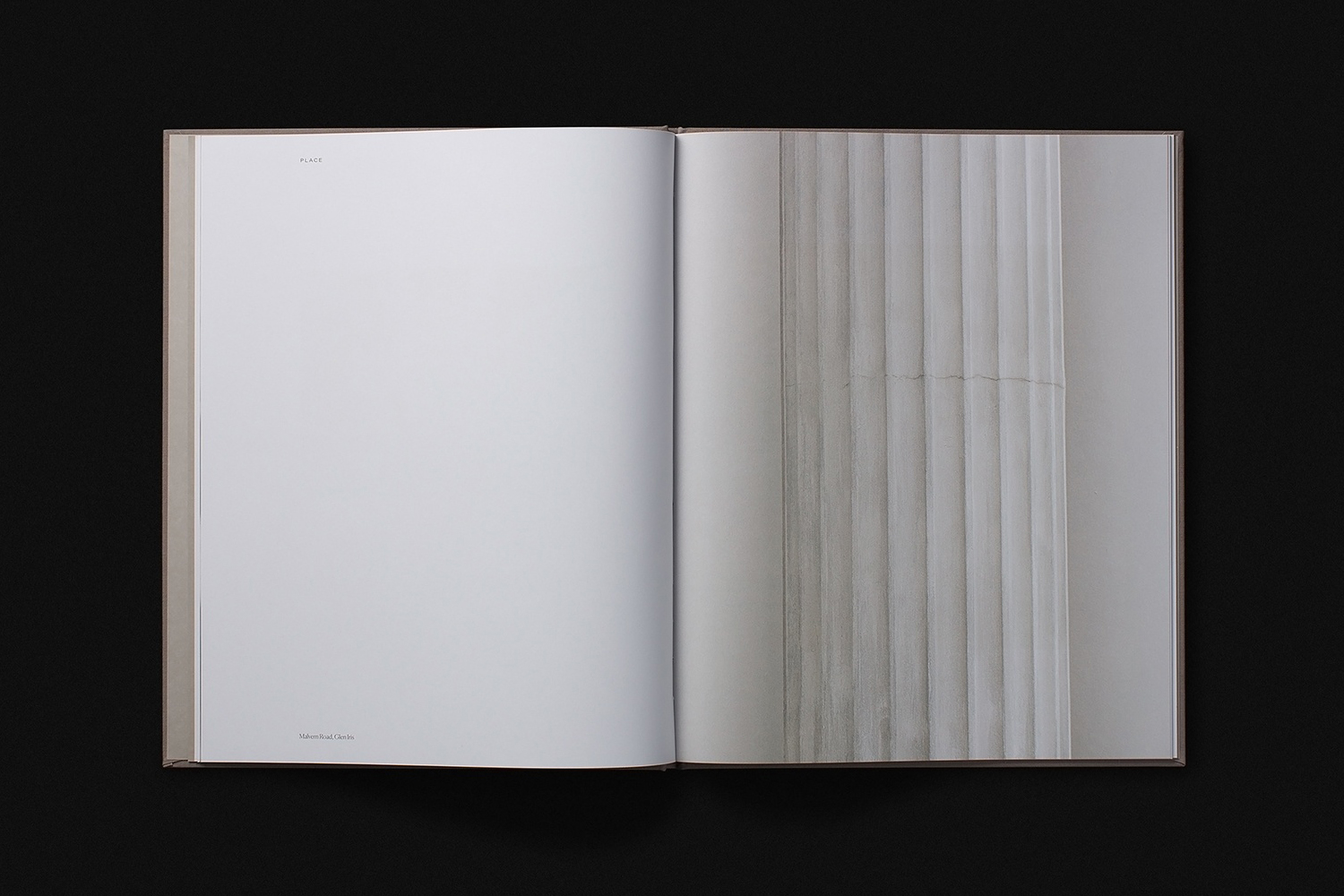
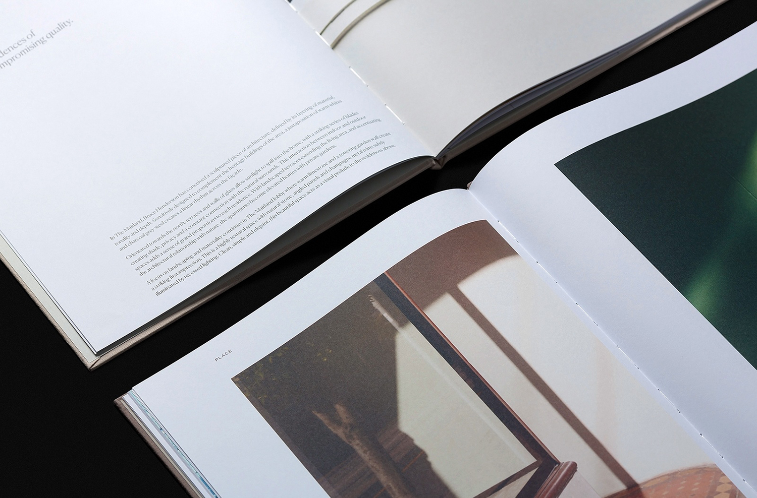
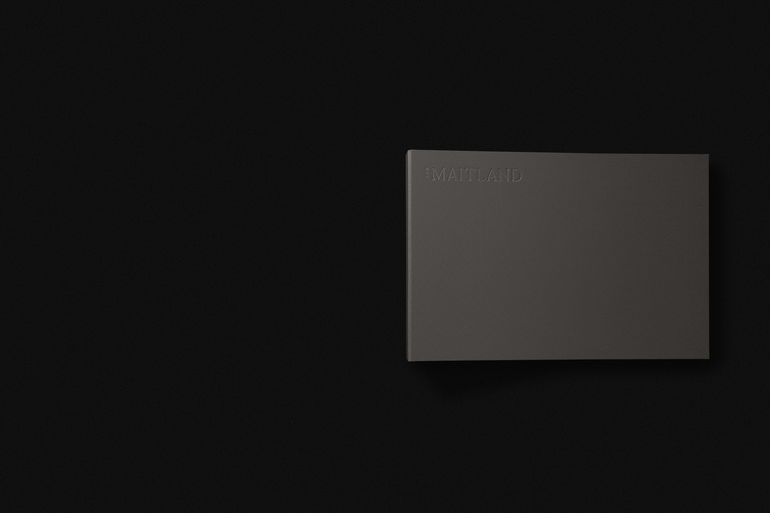
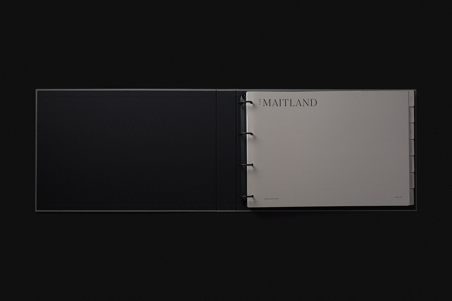
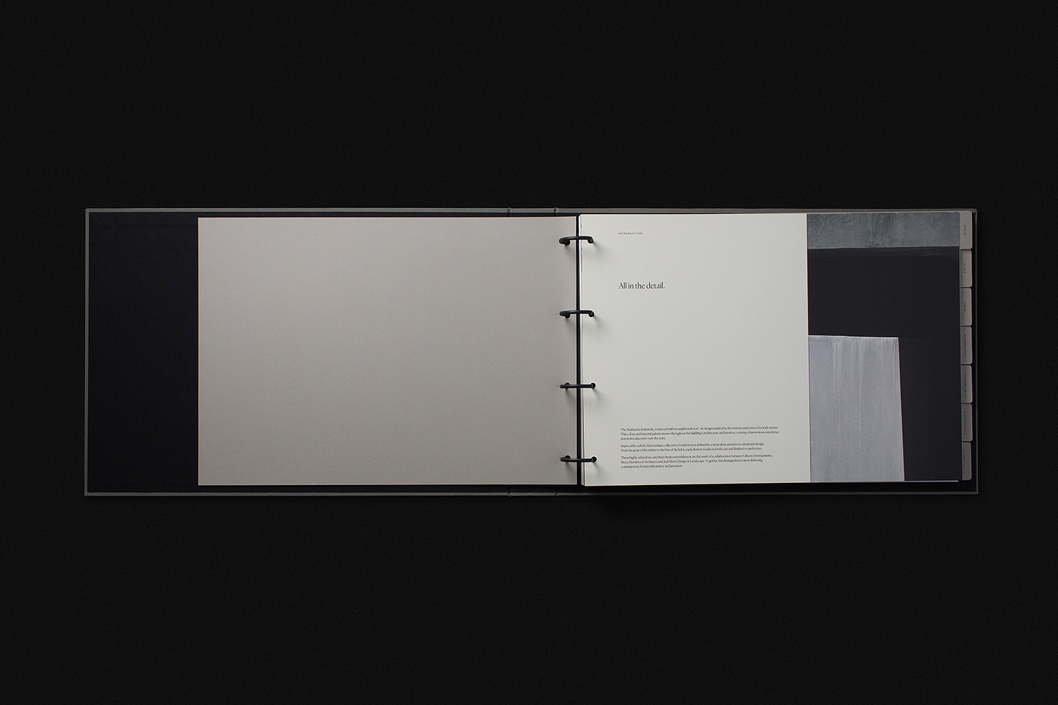
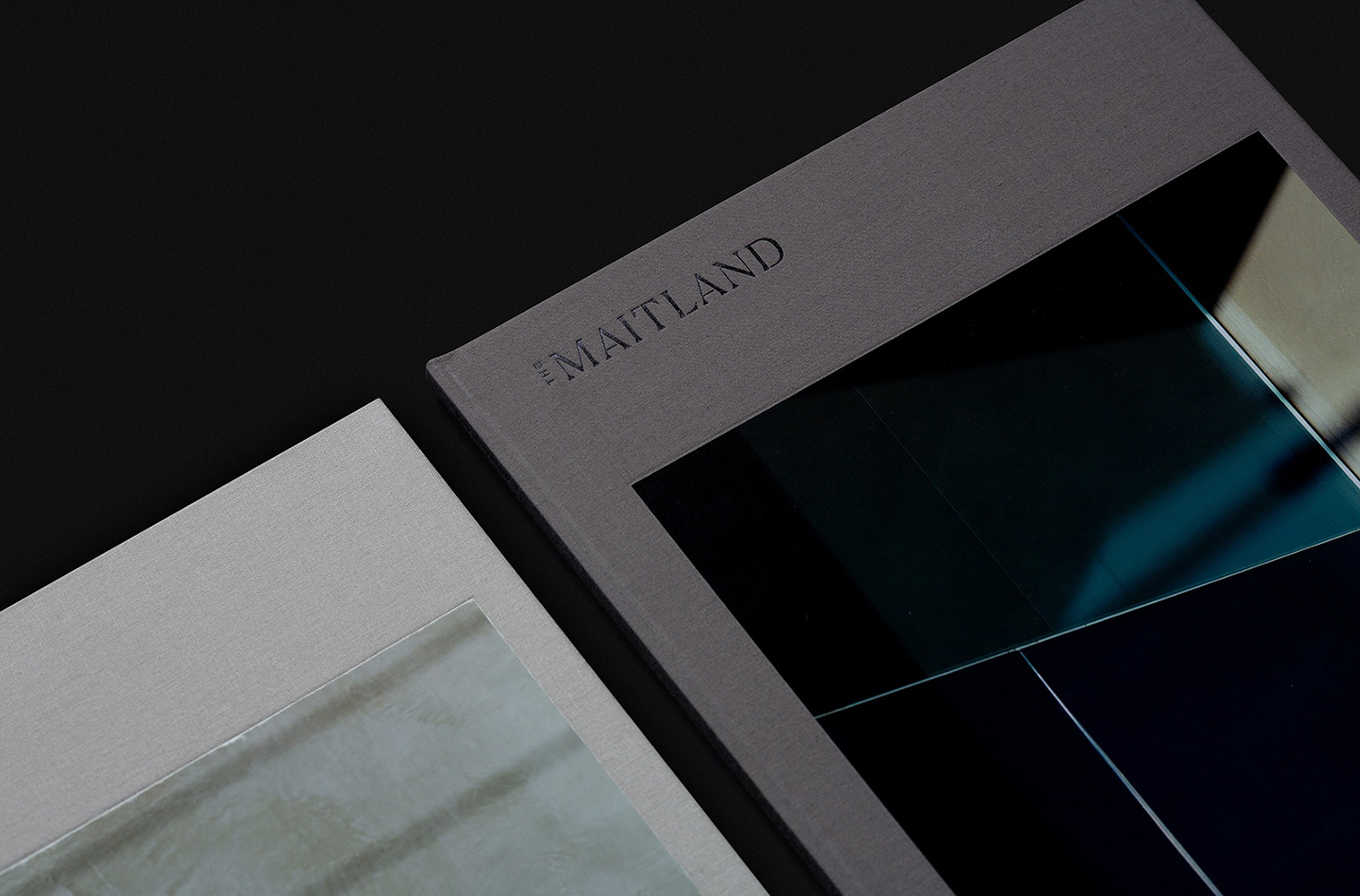
Studio Brave’s approach draws out and creates a dialogue between the intimate details of interior space and exterior place. This is expressed through two volumes; Space and Place. Their critical relationship addressed in the shared slipcase, proportionality, materiality and finish. Much of the graphic and material language employed by Studio Brave distils down the high-quality build of the property through few but concise gestures; in surface, texture, embossing, binding and colour. These focus on an immediate and tangible value, as if the volumes were literal and essential pieces of furniture pulled from space. This is not unusual, but often poorly realised elsewhere, and given more conceptual weight within the context of photography.
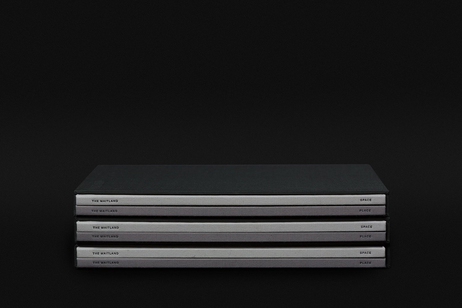
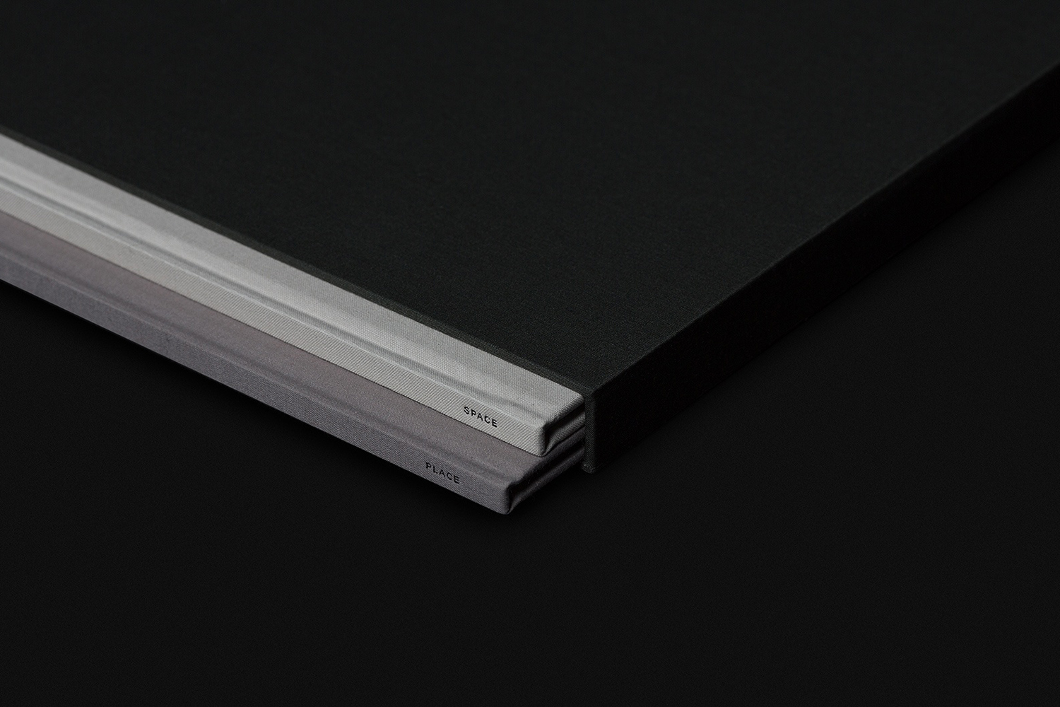
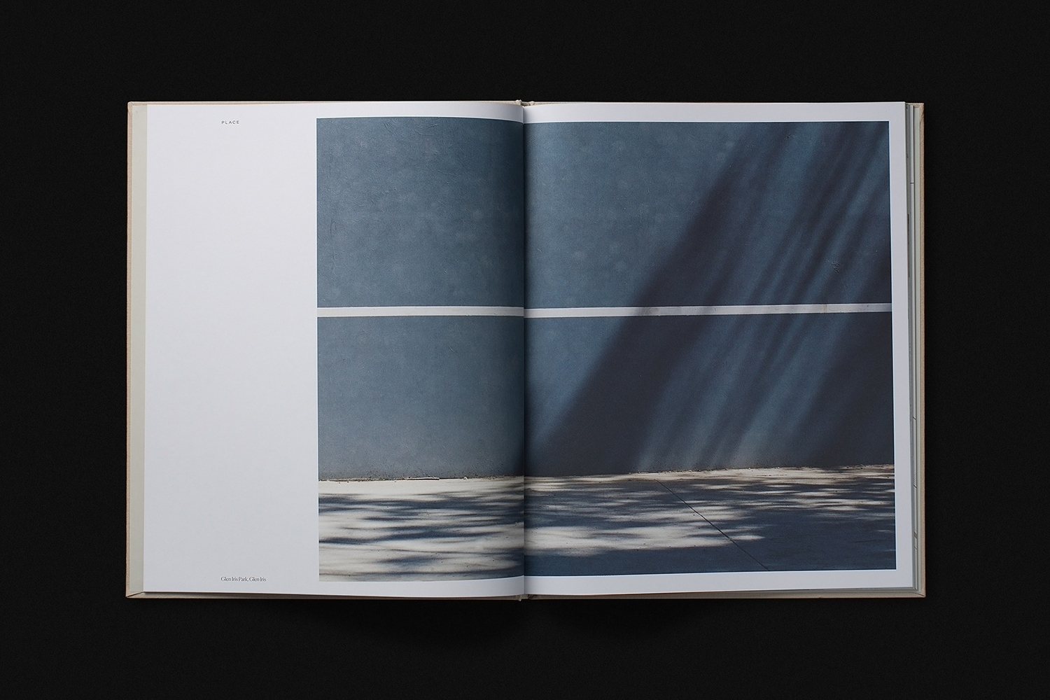
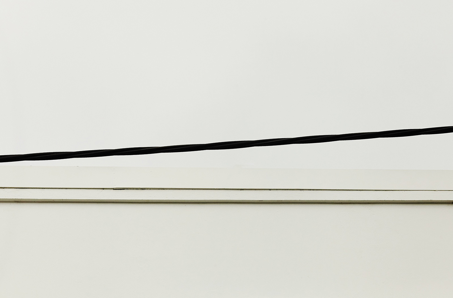
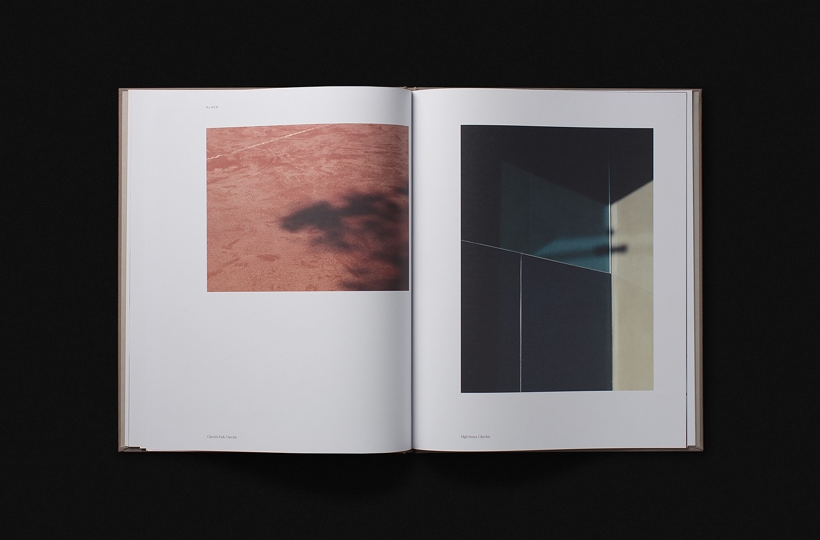
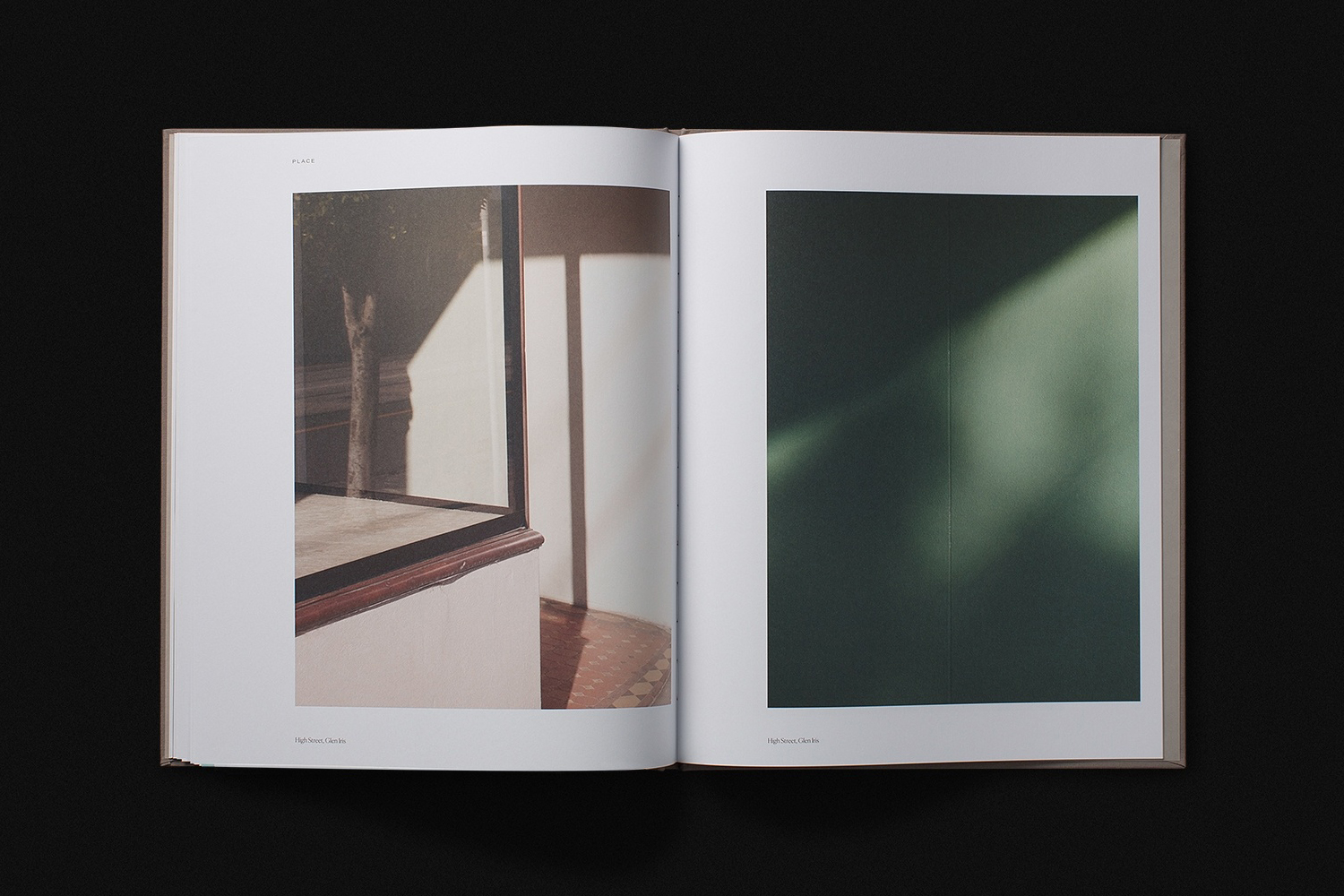
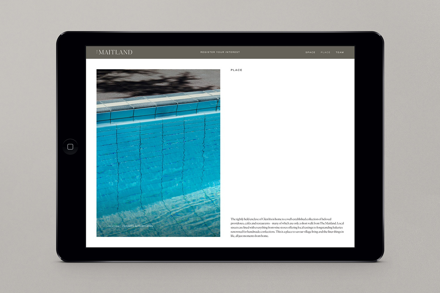
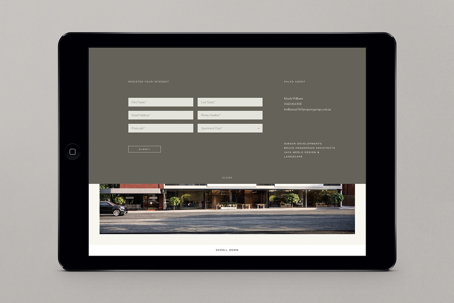
The two volumes, and a complimentary website, function as a material and digital framework in which to explore and hold the more visceral experience of place by way of the photography of Traianos Pakioufakis who was commissioned to seek out small and overlooked details of the area. These photographs, in their tight cropping and occasional abstraction (the familiar made unrecognisable, the material becoming a feeling), capture a beauty in the banal and commonplace. These are elevated by their presentation, something close to that of a contemporary art gallery book in arrangement and use of space, blurring the line between the tangible (the tactile and quantifiable presence of the book/space) and the intangible (a feeling of place), giving rise to both literal and metaphorical textures.
The cutting of Commercial Type’s Canela, the intersection of modern utility and classical luxury is a familiar gesture that adds little where these sentiments really come across well in the intersection of materiality and imagery. Occasions in which the wordmark is isolated and needs to function as a distinctive and communicative gesture feels too few to justify this. This is supported elsewhere by Acumin, a straight-faced and useable sans-serif.
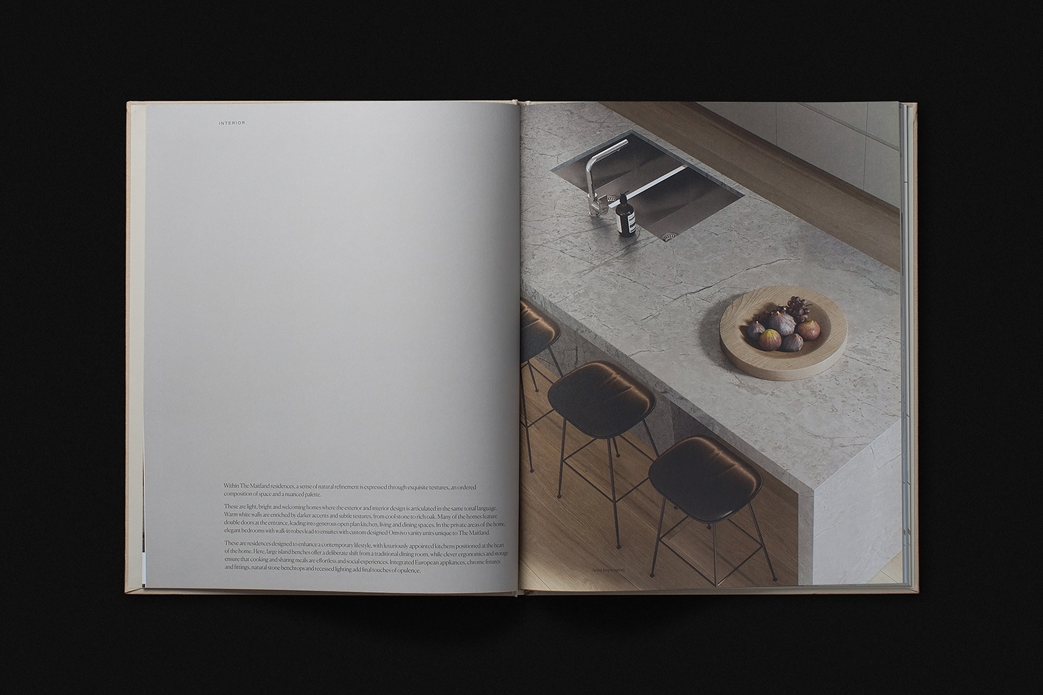
The commissioning of Traianos Pakioufakis, the content of and appraoch to photography really elevates the work. Aesthetic pleasure and visceral experience, the inside and out, feel neatly addressed by this, offering a useful counterpoint to a material and more familiar luxury. There is, of course, the suggestion of art at work, particularly in the presentation and framing of image across the cover of the two volumes, in the spatial relationship with printed and digital page which is pleasing.
Often, properties fall short in folding in the local environment into their proposition. As such, the home can be presented as a sanctuary away from the outside world. As a marketing exercise, the approach to imagery is smart in its balance of visual, visceral and communicative distinction. It sets up a promise. Its success then relies on the fulfilment of that promise. More work by Studio Brave on BP&O.
Design: Studio Brave. Photography: Traianos Pakioufakis. Opinion: Richard Baird. Fonts: Canela & Acumin.
