246 Queen by Studio South
Opinion by Richard Baird Posted 23 October 2018
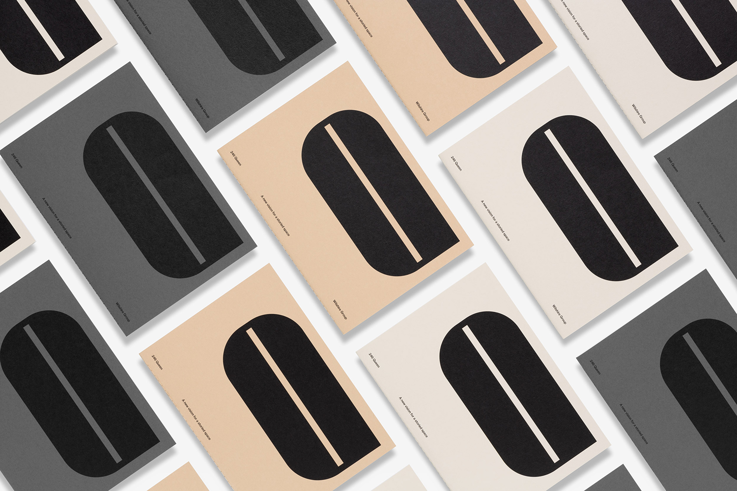
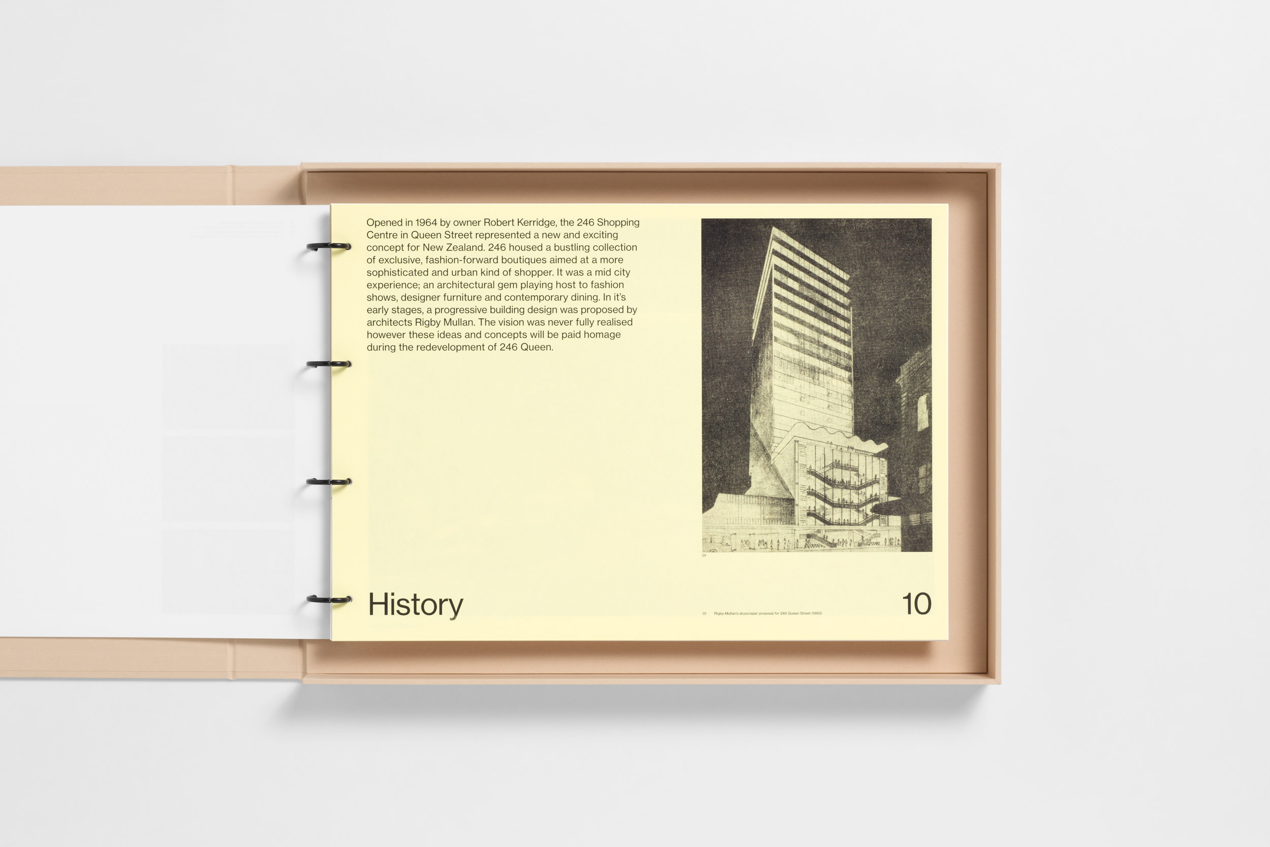
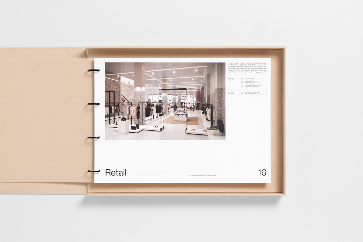
246 Queen has a long and storied history. Opened in 1964 on Auckland’s Queen Street, it heralded a new era of modern architectural vision, exclusive boutique-based experience and an urban post-war retail sophistication. The building played host to fashion shows, designer concessions, furniture showrooms and contemporary dining. However, the architectural ideas drawn up by the original architects Rigby Mullan (Alan Rigby and Antony Mallen), remained only partially realised. These are now being paid homage to in the building’s renovation by the Wilshire Group working in collaboration with architects Fearon Hay, once again becoming a mixed-use space of food and drink, retail and commercial opportunities across eight floors.
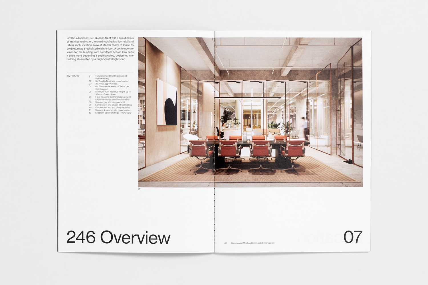
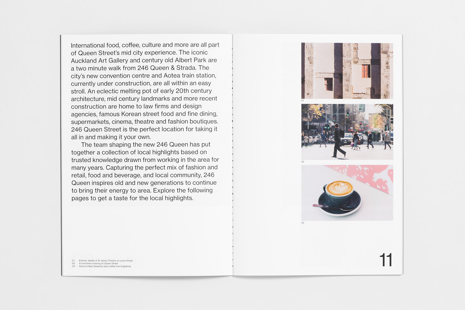
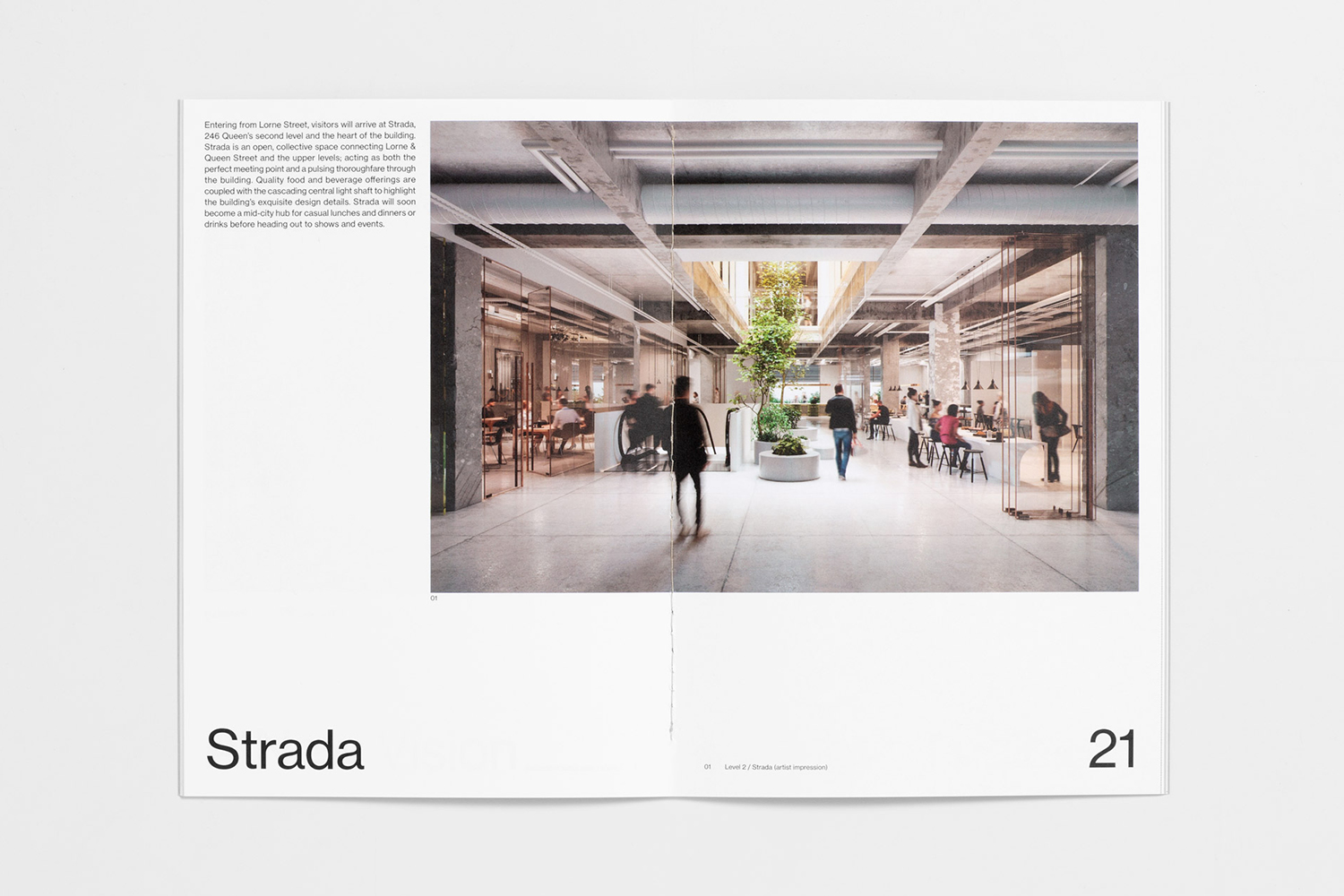
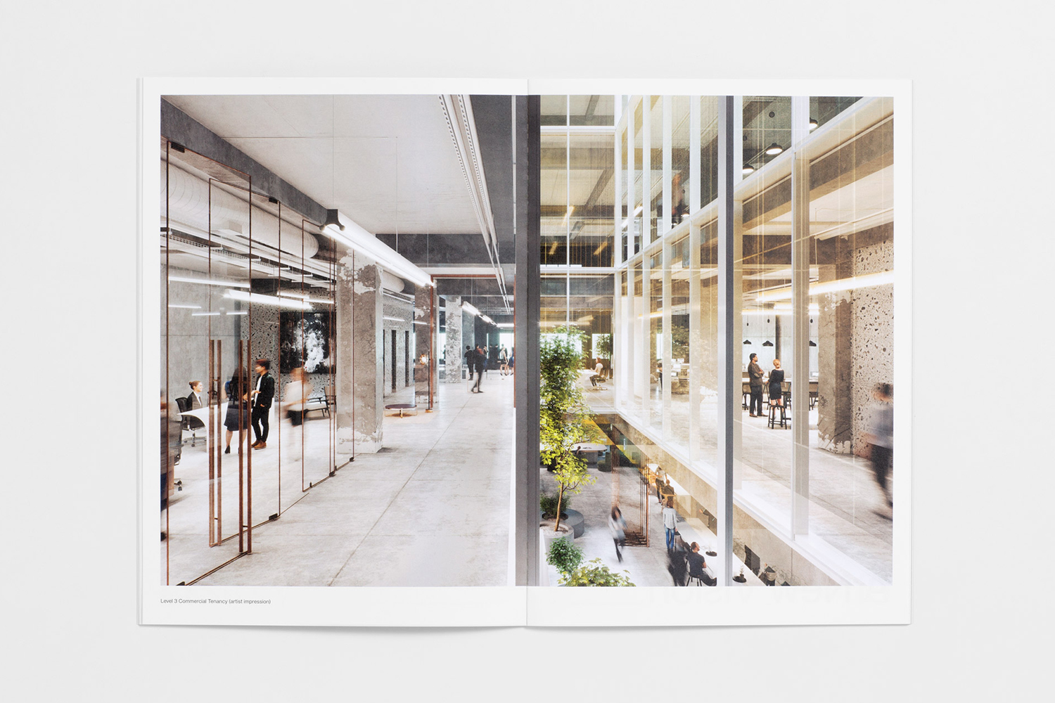
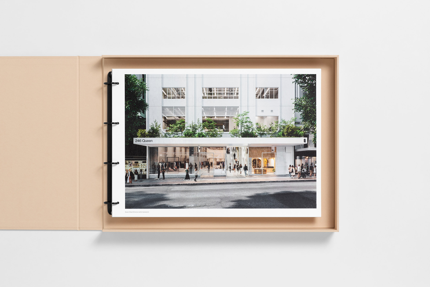
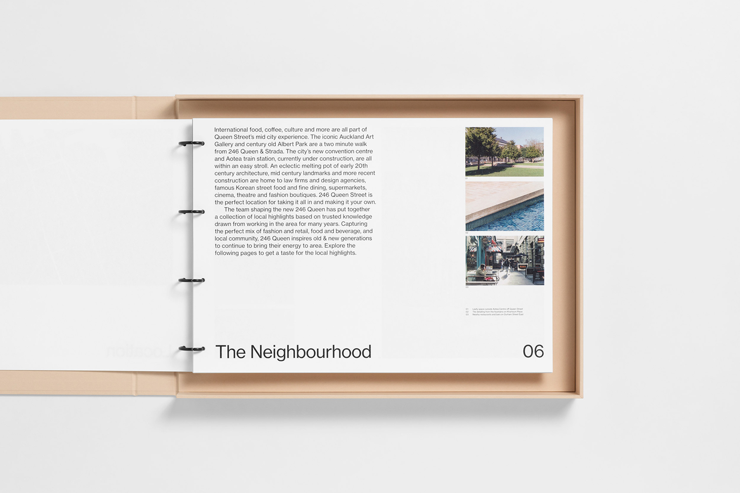
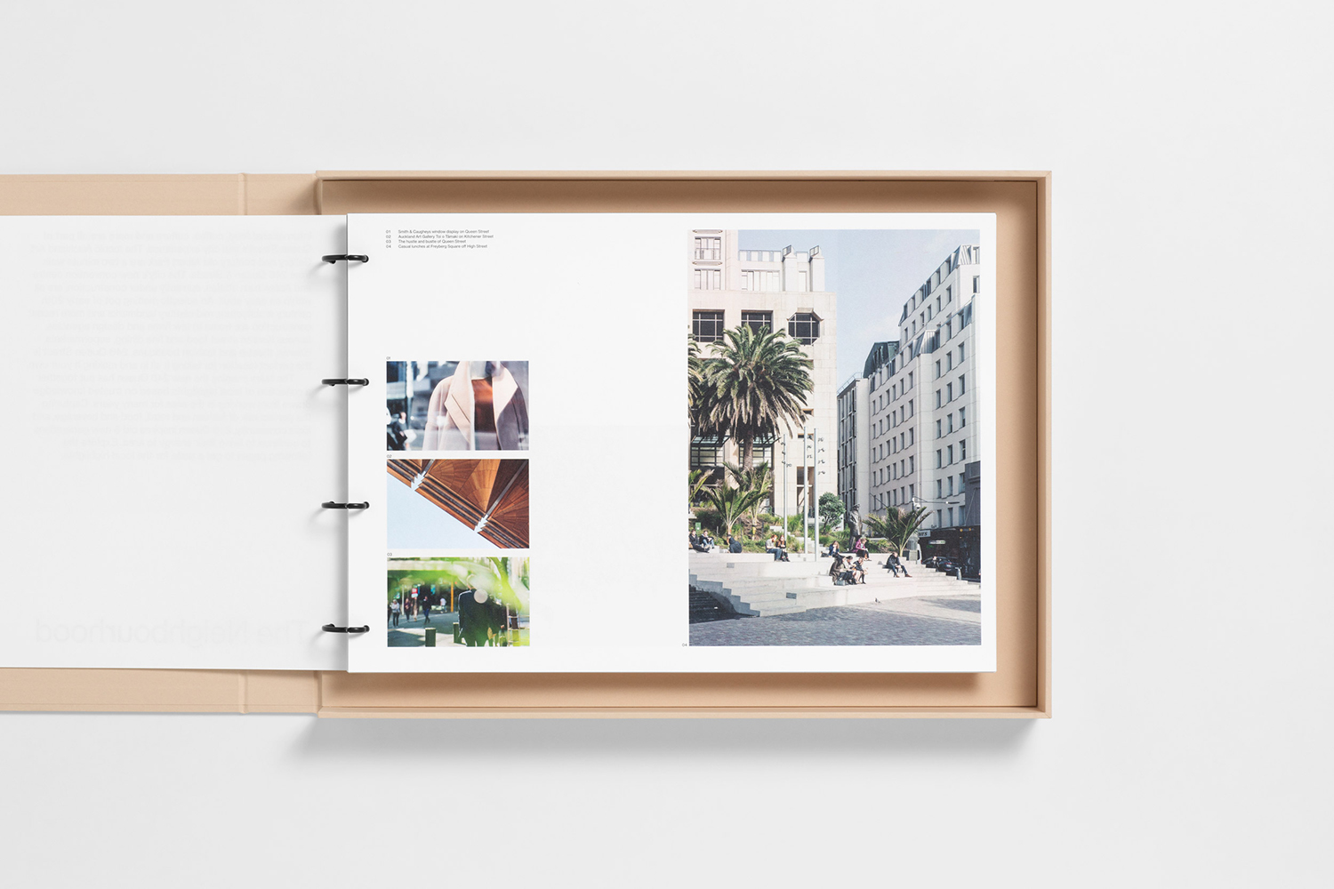
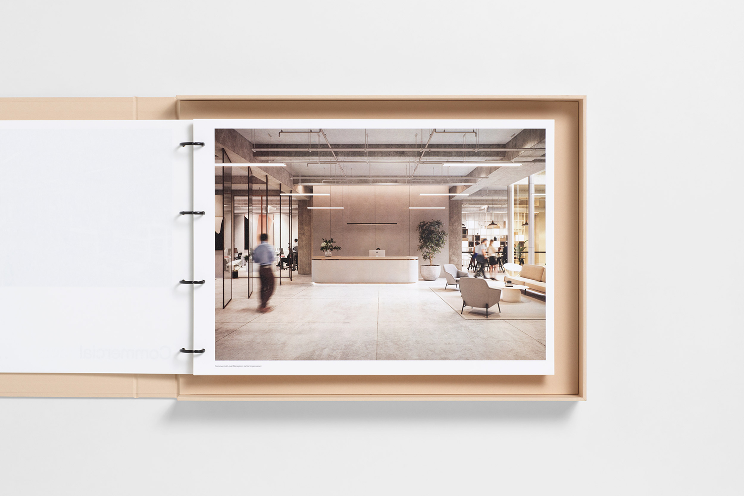
Architectural details include a distinctive fascia of curved windows and accents, floor to ceiling central glass light well, exposed ceiling and concrete floors. This sits within a district of 20th-century architecture and mid-century landmarks, a broad range of coffee shops and casual dining, the Auckland Art Gallery and the century-old Albert Park.
The marketing of the building and its spaces is aimed at what are described as design-savvy directors. Those with companies within the creative sectors, smart PR, marketing, bespoke legal and financial services, those who have developed award-winning digital experiences or are tech innovators. Essentially, those with clients who expect the structure and space to fit the nature of the companies they intend to work with. In this way, modernist architecture functions as a material symbol of the pioneering spirit that now exists within the less material worlds of the service led and digital sectors.
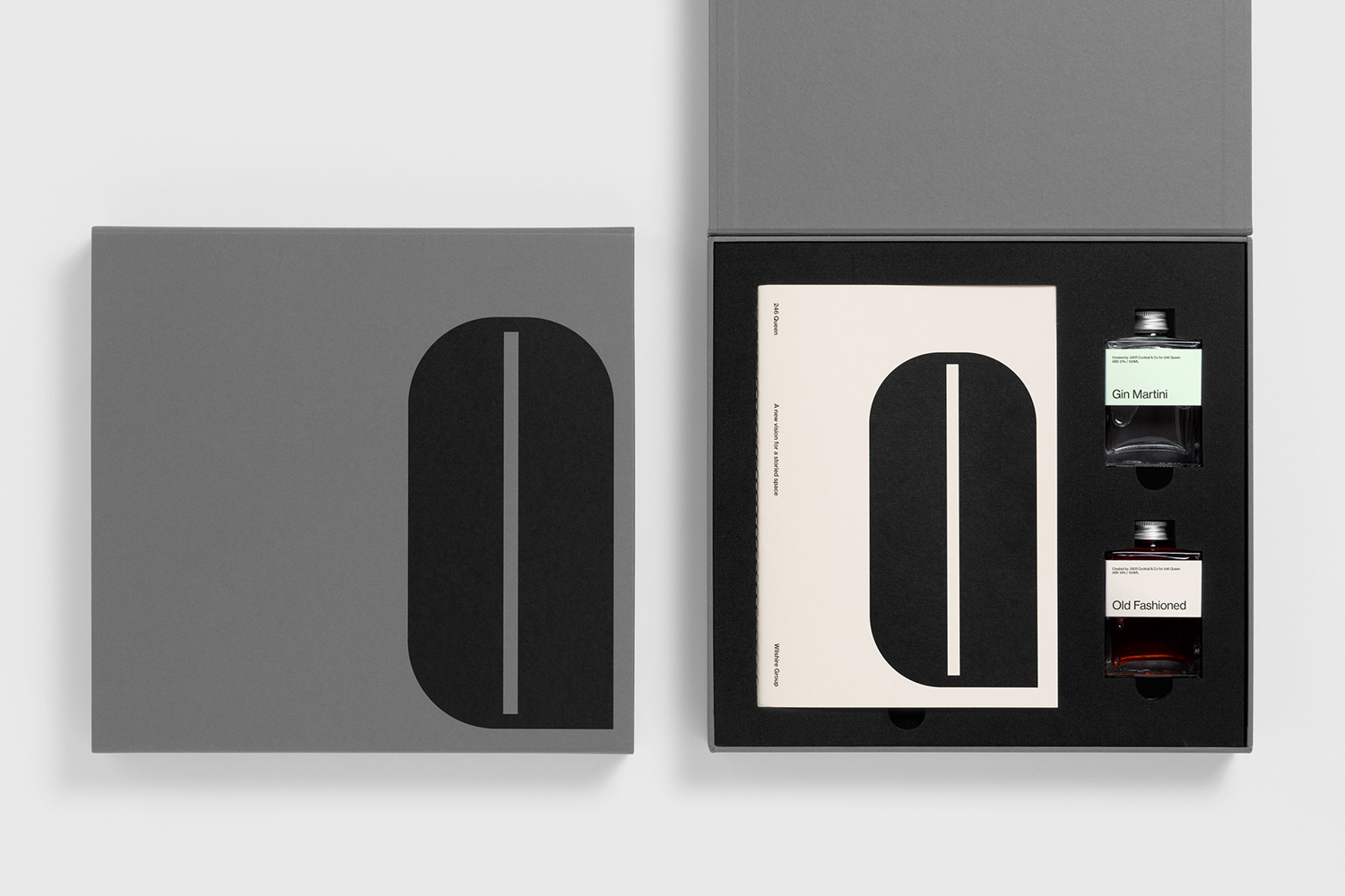
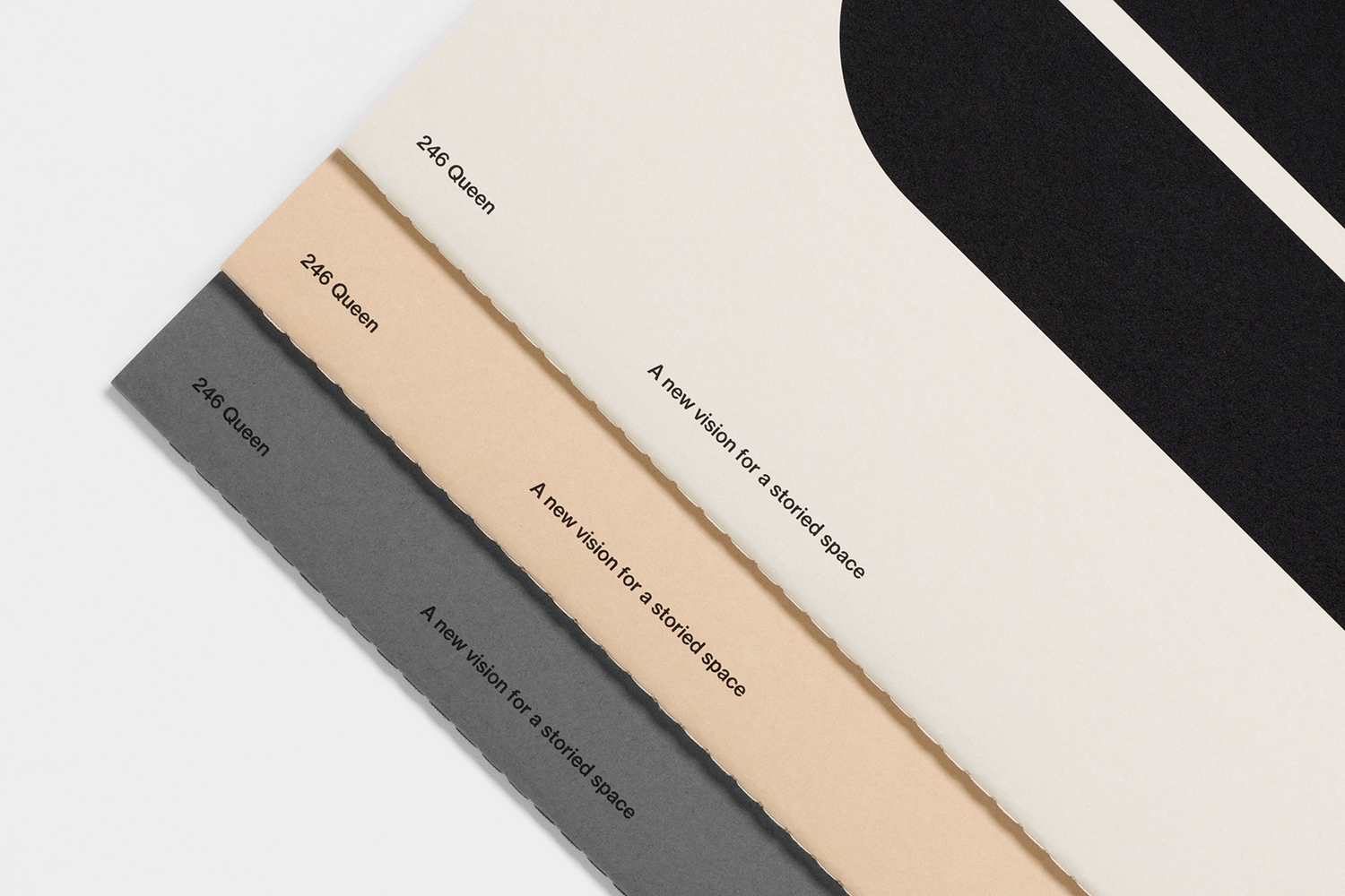
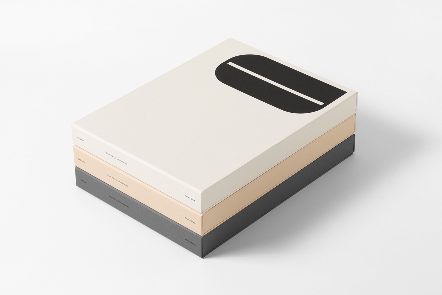
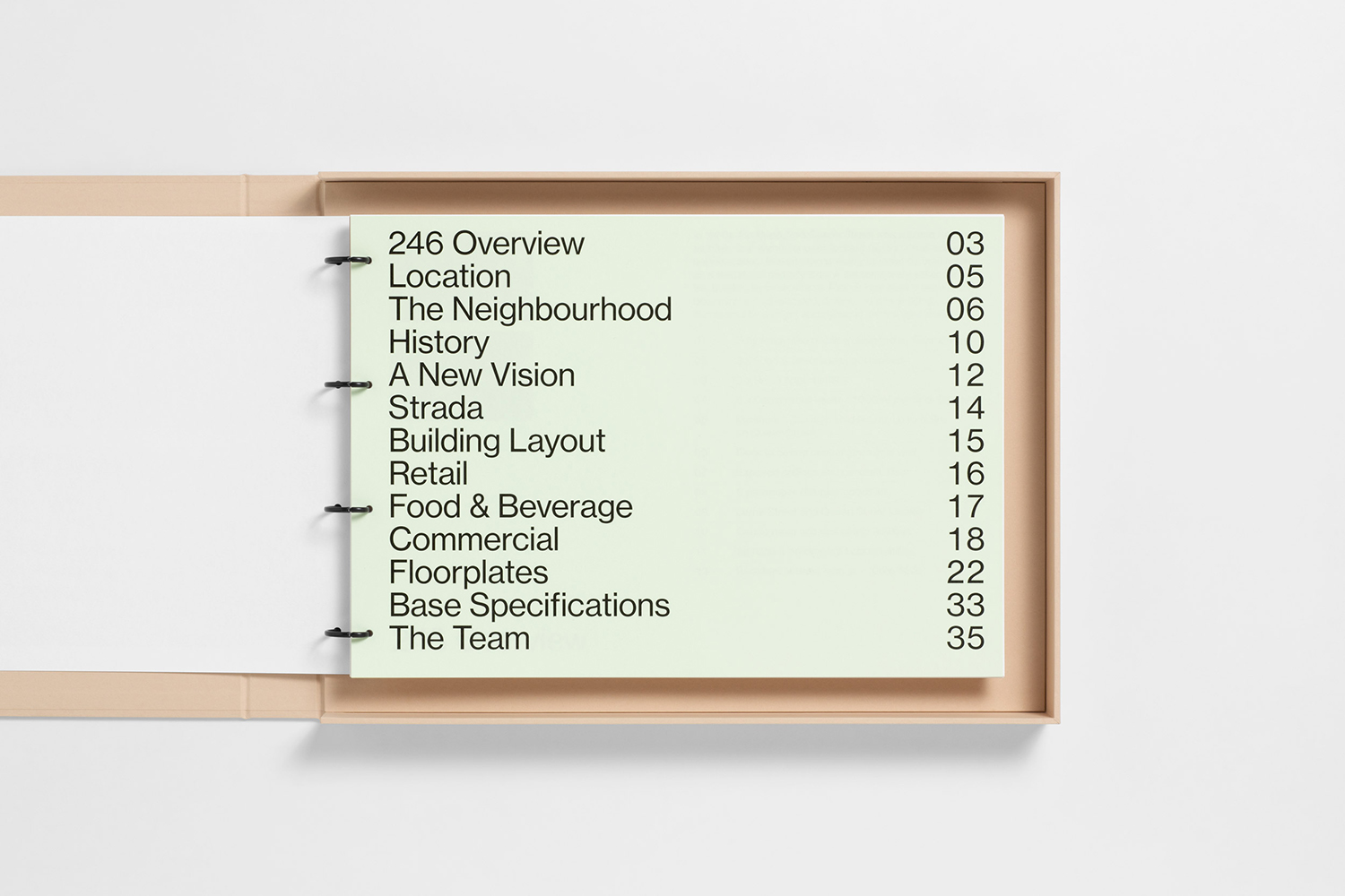
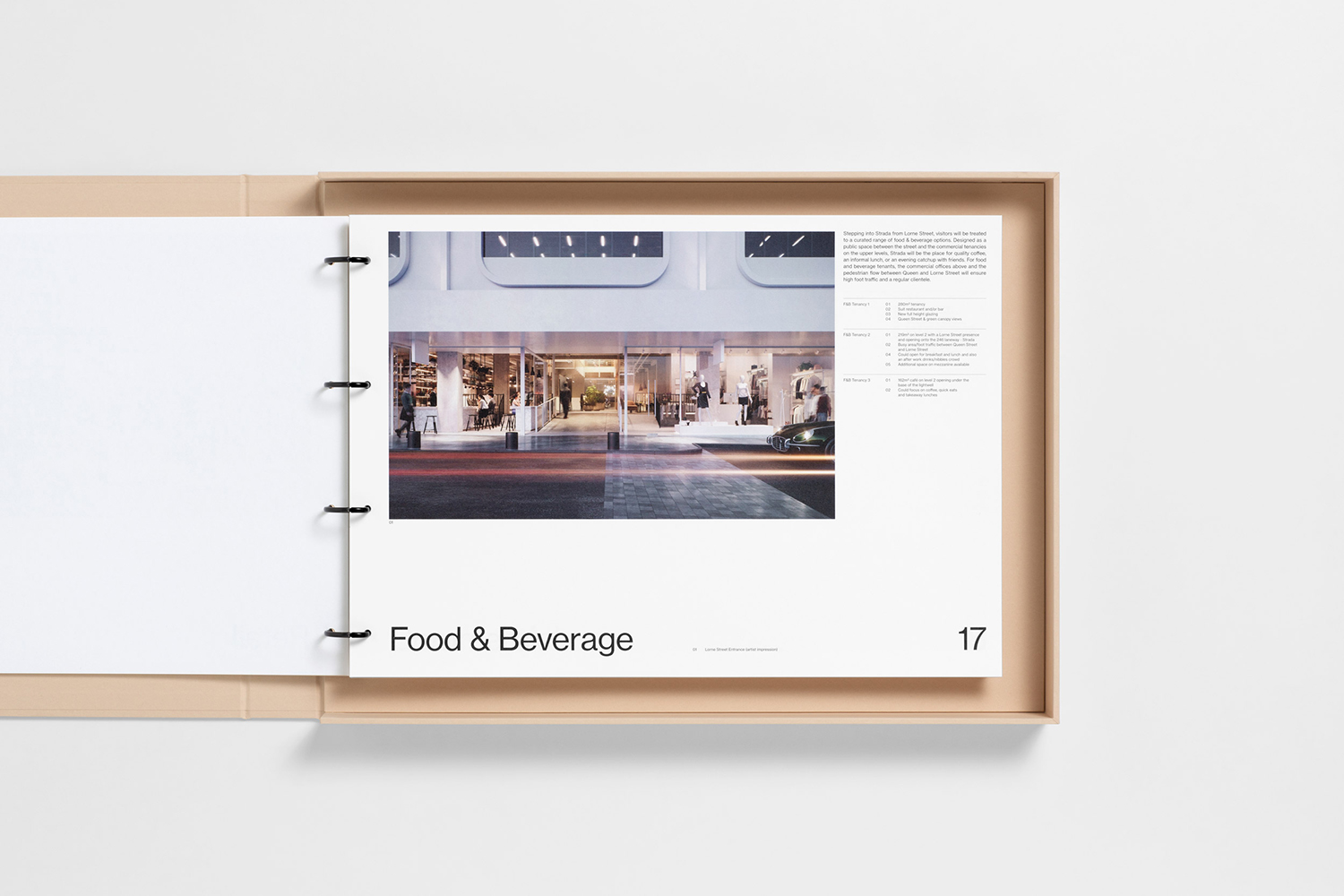
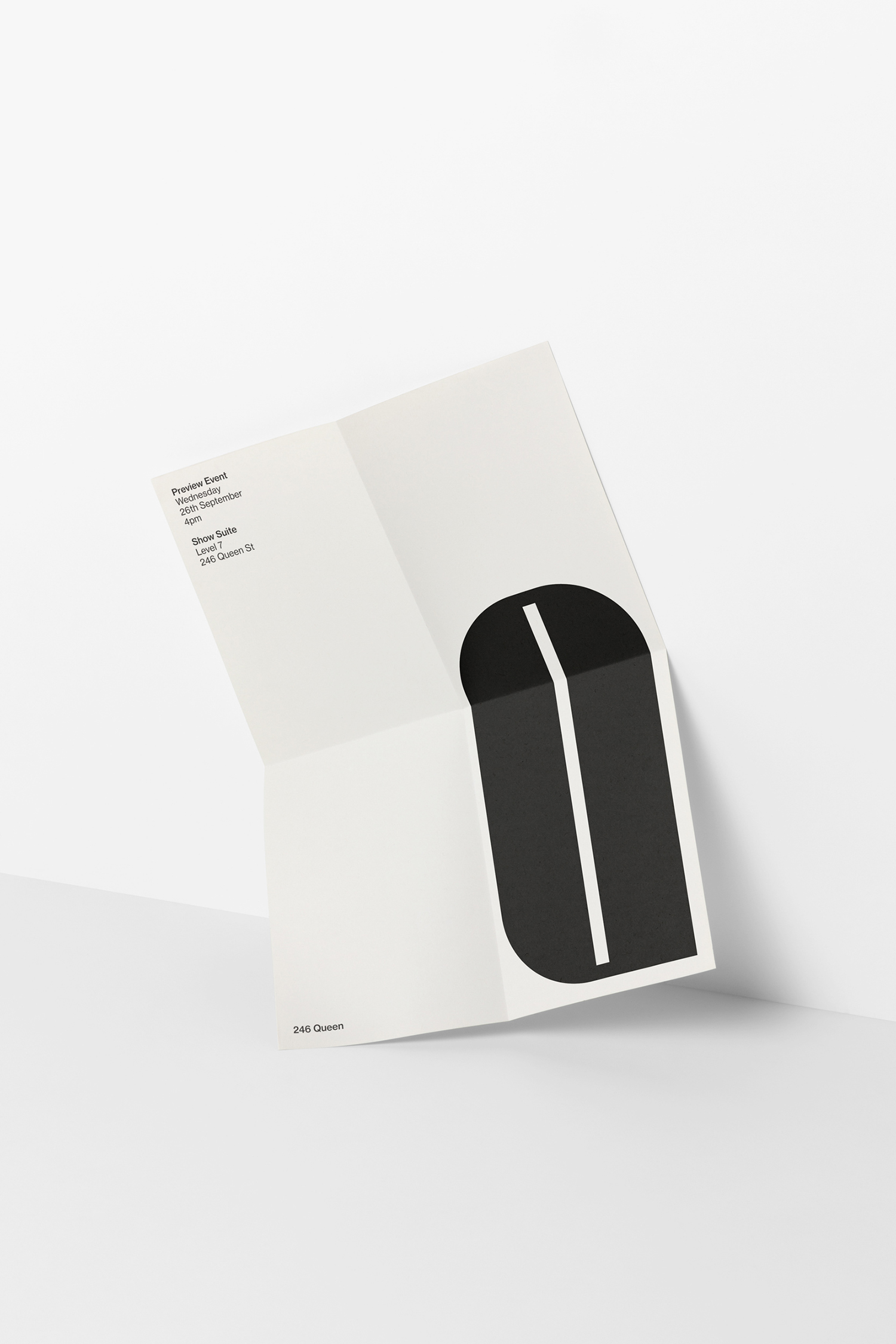
The marketing language and the graphic identity of the building, designed by Auckland-based Studio South, draws on the history and original vision of the building. This revolves around the modernist, and aimed at those that recognise or are drawn in by mid-century architectural heritage and an associated graphic history, and desire access to contemporary international food and high-quality services in building and locally. This manifests itself through type (Neue Haas Grotesk) and text, colour, material and structure, and through a graphic motif that is inspired by the building’s curved accents and large rounded windows.
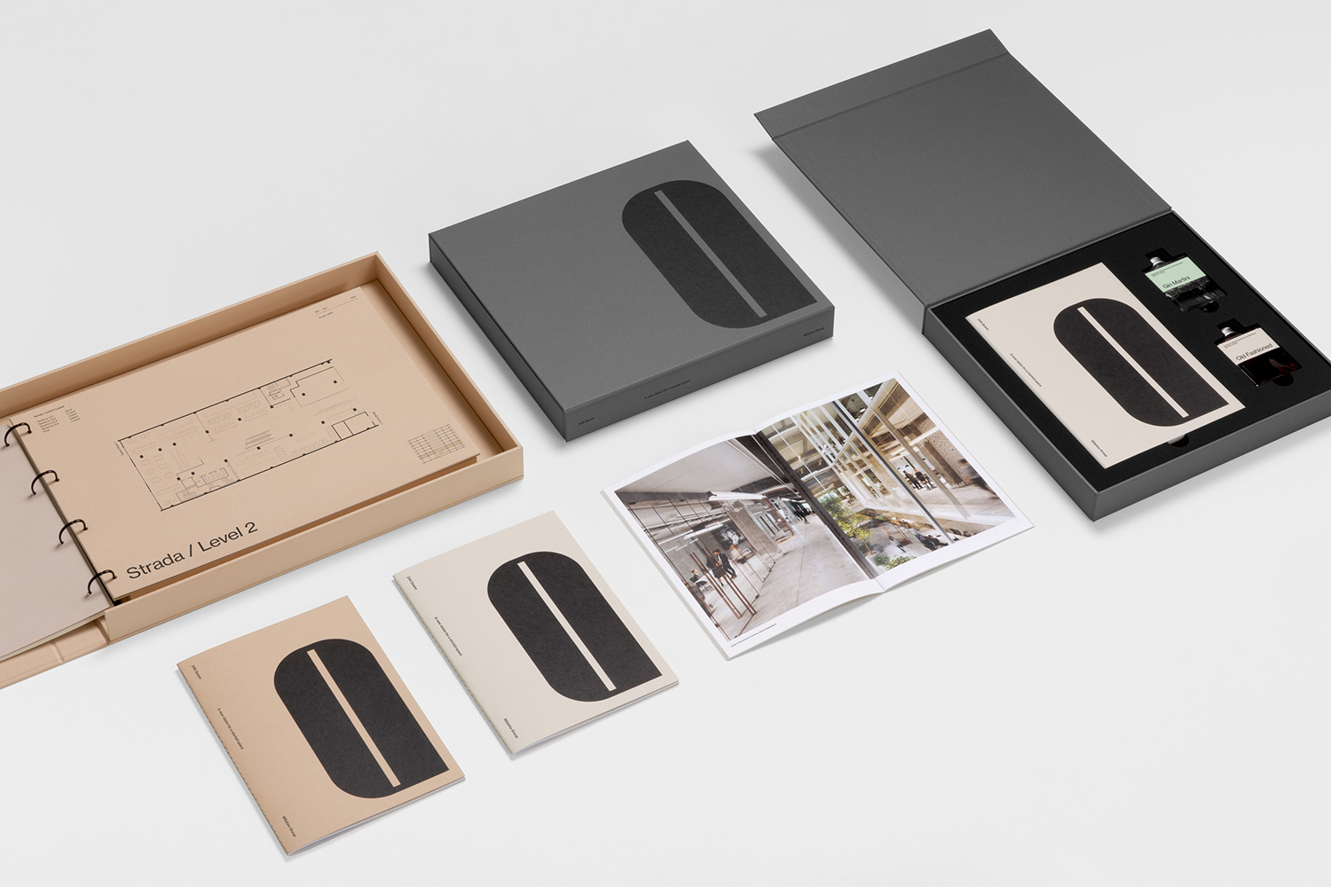
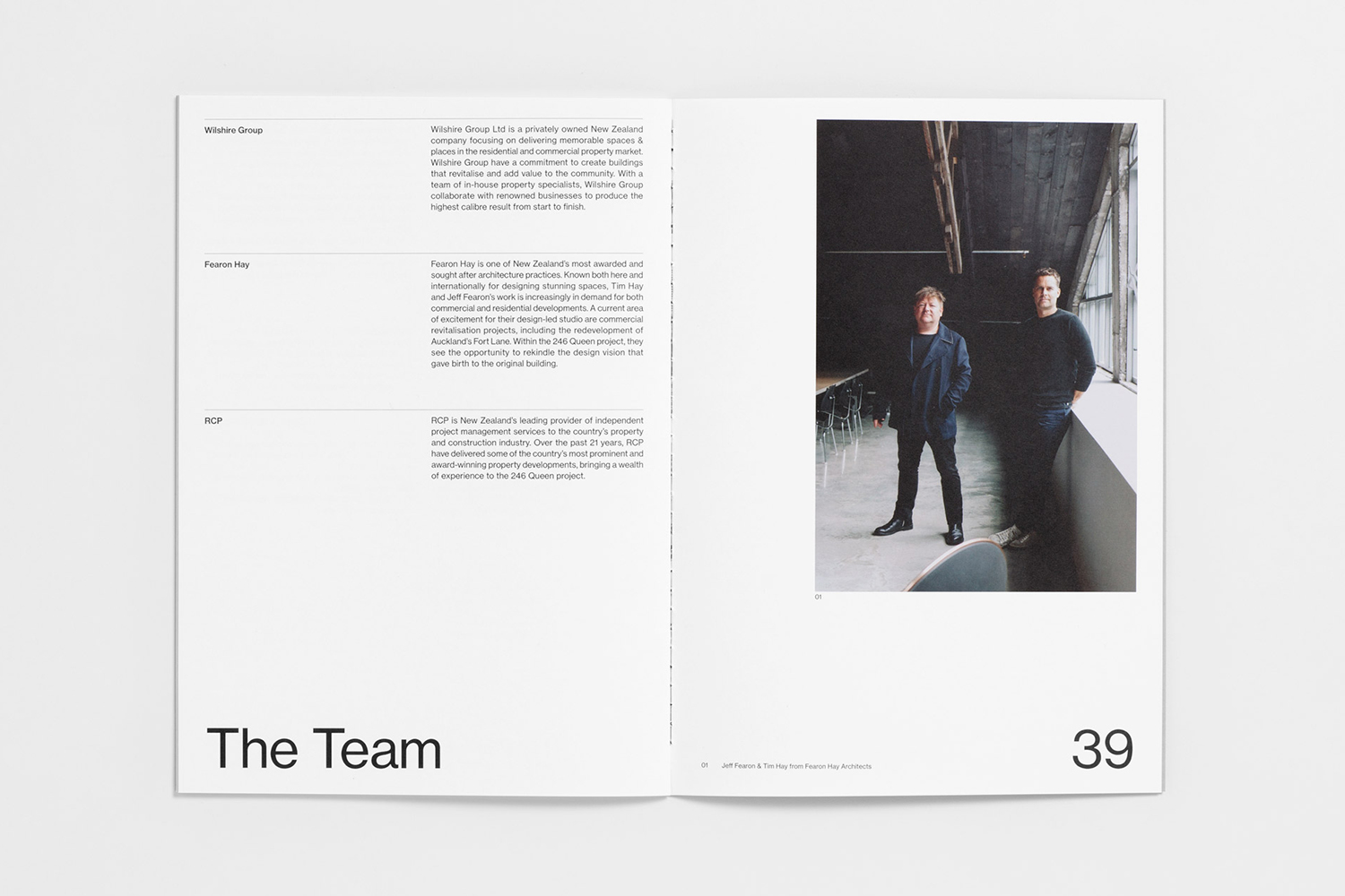
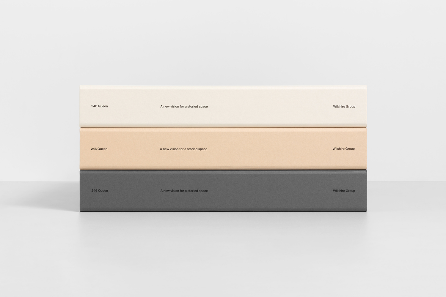
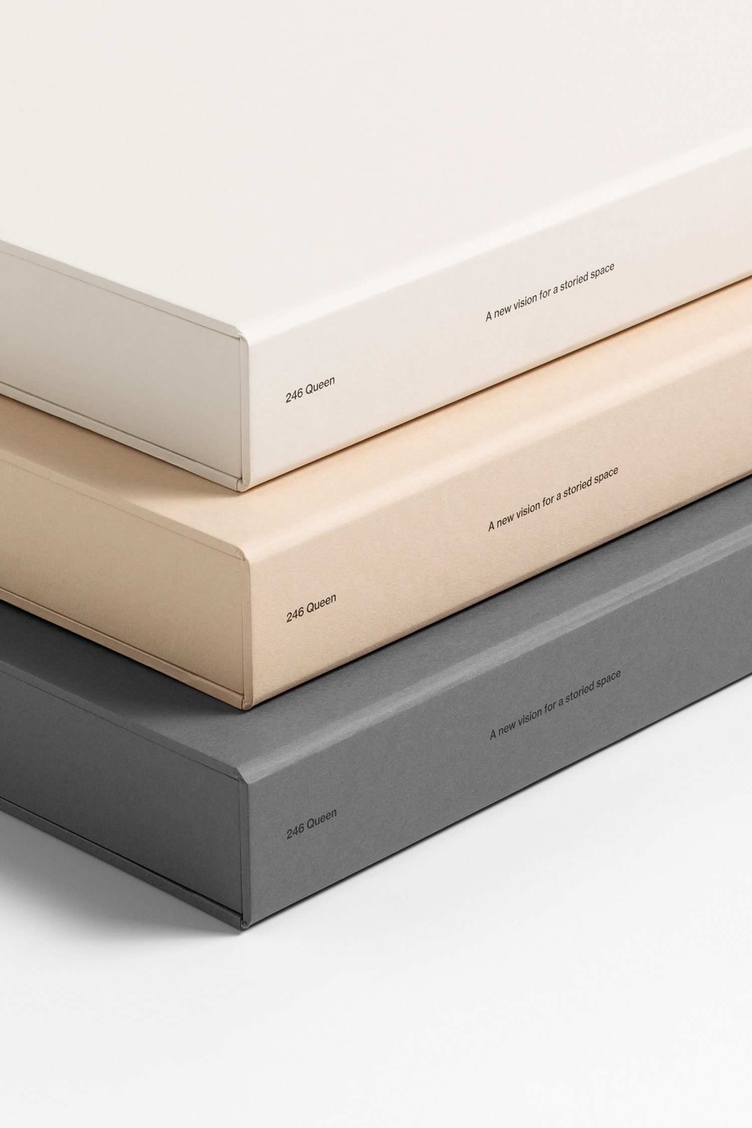
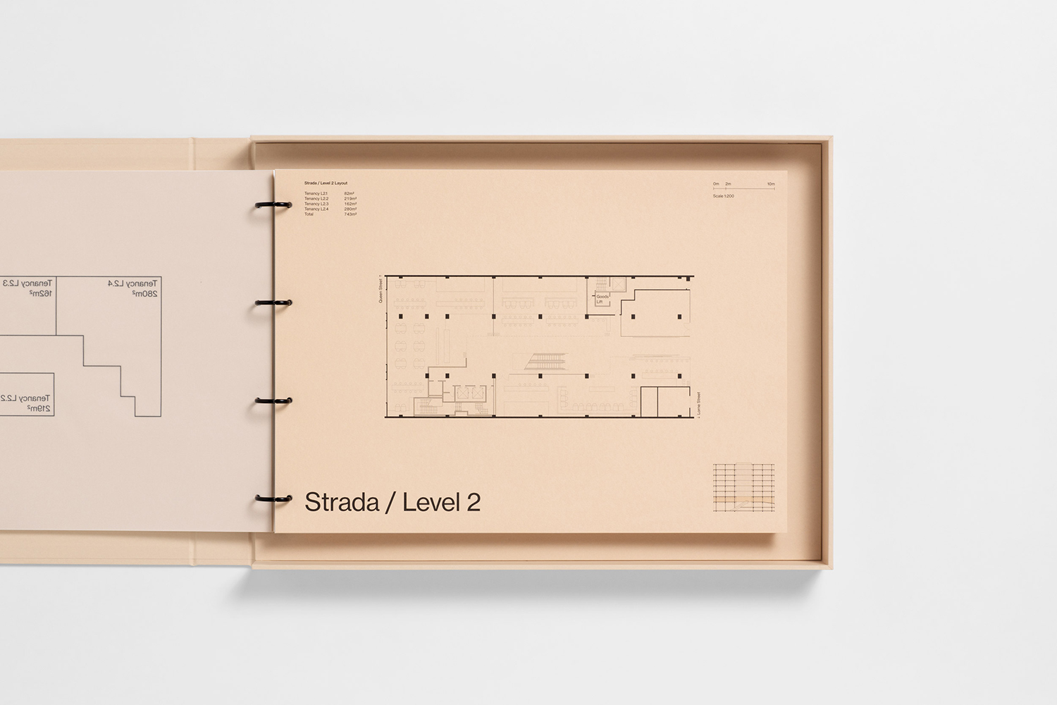
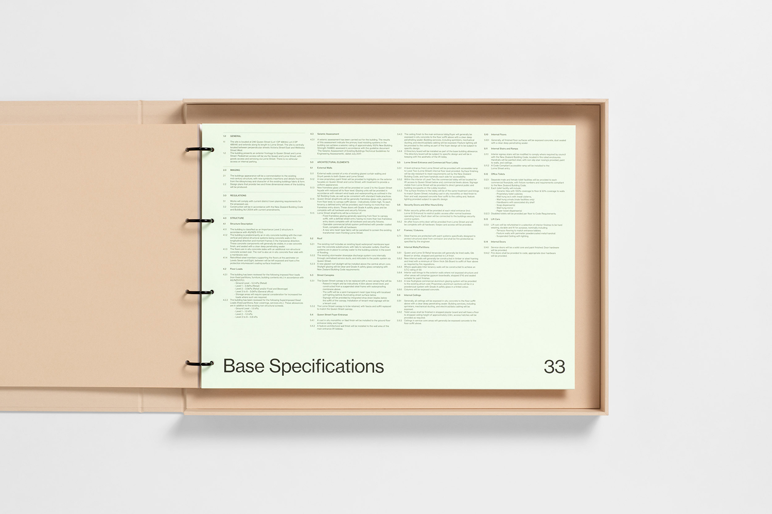
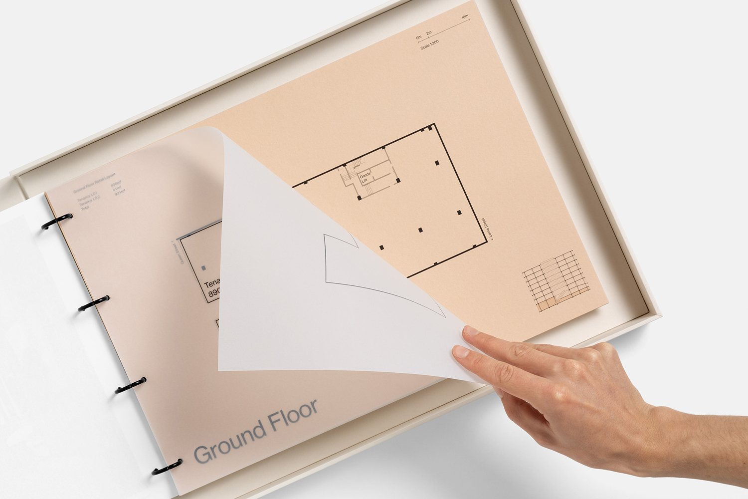
Mid-century modernism and modernist architecture, as well as the Swiss International style, are viewed through the lens of the present. This can be clearly seen in the bold and singular graphic expression; in the weight and proportionality of the Q in contrast to small and light typography which frames the space of the page. Further, in the robustness of the folders, themselves taking on an architectural quality (and contemporary design craft) in their material weight, construction and stacking, and within the colour palette, drawn from the muted tones found in Terazzo tiles and mid-century design.
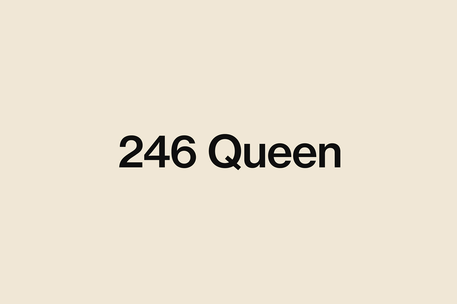
Although the logo and logotype appear as part of the fascia within architectural renders, this is clearly a marketing identity, one designed to draw in and sell the spaces to businesses looking for a prestige building with impressive amenities, and retailers that see value in space with a notable history. Perhaps graphic identity lingers in one form or another within space. In some ways, this has the qualities of a residential property programme. Layers of intangible value; local community, history, stories etc. are woven into the tangible material qualities of the architecture, and as expressed through the finishes, structure, image and texts of the marketing package.
Although the modernist architectural aesthetic is now something of a regular facsimile that crops up in many urban centres, the building has a genuine modernist heritage, developed by one of the most high profile architectural studios in the country. The visual language essentially seeks to distil down an architectural process and detail that pays homage to and seeks to reveal and revel in this history.
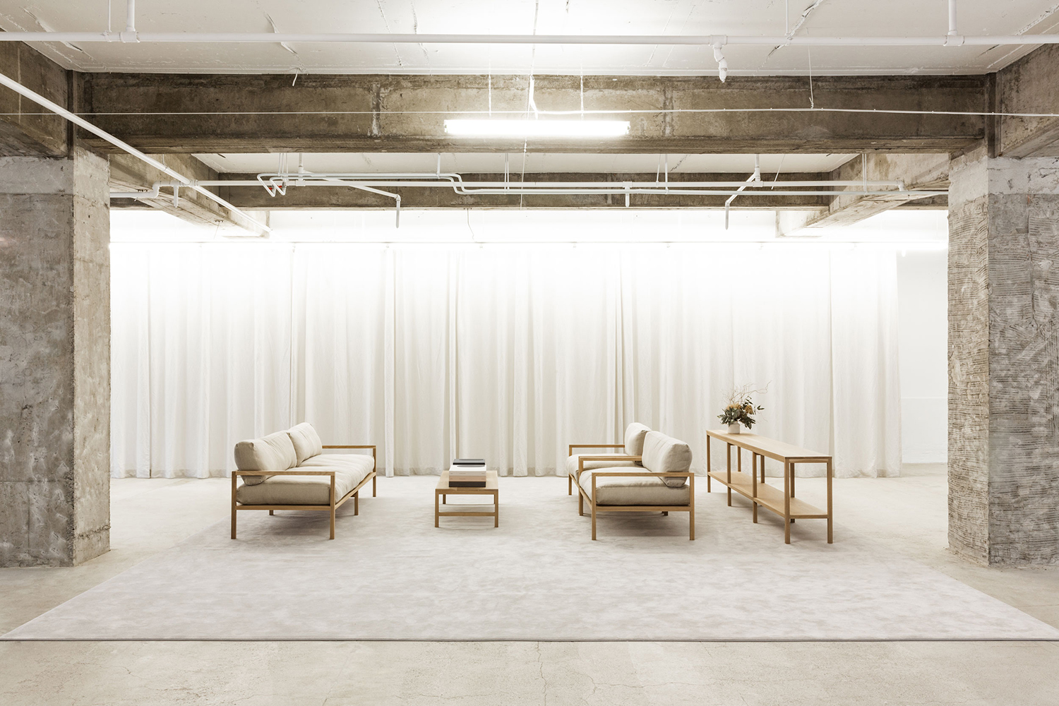
The show suite is an effective distillation of concept; an exposed modernist architectural vision of the past as a tool to frame and engage in a dialogue with the design of the present. Also, in the leveraging and elevation of an associated ideological integrity that, through its renovation and presentation, poses a question to the surface of retail and business spaces of the present, and also positions itself as authentic. This is important to understanding it visual presentation.
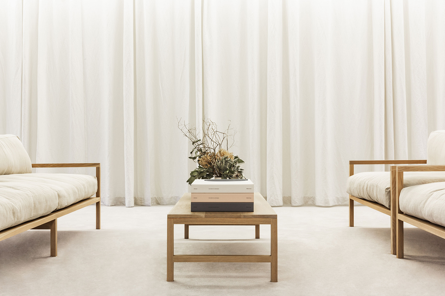
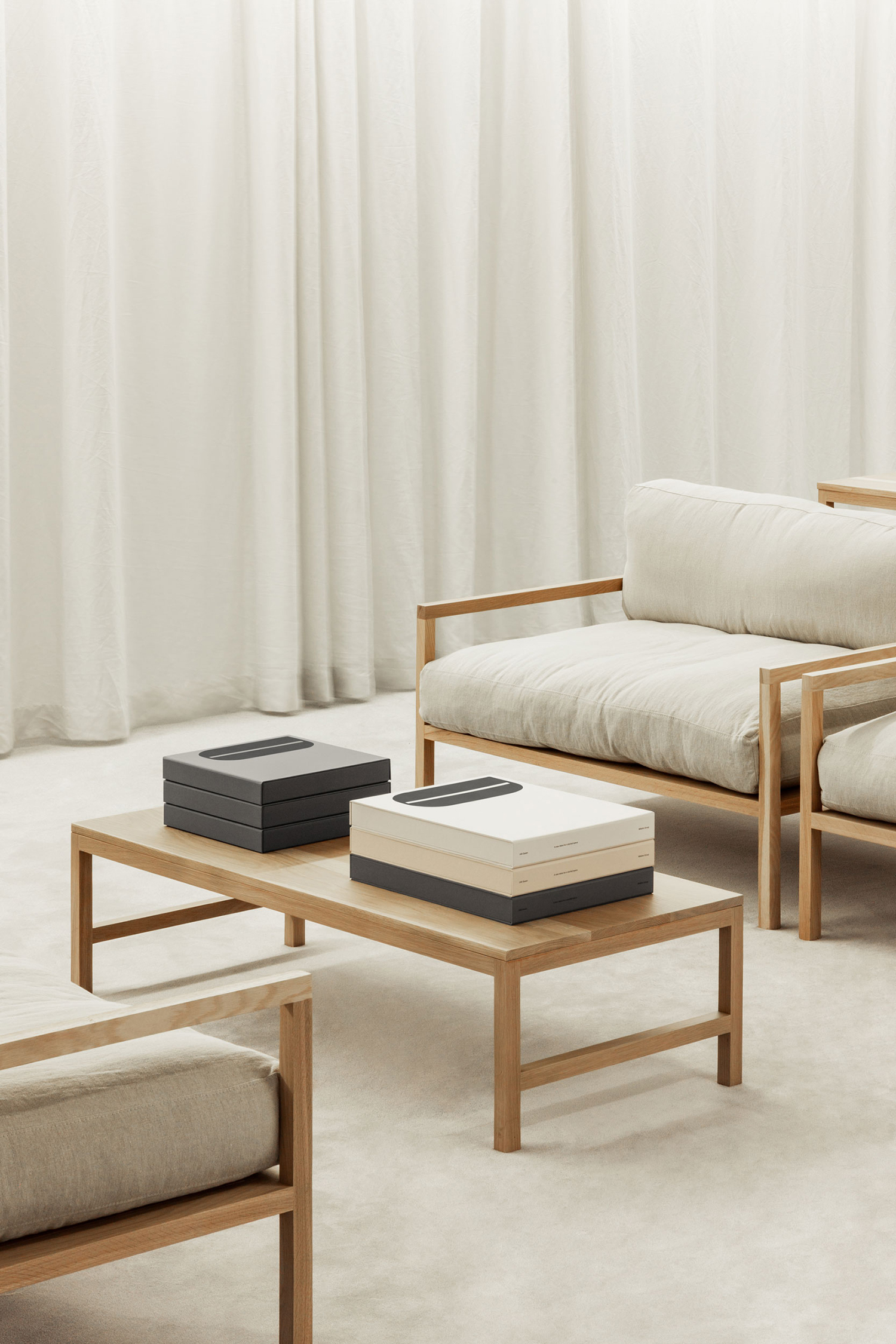
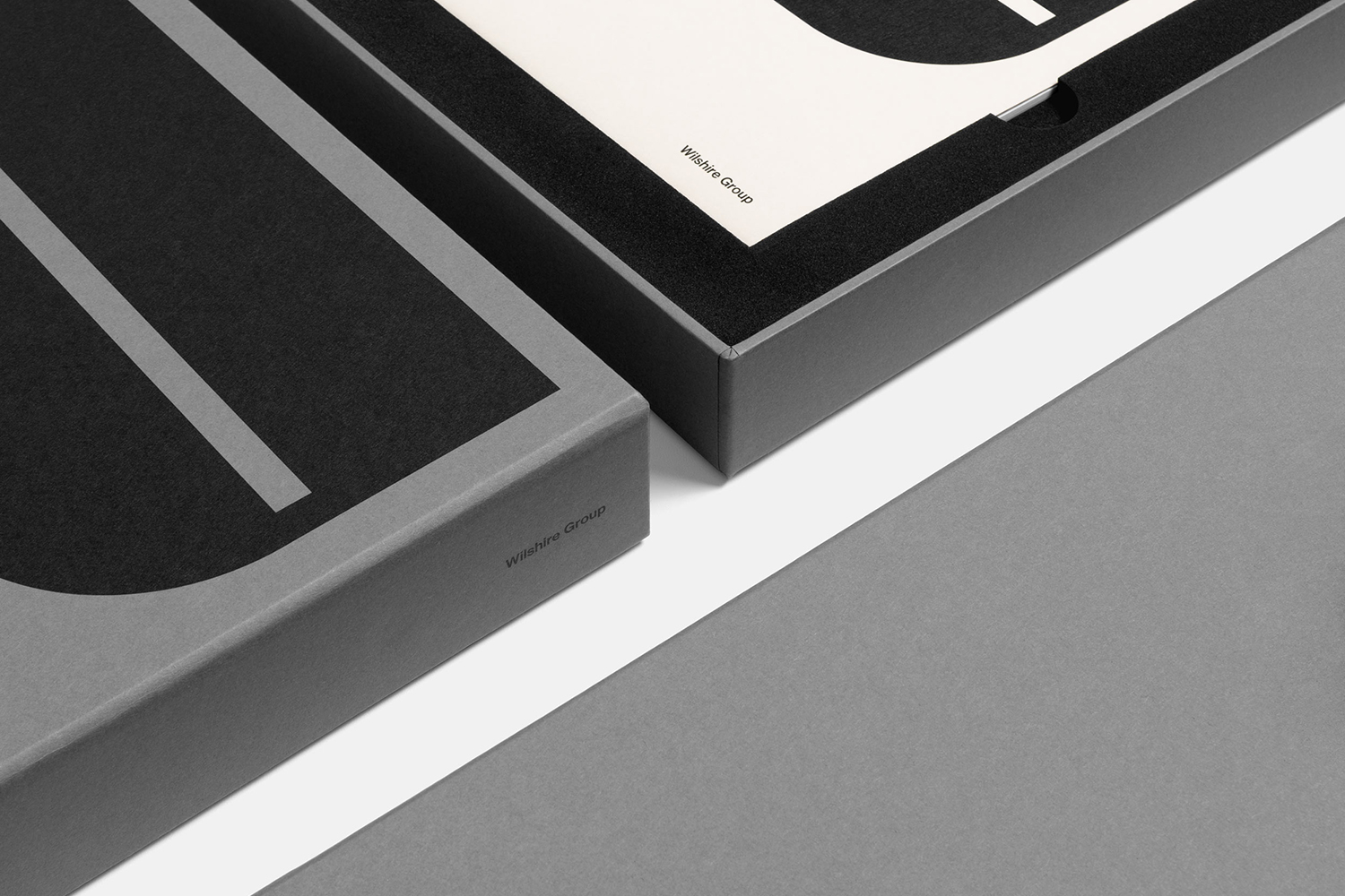
The visual language of the past is referenced and reconfigured. In this transition, it both retains and looses some of its spirit. Colour palette, logo, the proportion of Neue Haas Grotesk and arrangement of image across the brochure spreads and the yellow page with the original architectural rendering feel true to this spirit, however, there is more of a corporate utility to this, rather than the play that often characterised mid-century graphic design. This does make sense within the context of the market, which is broad, and in the need for identity to function across digital environments, as well as material surfaces. There is a clear craft at play in structure and construction of marketing objects and in the sensitivity to colour and layout. These serve to link various strategic and communicative directives; storytelling, historical, material and spatial value, and opportunity. More work by Studio South on BP&O.
Design: Studio South. Opinion: Richard Baird. Fonts: Neue Haas Grotesk
