Felt Coffee by Studio fnt
Opinion by Richard Baird Posted 24 October 2018
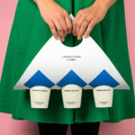
Felt is a coffee shop in Seoul with their own brand of speciality coffee which has been sourced by way of direct trade and roasted in Gyeonggi-do, a populous (relevant later) province of South Korea. They opened their first store in September 2015 and a second in October 2018. The team at Felt see every part of the coffee experience; its growing, harvesting, sourcing, roasting, preparing, branding, packaging and spatial experience as part of a total project, visiting coffee-producing regions to handpick raw beans, engage the quality control of professional green bean buyers, cuppers, roasters and baristas, in the creation of thoughtful space and in the commissioning of Studio fnt to develop visual identity.
Drawing on the experience of drinking the same coffee in the same space, a shared feeling but peripheral connection, Studio fnt worked with Felt to develop a visual identity and packaging for its coffee ranges. This is characterised by the simple and textural, and the precise and immediate, unified by a thoughtful and subtle concept, the use of intersecting lines and the demarcation and crossing of space.


In the design of the visual identity Studio fnt drew on the unusual spaces of Felt. The studio noticed that there were no tables or movable chairs, only one long built-in bench around the walls, unusually on the periphery of interior space. That, although not sharing words, people were exchanging glances, participating in and acknowledging a shared experience. This reminded the designers of Trading Cities 2, a passage within Invisible Cities by journalist and writer Italo Calvino.
“In Chloe, a great city, the people who move through the streets are all strangers. At each encounter, they imagine a thousand things about one another; meetings which could take place between them, conversations, surprises, caresses, bites. But no one greets anyone; eyes lock for a second, then dart away, seeking other eyes, never stopping ( . . . ) Something runs among them, an exchange of glances like lines that connect one figure with another and draw arrows, stars, triangles, until all combinations are used up in a moment and other characters come on to the scene ( . . . ) A voluptuous vibration constantly stirs Chloe, the most chaste of cities.” – INVISIBLE CITIES / Chapter Three. Trading Cities 2.
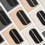
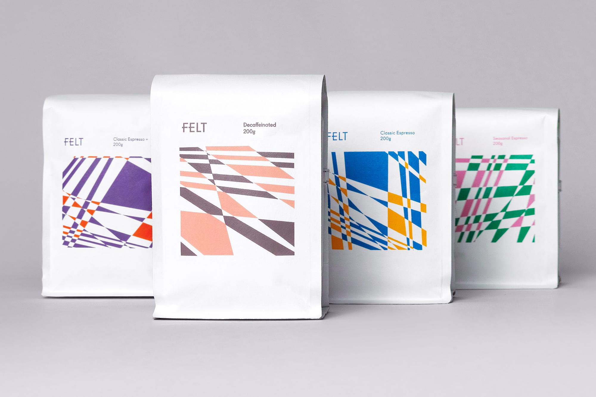
This crossing of social boundaries, fleeting connections made through glances, through a line of sight rather than verbally, as well as the words “exchange”, “connect” and “flow”, and the arrows, stars and triangles that form in these invisible exchanges, are materialised as lines, fills and voids that allude to paths. The resulting graphic itself interrupts line of sight, and perhaps direction, through the eye-catching and visually pleasing. Further, and into the meta, the hashtag becomes a secondary reference point, emerging in the crossing of lines, and as a symbol of something special; musical notation, the shared flow of an Instagram or Twitter conversation etc.


The original Felt wordmark is folded into this new concept and visual language by way of simply extending the central horizontal bars of the F, E to the right, allowing lines to cross the thresholds of the vertical and connecting the two letters through the symmetry of approach. In this sense, the wordmark is given a little more character, while the concept of direction and flow, line of sight, and a shared feeling is furthered.

The irony of intense crisscrossing telephone lines in densely populated neighbourhoods of Seoul yet the reluctance to connect with strangers in a spatial sense is an additional reference point for the artwork, a subcontextual and largely invisible detail yet again grounded in concept, and in some ways a question posed. This resonates well with the white coffee pack and white square label as a canvas for artistic expression. On the surface, the use of fills and voids, and the complementary colour of some of the labels are visually appealing. As simple but immediate graphic gestures they also serve a more commercial imperative, asking for consideration and as a tool to develop an emotional connection with brand. More work by Studio fnt on BP&O.
Design: Studio fnt. Opinion: Richard Baird.