Teatulia by Here Design
Opinion by Richard Baird Posted 6 November 2018

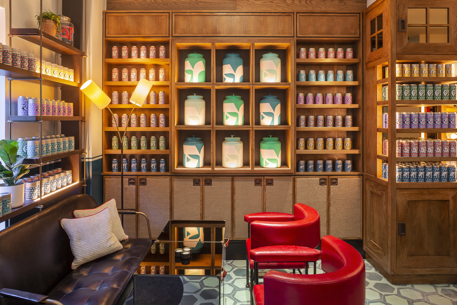
Teatulia is a Bangladeshi single origin tea brand that recently moved into the UK market, opening a flagship store, tea shop and cocktail bar in London’s Covent Garden. It is a social enterprise creating jobs in a remote region of Bangladesh and has, so far, transformed 3,000 acres of barren land into an organic tea garden. Drawing on Teatulia’s single-source positioning—common for coffee but unusual for the tea market—Here Design developed a graphic identity that, through colour and form, and inspired by the work of renowned Indian filmmaker and graphic designer Satyajit Ray, is infused with Bangladeshi culture. This intersects an elegant interior design of warmth and texture by way of packaging and window decals.

Here Design’s work is a significant and refreshing departure from Teatulia’s graphic identity as it exists outside of the UK. This could be characterised as a trite and forgettable visual expression of an organic product, locally farmed and born of a social enterprise. Outside of the UK it also suffers from an absence of any form of design craft.
As Teatulia moves into the UK it finds, through a new visual language and approach to retail and hospitality space, a stronger and more distinctive voice, and an intelligent balance between an urban liveliness and refinement.
Although the project seeks to make an authentic connection to the culture and origin of the brand it also recognises and acknowledges the market and locality it is now entering, viewing this culture through a contemporary European lense. That is to say, it distils it down into a concise gesture. This fits with the single origin of the leaves and, in its simplicity, is communicatively direct and capable of bringing to life the variety and experience of full-bodied flavour through vivid colour.

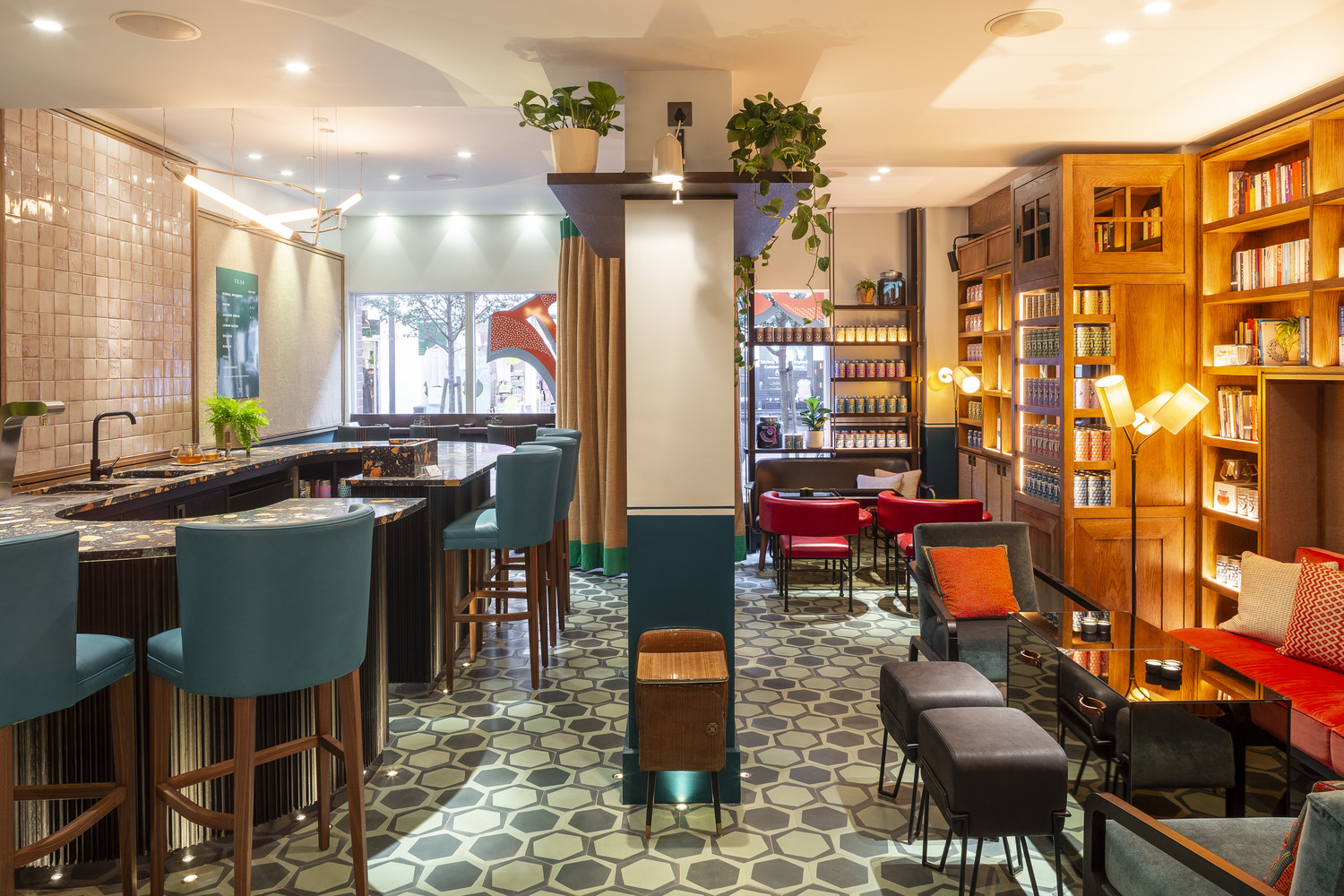
BP&O typically seeks to order images in a way that places the strongest and most influential asset at the top and follows this with the more granular detail. However, here, there is an interesting interplay, balance and dialogue between the interior design of the flagship store and graphic identity, although graphic identity reaches further afield. That, to place one above the other would be to misrepresent the ambition of the project and the potential of the brand, in response to this, these are interwoven.
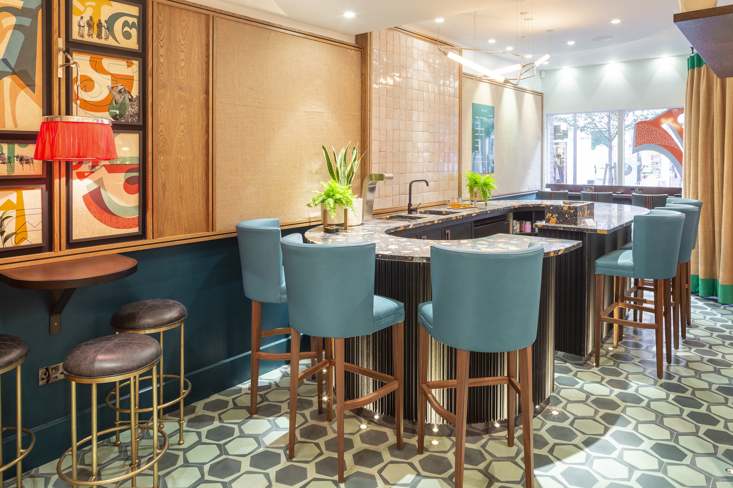
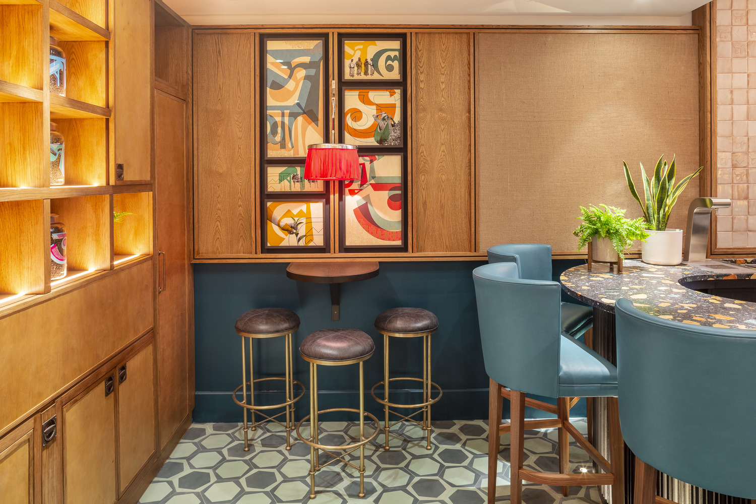
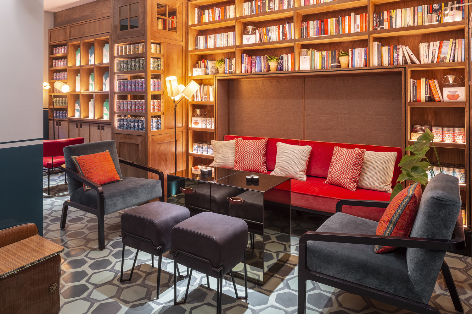
Interior design is marked by, not just a balance of warm lighting and inviting texture, modern colour, shape and natural material detail that reference the local landscape and the hessian bags used to move tea, but also its spatial planning, in the creation of distinct spaces and communal experiences within a very small floorplan. The highlight here is the way in which these are connected yet differentiated. In Bangladesh tea is considered a social event, it could be an occasion for debate or laughter, these different areas appear to recognise this, as well as the transition from hot drinks during the day to alcohol-infused creations in the evening, clearly a contextual sensitivity to Covent Garden. There is, perhaps, a question of flow with regards product and takeaway purchases.
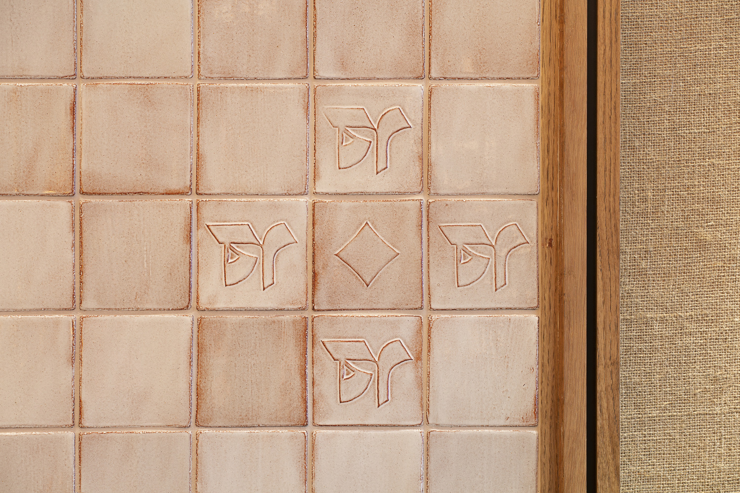
At times graphic identity and interior design come very close to meeting. Much of this has to do with shape and colour, but also in the implication of motion. This can be seen in the floor tiles, in the overprinting of image and Bengali script and the suggestion of direction within the background patterns of packaging. This is tempered by a midway point, marked by the height of the bar, in which the finer material details of counter and graphic pattern of tiles meets a calmer palette of wood and traditional tiles.


Where retail space offers a sophisticated and refined tea drinking experience—the implication of intellectual reflection in the bookcases filled with books selected by actress Tilda Swinton, something akin to the past in spirit but thoroughly modern in its application—graphic identity imposes itself, rather effectively through packaging and supergraphics that lean into the visually immediate and urban.
Through colour and the repetition of form graphic identity delivers an impact, energy, visual flavour and, in its reference to the jewel-like colours of the clothing worn by the local Bangladeshi women working in the tea garden, offers something of a very specific and singular connection to the origins of the tea. This is elevated and made more distinct in the use of spot colours and the maximum use of surface area of packaging structures.
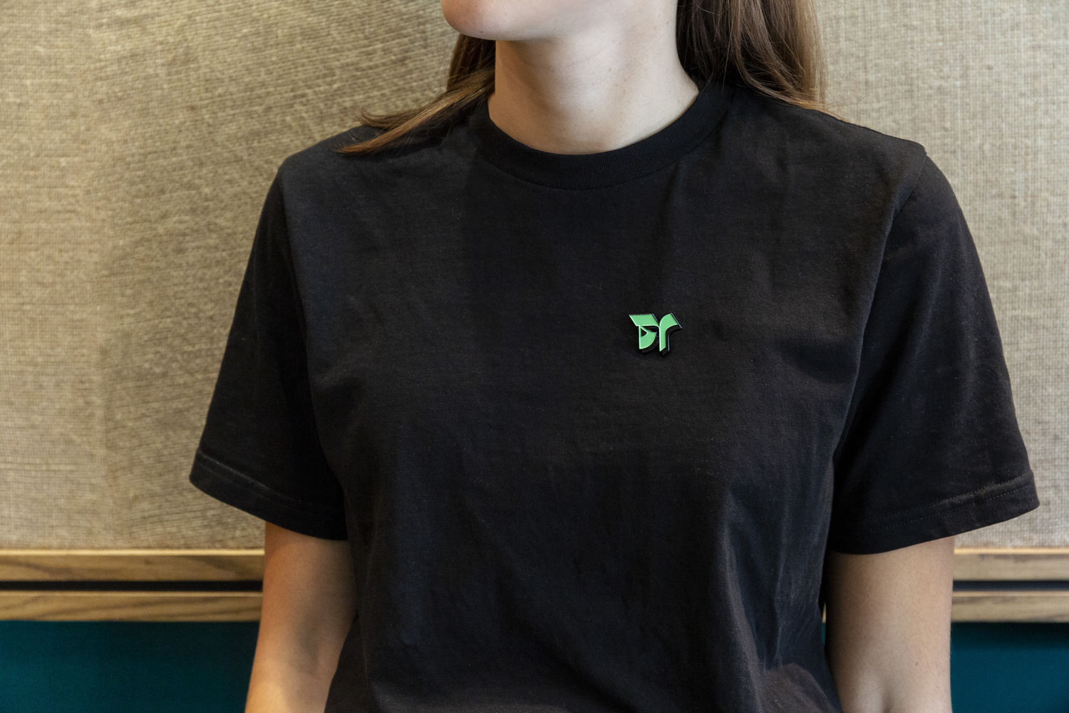
Logotype sits on the periphery to graphic pattern, with the first characters of each variety placed at the forefront, becoming both a tool for differentiation and a graphic impression that is developed beyond just a logo.

Just as the repetition of the patterns brings a strong visual character to each vessel, the collective impression of vessels, aligned within space, brings a further layer of personality to space.
The proportionality of the logo and the single letters of the packaging–the first letter from the name of each variety written in Bengali script–makes for a distinct graphic expression clearly rooted in origin. There is something of a mid-century modernism in the bright solid colours of the tea caddies and the way the logo has been cropped, becoming shape rather than character, that again acknowledges the move into a Western market.

The result is an interesting interplay of eye-catching graphic identity and elegant interior design. There is an appealing and distinct interplay between these, a confidence in their dialogue, moments of symmetry and difference that develops a communicative breadth. Packaging also holds up outside of space, set alongside other tea brands within stores such as Harrods. This moves the brand far beyond the conventional and tired use of leaves and floral patterns, embraces its origins yet acknowledges its new context. More work by Here Design on BP&O.
Design: Here Design. Interior Design: Russell Sage Studio. Opinion: Richard Baird.