Heyday by Collins
Opinion by Richard Baird Posted 7 December 2018
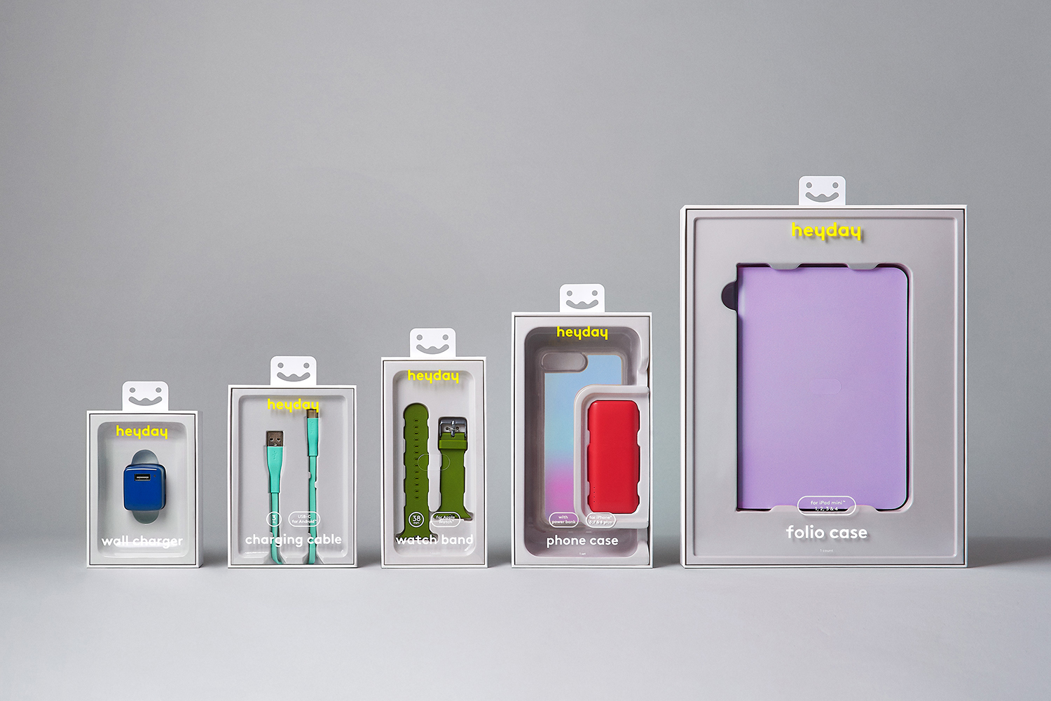
Heyday is a range of 150 moderately-priced high-quality own-brand consumer tech products from American retailer Target and their first foray into the electronics and tech accessories sector. The range includes battery packs and chargers, cables, covers and wireless speakers amongst many other products. These share a form language that balances an everyday simplicity, robustness and utility with novelty and cheerfulness by way of shape, colour and materiality. Heyday’s visual identity and packaging design, developed by New York and San Francisco-based Collins in collaboration with Target Creative, is deceptively simple, it is loaded with a bunch of neat ideas that recognise, not just how product is presented and its value and functionalities communicated in store, but also how these products migrate and seek attention online. This can be seen in the approach to product, packaging and lifestyle photography.
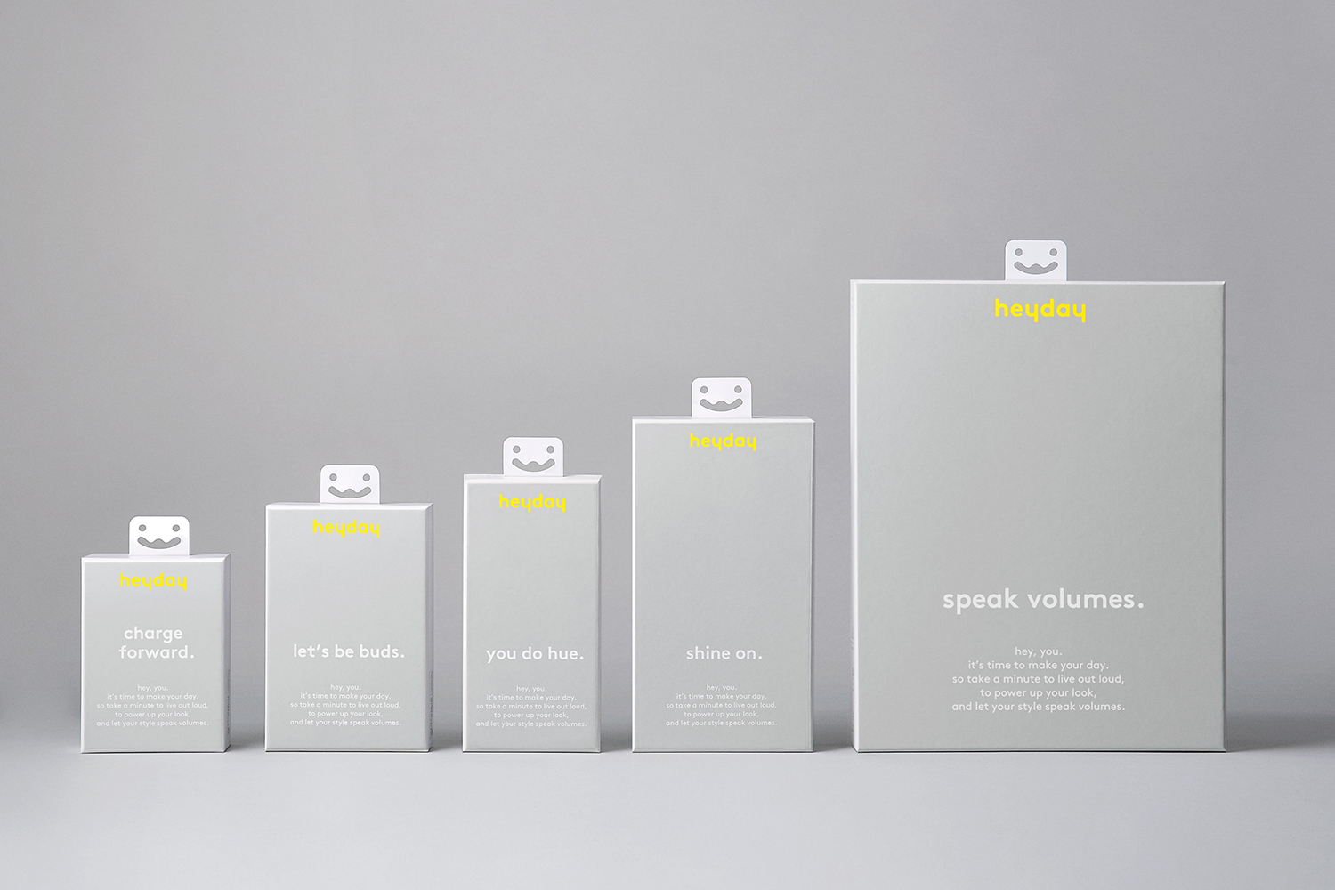
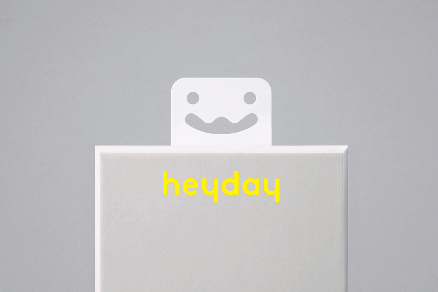
Much of the commentary online has been about the euro slot (the cut that allows the products to be hung on store pegs) and rightly so, it draws delight from the banal, distinction from ubiquity. It does not feel frivolous in that it shares something in common with a product range that elevates the invisible or overlooked tools that give or extend further life to tech products by way of a cheerfulness. It is a feature that catches the eye in its unexpectedness, and by extension asks for consideration. However, there are a few other details that are subtle but equally as thoughtful.
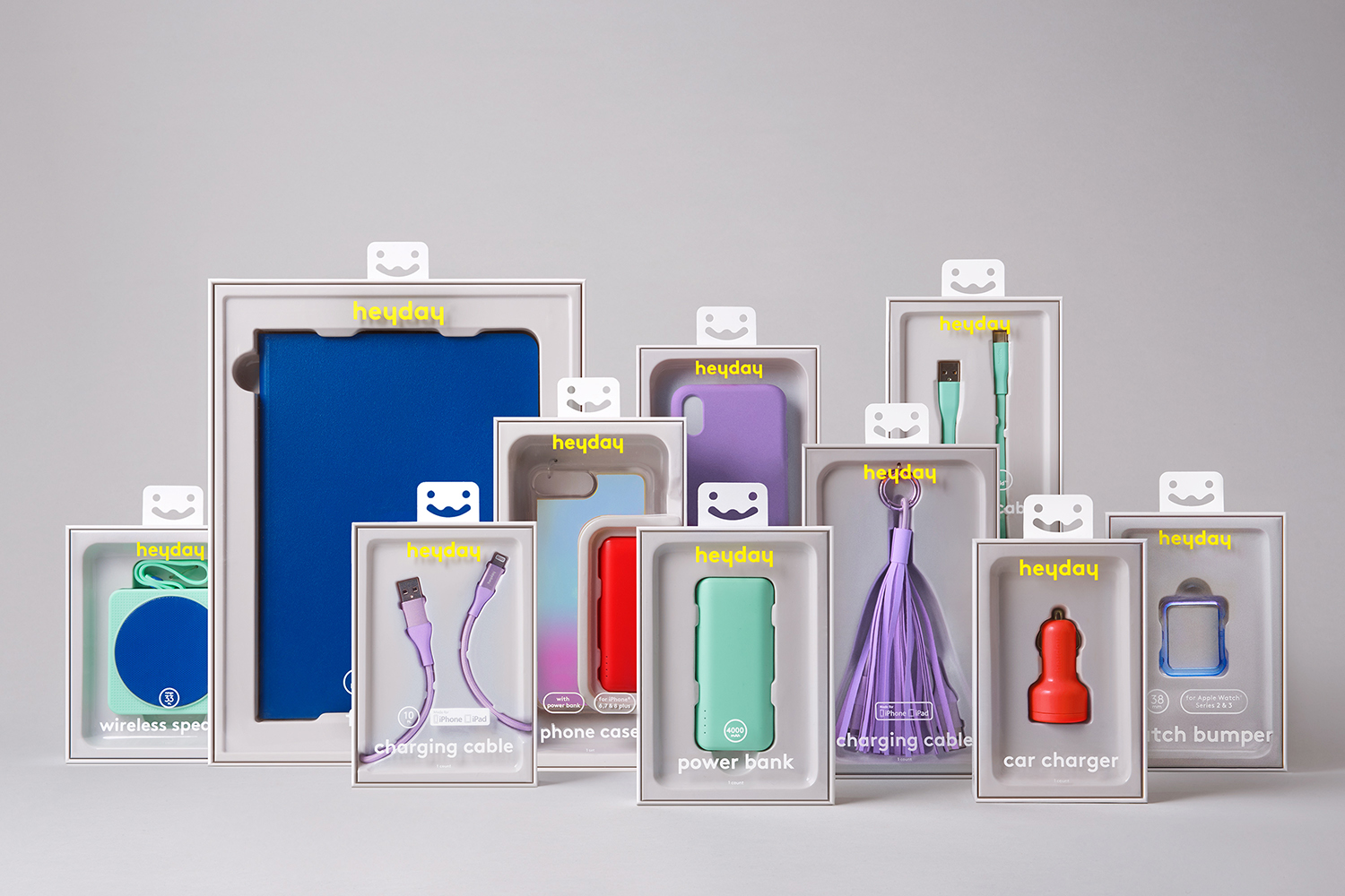
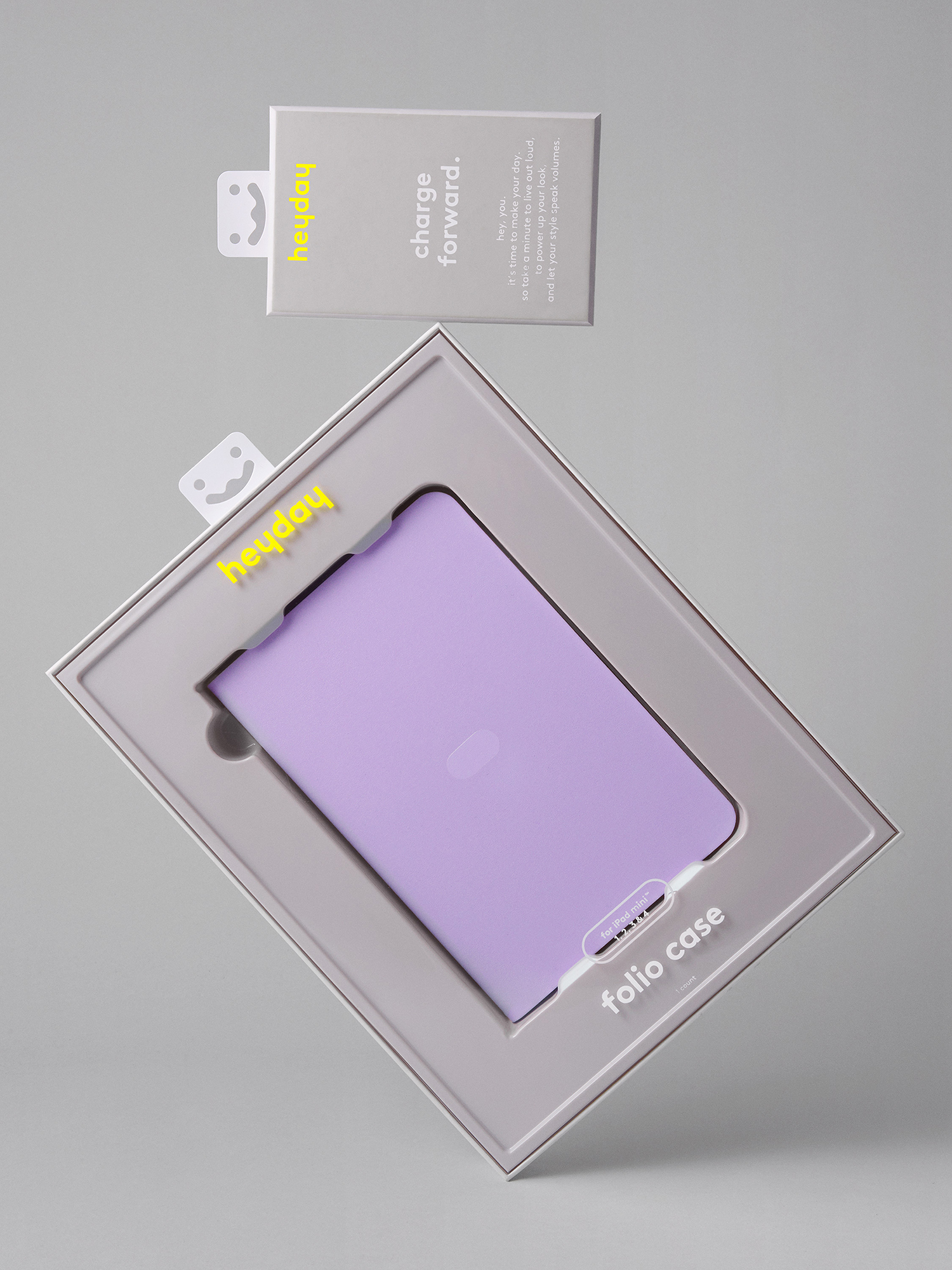
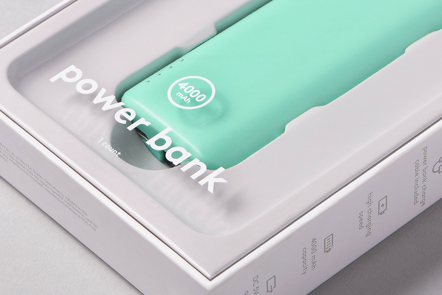
Brand is very much, and impressively so, in the extent to which the form language of the range is present throughout. Recognising this continuity of form, colour, surface and materiality Collins’ visual identity, as it exists as packaging, frames products effectively, not just using graphic techniques but in the light and shadow of a recess, in the use of a clear lid to layer text over product (dissolving the threshold between packaging and product) and in the use of a light grey tray.
The logotype manages to distil down the spirit of the range in the reductive geometric forms of type, the bright yellow of its application (standing out from the many product colours), and in its positioning below the smile of the euro hook. This latter detail is important as the registered trademark is the hook rendered as a graphic motif above the logotype.
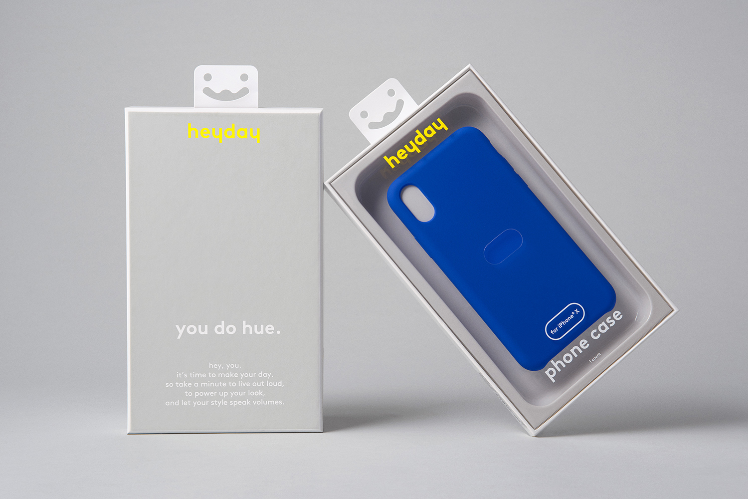
Back of pack furthers the visual character of brand in the confluence of type and words. The tone is informal and convivial, its placement unassuming but present. It is difficult not to attribute this voice to the face of the euro hook. Where the barcode goes is a question, and could have easily been part of the solution, even by way of a sticker.
Copy Opinion by Seth Rowden
Cool name. Heyday – meaning the high point of success, popularity etc. – speaks to a younger audience and has a feel-good, “live for the moment” ring about it. In the wrong hands, the bubblegum colours might be paired with an awkward first-person voice punctuated with exclamation marks, but not here. The descriptions on the front of the packs are short and simple nouns, uncluttered and transparent. The use of all lowercase letters and the second-person voice create a relaxed, conversational style that borders on the abstract. There is an almost hypnotic rhythm to the “hey, you” longer copy that feels like a poem or a pop song, or even a sleeve note. This suits the products themselves; accessories for phones, which we use to play music. The words “loud” and “volume” add to this impression. These five lines on the back of each pack are the highlight. They lend themselves to expressive copy, and I believe this is where the brand can establish a distinct voice over time.
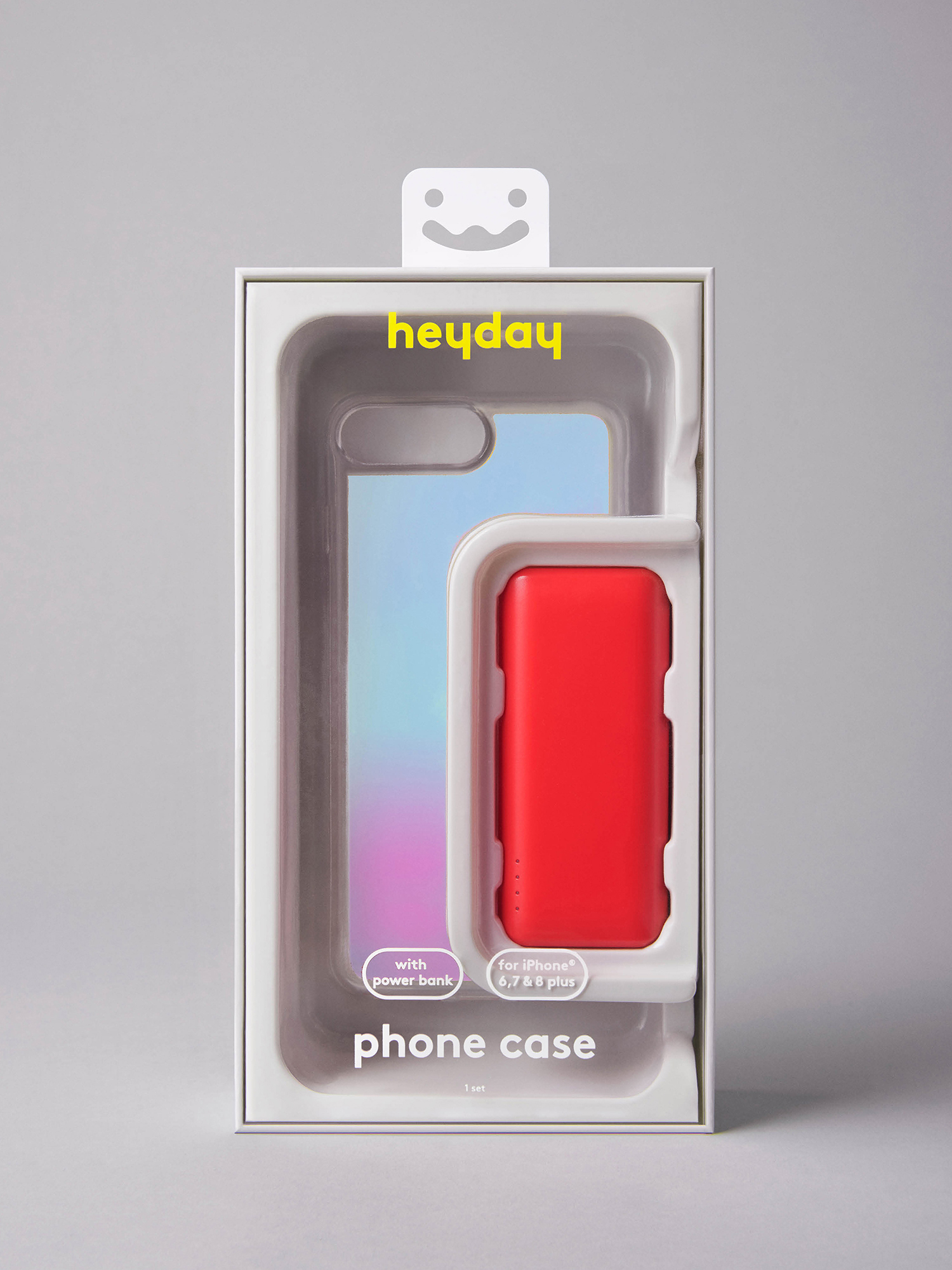
There is, of course, the further question of material excess in the relationship with the constant reconfiguration of the iPhone annually (and continuously when considered collectively as an industry) and the endless outpouring of related ancillary products. Although the range is low-cost its packaging seeks to infuse product with more in the way of an intangible and less disposable value. It is not a solution to material waste but helps to reconfigure consumer understanding of value with the longterm in mind.
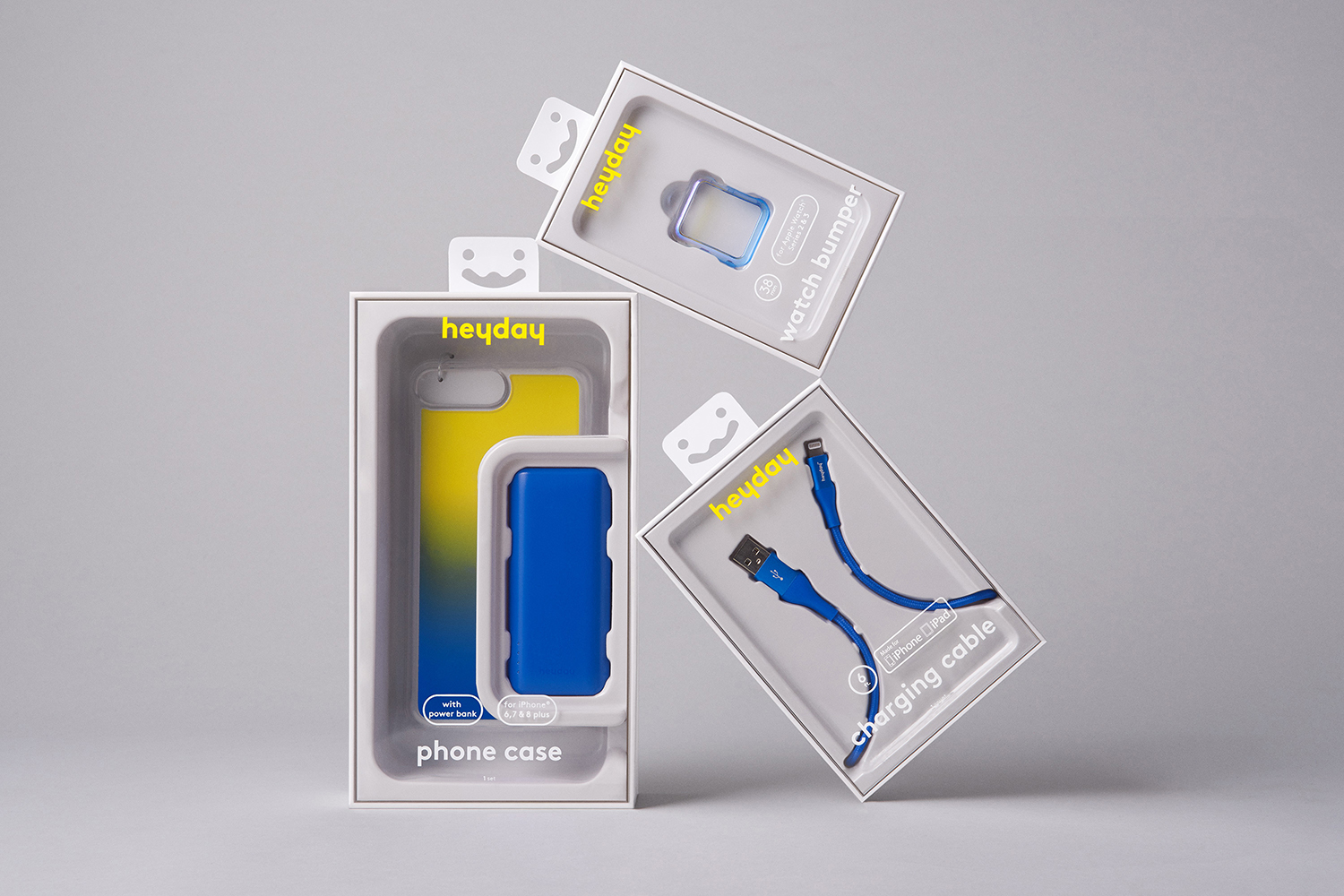
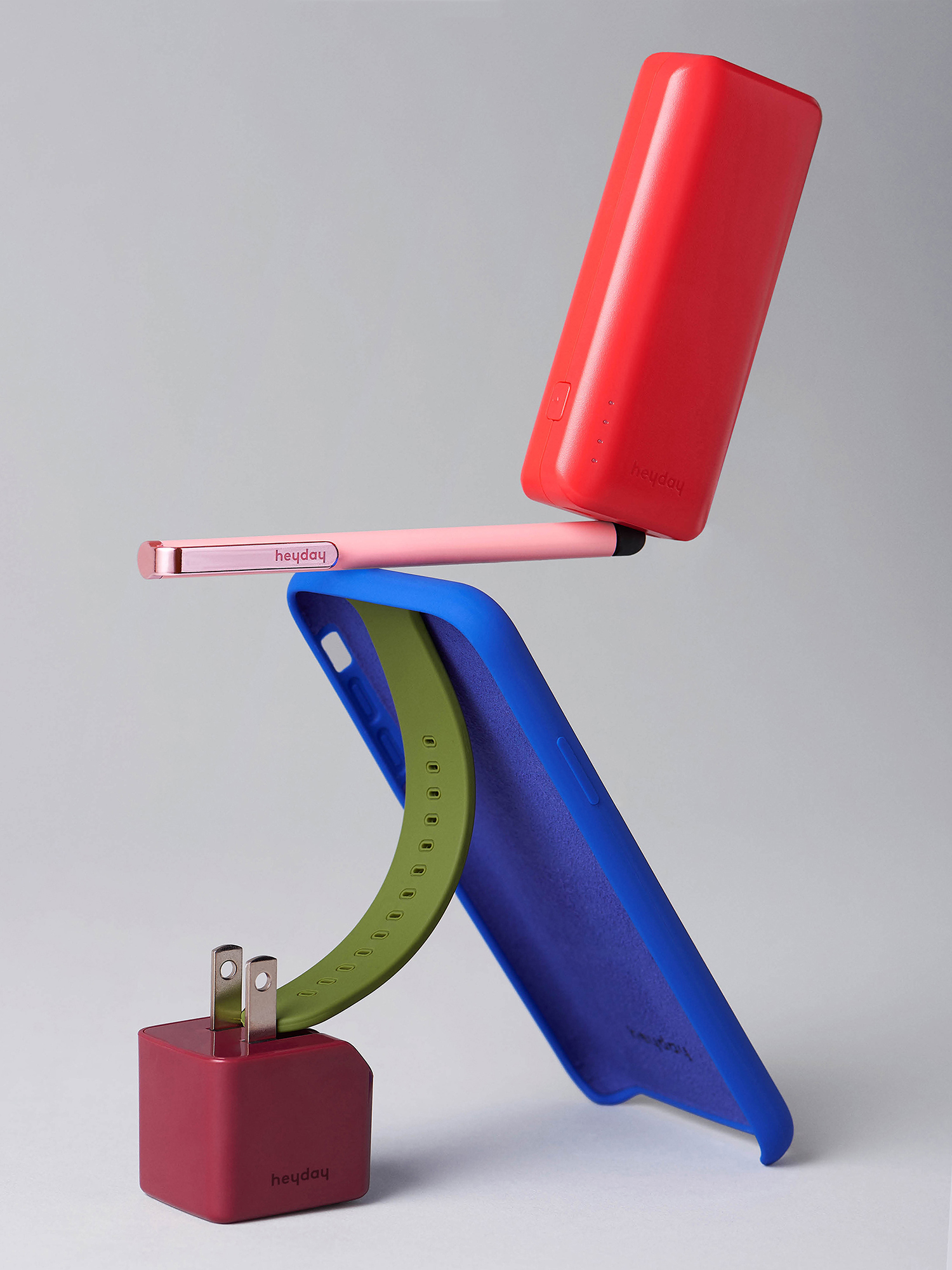
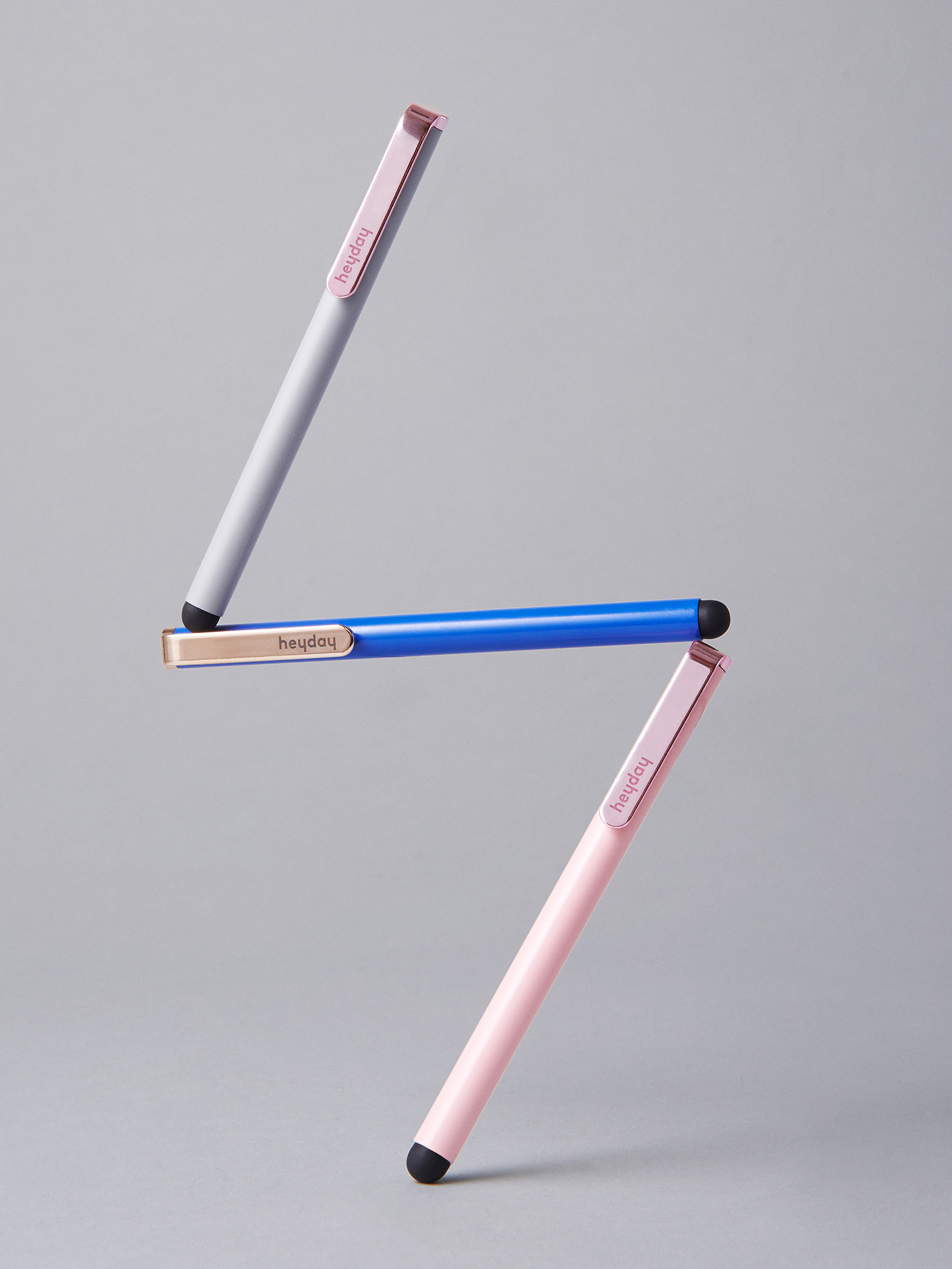
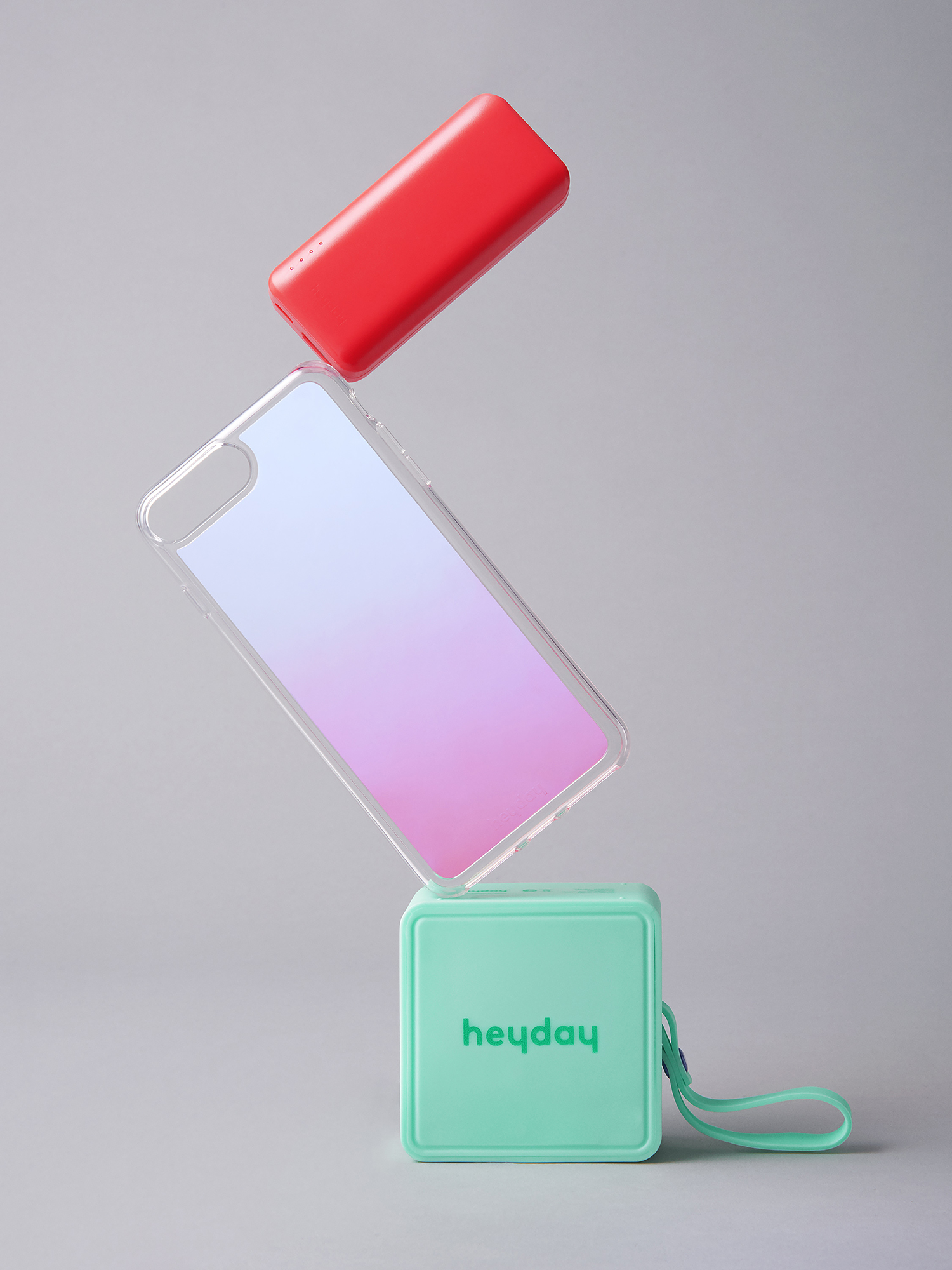
There has been an interesting shift in the documentation of packaging projects by design studios. These are increasingly fulfilling a dual role; a necessity for studios to share their work, profile build and generating new leads, but also as a tool in which a consumer product may find its way across the internet. Collins first explored this in their work for Target’s Room Essentials range which saw Pinterest-ready imagery developed in a way that existed concurrently and effectively with the context of both a material surface and digital platform (their vertical orientation making the most of Pinterest). To see a digital platform assert itself within physical space is an interesting development, you can see this in the covers of books and the graphic patterns and colour blocking of fashion. In the playful and gravity-defying or tension-creating still life-like arrangement of products and packaging, this online movement is understood, acknowledged and leveraged here. The euro hook, in its material function and anthropomorphisation, is folded into this online visual econony and social capital of aesthetic immediacy and joy. It is perhaps also worth pointing out that the blog and the visual journal also play their own roles in moving these products online.
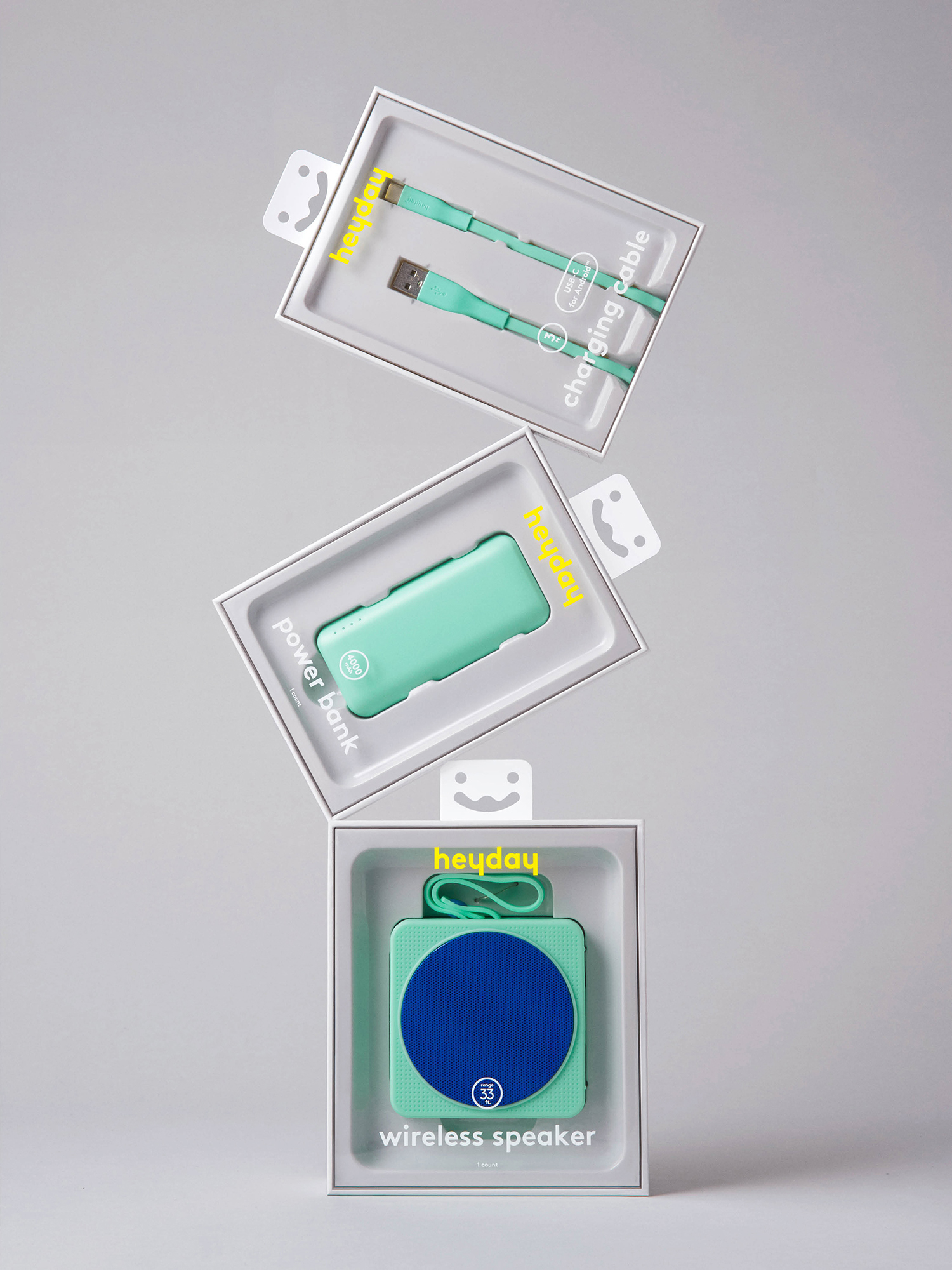
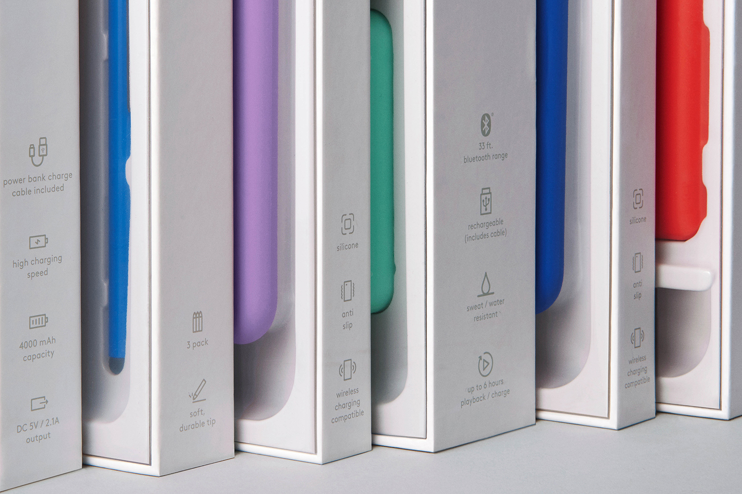
There is a complementary relationship and a smart blurred boundary between packaging and product, not an independence. Both seek to develop a pleasurable material and form language from functionality which is furthered by copywriting, the interaction of type and product, and the universality of iconography. Packaging augments product. It does not oversell but frames the best qualities and value characteristics of the range. By utilising almost all the techniques available to a designer, (surface and structure, the graphic and the material, physical space and digital migration) Collins infuses an intangible and hopefully a longer-term value into a product where there is an encroaching seasonal life-cycle within tech. More work by Collins on BP&O.
Design: Collins. Opinion: Richard Baird.
