Hackney Forest School by Spy
Opinion by Richard Baird Posted 10 December 2018
Forest School is a scheme set-up by Hackney Council, London that seeks to connect children living within the local built-up area with the thrill of the rural outdoors. The scheme reaches out to schools and parents, offering programmes that cover all areas of the curriculum and aims to engage and develop a child’s understanding of sustainability.
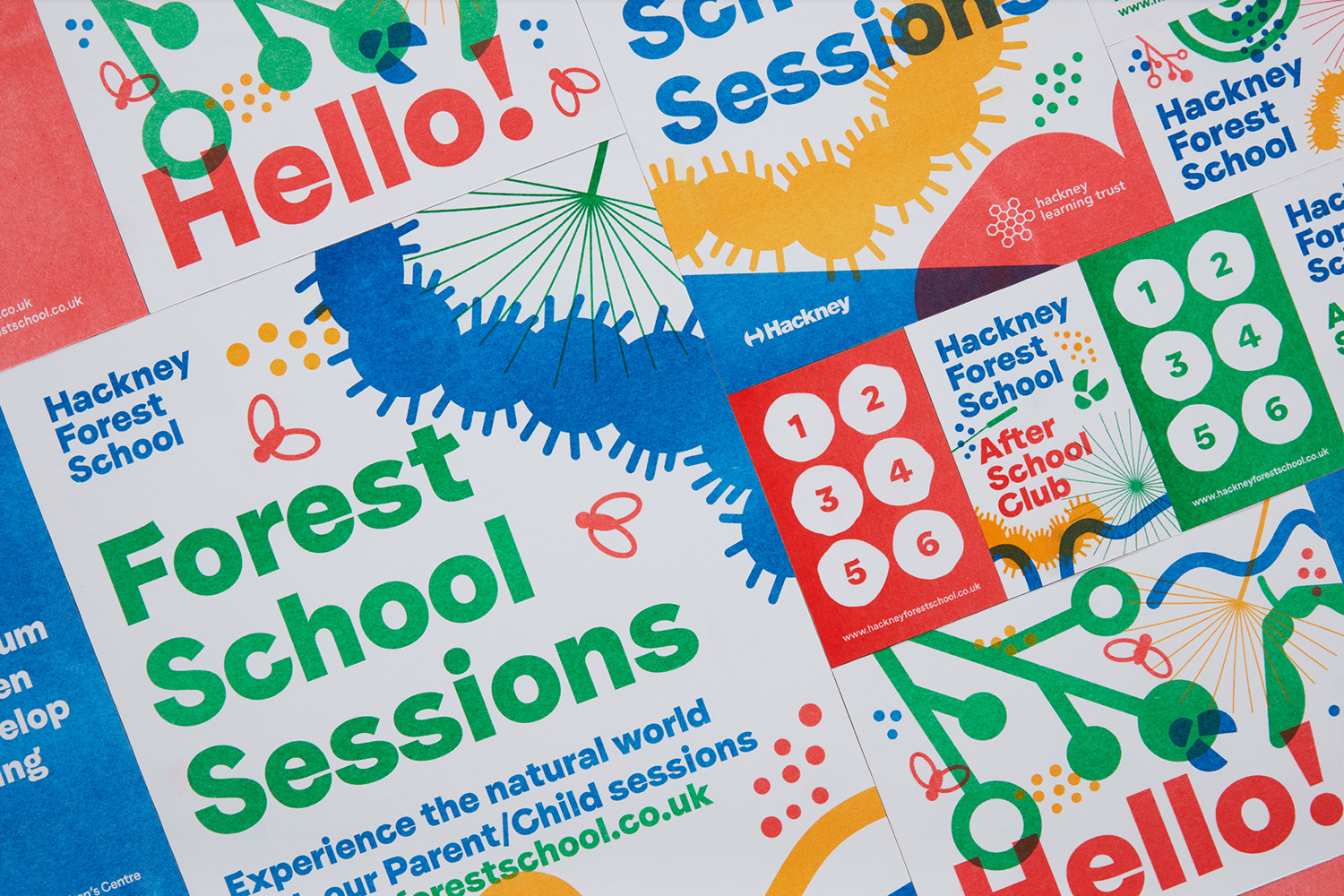
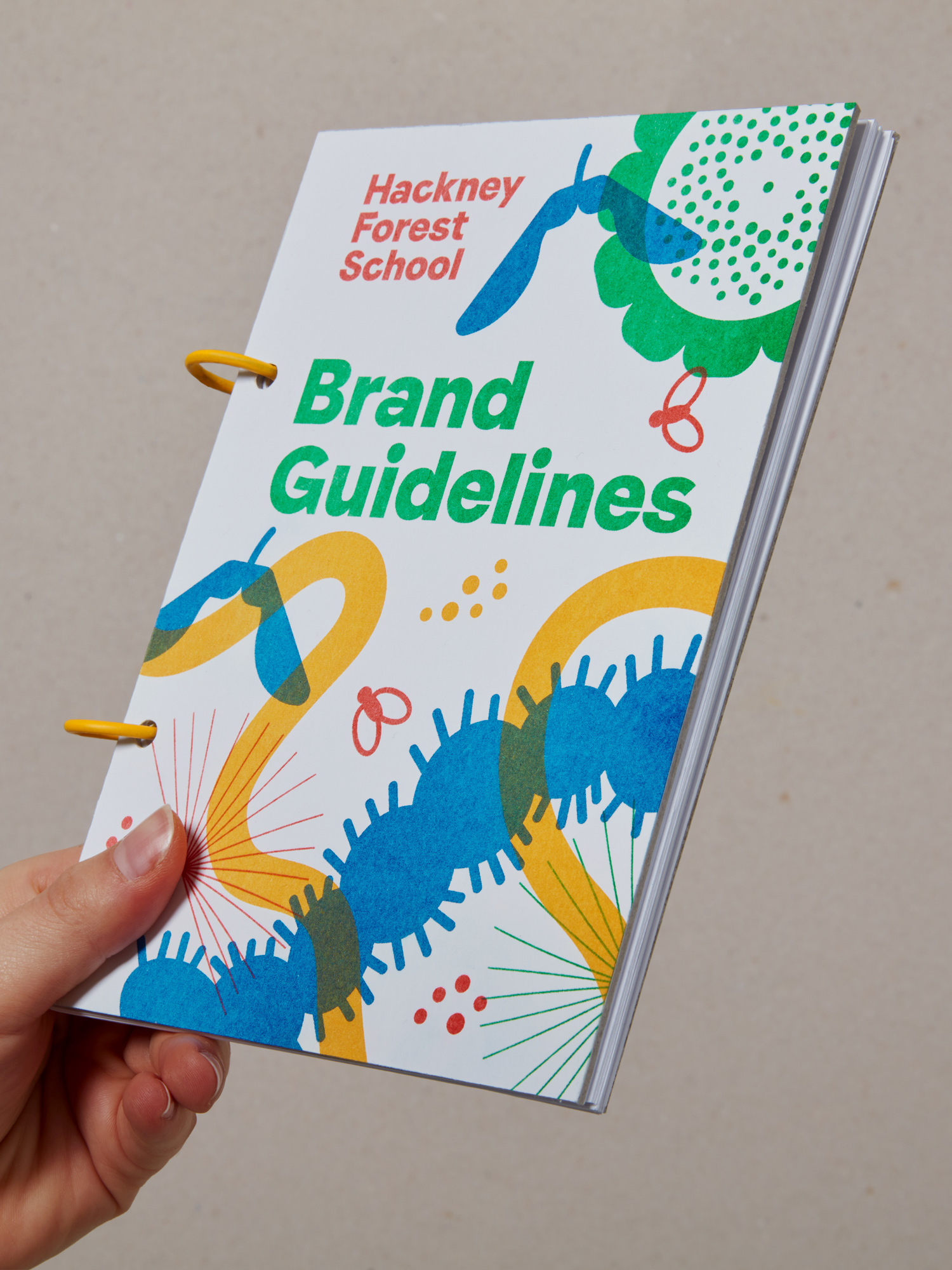
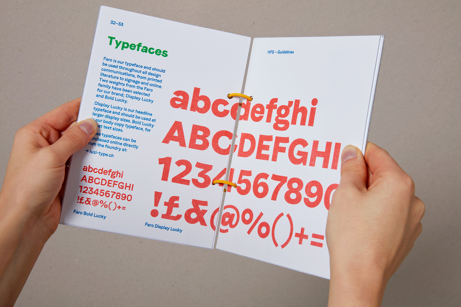
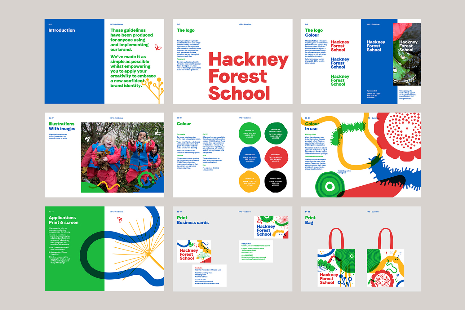
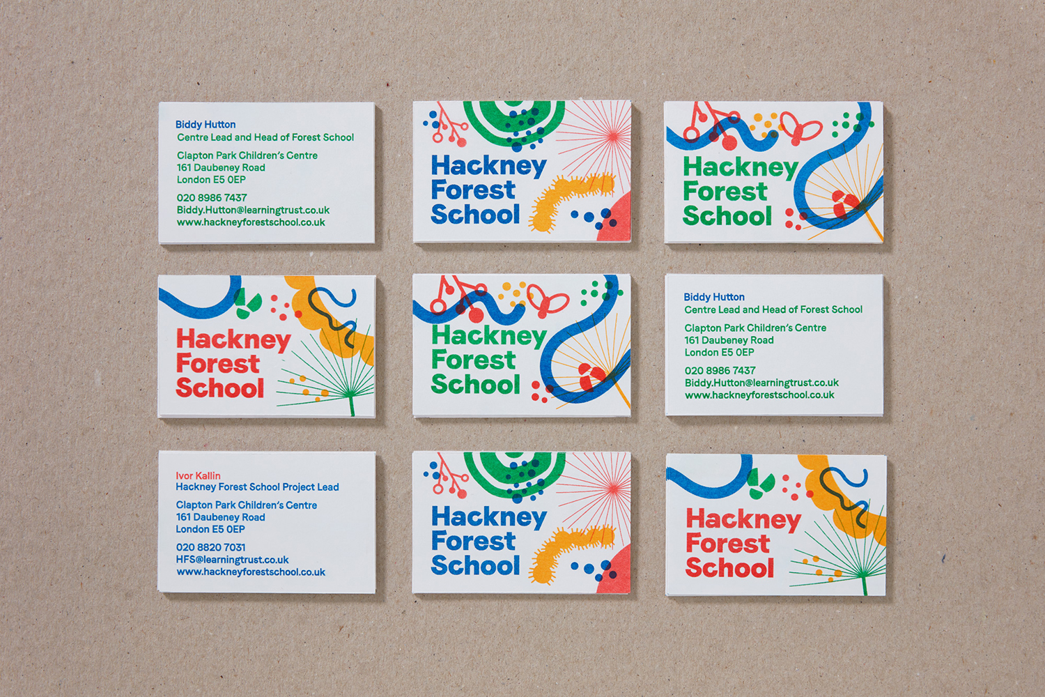
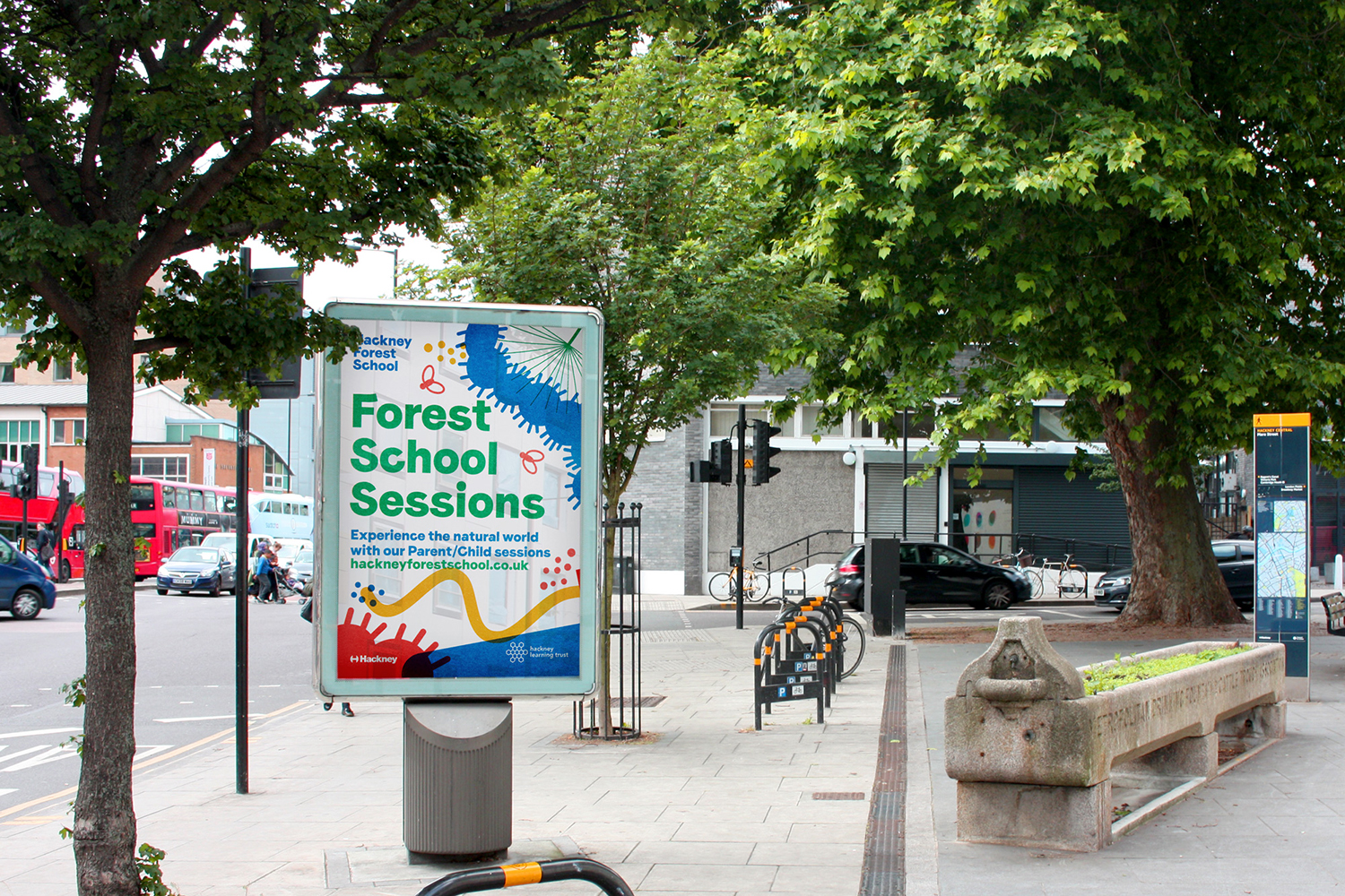
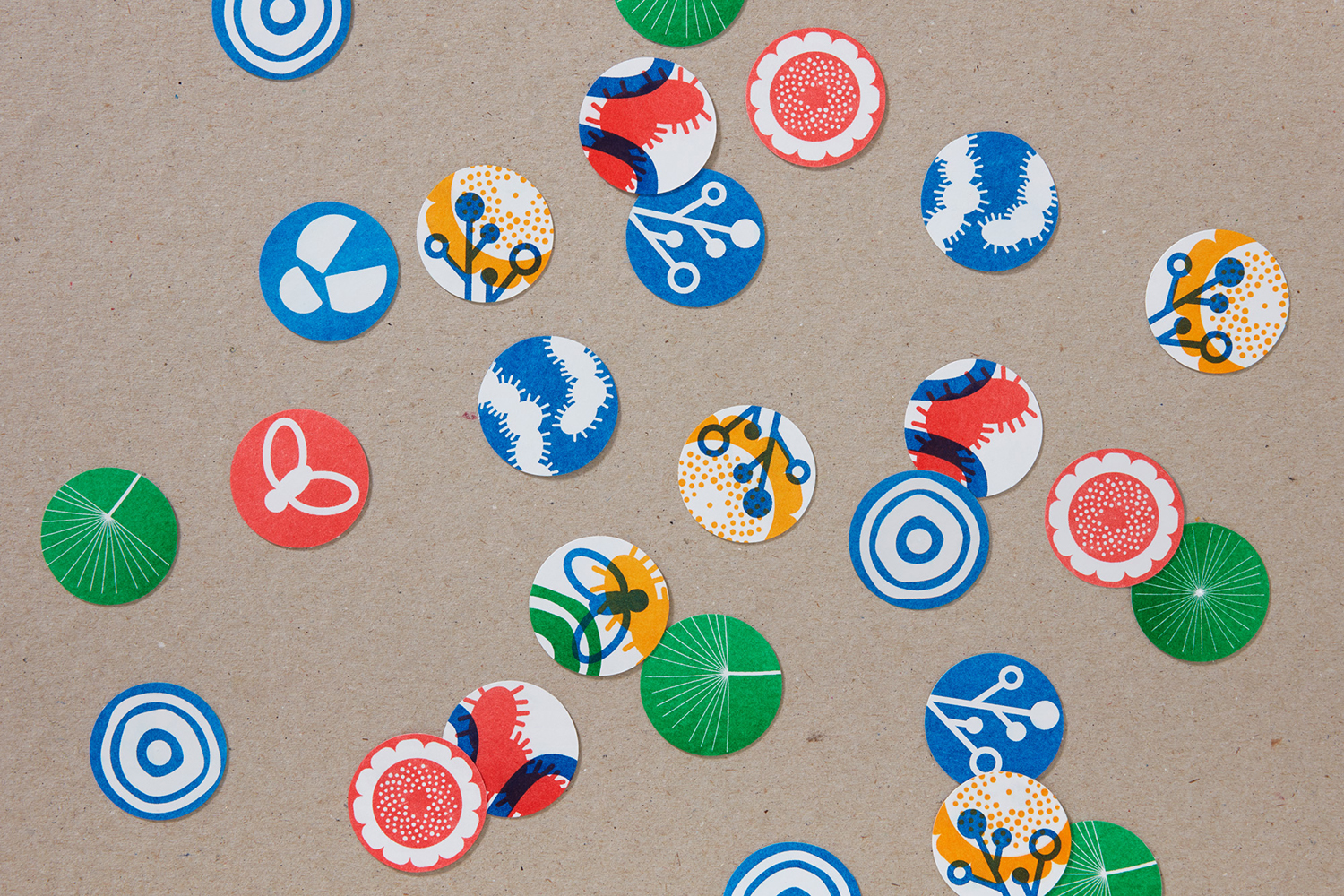
London-based design studio Spy was commissioned to develop a visual identity for Forest School with the intention of increasing awareness and uptake. Following hands-on experience running activities on Hackney Marshes and having conversations with children, families and teachers the studio developed an eye-catching design direction of bold colour and shape. This is codified with a ring-bound brand guidelines document and runs across and connects club cards, posters, postcards and business cards, work packs, apparel, bags, stamps, cards and badges.
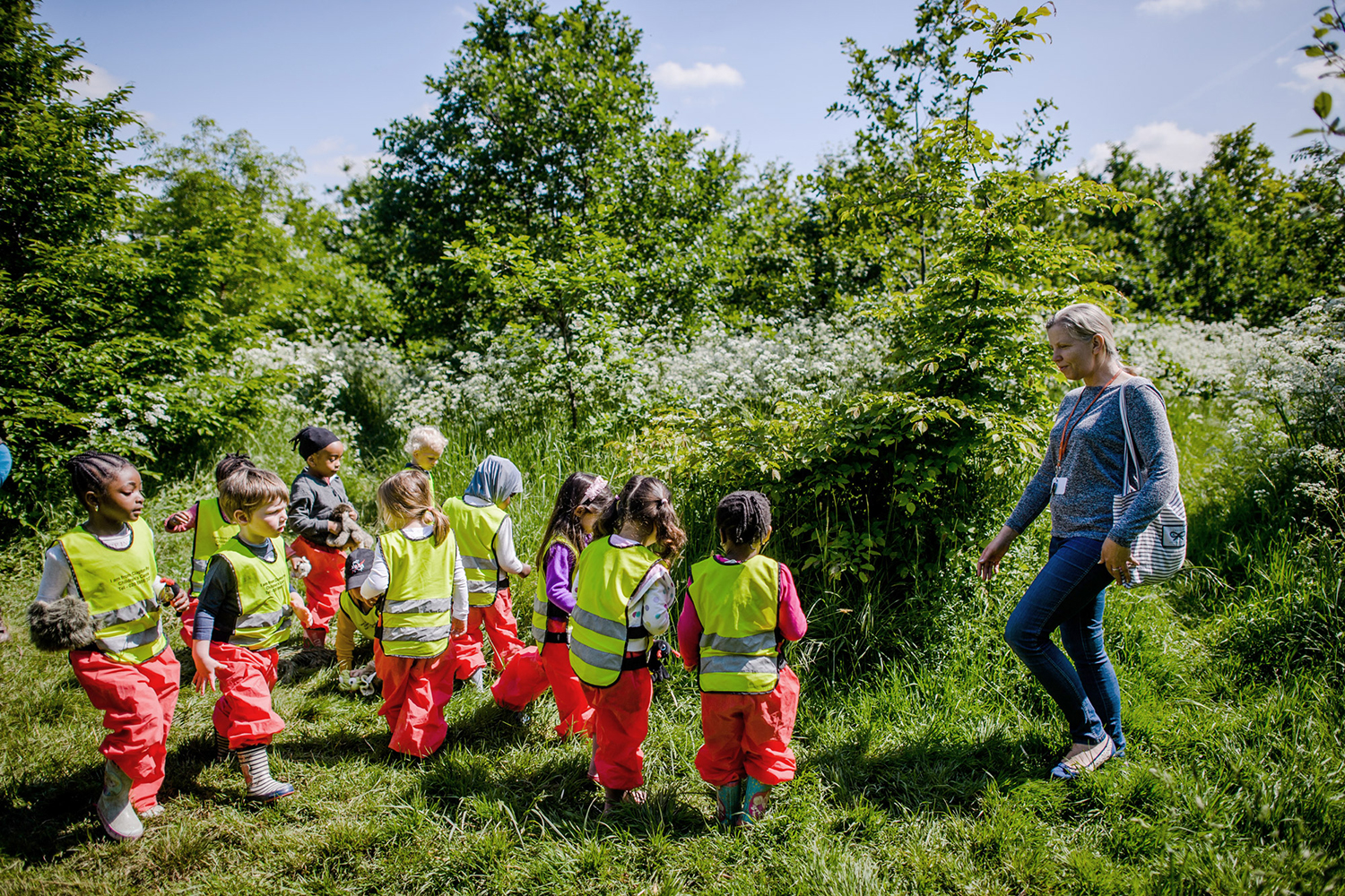
Drawing on the energy and excitement of discovery and the creatures that can be found in the undergrowth, Spy developed an informal brand language that amplified the promotional potential of the school. This is marked by a visual abundance of form, vibrancy of colour, the immediacy of type and the unique qualities of riso print.
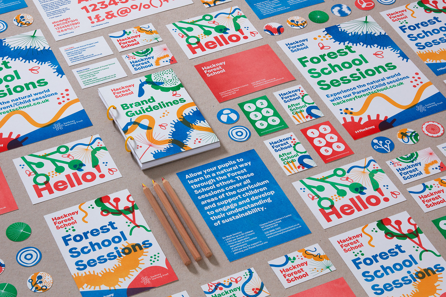
This is an enhanced version of nature. Natural colour gives way to a range of vivid riso colours that capture, not just an energy and child-like joy, but prints with something of a made texture, while the irregular forms of nature are reduced down, for the most part, to the uniform and geometric. This balance of the natural and the systematic feels well-suited to an educational programme set within a rural context. The use of riso printing is perhaps the smartest component in that it balances an economic imperative with an aesthetic sensitivity (achieving a true overprint) and a conceptual relevance.
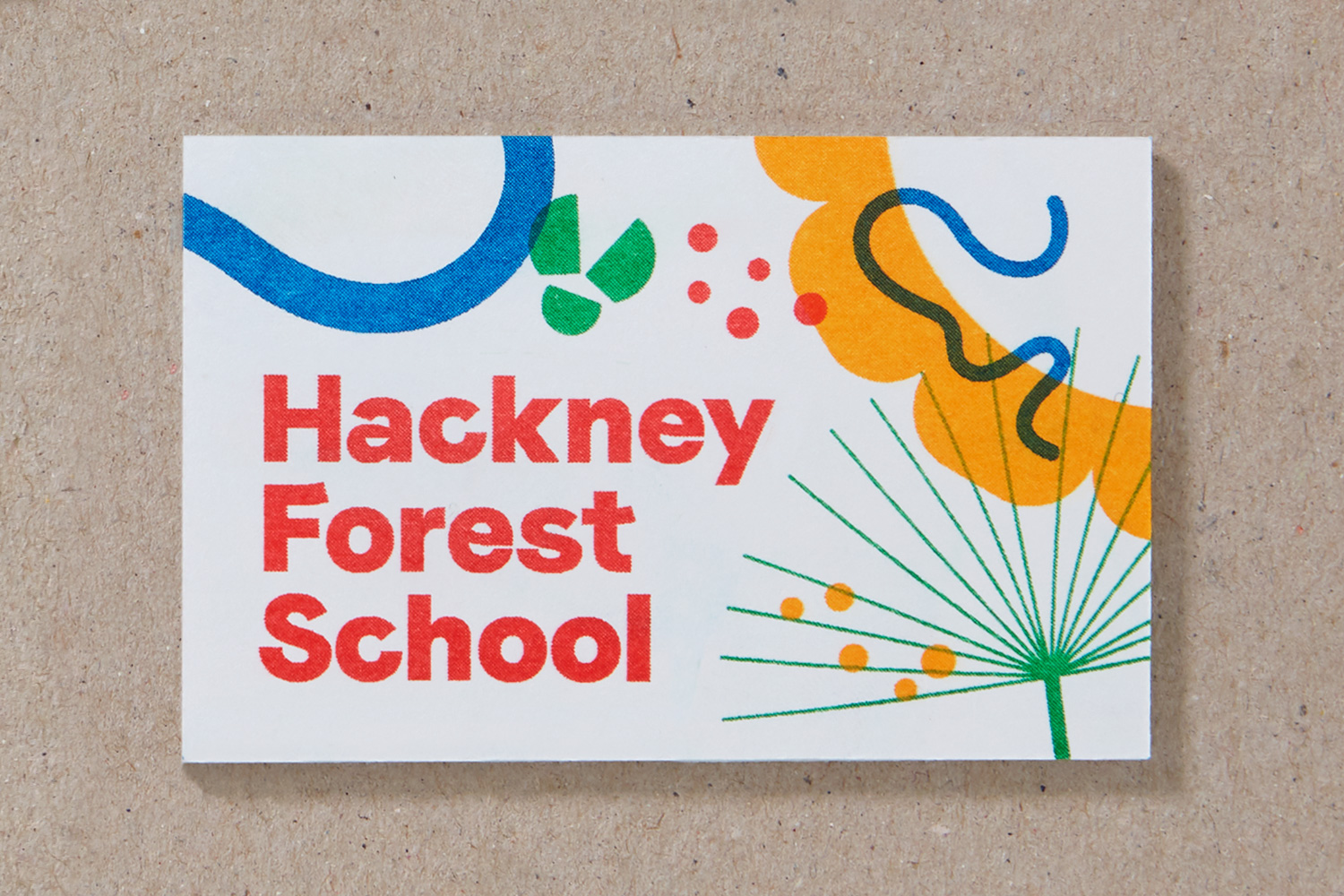

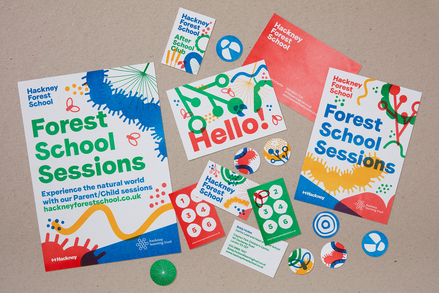
Recurring forms and colour, riso print texture and type establish an immediate continuity, from simple small-format stickers to large format posters. It finds a balance between a child-focused intrigue and a more sophisticated visual system that sets the tone of a credible and engaging programme of learning to parents and schools.
Techniques such as overprinting, a sensitivity to white space and colour blocking, bold type with moments of cheerful character, and shape alongside the fine and delicate balances a contemporary design eye with a made and involved aesthetic. Composition, bold type and hierarchy by way of space, colour and layout make sure that, while visually busy, the proposition is clear and compelling. More from Spy on BP&O.
Design: Spy. Opinion: Richard Baird. Fonts: Faro.
