Espelma by Commission
Opinion by Richard Baird Posted 11 December 2018
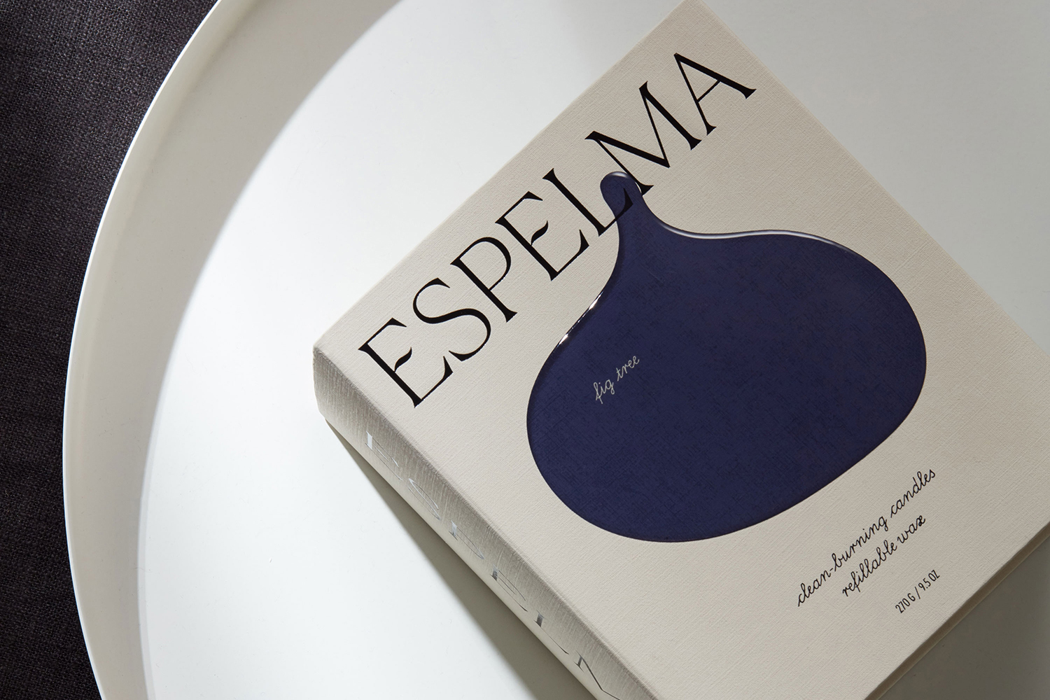
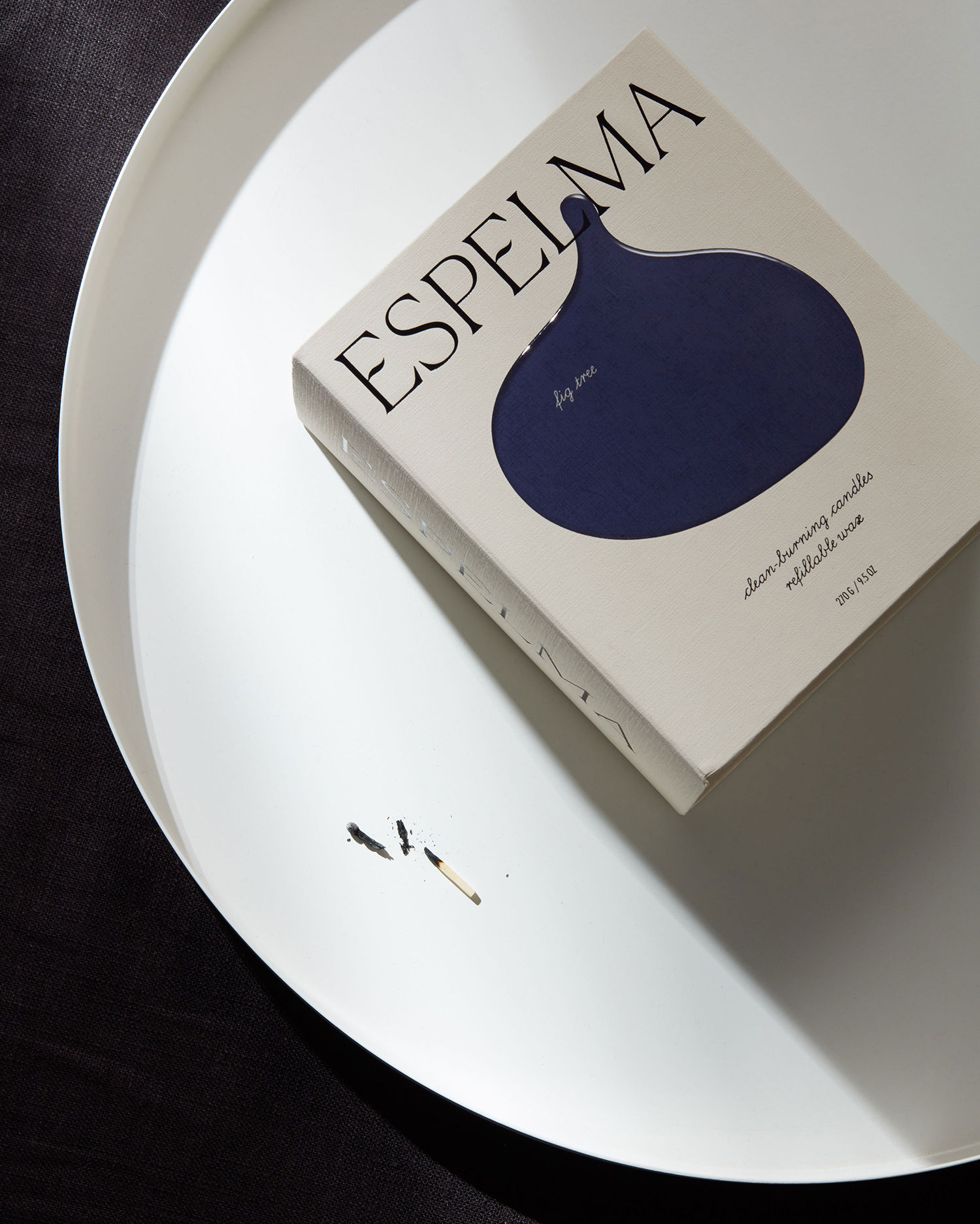
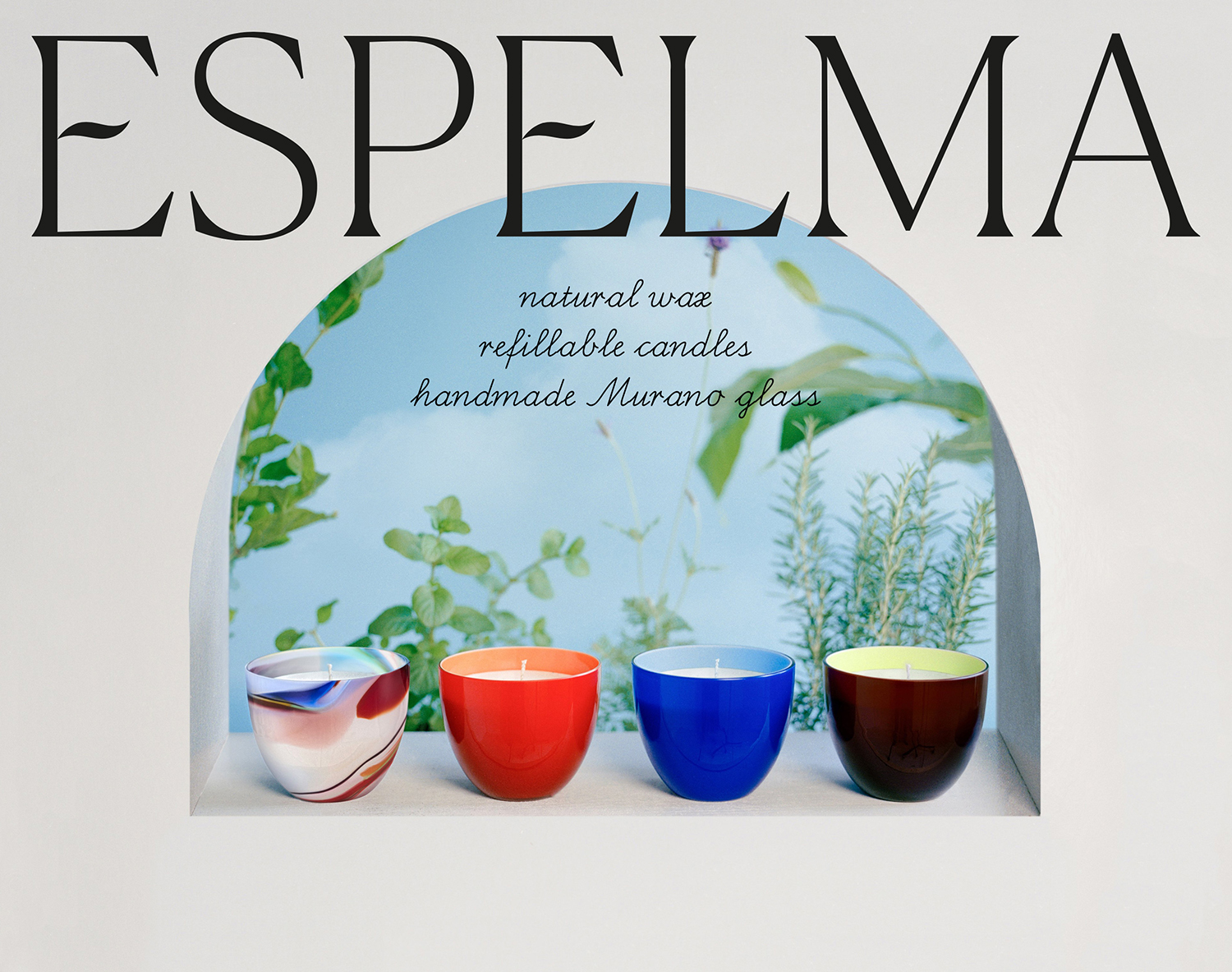
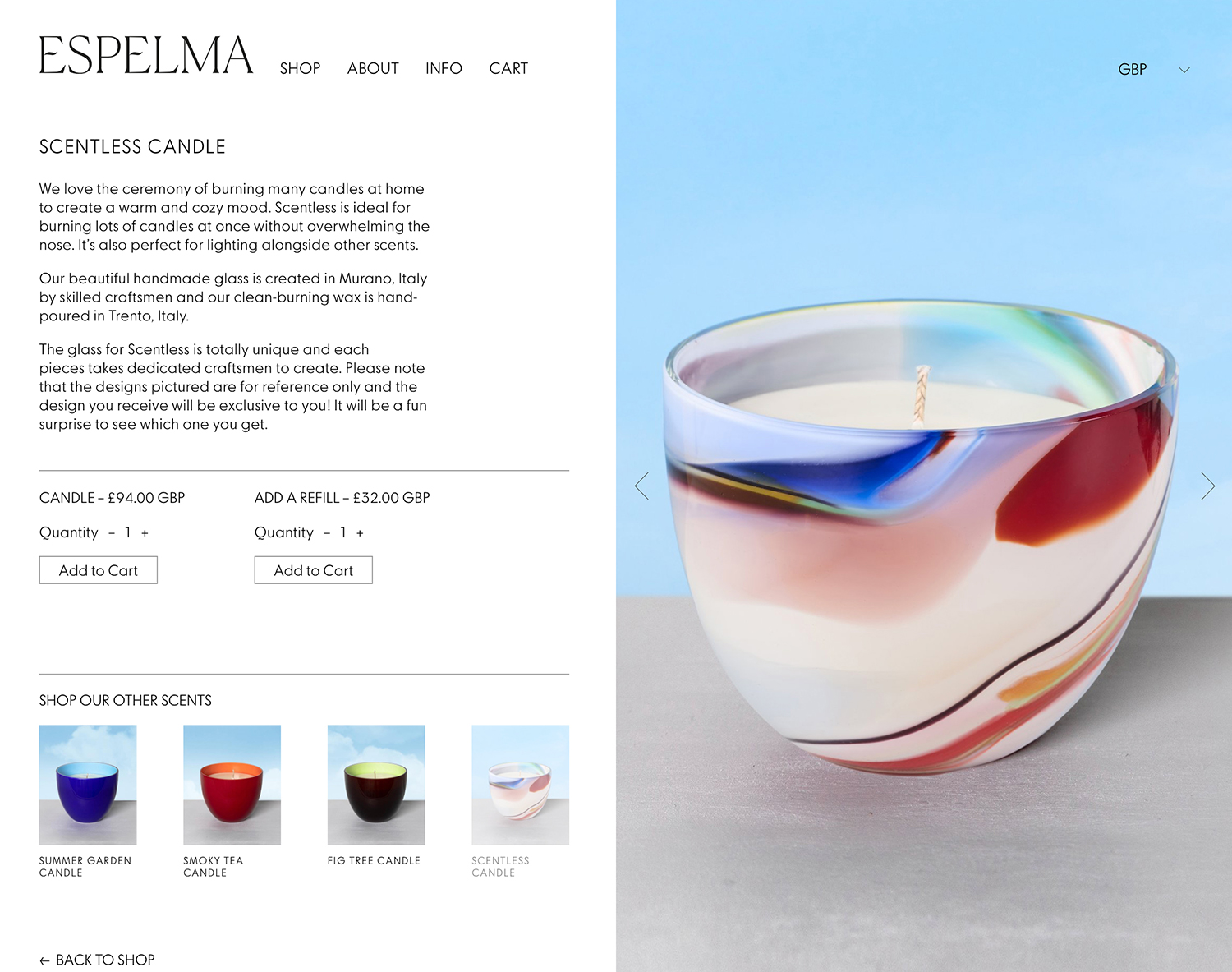
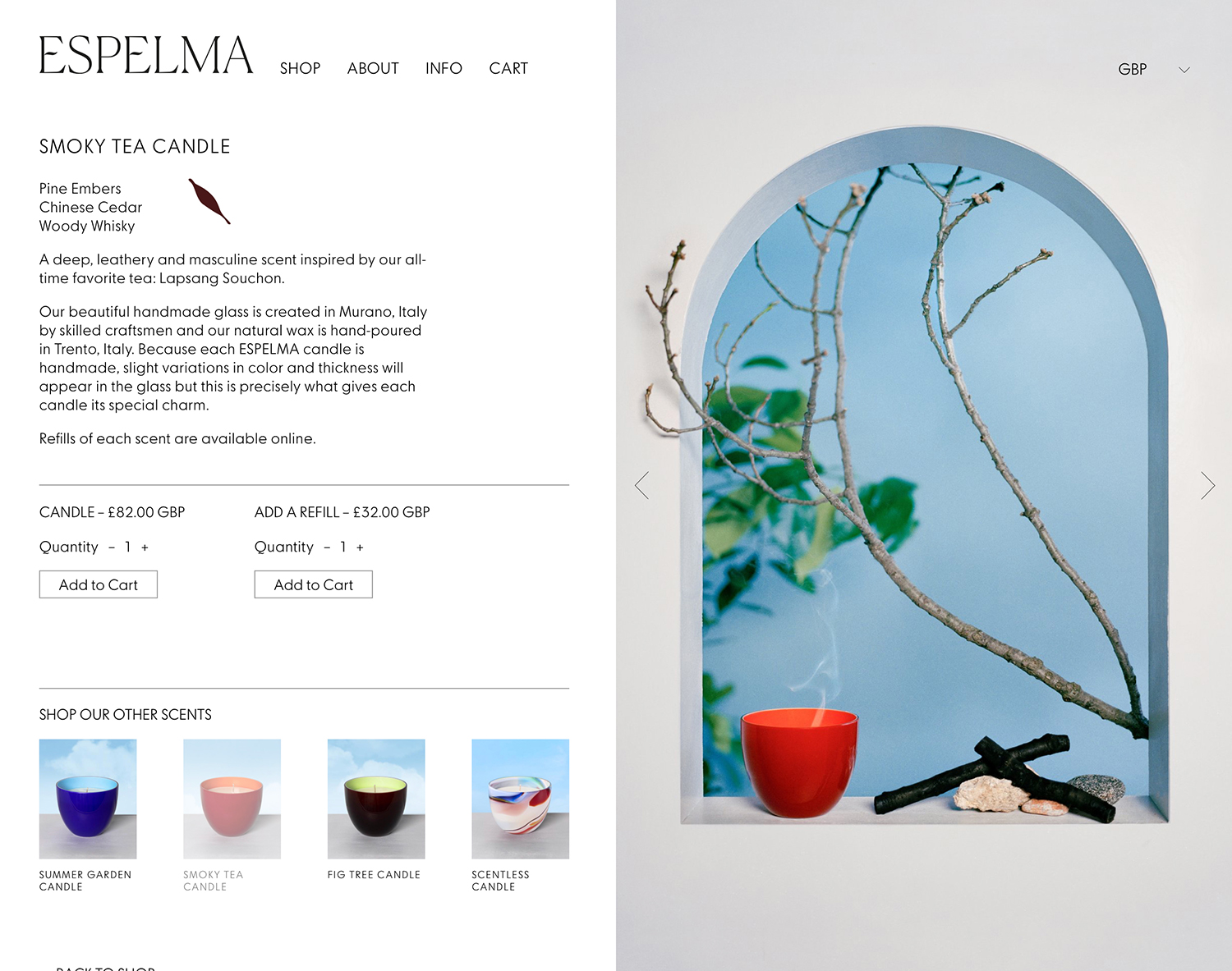
Espelma is a clean-burning natural wax candle company. They have an online store and have hosted pop-ups in London and New York. Each candle comes in a refillable glass vessel, designed by Espelma founders Clara and Claudia, and handmade on the Italian island of Murano. Espelma is distinguished by its mix of glass craft, distinctive colour and form, the clean-burning nature of the candle’s formulation and the thought given to sustainability by way of refills. Further, each fragrance is inspired by the two founder’s summers spent as children at their grandmother’s house near Barcelona. This regional reference, and the implication of a story can be seen woven throughout Espelma’s brand identity, designed by Commission, in the arched white architecture present in still life imagery, and in the colour and texture, shape and structure used across packaging.
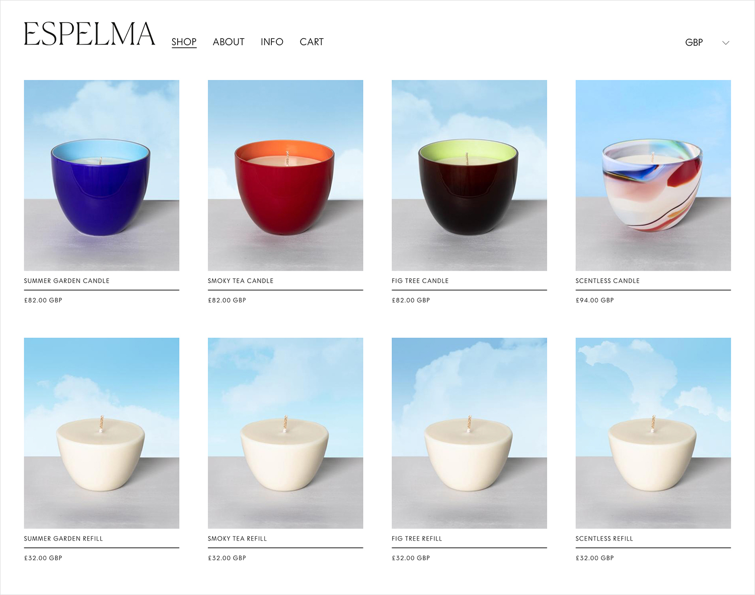
Espelma candles are currently pre-order only, due to ship out in December and retail between 82.00 and 94.00 GBP, with refills available at 32.00. A clean-burning formulation, the glass craft and associated legacy of Murano, and a very personal brand story are intertwined dissolving the threshold between material and intangible value. Commission’s brand identity, existing across packaging and website, and being composed of still life imagery, an unexpected and satisfying material detail in print and strong singular graphic gesture are a critical part of developing and communicating this value.
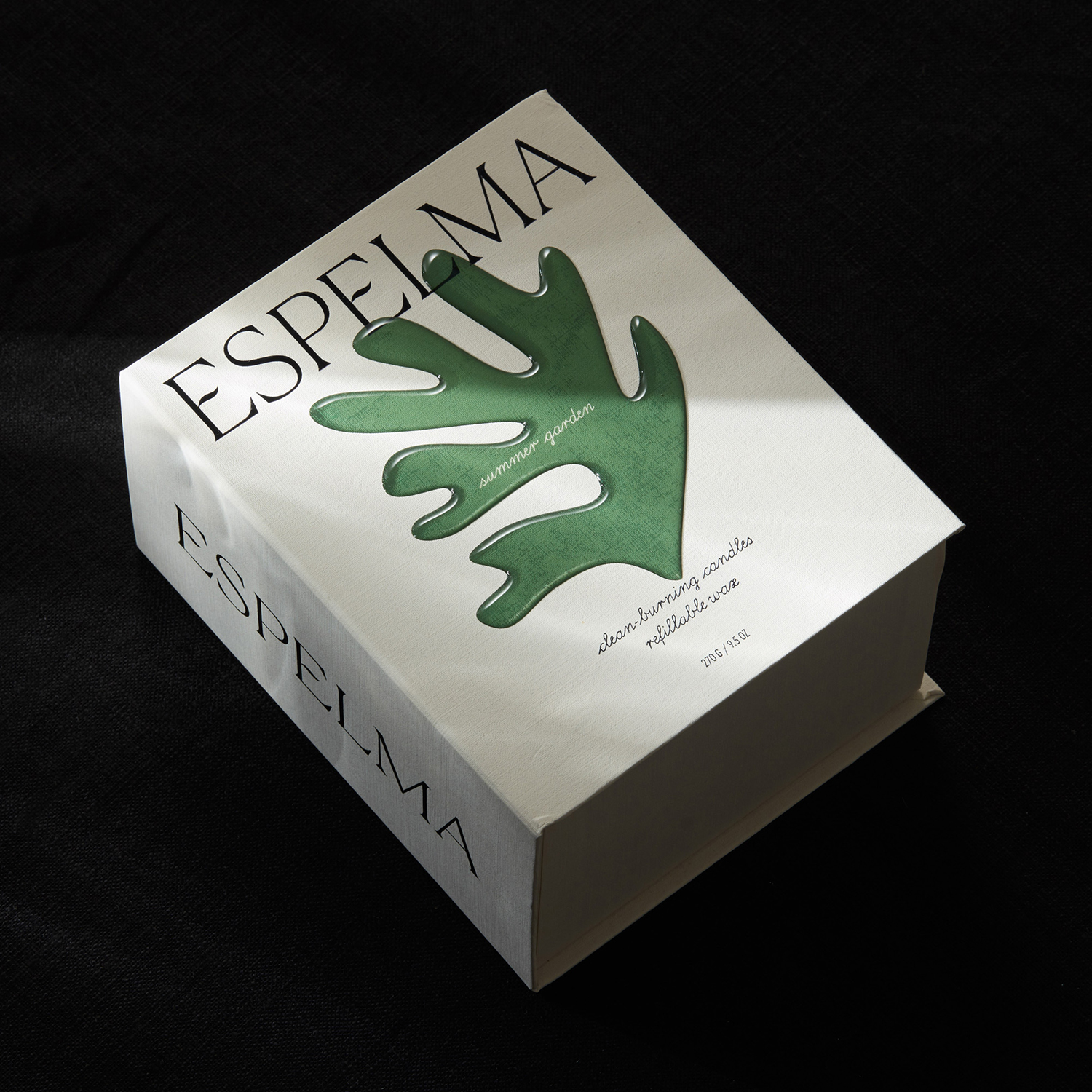
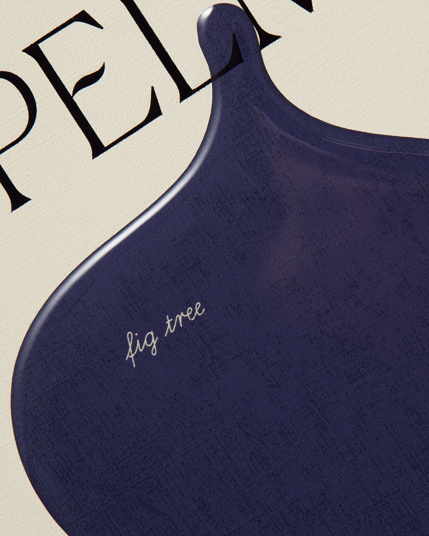
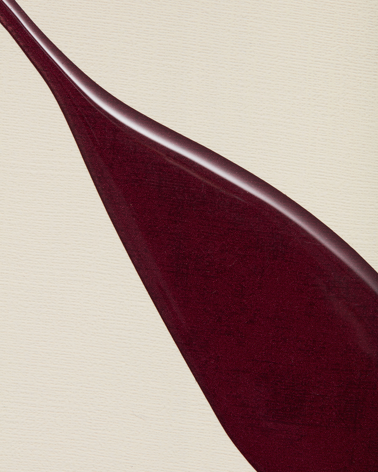
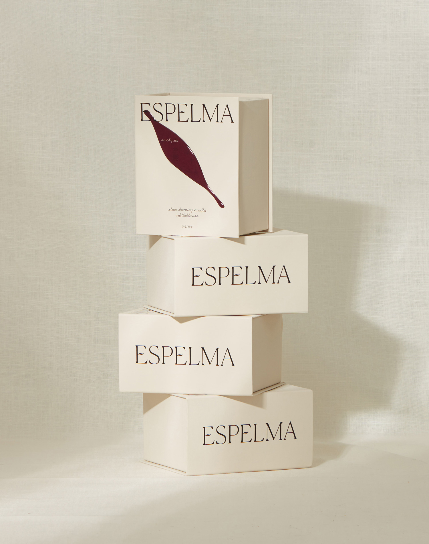
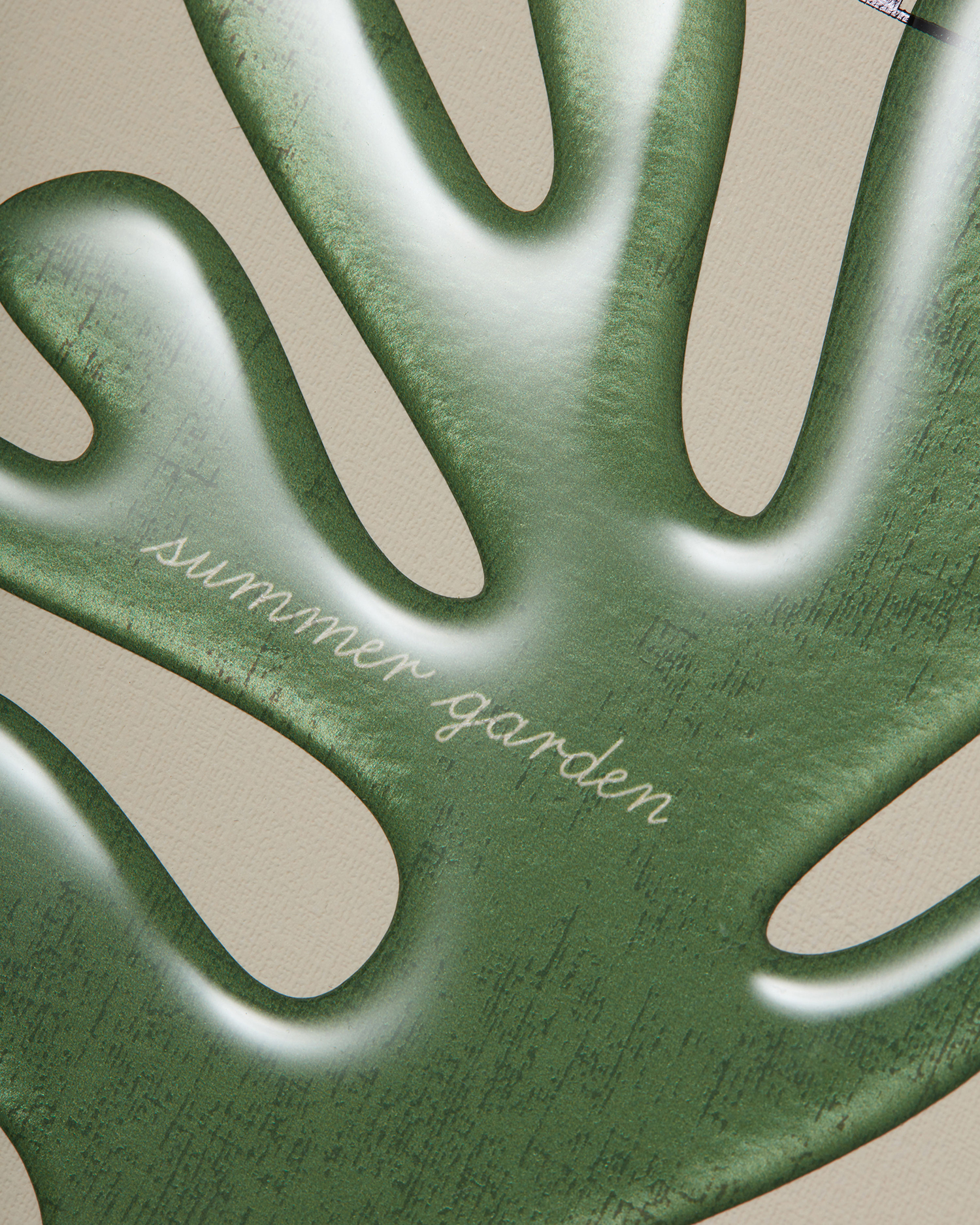
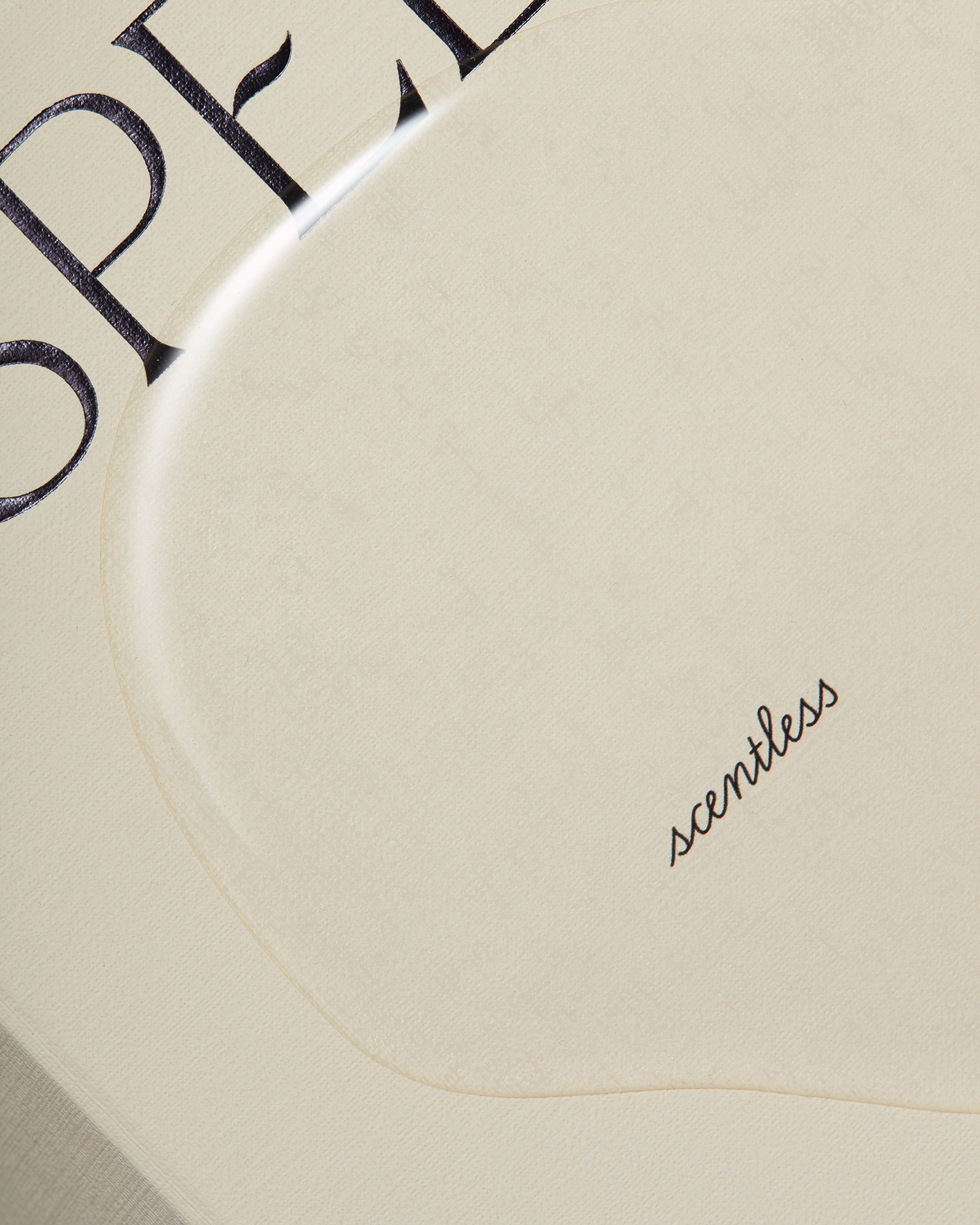
The implication of a story to be told or discovered is set up in the structure of the box, in the mechanism of its opening, in the allusion to the book. This is emphasised in the surface embossed texture of the material, the arrangement and style of type and the singular graphic gesture. This graphic gesture is a highlight in its simplicity of form but layered reference. Its shape, within the context of a story rooted in childhood spent just outside of Barcelona, calls to mind the artistic work of Miro and folded in with the craft of glass making, the key ingredient and a wax spill by way of a glossy silicone relief. It functions primarily as a distinctive and eye-catching graphic element, follows this up with a pleasing materiality and a subtextual story which is then augmented by structural design. It is incredibly elegant and thoughtful, fulfilling both emotional and practical considerations.
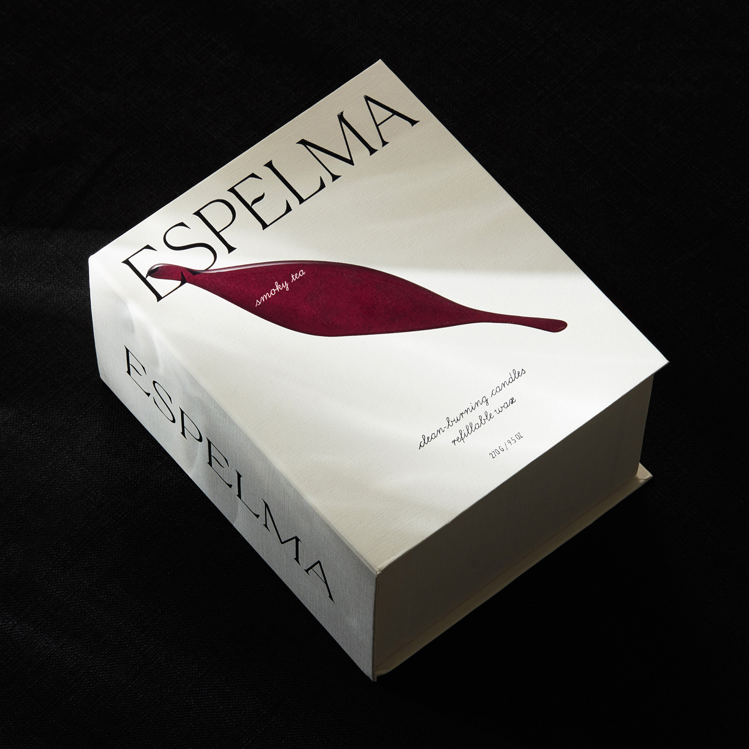
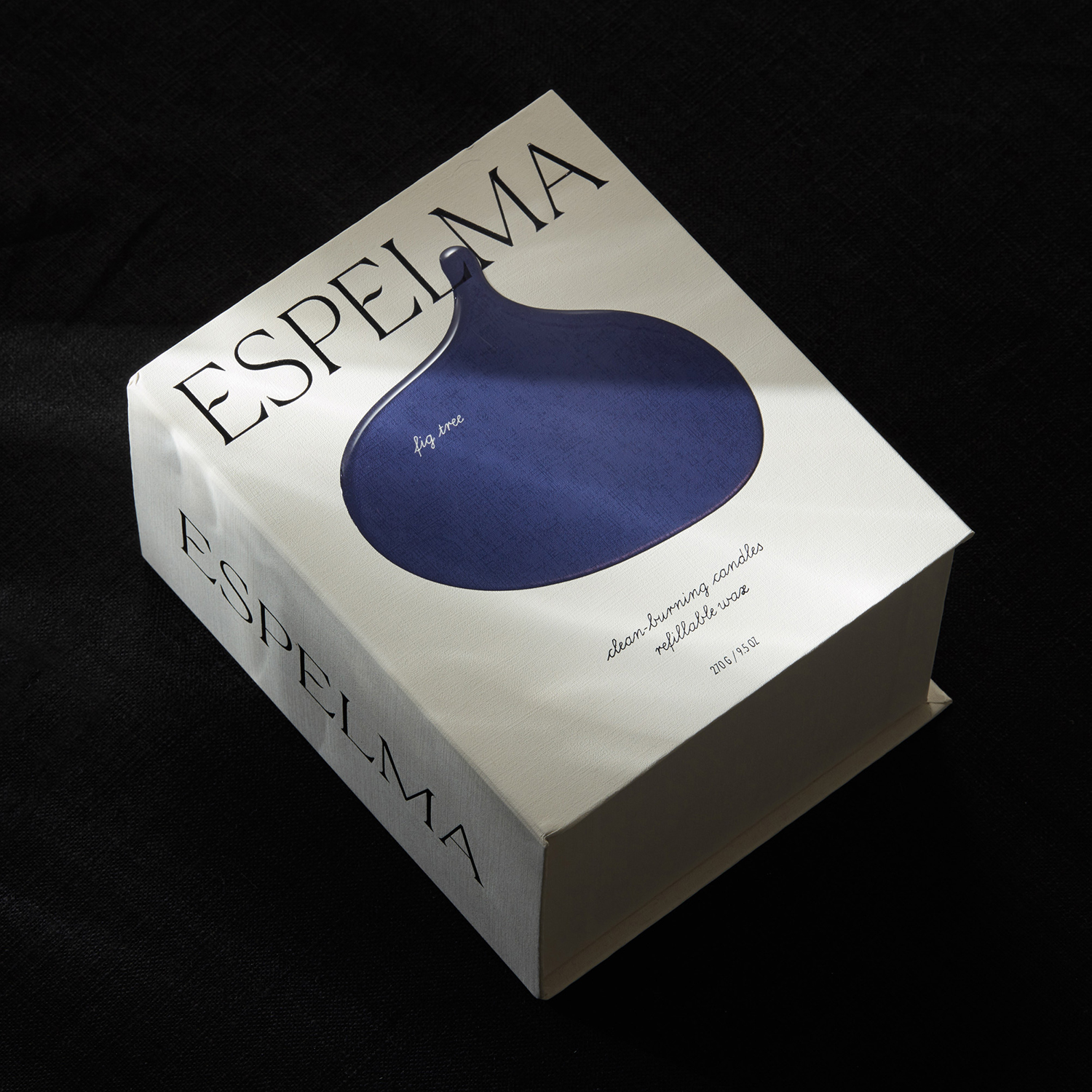
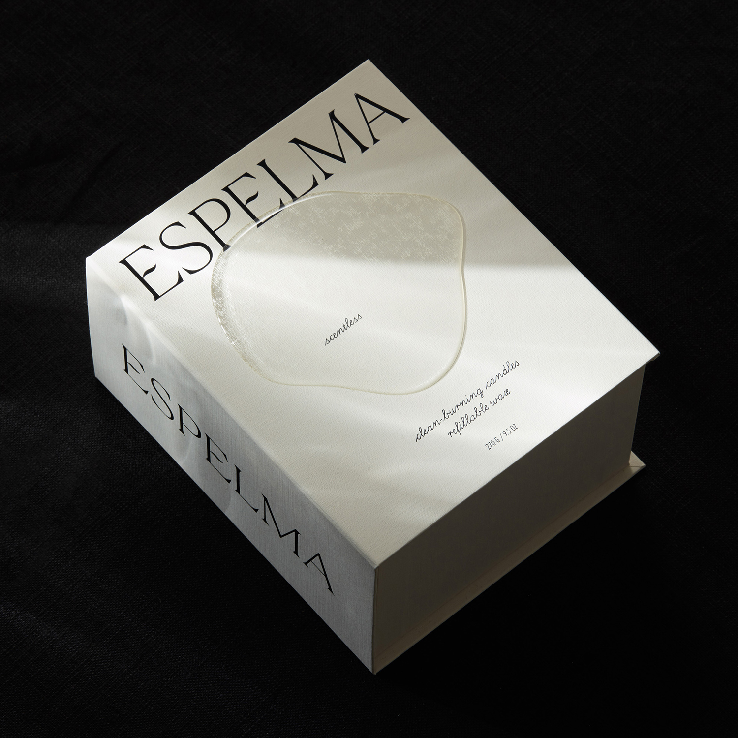
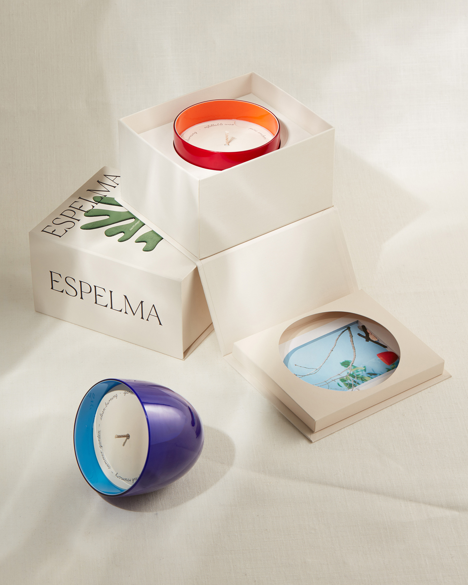
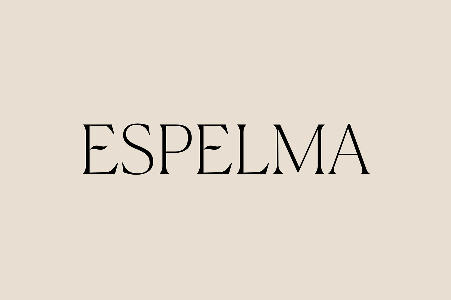
The colour and structure of packaging, the die cut shapes and the arches that feature throughout the still life hold something of a Mediterranean quality to them, bridging the Spanish summer holidays and the Italian origins of the glass. Its implicit rather than implicit, but also functions as a premium cue. Other highlights include the linen-like surfaces of the boxes, continued through to the art direction and documentation of the project, as well as the small flame-like details held within an elegant custom-drawn logotype which has been black foil embossed on to the surface of the packaging. This and the single line script has something of a burnt wick to them.
Commission have distinguished themselves by way of a sensitivity to structure and mechanism, the sensual surface and subtextual story, as well as an often delicate and balanced intersection of graphic and material expression, whilst maintaining a simplicity, and serving a concise communicative strategy. The candle and its remarkable and continued market segmentation has become an ideal canvas in which to play with the lines between tangible and intangible value, brand and object. More work by Commission Studio on BP&O.
Design: Commission. Opinion: Richard Baird. Fonts: Moskau Light (Website)
