A’18 by Pentagram
Opinion by Richard Baird Posted 7 January 2019
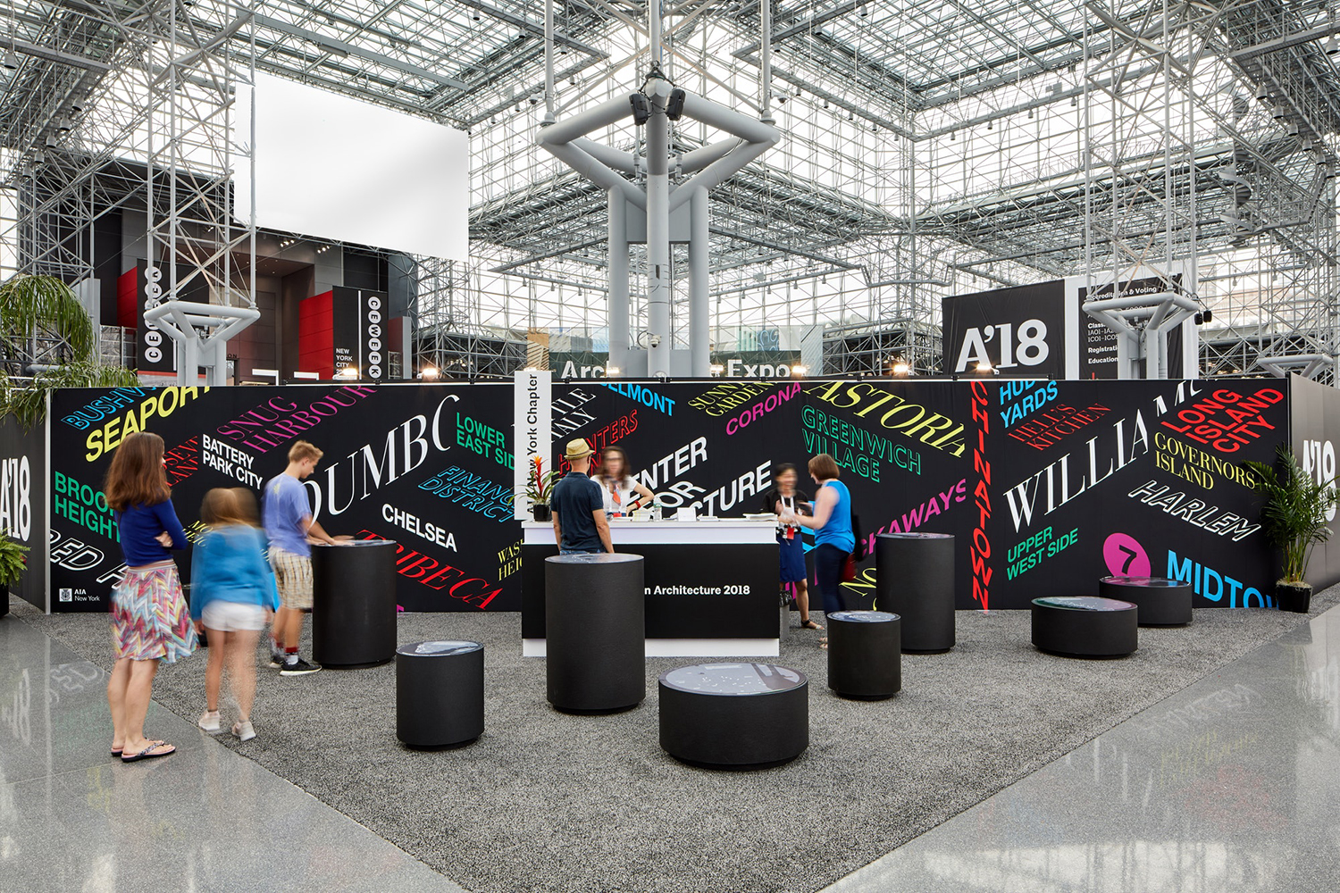
AIA Conference on Architecture is an annual three-day event that explores what is new and now in architecture and design. In 2018 this took place between June 21st and 23rd at Manhattan’s Javits Center, a pioneering modernist space frame structure designed by architect James Ingo Freed. The event is made up of workshops, seminars and city tours across the five boroughs of New York City as well keynotes from those working within the fields of both architecture and design who spoke of their approaches to making a difference to cities across the globe.
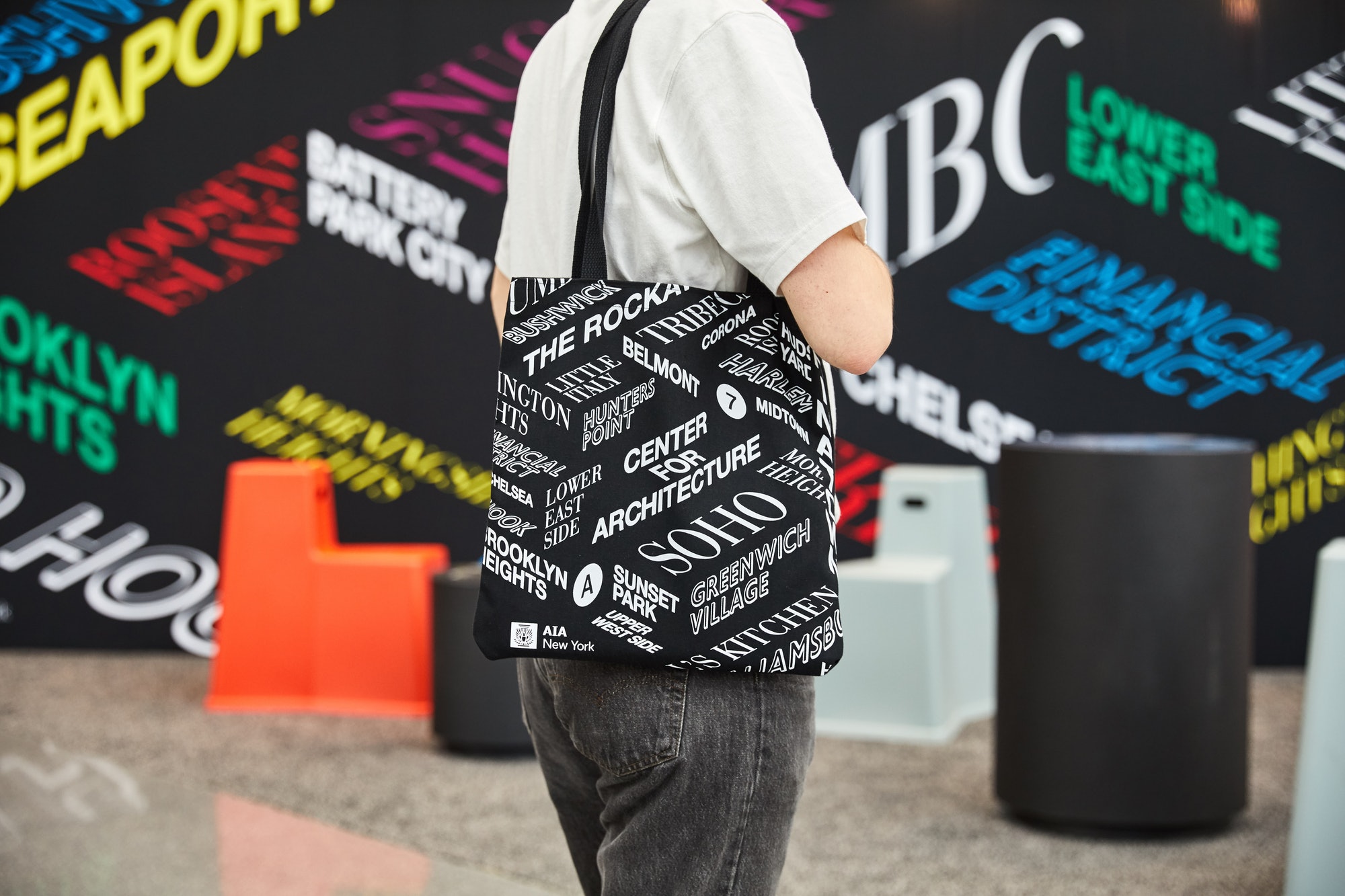
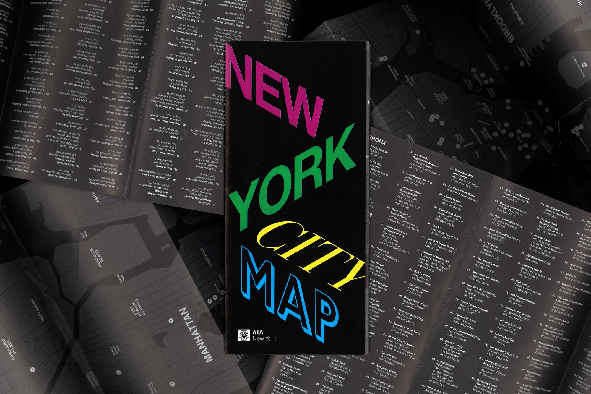
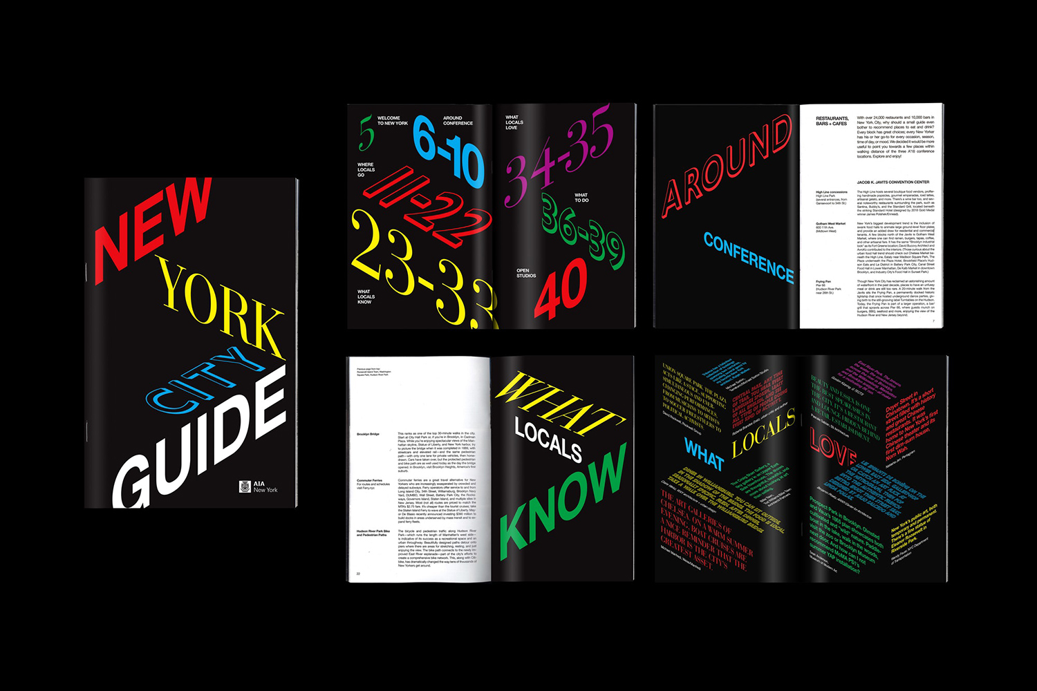
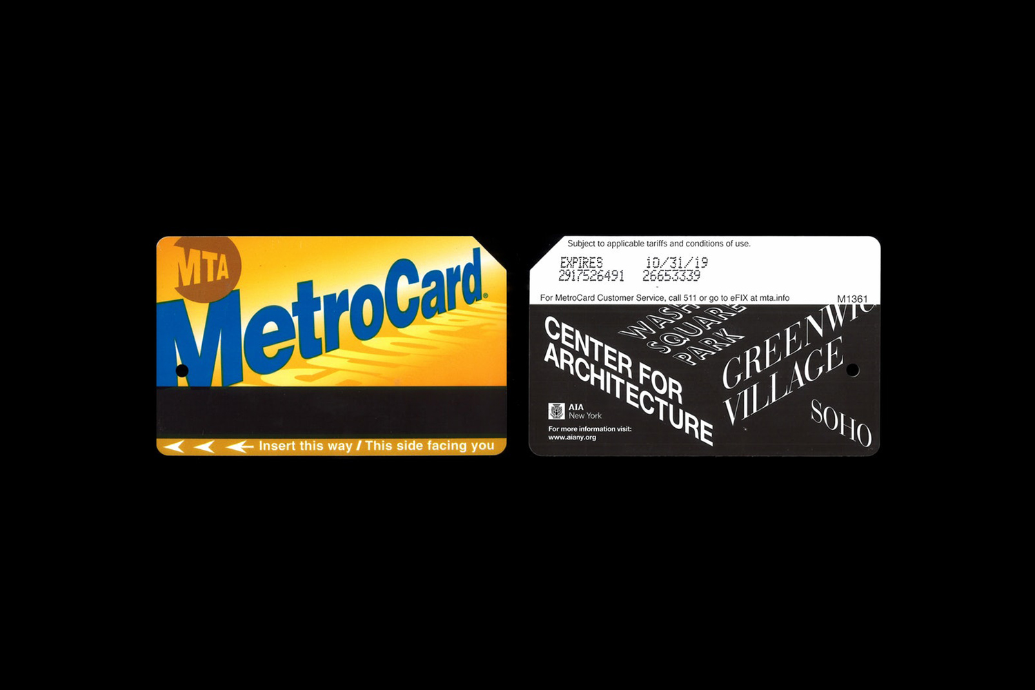
Pentagram partner Natasha Jen and team developed the visual identity for A’18, building on the graphic identity developed for AIA, also designed by Pentagram. This captures the vibrancy and life of the city, and the idiosyncrasies of its diverse neighbourhoods. This linked the welcome desk with takeaway assets that included tote bags, Metro Cards and city map.
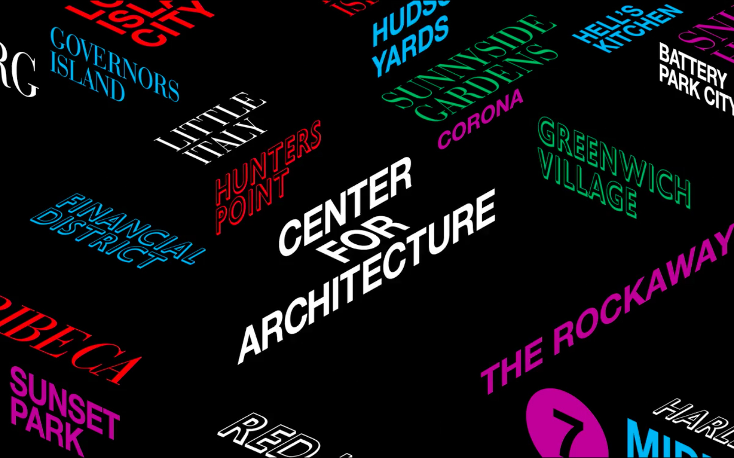
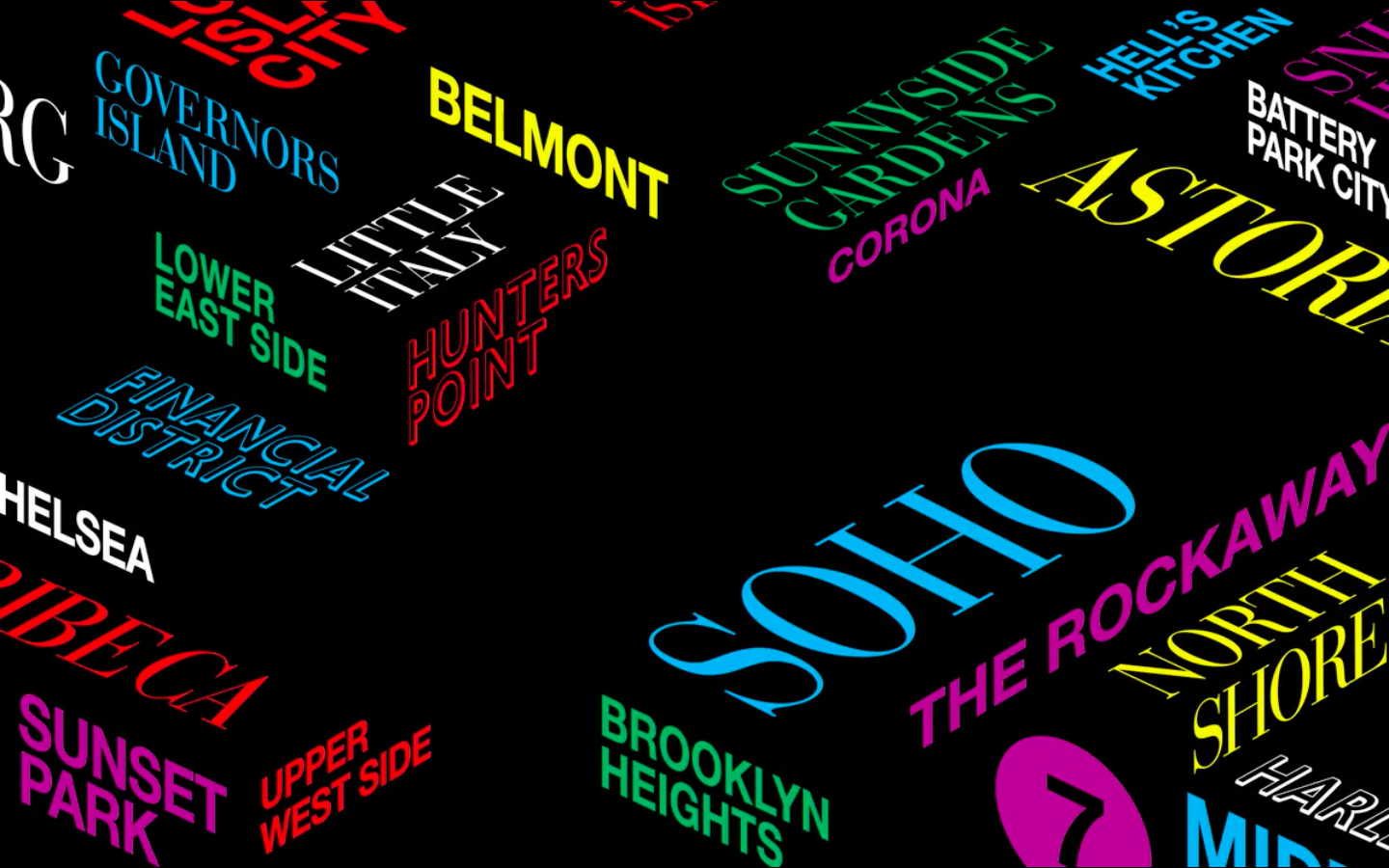
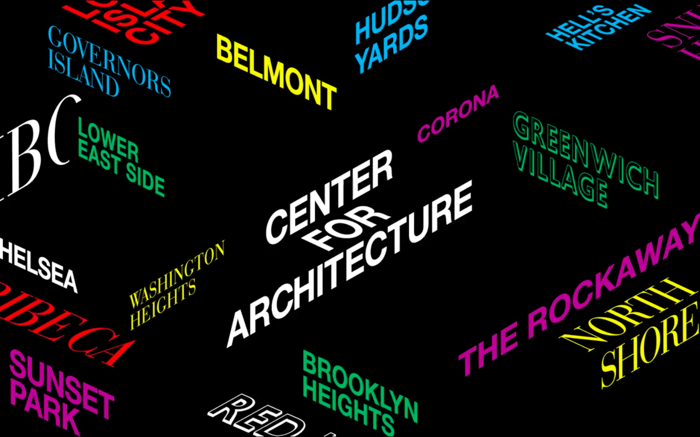
The interplay of Helvetica, Bodoni and Gill Sans, five colours, space and structure, the suggestion of motion in direction and in animation builds to a visual language that touches upon architectural imposition and juxtaposition, architecture as it exists across time, and the various architectural ideologies that have shaped the urban landscape of New York City.
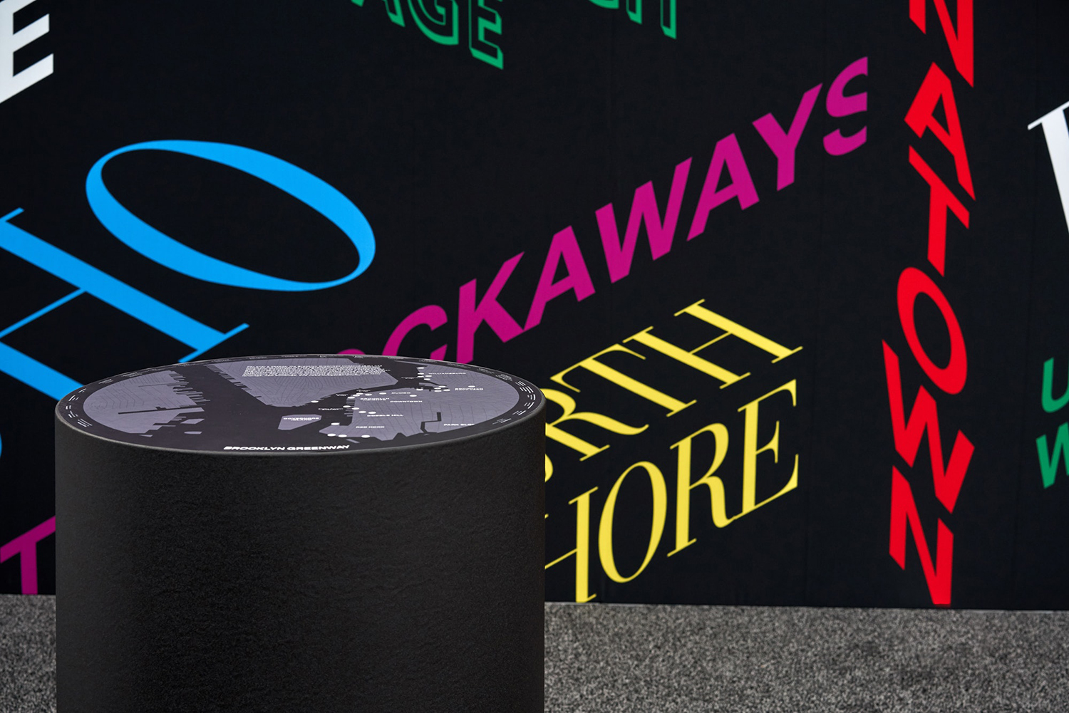
The immediate impression is one of space and structure. That this is formed by way of type; a stand-in for a variety of historical and cultural periods and architectural ideologies (Gothic revival, International Style, Art Deco etc.), as well as the diversity of the five neighbourhoods, bring a subtextual nuance to the work whilst calling to mind the blinking street signs of the night. To see the depth inherent to one particular typeface flattened when applied to a plane in three-dimensional space is a little unfortunate, to have this protruding in a more material way would have been a nice detail.
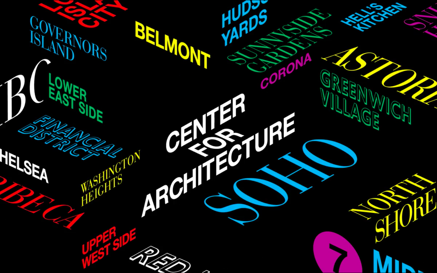
Where arrangement shares something in common with the space frame architecture of the Javits Center colour and typographical character, as well as the use of a night-time background, distinguishes the work, setting it apart, bringing in some of the diverse architectural and cultural personality of the city into a bright white modernist context. This interplay of light space and dark visual identity (white and black pages) is a neat allusion to the transformation that architecture undergoes over the day. That visual identity can then move outwards by way of Metro Cards, tote bags and city map is smart detail, dissolving threshold between the exterior city and interior event. More work by Pentagram on BP&O.
Design: Pentagram. Partner in Charge: Natasha Jen. Opinion: Richard Baird. Fonts: Helvetica, Bodoni and Gill Sans.
