Kaiyo by Pentagram
Opinion by Richard Baird Posted 18 February 2019
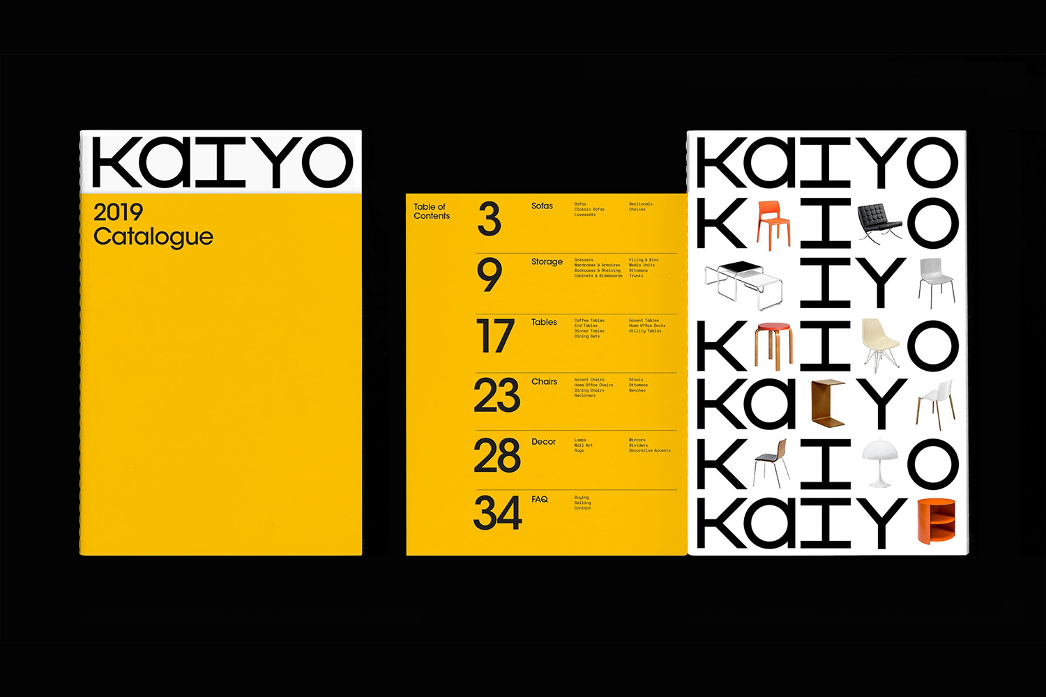
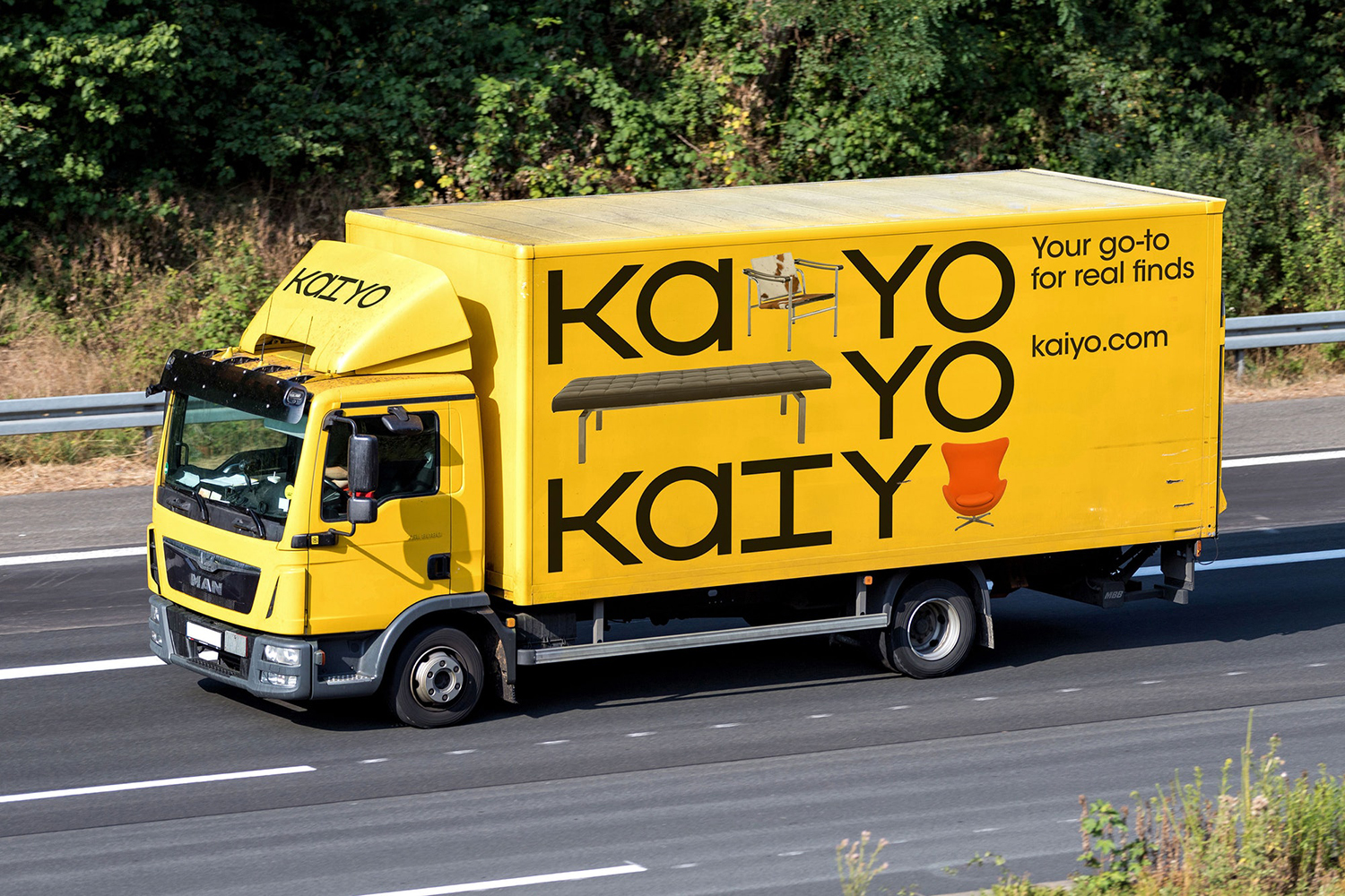
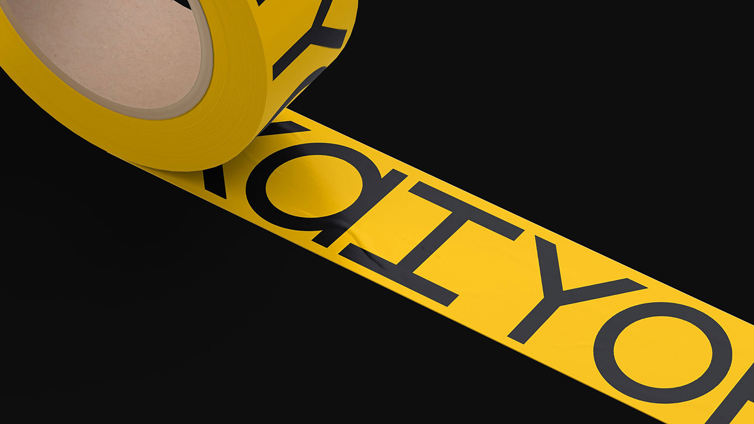
Kaiyo, formerly Furnishare, is an online platform for the reselling and buying of used furniture, currently available in New York City and New Jersey, but with the intention to expand this internationally. Kaiyo picks up, inspects, cleans, photographs and uploads furniture to its online catalogue, easing the difficulties of selling secondhand online. It is part of a growing up-cycling movement, challenges the notion of seasonality promoted by large furniture retailers and was created in response to the approximately 8 million tons of furniture that ends up in American landfill each year. Eco-modernist, good design available to everyone, reuse and longevity are central to Kaiyo’s positioning. This was developed by Pentagram partner Natasha Jen and team, alongside naming and graphic identity which runs across website, brochure, van livery, tote bag and box tape.
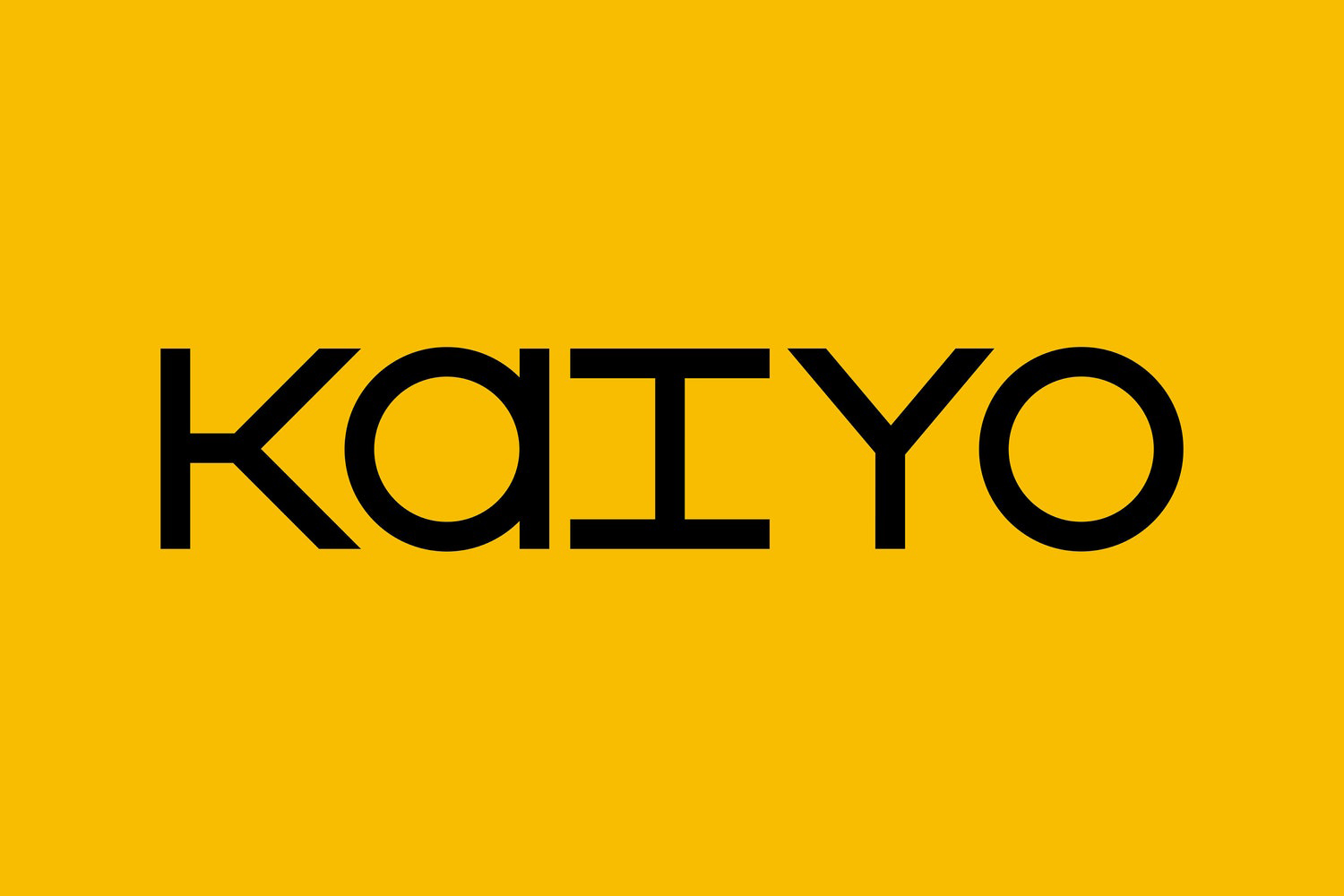
The zeitgeist; up-cycling, longevity and reuse once again calls the modernist principles of good design for all, design fit for purpose, to the present. These services have, up until this point, largely been managed on an individual basis; the Craiglist advert, the Ebay post, second-hand markets, junk shops etc. Pentagram brings a high-street retail quality to the world of the pre-owned.
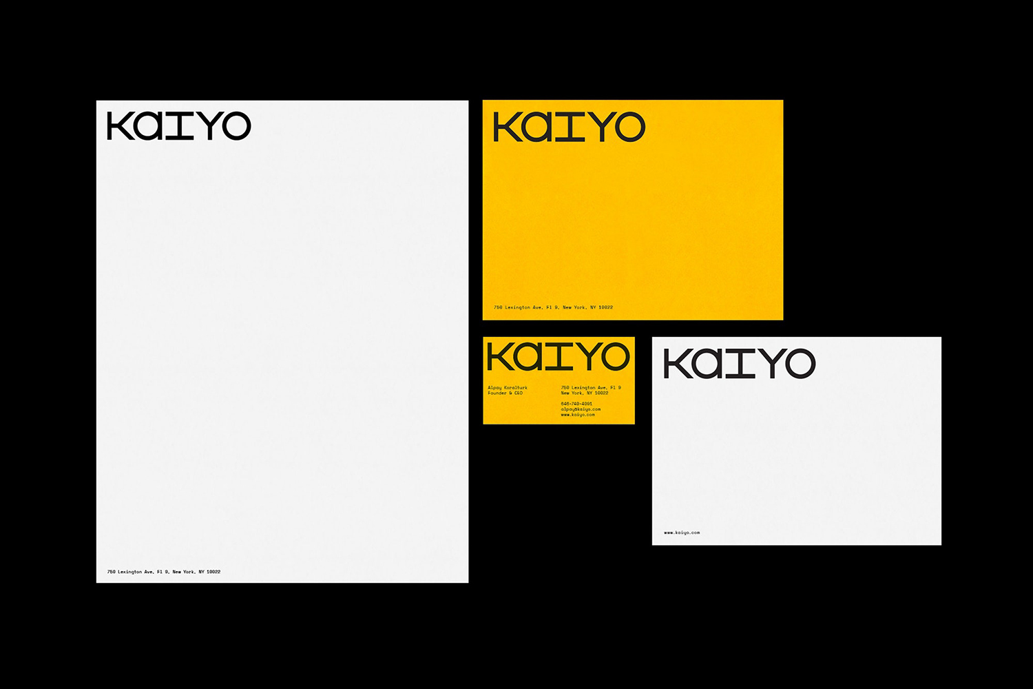
Imagery, design classics, placed amongst type (Space Mono) establish an immediate visual language that speaks to a market that is design literate. Presently, the Kaiyo website is mixed, without the same eye for photographic elegance, or the standout pieces as visual identity, as such identity appears aspirational. There is, however, a continuity in the way the current stock is presented and visual identity; its modularity, secondary typeface (Avant Garde Gothic) and eye-catching colour palette, manage to hold a variety of second-hand products together, a point of difference, where previous experiences, those user-generated platforms, are fragmented.
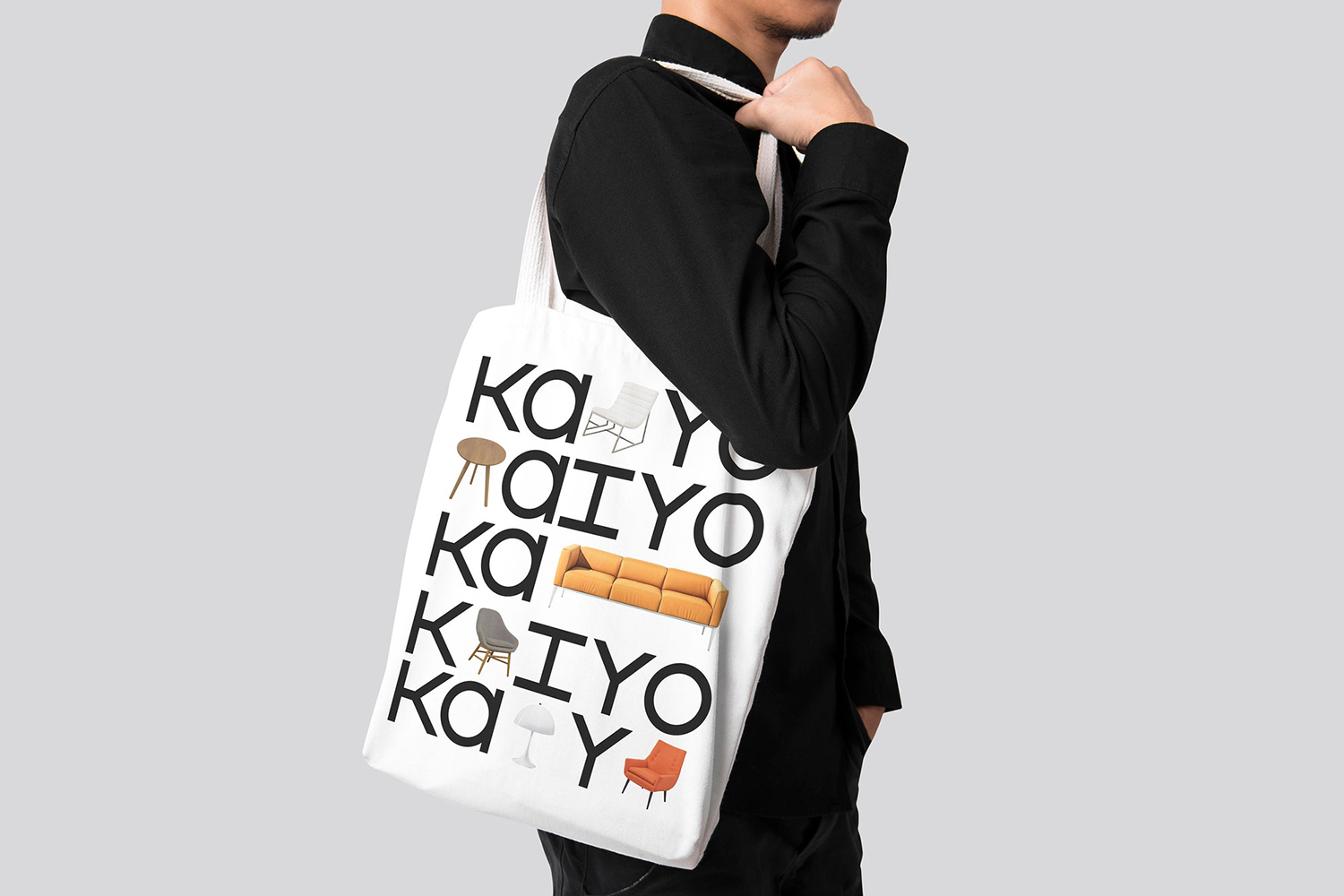
Isolated image punctuating type has seen a bit of a resurgence, check out Paula Scher’s work for The Library Of Congress, yet, furniture and the way Kaiyo captures and treats these feels well-suited to this approach. The single, two and three person chairs and sofas, long and short dressers, a small coffee table or lamp, comfortably sit within the grid intersecting a monospaced logotype, itself sharing something in common with the forms mid-century furniture, bound together by the monolinear, space and structure.
The potential to reconfigure the imagery between contexts brings a variety and places offering and aspirations right at the centre of visual identity. It essentially and effectively co-opts the enduring and compelling designs of the past and reframes these for today. There is a question of continuity, the Kaiyo catalogue of furniture is not quite there yet, but visual identity conveys the brand’s aspirations well. More work by Pentagram on BP&O.
Design: Pentagram. Partner In Charge: Natasha Jen. Opinion: Richard Baird. Fonts: Avant Garde Gothic & Space Mono
