Salbini by Studio Brave
Opinion by Richard Baird Posted 29 April 2019
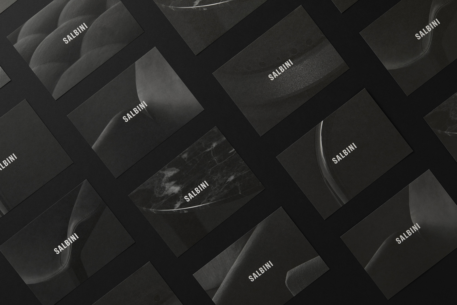
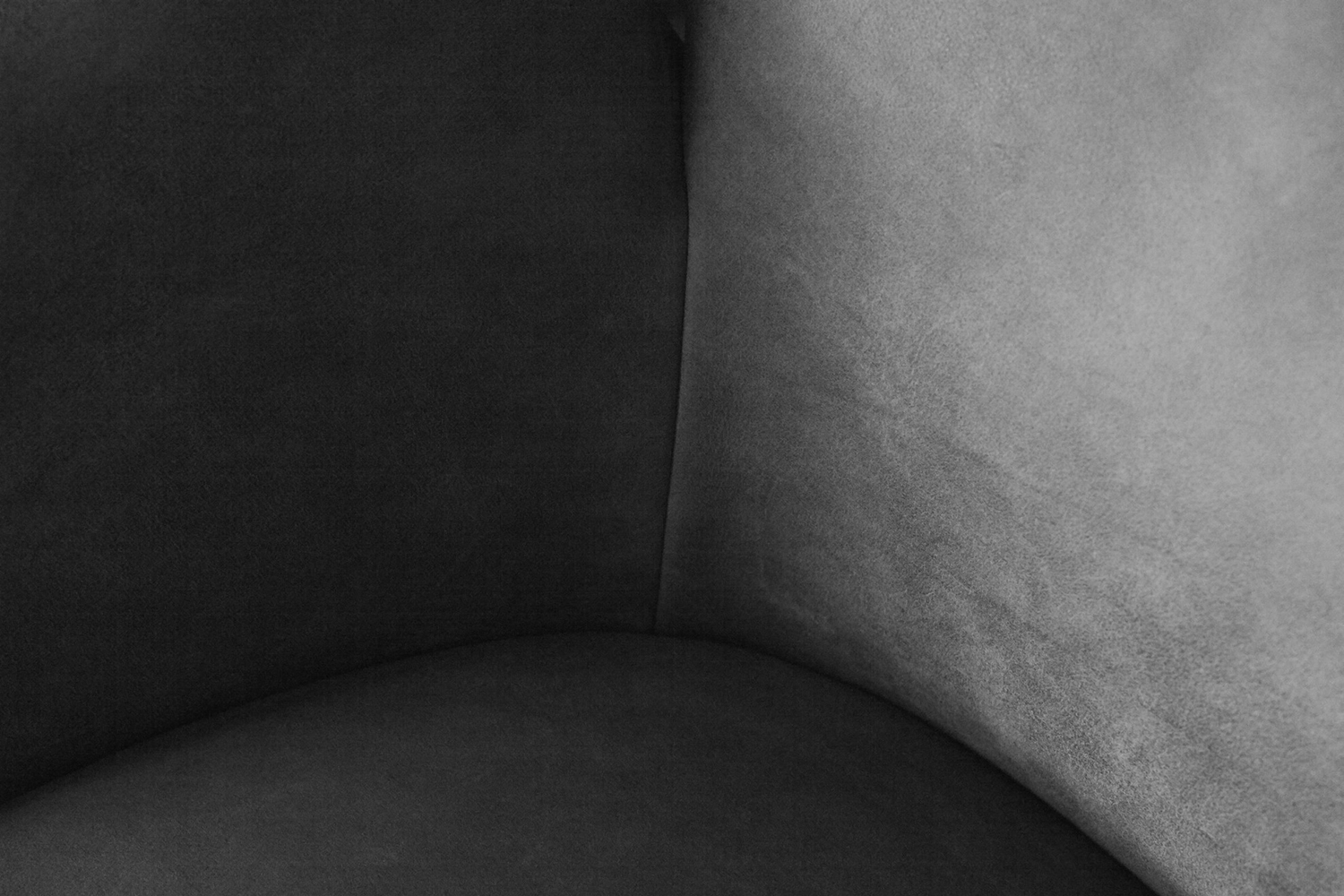
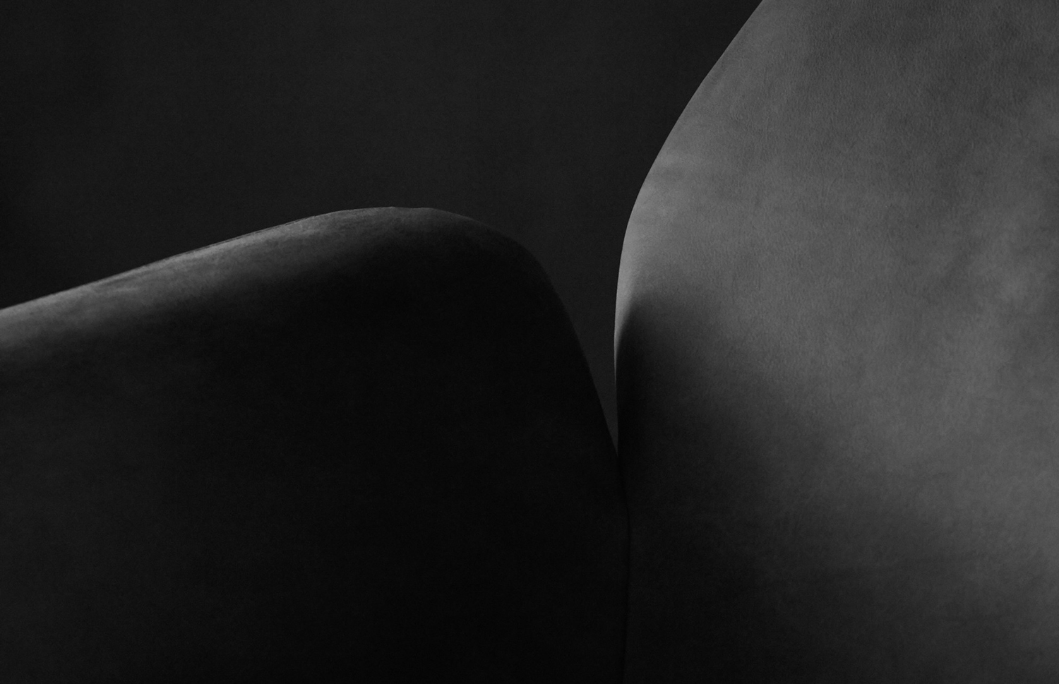
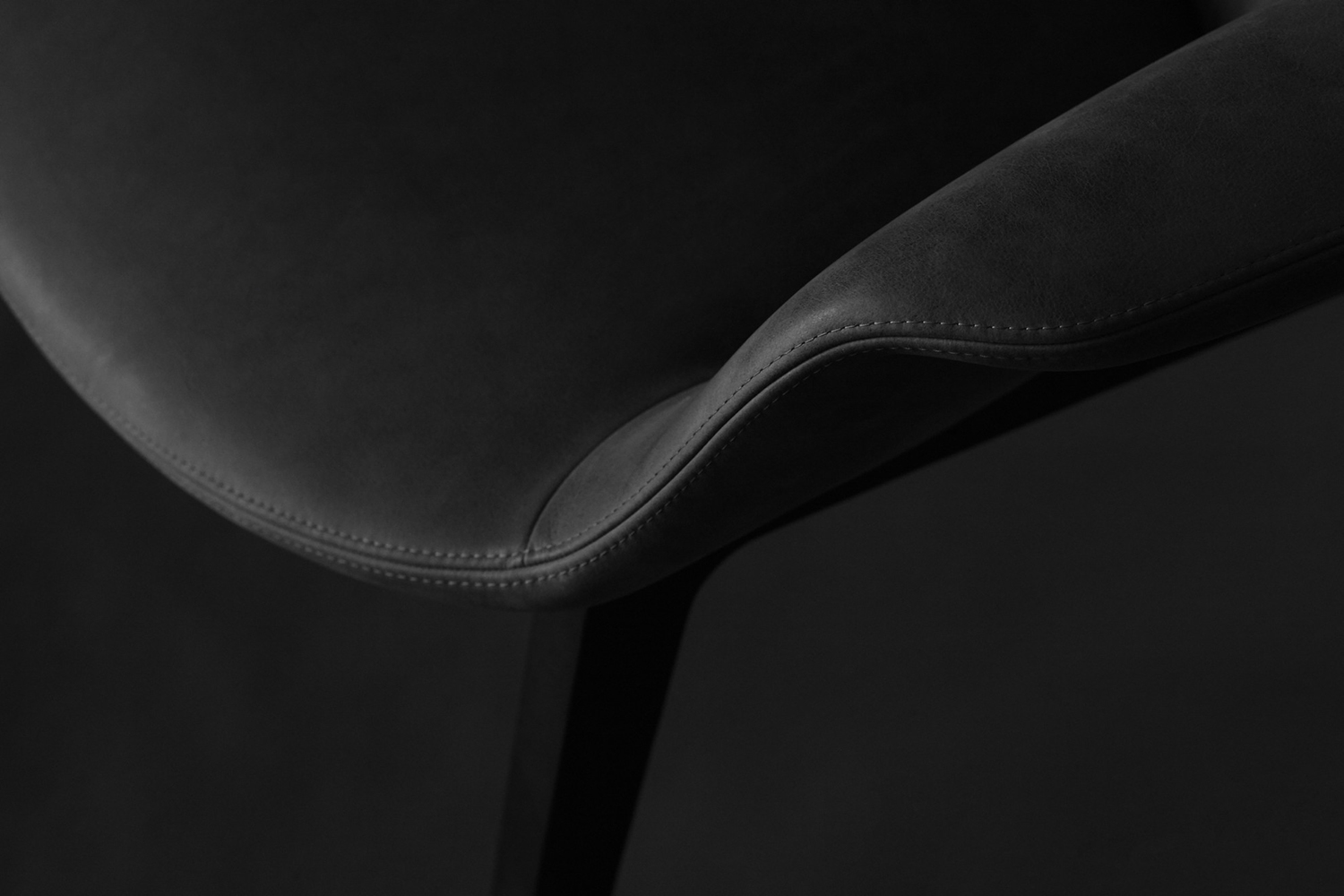
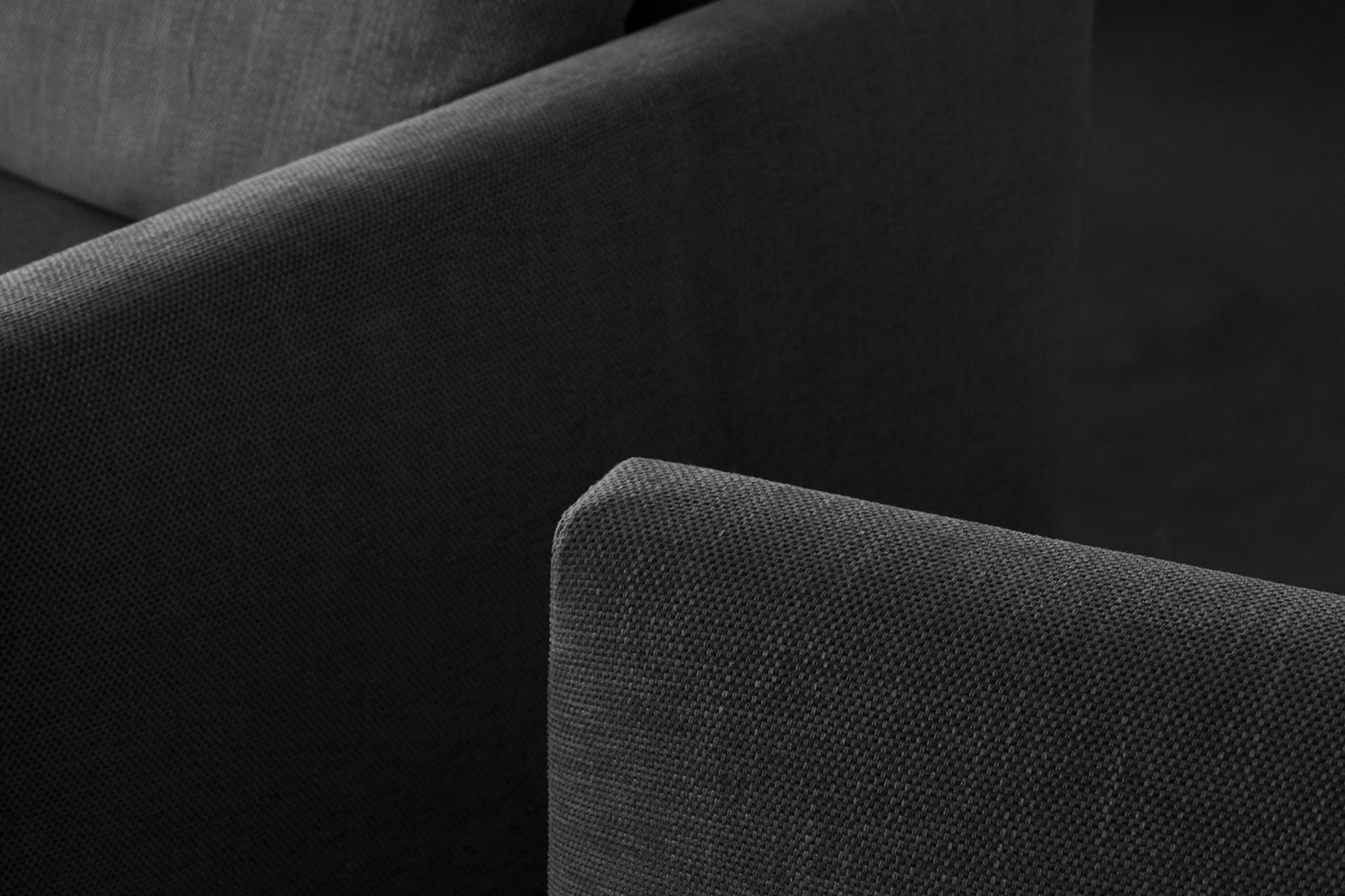
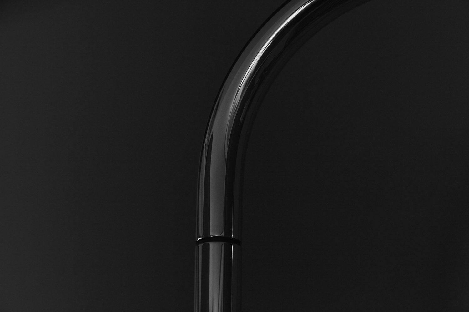
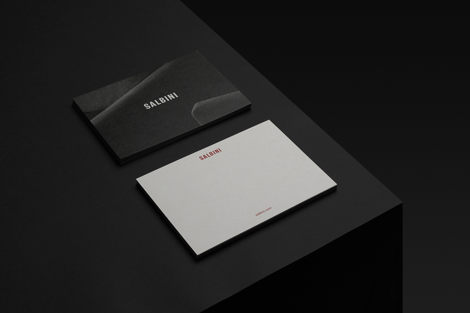
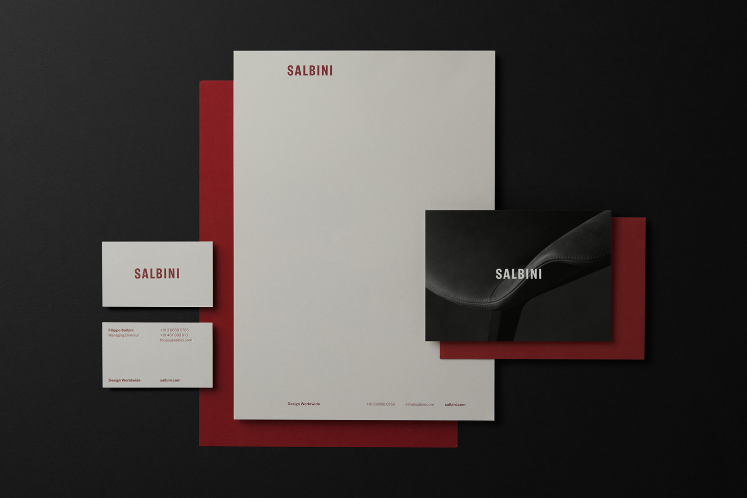
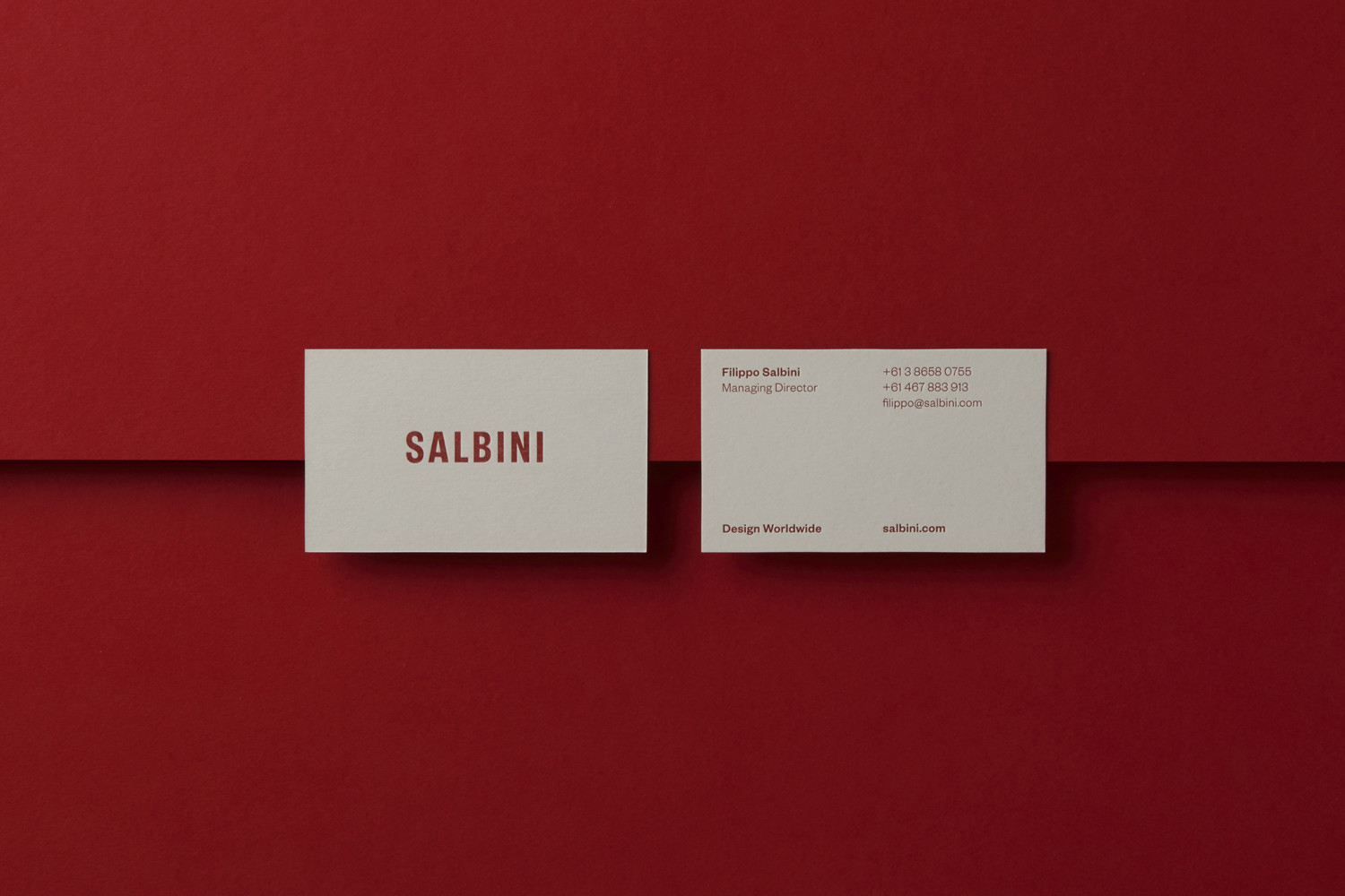
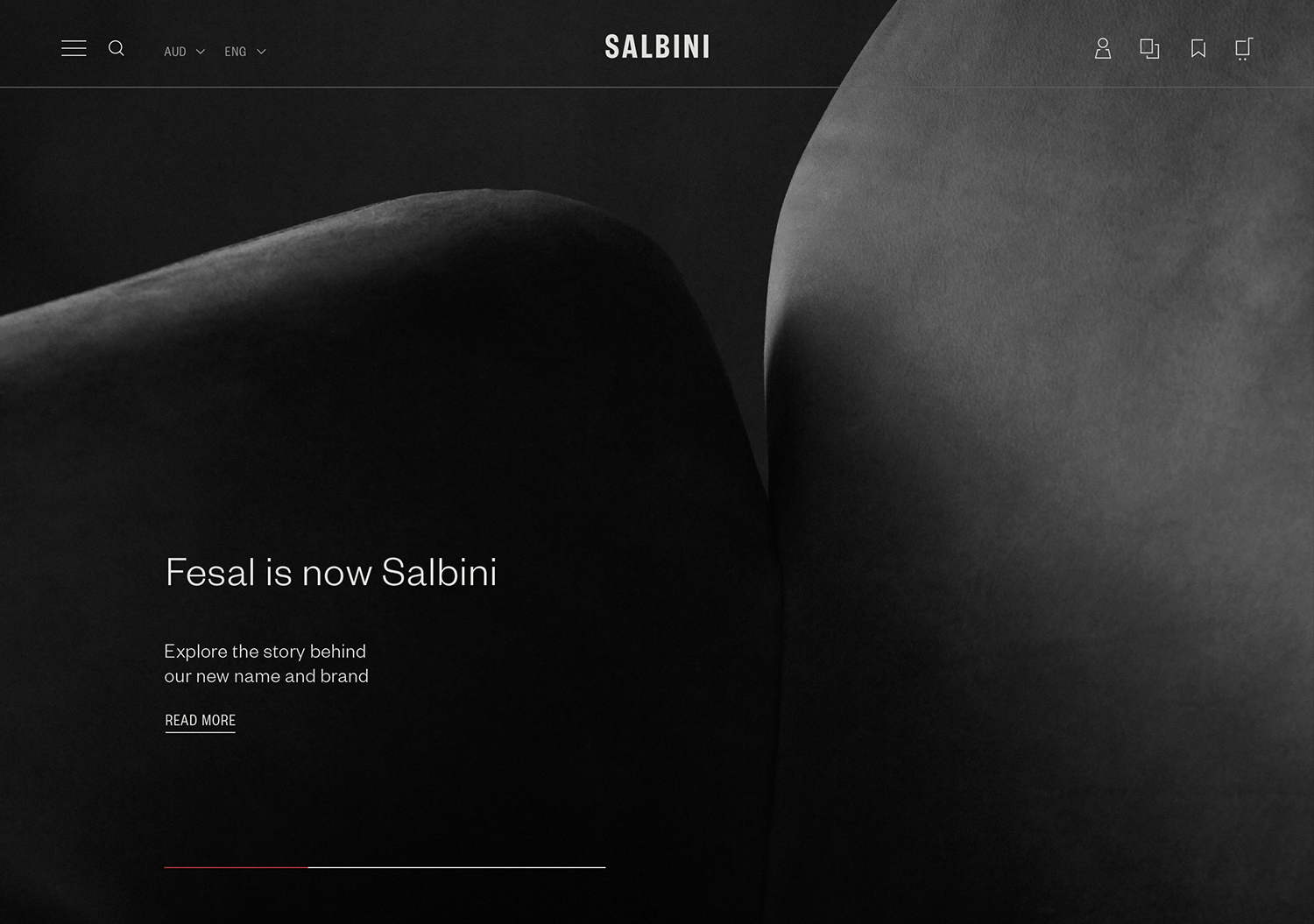
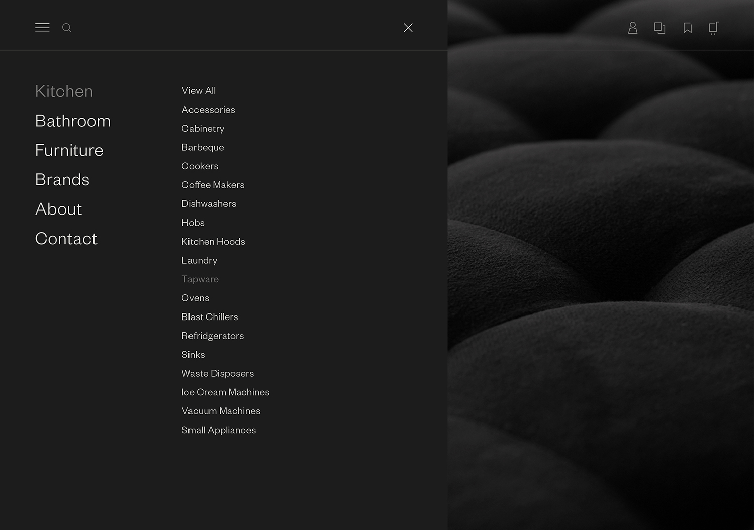
Salbini, formerly Fesal, is an online retailer of premium European furniture and appliances based in southern Italy and shipping internationally. It deals in both one-off purchases and tailoring for large commercial projects, offering both local and global brands. Fesal comissioned Studio Brave to rename and refresh its brand and overhaul its online store. While the project features revisions to type and the introduction of colour, it is the combination of cropped imagery shot by Traianos Pakioufakis and high quality material choices that stand out as a simple and compelling of articulation of craft, quality and elegance. These images link printed materials such as post cards, business cards, letterhead and certificate sleevers with a redesigned e-commerce website.
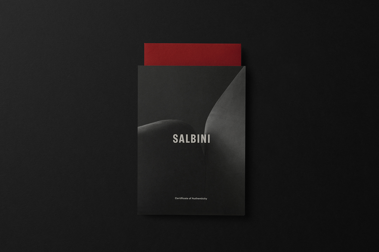
The black and white imagery of Traianos Pakioufakis serve dual purposes. On the one hand there is an element of abstraction, the intersection of and elevation of form and detail by way of staging, lighting and cropping, emphasise craft and detailing, but also collectively play with a the elegance of a considered interection and sensuality of form. Further, the approach unifies a diverse catalogue of products from a variety of brands. The placement and continuity of the Salbini wordmark, the condensed and simpified forms of Founders Grotesk Condensed function as an antithasis to image, elevating the softer forms or detailing of image through contrast. This approach calls to mind the architectural abstractions of Studio Brave’s work for George + Powlett or The Maitland.
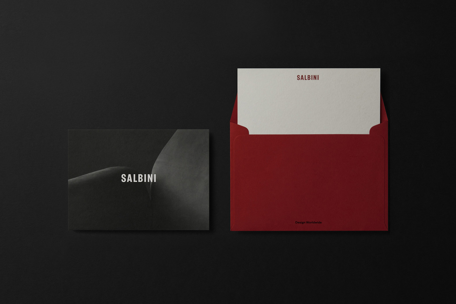
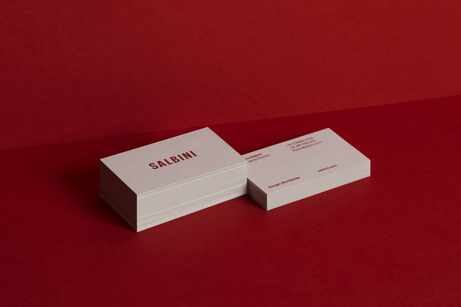
The introduction of a bright red brings a warmth and vibrancy. This is rooted in the Southern Italian origins of brand, but ties in with personable appraoch to business, something often missing from online retailers, and part of the brand’s positioning. This red also serves as a useful colour to call out the live chatting functionality of the site.
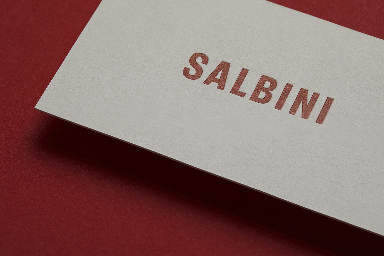
Colorplan papers and letterpress printing across stationery carry forward to materiliaty implied by imagery, giving a tactile layer to type. Red envelopes are unexpected and develop the artisnal visual language, while Design Everyhere, is a neat sentiment. More work by Studio Brave on BP&O.
Design: Studio Brave. Photography: Traianos Pakioufakis. Opinion: Richard Baird. Fonts: Founders Grotesk & Founders Grotesk Condensed. Papers: Colorplan. Business Card Print Finish: Letterpress.
