PLATF9RM by Studio Makgill
Opinion by Richard Baird Posted 27 June 2019
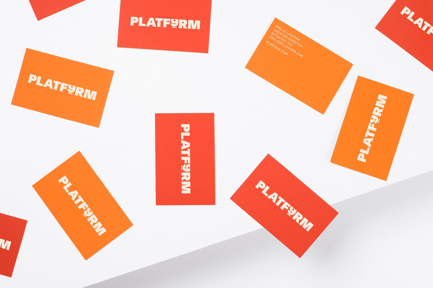
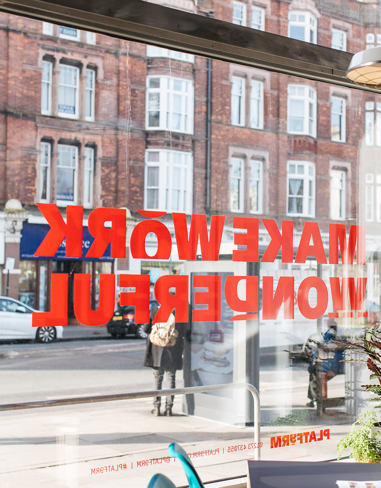
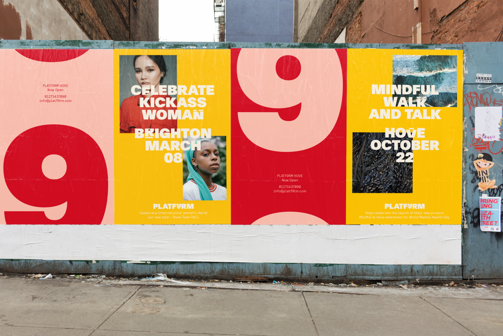
PLATF9RM is a co-working and office space in Brighton and Hove. It features an interior design by We Like Today that blends the utilitarian with moments of bright warm colour. Studio Makgill, working closely with PLAT9RM Founder, Seb Royle and Creative Director, Emilie Lashmar, designed a graphic identity for the space that would capture and express a spirited approach to co-working and connect with those who have a desire to escape the daily commute. The motion and energy of a collective space, and an allusion to a shorter more cheerful commute is expressed by way of bold type in motion, and through a modern convivial colour palette, this links printed materials such as business cards, posters and newsprint with the supergraphics that run throughout PLATF9RM.
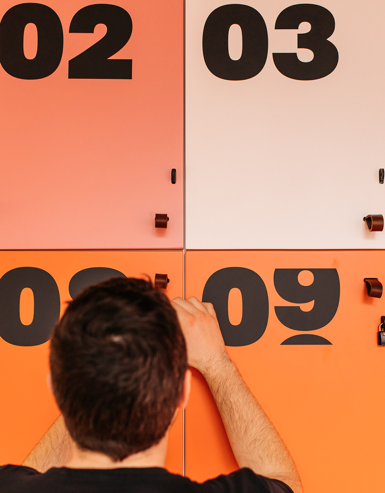
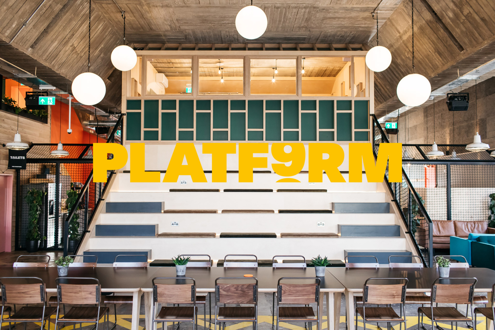
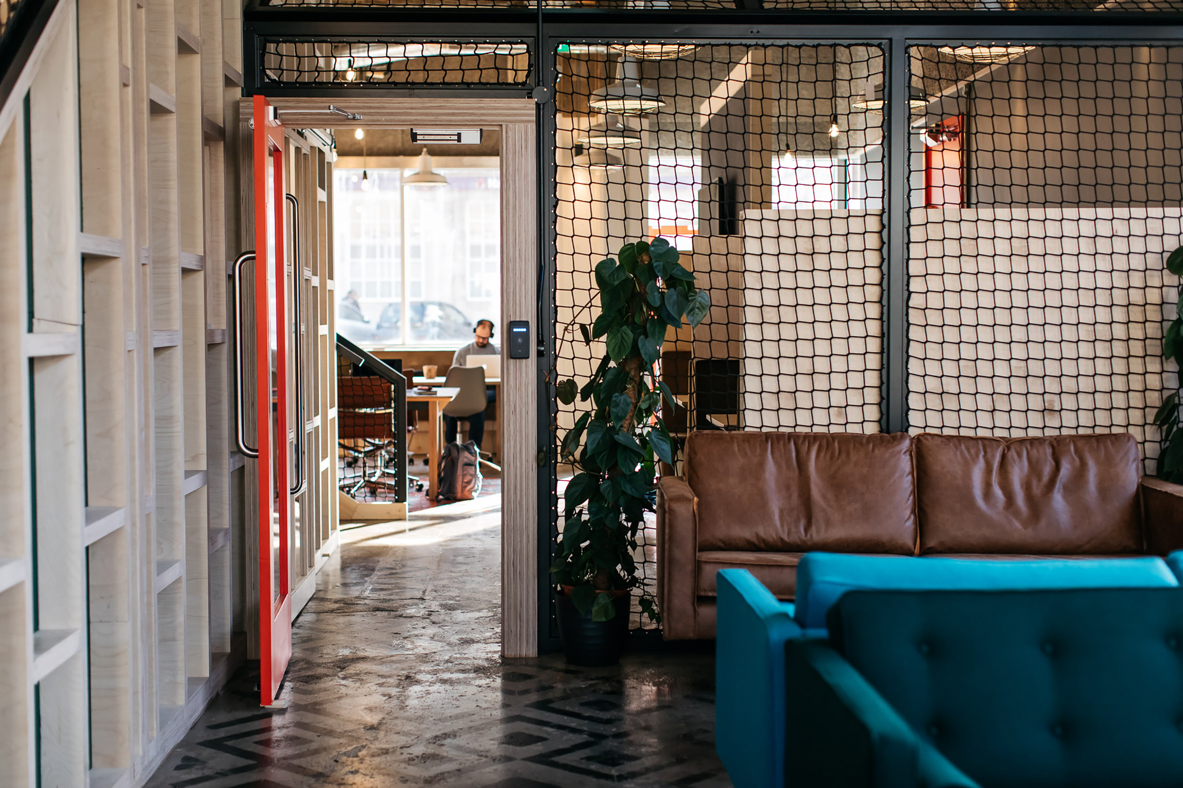
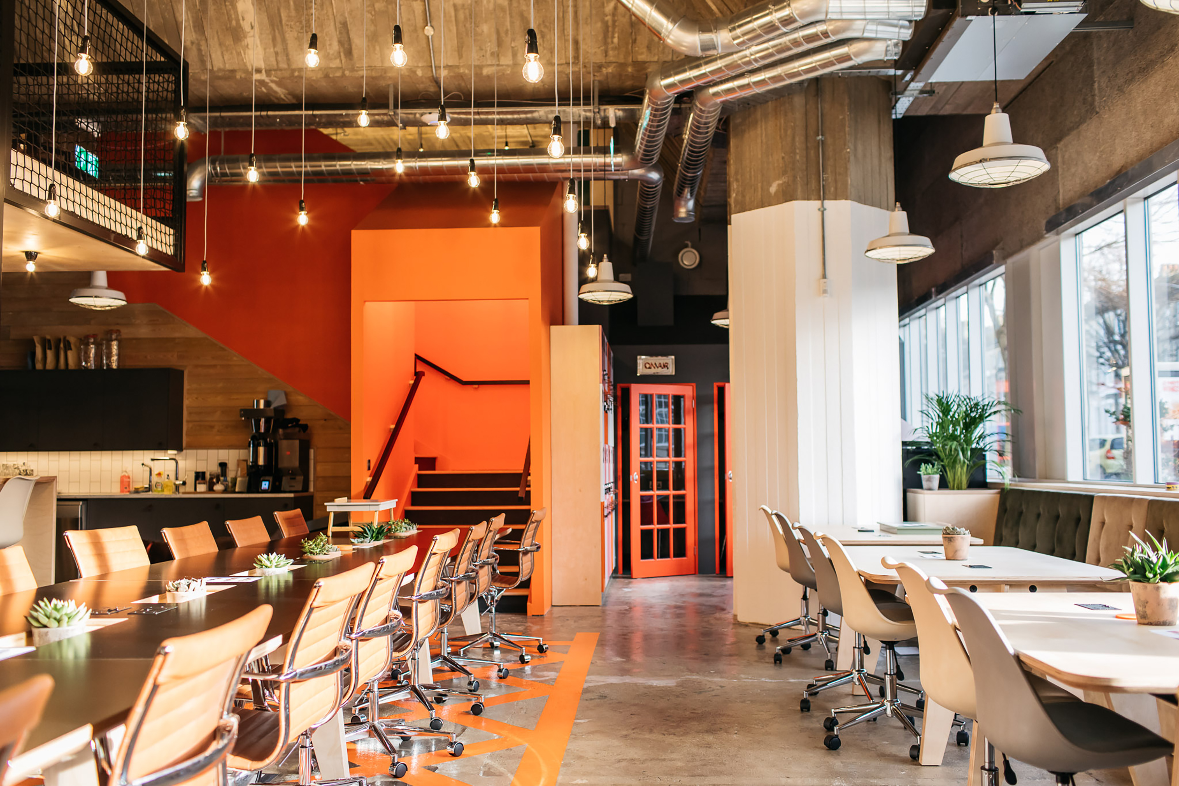
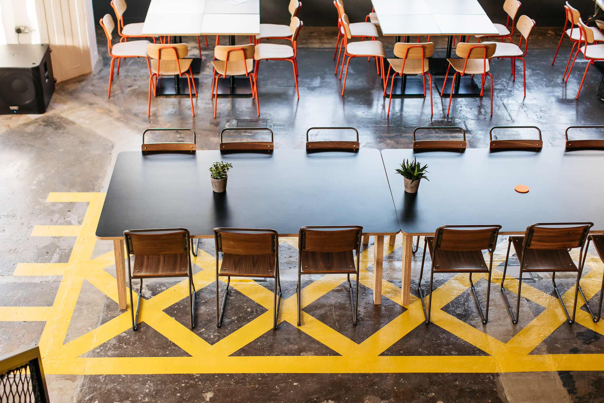
The PLATF9RM space is marked by a mix of the utilitarian architectural language of exposed utilities and concrete floor, the markings of vehicular infrastructure, bulbs absent shades, powder coated frames, unpainted wood surfaces and the frames that hold these and moments of vivid colour by way of modern furniture, upholstery and painted cabinets and lockers. Check out more interior photography here. Other nice details include the actual building surfaces, in particular, the main space roof that calls to mind Londons National Theatre in the texture of the concrete. In words, this reads as familiar, in practice, it appears distinct.


Studio Makgill’s strategic direction (brought to life through naming, logotype and graphic identity) channels some of the qualities of the space and makes an allusion to a better work/life balance absent the struggles of the daily commute, imagining a ninth platform as an addition to the 8 at Brighton Station. Going places without commuting is a nice metaphor for independent workers and small teams wishing to collaborate and mix without having to head to London.
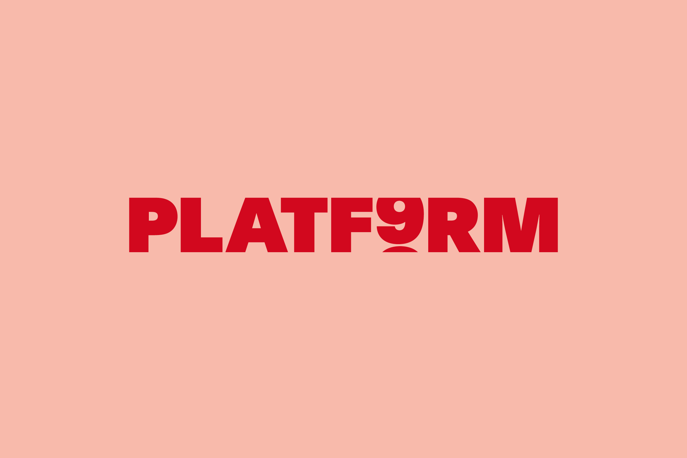
From this, Studio Makgill built a graphic identity of endless scrolling numbers and letters, a reference to the split-flap notice boards of train stations. Associations with the rolling numbers of analogue clocks also come to mind, whether time running away with you or a more general sense of always on the move will come from the individual. The name helps keep the allusion near.
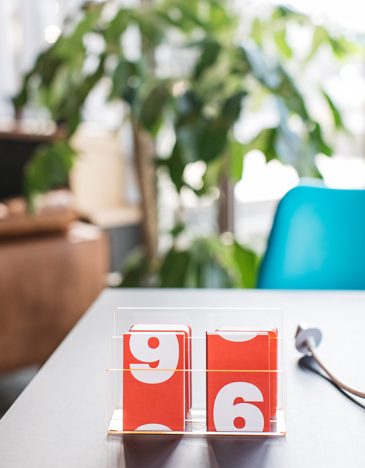
Just as the utility of the space is punctuated by colour, the functionality of the arrivals and departure board is given a cheerful vibrant palette, graphic immediacy and impact a warmth and invitational quality ideal for co-working. It would have, perhaps, been interesting to see this scrolling continue through to imagery across posters, cropped to the top and bottom, just to broaden the graphic language. a palette of spot colours and scrolling letters go on to connect the header for newsprint, interior signage, supergraphics, posters and locker numbers, but with restraint. Studio Makgill get a lot out of a simple idea, and find a way to fit it neatly within the space and appear distinct and eye-catching outside of it. More work by Studio Makgill on BP&O.
Design: Studio Makgill. Interior Photography: Emma Croman. Interior Design: We Like Today. Opinion: Richard Baird. Fonts: Relative, Relative Mono, Plain Platf9rm.