We Compost by Seachange
Opinion by Richard Baird Posted 11 September 2019

When organic waste breaks down in landfill, methane, a potent greenhouse gas, is released. This has been identified as a significant contributor to climate change. Through composting, this organic waste can be repurposed as a soil nutrient which can then play a role in developing local and sustainable methods of regional food production. The challenge of turning this into a consistent resource comes down to good waste management, both on the part of households and collection services. Few of the latter exist, however, in Auckland, We Compost intends to make this a widespread reality. Collecting over 40,000 kg of organic waste and diverting it from going to landfill each week We Compost has grown over the last seven years to become the city’s leading commercial compostable waste collection service.
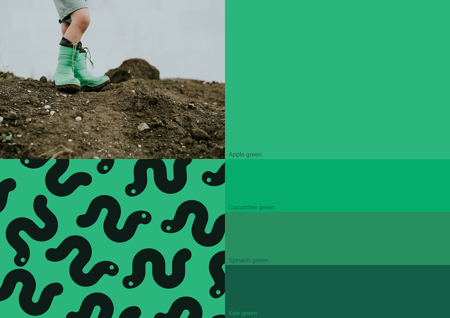
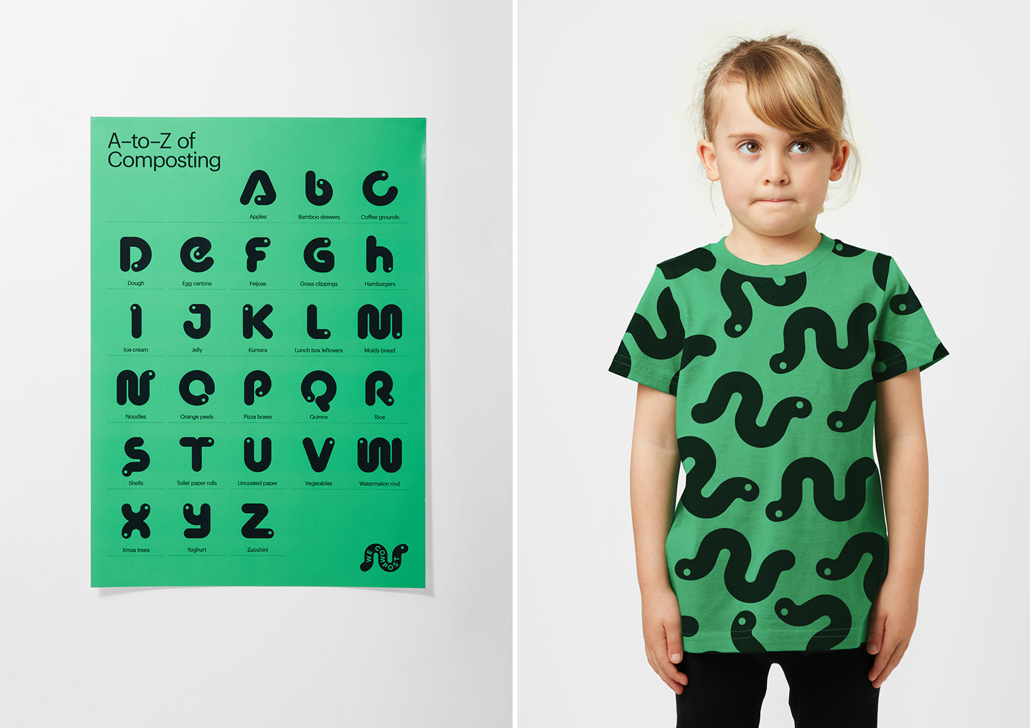
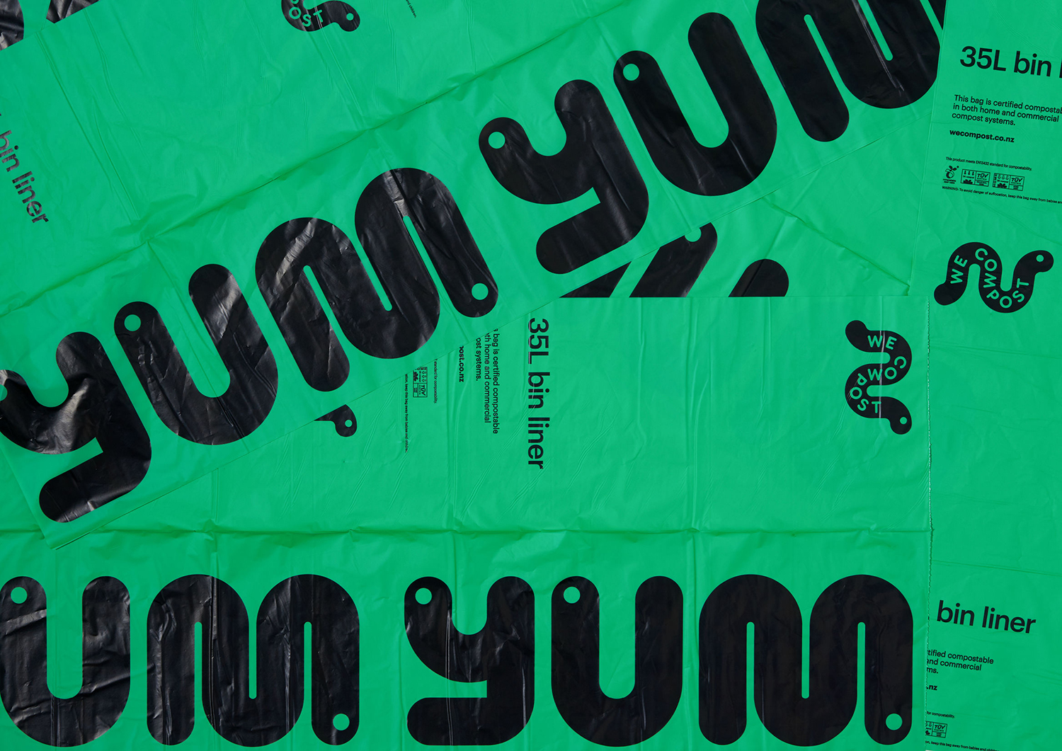
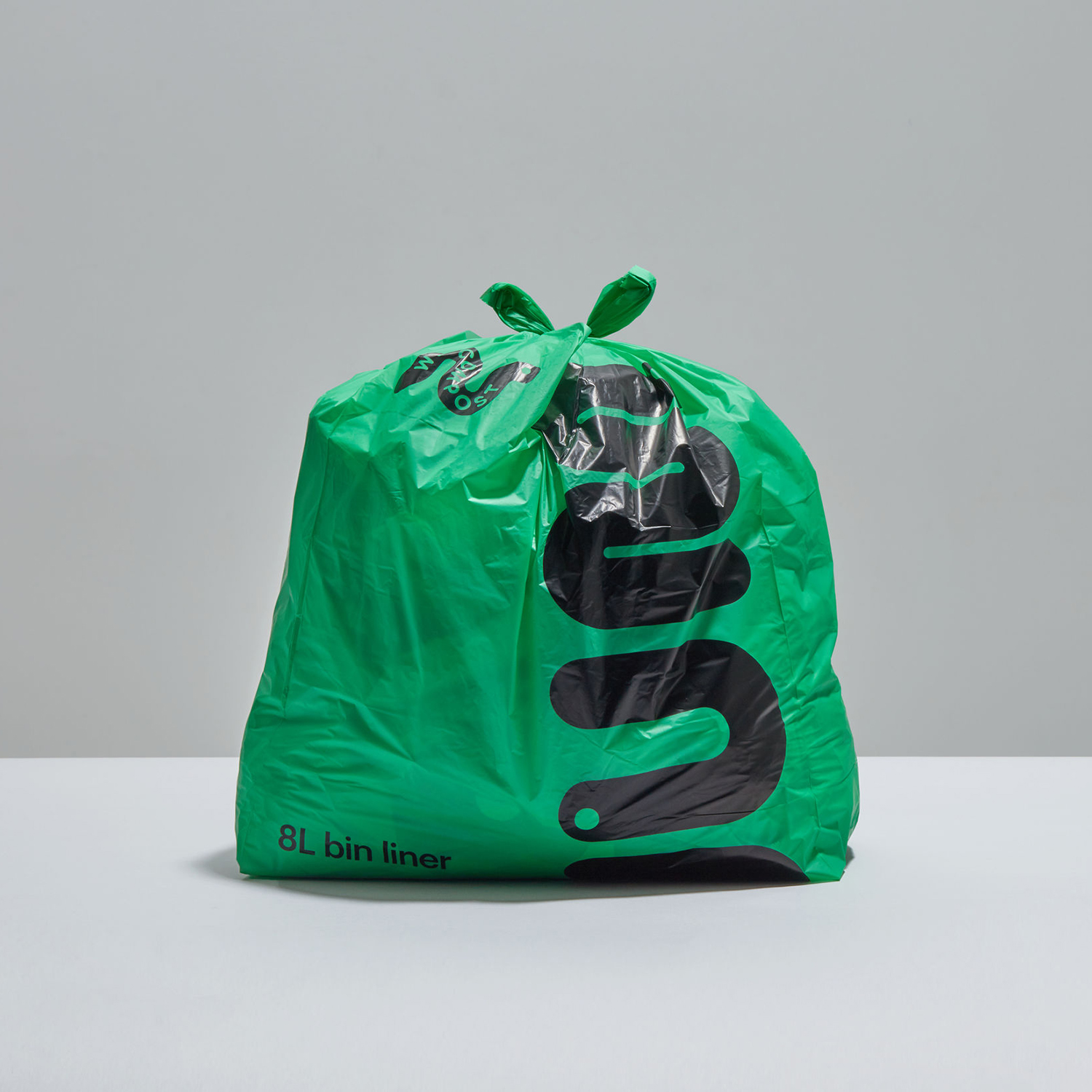
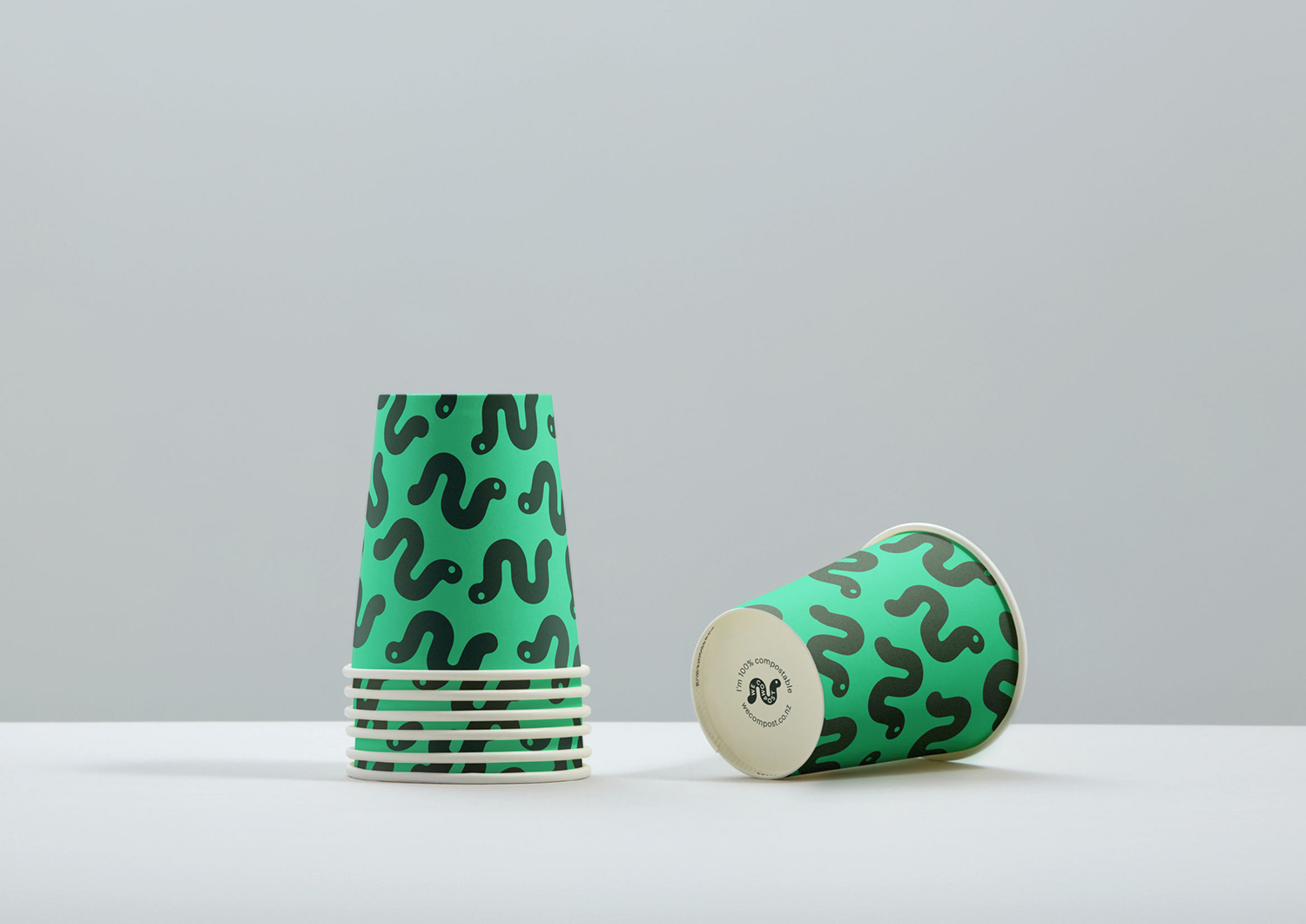
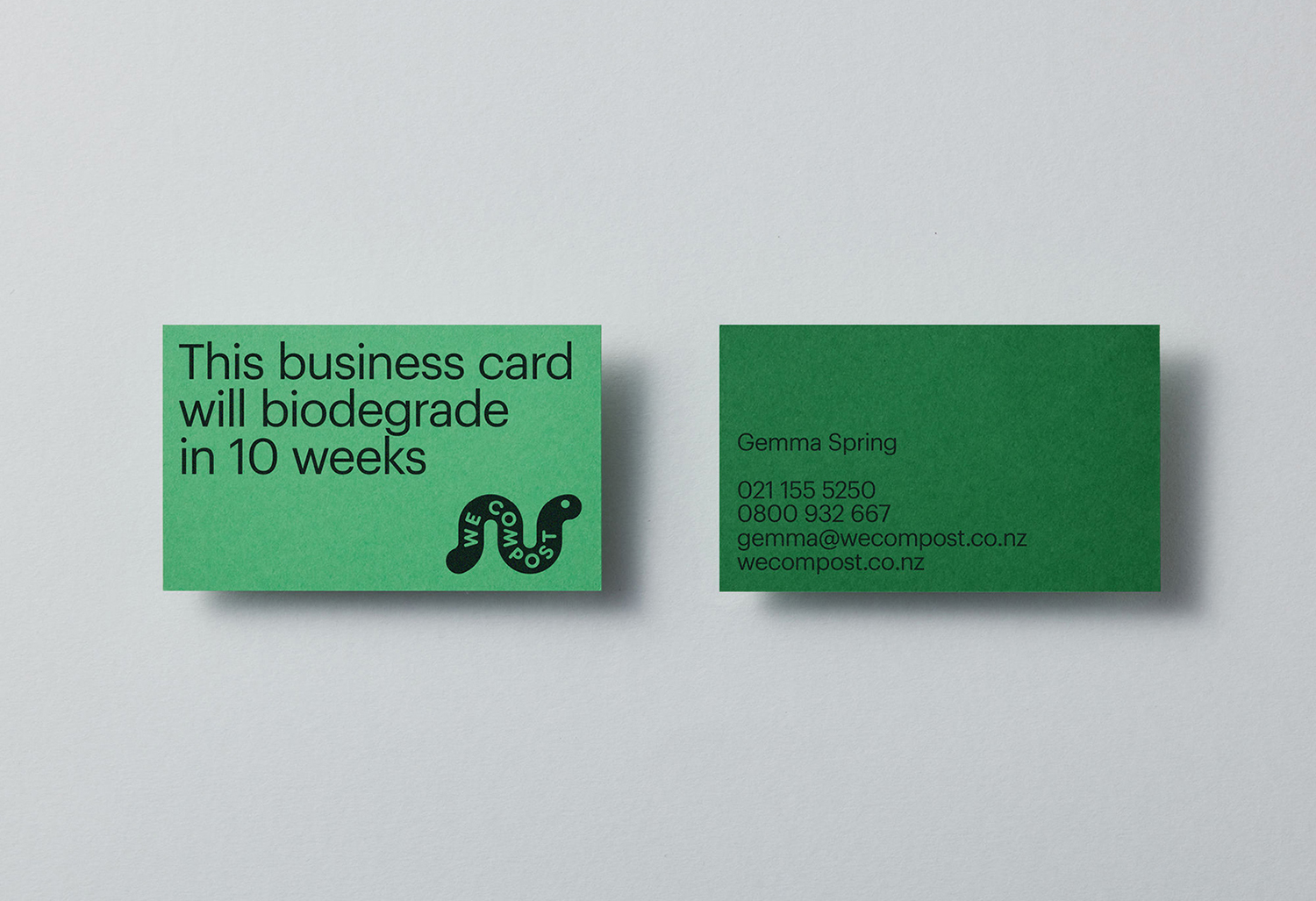
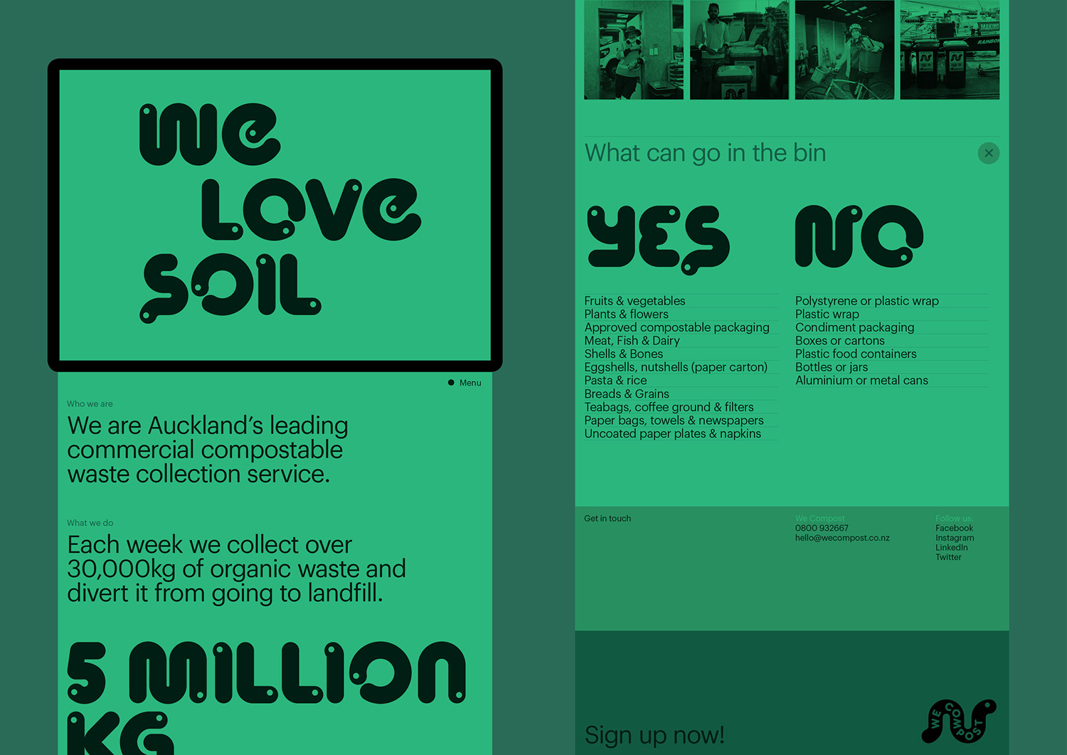
With a desire to continue this growth, We Compost worked with design studio Seachange to help with brand positioning and visual identity, to better align it with their ambitions, make it an every household mainstay and to move it beyond those already invested in ecological challenges and solutions. To achieve this, Seachange’s strategy sought to find a fresh graphic approach to compostable waste management and collection, to find a fun, modern and accessible route that would be an invitation to all ages and types of households to get involved. The studio achieved this by way of a custom typeface that draws on the crucial role worms play in the process of composting, and pairs this with a variety of greens. A range of patterns and statements deliver a convivial and recognisable immediacy across differing of contexts, these included bin liners, t-shirts, business cards, posters and website.
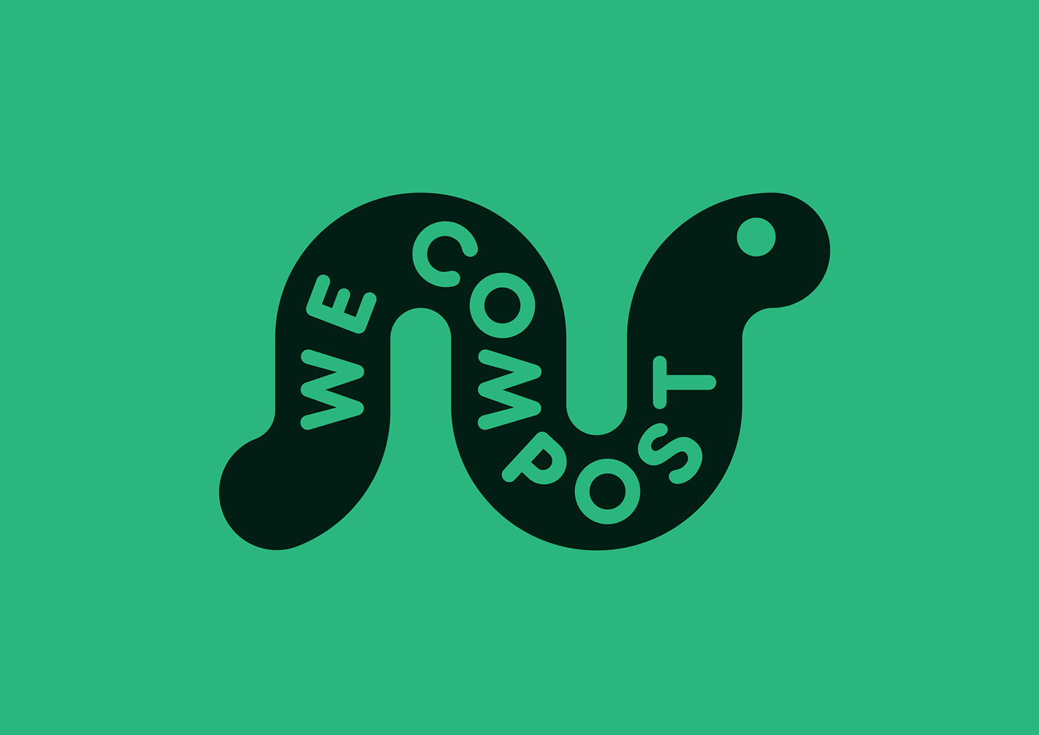
This neatly follows on from yesterday’s piece on refuse collection company Supertrash. We Compost and Supertrash are part of a family-run ecologically conscious initiative with the former engaging in circular solutions; recycling, reusing or repurposing, and the latter, as the name implies, in the collection of compostable waste. Both companies have visual identities designed by Seachange, and similarly apply a strong graphic device, maintain a modernity and simplicity in a restricted colour palette and engagement through words and phrases.
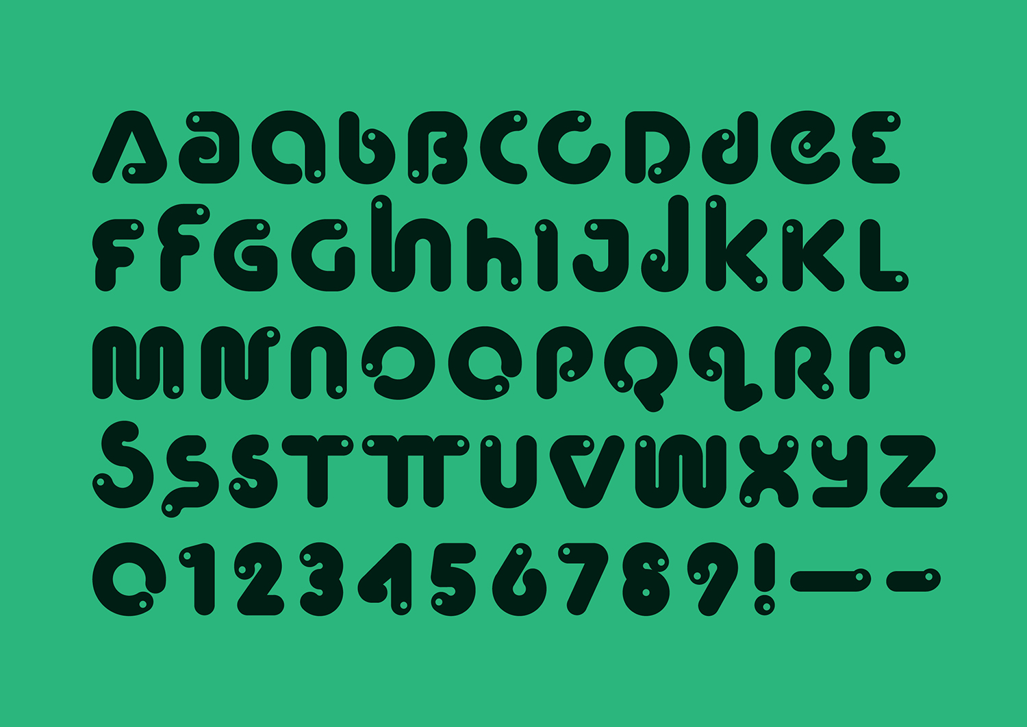
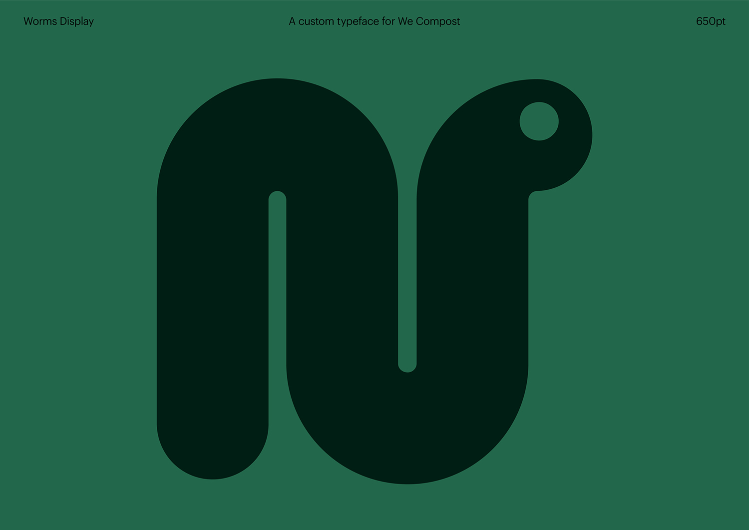
One of the central challenges revolved around reimagining the visual world of composting, one that Seachange rightly describe as being saturated with leaf logos, recycling symbols and “overly worthy messages”. Creating something playful and nurturing, rather than continuing to draw on the impersonal mechanics of sorting and the civic and social responsibilities (and feeling of imposition) of recycling feels like a sensible route to stand out and develop an interest in younger citizens. The worm becomes a useful and universal entry point, a way to speak about the service and the process. A custom typeface, ‘Worms Display’, neatly weaves together words and distinctive imagery.
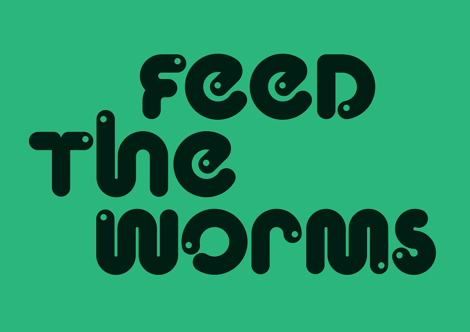
The custom typeface has something of a pre-school learning quality, something you might employ to encourage a child into recognising individual letters forms. The principle remains the same, however, Seachange does manages to temper this enough for it to feel more universal, largely in the paired back colour palette, in the restraint and the quality of its design and application. There is definitely a period quality to it in the shape of the letters, the NASA worm comes to mind, in its playfulness and simplicity, and across the compostable bin liners, which are lovely.
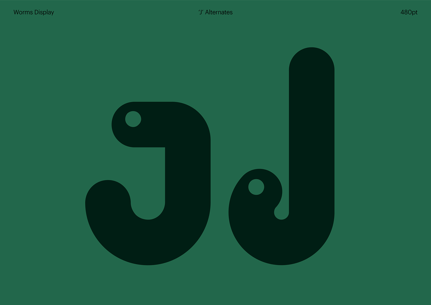
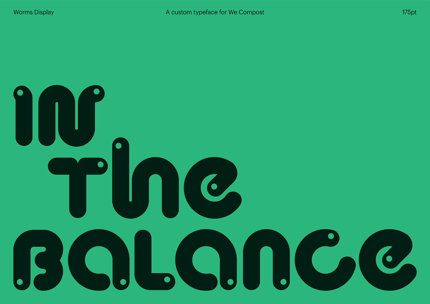
For the most part, the rounded terminals and knock out circle leads the mind to worms across most of the letters individually. Its power really comes in the collective, in the forming of sentences and having many worms together. The animated transition from random worms to statements is neat, while the business card with the “10 weeks to biodegrade” is also a lovely idea, something that could be expanded upon across other compostable products. Every touchpoint was seen as an opportunity to grab attention, in print and online, across bin liners and business cards, and ‘Worms Display’ is an effective and memorable way of doing this. More from Seachange on BP&O.
Secondary font: Graphik Regular
