Ascari by Blok Design
Opinion by Richard Baird Posted 15 October 2019
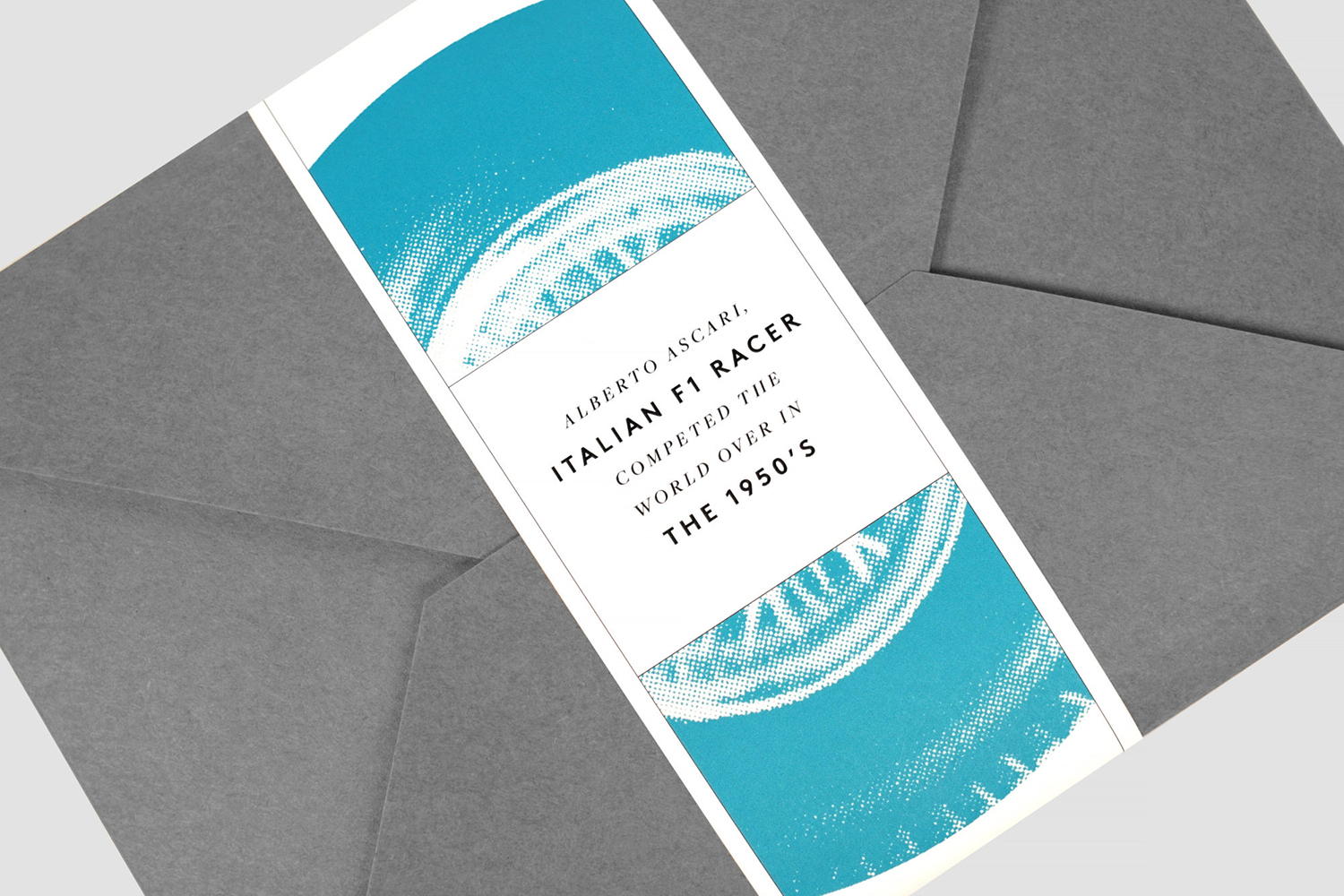
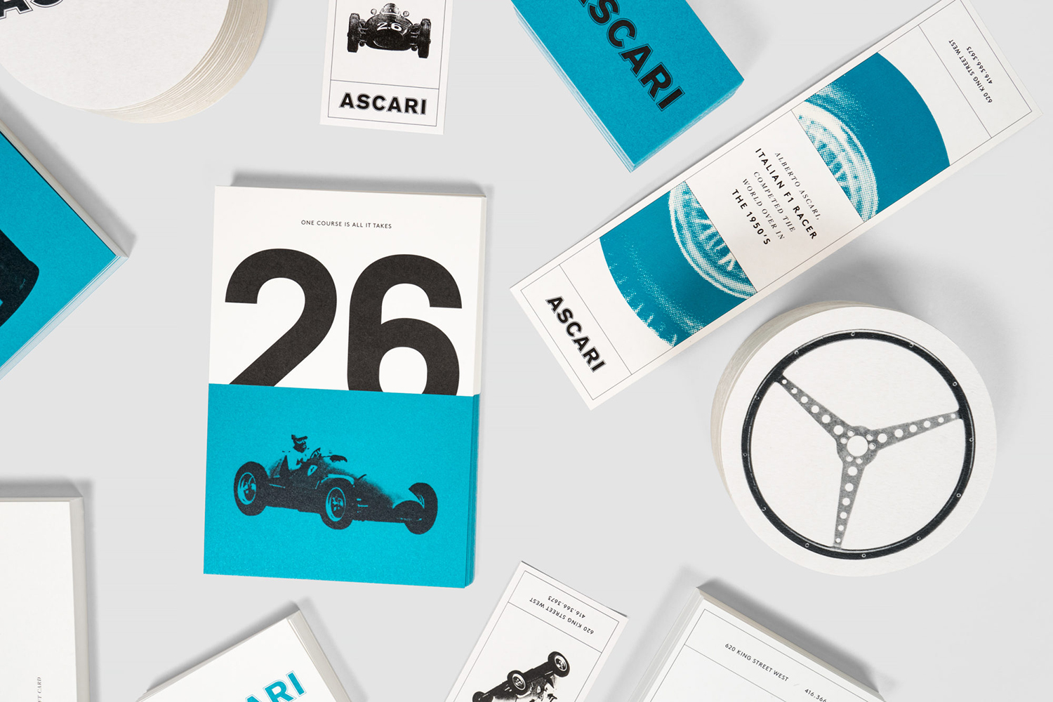
Ascari is an Italian restaurant which two locations, one on Queens Street East and another newly opened establishment on King St West. Toronto, Canada. It is named after the proprietor’s hero, Formula 1 legend, Alberto Ascari, (who was also known for his love of food). To reflect both the passion for good simple food and racing, design studio Blok developed an identity that brings together the visual cues and photography of 1950’s motor sport with a modern use of colour–the striking blue of Alberto Ascari’s helmet–and the outlines and solid fill logotype. These link coasters, business cards, signage and menus.
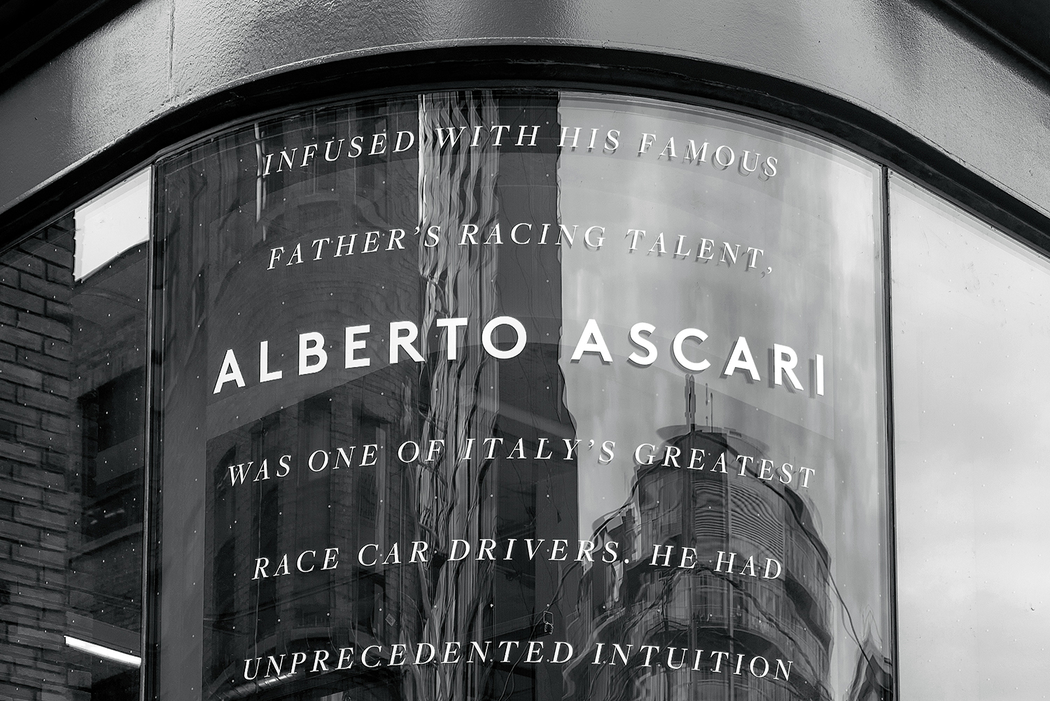
The intersection of racing and food is unusual and unexpected, but one that neatly draws together the passion and skill present in both worlds. This gives the restaurant a distinctive and immediate character.
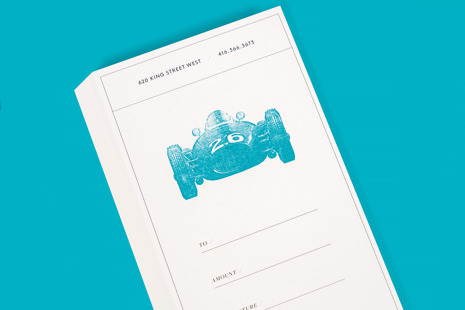
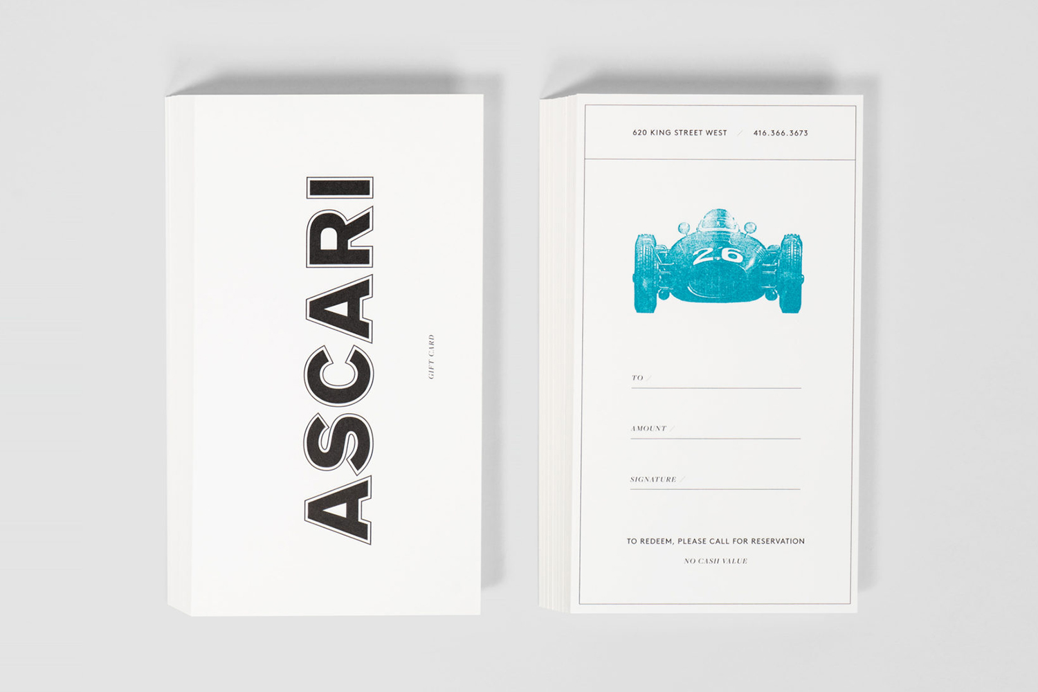
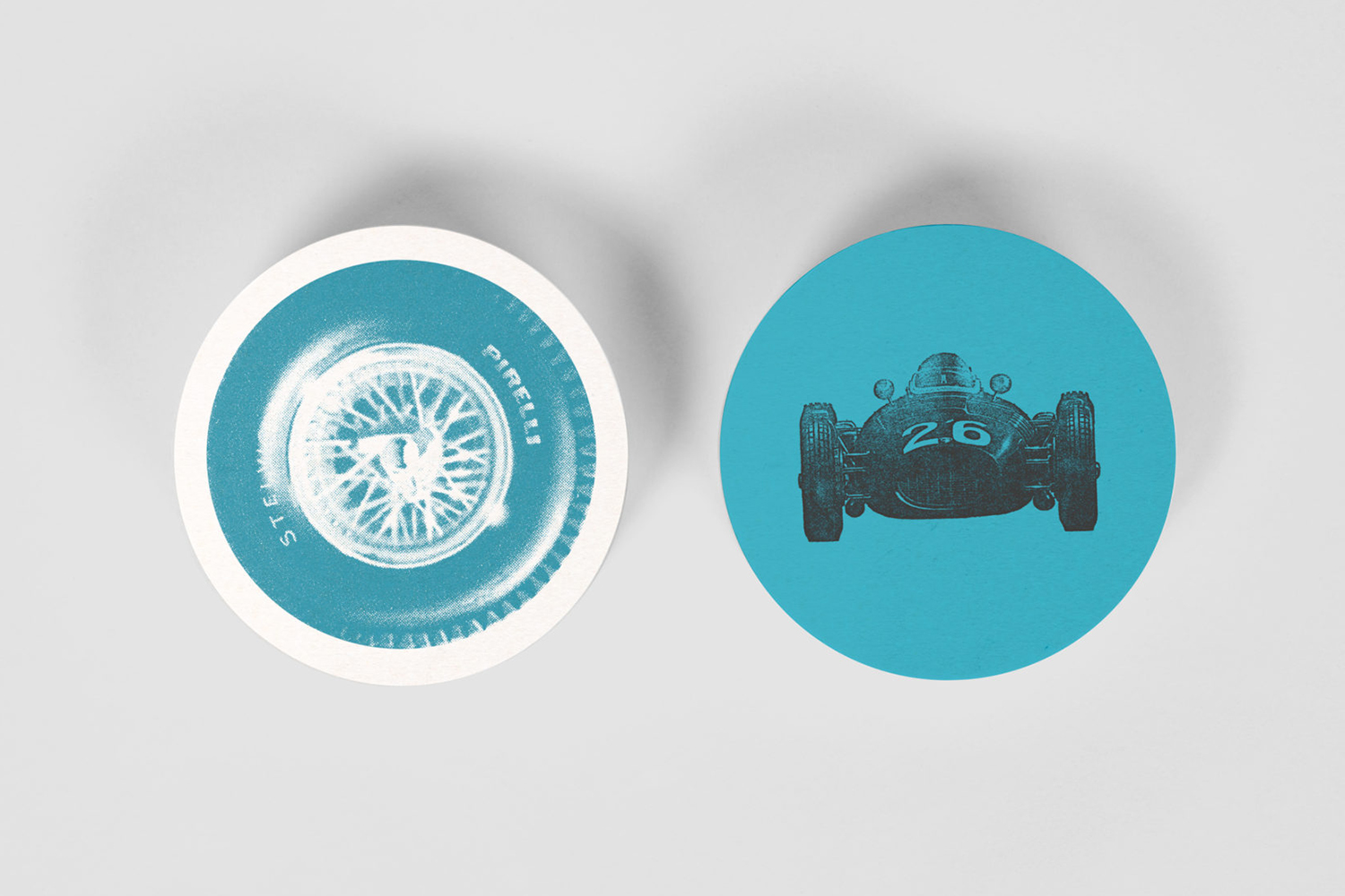
There are a number of discernable racing visual signatures at play throughout the visual identity. This comes through subtly in the thin outline of the logotype and more immediately in the use of racing objects. A continuity and period quality is effectively established and expressed through clipping and greyscale. And a contextual senstitivtiy such as a steering wheel on coasters is cheerful.
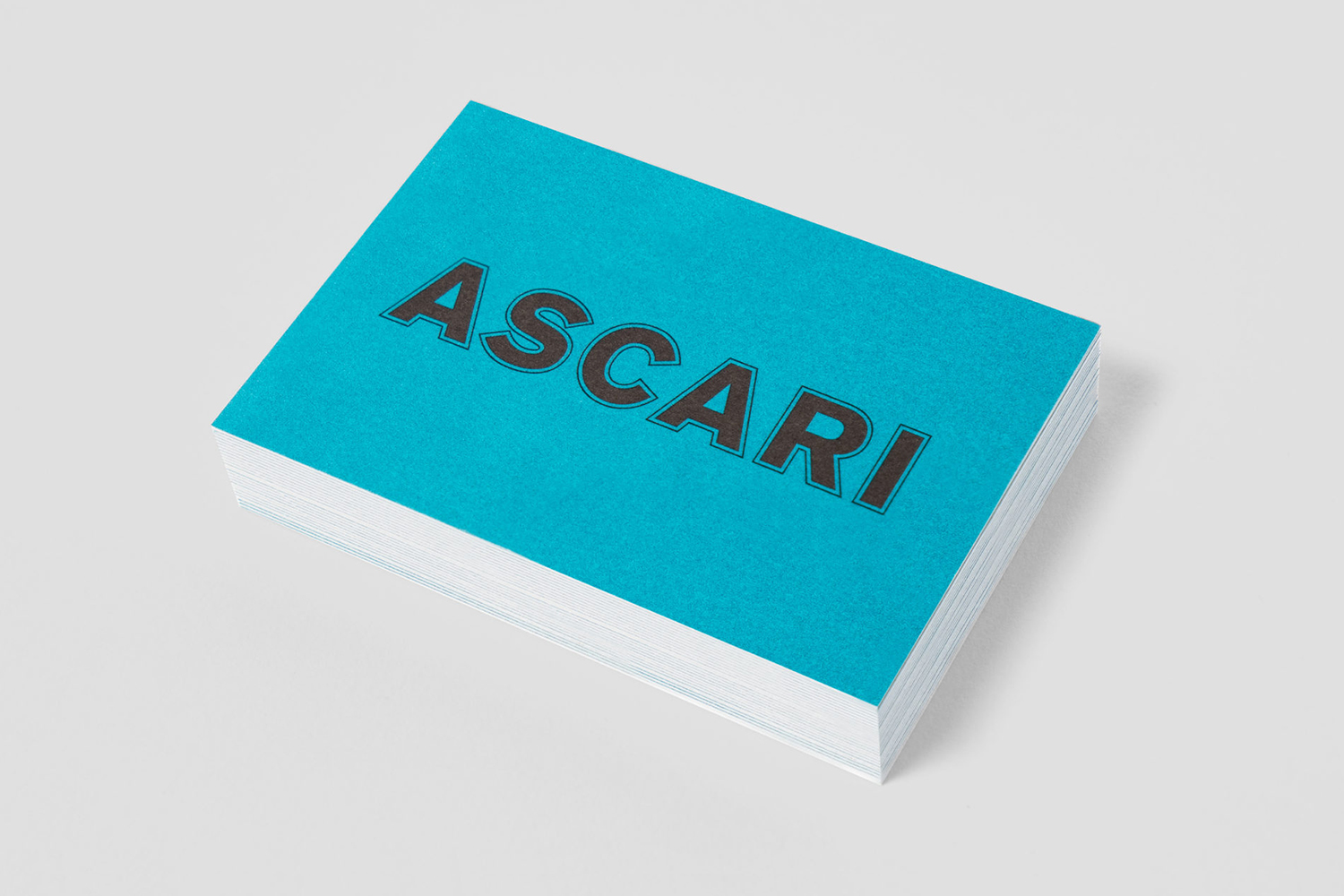
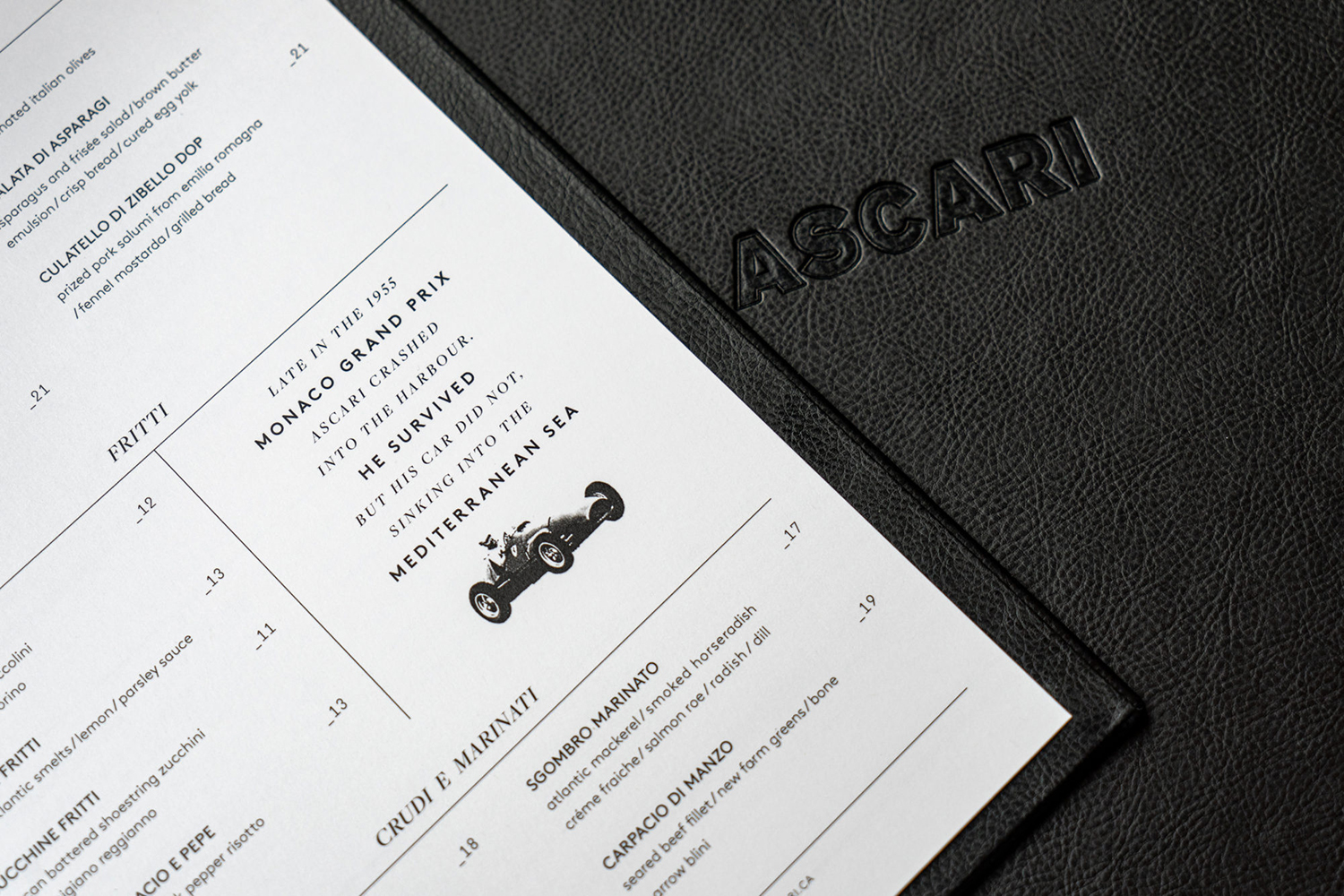
The drawing of the logotype evokes the hand painted signs/race car bodywork of the era. This delivers a sense of authenticity, while the offset strokes reinforce a classic racing aesthetic. The blue, drawing on Alberto Ascari’s distinctive helmet feels light, cheerful and modern in this context.
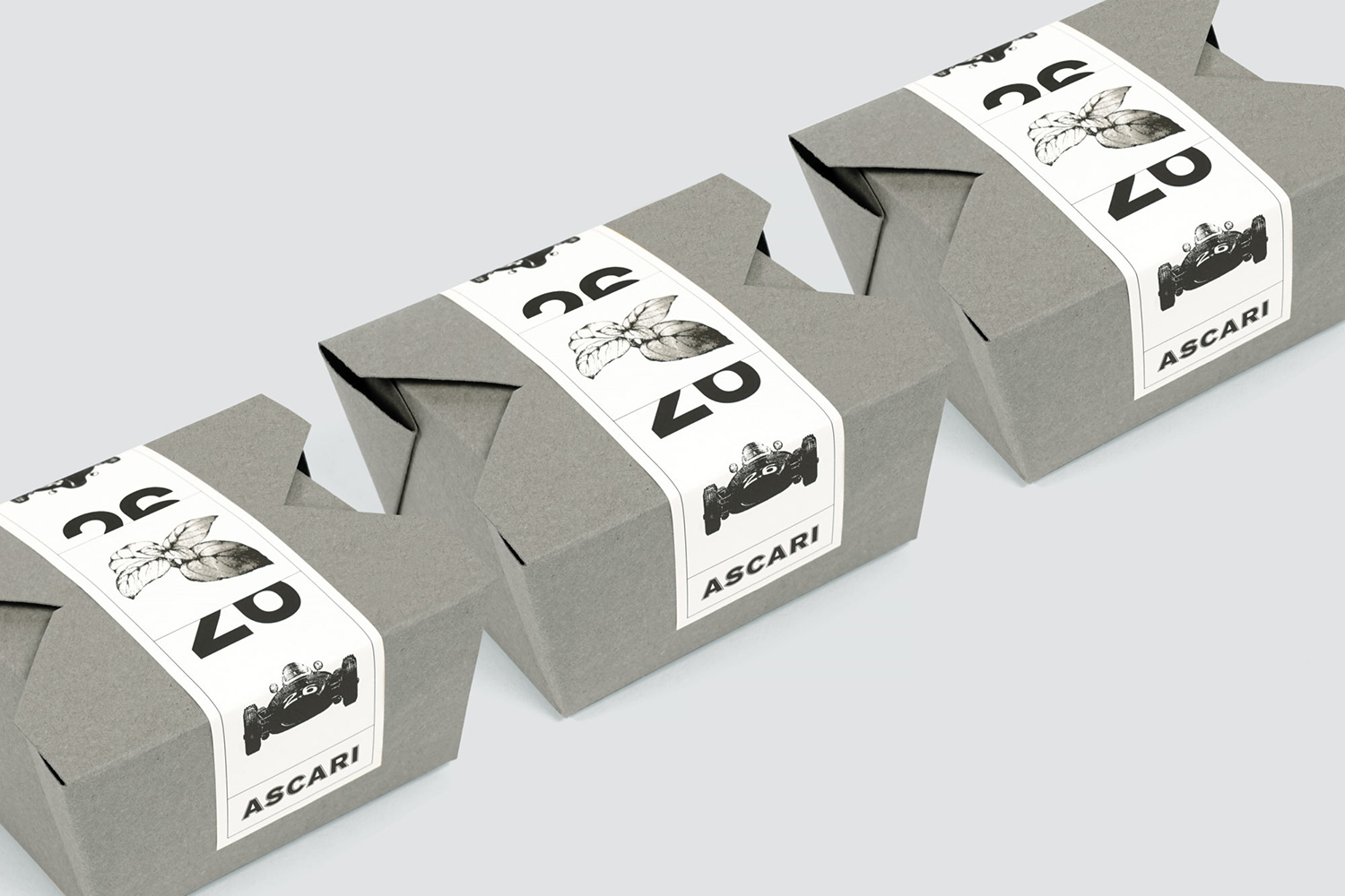
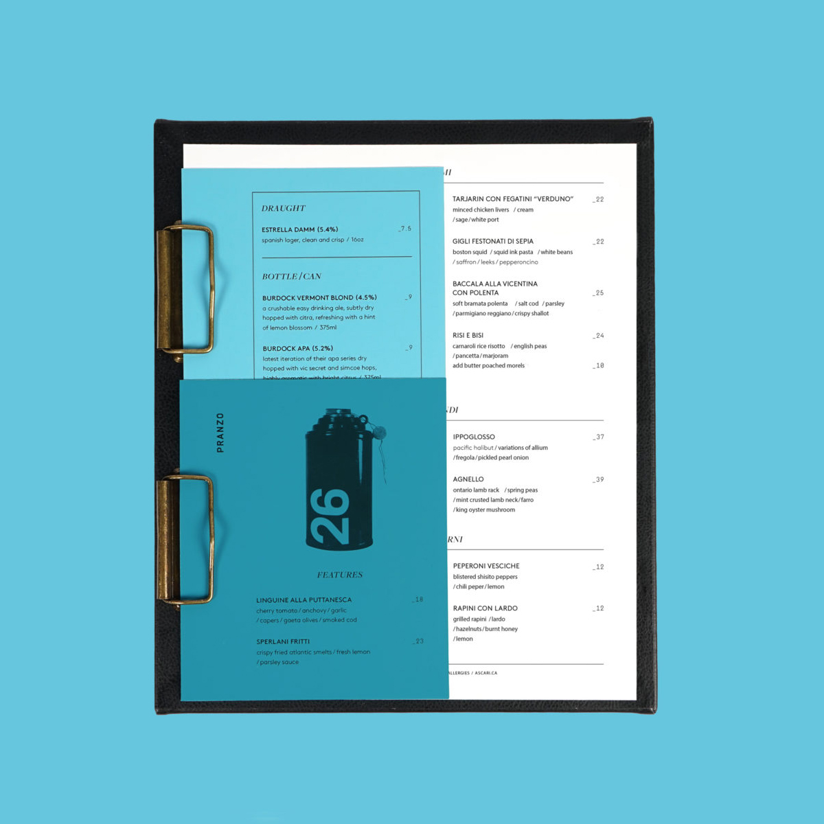
There are a few other nice little details that give a limited set of assets variety. These include cropping, a halftone effect that alludes to the repurposing of historical imagery and the material layering and embossed leather of the menus, this is neat little nod to car upholstry.

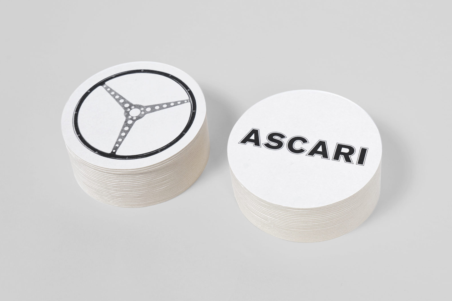
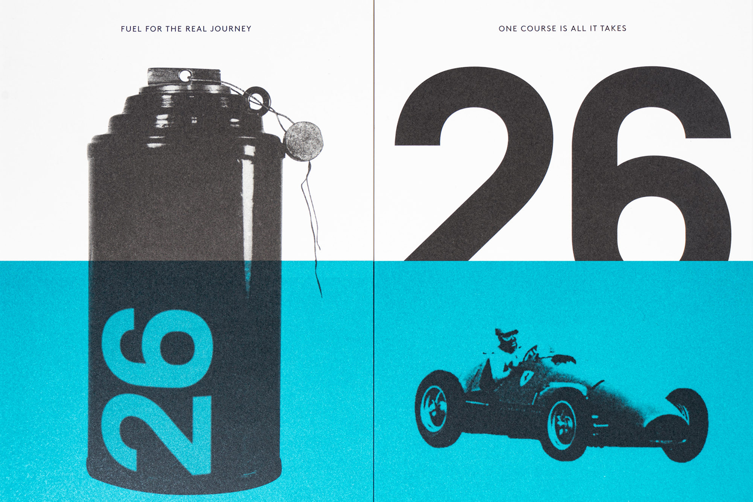
Although many of the visual assets draw on the past, their resolution and implementation across various surfaces–menus, coasters, signage and box stickers–as well as the limited colour palette feel modern. More work by Blok on BP&O.
