Napier Street by Studio Hi Ho
Opinion by Richard Baird Posted 23 October 2019
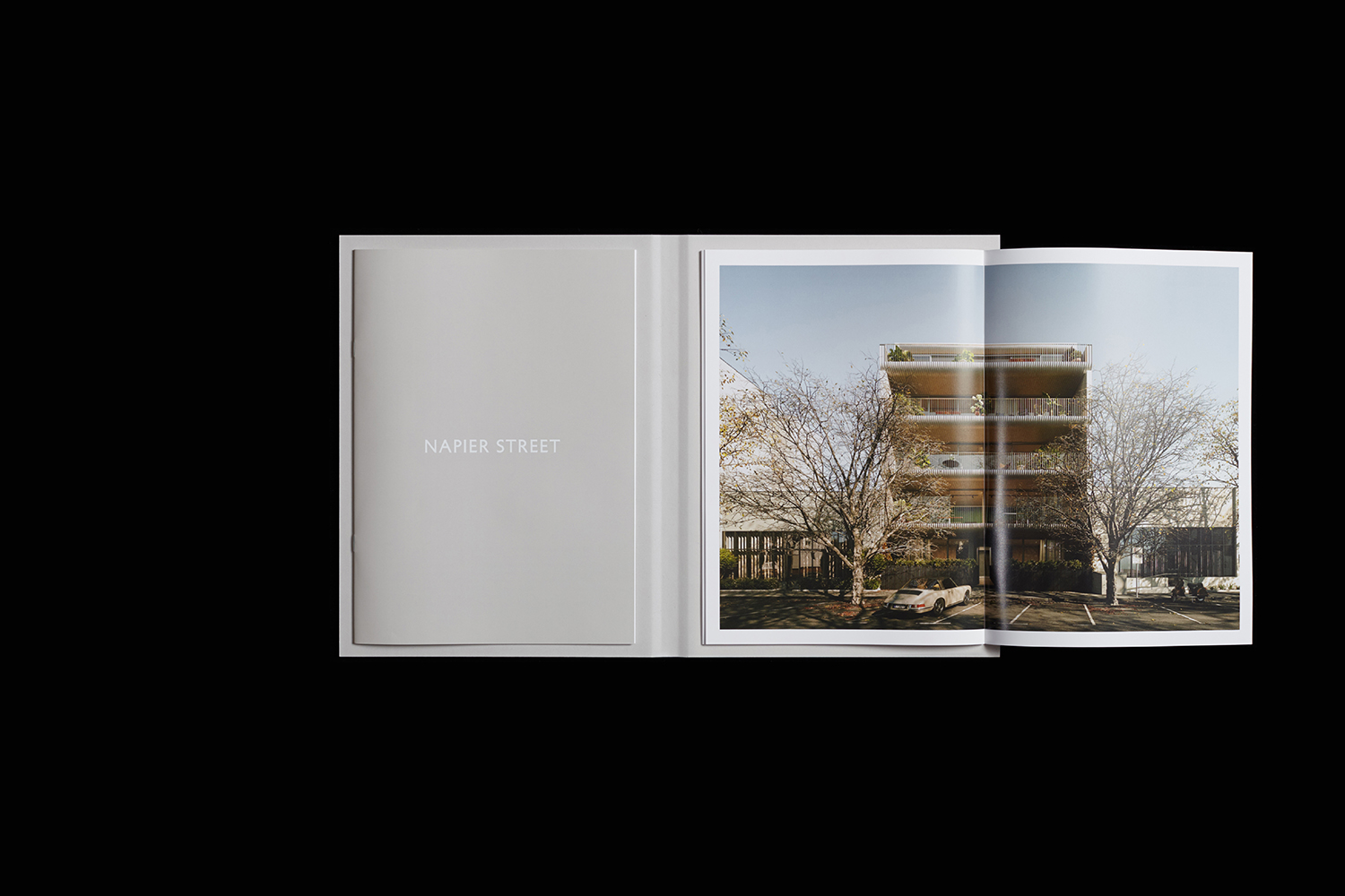
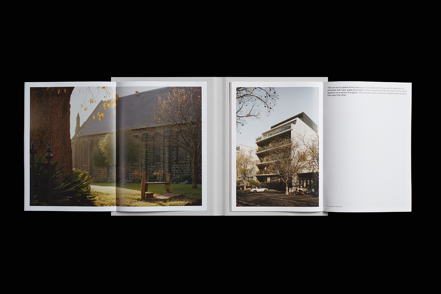
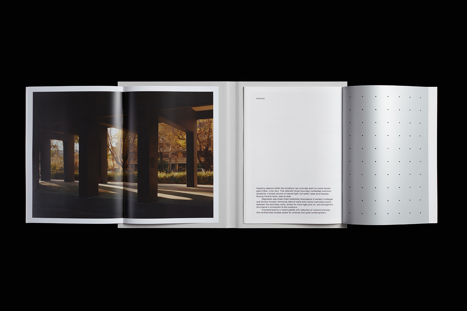
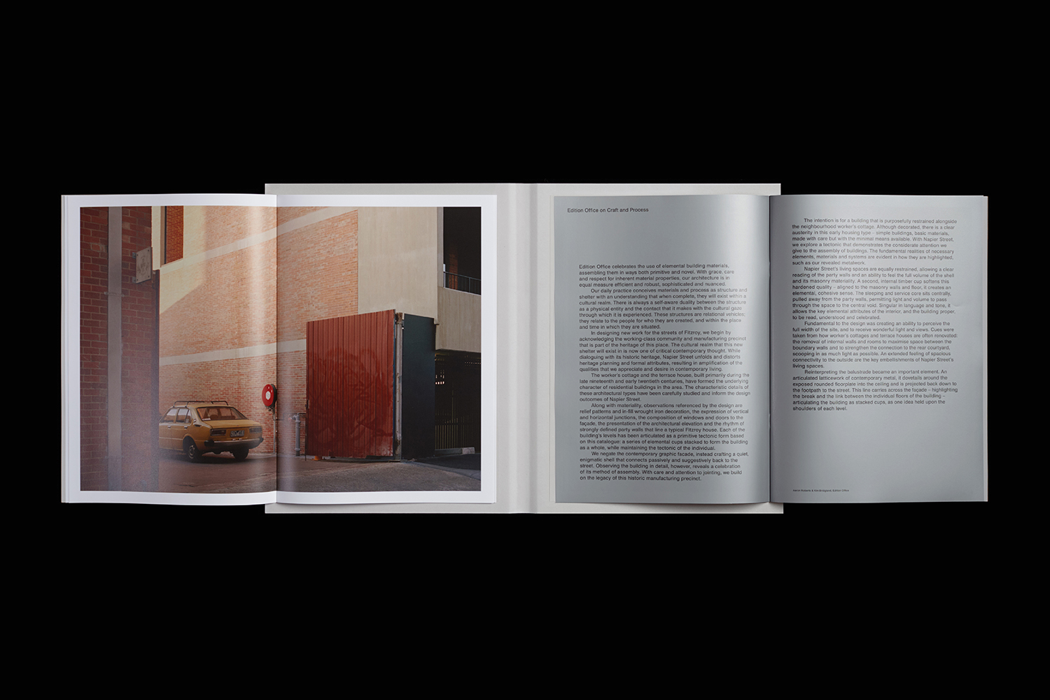
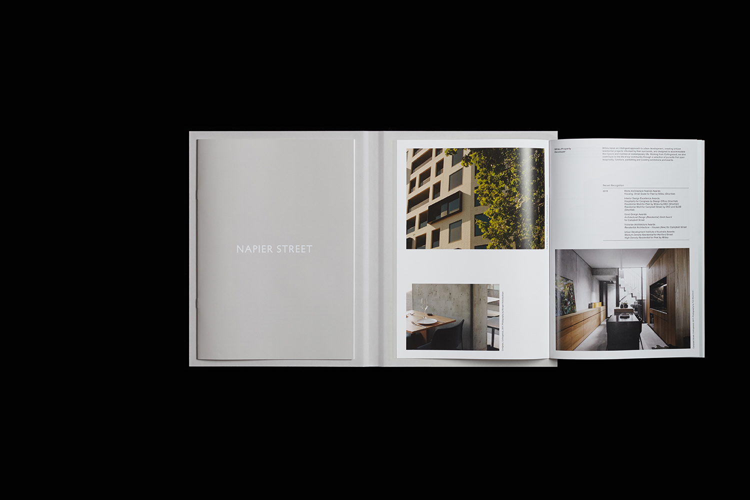
231 Napier Street is an eleven apartment building, now sold out, created by property developer Milieu, set with the culturally rich part of Fitzroy, Melbourne. It is their first collaboration with architect Edition Office—an innovative practice with a strong conceptual focus—and part of the developer’s ongoing enquiry into and interrogation of the dialogue between architecture and place. This interrogation forms the basis of 213 Napier Street’s brochure, designed by Studio Hi Ho; two books bound together, placed side-by-side delivering a juxtapositional concept of architectural structure and neighbourhood context expressed through the interplay of photography, text, surface and materiality.
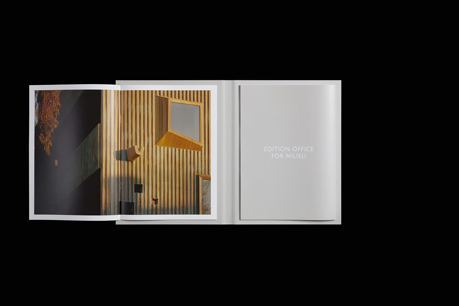
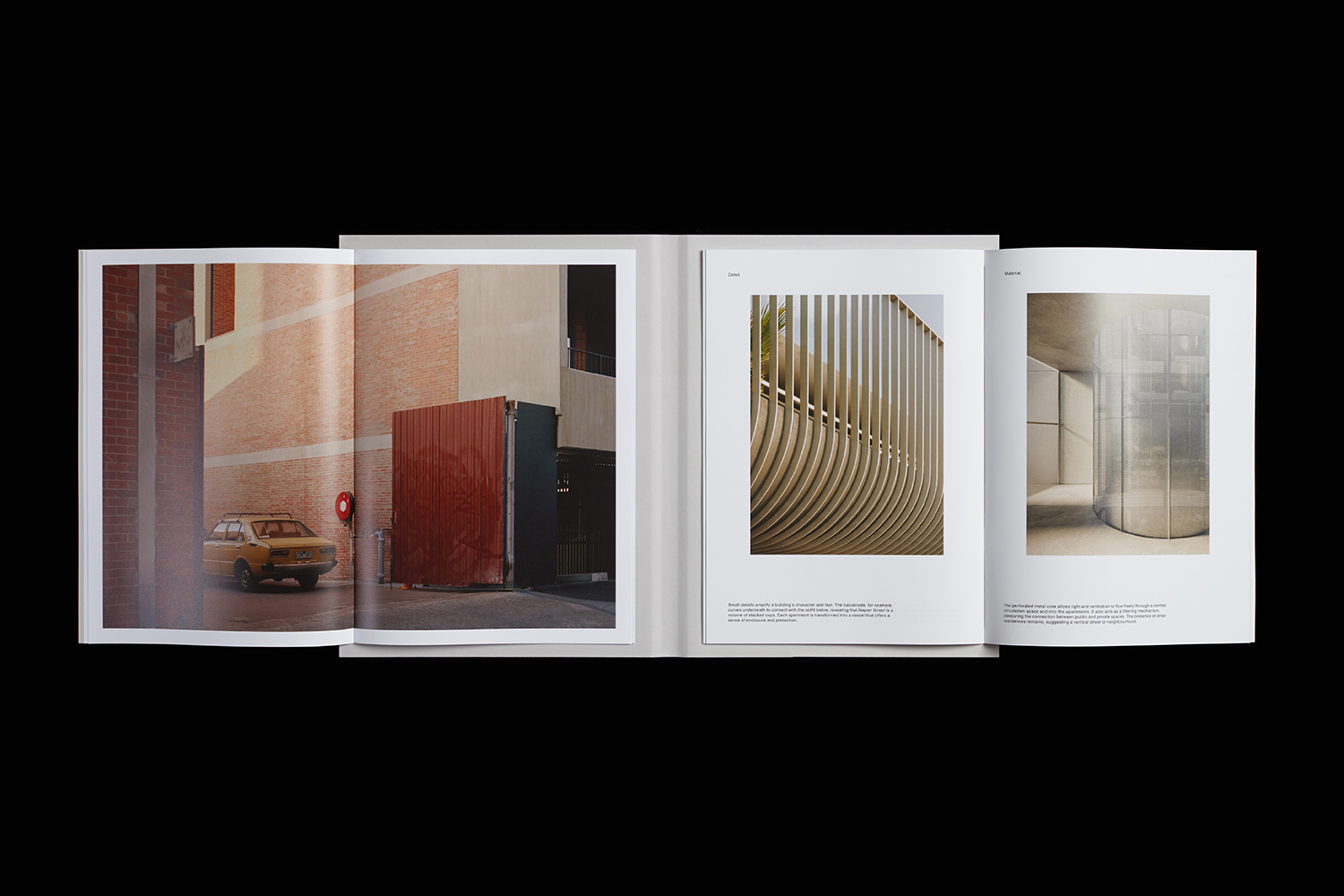
In the placement and binding of the two books, in the differing communicative techniques used within, the bound brochure creates a space between things; a space for interpretation and a provocation to the reader to consider and infer further meaning. Where other property brochures are pragmatic and forthright, here it is nuanced. The potential to open each book at different pages essentially creates a variety of relationships, rather than a linear, preprescribe sequence. In this way, it calls to mind the pages of Real Review, a grotesque corpse of image and text afforded by the use of vertical fold.
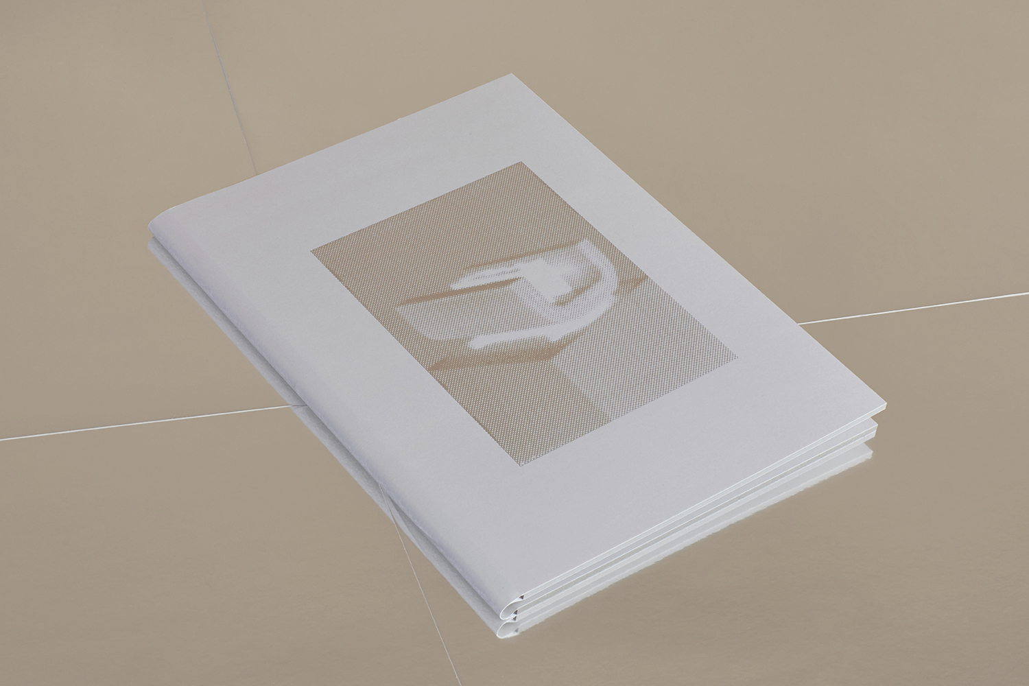
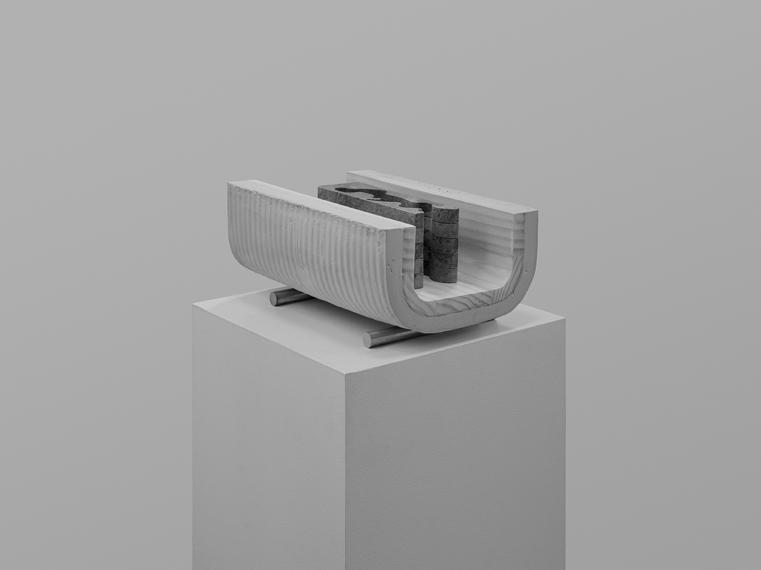
Just as the architecture is a series of moments—informed by and narrativising the area through material and form, heightening awareness—so does the brochure. Small moments exists thought-out the printed document. The curved spine references the balconies. Perforated dividers printed with silver ink mirror Napier aluminium core. The cover photograph of the architect’s model silver foiled onto textured stock alludes to the building’s aluminium and concrete materiality. See more here.
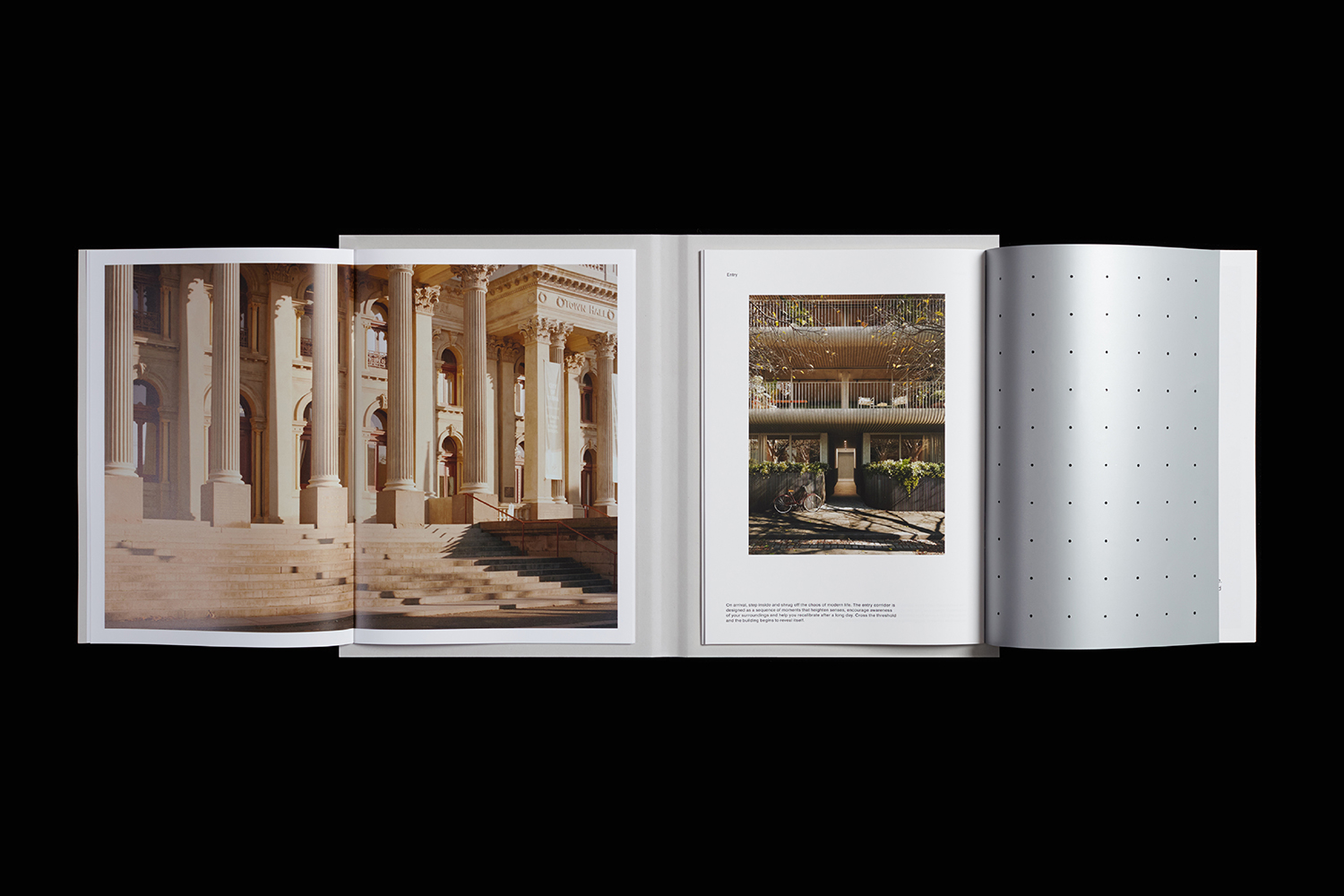
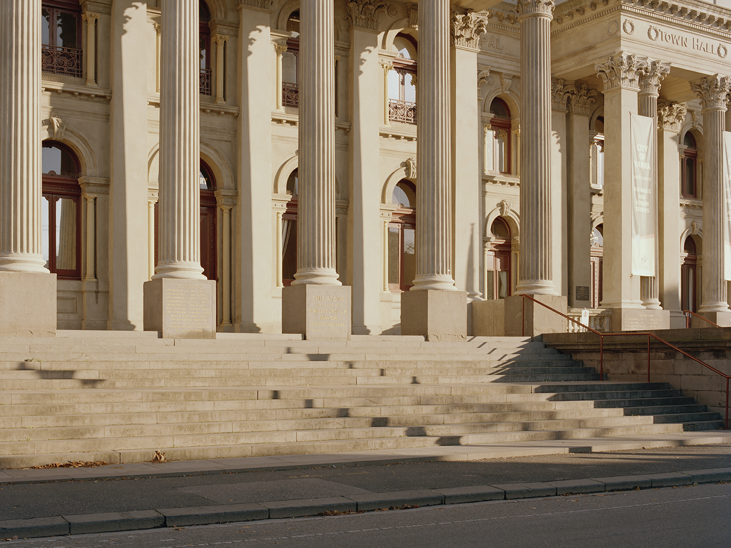
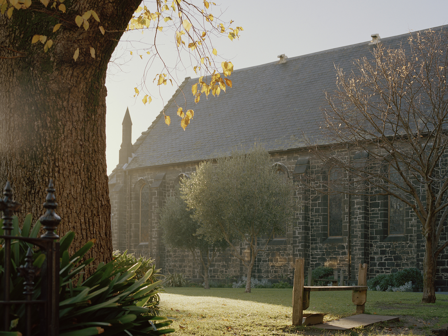
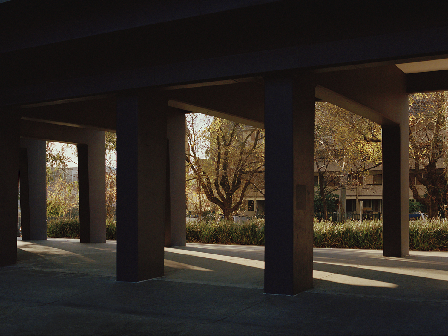
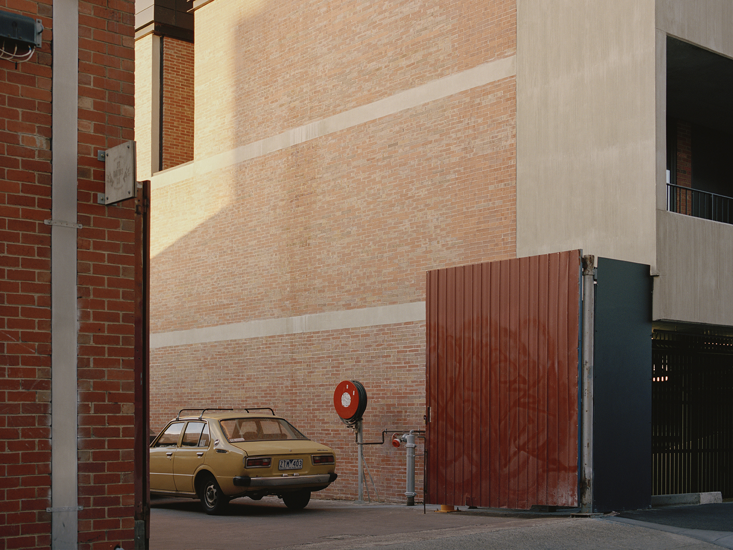
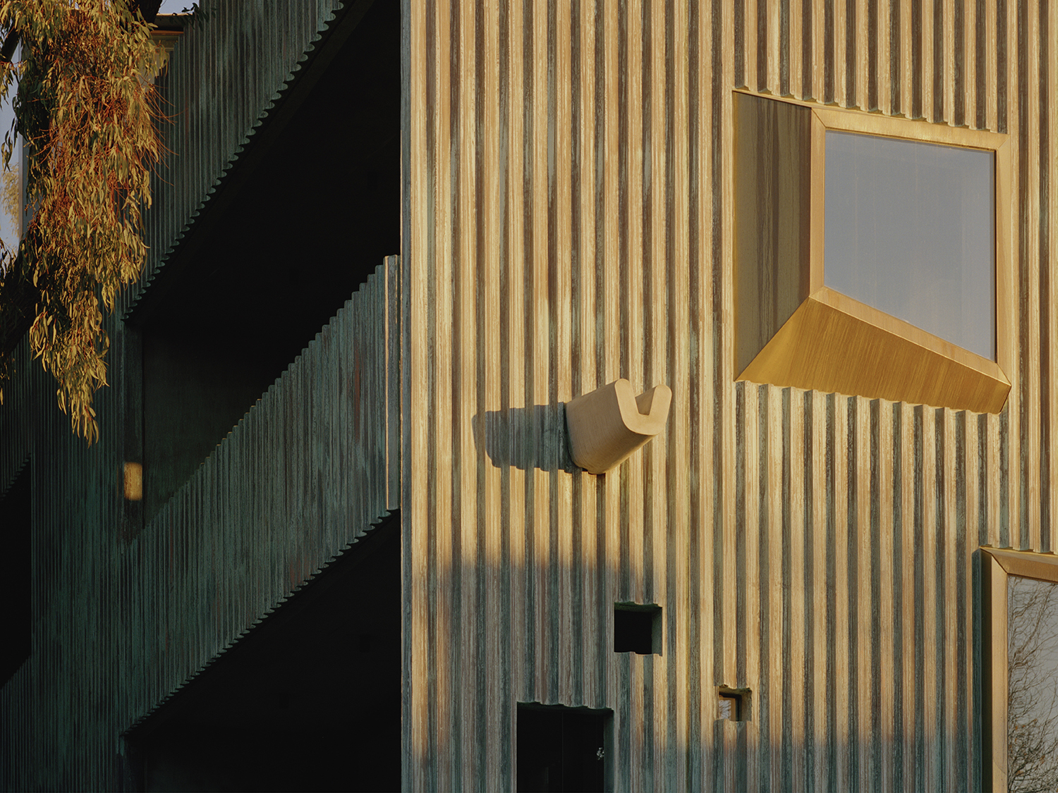
The photography of Gavin Green, beautifully lit, alongside carefully textured renders of the property development, bring to light the architect’s methodology and material outcome informed by a ‘hyper-machined v. hand-made’ conceptual position, and the design references that Napier Street makes to the surrounding neighbourhood. Imagery is notable for its absence of people, of community life, that is not to say it is unreal, only that these capture a moment of peacefulness. Colour and lighting, the time of year, the position of the camera, these deliver a quiet warmth, a serenity of surrounding space and a structural sanctuary from inner-city life. More work by Studio Hi Ho on BP&O.
