OneFourFive Clarendon by Studio Brave
Opinion by Richard Baird Posted 2 January 2020

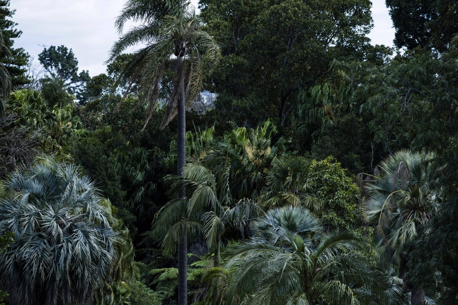
OneFourFive Clarendon is a modern workspace, developed by Salta, designed by Architectus and created for future-focused businesses looking to situate themselves in Southern Melbourne. The development aims to attract like-minded progressive people with a conscious focus on connectivity and local activity. With this in mind, Melbourne-based Studio Brave developed the narrative ‘A Life Unlimited’ as a way to express how the building will allow businesses and their employees to achieve the contemporary model of a professional-lifestyle balance. This narrative is complemented by a graphic identity that intends to subvert the boundaries of expectation within the commercial property landscape in the confluence of bold contemporary typography and colour, materials and finishes that evoke the context-sensitive tectonics, layers and composition of the building, and photography by Josh Robenstone of the Southern Melbourne urban landscape.
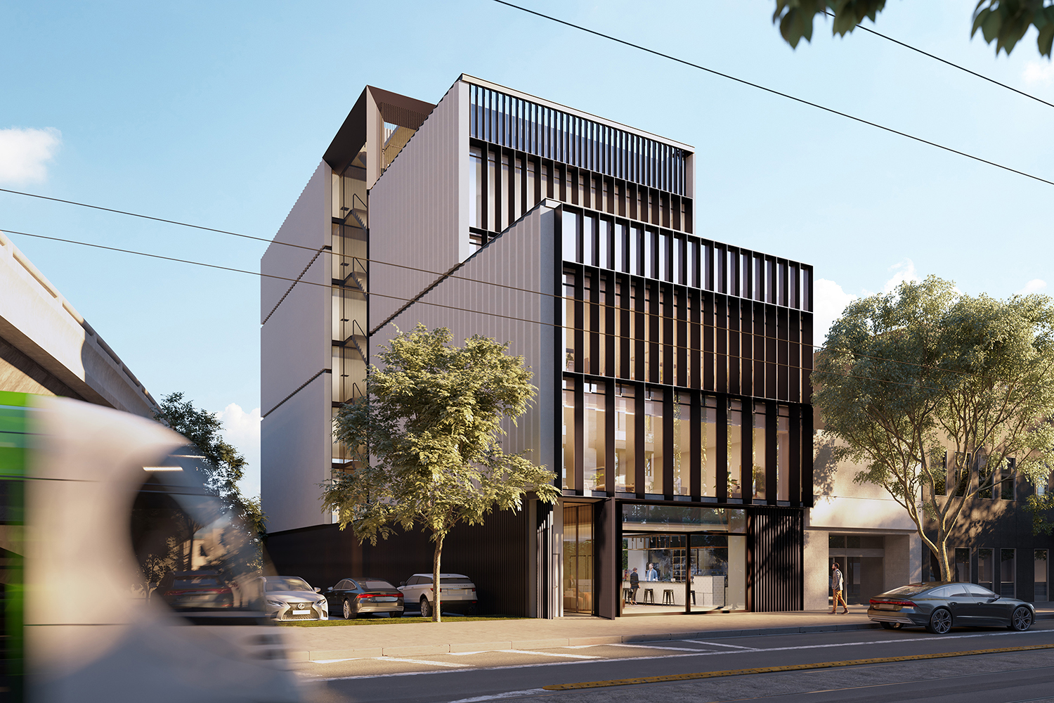
OneFourFive Clarendon is described as a contemporary environment that reimagines the modern workspace through flexibly designed interiors, a light-filled open stairwell and generous outdoor terraces created to foster collaboration and wellbeing. This is born from the Architectus design philosophy of “people, purpose, place, planet and production”. The building has a context specificity, referencing the industrial past of the area by way of corrugated concrete, tensile cables and metal frames. These combine to complement the surrounding urban space, celebrating the traditional materials of the local streets and laneways.
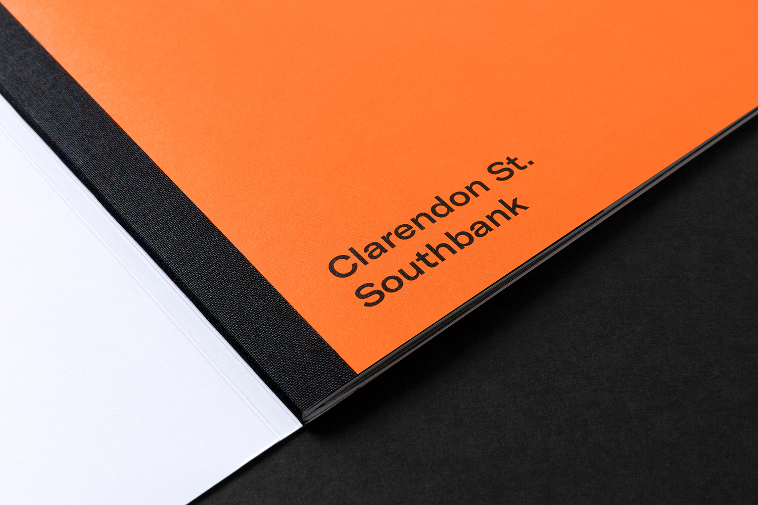
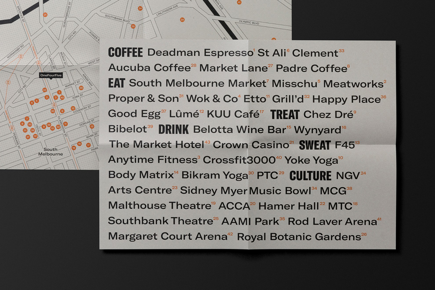
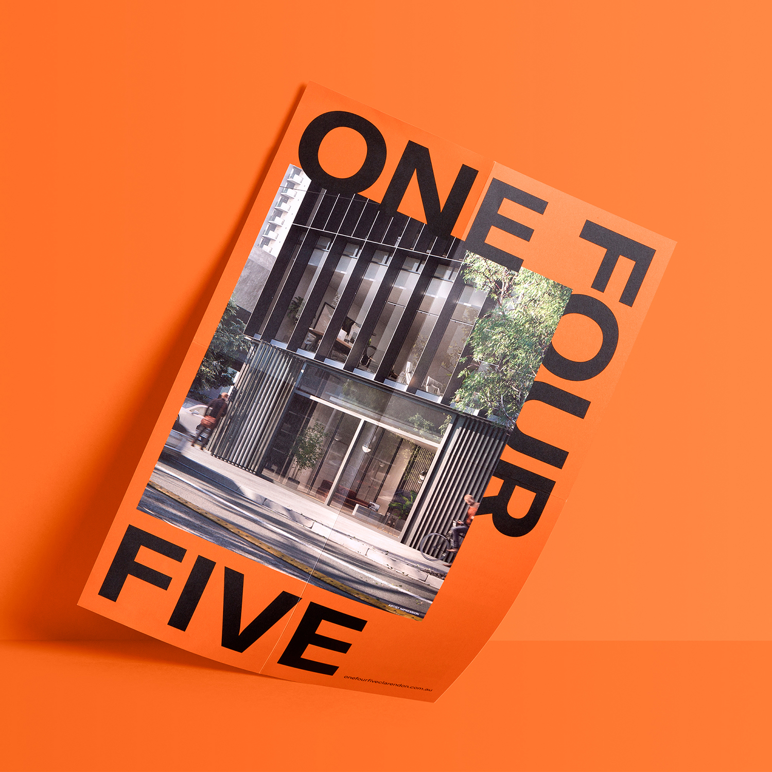
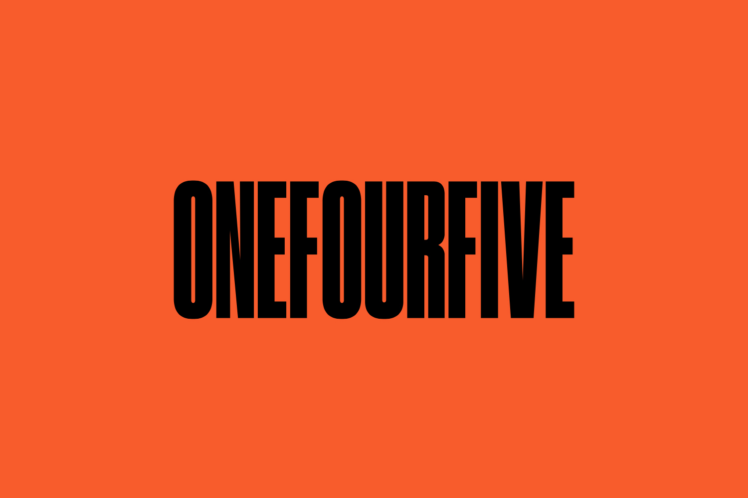
Studio Brave’s graphic identity, inspired by the distinctive forms of the building, interprets and turns the architectural notion of context specificity, rather than modernism, and the integrity of the Archtectus’s philosophy of “people, purpose, place, planet and production” into a graphic expression. This can be seen in the tall elongated forms of the compressed style of GrilliType’s GT America, the blind embossed ribbing of the cover sleeve, glossy embossed detail of the logotype and the three layers of the marketing document which is made up of a brochure, local area map and fold-out sheet.
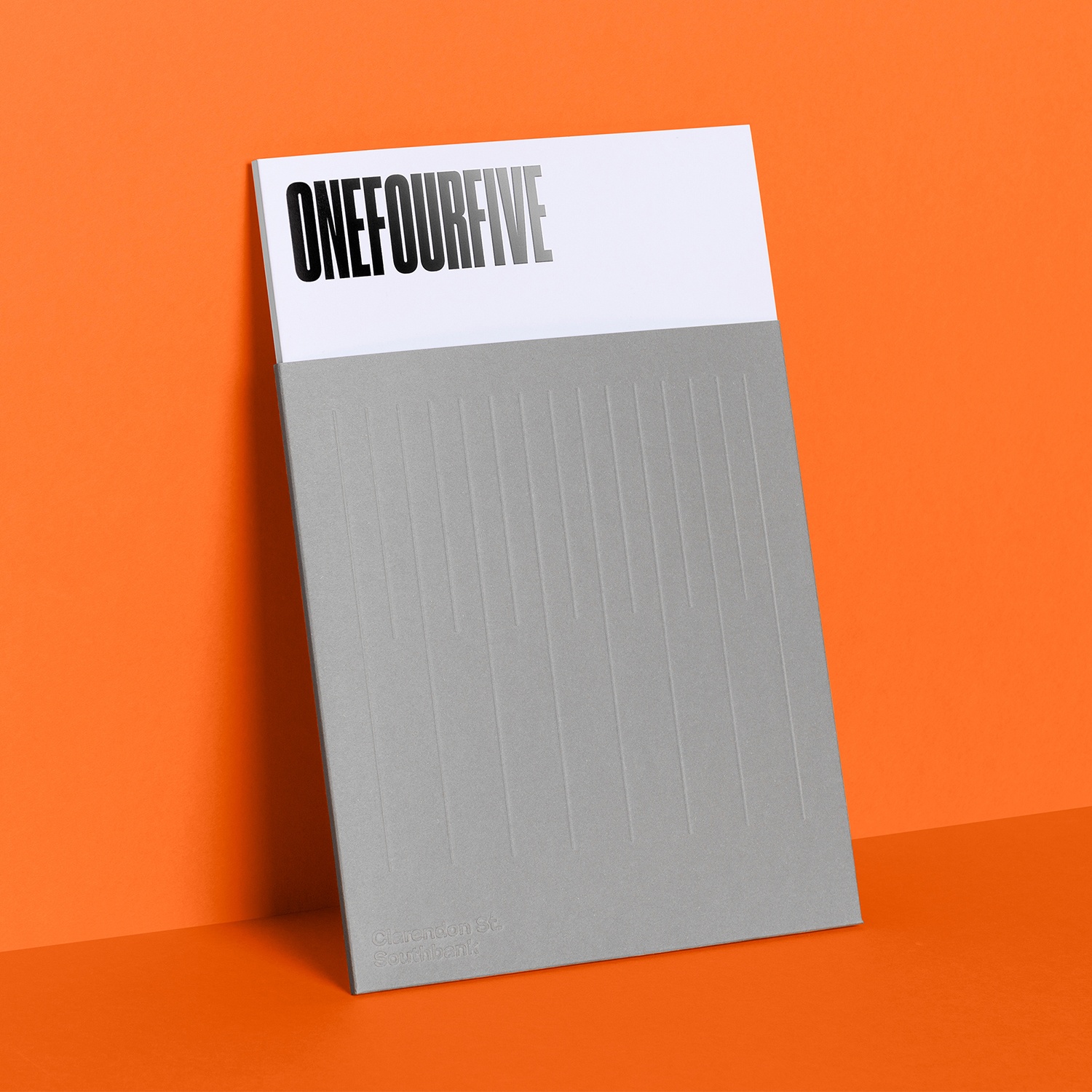
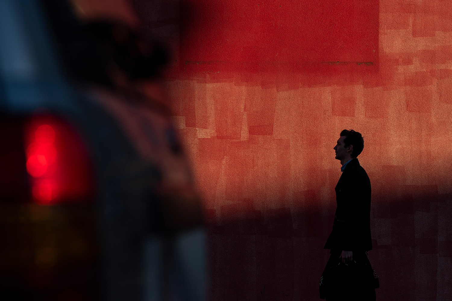
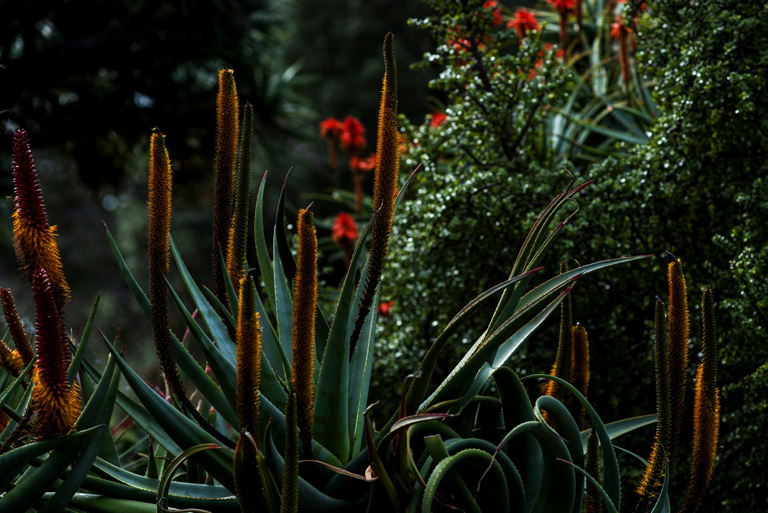
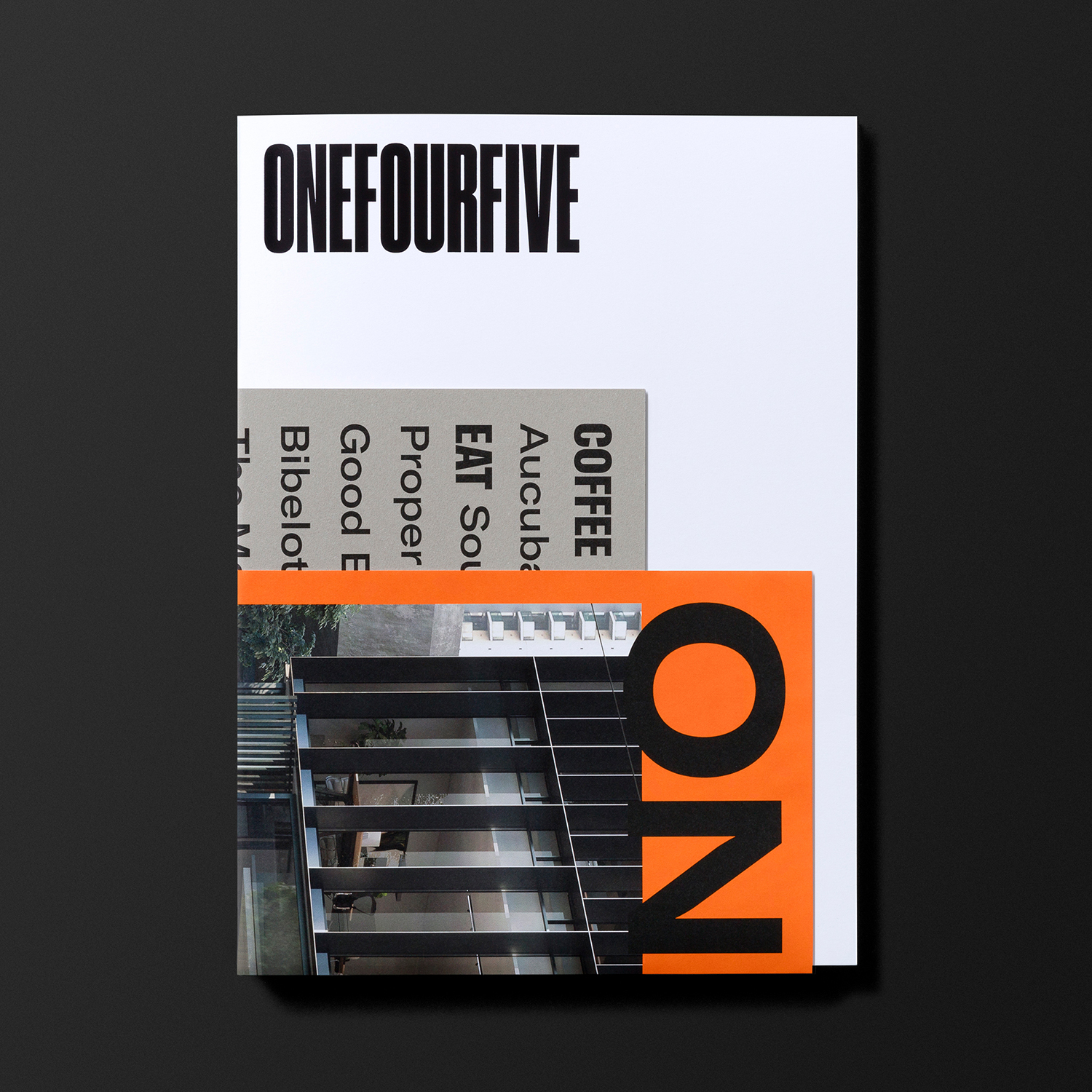
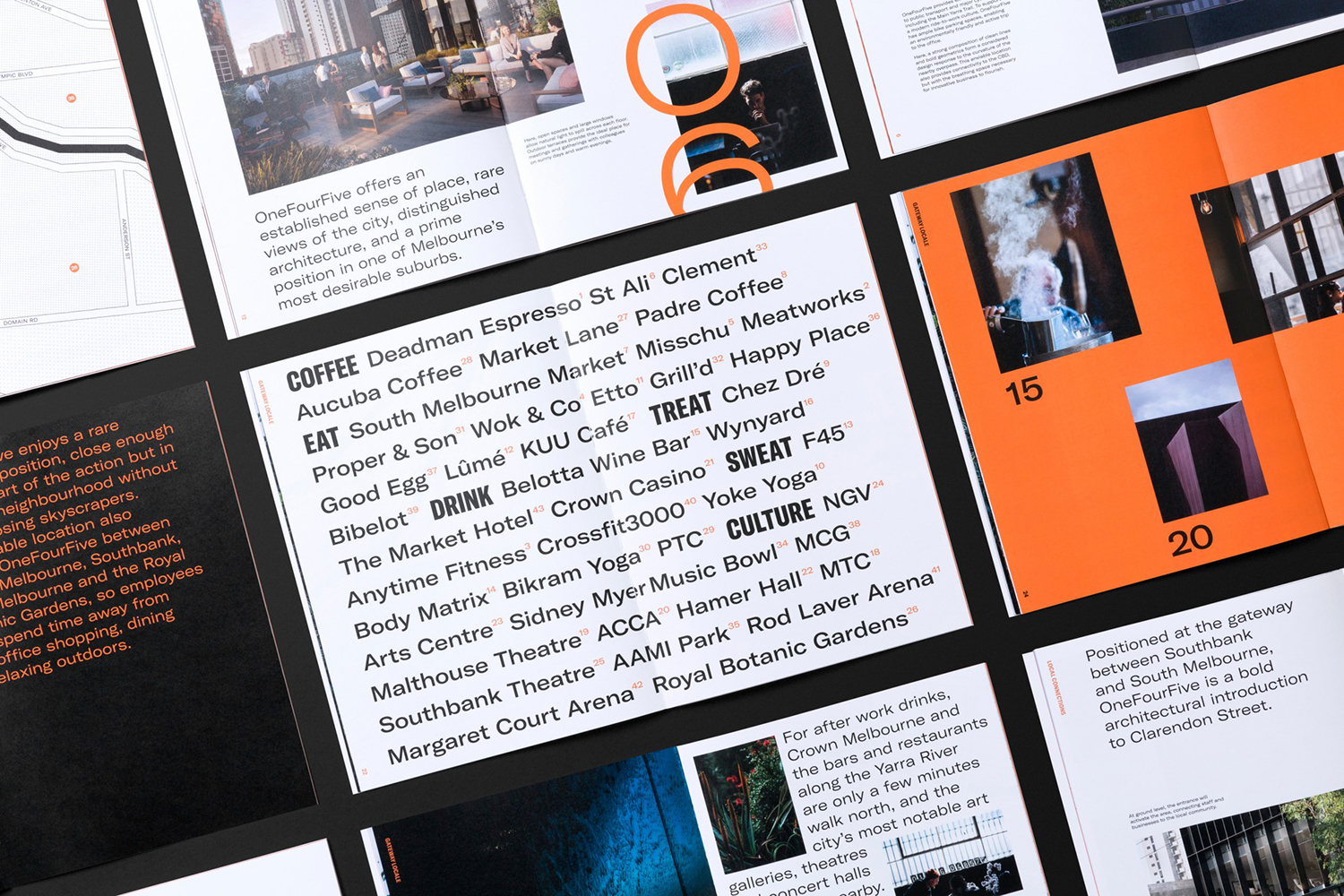
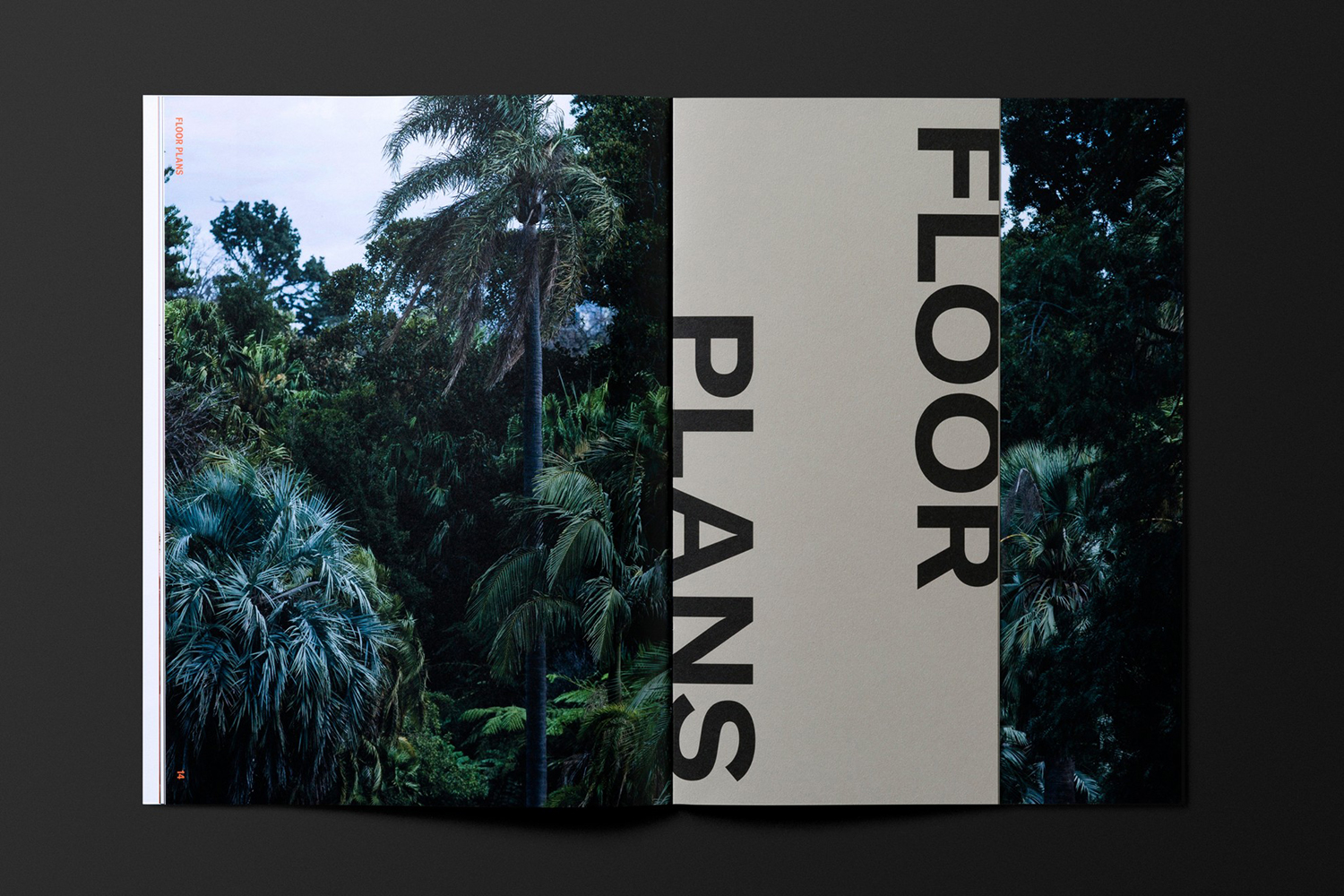
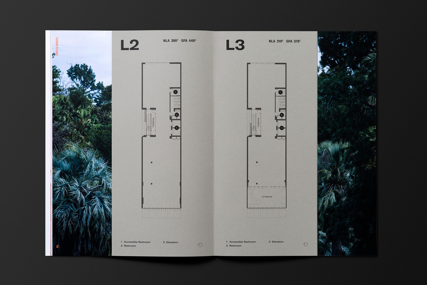
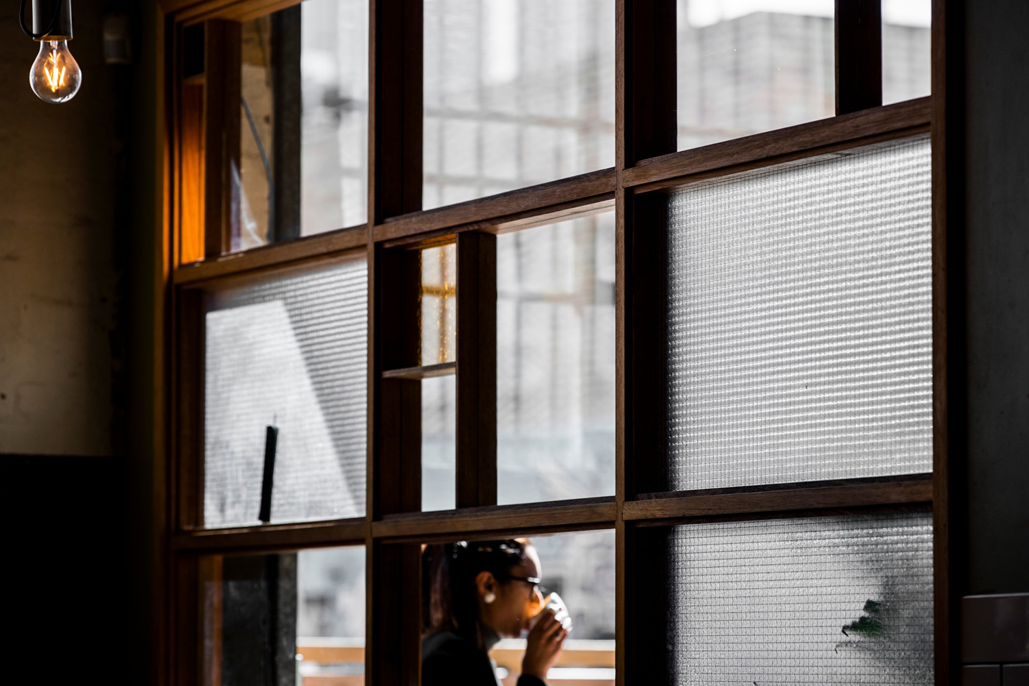
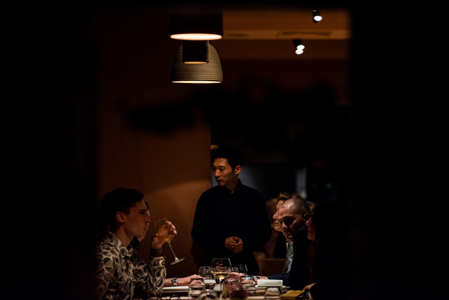
Contrasting extended type–GT America Extended–and a shot of bright warm orange, as well as the composition of some of the brochure layouts, appears thoroughly current and striking with a youthful energy and vibrancy alongside the more formal expression of the building’s tectonics. What really elevates these gestures is Josh Robenstone’s low-lit photography. ‘A Life Unlimited’ is narrativised both in type and image, weaving together the character of South Melbourne and architectural purpose throughout the brochure. Image imposes on copywriting and type in print and intersecting as layers online. This layering also manifests itself in the folding together of independent sheets and tipped in floor plans sitting over imagery of local flora. More work by Studio Brave on BP&O.
