AIR Studios by Spin
Opinion by Richard Baird Posted 6 January 2020
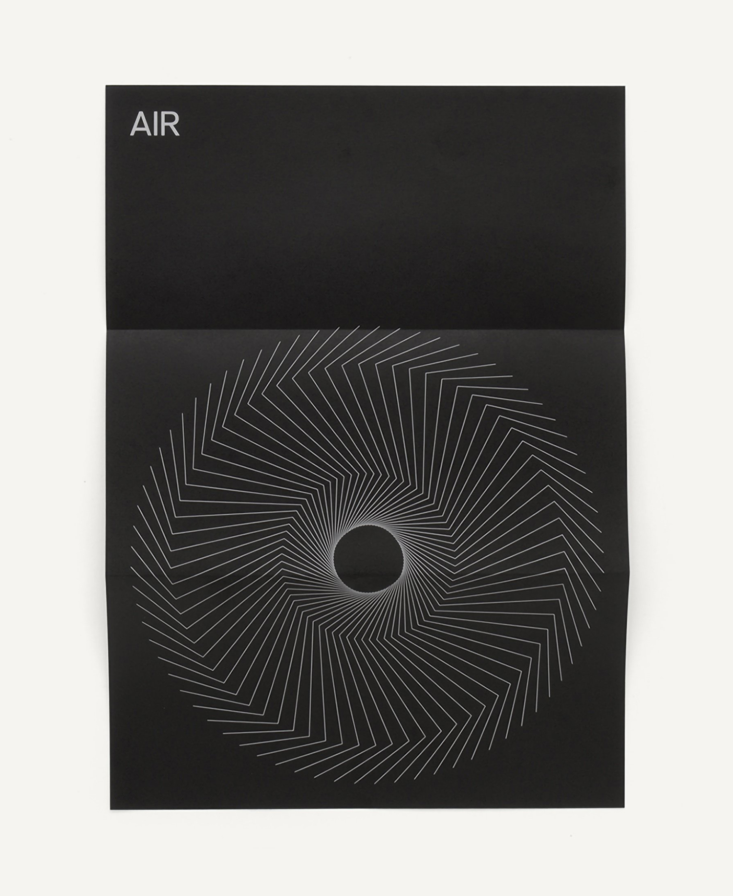
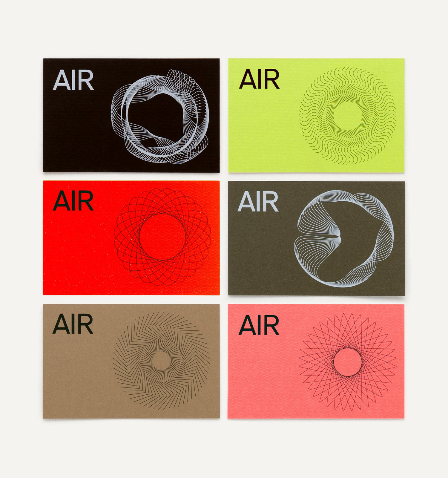
AIR Studios was founded in 1965 by Beatles producer Sir George Martin. It is located in London’s Lyndhurst Hall, a former church with one of the largest recording rooms in the world and a live space capable of holding a full symphony orchestra. Since its opening, it has hosted a plethora of world-class talent. These have included Sir Paul McCartney, Adele, The Rolling Stones, Elton John and Lou Reed, amongst many many others. It has also been the studio in which Oscar-winning scores such as Atonement and Grand Budapest Hotel have been recorded. London-based design studio Spin were commissioned to develop a new graphic identity for the studio that would pay homage to its rich heritage, bring to the fore the talent it attracts and Air’s future ambitions. This culminated in the creation of a dynamic symbol of orbital paths and undulating waves, a modern colour palette of neutrals and bright colour, black and white photography and the use of motion on screen
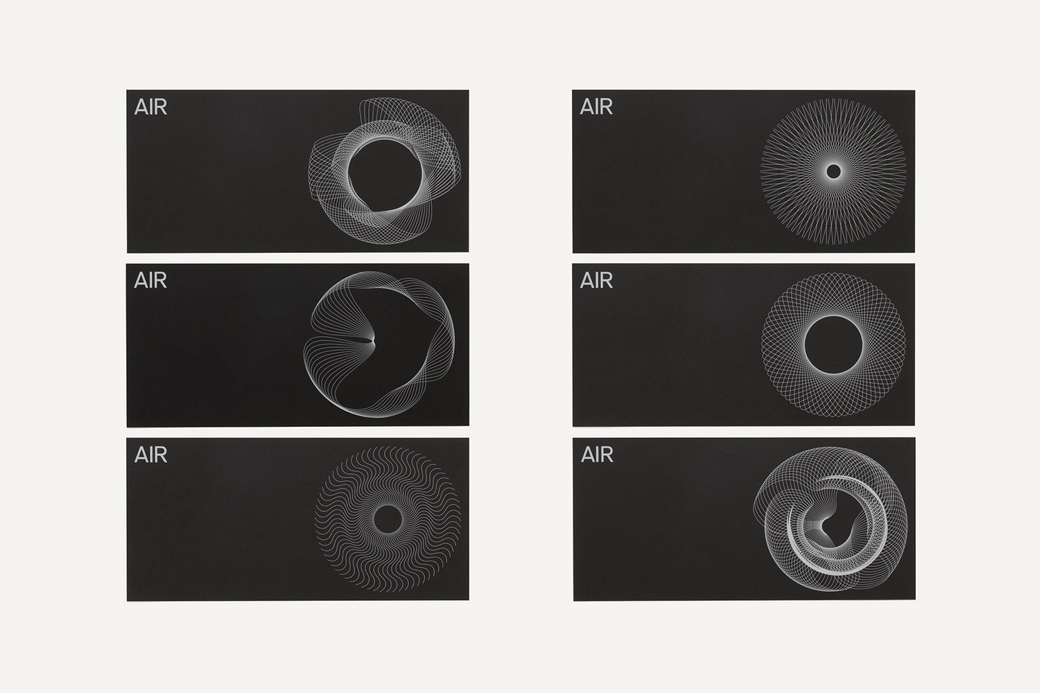
The approach very much speaks of Spin’s own design philosophy. It continues in, and furthers, the spirit of mid-century marque-making and corporate identity programs, those made up of shape, colour, type and the arrangement of information, whilst also working in the joy of motion and transitions afforded by the digital interfaces of today.
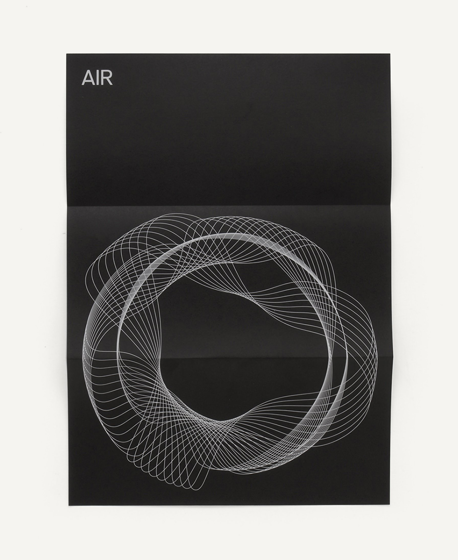
The name Air, like sound, has a spatial yet invisible quality. This commonality is developed into a visible form language that, given the context of a recording studio, draws the mind towards sound having spatial (and auditory) volume, radiating out from and orbiting a central point, that of the recording artists. This also channels some of the spatial qualities of Air Studio’s home at Lyndhurst Hall, which has a 360° central live space. The precision and lightness of the lines that make up the symbols fold in nicely with the clarity and delineation between frequencies achieved through good mastering.
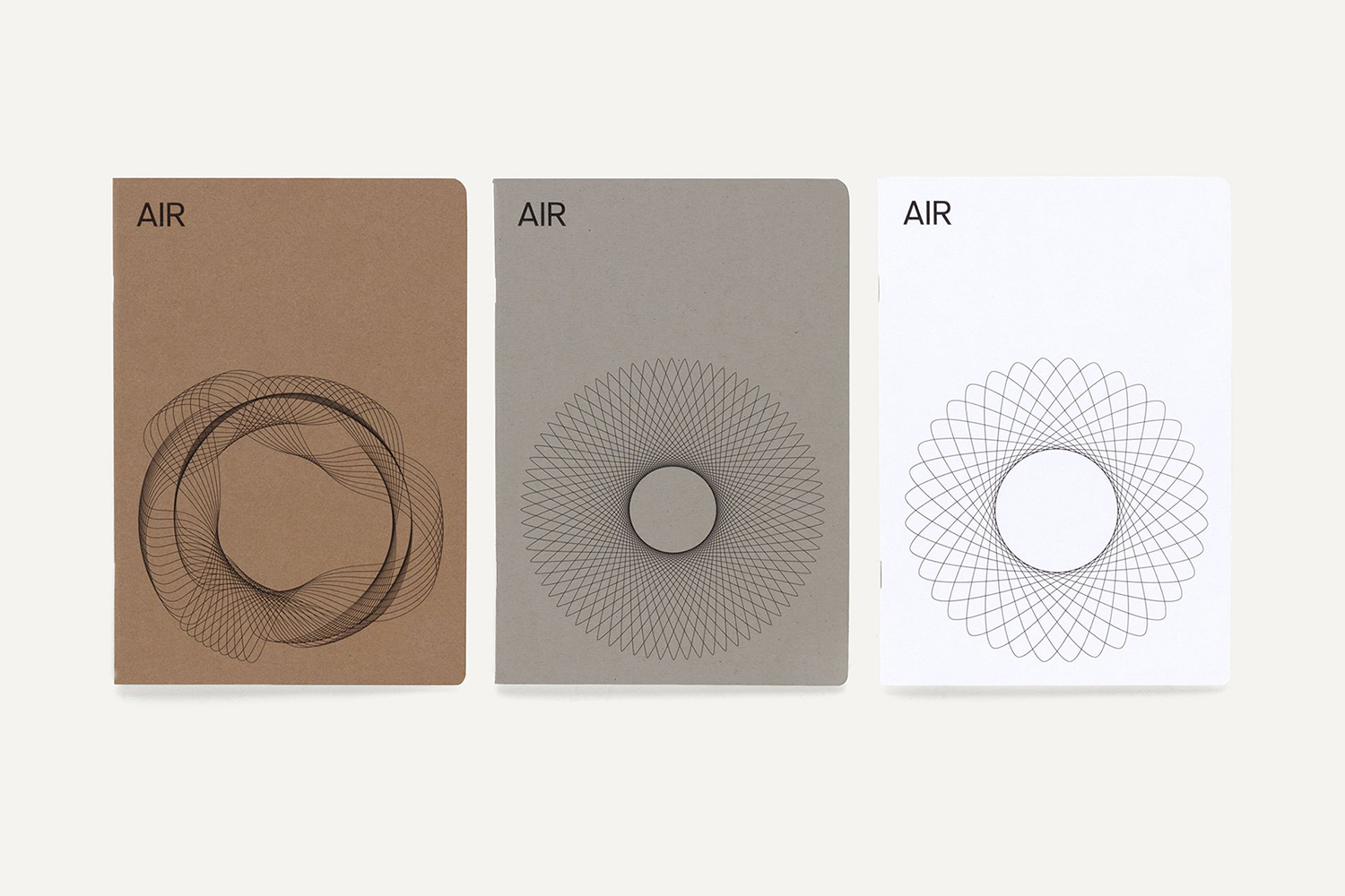
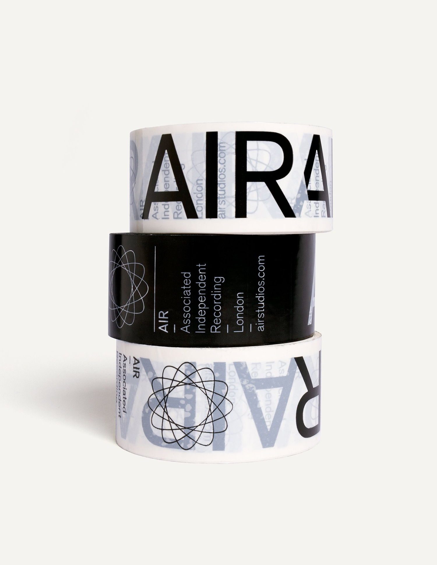
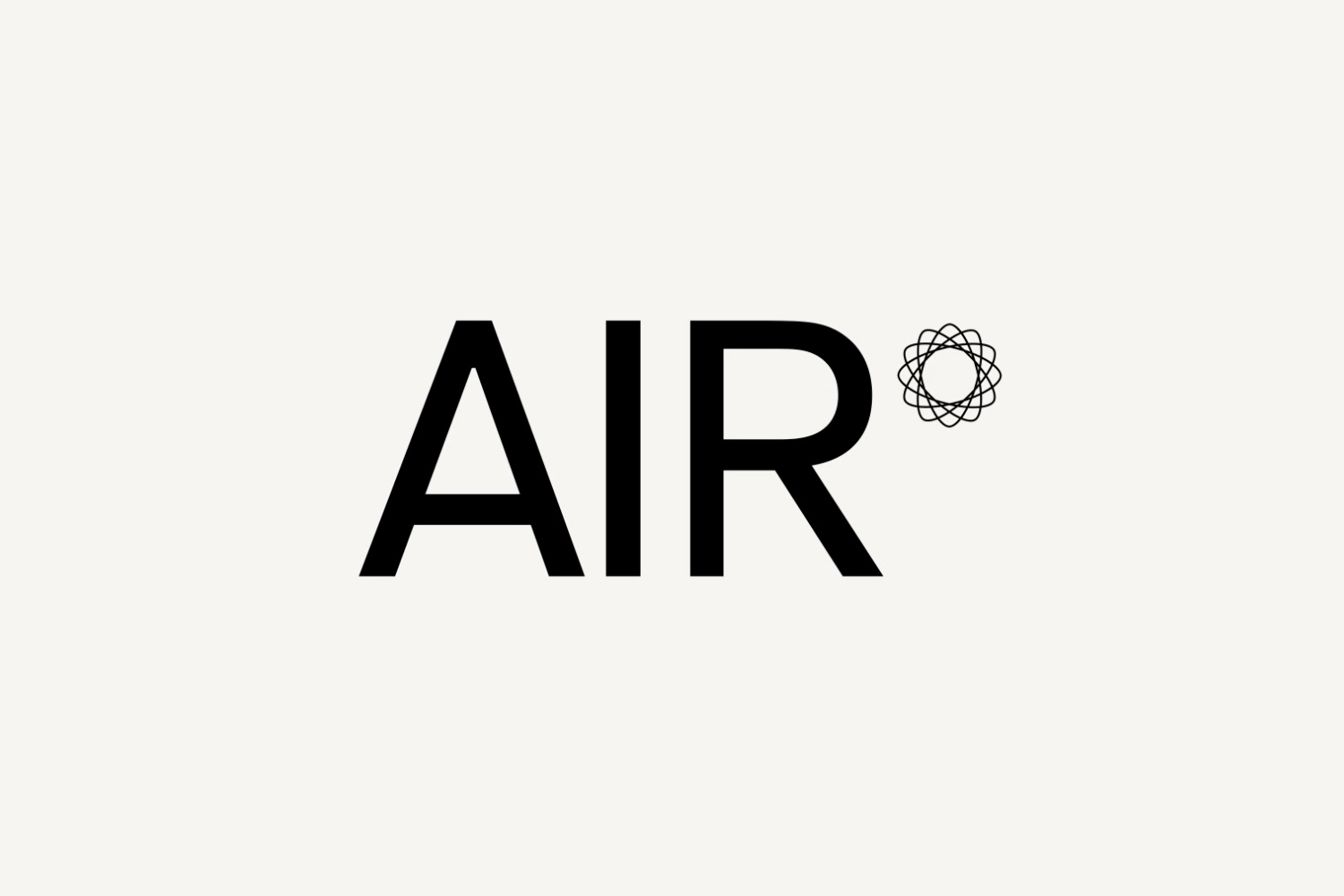
Isolated, and in its simplest form, the logo is an effective balance of fine and bold, large and small, detailed and reductive. Different proportionality between symbol and wordmark give it a flexibility and utility, while the letterforms of Akzidenz Grotesk compliments the compactness and immediacy of the name.
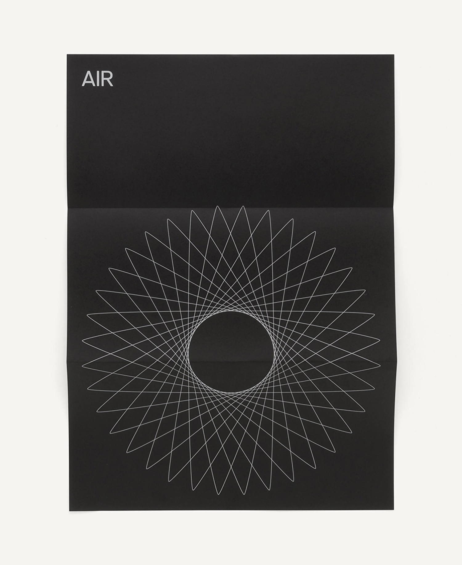
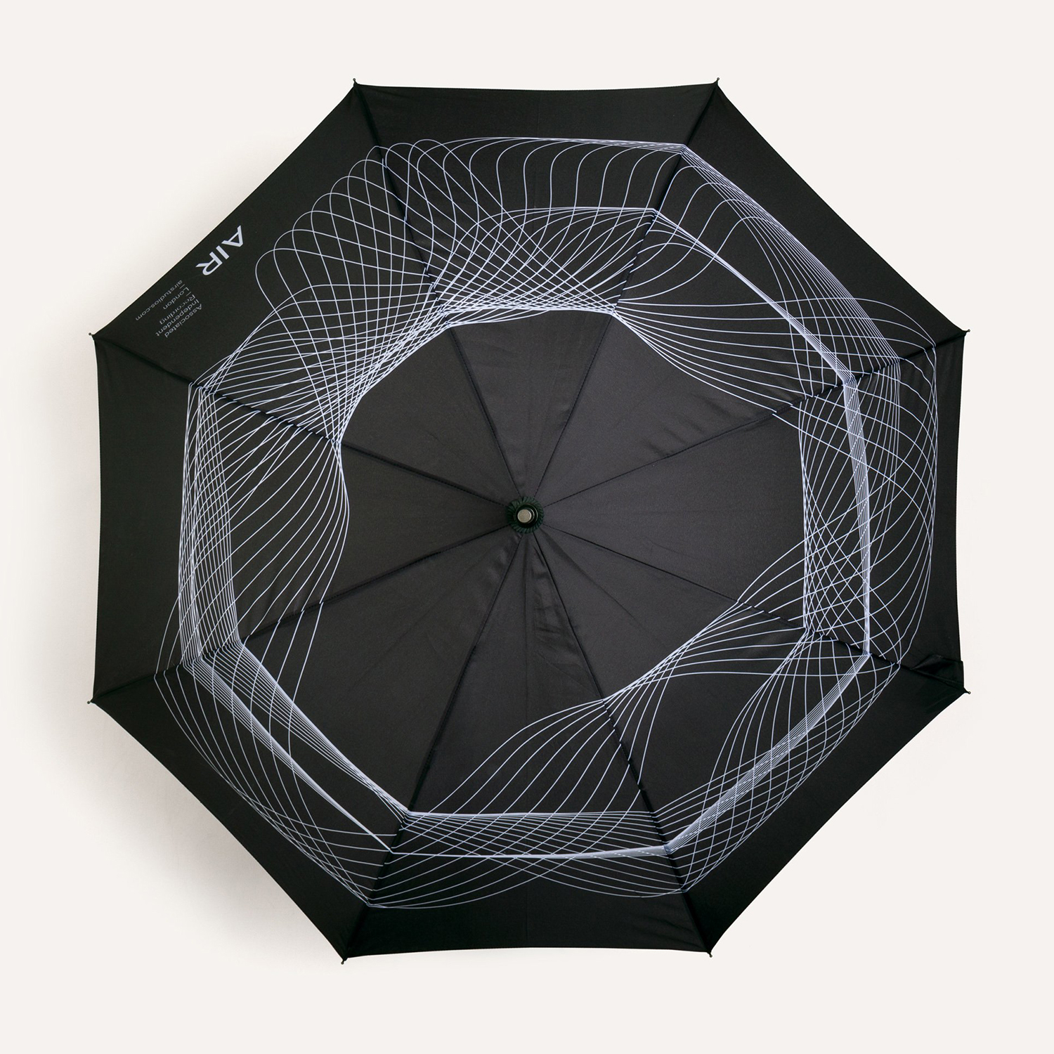
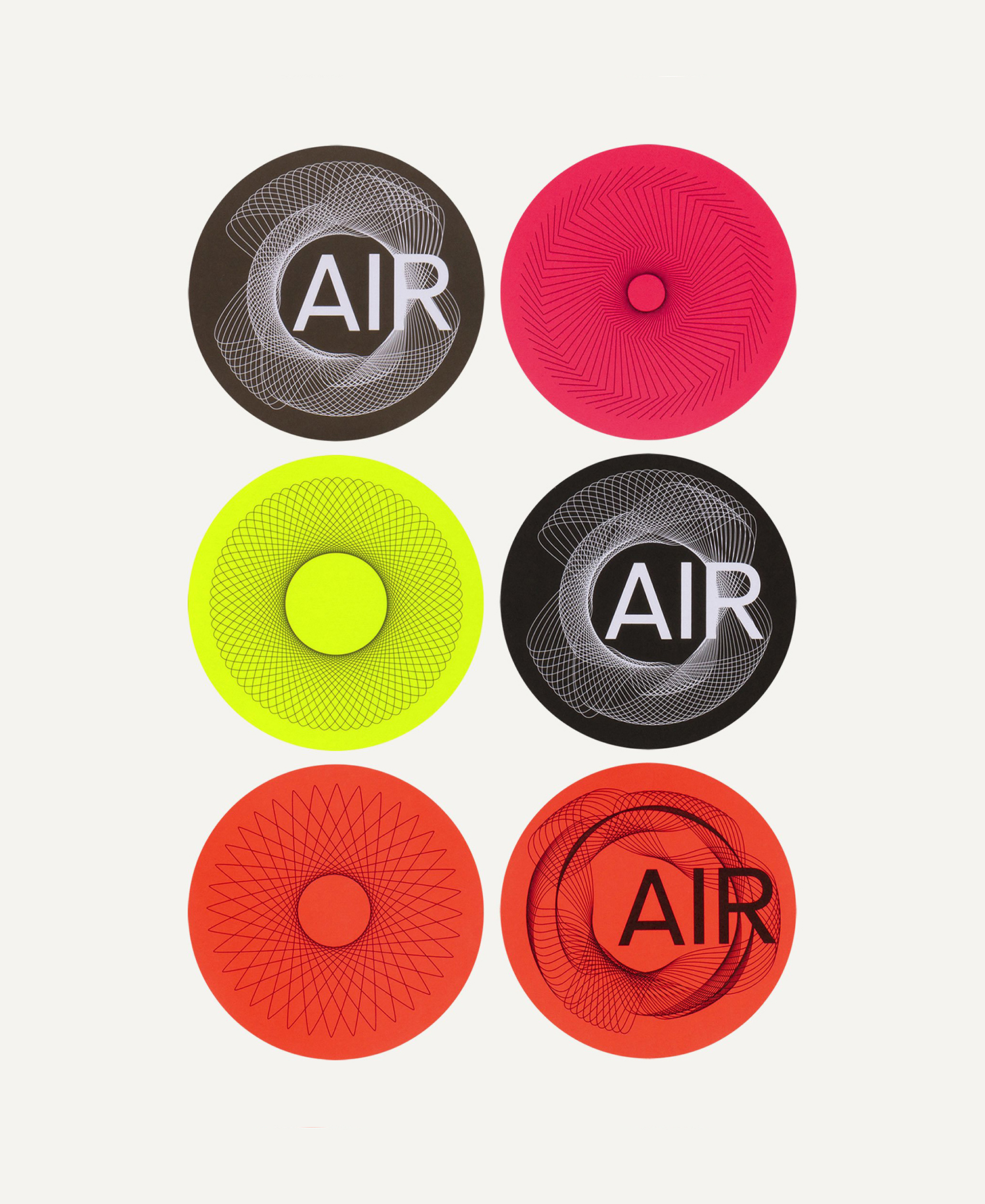
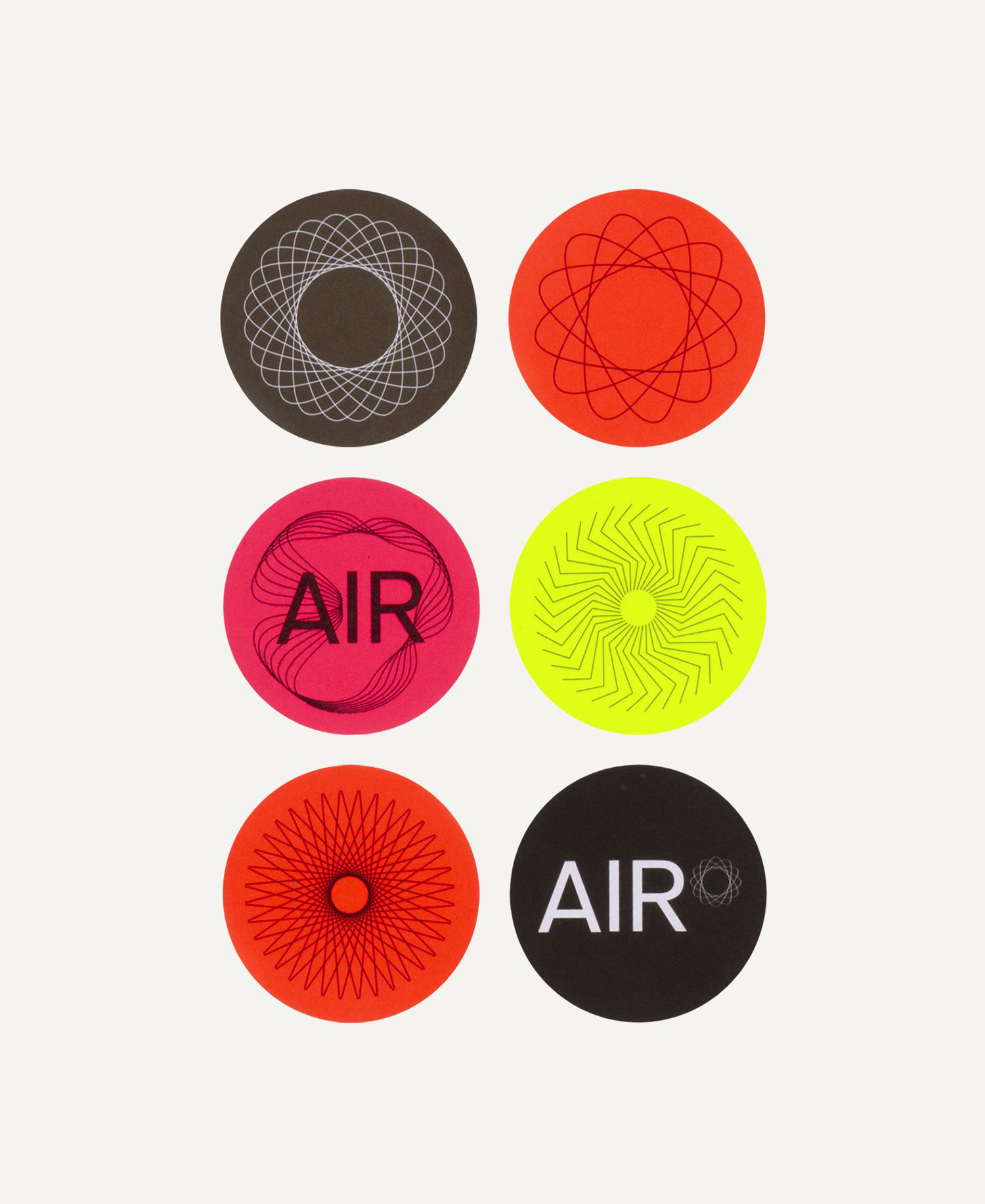
Although largely a graphic system with a central symbolic component, it has variety in the creation of different symbols and in the use of motion on screen. There is also a beauty to these as a collection. Each, in their abstract qualities, can be read as something, an invitation to seek meaning, shapes with a vocabulary. A timeline or 0 line level curved into a circle becomes a vortex to be drawn into, waves to be flooded by or an orbit to be spun around. On a black surface, its difficult not to feel the a sense of vast space, of quietness in which sound moves through. There have, of course, been variations on this in the past, yet the range, motion, colour and application of the idea appears distinctive and interesting.
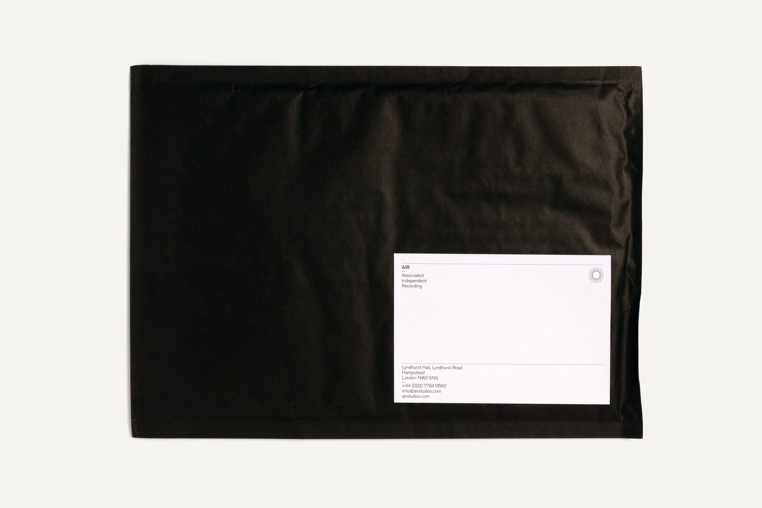
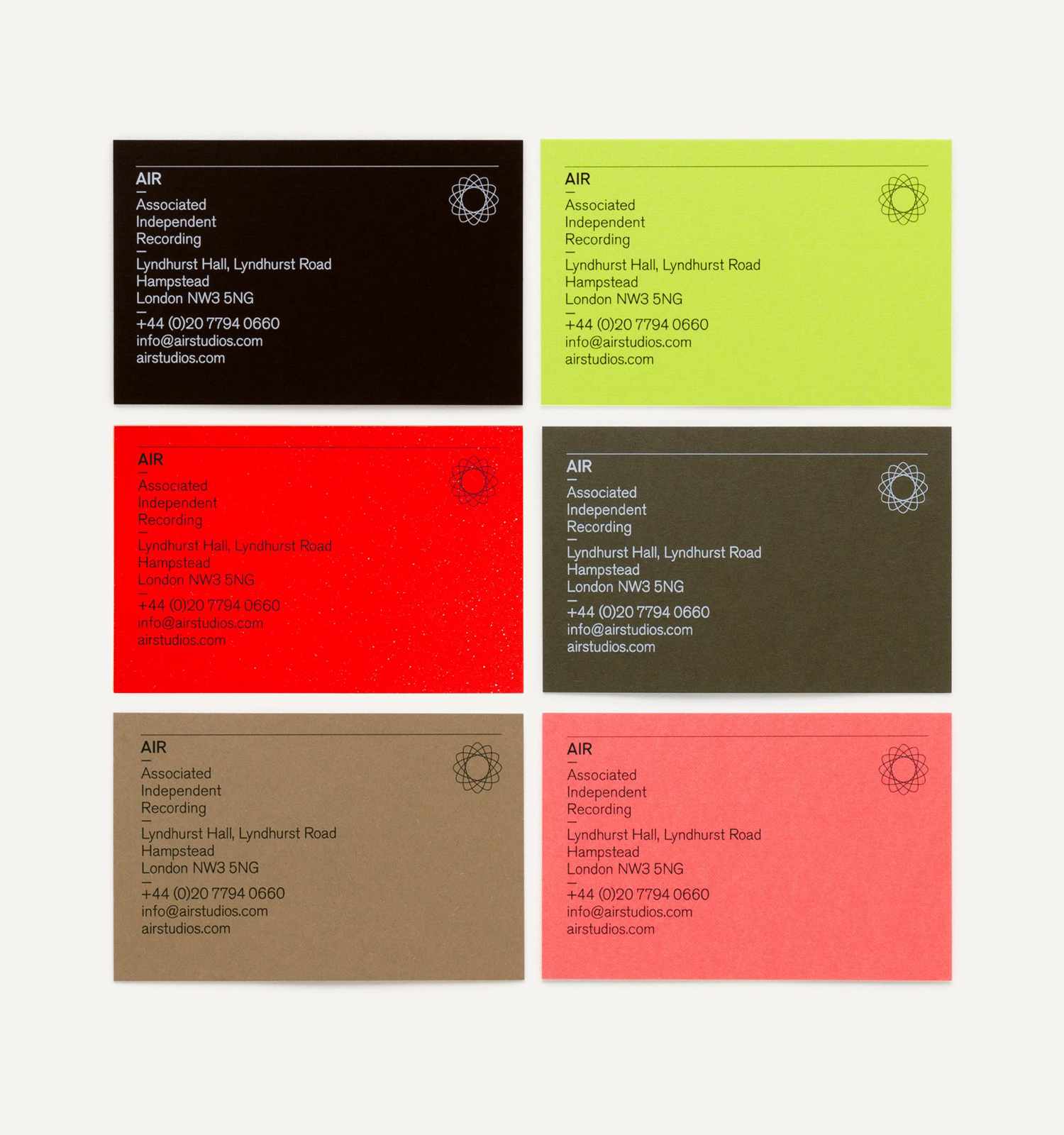
The use of bright colour online, juxtaposed alongside black and white images of the history page gives the identity further range, a sense of past and present, immediacy and subtlety, joy and functionality. This is furthered in print in the use of neons and neutrals. As a logo-centric system, with the forms running consistently across badges, small and large stickers, umbrella and embroidered into uniforms, and printed throughout business cards and test pressings, it cohesively and quickly links everything with enough of a potential form language to keep it interesting and thoughtful. More work by Spin on BP&O.
Design: Spin. Opinion: Richard Baird. Fonts: Akzidenz Grotesk.
