Northzone by Ragged Edge
Opinion by Richard Baird Posted 22 May 2020
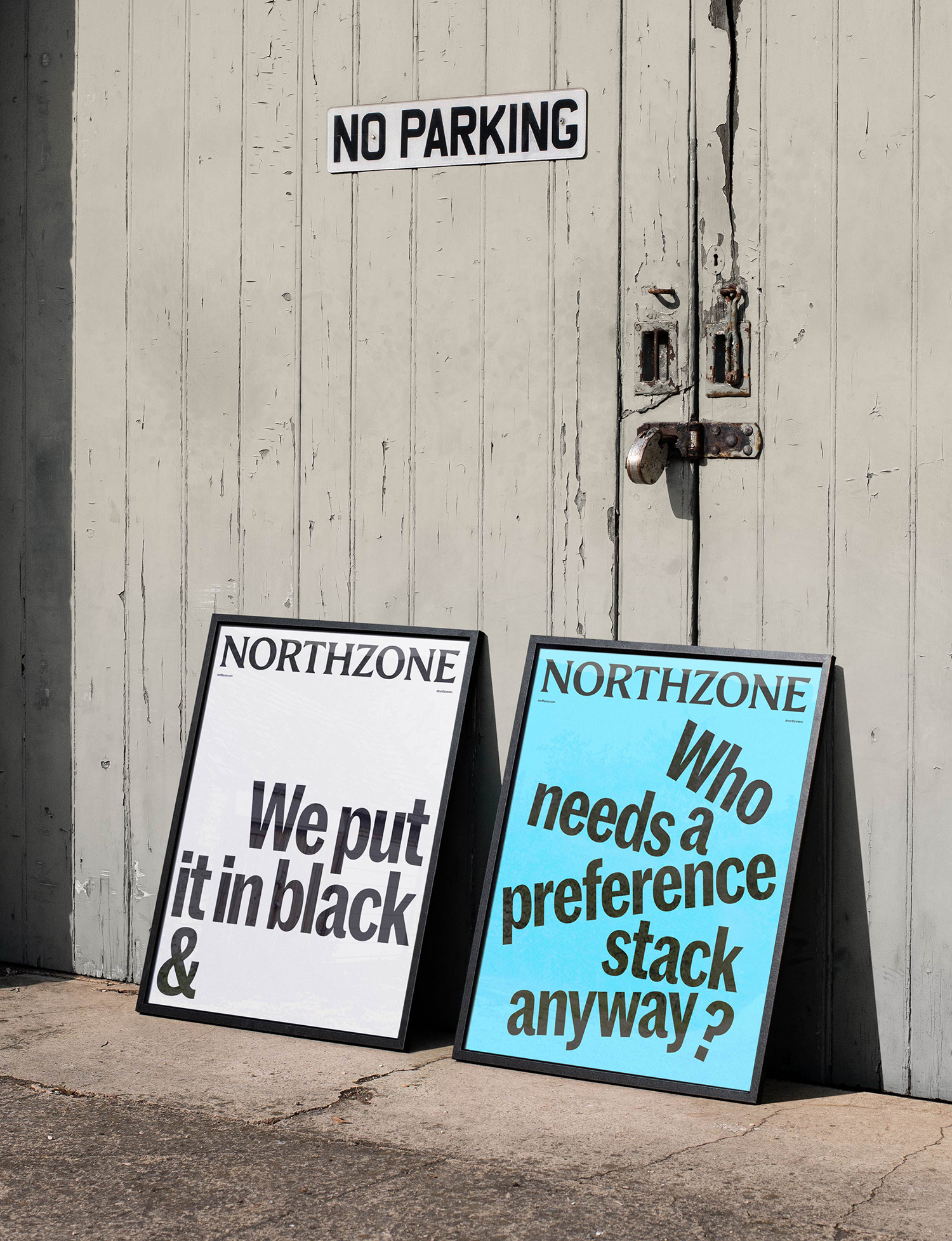
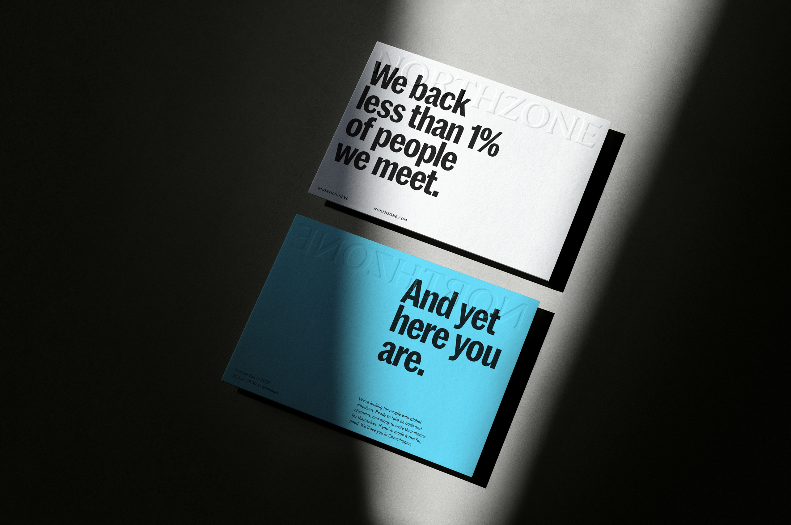
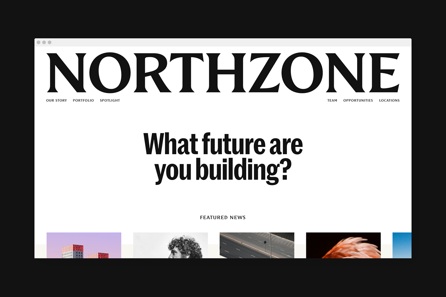
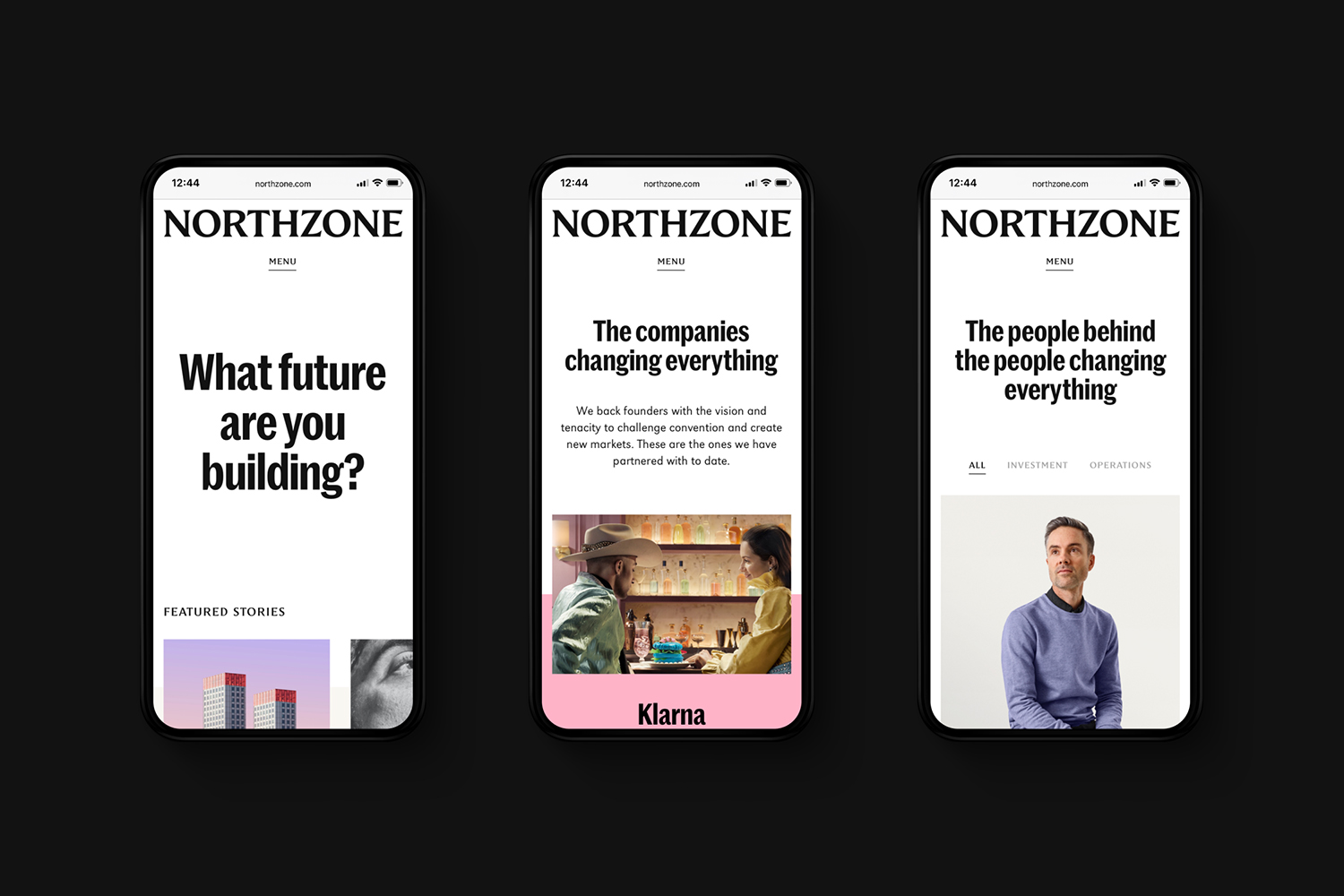
Northzone is an early stage venture capital fund with the insight necessary to cut through the hype of funding and recognise strong teams doing good work. From their offices in London, Stockholm and New York they partner with founders at Seed, Series A and Series B stage across Europe and America. London-based Ragged Edge worked with Northzone to create a brand identity that would put founders before figures, and position boutique venture as the aspirational choice. Based around truth over hype and character over the size of an investment opportunity, Ragged Edge developed a visual language that evokes that of the editorial. This manifests itself through a bold logotype/masthead, dynamic layouts informed by stories, and an intelligible tone of voice. This links mobile and desktop digital experiences and printed surfaces such as business cards, newsprint, posters, book and invitations.
“The industry is defined by bravado. Everyone backs game changers, and everyone spots outliers. Northzone’s experience means they cut through the hype and get to the truth about the team. They build their relationships from this common ground. So we placed strength of character, not just size of opportunity, at the heart of their brand.” – Ragged Edge.
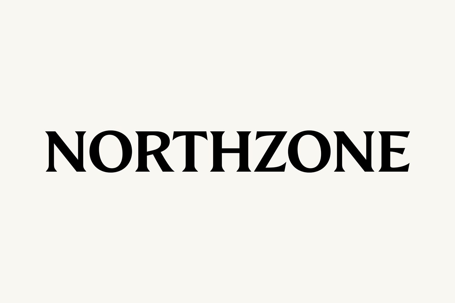
The logotype is beautifully crafted. It holds up well small, and more importantly, large as a masthead in both digital and printed contexts. It is immediate, evokes and alludes to heritage press, and by extension truth, and in its placement, perfectly sets up the editorial visual language that holds together the content that follows and a variety of touchpoints.
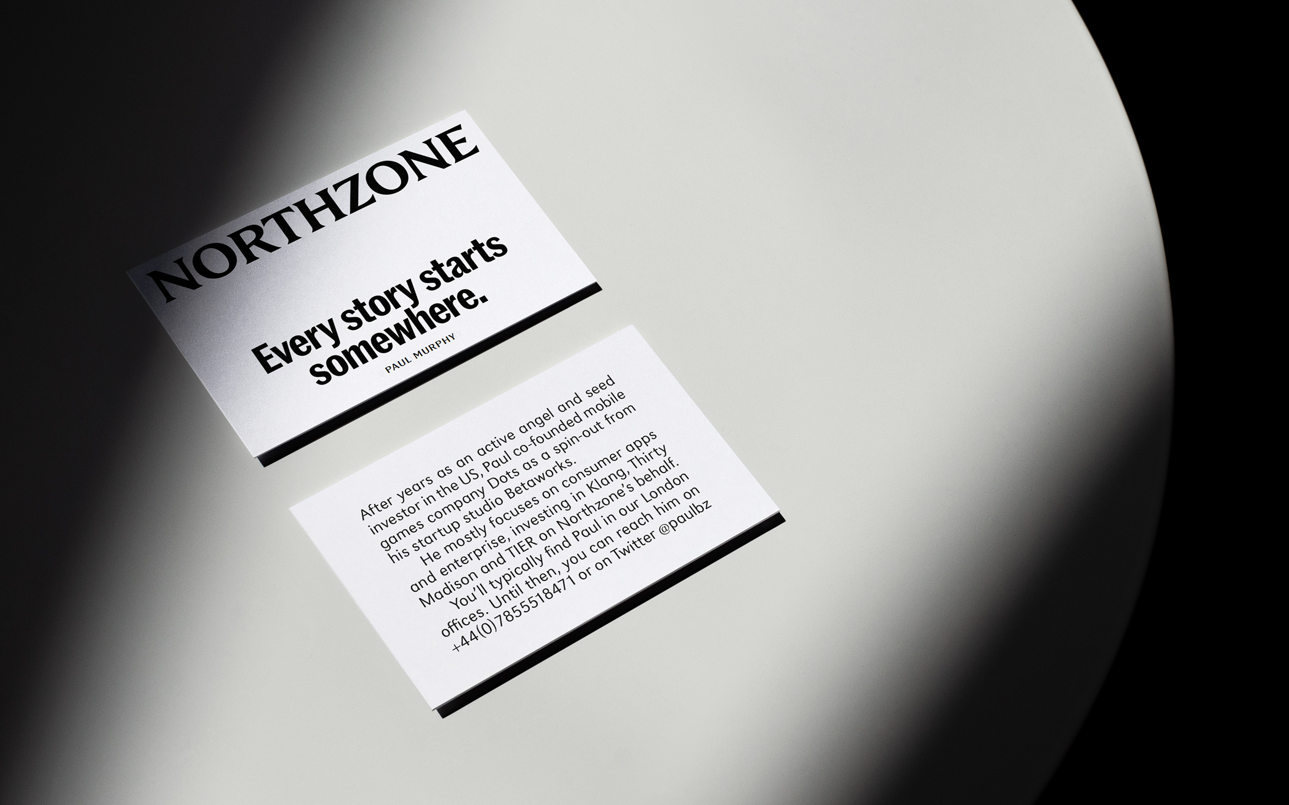
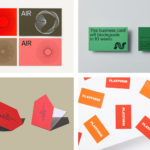
Each surface is a space to tell a story. The business cards are no different, with General Partner Paul Murphy’s offering a short background. Marrs Sans Condensed, justified text, black ink and white board and the two sides presented as if it was a folded newspaper is a thoughtful editorial-inspired detail. This could have become a gimmick if it were not for the restraint and range that is present throughout the brand identity programme.

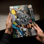
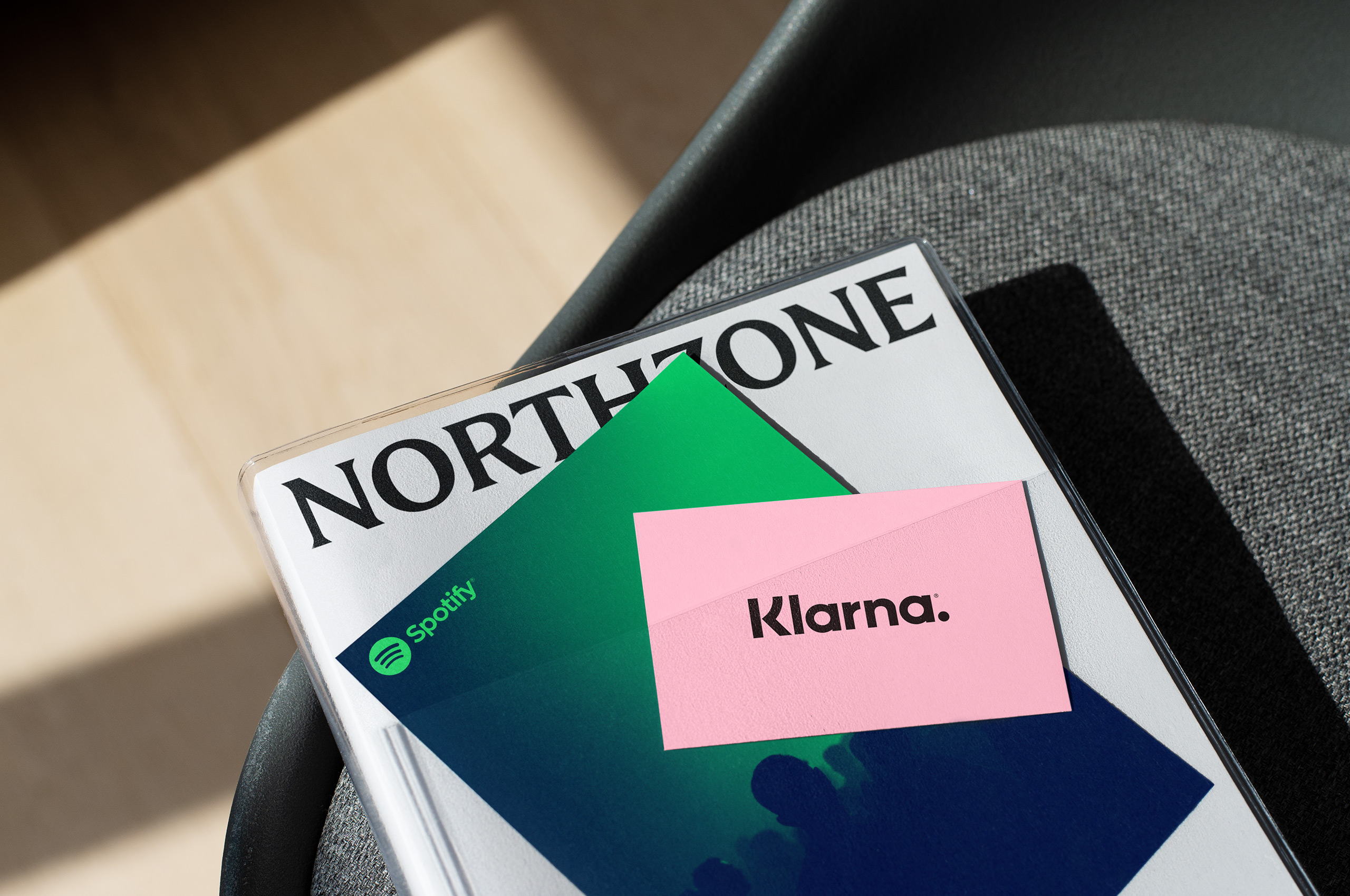
Where the business card plays with something closer to a newspaper editorial, the book moves further towards an independent fashion magazine in its colour, transparent sleeve and pocket full of colour postcards of brands Northzone have worked with. It appears as a credible backdrop to some compelling success stories, without being dwarfed by big brand names, the masthead logotype at the top, holds things together.
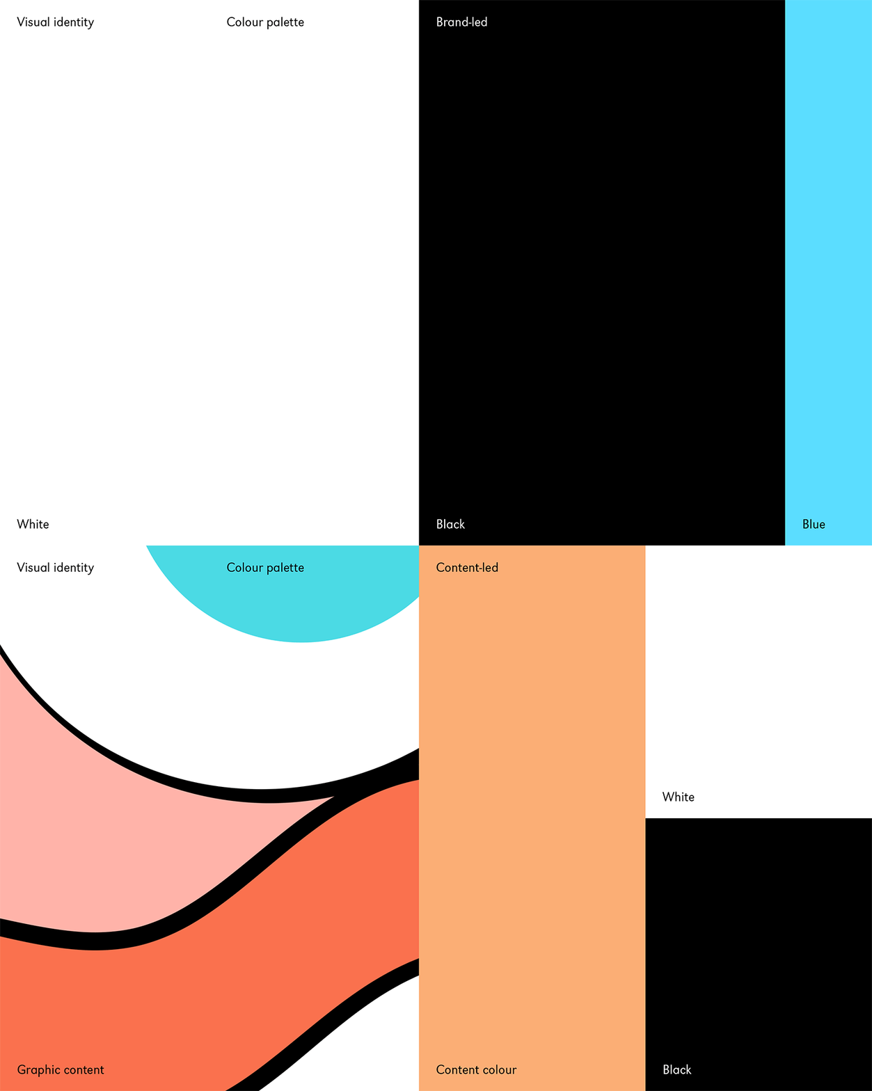
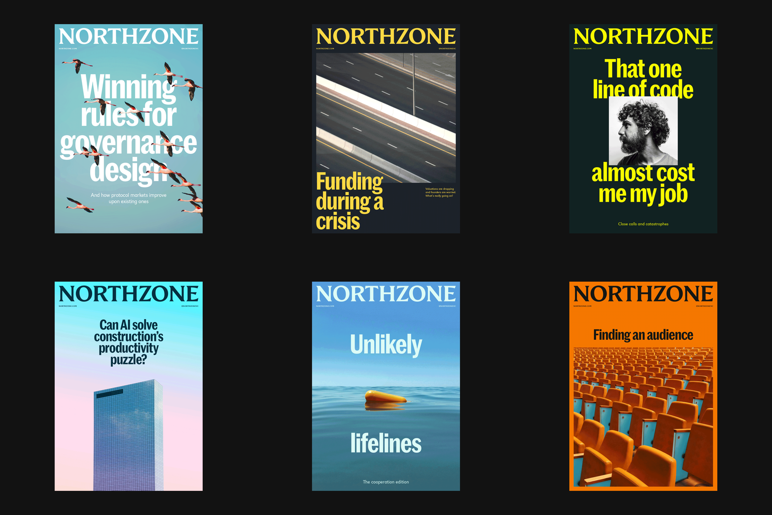
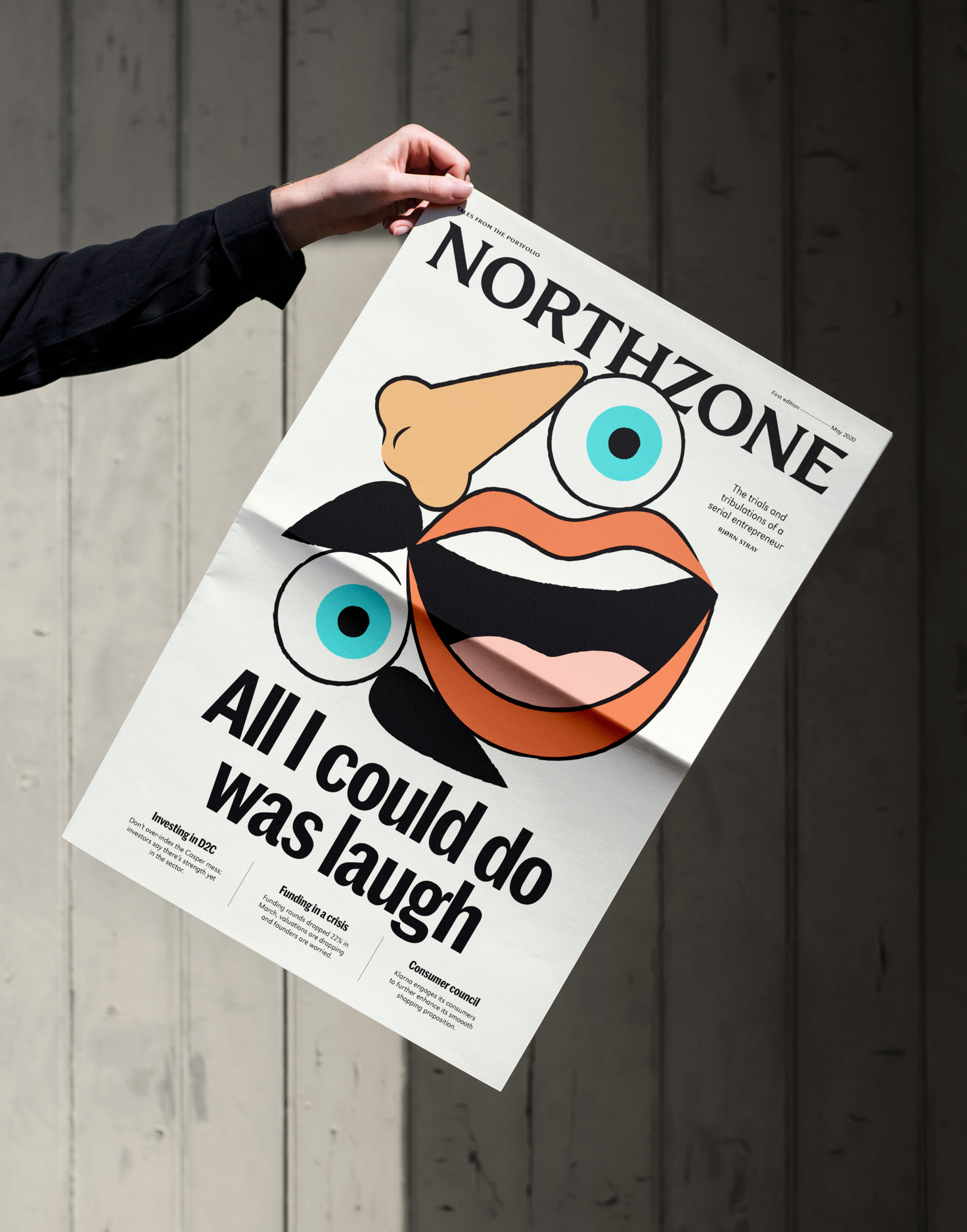
At times, the editorial concept emerges in a more literal fashion as a piece of news print or digital layout that take their cues from those publications that continue to surprise each week with dynamic layouts that are tuned to the story (read The New York Times Magazine). Placing stories at the heart of their communications is a smart strategic move, humanising and connecting, moving away from inflated egos and embellished figures. This is supported by two colour palettes, Brand-led and Content-led which delineates and provides range.
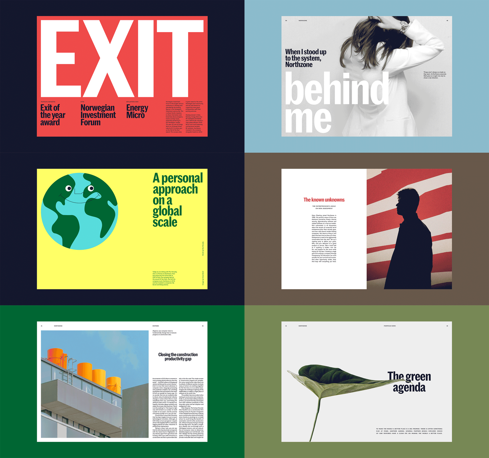
While much of the work is dynamic, with lots of different layouts, there appears to be an underlying grid-system to it. Editorial as brand is a fascinating idea, but as a brand identity system, it needs to be somewhat systematised in order to deploy consistently, to leave enough room for new and different communicative opportunities, and allow others to easily deploy it. For the most part, it seems Ragged Edge have crafted a lot the first round of communications, and hopefully, will be able to continue to maintain this standard going forward. More from Ragged Edge on BP&O.
