Leandro Erlich: Both Sides Now Catalogue by Studio fnt
Opinion by Richard Baird Posted 16 September 2020
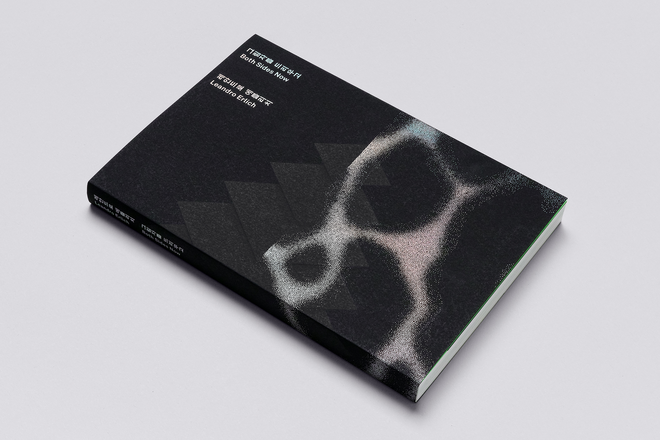
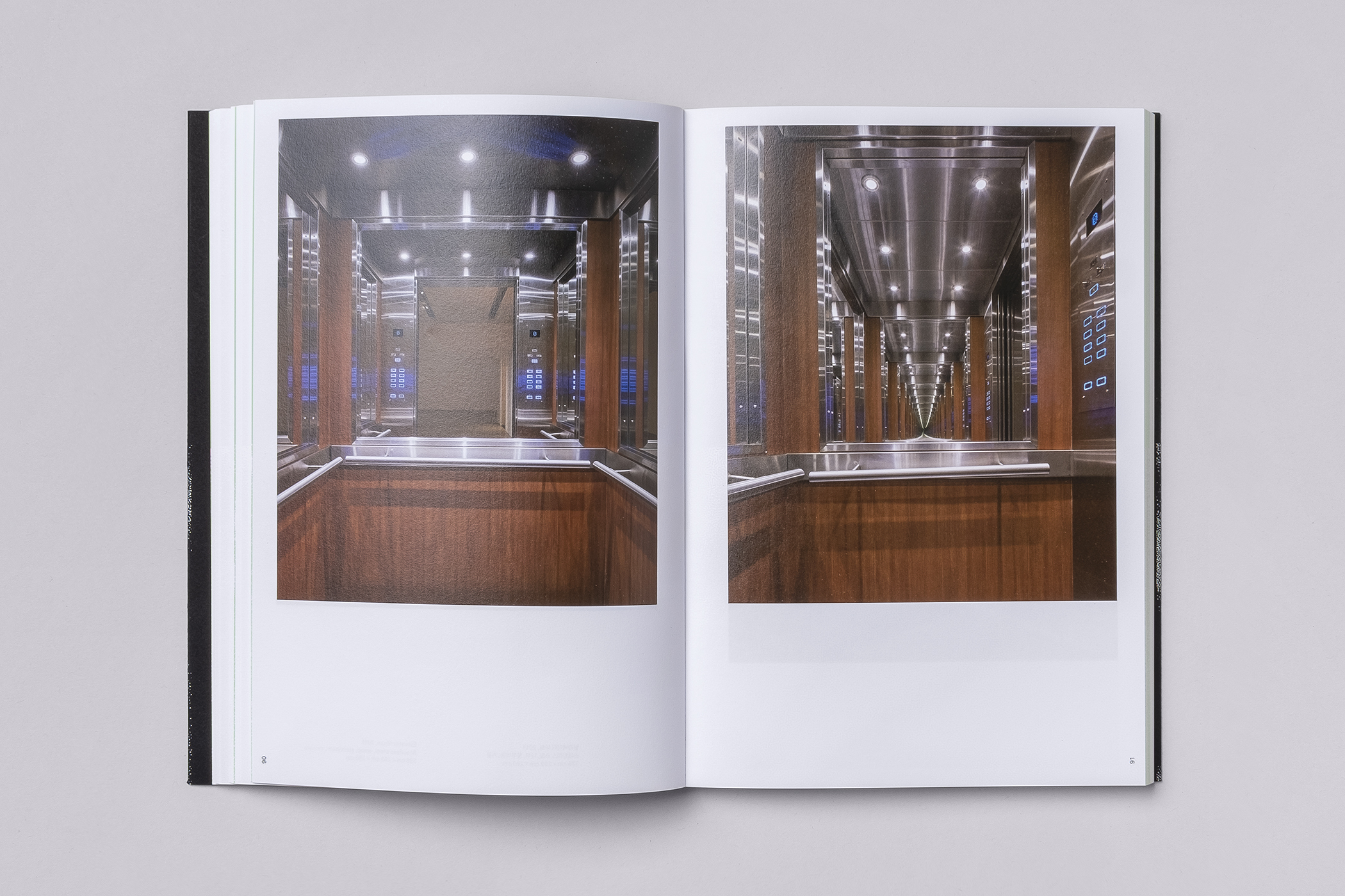
Both Sides Now was an exhibition of works by Argentinian contemporary artist Leandro Erlich. This took place at the Seoul Museum of Art between December 2019 and March 2020. Erlich’s installations employ mirrors, reflective surfaces, water and other materials to form optical illusions with the intention of transforming familiar, everyday spaces. Studio fnt worked to develop an identity for the exhibition that would establish a continuity of surfaces by drawing on one of the artist’s pieces to convey recurring ideas, proposals and motifs, those found throughout Erlich’s work. This connected supergraphics and programmes with posters, banners, digital displays and an exhibition catalogue.
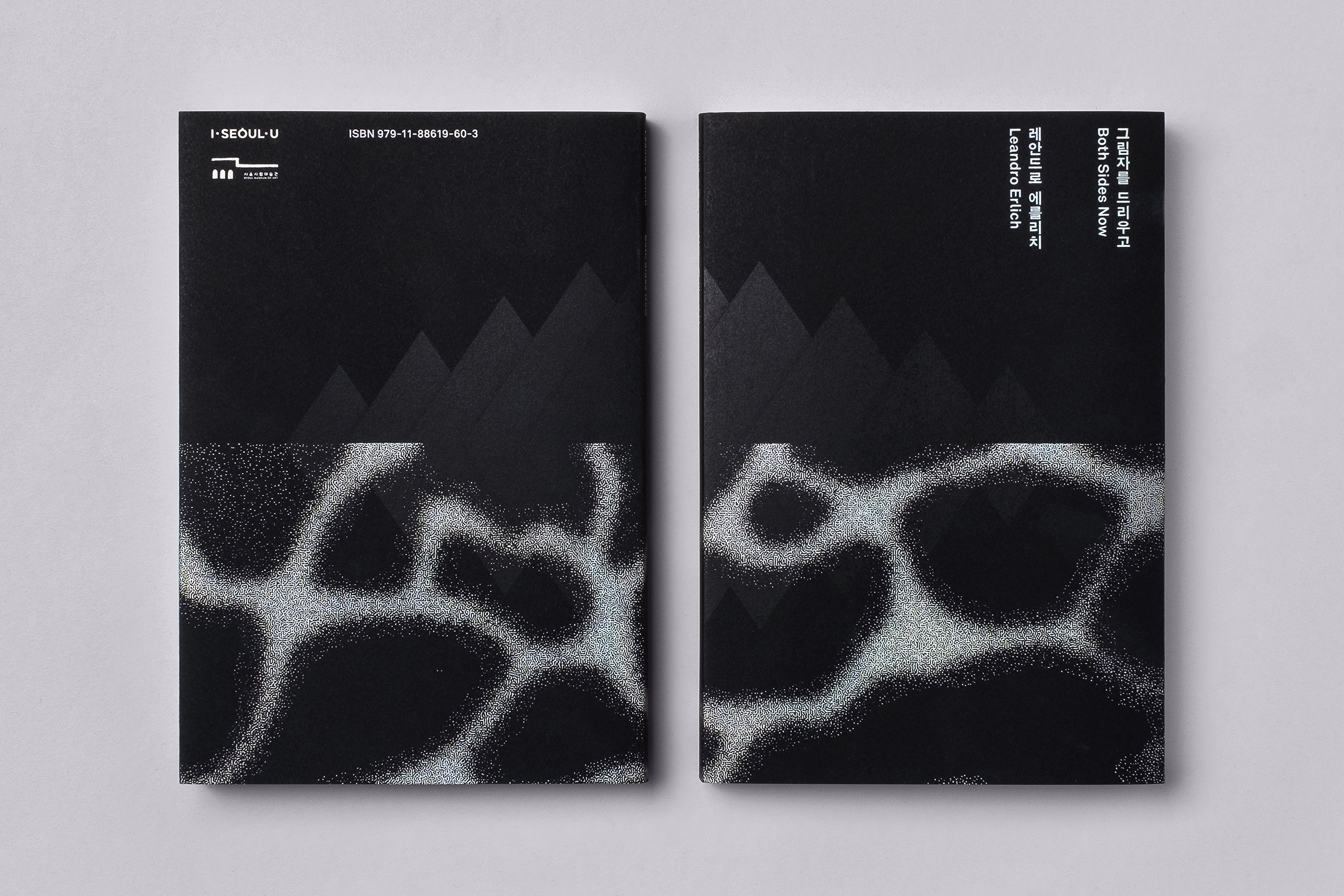
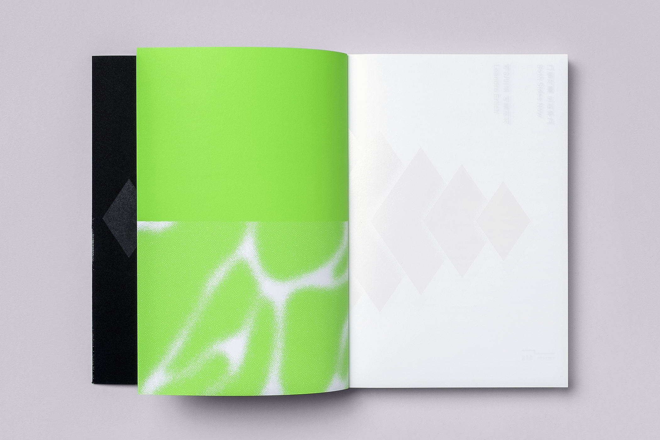
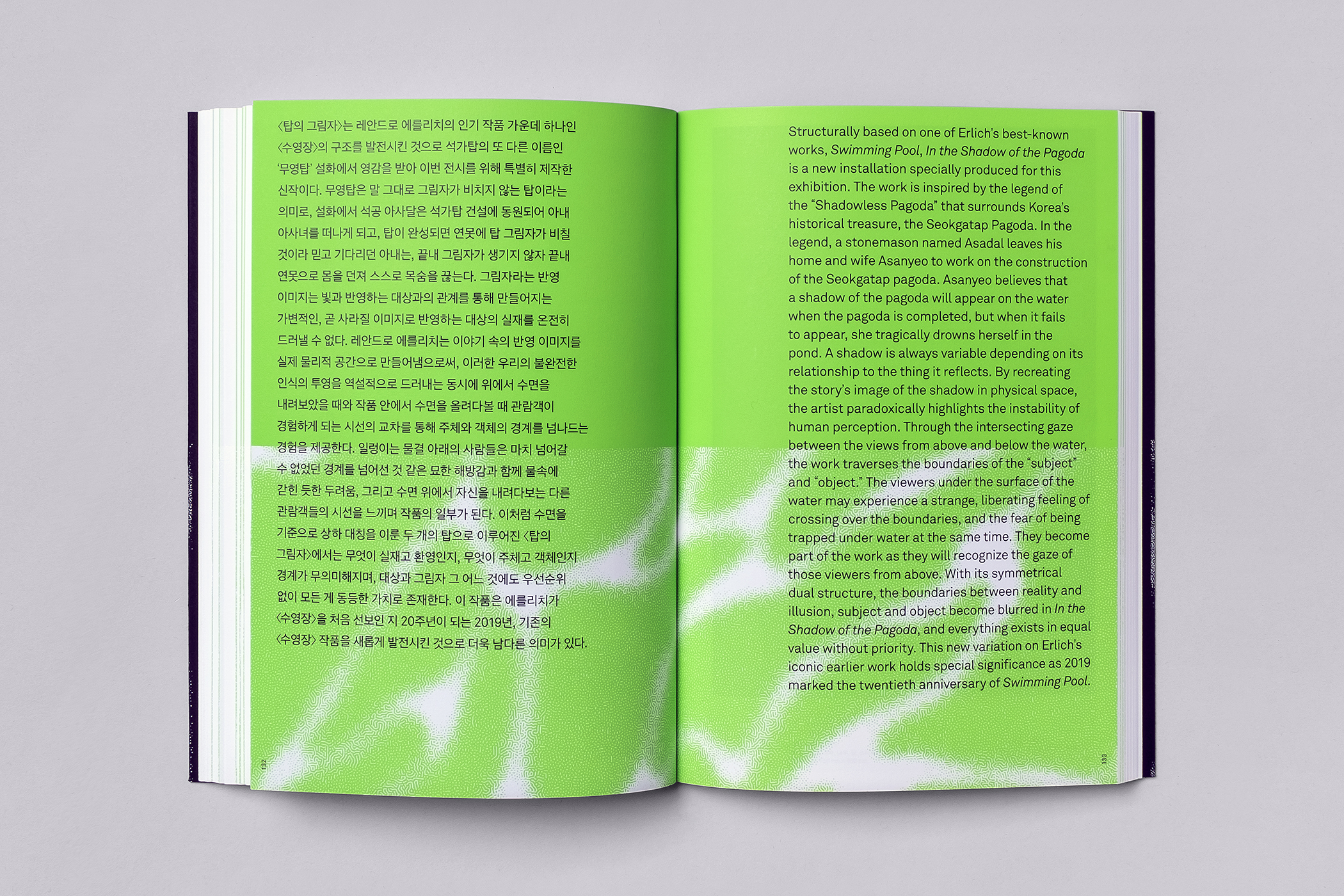
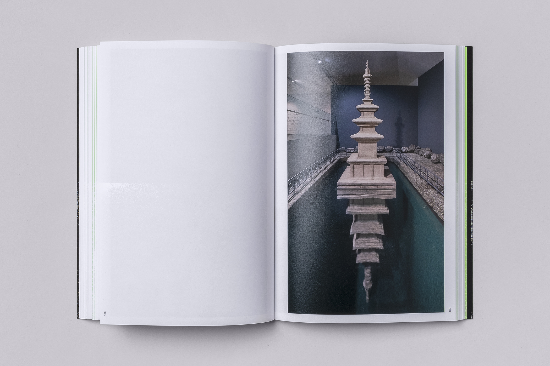
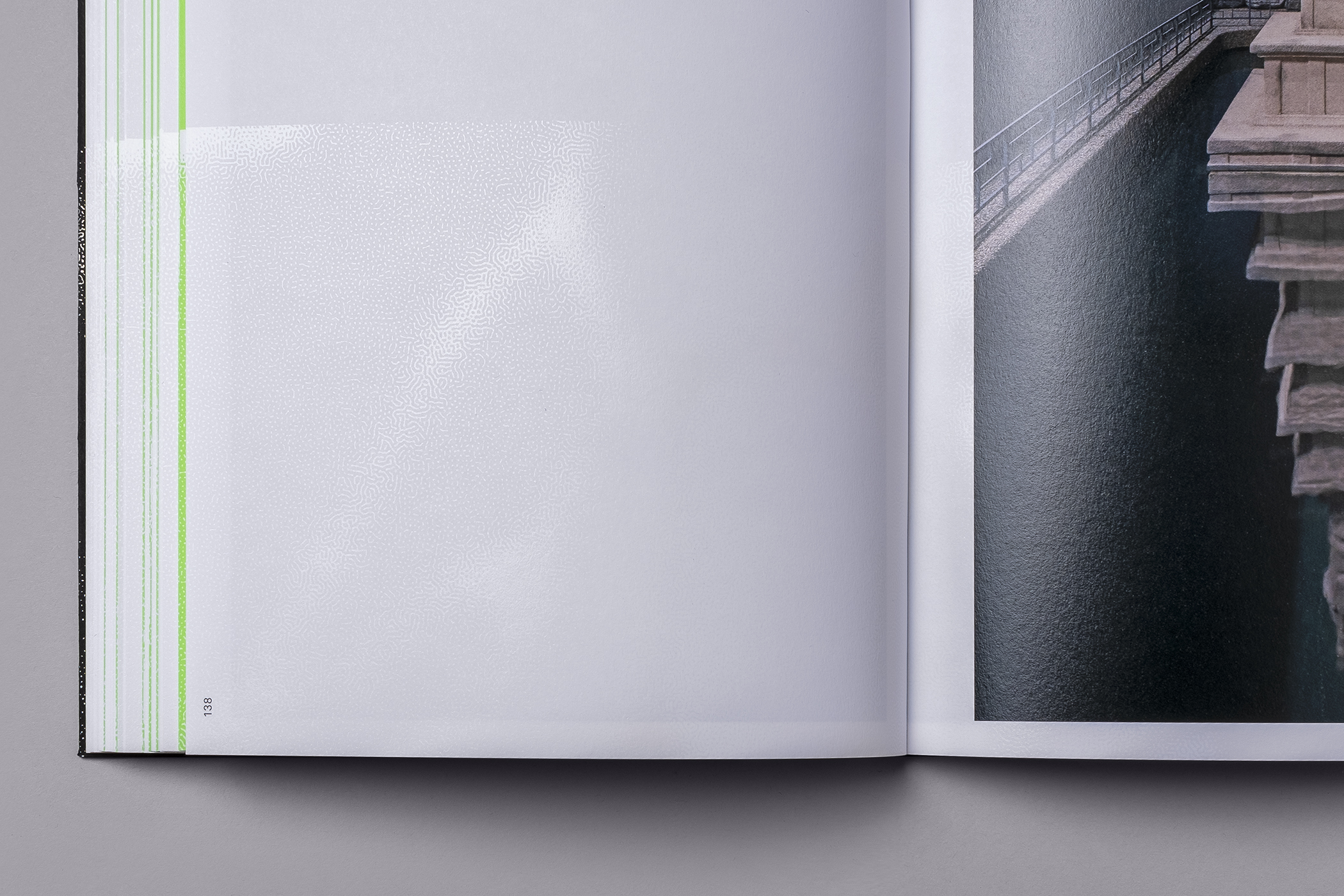
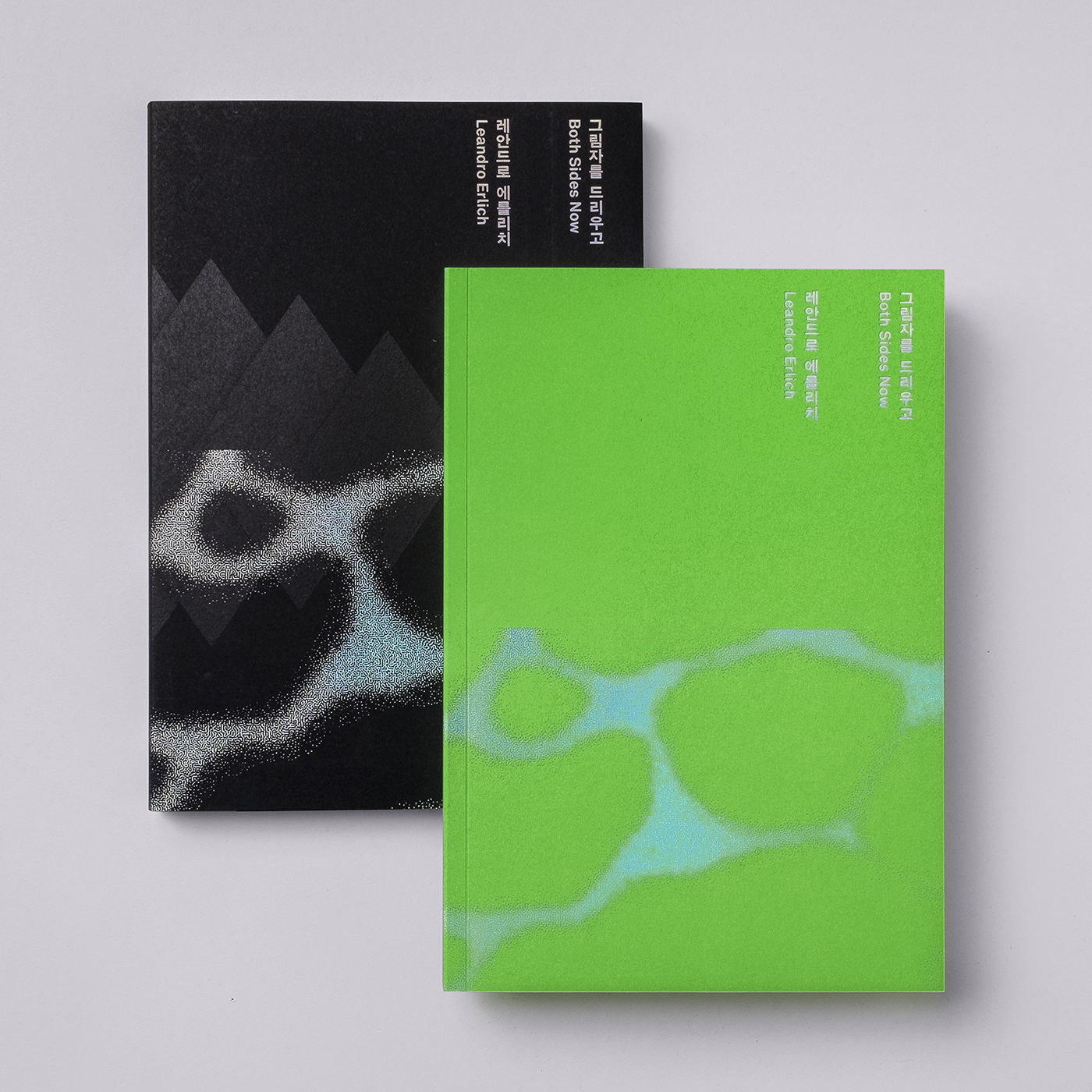
Details such as a strong graphic form and focal point (that of a pagoda drawn from legend), holographic foil and distorted typographical elements characterise the identity of the exhibition. Read the BP&O review here. These were woven together to express the transience and subversiveness of a reflection or shadow, as well as the blurred boundaries between the material objects that make up our subjective experience. These ideas are furthered explored in the design of the exhibition catalogue. Partial varnishing becomes a device to express the message of “Incompleteness of Recognition” within the artist’s work. As founder of Studio fnt Jaemin Lee explains, “the world we see is merely shadows made out of light sources.”
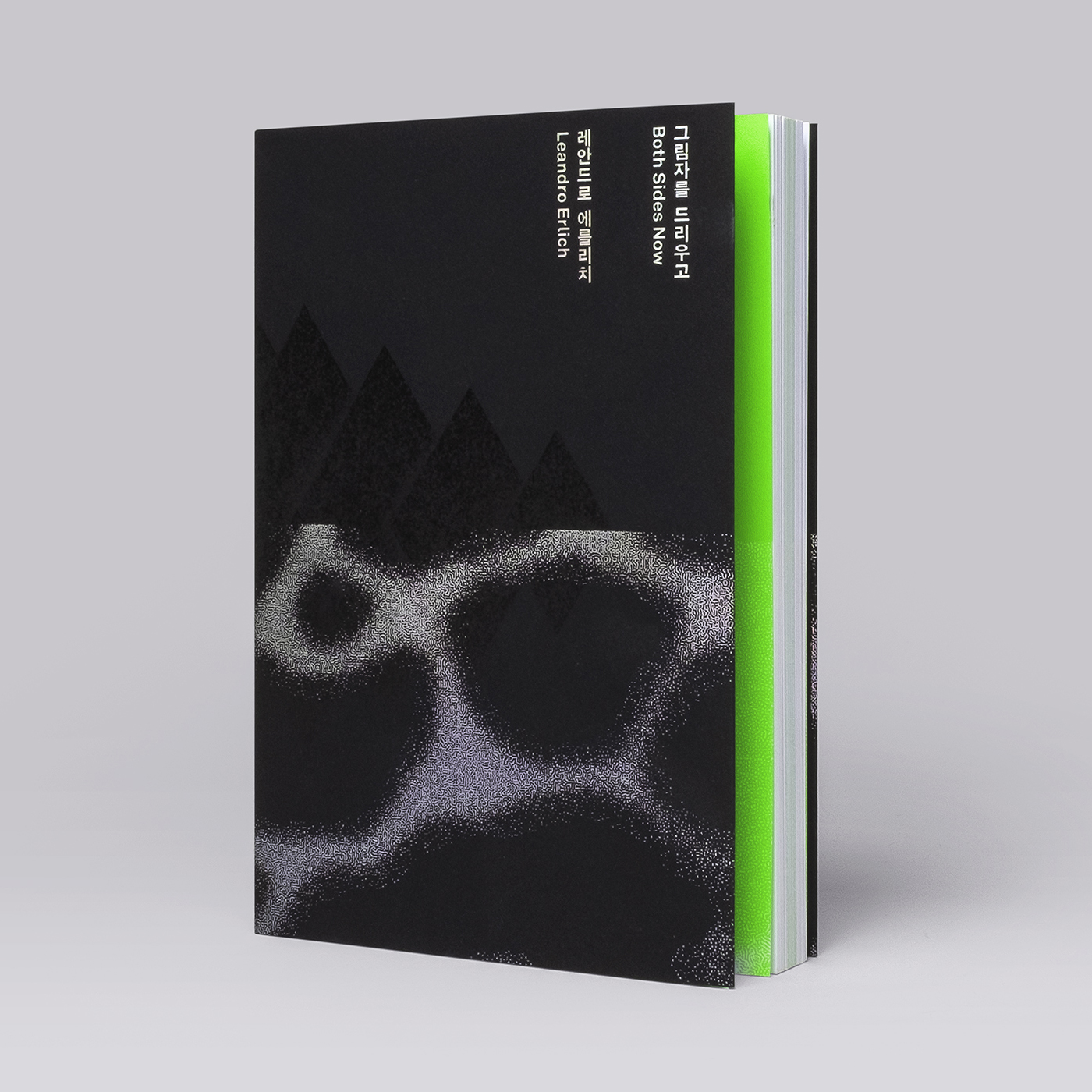
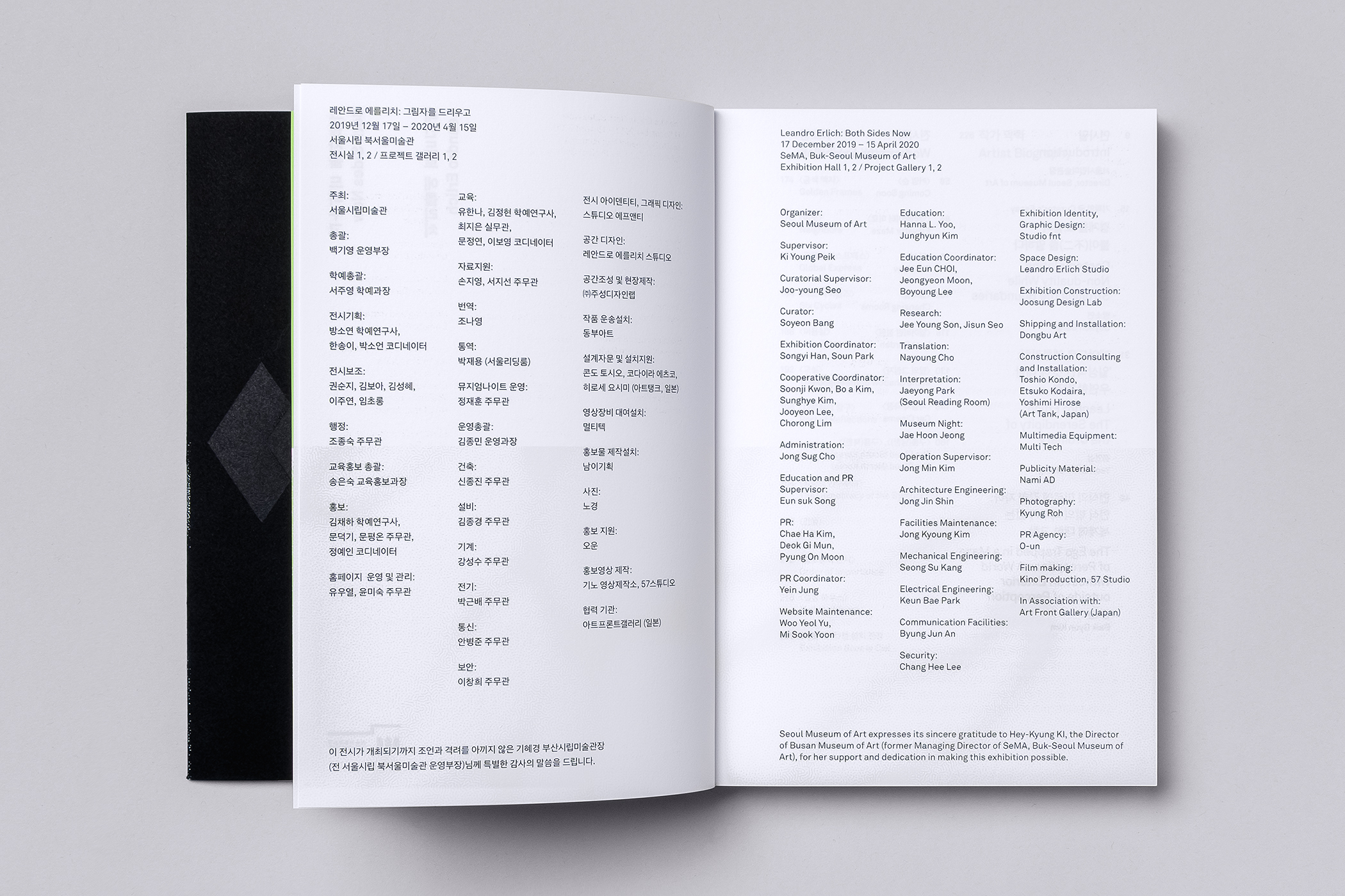
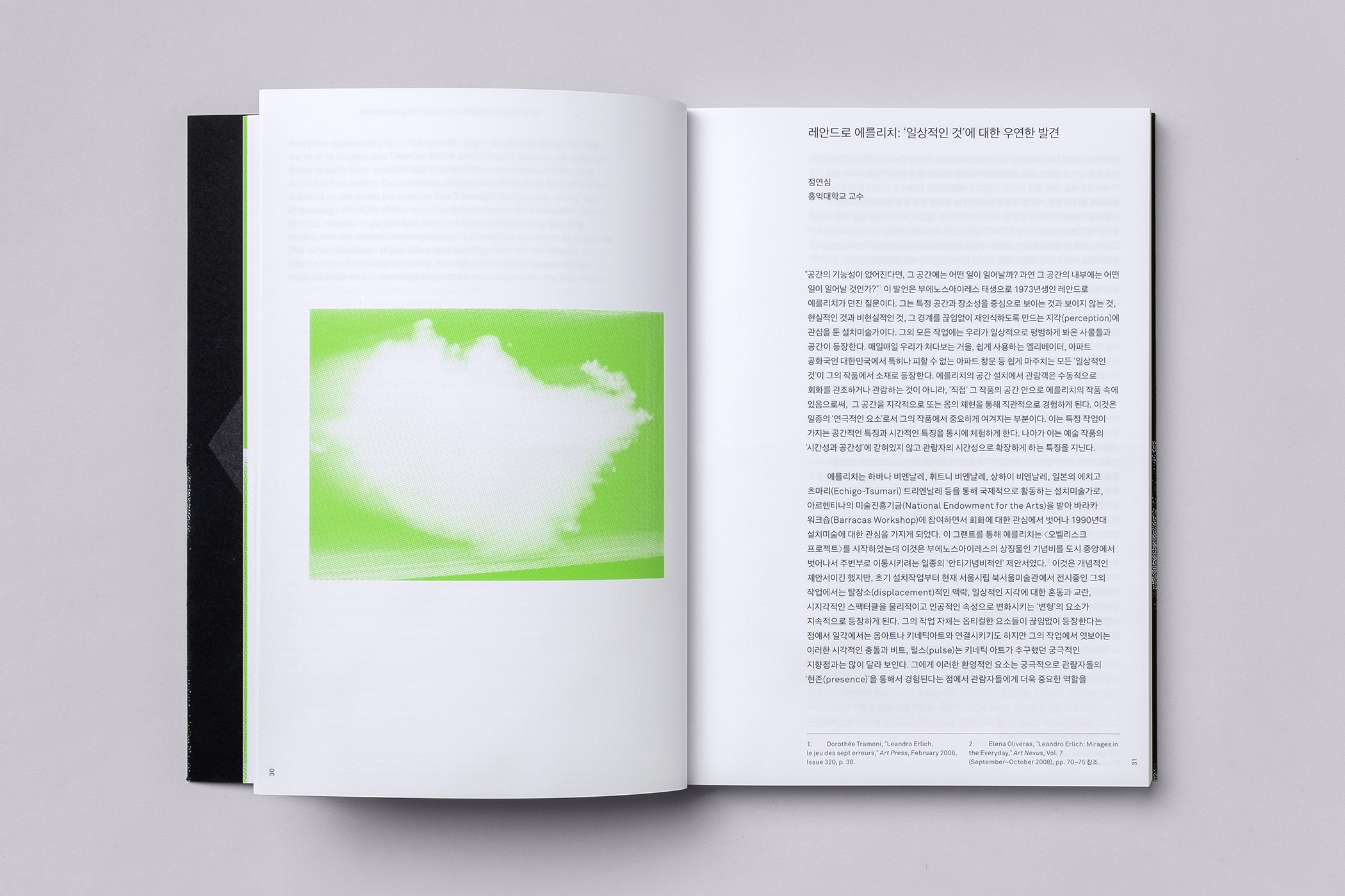
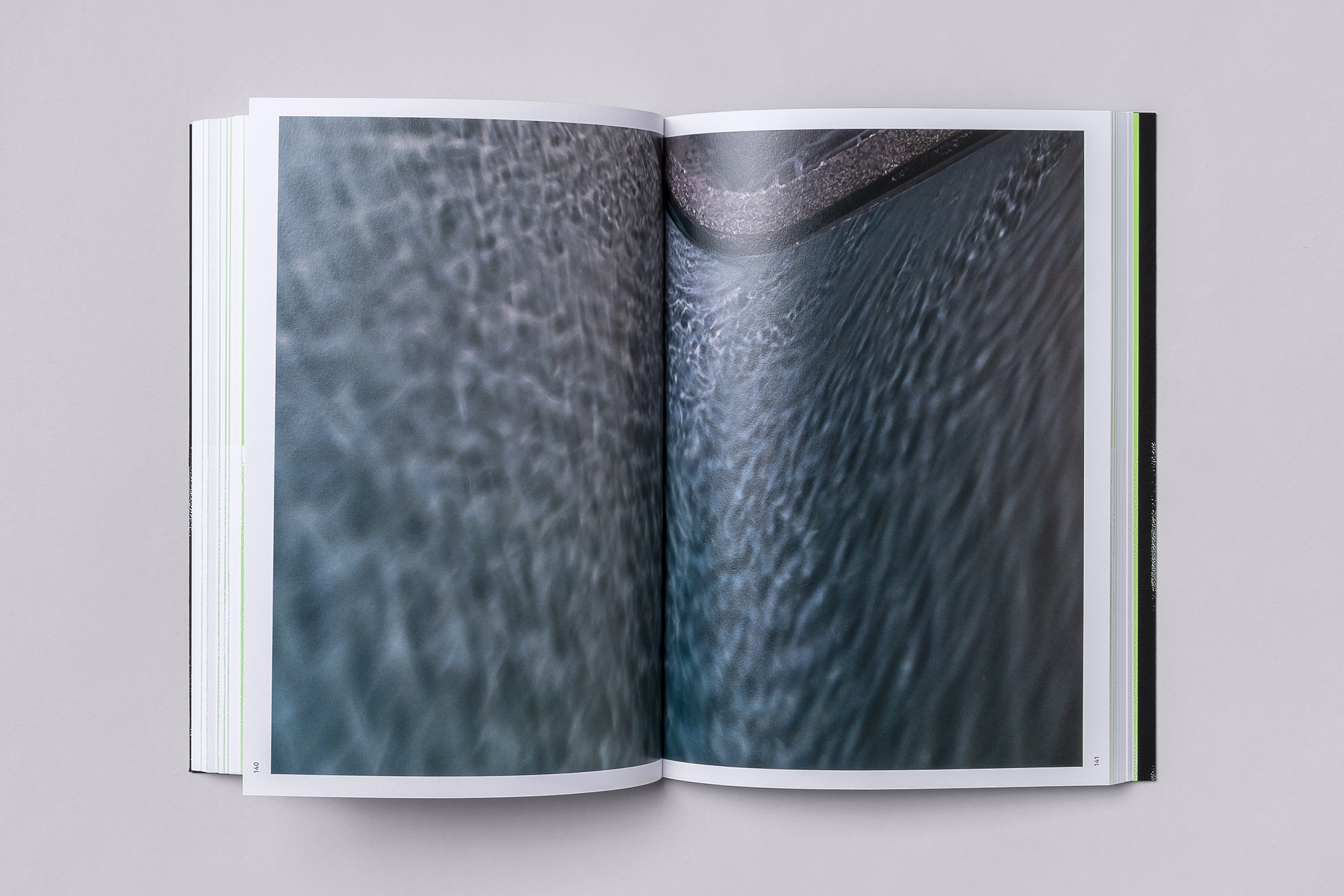
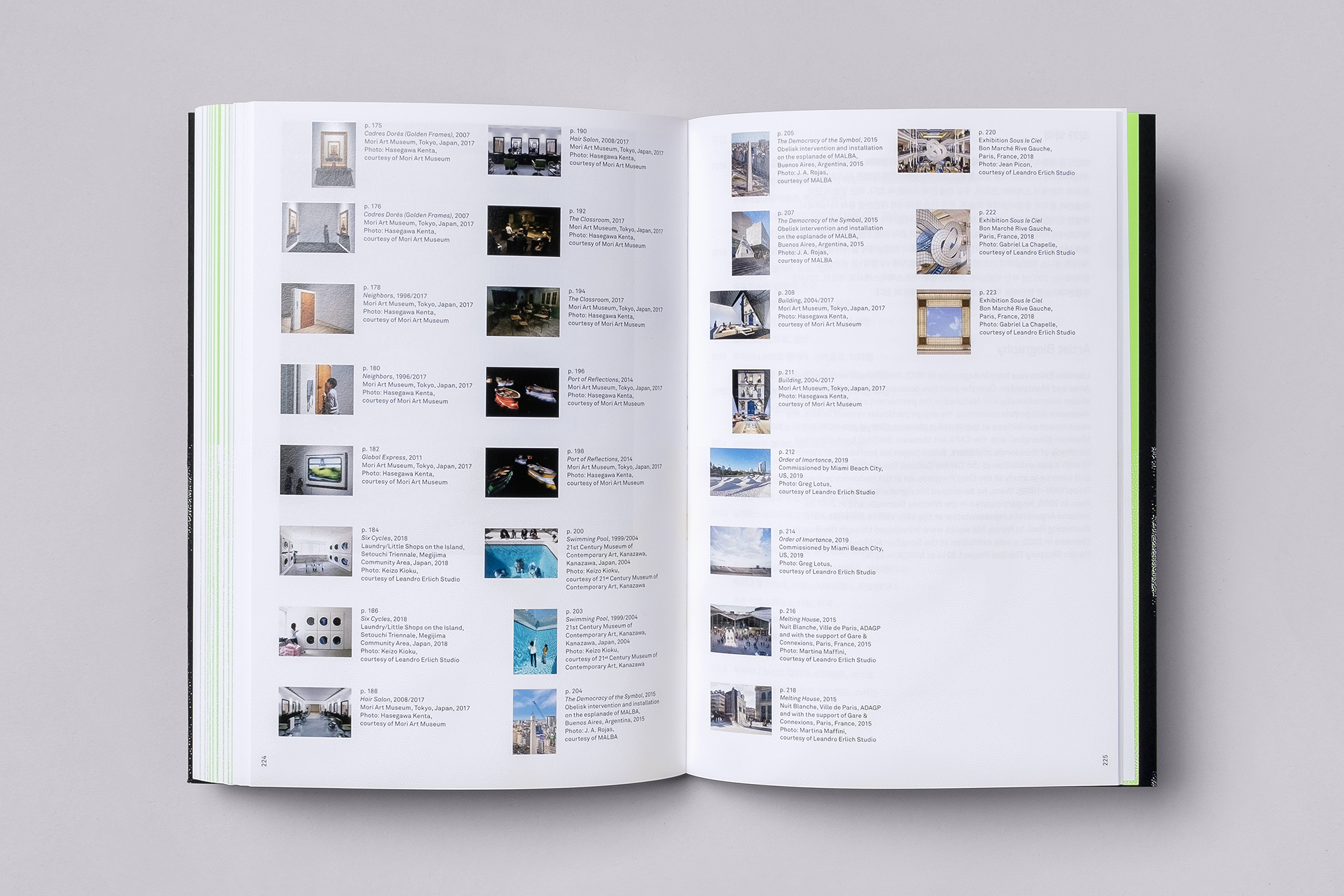
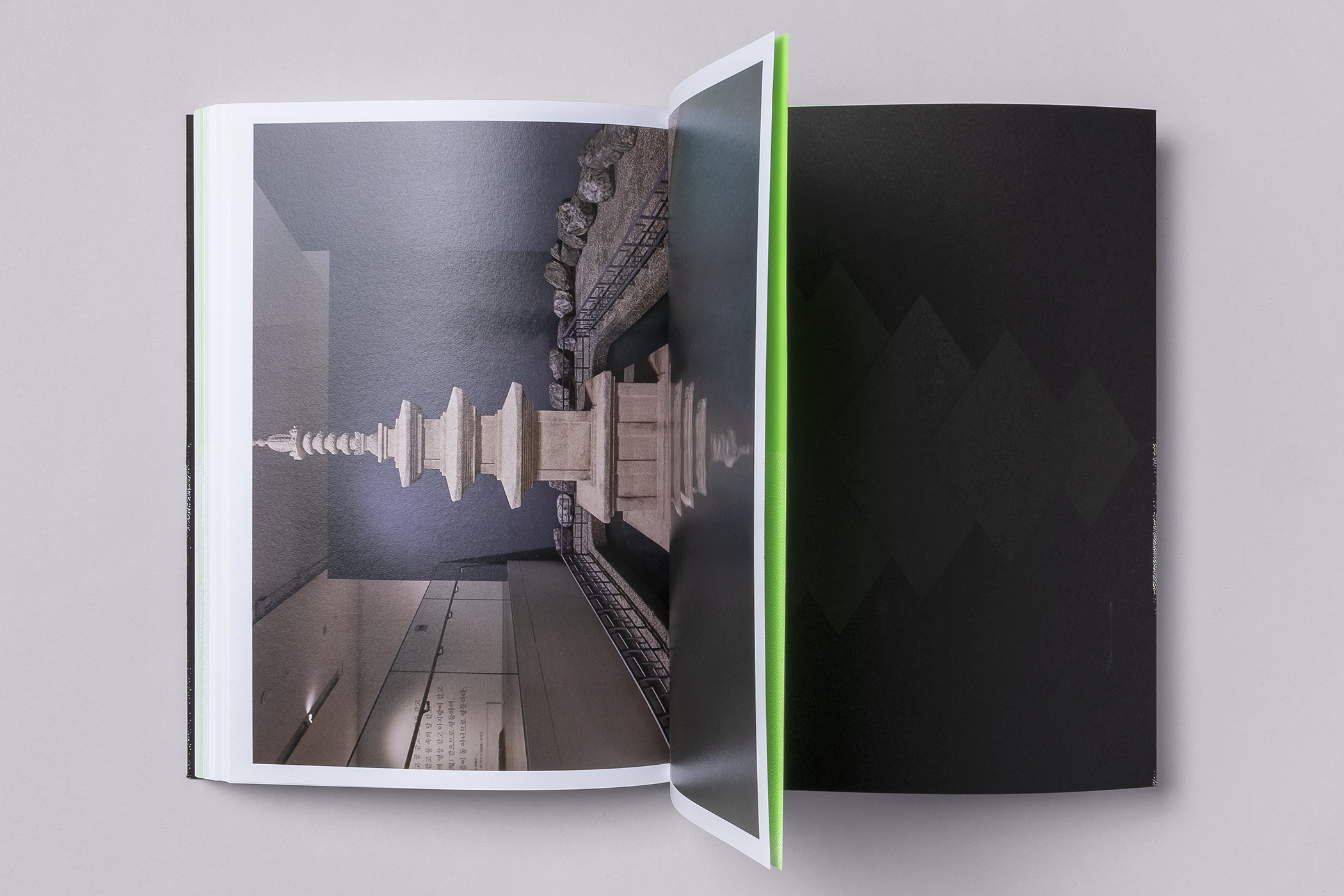
There are number of beautiful details to this publication that, just like the artworks themselves, generate atmosphere and seek to express the things that cannot simply be put into words. There are techniques such as contrast in the use of a dark cover and bright fluorescent opening page and holographic foil that have an immediate material allure, yet there are also those that speak of something deeper. Waves of varnish and the changing colours of holographic micro-foiling over and below other elements imply something existing beneath the surface, furthered using show-through, and neat tricks with page and image play with perception, and alter the relationships of images as the page is turned. See second image from the bottom. The catalogue offers the owner the opportunity to engage more directly with the ideas present in the works on display. The atmosphere of space, is infused into and throughout the publication. More work by Studio fnt on BP&O.
