Cable Factory by Bond
Opinion by Eleanor Robertson Posted 20 March 2022
Cable Factory (Kaapelitehdas) is one of Helsinki’s most famous buildings, originally designed by the Finnish industrial architect Wäinö Gustaf Palmqvist in 1939. For many decades it was the largest building in Finland with a footprint of 56,000 m², and it remains one of the most iconic. In 1991 the site was redeveloped to become the country’s biggest cultural centre, housing artists’ studios and three museums, as well as hosting a calendar of concerts, exhibitions, fairs and festivals.
By 2020, Cable Factory had over 300 tenants, attracting a million visitors each year. But despite its many public activities, it was increasingly viewed as an exclusive venue for the cultural elite. The team at Bond’s Helsinki studio was approached to help counter this perception with a new identity centred around the ideas of accessibility and participation to celebrate ‘togetherness and new, unexpected encounters’.
This post includes Extended Insights for BP&O Plus members.
Find out more and sign-up here.
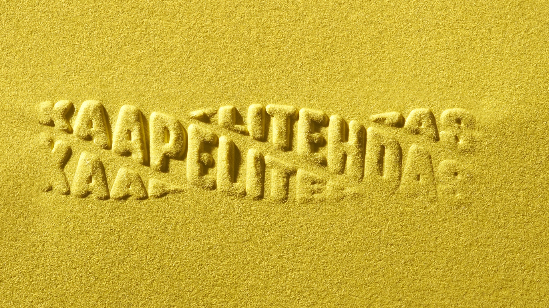
The three logos speak to a multicultural audience in English (Cable Factory), Finnish (Kaapelitehdas) and Swedish (Kabelfabriken). They are used interchangeably and given equal weight to represent a meeting of culture, people, ideas and art forms: ‘Cable Factory tying together the world’. The triplet wordmarks cleverly twist the brand name into a short length of cable to emphasise this theme while paying homage to the building’s history.
In each case, BOND has pulled off a clever optical illusion by splitting, duplicating and distorting letterforms in a way that should – but somehow doesn’t – sacrifice legibility (unlike much of the trend-led kinetic typography that’s so popular on Instagram). The logo works beautifully in static forms including gritty tactile embossings, but it is most pleasing when it is spinning in motion, mesmerising like the impossible objects of M.C. Escher.
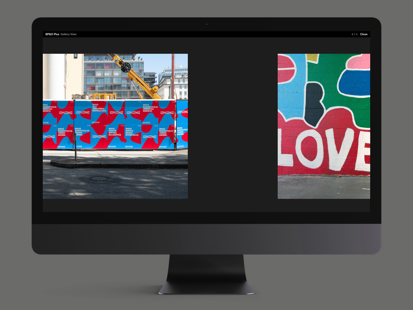
The clean, curvy sans (Struthio Round) is a smart choice, adding modern simplicity alongside character and providing a distinctive foundation for the brand. We are told that the typography draws upon the chunky painted lettering of the street art legend Thierry Noir’s onsite mural, Love and Anarchy, which also provided inspiration for supporting graphic elements: ‘through repeating, mutating and combining the familiar shapes and colours the identity applications produce limitless new takes on the original artwork’.
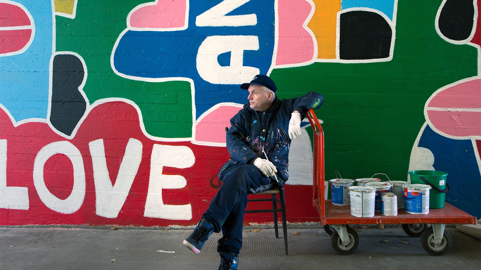
While the visual connection may not be immediately obvious, there is a spiritual relationship. Noir’s Berlin Wall paintings – featuring his signature brightly-coloured, cartoon-like figures – are representative of the voice of freedom in artistic protest against the Cold War. In Germany at least, the fight was for reunification, so there is a crossover with the artist’s mural and BOND’s universally charming amorphous shapes, open to endless interpretation and representative of everyone, everything.
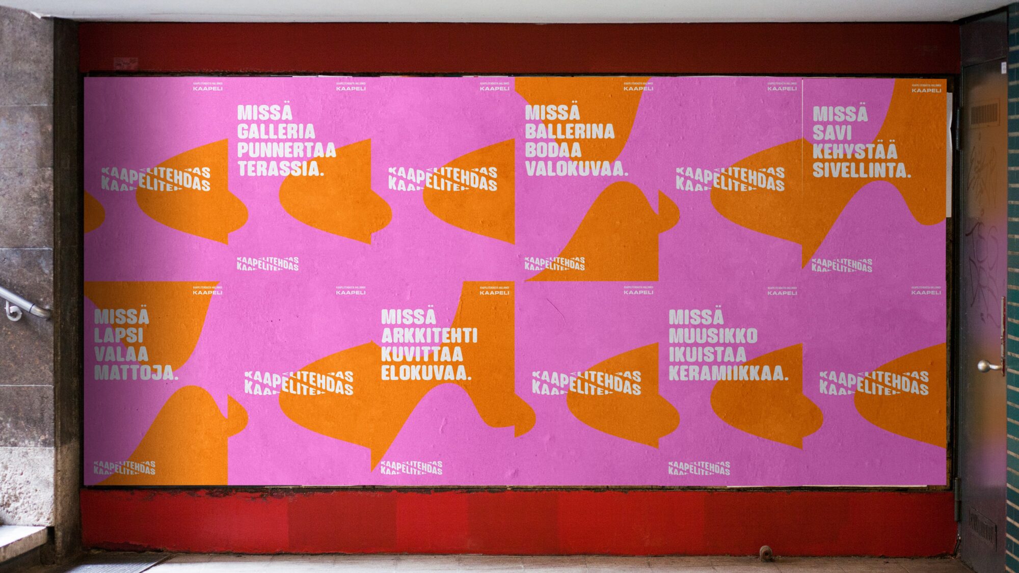
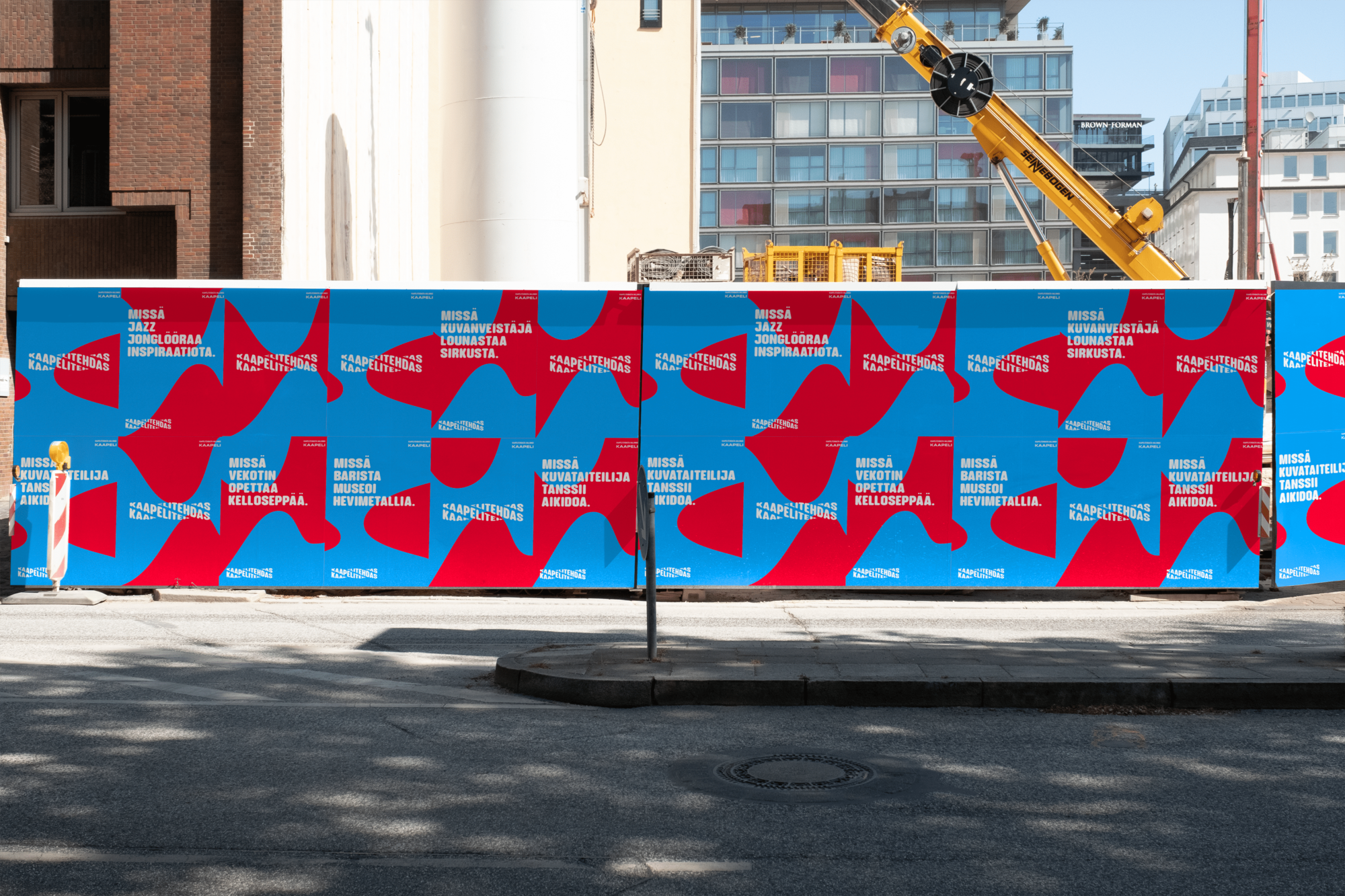
The generative copy lines take their lead from Exquisite Corpse – a collaborative poetry game with roots in the Parisian Surrealist Movement. The technique is used to release participants from imaginative constraints to produce surprising, absurd and delightful combinations of words. For Cable Factory, it emphasises the collision of art forms: ‘It’s where a bassist dances aikido. It’s where jazz juggles inspiration. Where a bodybuilder frames circus. Where an architect illustrates a movie. Where a ballerina sketches ceramics.’
The line breaks are not always attractive but the treatment works well in animation, applying the logo’s rolling motion to create an addictive social and OOH campaign that satisfies with unpredictable outcomes. BOND describes it as: ‘A slogan that keeps reinventing itself. A dynamic solution with infinite variations, also providing a way to dive deeper into the offering of the centre.’ It might have been interesting to see the same principle applied to imagery – perhaps through collage – to further promote the diversity of the cultural centre.
This is more successfully explored through the approachable rainbow-spectrum colour palette which has a youthful, open and idealistic brightness. The pairings continue the theme of intertwining people and practices in considered combinations that ensure good contrasts. It is well-crafted, but it also feels extremely human with organic points of overlap and spontaneous encounters.
Cable Factory describes itself as: ‘Open-minded. Tolerant. Never boring. Unreserved and adventurous. Aiming to inspire, stimulate and surprise – but always positive and welcoming.’ BOND has nailed the brief with a joyful identity that is open for everyone, digitally-led and inspired by connection.
