Autex Acoustics by Marx Design
Opinion by Richard Baird Posted 5 April 2022
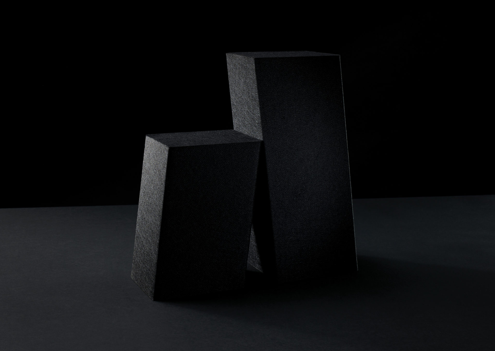
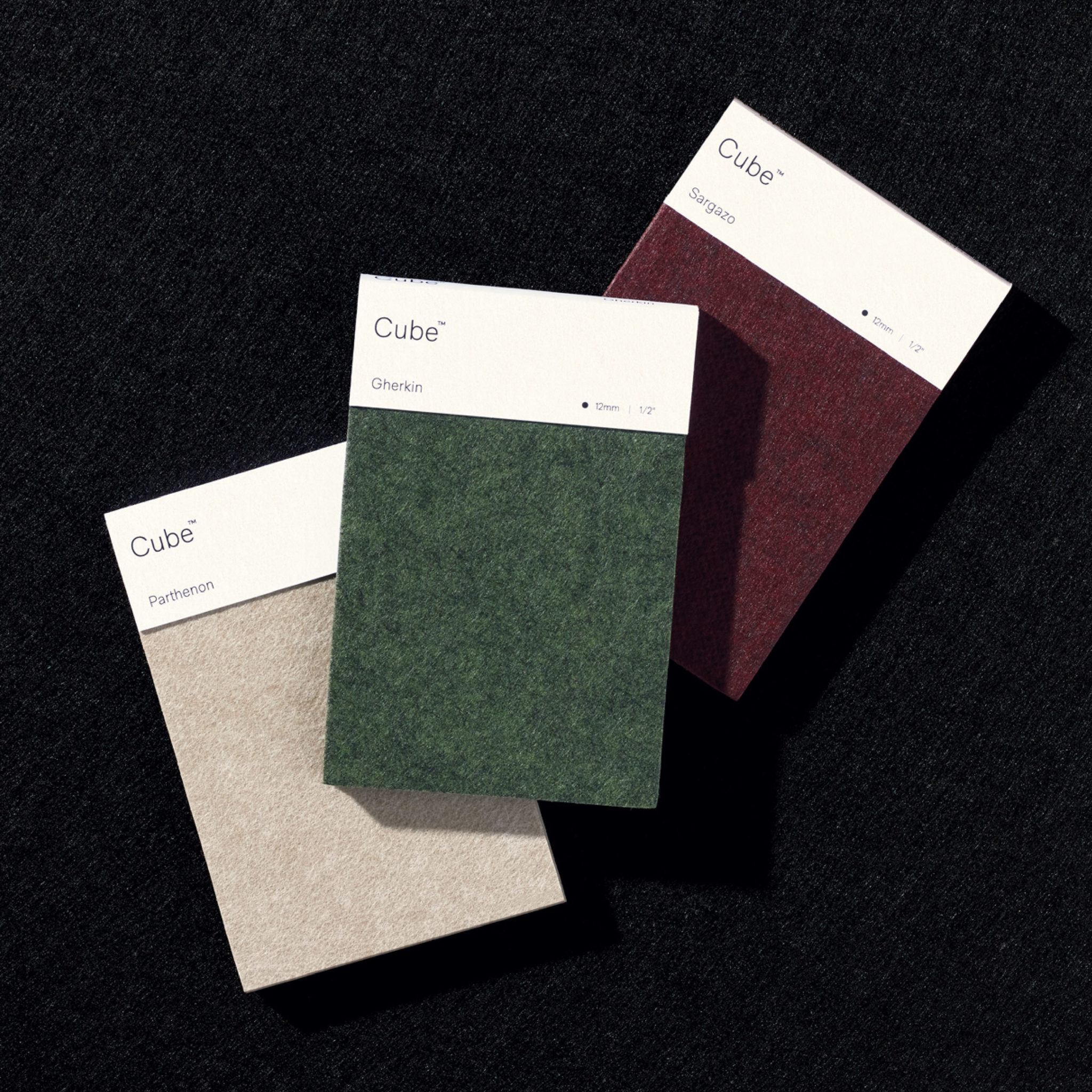
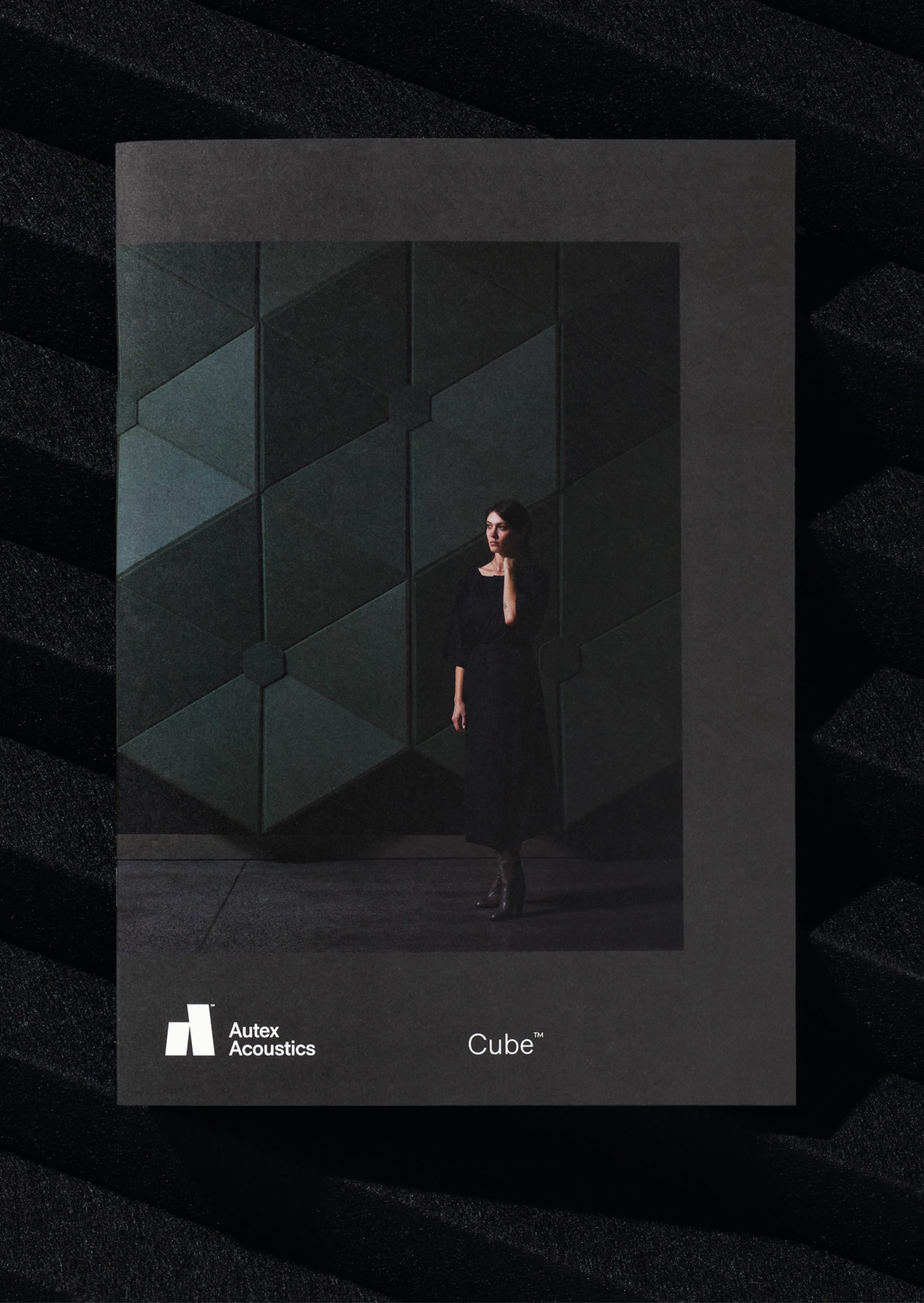
With manufacturing and sales teams throughout Australia, UK and the USA, Autex has grown to become the market leader in interior acoustic products in New Zealand, and the go to choice for leading architects aspiring to reduce the amount of atmospheric noise within cutting-edge residential and commercial spaces. Their products are innovative, produced in a variety of forms and colours, from unusual panel shapes to the striking surfaces of acoustic baffles.
With a desire to develop the consumer side of the business, previously sold under the Autex name, the company worked with Marx Design to develop a new consumer-facing brand for a range of interior acoustic products. The brief was to develop a communications strategy and visual identity that would shift brand perception from functional manufacturers to design-led innovators.
This post includes Extended Insights for BP&O Plus members.
Find out more and sign-up here.
Three key factors are at play throughout Marx Design’s approach: the functionality of the product, its innovative material properties, and their relationship with architecture and design-savvy buyers. Product audit and perception interviews were the basis for resolving these core considerations. Mapping ‘timeless’ design principles – simplicity, clarity and distinctiveness – to an auditory product provided the framework for development.
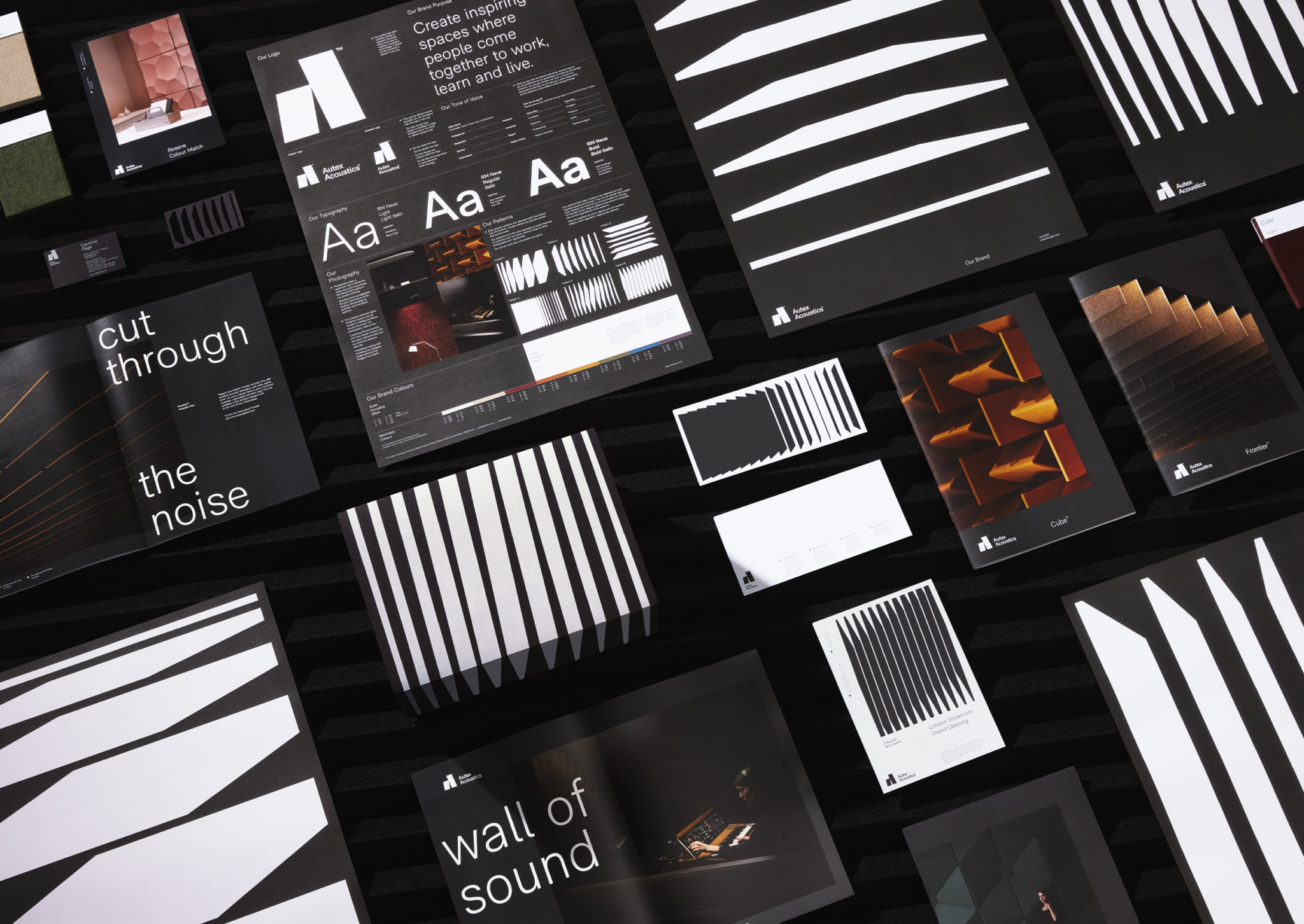
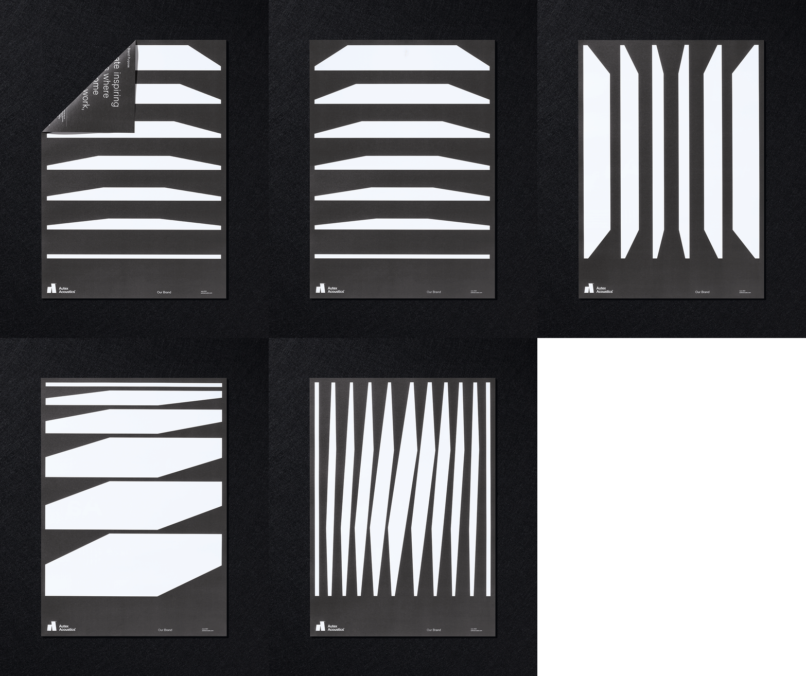
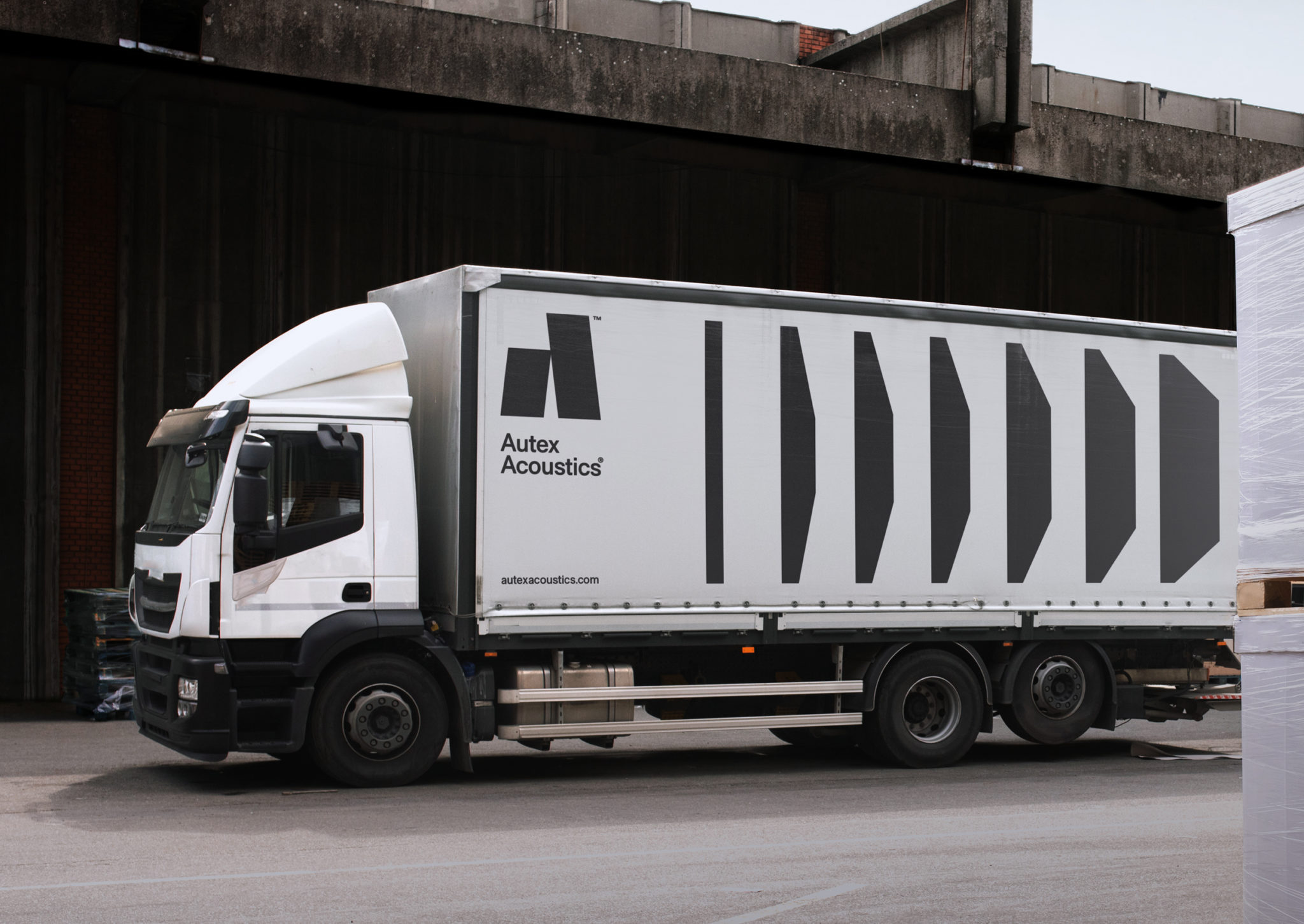
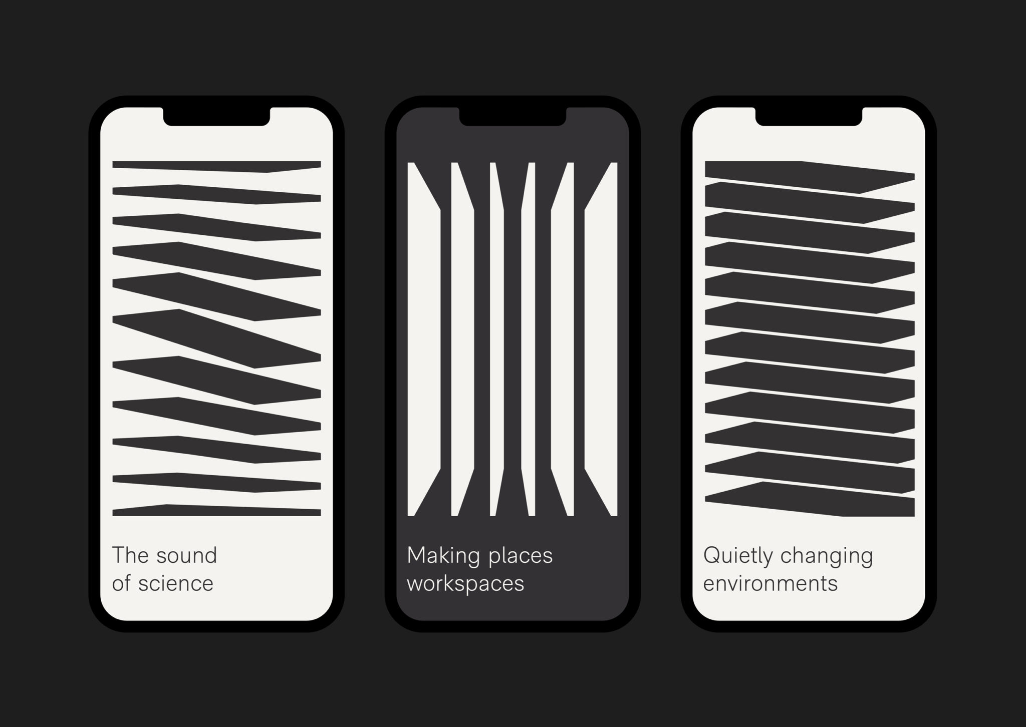
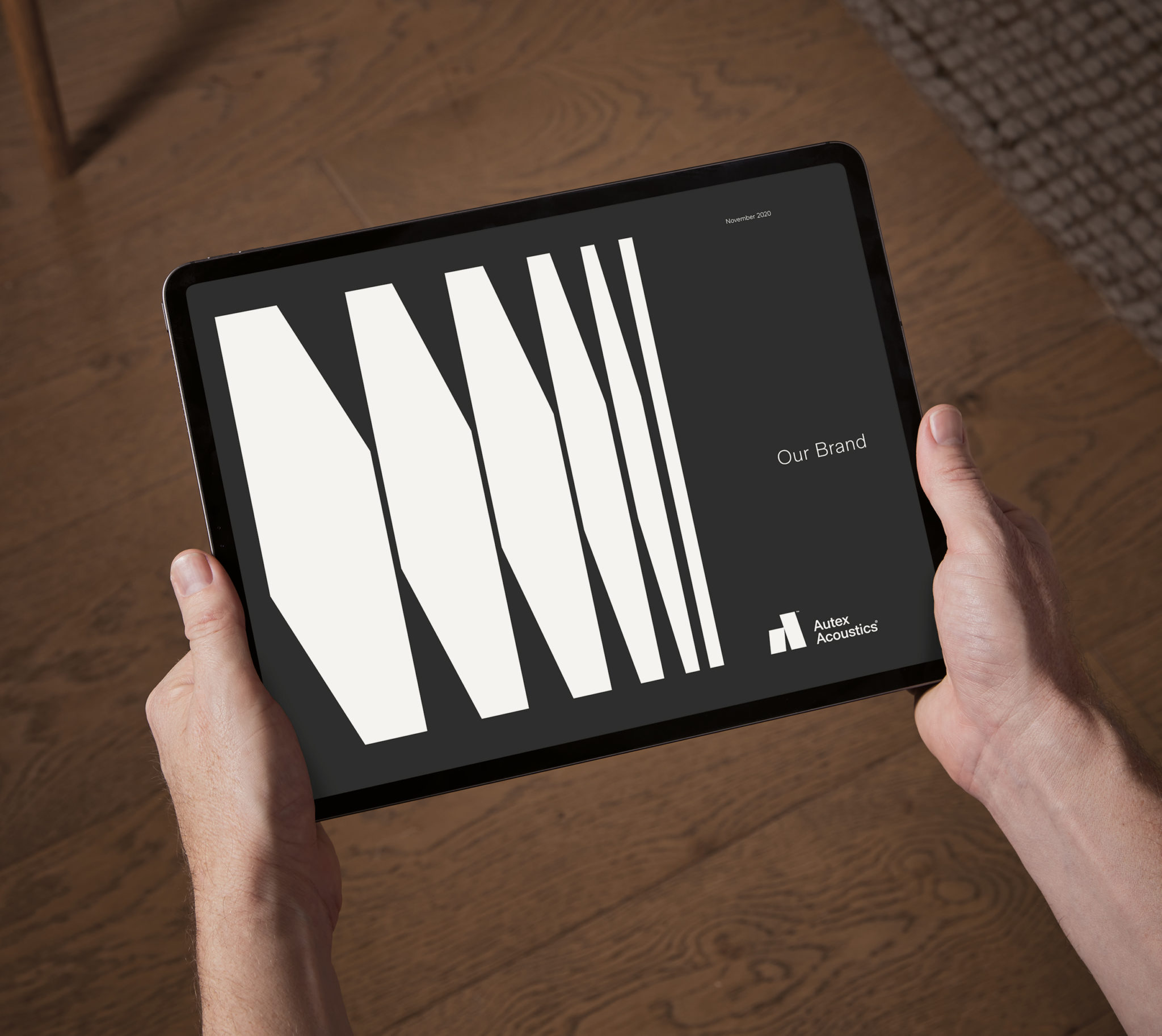
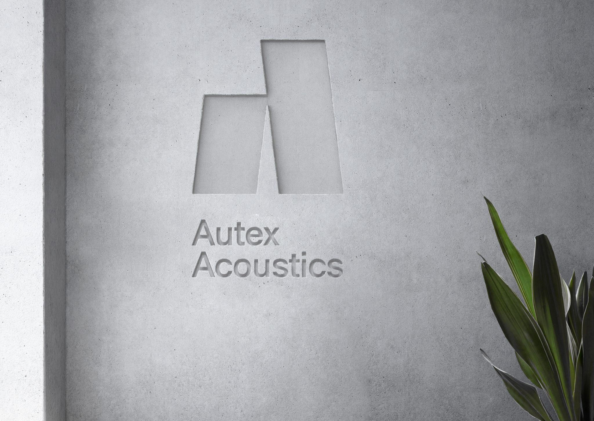
Taking inspiration from both the product and its function, Marx developed a suite of graphic patterns based on product panels and the quietening of sound waves. These architectural, dimensional forms have been created to adapt across all touch points and to serve as ownable brand assets. The approach scales well across all sorts of surfaces, from mobile devices to lorry curtains. It is eye-catching and – in static application – it employs a form language that weaves together the architectural and the transitional (the dampening of sound over time).
The motif gains further narrative dimension in motion, moving from dynamic waves to quieter patterns. Without sound the graphics are universally relatable, but they are most pleasing when the two are synchronised. The sound wave is a common and fairly universal visual shorthand, but when sliced with the architectural elements, it becomes a distinctive design language unique to the brand.
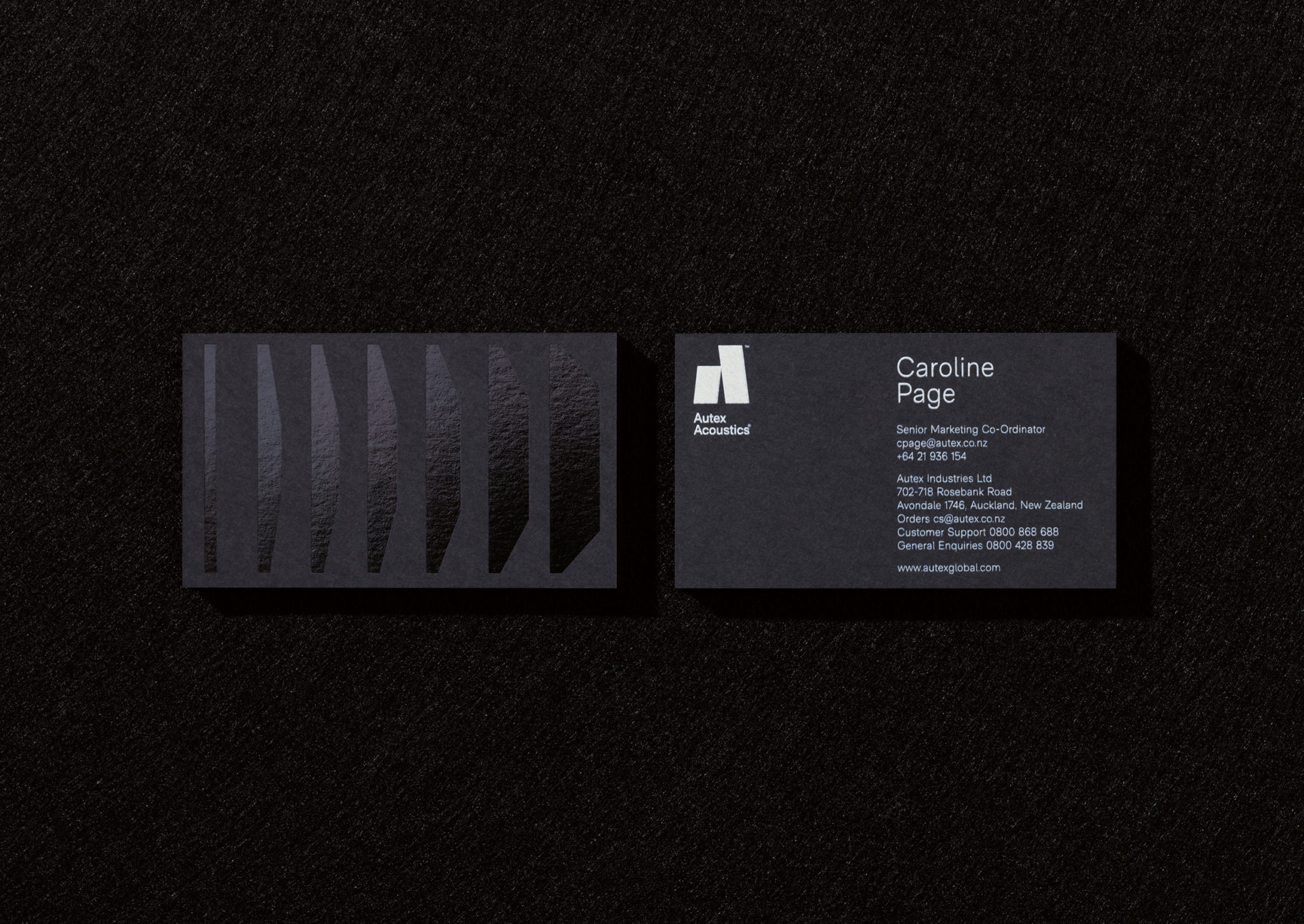
Scale is used to great effect to create a modulated sound landscape across different contexts. Type (RM Neue from Co Type) functions like form in the same way with clear contrasts in point size, which are amplified further by the absence of colour. Colour is introduced in key use cases such as infographics, but otherwise the palette remains monochrome to allow the product range (which is manufactured in many different colours: a key selling point) to take centre stage.
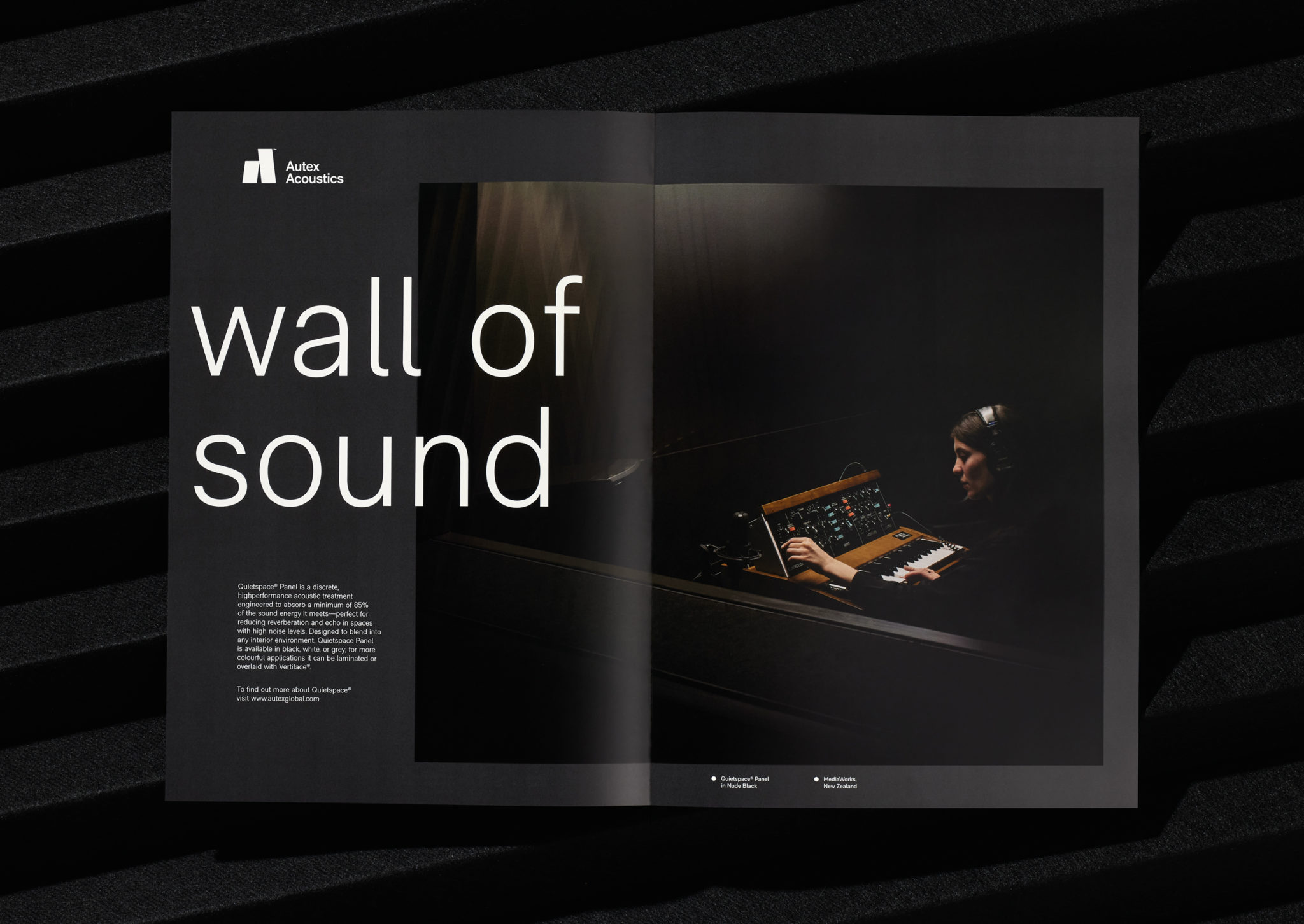
The forms derive from the materiality and structure of the products, and their relationship with interior architecture. Yet, the motion work takes this a step further, relating form to acoustics and acoustic properties. The result is striking and immediate. Visual identity has a sound and a volume. It is graphic, immediate, eye-catching, simple in its ideation and realisation, and – while simple – distinctive. Motion has been applied to generate further meaning from form, rather than as just a flourish. There is an obvious narrative element – from sound to stillness throughout; the irregular to the ordered. Further developing the visual language, tone of voice serves to take something brutal and warm it up. It is personable but professional with headlines making full use of the ‘sound’ subject matter.
