Yes You Can by Marx Design
Opinion by Richard Baird Posted 12 April 2022
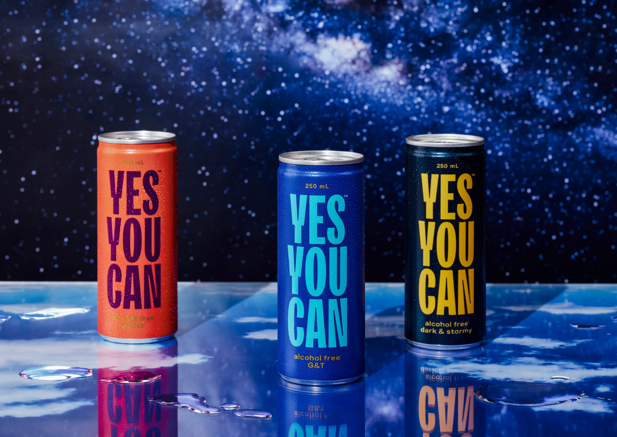
Yes You Can is a non-alcoholic ready-to-drink range developed by former Olympic athlete Tyler Martin. It exists in the growing direct-to-consumer space alongside more traditional channels of distribution that includes major liquor retailers across Australia. Yes You Can launched with three products aimed at a young ‘social “seltzer” crowd’ looking for healthy and sophisticated alternatives to other ready-to-drink products. Helping to bring the range to market was New Zealand based Marx Design, whose challenge was to mitigate perceived social stigmas around non-alcoholic drinks through positioning, brand development and package design.
This post includes Extended Insights for BP&O Plus members.
Find out more and sign-up here.
The first to enter this emerging category took a strong oppositional position, what could be described as a somewhat anti-alcohol stance. This is understandable. A provocative polemical position plays to the algorithms created by modern media platforms, which favour the divisive. You have to have something to say, a point of view, and – preferably – it polarises. This is fundamental to the social space, whether you are a person or a brand.
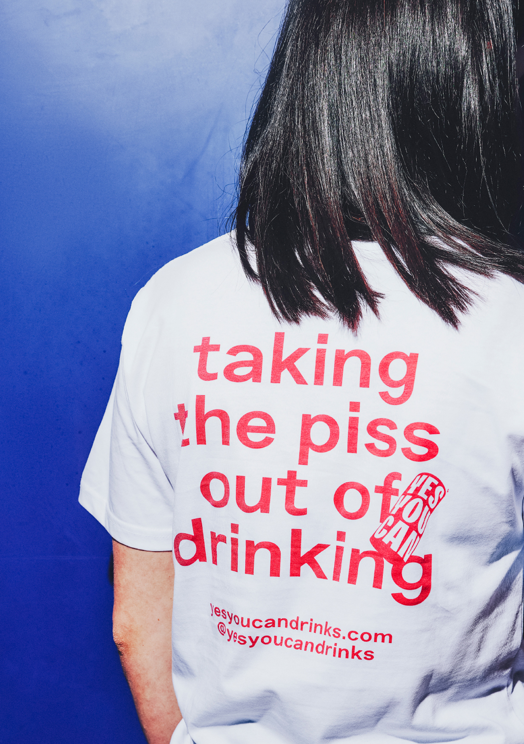
The strength of Marx’s idea lies in the word ‘can’, functioning as a verb and a noun. The use of colour, typography and copy-writing either supports or furthers this principle idea. Rather than positioning it in relation to something else, an antagonist to alcohol, the message is ‘positive, inclusive, and non-judgmental’. Humour plays a roll in developing this by way of can-based puns, however, ‘Taking the piss out of drinking’ feels more like the opposition the brand sought to avoid.
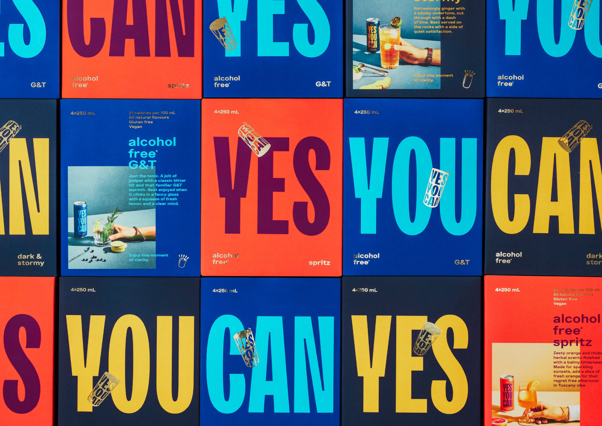
It could be said that the visual language plays with an aspect of political voice through a bright colour palette and tall condensed sans-serif TT Trailers, calling to mind protest placards and signage. It is, perhaps, simpler and less referential than this, operating more along the lines of ‘statement as brand’, an empowerment rather than an expression of marginalisation.
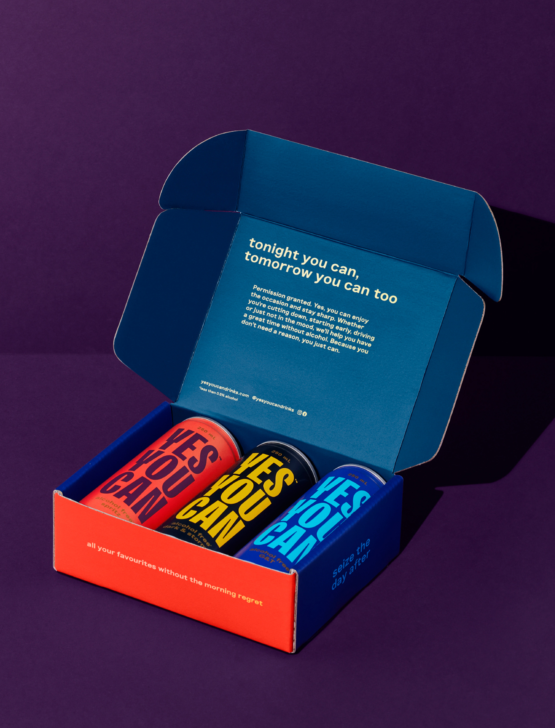
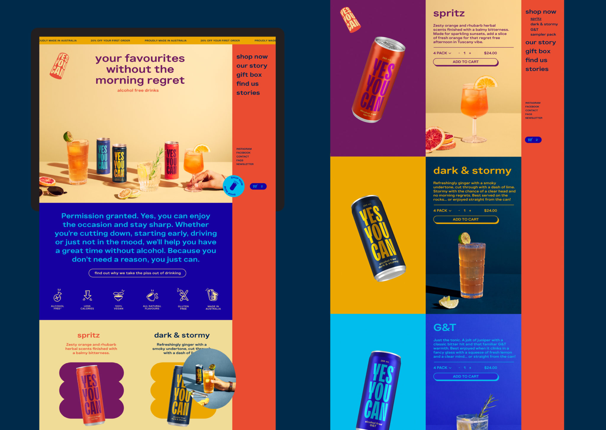
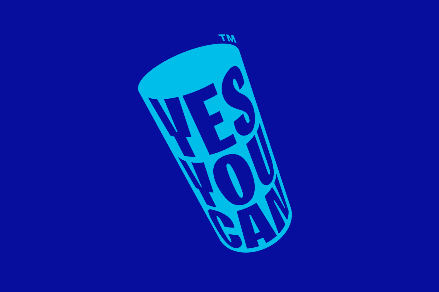
There are some nice details throughout that provide variation alongside the repetition in copy. The logo, for instance, becomes an adaptable 3D can-shaped cylinder that can be used in different orientations. It becomes an interactive element on screen, and is tossed around freely on the face of packaging.
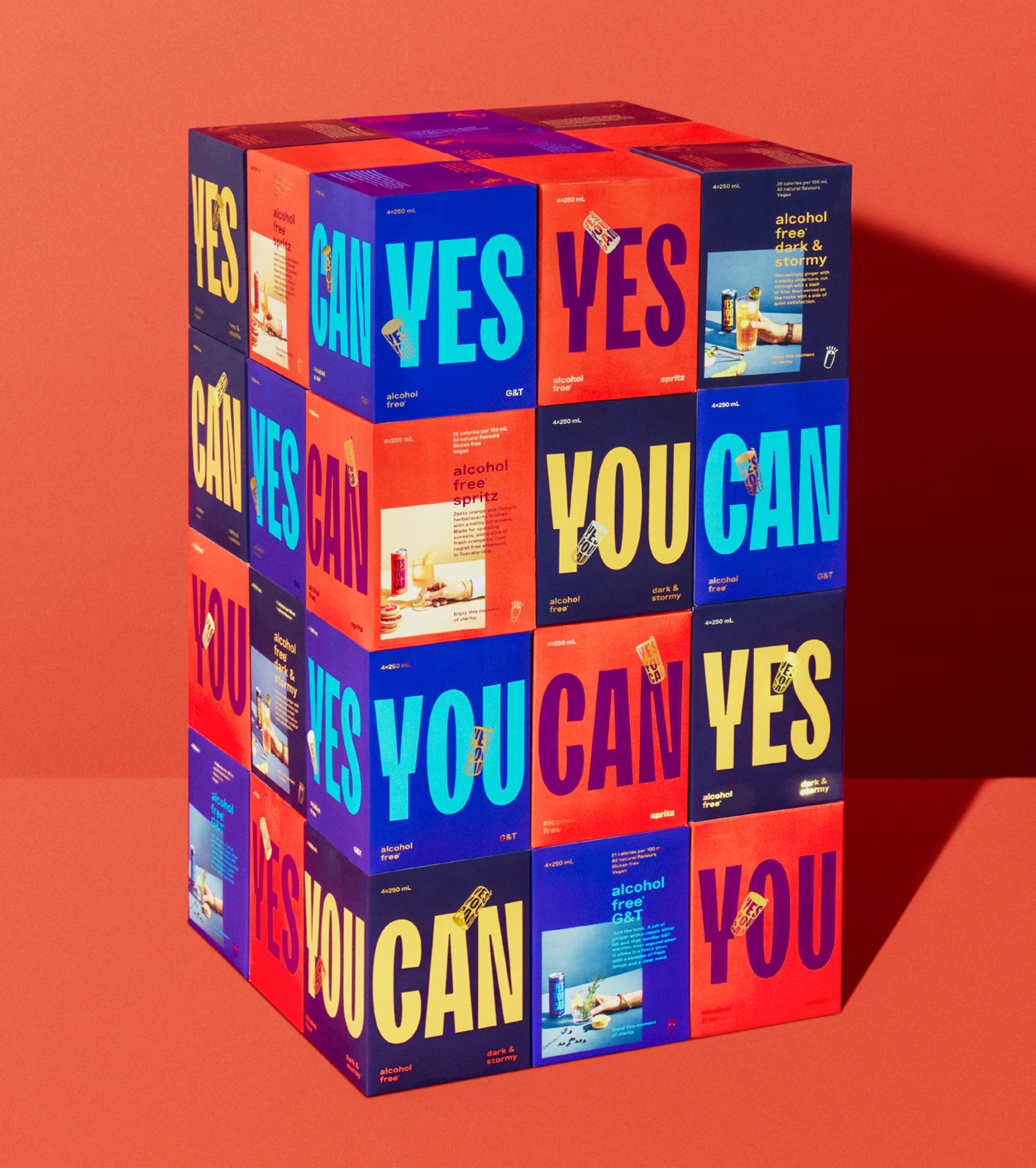
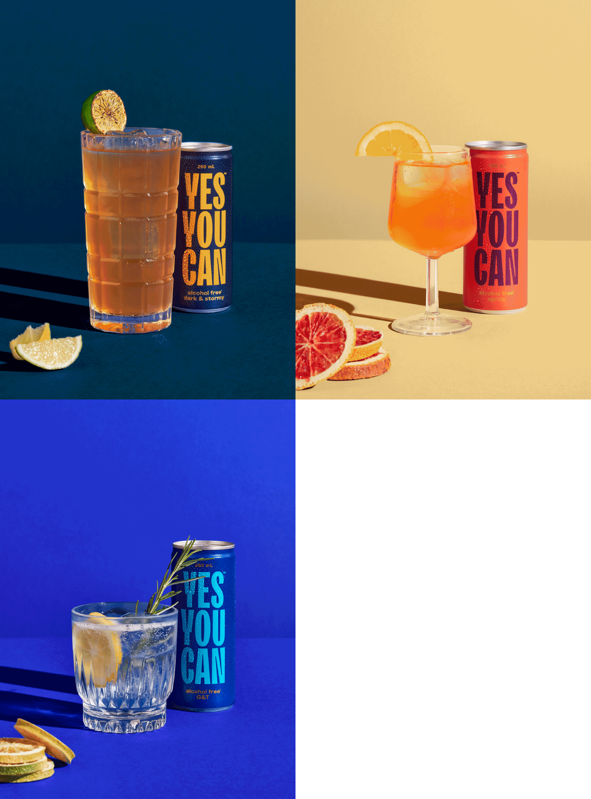
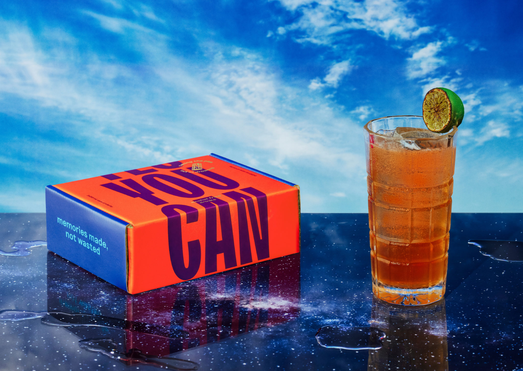
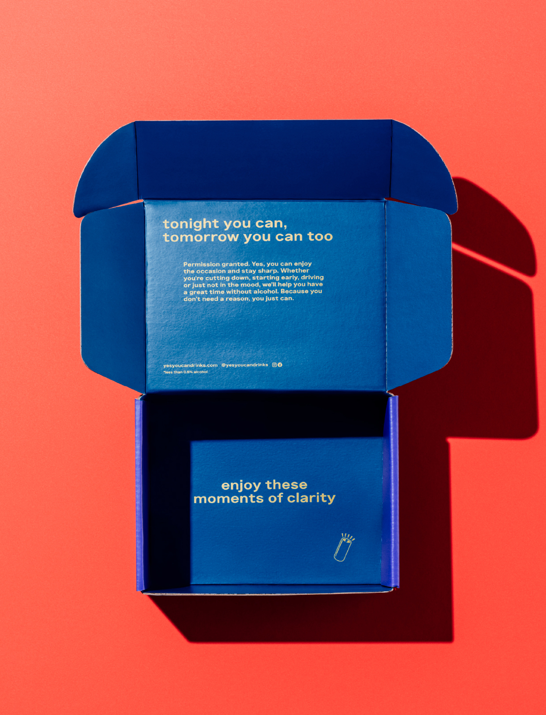
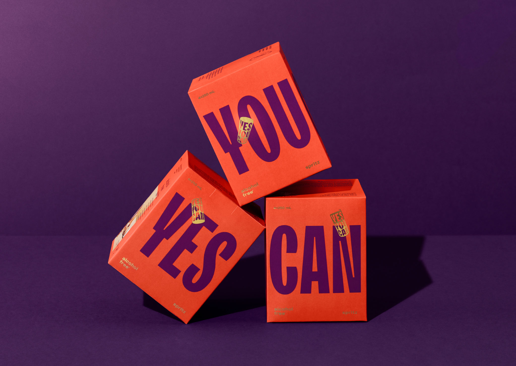
The approach to secondary packaging is equally dynamic with the sides presenting ‘yes’, ‘you’ or ‘can’ in turns. The variety is engaging as is its many permutations, and when stacked in a merchandising setting the boxes have a striking presence. Informed by flavour and remaining true to the positive intent of the brand, colours are a key graphic component, appearing vibrant, punchy and high contrast.
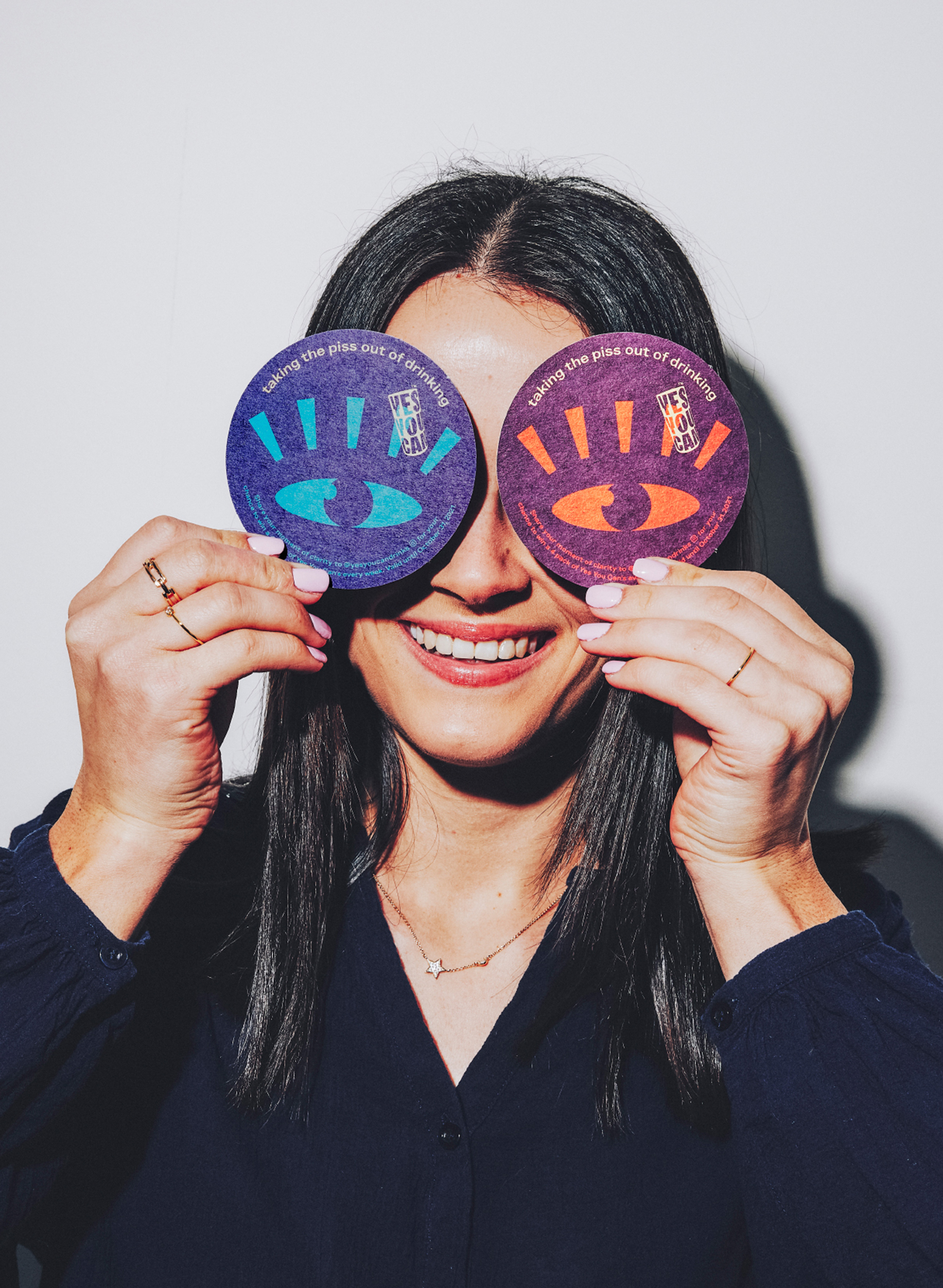
The still life styling and lifestyle photography develop product positioning. Casual and social, relaxing and warm, the image series contextualises the overarching brand narrative of participation rather than marginalisation, playing out across social channels to form a continuity between the brand’s online and offline presence.
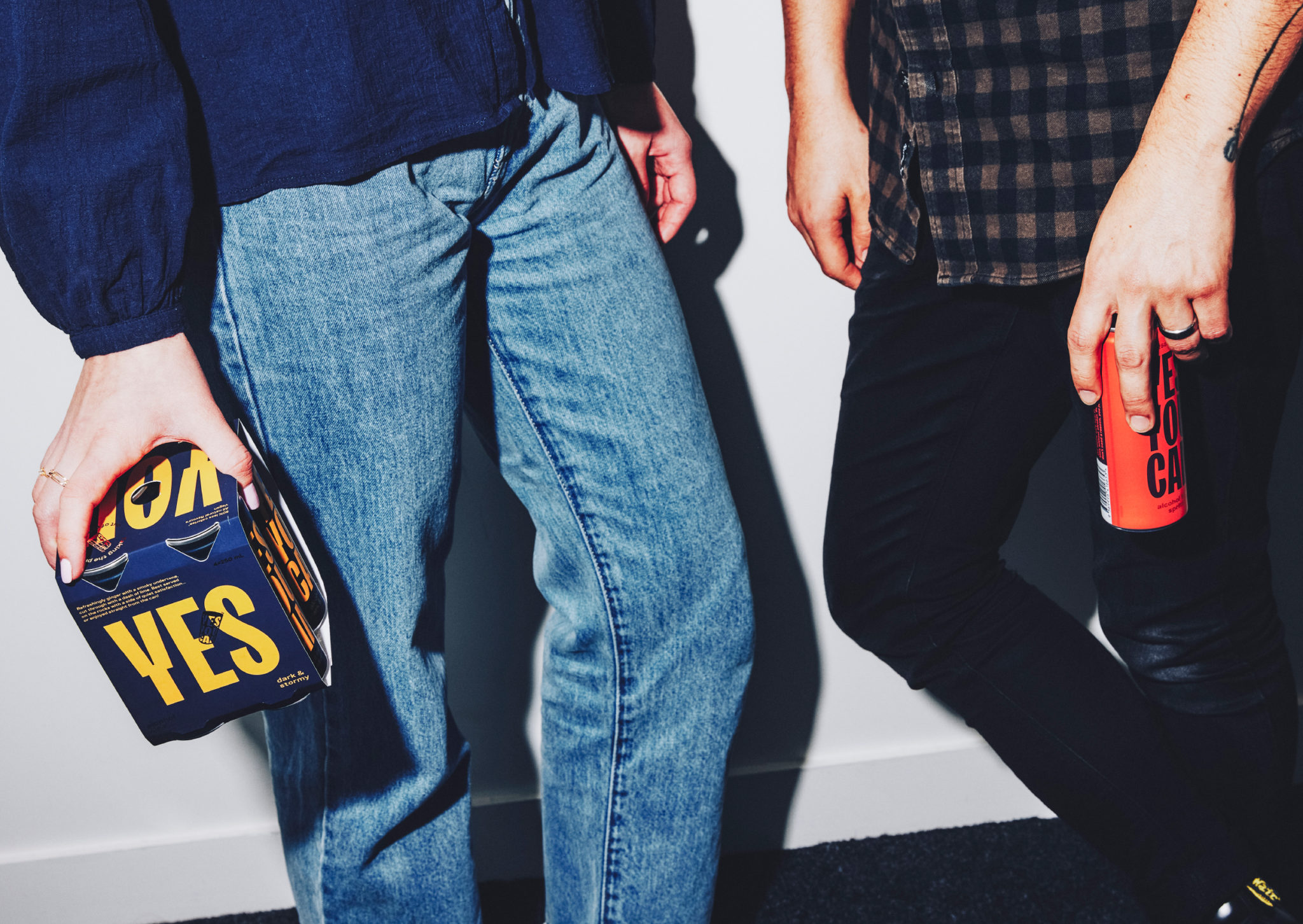
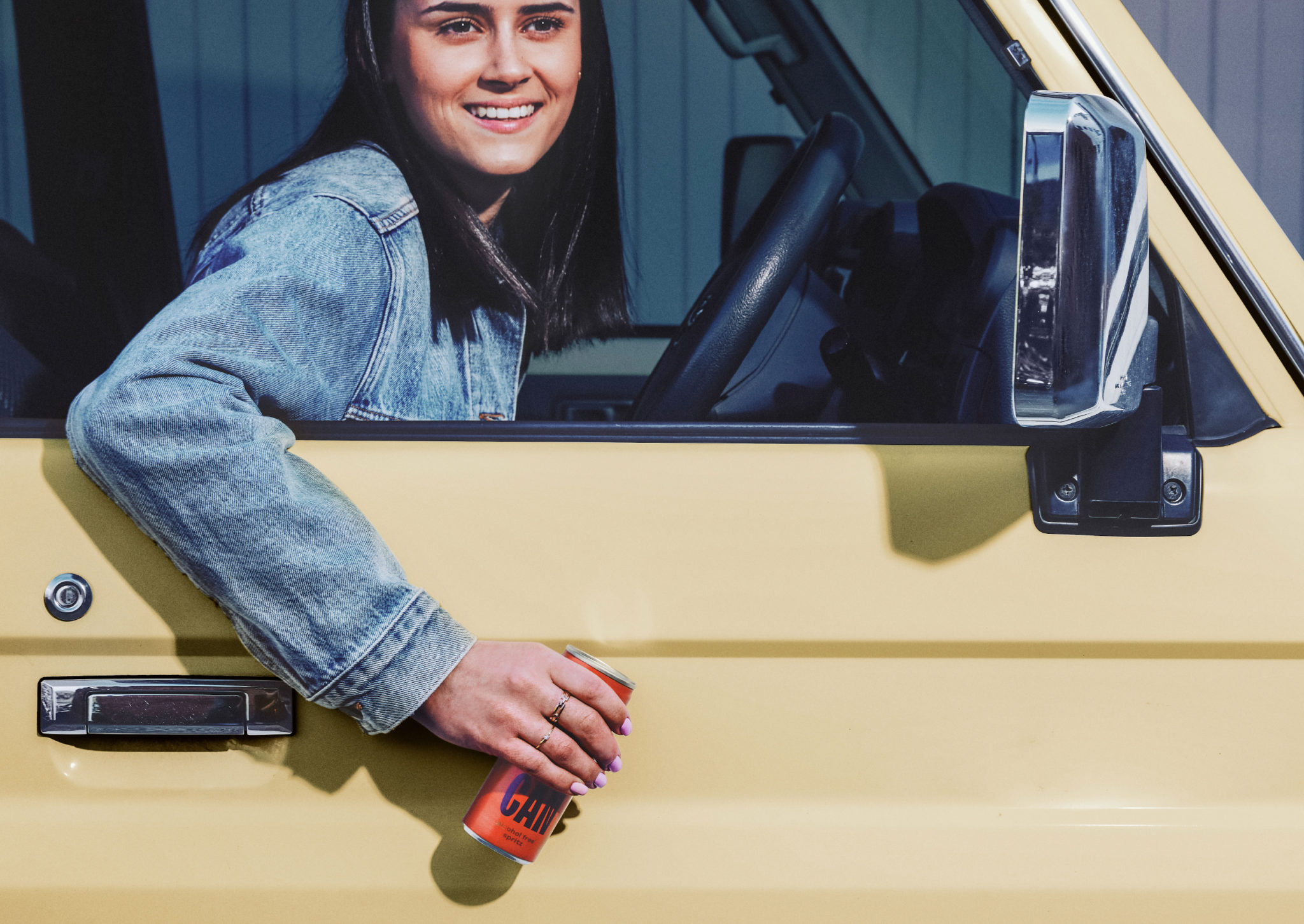
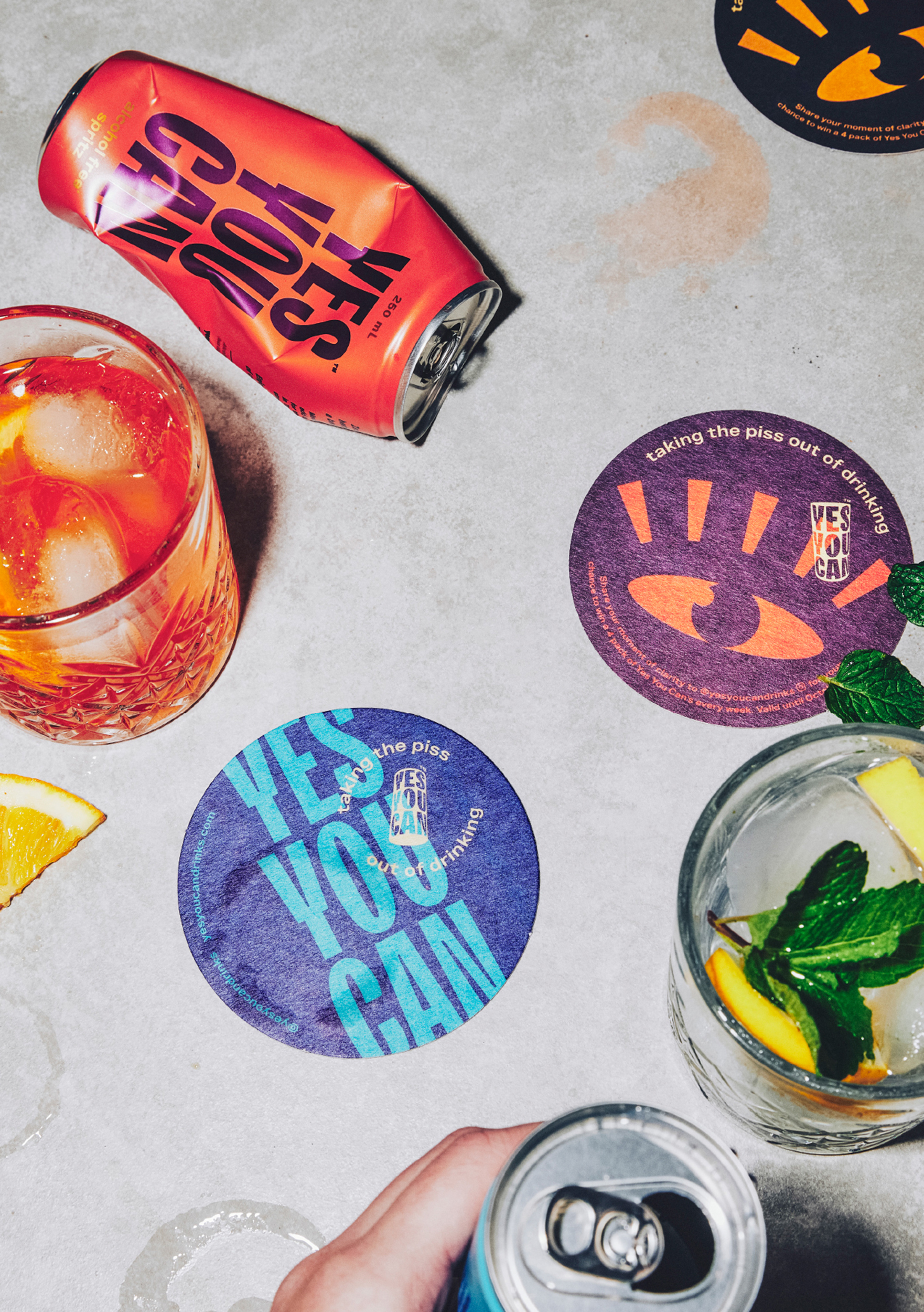
The combination of bold type and immediate copy, supported by bright colours and narrative-led art direction, establishes a visual identity that presents the brand as a positive enabler in two senses. First it offers spontaneous participation without stigma, suggesting that there is a lead to be followed; and secondly, and perhaps with even more vision, implies that the brand liberates tomorrow, making it free from hangovers and social anxieties.
