Eames Institute by Manual
Opinion by Richard Baird Posted 10 May 2022
American industrial designers Ray and Charles Eames fundamentally believed that good design should be available to everybody. It’s ironic, therefore, that today – in part due to institutional bodies, galleries, collectors and capitalism – their work has been elevated far beyond the reach of the common person. Design that was supposed to be accessible has become a symbol of taste, a gesture of particular historical insight, education and social status, commanding the high price of luxury.
In the last ten years, there has been an explosion in period reproductions, initially through licensed vendors who made contemporary adaptations to production (fibreglass became polypropylene) – and then, more recently, as unlicensed injection-moulded ABS knock-offs. What’s perhaps surprising is the extent to which key pieces did make it to the masses: everyday pieces, for everyone, everywhere. The DSR Plastic Side Chair, for example, can be seen in its hundreds in a Westfield food court (not an original, but original in form).
In some ways, the knock-offs better represent the philosophy, if not the quality. Good design doesn’t need to come with a big price tag. It should be for everyone. It should engage, excite, and serve a purpose.
Eames Institute functions, in a way, to reassert the historical and ideological legacy that these items were born from – and goes further. Through thousands of artefacts, the institute shares the unique mythologies and diverse interests of Ray and Charles Eames, illustrating these perspectives through curation, engaging with other institutions, designers and – perhaps more importantly – the general public sitting on replicas.
San Francisco-based design studio Manual was engaged by Eames Institute to develop a brand identity that would support its endeavour to bring the lessons of Ray and Charles to life, and to aficionados and the general public alike.
This post includes Extended Insights for BP&O Plus members.
Find out more and sign-up here.

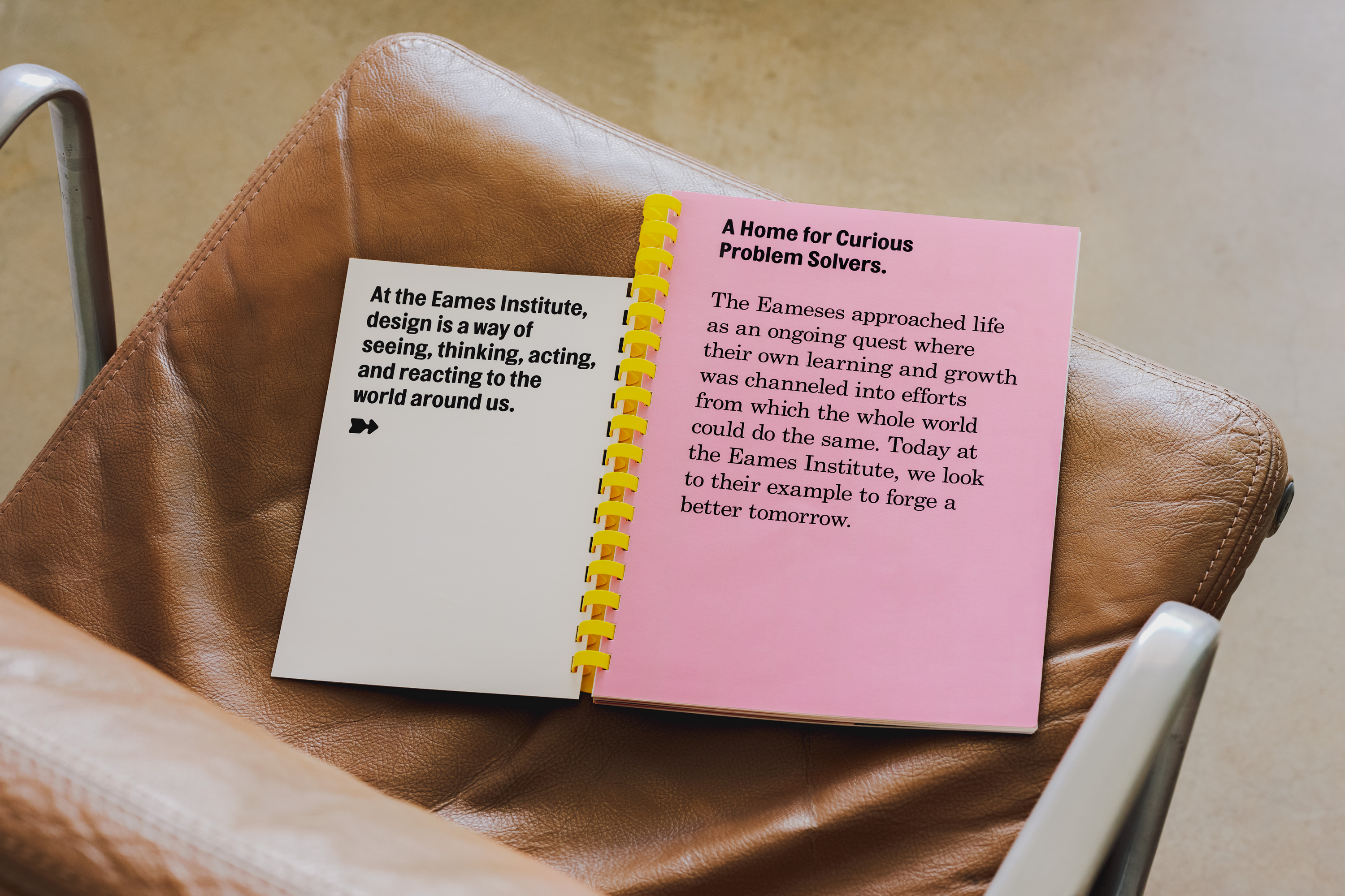
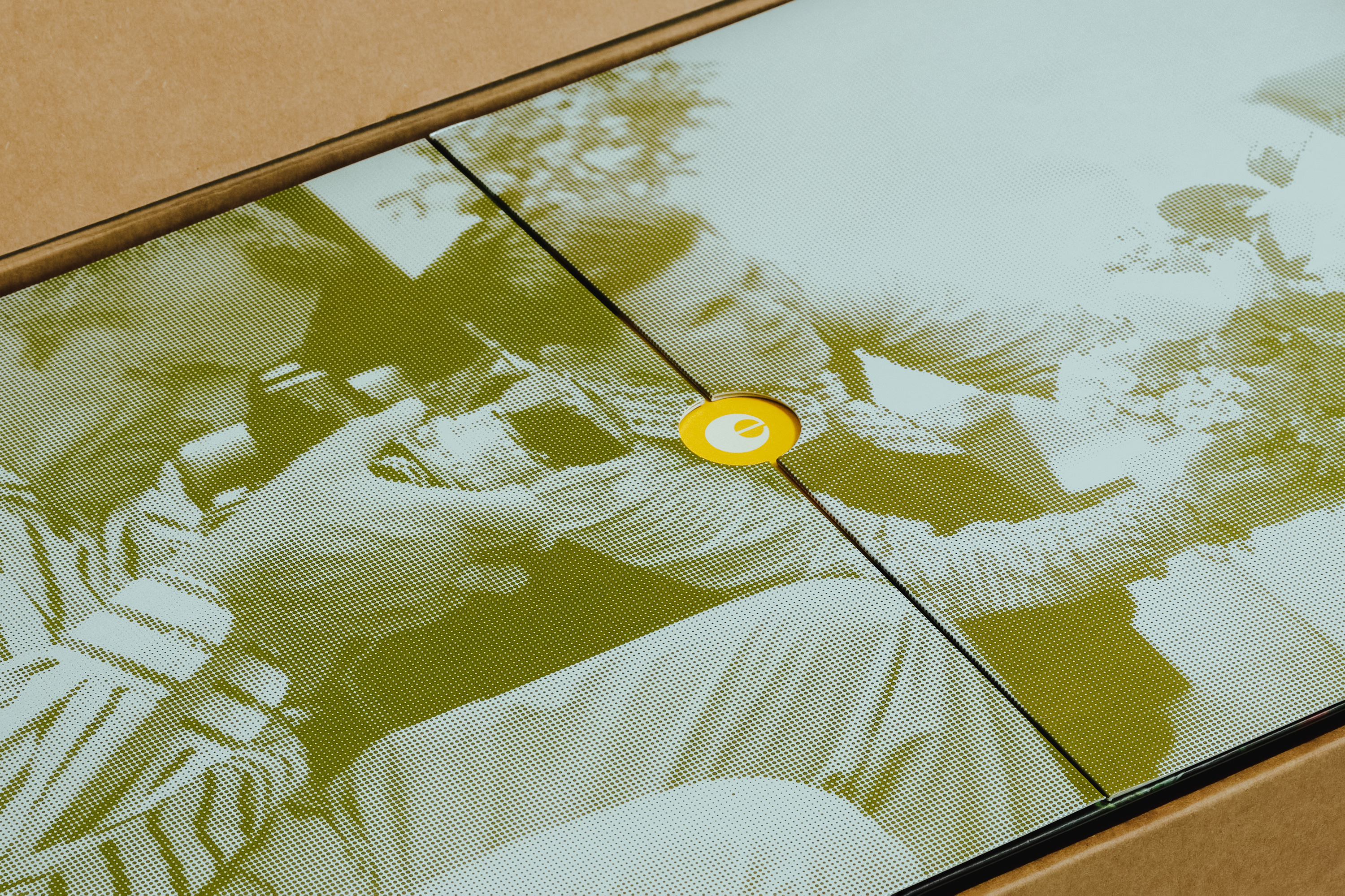
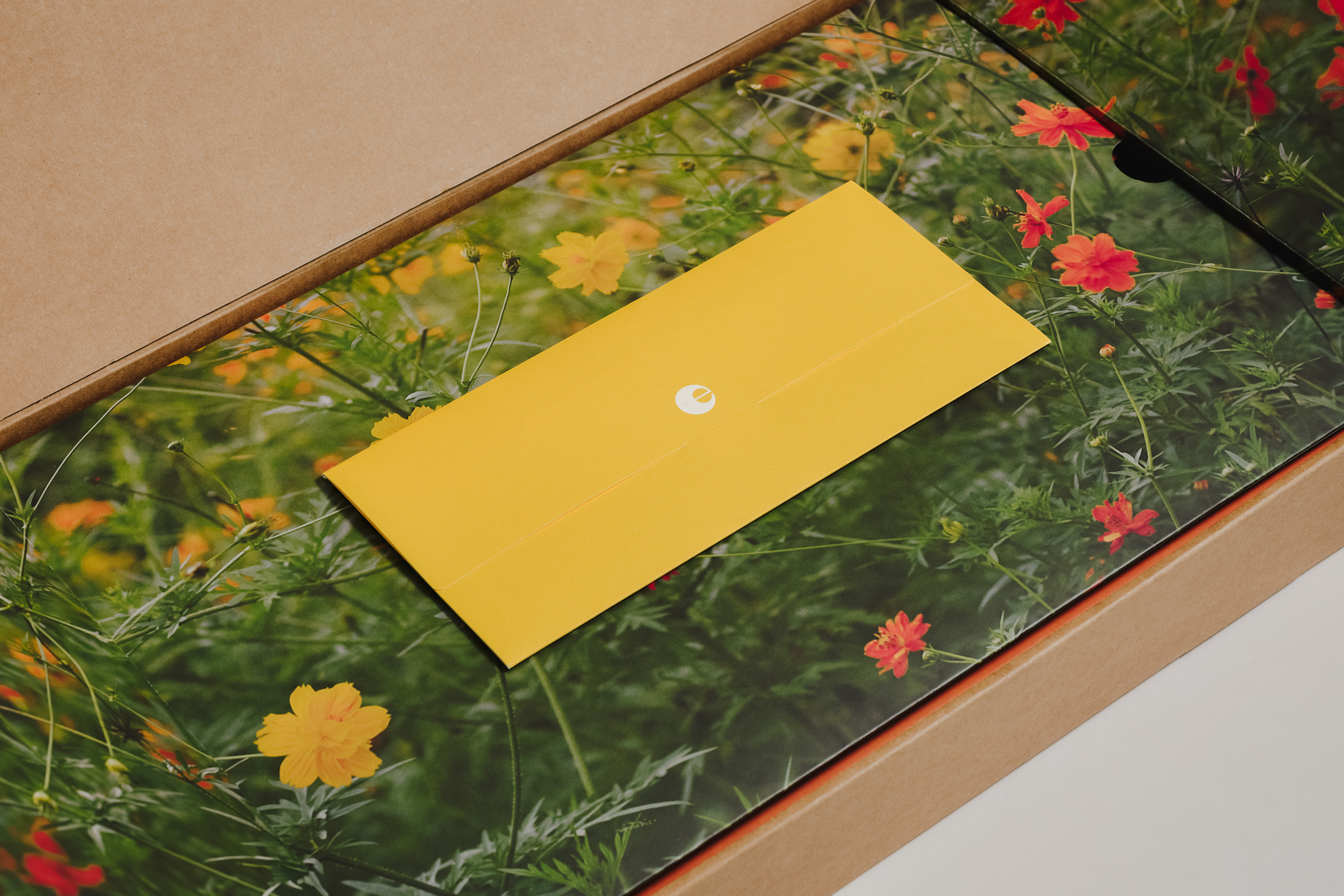
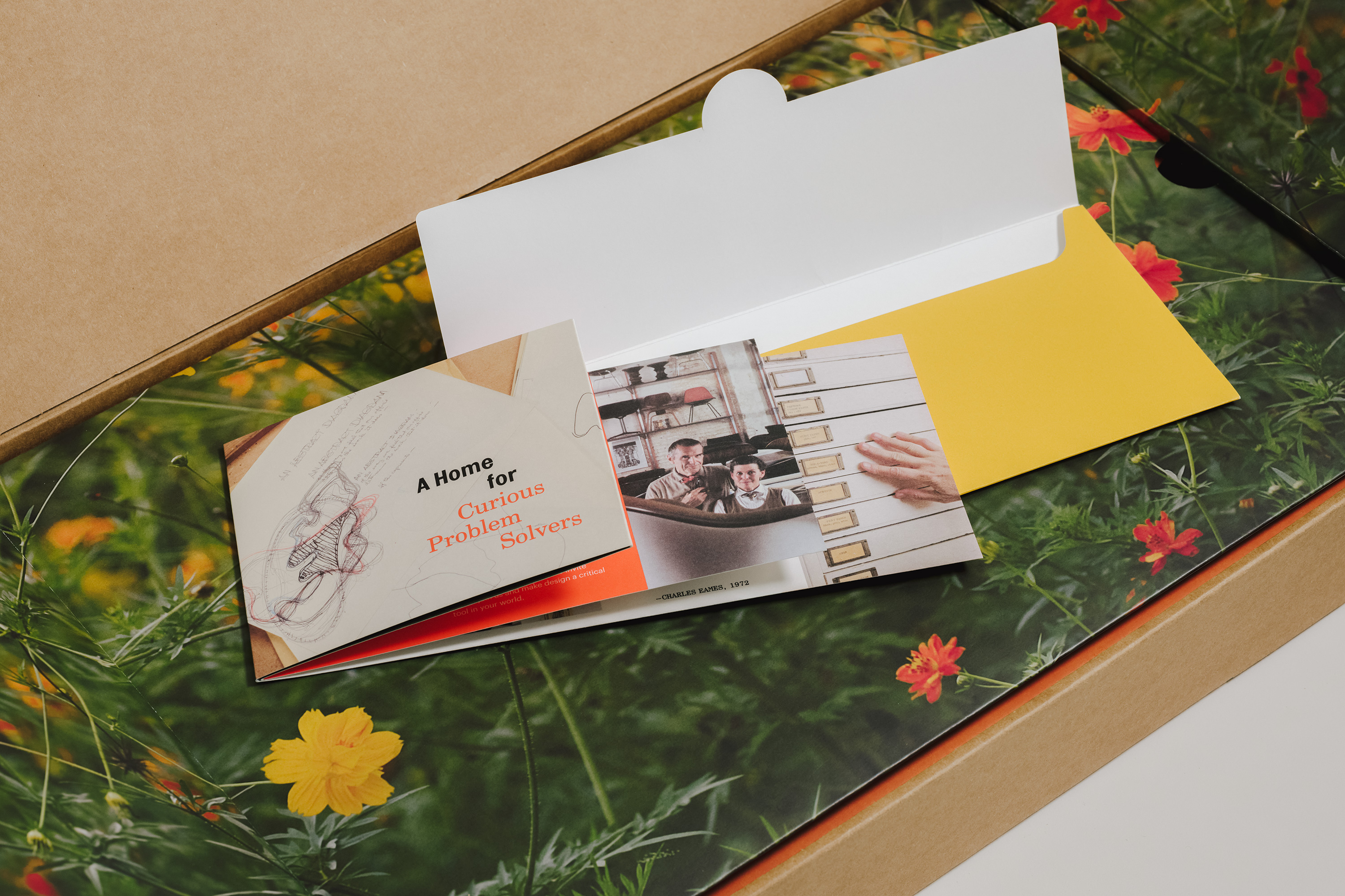
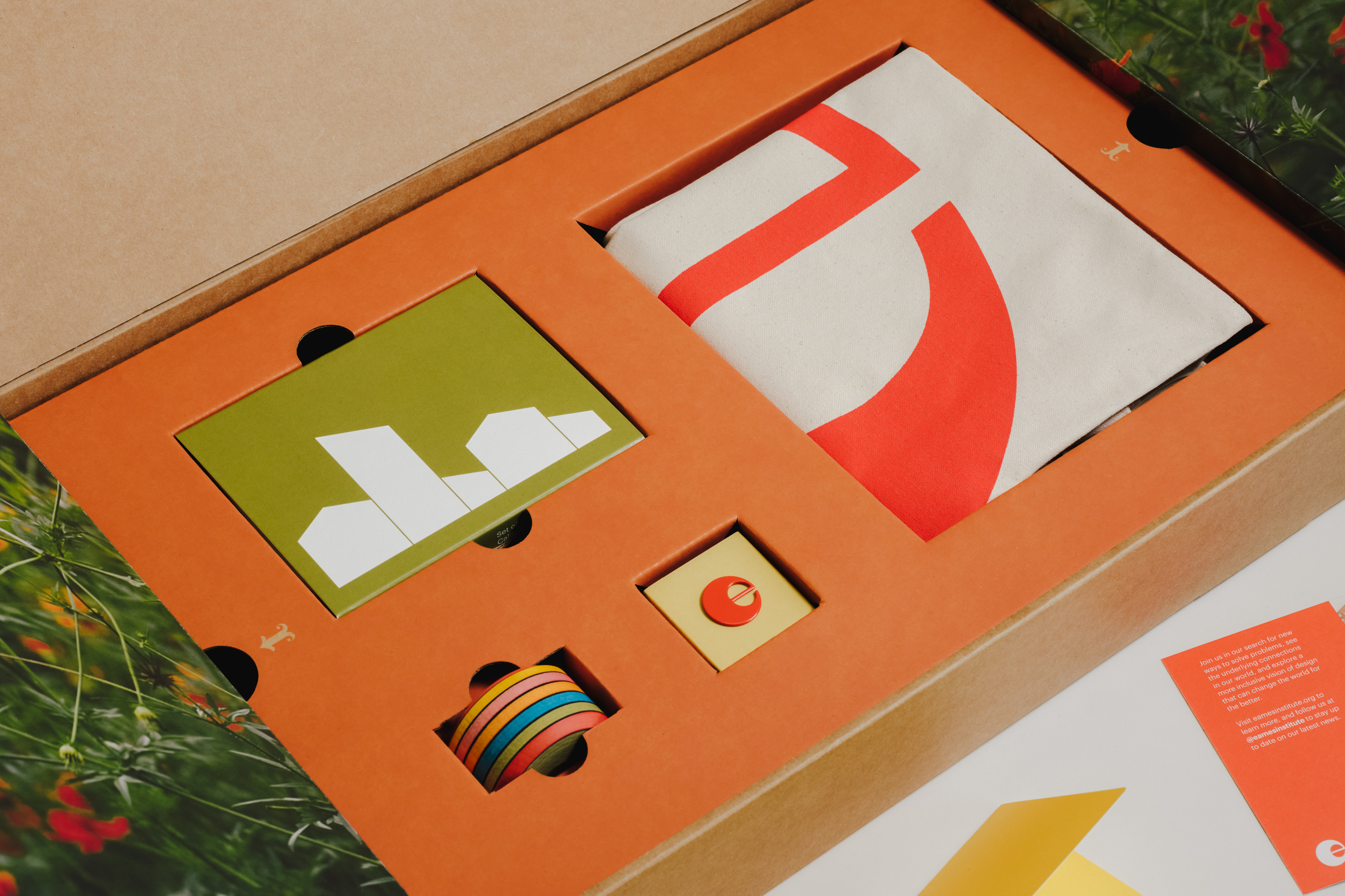
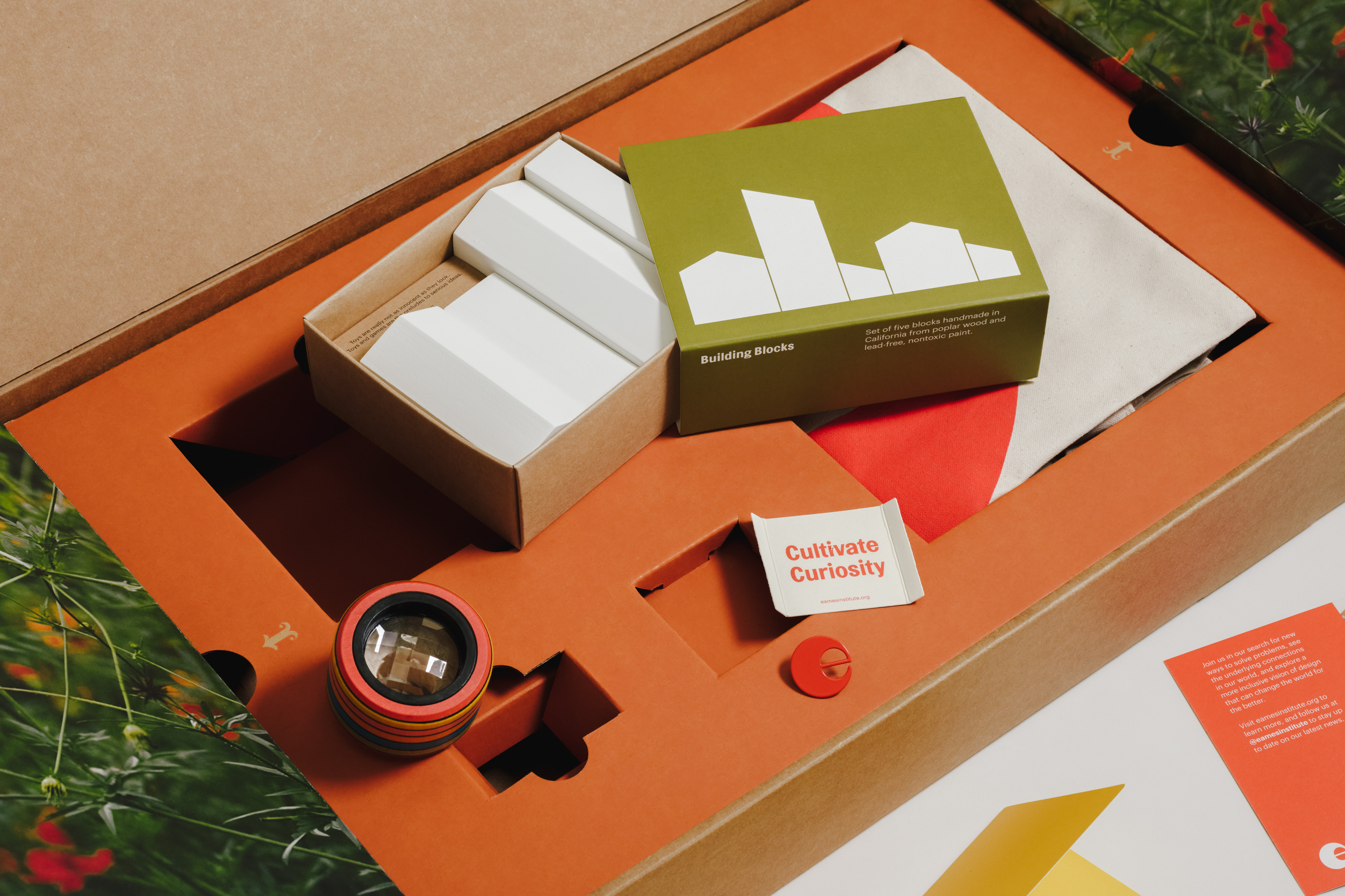
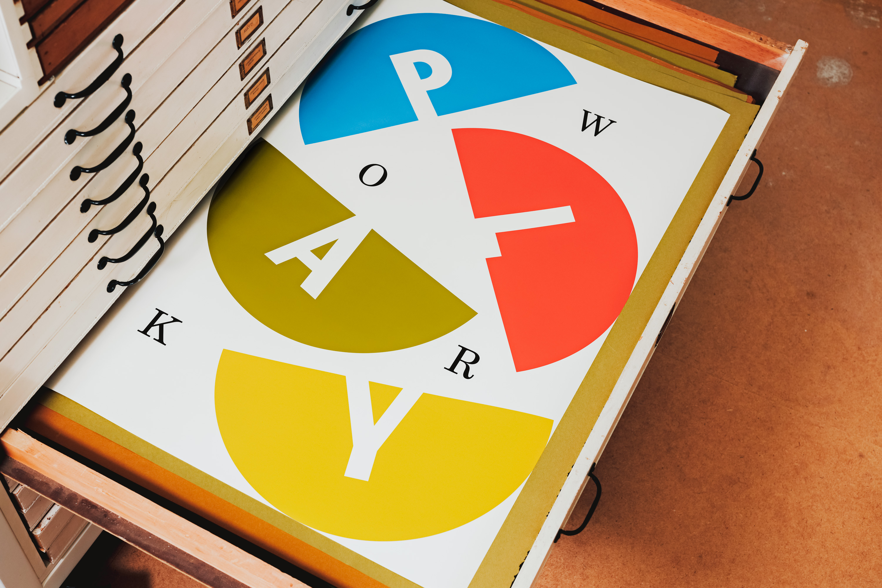
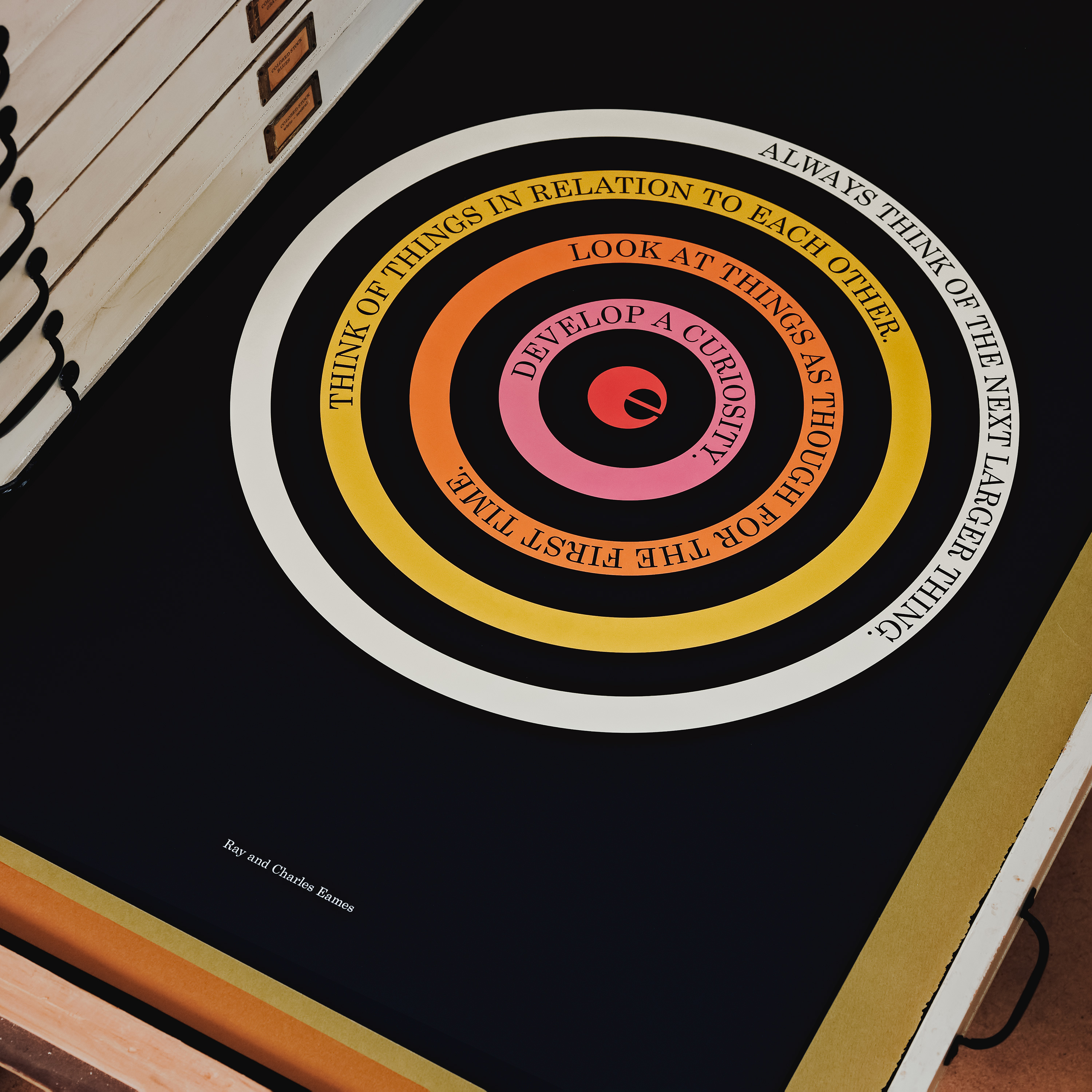
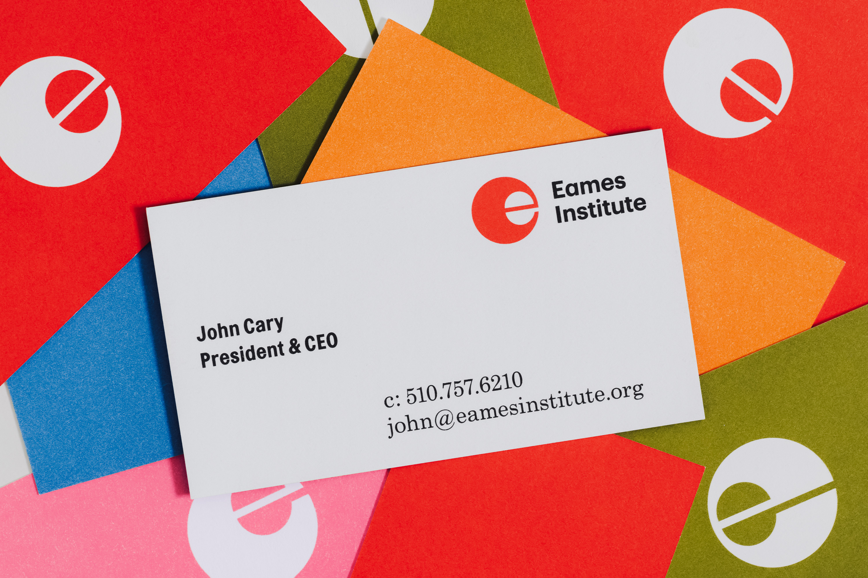
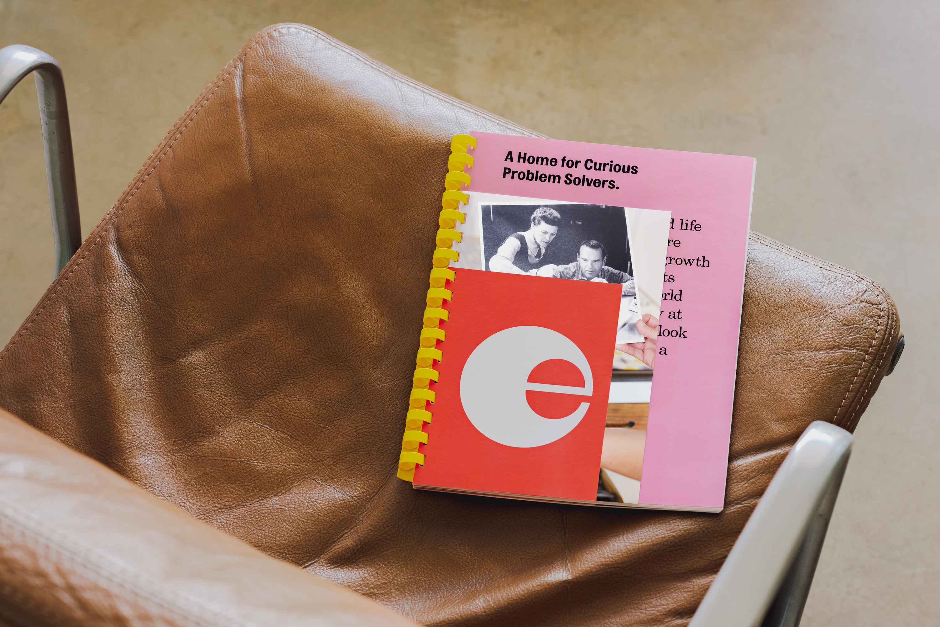
There are a number of themes at play through the visual identity. Initially, it is unmistakably joyful, whether it is public-facing online in the form of a ‘curious e’; or internally, through a set of materially playful brand guidelines. You don’t need to have studied Ray and Charles Eames to get a sense of how they saw the world, and how that influenced their work. But as a former student of furniture design, it is refreshing to see an approach that brings elevated objects back down to earth, instead of presenting them as covetable and unobtainable.
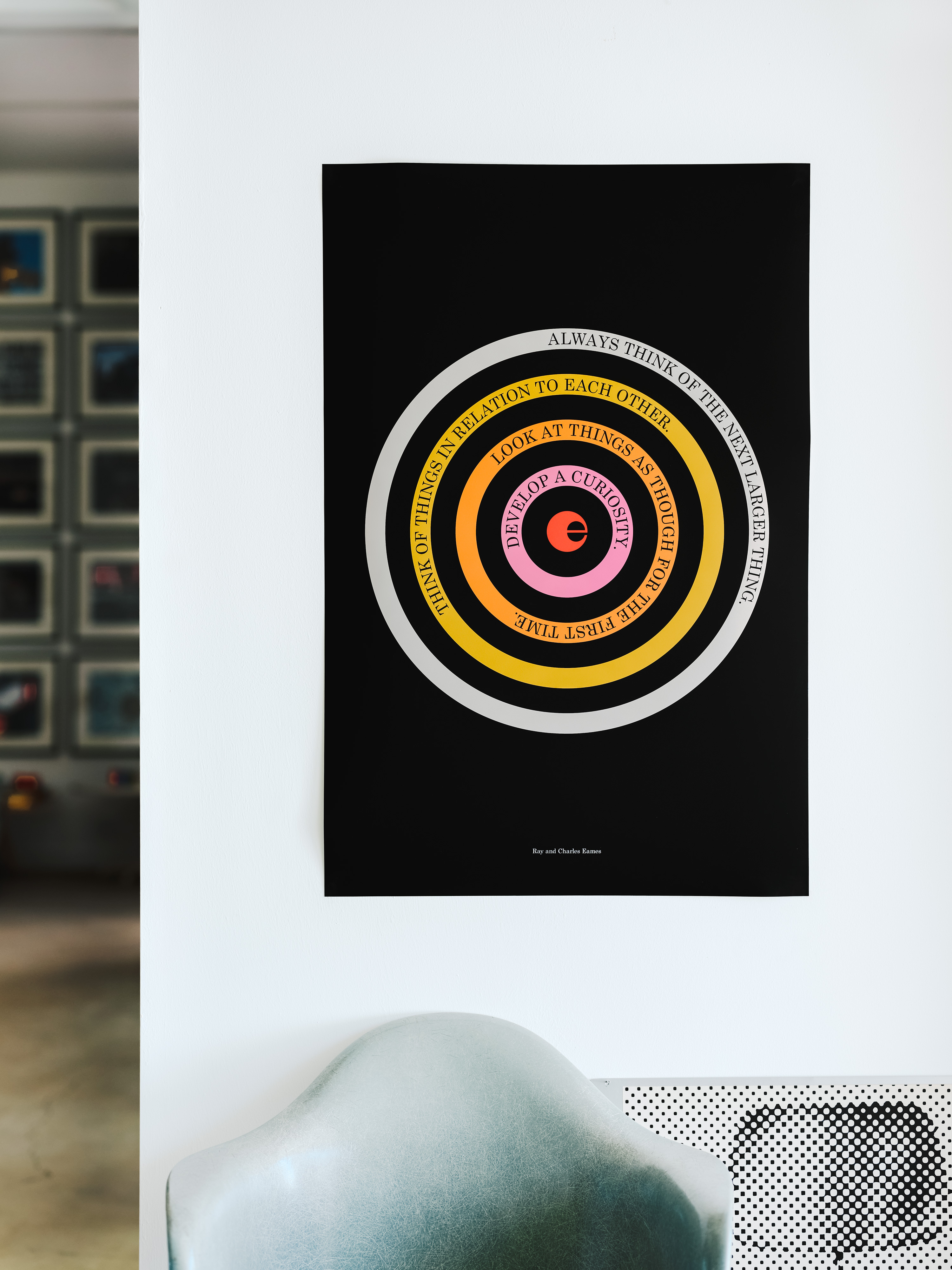
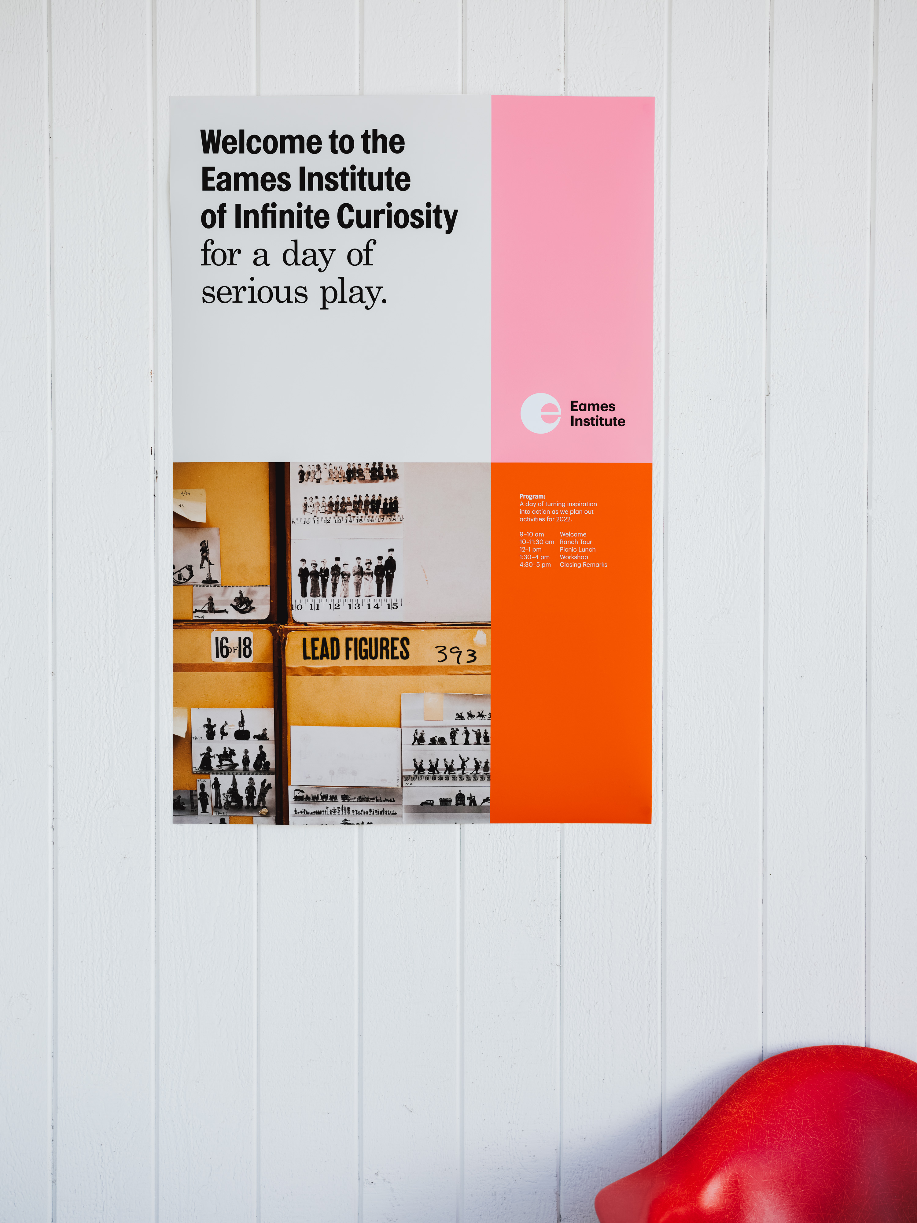
Manual’s work charms because it doesn’t seek to idolise, or manifest something the studio imagines the Eameses might do themselves. Rather, it takes the couple’s process of play and discovery as a central premise and – by extension – positions industrial design as an opportunity to cultivate an attitude of curiosity, experimentation and engagement with the world around us. This idea is personified in the logo, where the ‘e’ behaves like an eye, darting around, hungry for interesting things, unusual forms, textures, colour combinations and material interactions. It gains much from its unusual and changing balance between positive and negative space, often maximising the body and creating a colourful volume, even when static and in print.
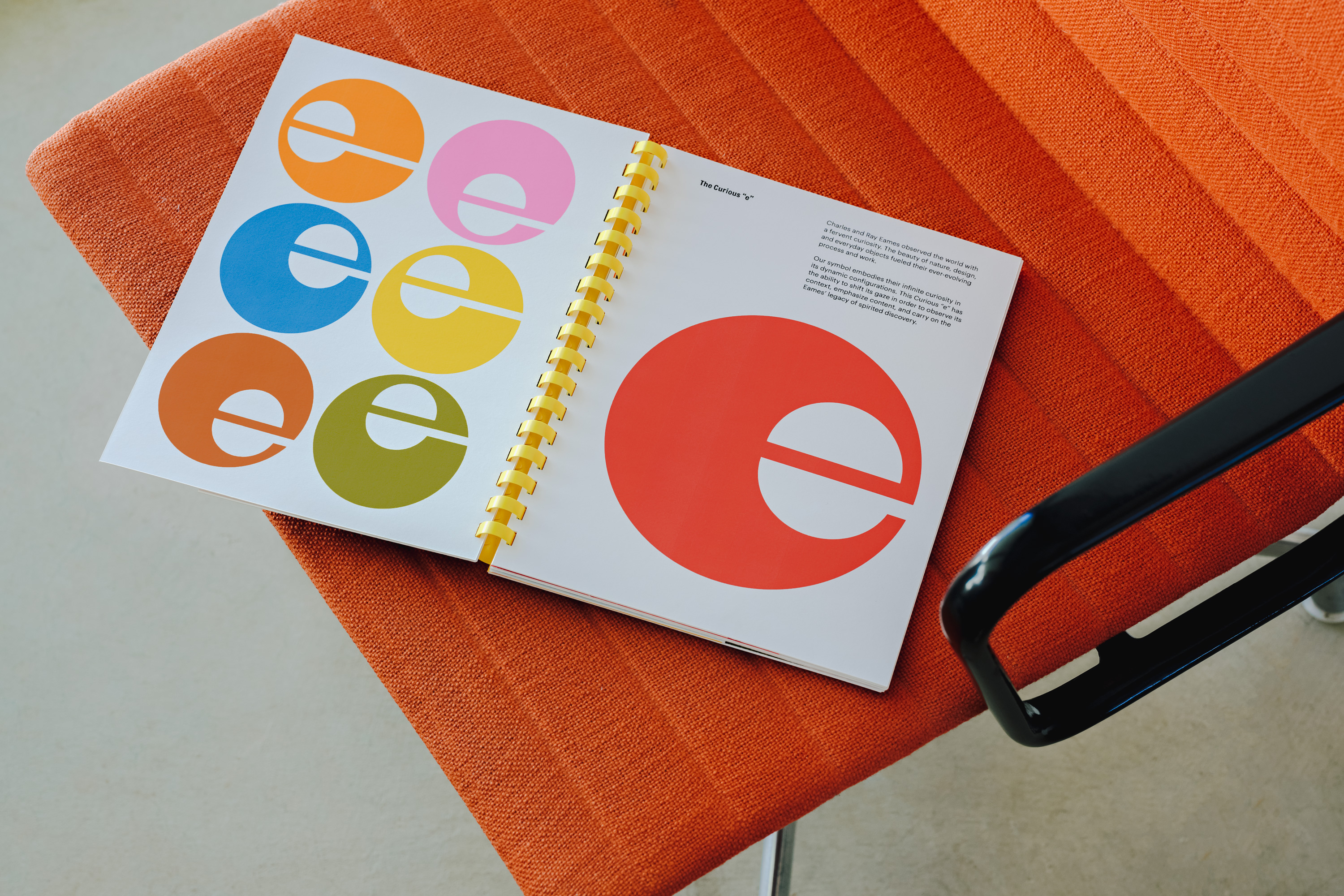

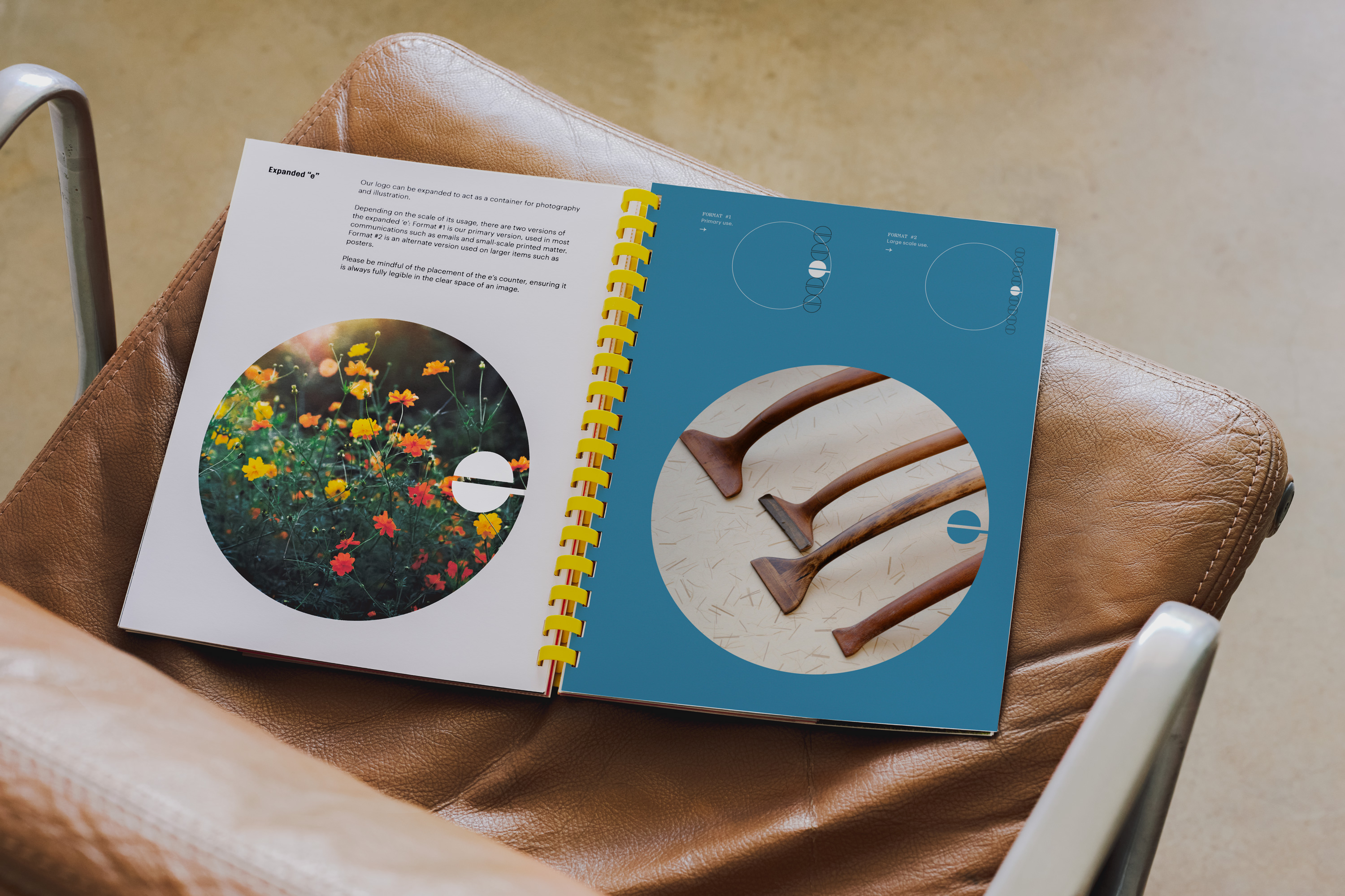
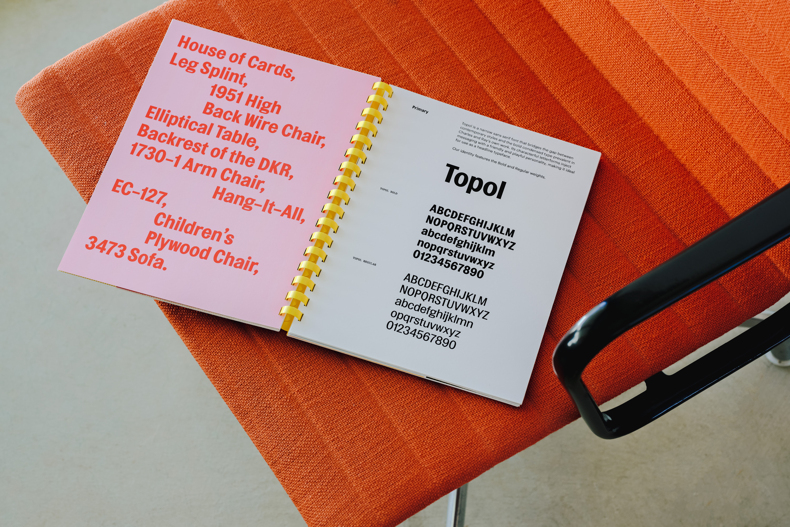
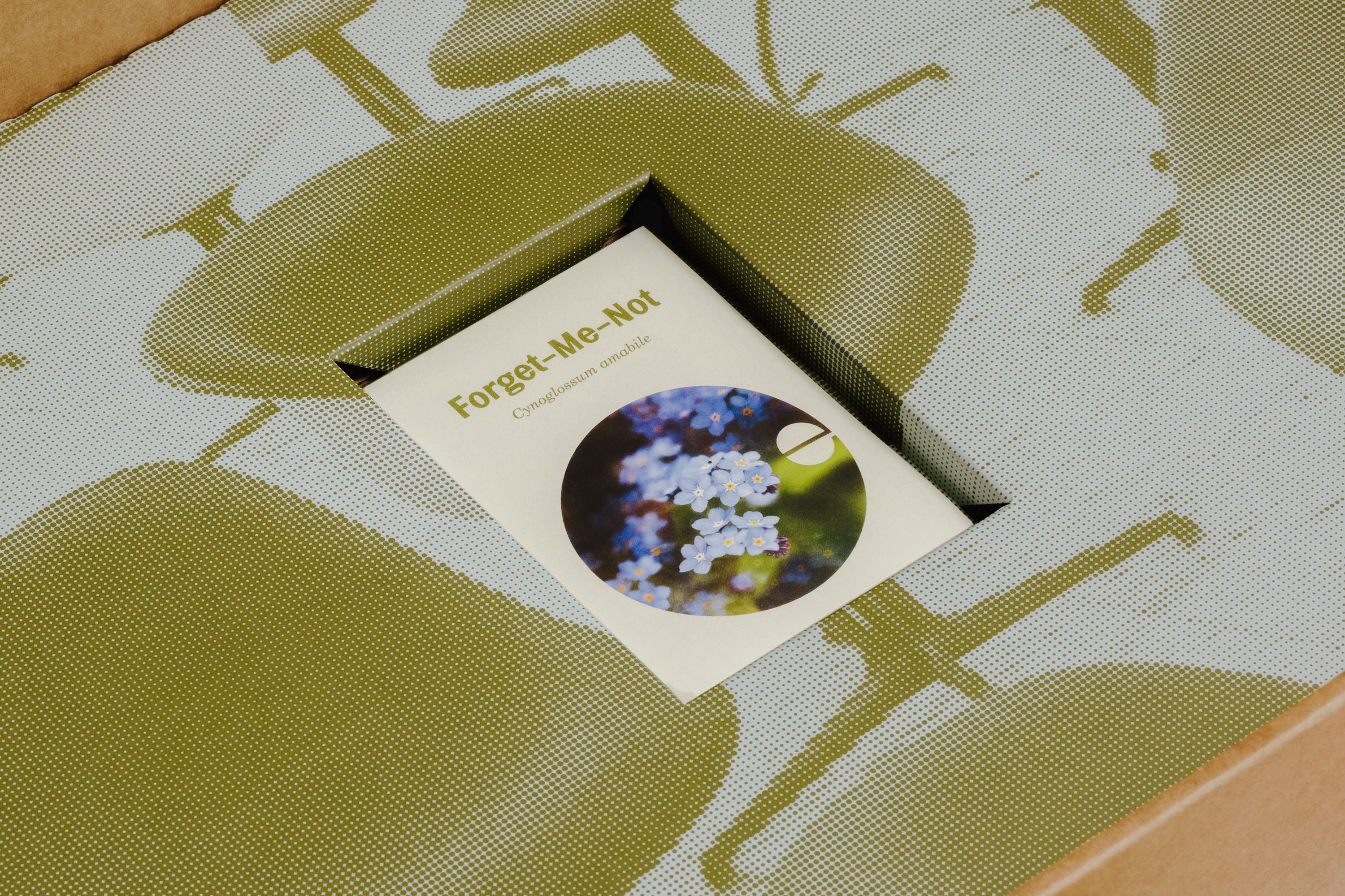
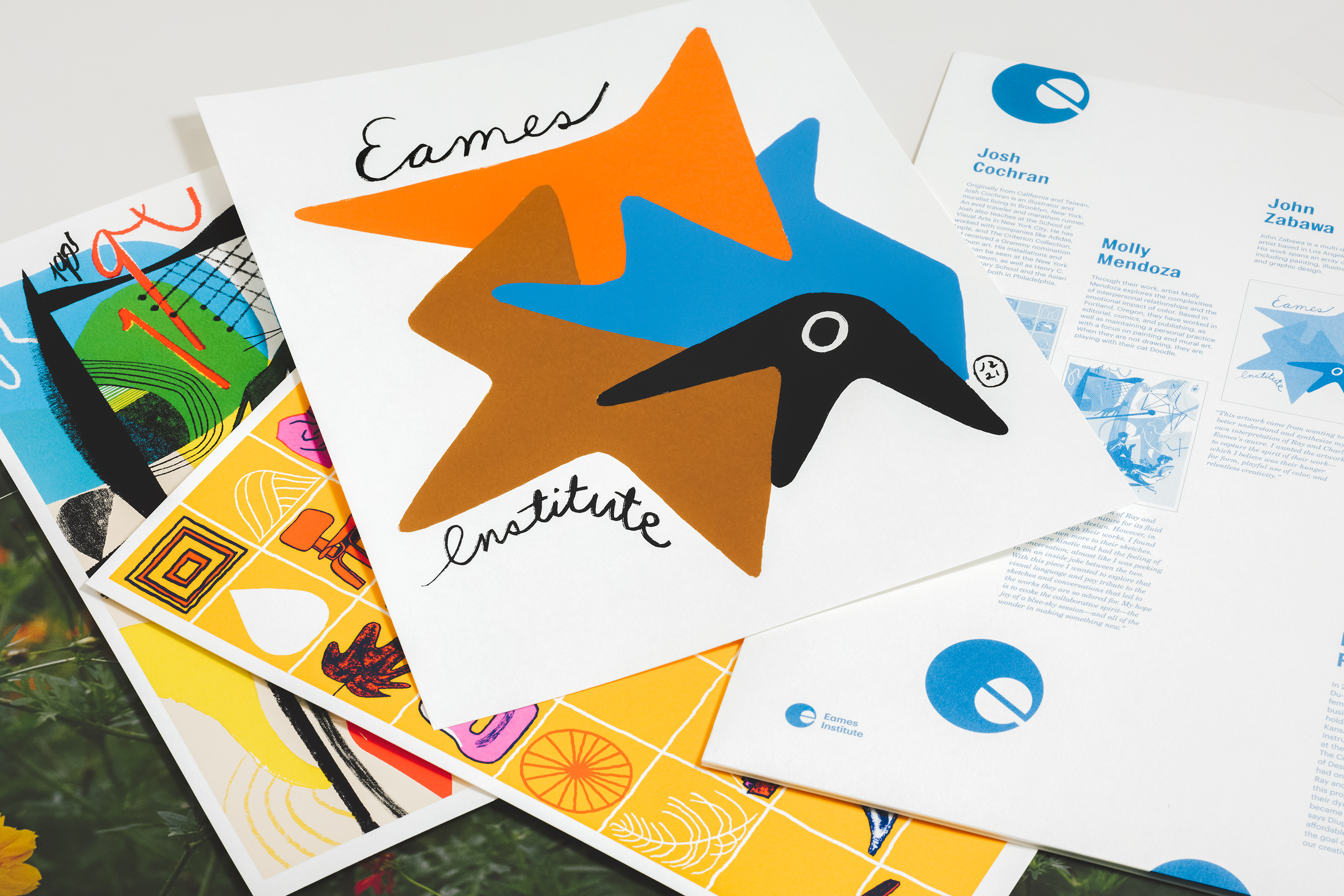
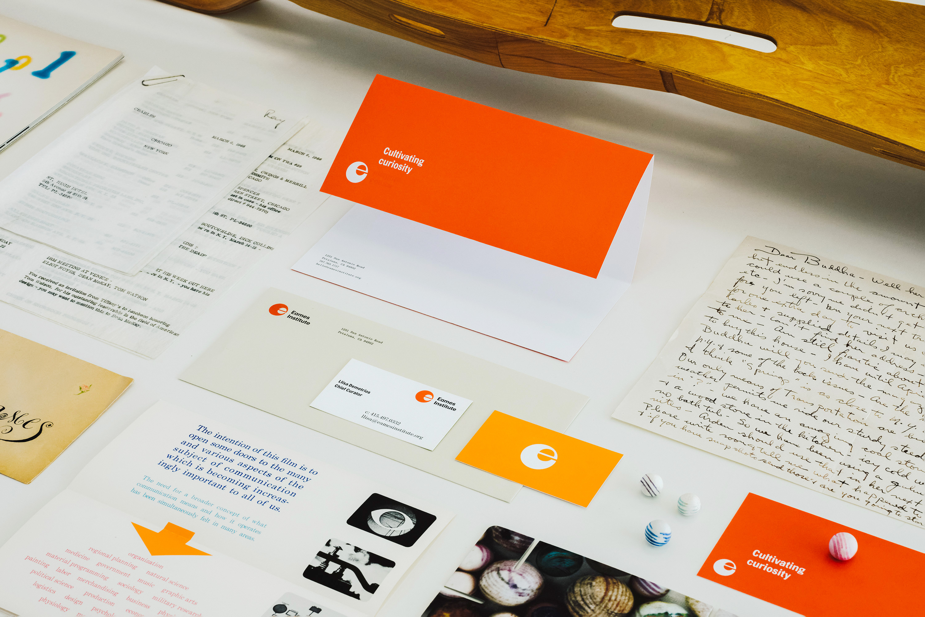
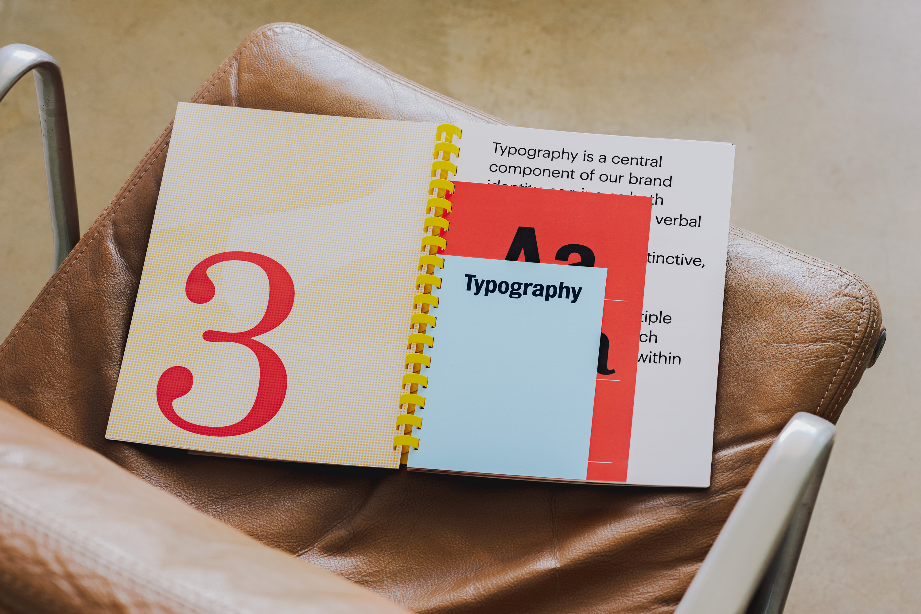
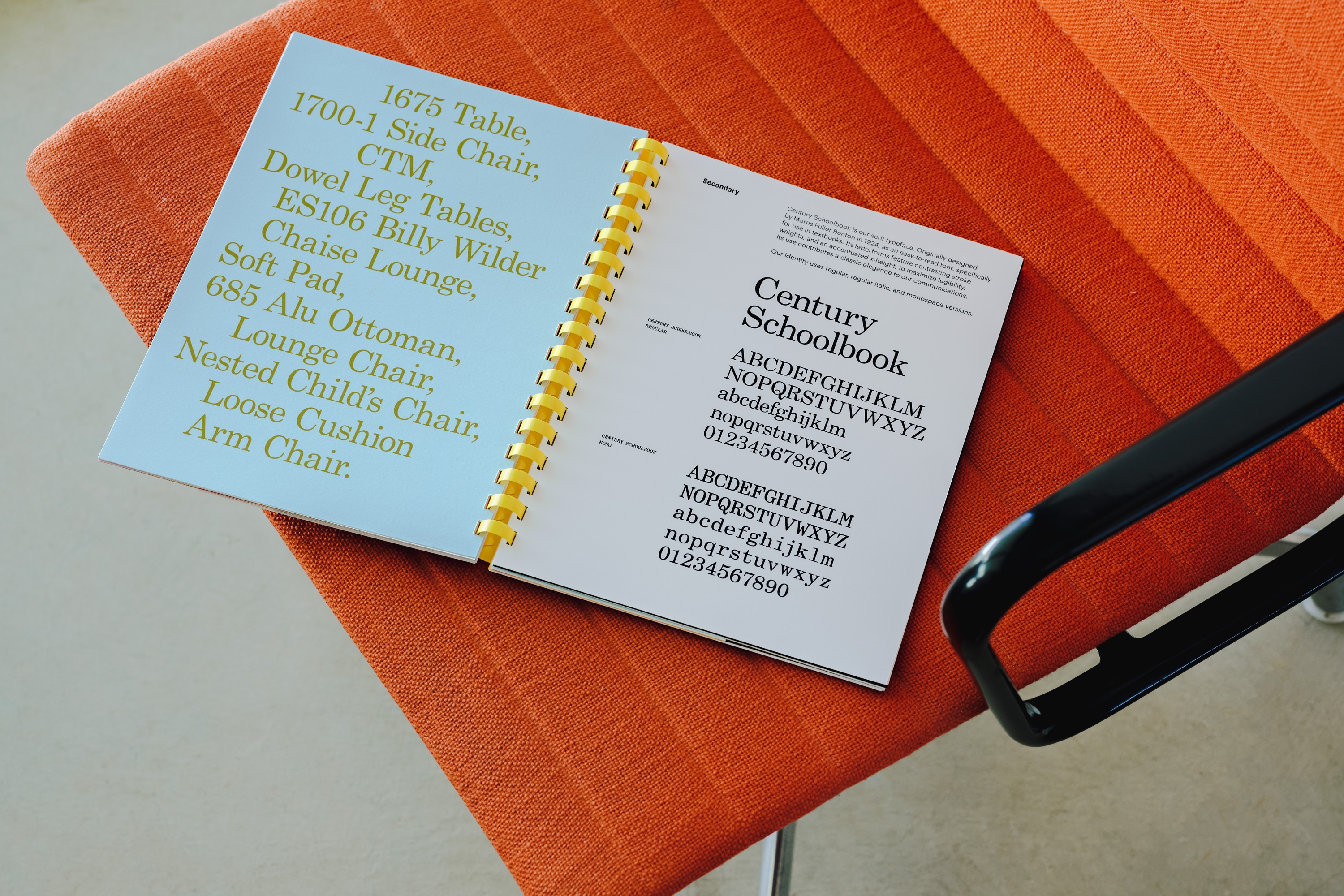
The visual identity plays out in colour compositions and material orchestration that manifest both this sense of joy and curiosity, and reflects an assembly of unusual and diverse found objects that make up the Eames Institute Archive. This is particularly visible in the layering, mixed media and proportions of the brand guidelines.
There’s a lot in the mix here, however, each is well-handled, woven into a succient visual grammar: type pairings feel suitably industrial (Topol) and educational (Century Schoolbook); colour pops match the designers’ iconic moulded chairs; the binding of materials is functional and efficient while eye-catching. The graphic and the material coalesce in a spatial pattern that respects the principles of furniture design with aspects such as proportionality (the fluidity of positive and negative space within the ‘e’), ratio (papers shift in size) and layering.
Ray and Charles Eames can be understood and engaged with through their work and the objects they collected, through their writing and intellectual pursuits, or through the point of view of others. Their design work can be admired for both its expression of purpose; technology applied fittingly, or simply thought he orchestration of form, material, colour and pattern. There are aspects that are bold, immediate and easily perceptible; others that are nuanced and philosophical.
Rightfully, Manual’s work does not get too caught up in the intangible but instead deliver an appealing, eye-catching entry point from which to begin to discover the world of the Eameses. It is charming, approachable and pleasurable, in the most useful of ways; and it draws out and is a tribute to industrial design through the structural nature of many of the brand’s new material assets.

