Big C Charters by Mucho
Opinion by Kinda Savarino Posted 20 October 2022
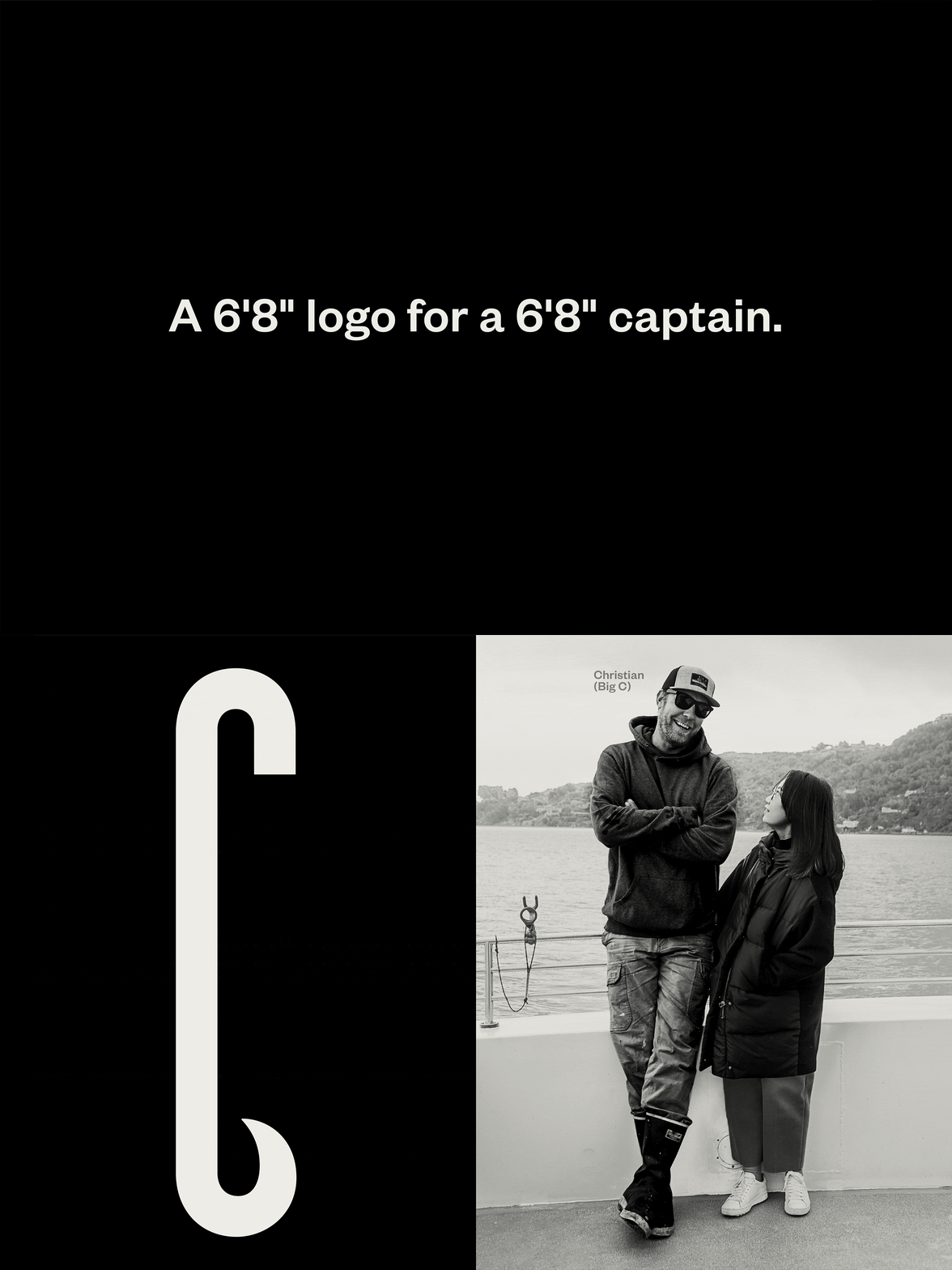
Big C Charters is a premier charter service located in the San Francisco Bay Area, offering hands-on fishing trips and excursions. The company gets its name from Christian Cavanaugh, captain, founder and former professional basketball player. With a growing fanbase and fleet, Mucho was commissioned to create a new logo, colour palette and custom typeface for the brand, as well as a suite of photography and brand collateral.
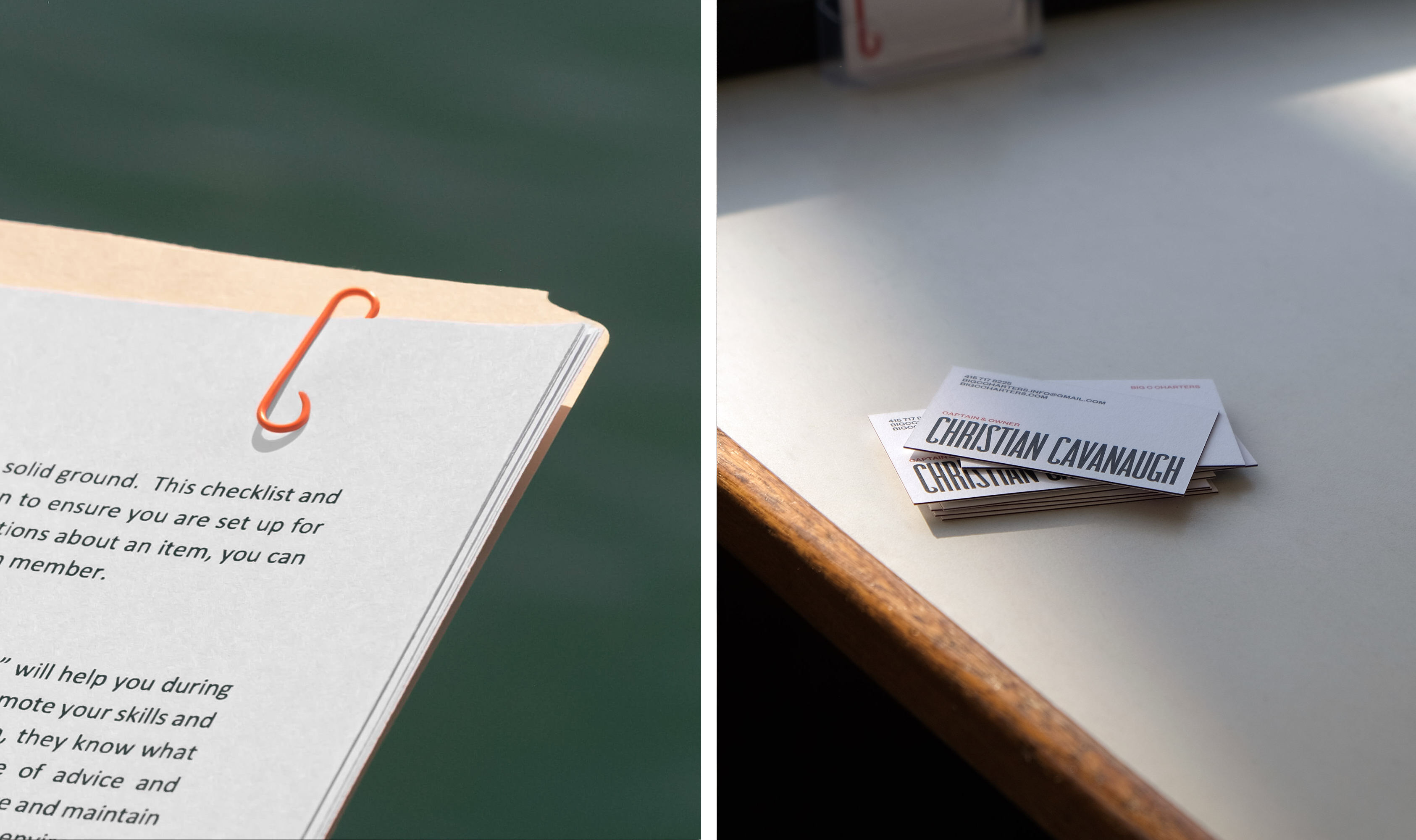
‘A 6’8’’ logo for a 6’8’’ captain’ is Mucho’s introduction to the brand mark, a tall condensed ‘C’ with an elongated bowl. Mucho has brought Cavanaugh’s own characteristics into the design – both his height and his local reputation for the biggest catches – which is fitting for a family-run company. The iconic ‘Big C’ also has a distinctively hooked finial, reminiscent of both fishing hooks and ocean waves. It’s a subtle nod to the industry, without being overt.
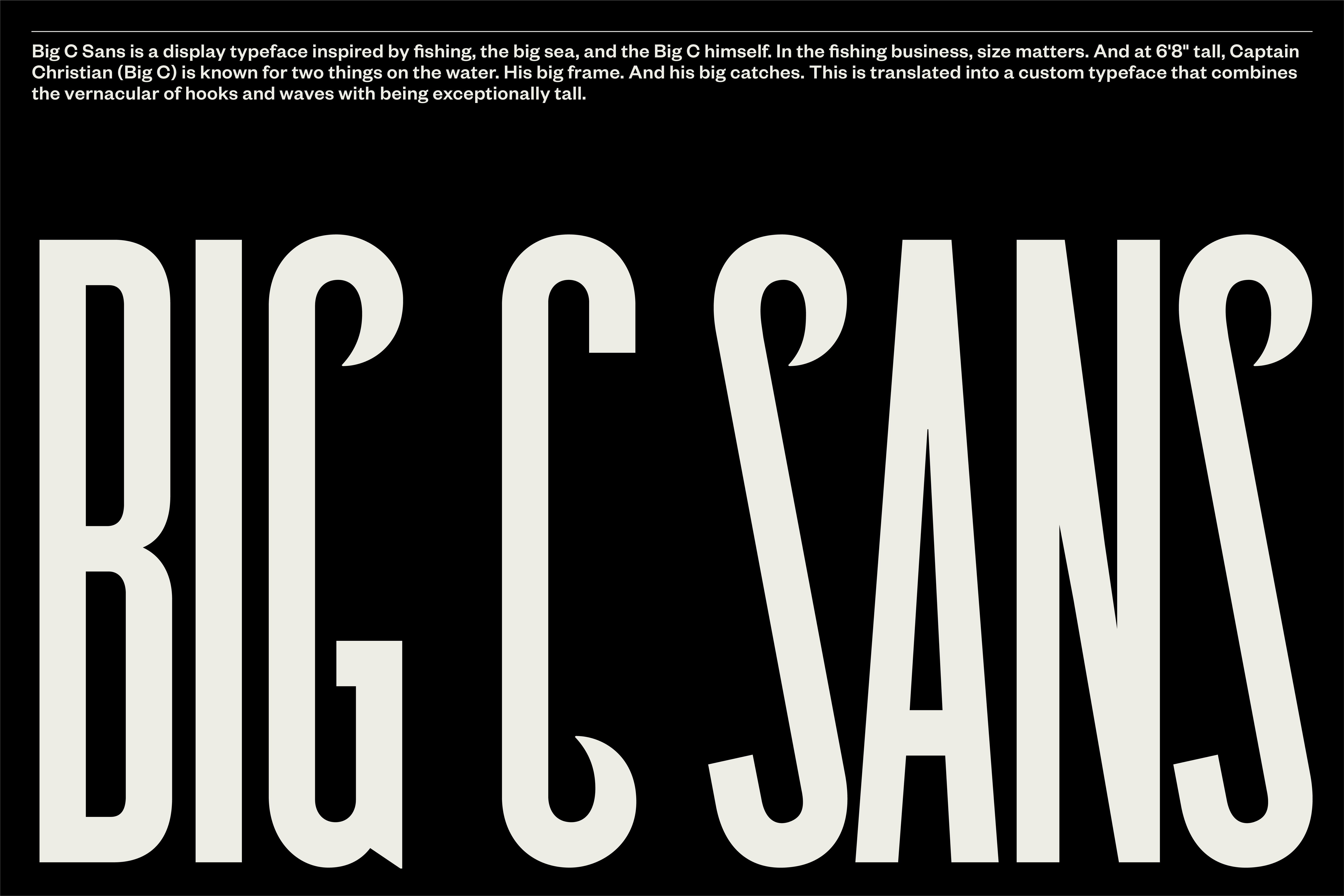
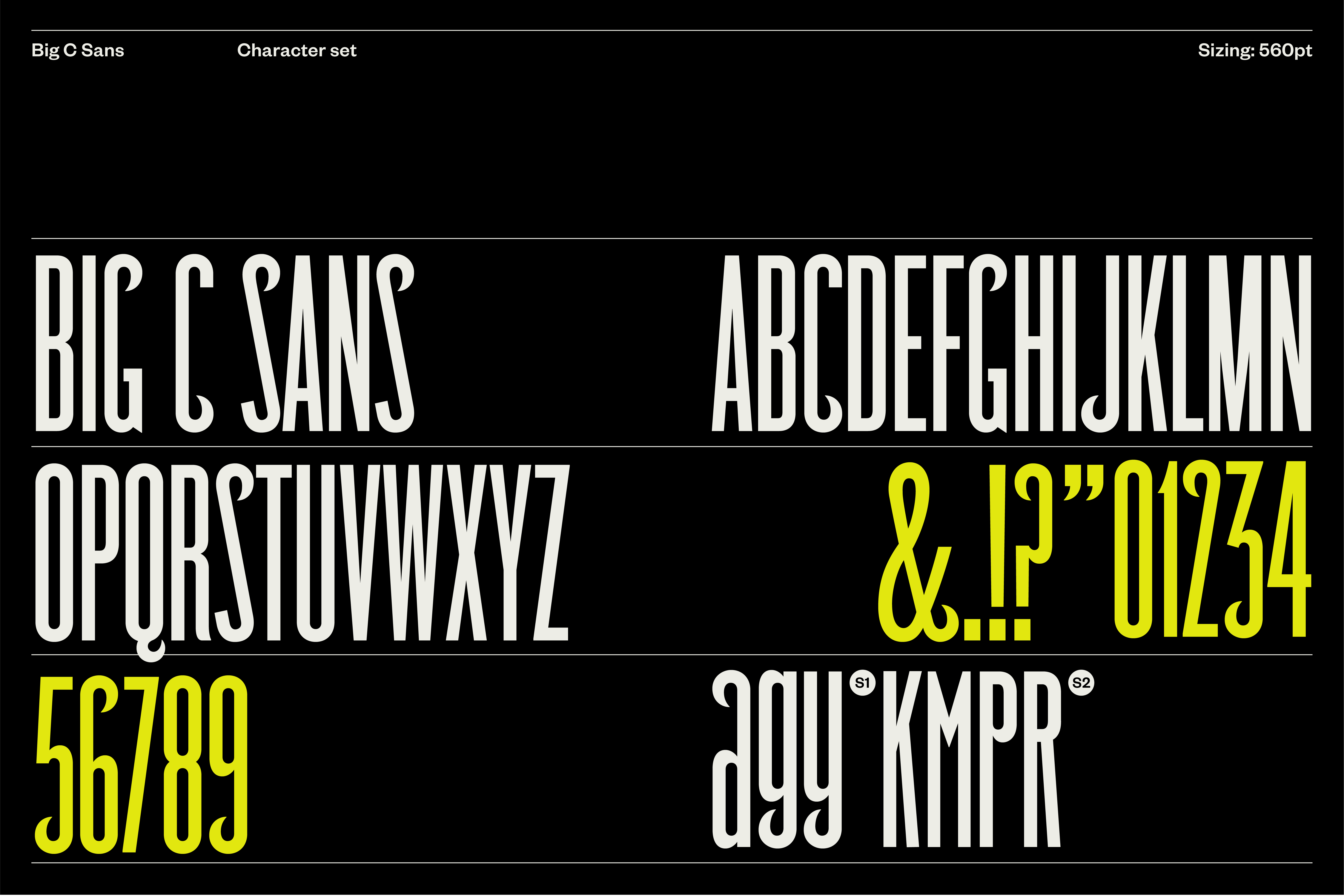
But Mucho went further than this, developing a full custom display typeface (Big C Sans), allowing the brand to fully claim elongated letterforms with hooked features. The result is eye-catching typography that has an imposing presence across printed and digital applications. With this tool in their tackle, everything on the horizon is immediately ownable, and unforgettable. As Mucho says, ‘Its usage makes for a high impact, boutique look that is recognisably “Big C”’.
This post includes Extended Insights for BP&O Plus members.
Find out more and sign-up here.
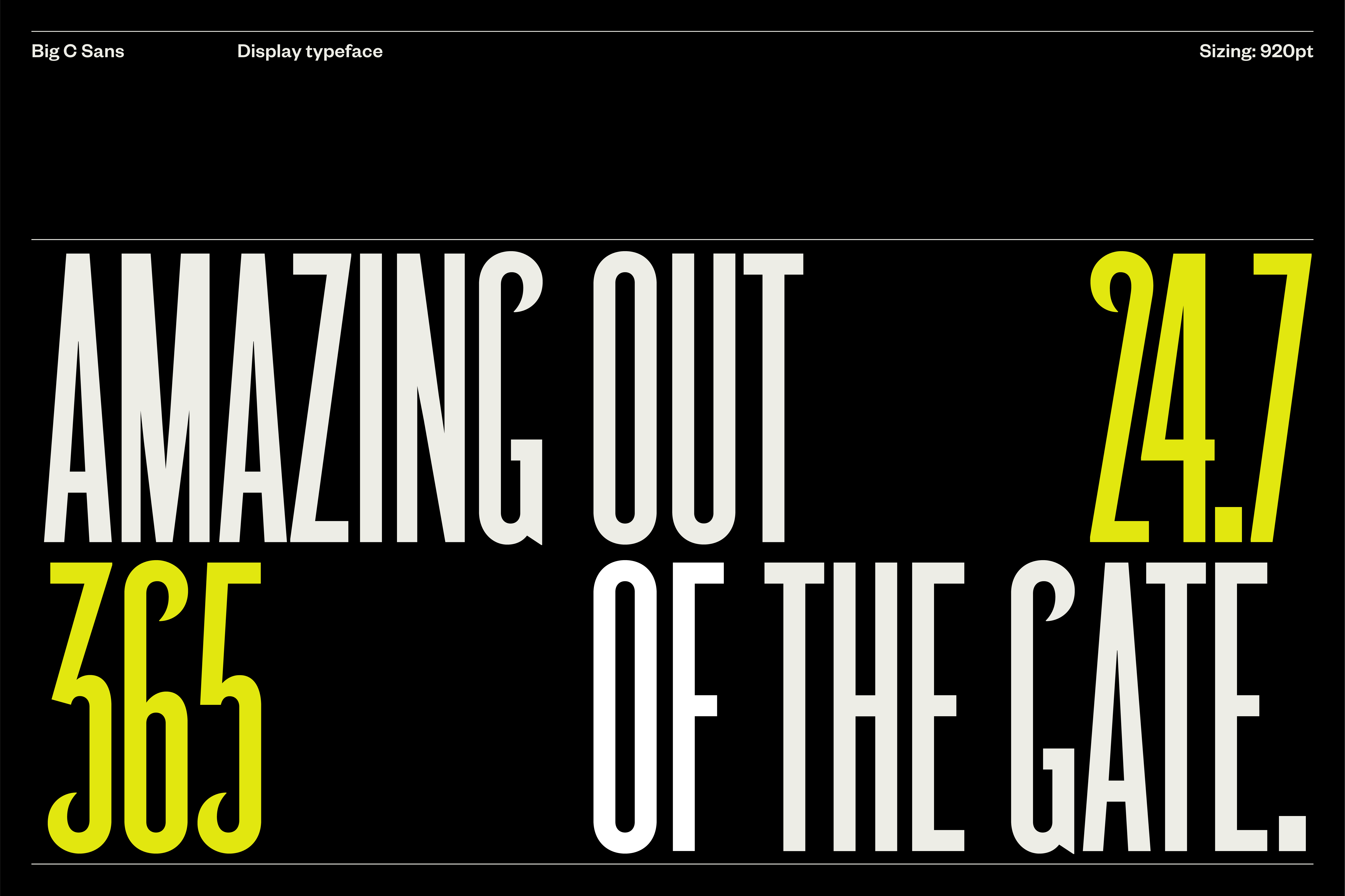
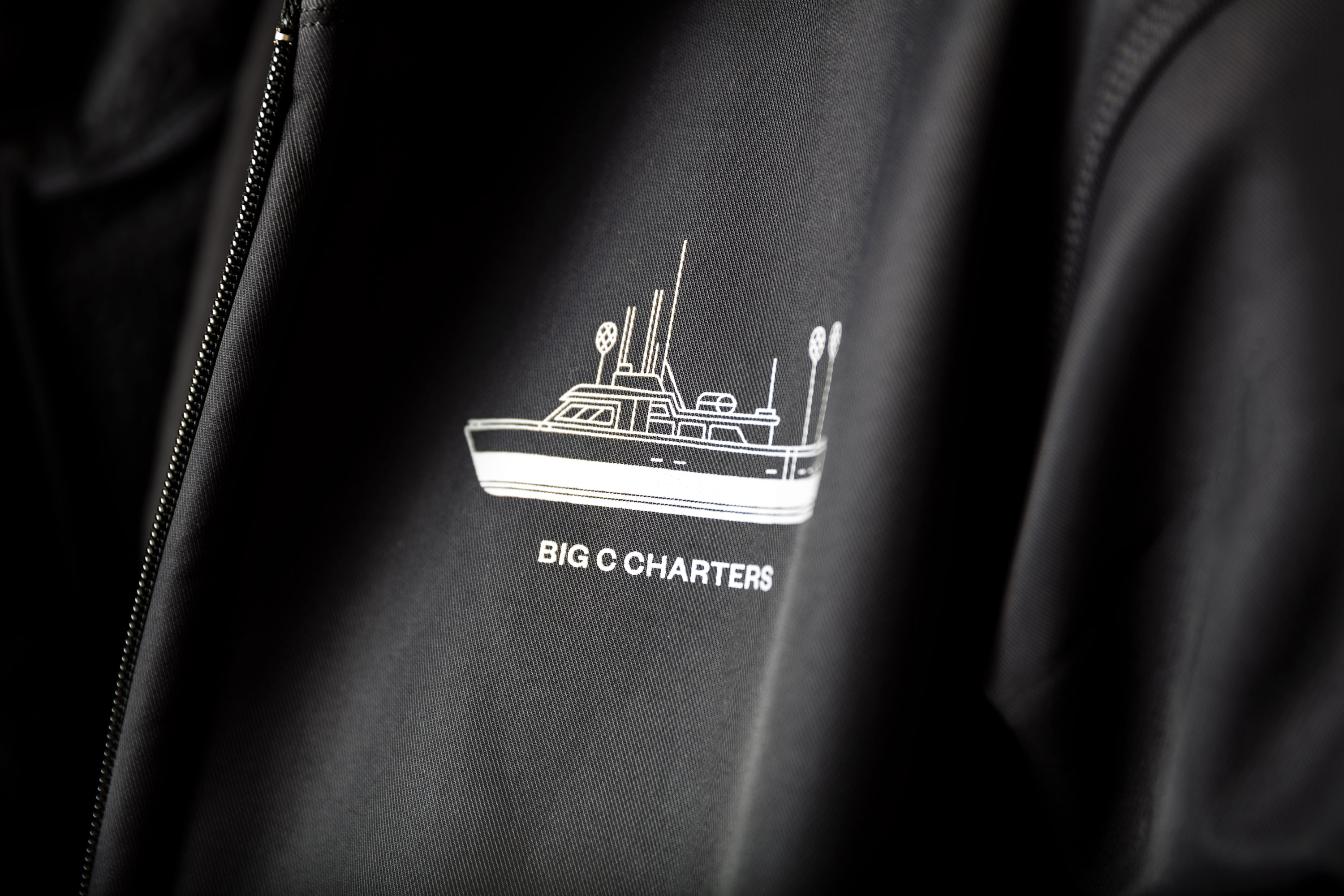
While the typeface is powerful and punchy, Mucho has found a way to inject a joyful tone to the brand through playful scaling of the logo, accompanied by vibrant colours and lighthearted animation. The hook motif features recurrently in merch and other brand collateral, often interlinking with elements in a similar way to how a fishing line would meet a fish.

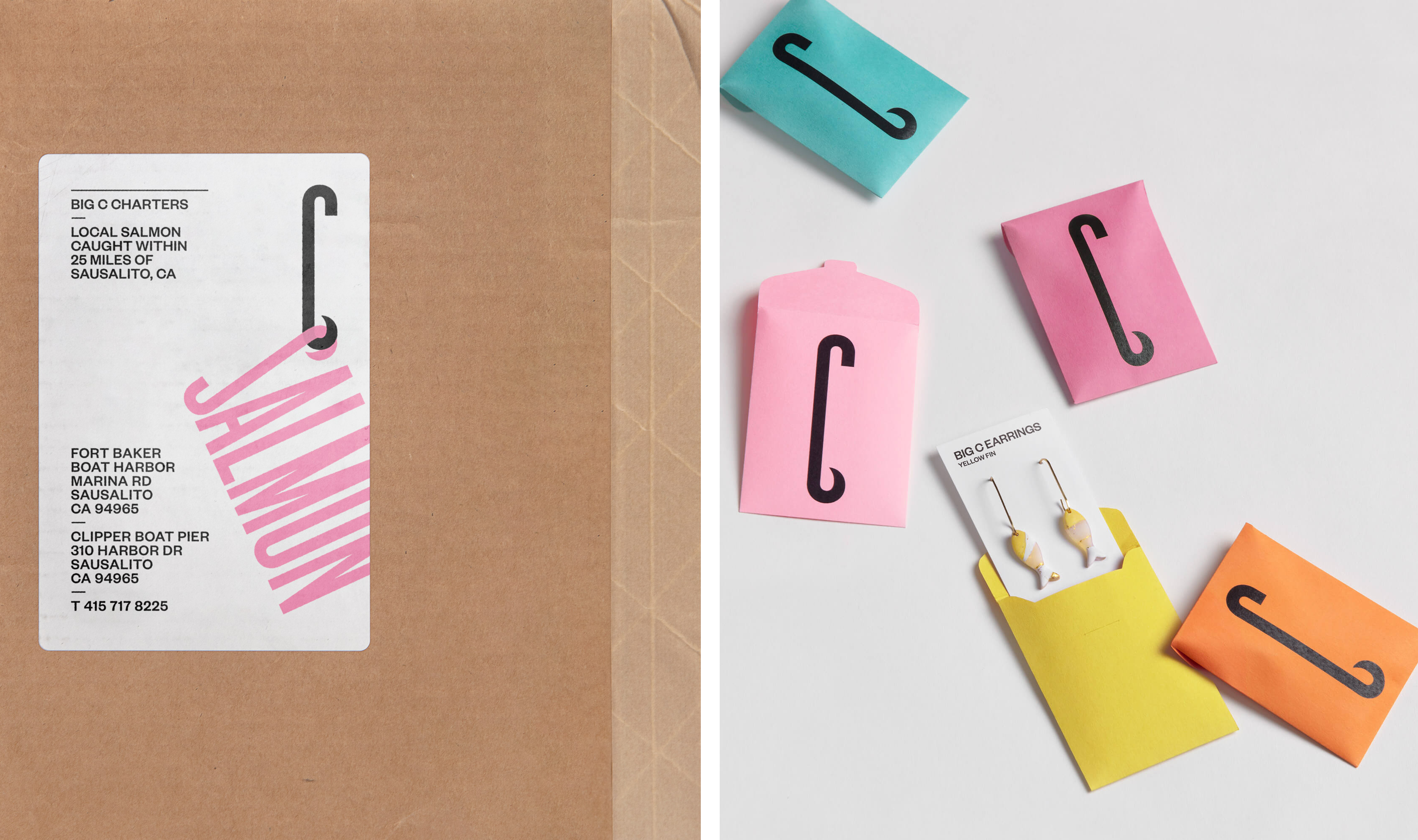
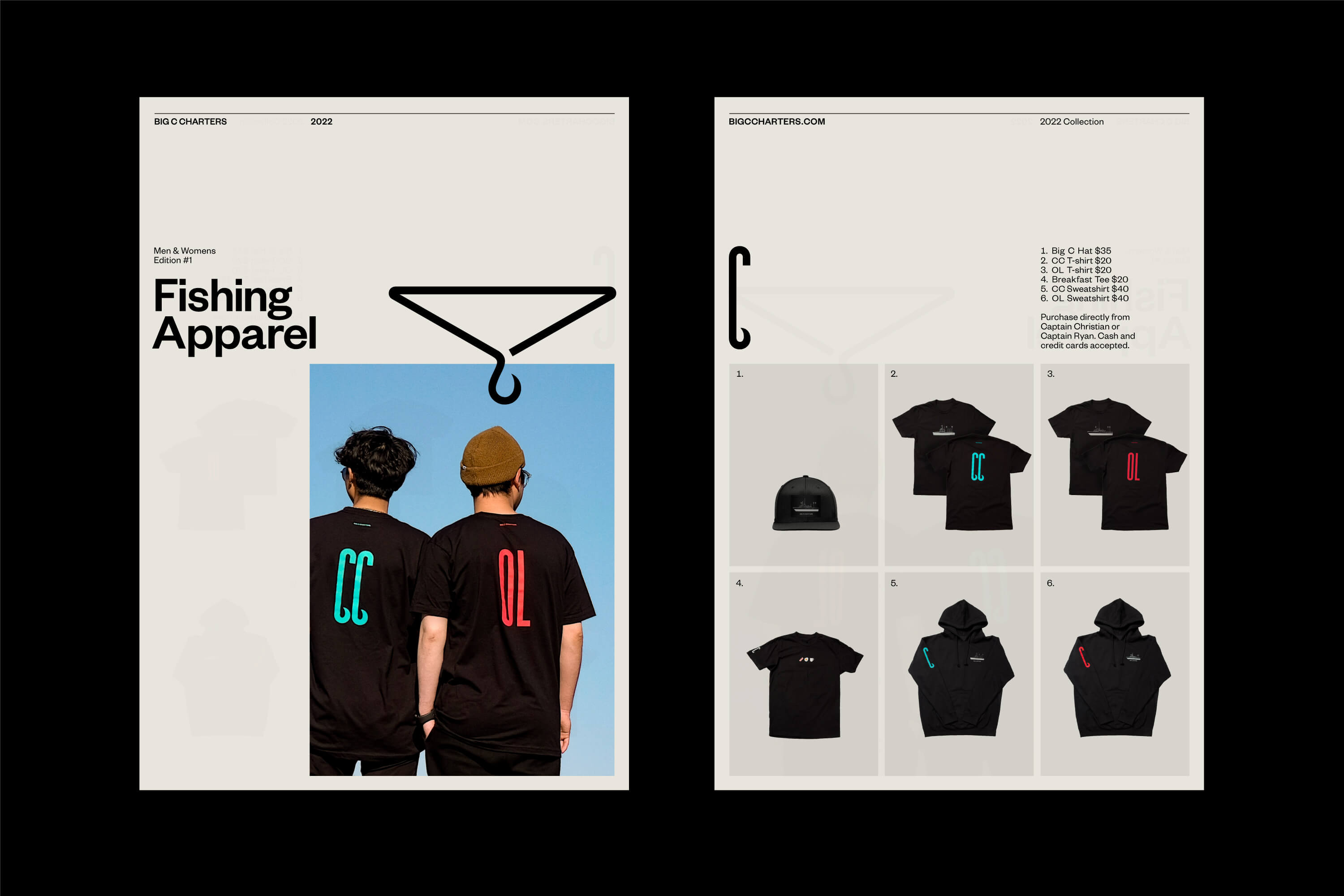
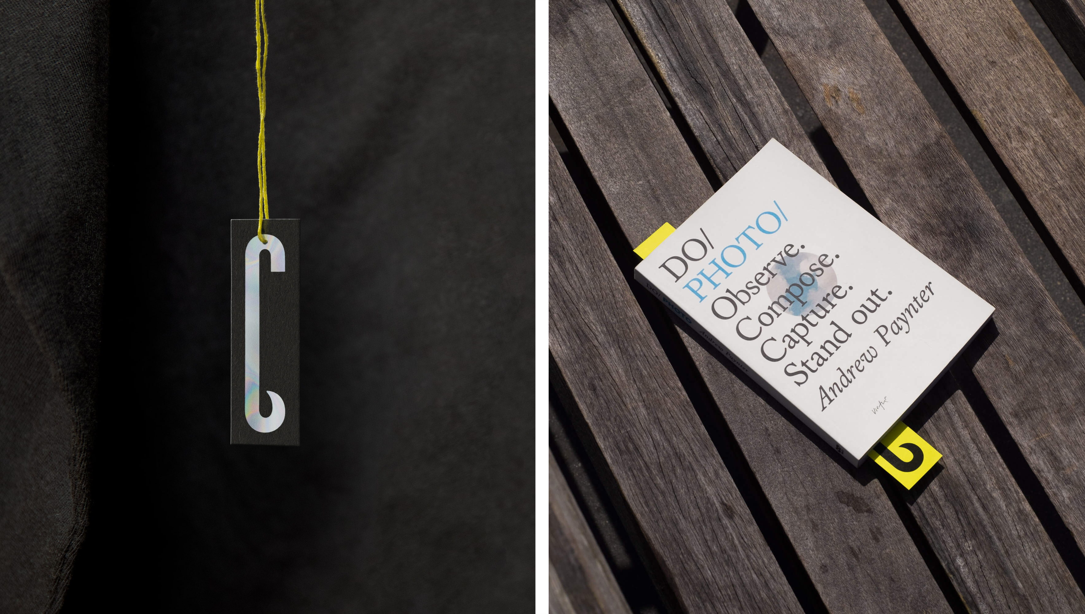
Visual cues from the fishing industry are also used as the basis for colour palette. Primary colours include ‘hi-vis yellow’, alongside black, white and off-white. Meanwhile the supporting palette features red, teal, orange and pink, colours that might be seen onboard a functional fishing vessel – such as lifejackets and bait flashers. This marks a refreshing departure from the usual ocean blues associated with charter services and similar water-based excursion companies, bucking the category and helping to ‘challenge the old-fashioned perspective of fishing’.
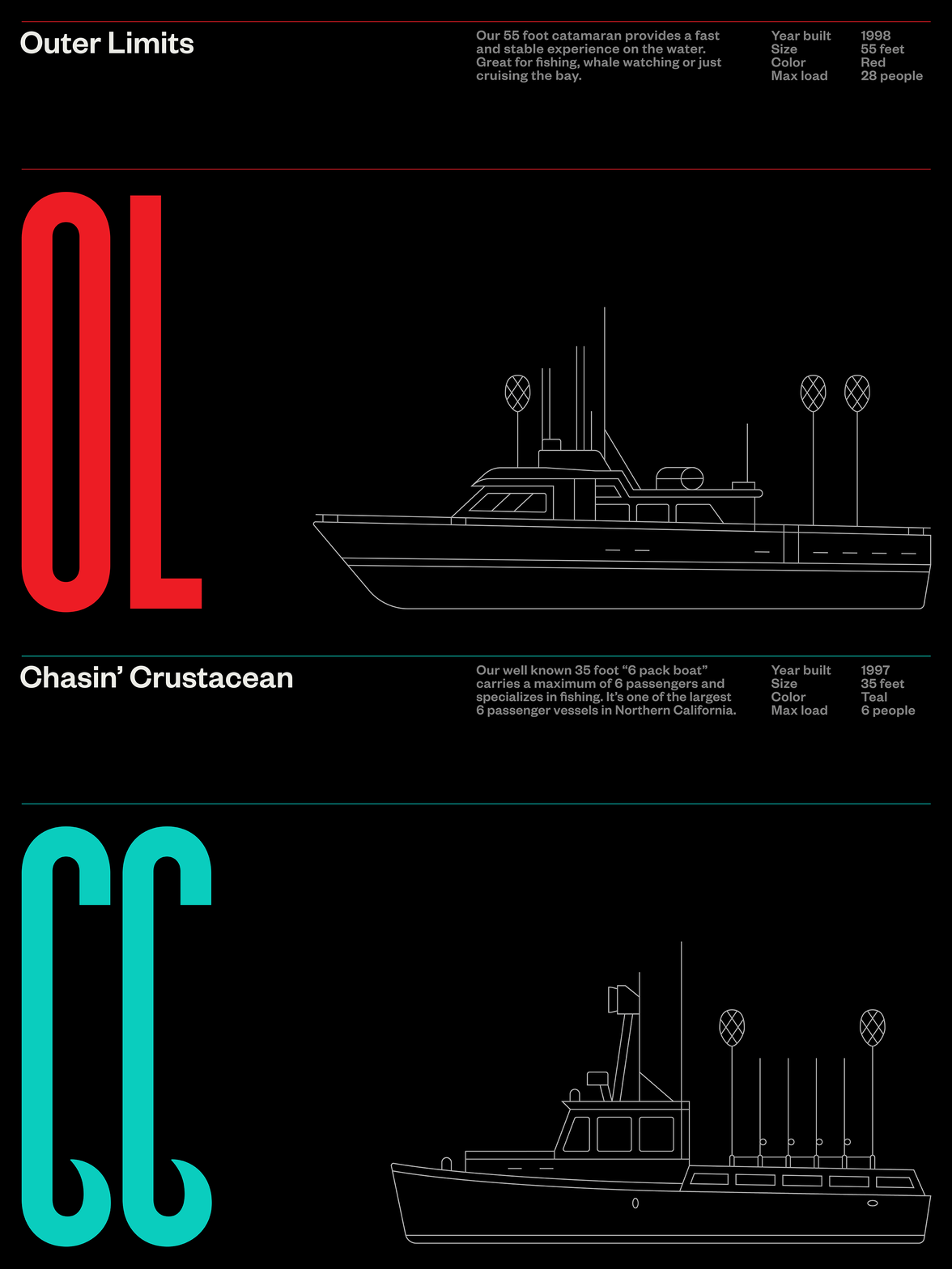
The colour choice not only calls back to the industry Big C Charters operates in, it also provides a welcome pop of colour to the visual identity. ‘Hi-vis yellow’ works beautifully with the new archive of photography, which is in itself a striking extension of the brand. Shot in a candid documentary-style, the images capture real moments at sea, bringing the audience closer to the action.
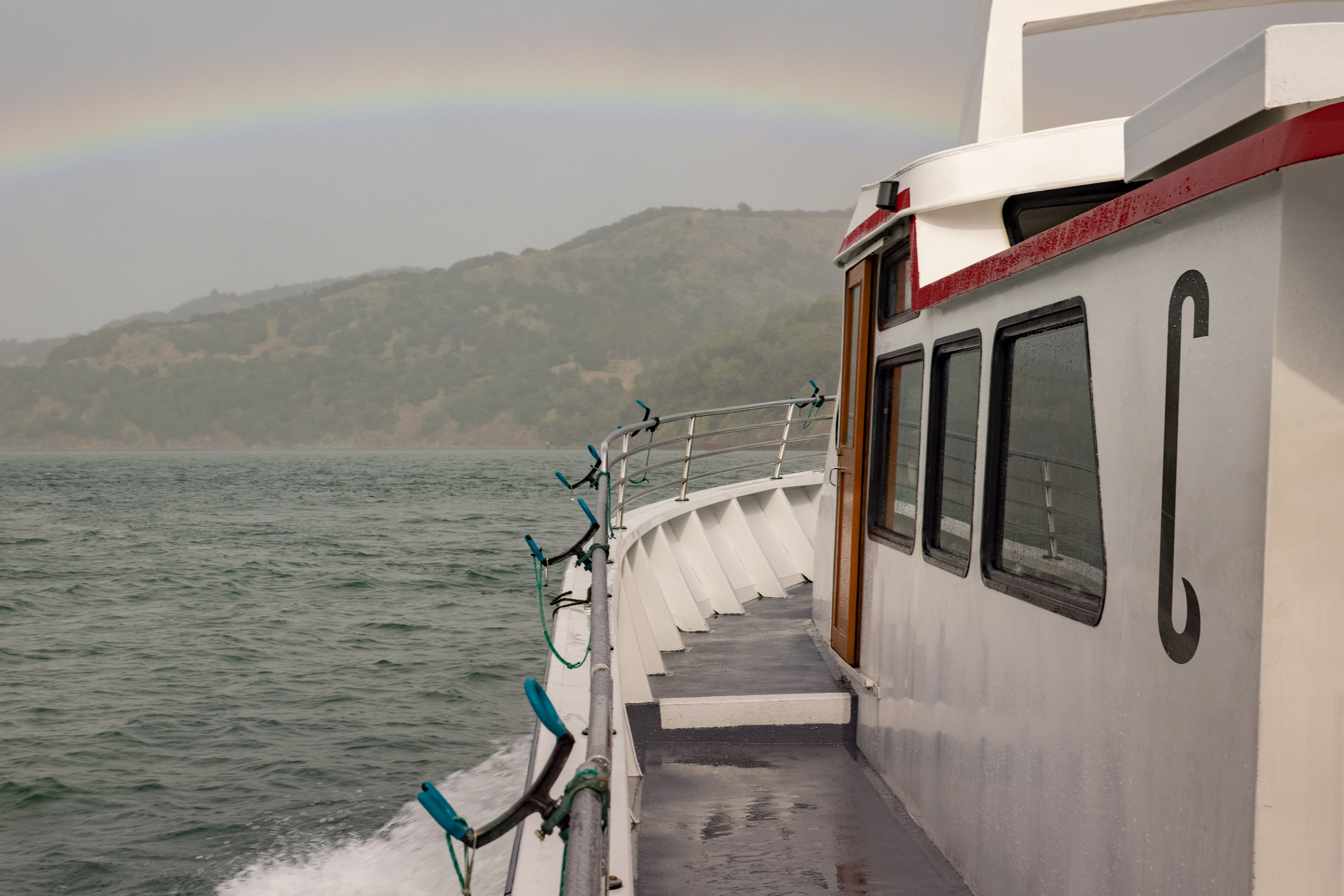
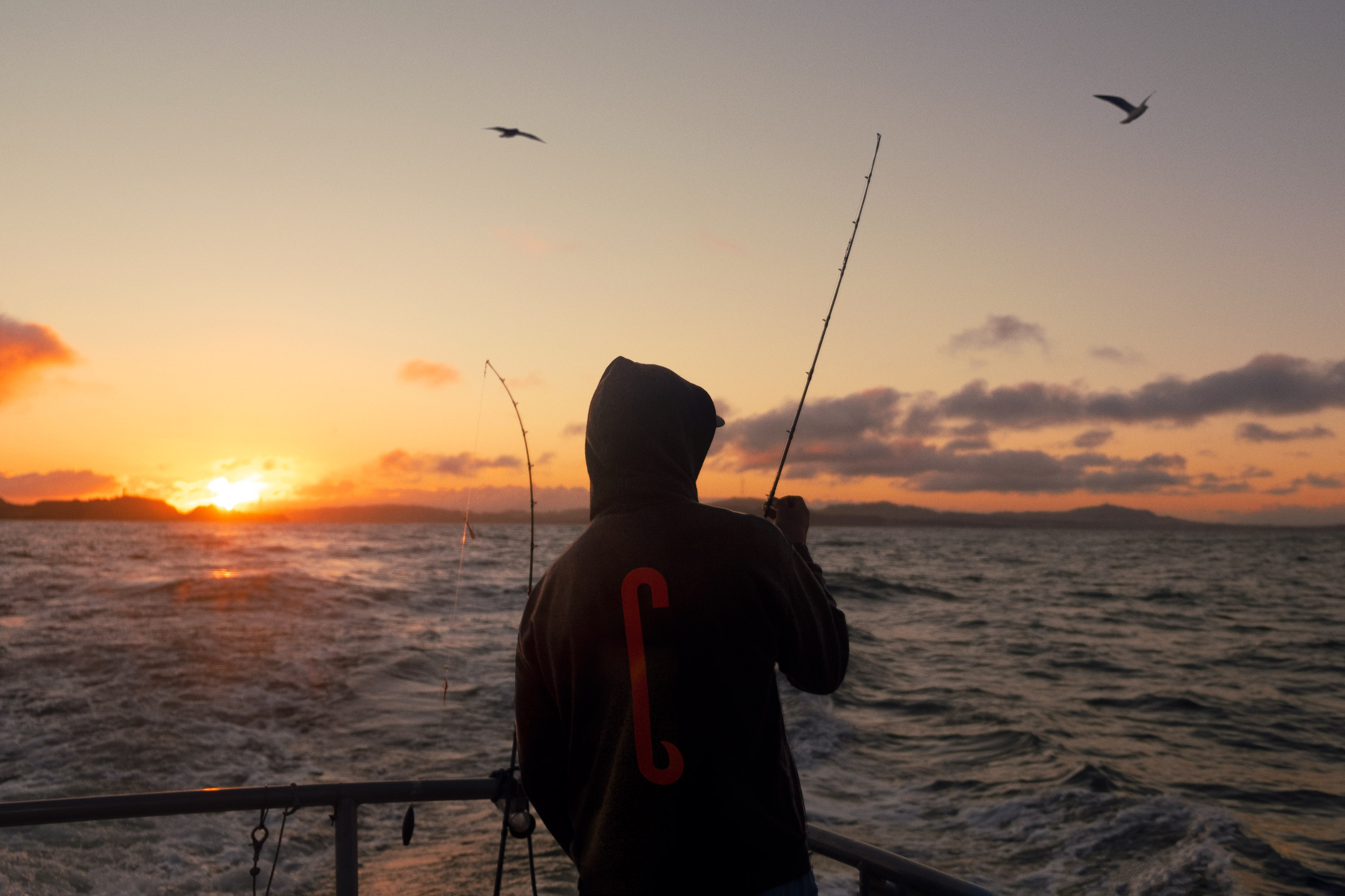
In combination, these elements work together to appeal ‘to wider ages and experience levels and set Big C Charters apart from others’. Big C Charters does not shy away from the reality of fishing, and neither has Mucho. The strength of this identity lies in its simplicity, and in the fact that key parts of the brand call back to the brand’s mission and story.
