Logo Design & Branding
Nu-clear your skin
Juana is a Dubai-based company creating CBD-based “bioactive” skincare, founded by Yann Moujawaz Martini, a French-born entrepreneur with Syrian roots and a background in brand strategy or – as he himself put it in an interview – “a decade designing multibillion-dollar wellness and medical tourism mega-projects for governments and Fortune 500s”, after which, he says, he “flipped the script” and...
Eternal Research by Cotton
Niche/difficult electronic music types and brand design nerds are rarely found too far from one another; often, indeed, they’re one in the same. It’s little surprise really when you look at the typographic wonders to be found across the spectrum of things like vintage synthesisers – the sublime curves of ‘Omnichord’ or the strangely pagan-ish letterforms on a Prophet-5, to...
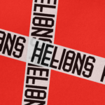
Helions by Pentagram
HELIONS… now that sounds impressive. Something to do with helium atoms and stellar fusion, the force that powers stars? Or perhaps it’s invoking Helios, the Greek god of the sun, blazing his chariot across the sky? Nope – it’s actually a tribute to Helions Bumpstead in Essex, a beneficiary of the British gift for naming that also gave us Pratt’s...
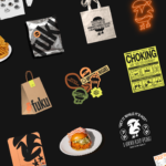
Fuku by Red Antler
Fuku (no sniggering at the back please) is a ‘fine brining establishment’ – i.e. some sort of eatery, you can safely assume – specialising in a specific type of chicken ‘sando’, or in normal language, ‘sandwich’. According to Red Antler, the Brooklyn based design agency behind Fuku’s branding, ‘the Fuku sando first hit the scene as a secret menu item...
New York Botanical Garden by Wolff Olins
It must be something of a dream project when an agency gets commissioned to work on those big-name cultural clients – museums, art galleries, orchestras, theatre companies, et al. You’d expect such projects to be a departure from the constraints and stakeholder-limitations of corporate clients; and perhaps a chance to be more creative than usual, thanks to the nature of...
Knahia by Requena Office
Estepona is a Spanish resort town on the Costa del Sol. It surveys the azure waves of the Mediterranean from the apex of a bight that traces a gentle South-Westerly arc from Marbella to Gibraltar. Strewn as it is on this notoriously idyllic coastline, Estepona largely conforms to the stereotypically cheerful charm of the Spanish resort town, pandering to the...
Be Equitable by For The People
There are many kinds of rebrand. There are rebrands that tread lightly, reverently refining and polishing what is already there, like archaeologists delicately exhuming sunken lucre so that it can once again gleam (National Portrait Gallery). Then there are rebrands that are a little more decisive in their handling of the raw materials—imagine our similetic Time Team creatively re-assembling the...
Mr Yum by Re Design
Sometimes a project comes along that doesn’t just make you think about how nice its typography is, or ponder if millennial pink is making a comeback (or indeed,, if it ever went away), or why suddenly a branded bucket hat seems to be a key facet of any company/product/concept’s ‘swag’. Sometimes, it makes you think about what ‘branding’ even means,...
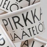
Pirkkalan by Werklig
It’s been years since millennials were first accused of buying too many avocado toasts and expensive coffees. The stereotype of young people loving handmade, refined and artisanal products holds true in their spending patterns, and today, that generation has matured into business leaders, reshaping the world’s mindset to align with these priorities. As consumers, Gen Z seem to be picking...
Omlet by Ragged Edge
We’re undeniably in an age of pet care 2.0: the post-fur-baby era, where people are finally beginning to see their animals’ needs and wants as independent to their own (i.e. dried pigs ears over vegan dog treats, eschewing leads for cats, and so on). These shifts in how we think about what it means to have and look after animals...
Kettle Kids by Two Times Elliott
The once laudable claim to have started a thriving business with ‘a small loan’ from a doting family member may have been muddied beyond recognition by the truth-stretching of serial tax-offender and part-time Presidential candidate Donald Trump. Despite this, turning ‘one thousand pounds from nan’ into a luxury watch and diamond dealership with a sparkling flagship store in Mayfair remains...
Black Bee Honey by OMSE
It was yesterday I made a run to the local supermarket to pick up some essentials. I had two choices, turn left to Waitrose or right to Morrisons. Despite being somewhat price conscious, I enjoy looking at the packaging at the higher-priced Waitrose, so went left–let’s say it’s the cost of being a designer. Anyway, honey was on the list....