The Wool Pot by Seachange Studio
Opinion by Richard Baird Posted 8 December 2022

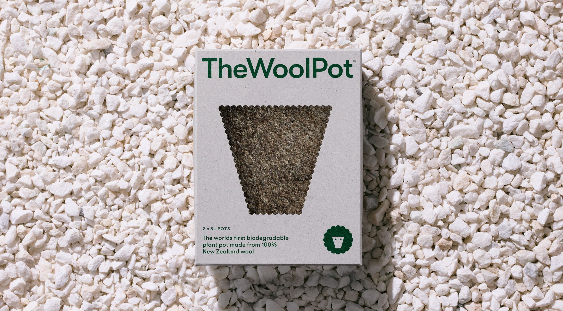
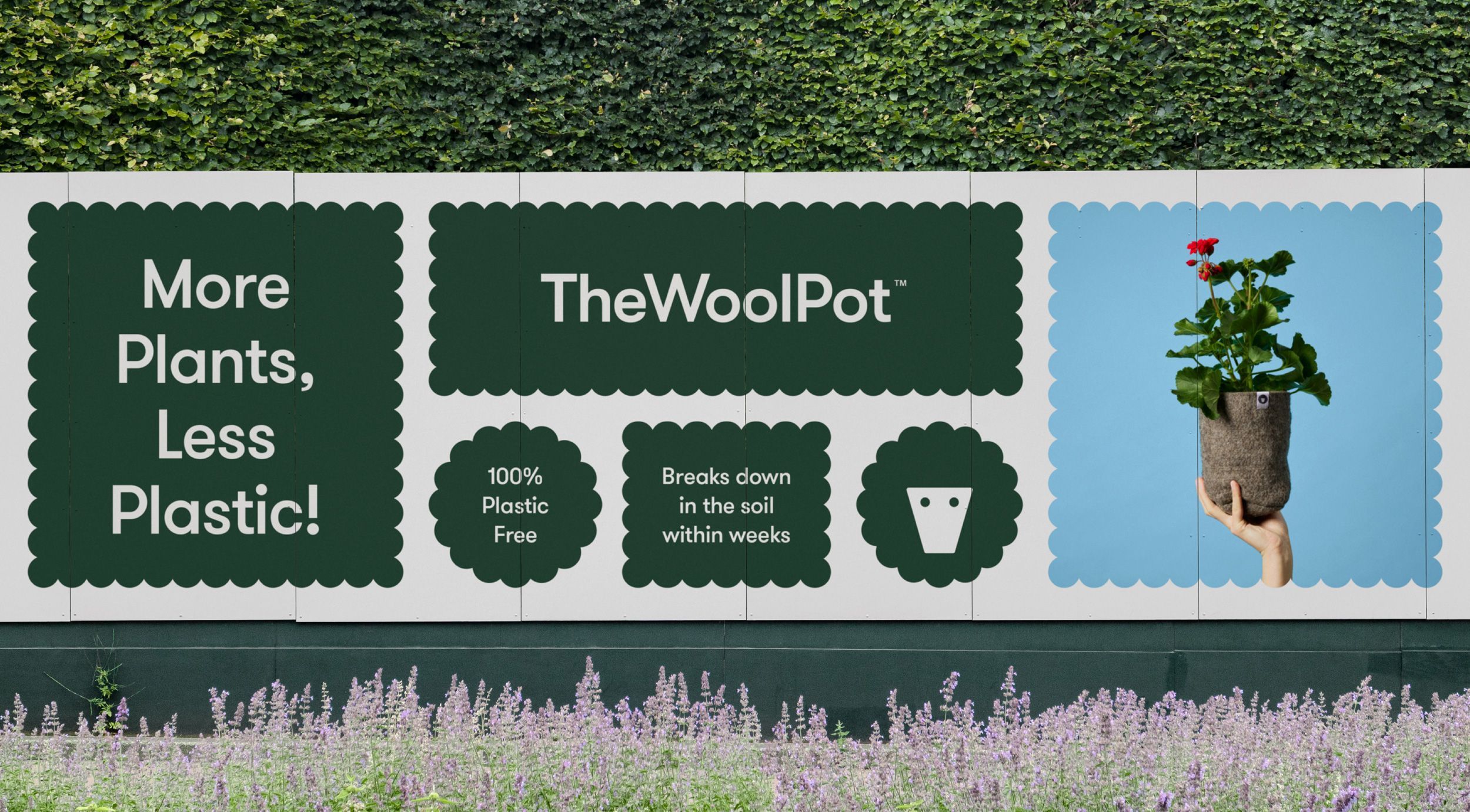
More plants, less plastic. A noble mission. Over the last decade, revelation has followed revelation with regards to the environmental impact of what seemed like the most innocuous of objects. Now it’s the turn of the humble flower pot. Yep, that. Stacked and sitting empty in the shed, or at the bottom of the garden. It turns out that these are just a small part of the billions produced globally every year. Worse still, millions of these end up in landfill and take over 450 years to decompose. In the words of new business and eco-innovator The Wool Pot, it’s the garden industry’s dirty little secret. And it’s the one that they’re trying to take on with their fully-biodegradable and 100% recycled New Zealand wool flower pot, a world-first. Helping them on this mission is Seachange.
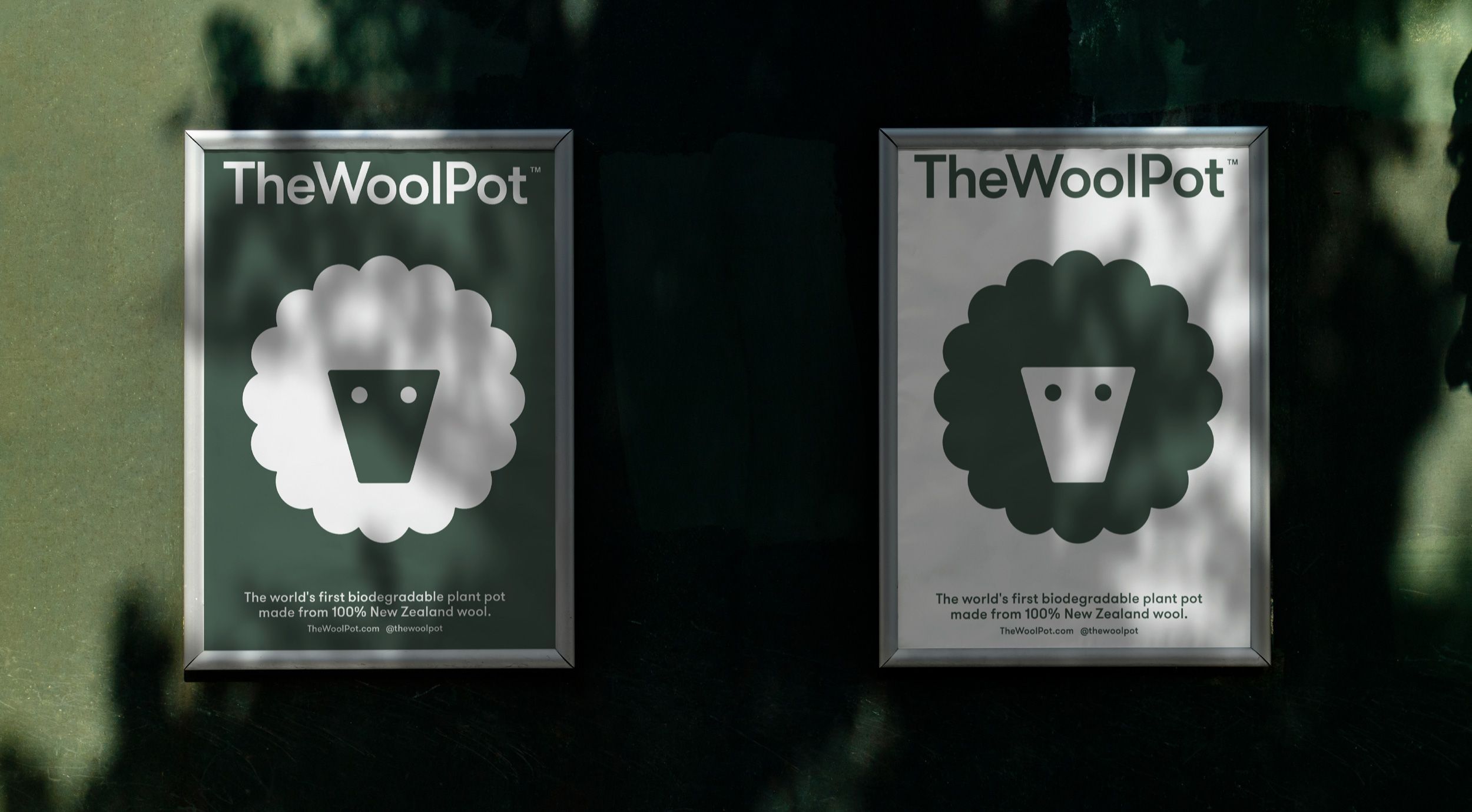
After the success of eco projects We Compost (reviewed Sept. 2019) and Supertrash (reviewed Sept. 2019), the studio are well-placed to help The Wool Pot share it’s innovation with the world, constructing a brand identity that, yes, has a bit of a campaign-y element in the form of a couple of placards, but leans into a cheerful visual language and direct messaging. These pots aren’t cheap in comparison to the plastic ones they’re taking on and its squarely aimed at the ‘mobile’ classes that are more likely to exercise an environmentally conscientious worldview through their consumption, but hey, whatever it takes to get change started, hopefully this drives cost down and makes it more widely accessible.
This post includes Extended Insights for BP&O Plus members.
Find out more and sign-up here.
Digging deeper, The Wool Pot once planted naturally breaks down within weeks. It leaves no trace and, in the process, adds nutrients into the soil to protect the plant roots and ensuring healthy growth. Fantastic. It’s an unusual combination, plant pots and wool, but it takes just a simple explanation like the above to get it the benefit. It’s probably worth noting that, despite its warm aesthetic appeal, these unusual wooly pots aren’t the decorative pots used for house plants, there’s a utility here, which is reflected in an inviting but paired down graphic image and application.
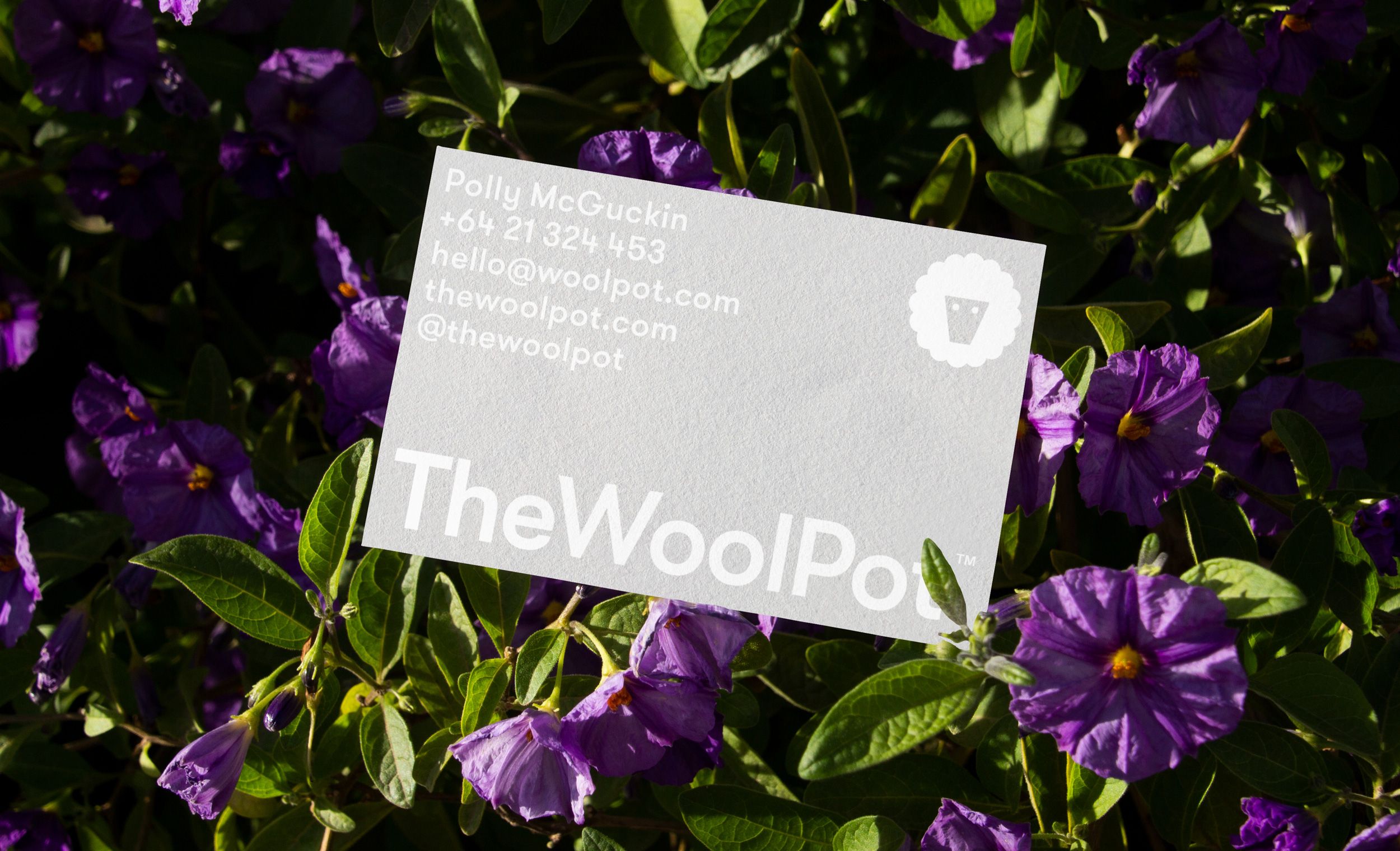
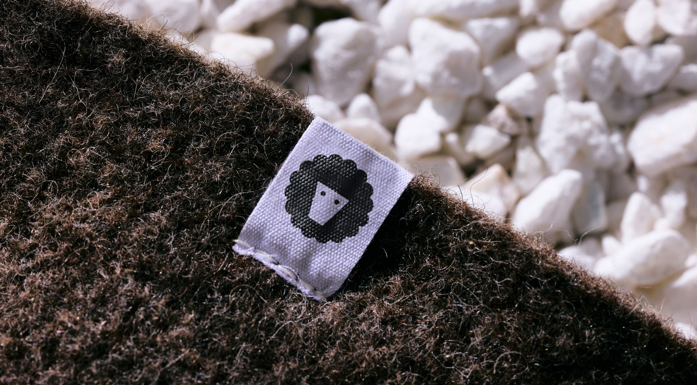
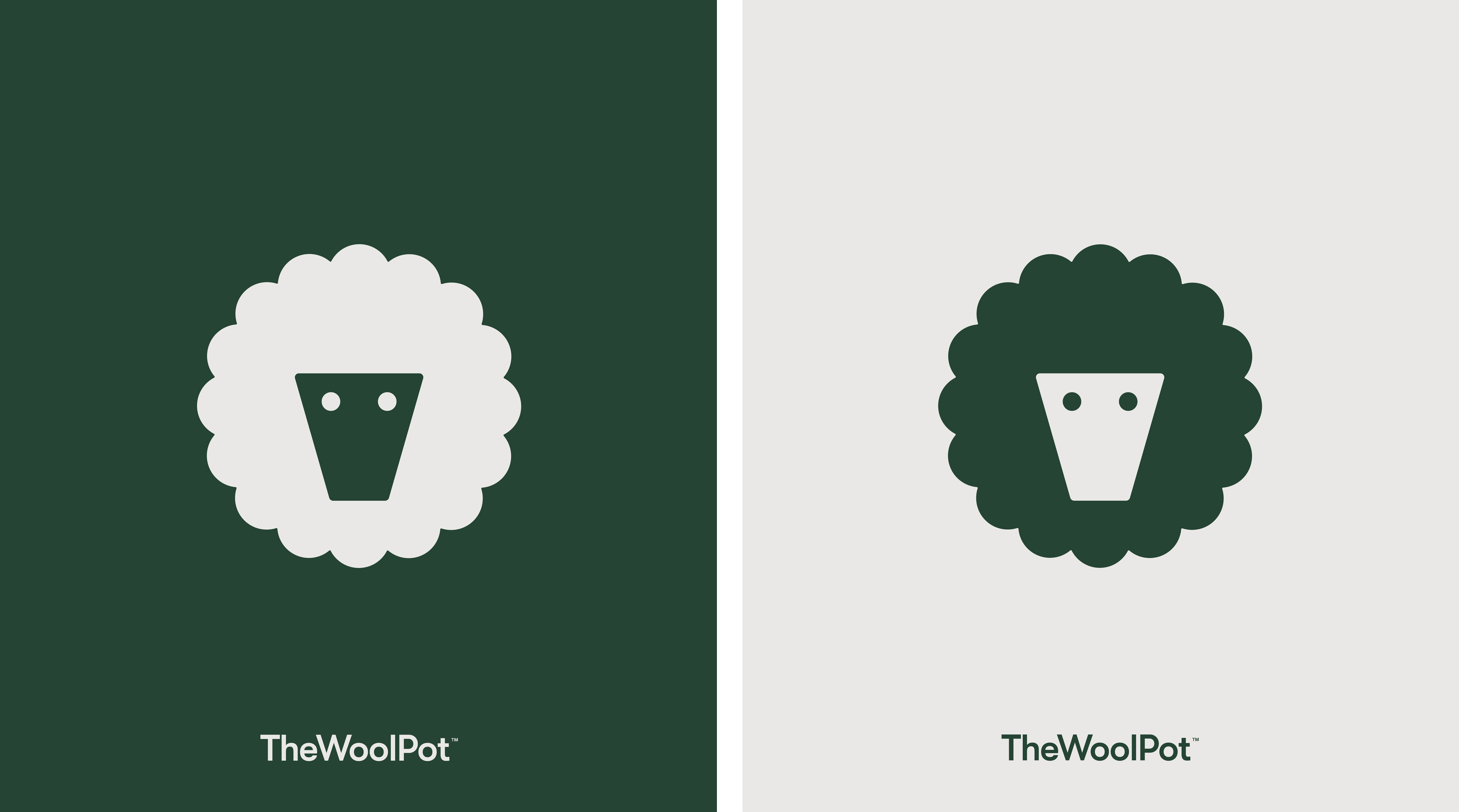
Provoking interest and asking for consideration is the visual identity, which makes the most of the graphic qualities of wool, flowers, seeds and plant pots. Seachange effectively (and satisfyingly) synergising these into a simple logo that employs and balances positive and negative space to create a sheep motif. This functions well reduced down and set within the circle and squares of social media, stitched into tags or built up as a white across business cards and packaging. The two dots, a simple addition, ‘seeds’ the mind, sending it in the right direction. Everything else appears to flow from this simple consolidation of elements.
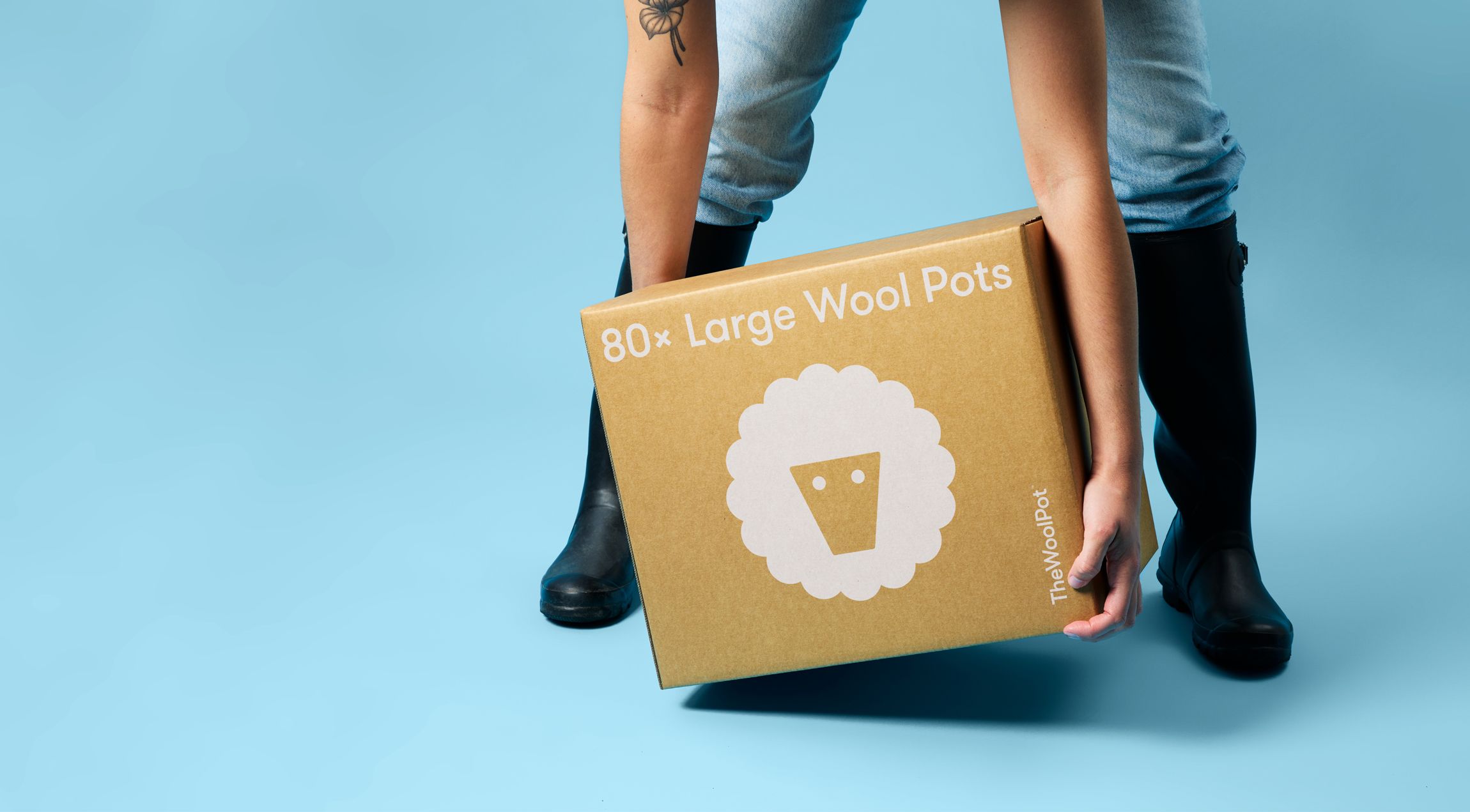
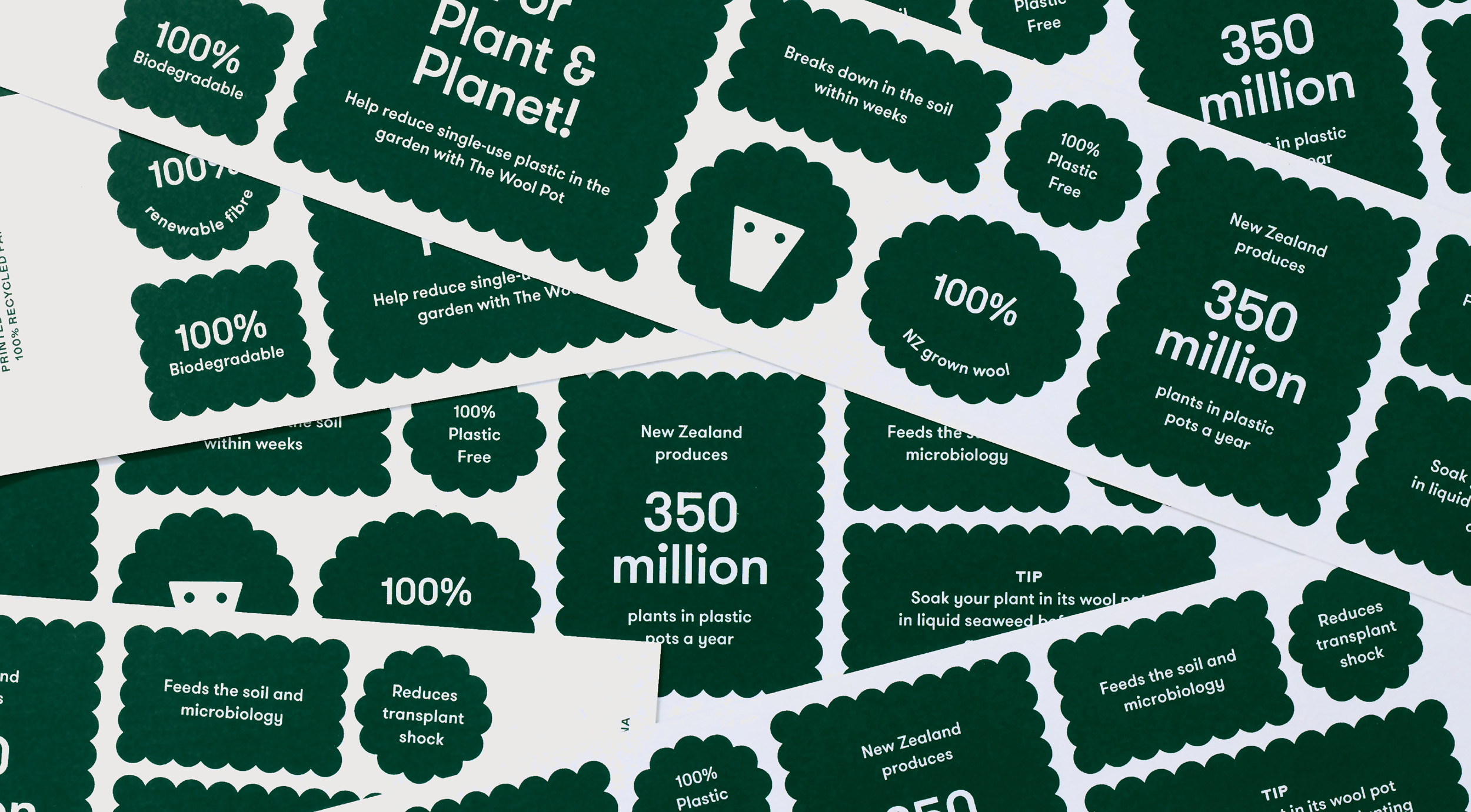
As a visual identity, the ‘woolly’ outline, which is applied to a multitude of shapes that contains bite-sized messaging and helps give iconography a coherent character. Alongside this, a dialled down palette of green and a grey, as well as materials elements of two types of kraft boards and a white ink print treatment keep everything ‘down-to-earth’, somewhere between lifestyle and utility. This is furthered by Grilli Type’s Walsheim, suitably human and inviting with a precise and formal geometry that resonates well with the other aspects of the identity.
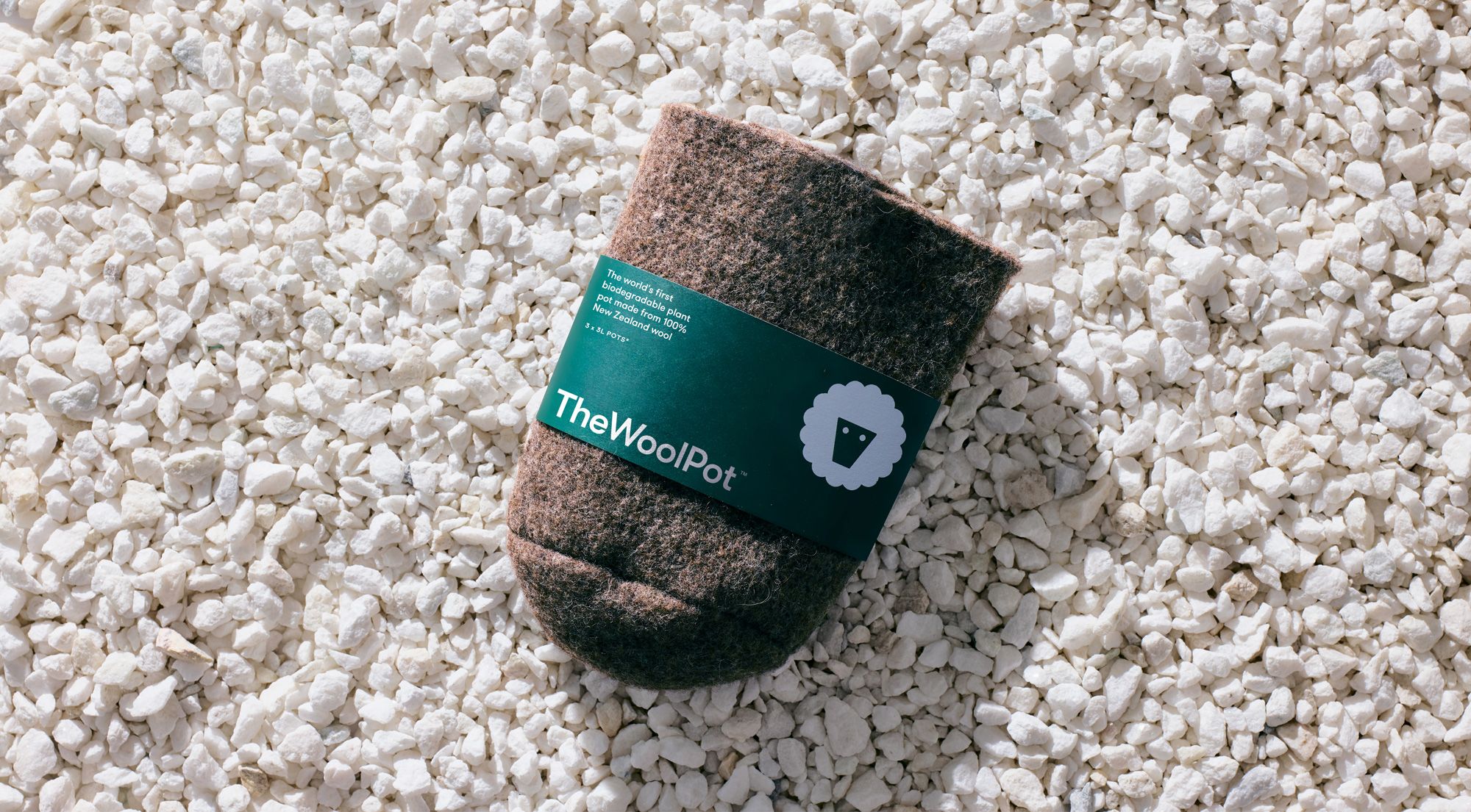
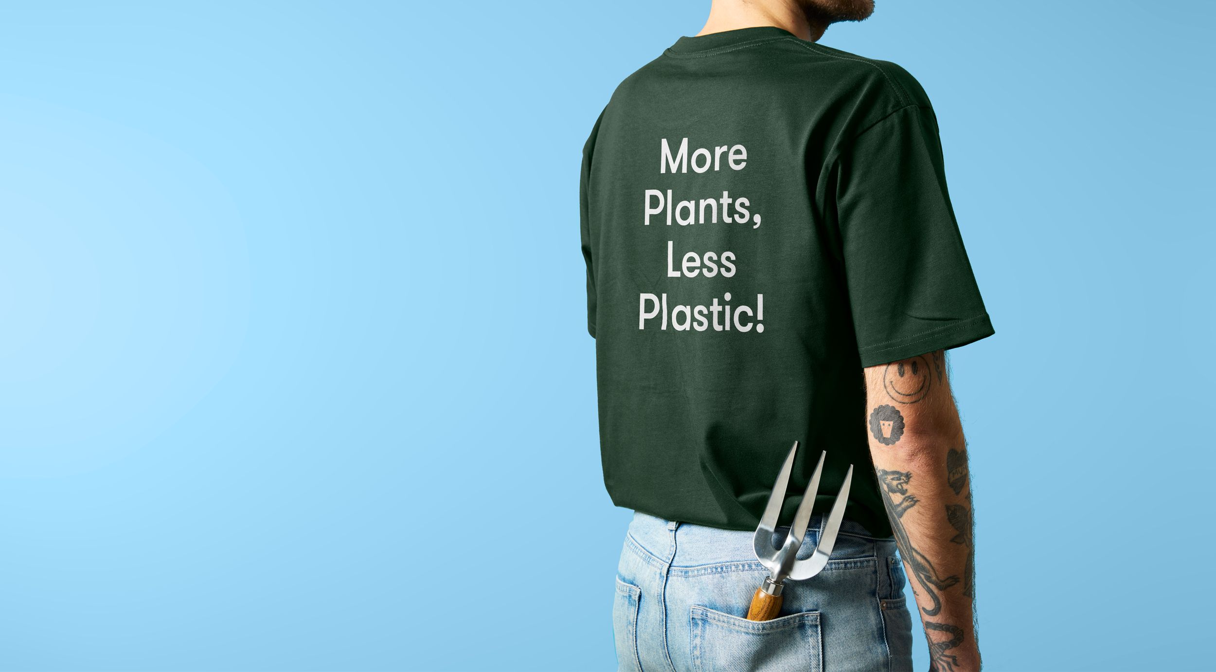
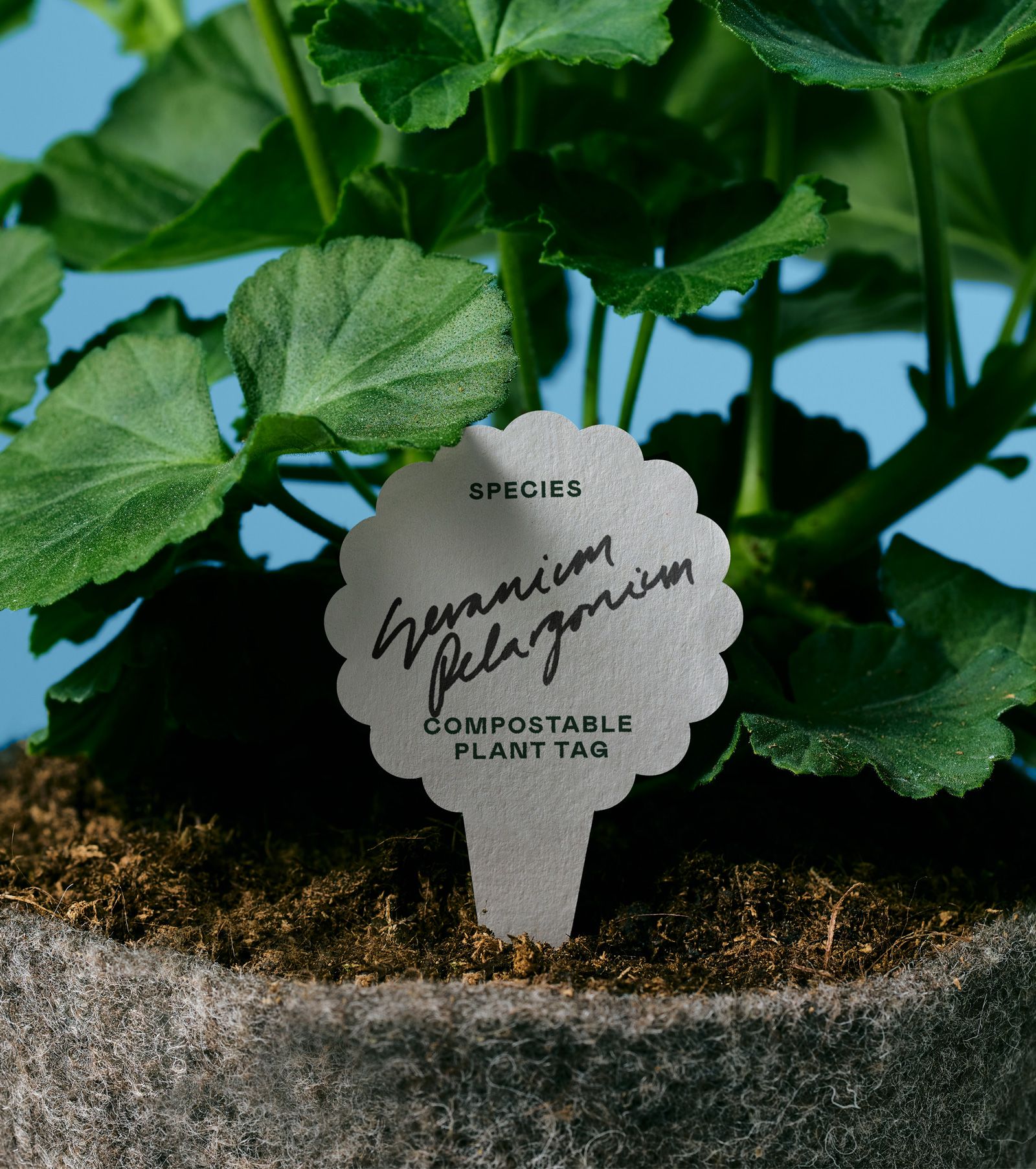
There’s a bunch of other small details that really help give the visual identity a bit of range, including die cut packaging that makes the most of the material composition of the product, compostable plant tag, stickers, campaign placards, a bit of tone of voice (for plant and planet!) and some decent product photography. This all comes together effectively online through the website but, at present, falls a little short on social. There are enough elements to make this work, just needs executing.
Love this project and want to learn more? Discover Extended Insights for BP&O Plus members. Find out how Seachange got lucky with the design of the logo, how they sought to create an identity that could educate, and read their take on designing for eco-brands. Sign-up here and instantly access 100+ insights across 25+ projects, with more added every week.
