Tembo by Perky Bros
Opinion by Richard Baird Posted 5 January 2023
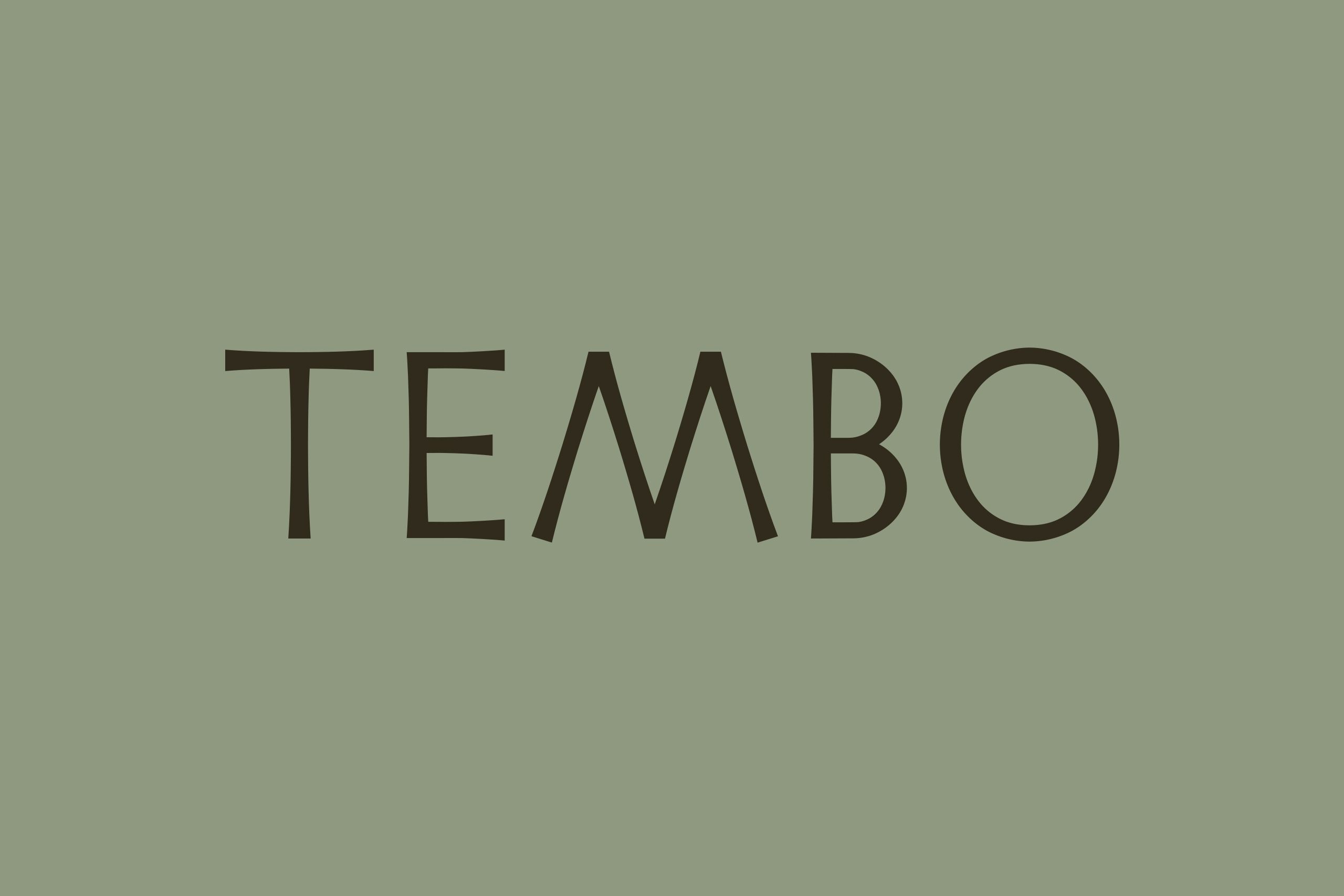
When I first caught Perky Bros’ latest project I misread it as ‘Tempo’, the speed at which music is played. Timing is everything, or so it is said. For real estate company Tembo this notion takes the form of patience; the time to grow gently and judiciously. Property development, momentarily paused during the pandemic, seems to have recovered and is again dialled up to frenetic. Corner-cutting and cookie-cutter developments appear to dominate the forever-shifting urban landscape. It is, perhaps, no surprise that from the urgency and alienation created from this alternative approaches emerge such as London’s Hub Residential (reviewed December 2022) and Tembo in New Jersey. Developments aren’t seen as ‘assets’ here, but as ‘parts of a family that enhance local communities’. Doing this takes time and Perky Bros’ visual identity for Tembo plays on this in a number of ways.

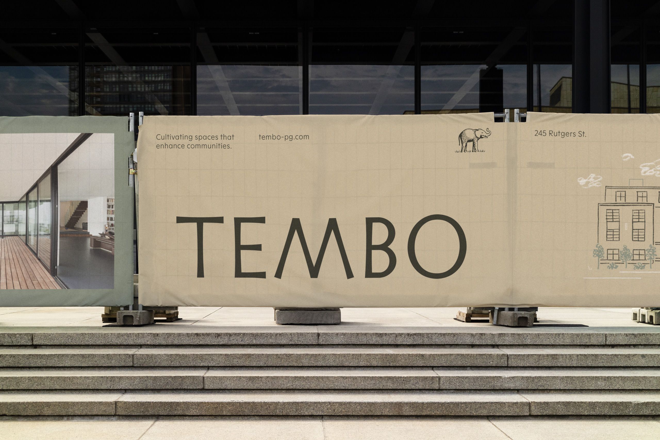
I’ve been sharing an opinion on the work of Perky Bros for almost ten years. It’s an odd feeling to write this. Like growing alongside but not really knowing one another. There’s an impression of the studio, a sense of what they’re like and how they might work, something of their principles and interests, but it’s just outside speculation. Perky Bros have always seemed to me to have been a very deliberate studio, interested in the material details as much as practical considerations of system and the behavioural concerns of motion. You can see it in their work for Bedroc (reviewed Jan. 2013) and Woodland Wine Merchant (reviewed Jan. 2015). They have a tempo that is their own. Tembo appears as a project ideally-suited to Perky Bros. And the logo set this all up nicely, the slow purposeful steps of a ‘tembo’, Swahili for elephant, a nod to the South African origins of the company.
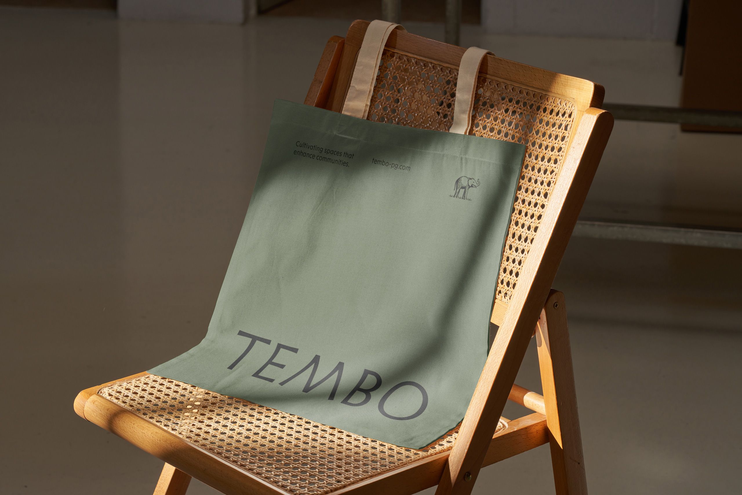
The elephant is realised, not through rationalised geometry, but using the careful strokes of a pen. With this approach, the elephant takes on a story-book-like form, borrowing and transposing the associations of community and family. An animal of this size, treads carefully and purposefully, and the illustration really support this and the mission of Tempo, who speaks of legacy and stewards over the buildings they develop.
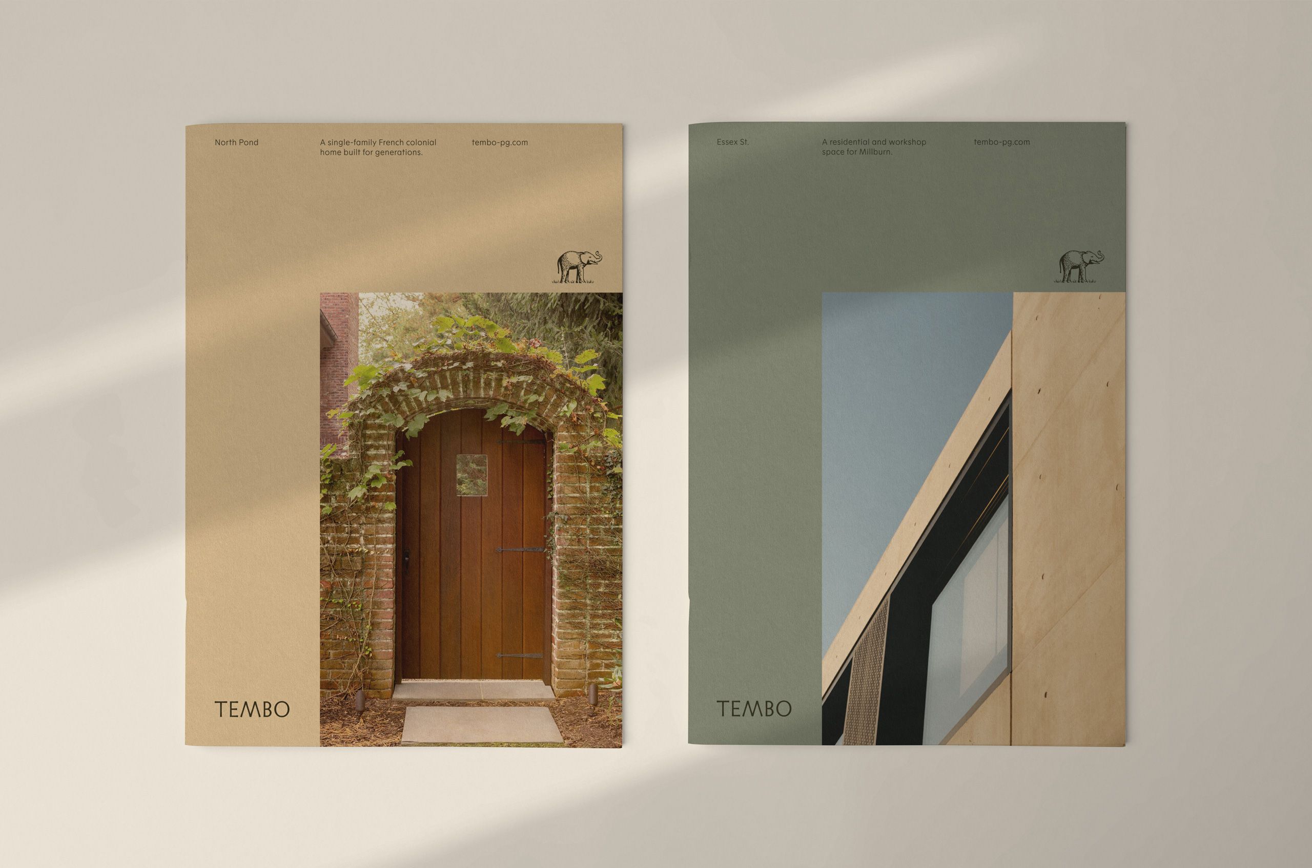
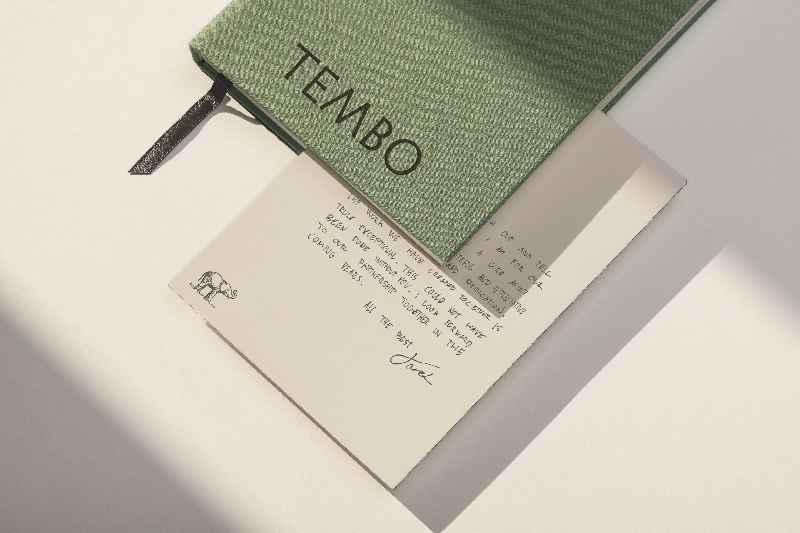
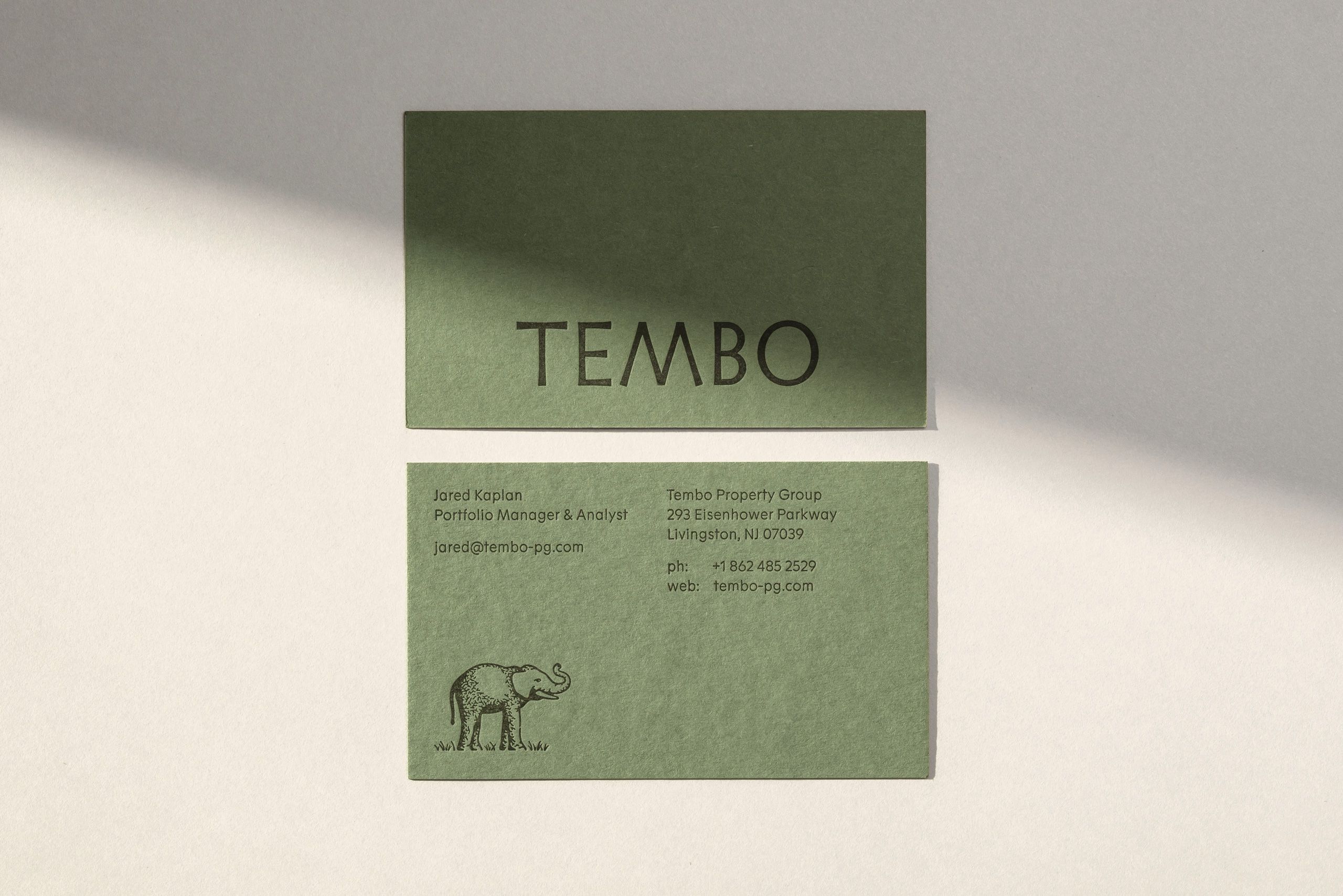
There is a sense that, no matter how long it may take to design and develop a website, or any digital experience for that matter, the impression given when using either is one of immediacy. Information is instantaneous. When done well the digital experience appears an effortless and seamless creation. Conversely, the material contains within it something slower and perceptibly deliberate. The deep impression of a metal die, the pigmentation of paper, the gloss of a foil, or the tactility of an uncoated surface. Craft takes time and appears quite visibly on the surface, it is felt. Perky Bros know this, and have embedded this perceptible slowness into the material elements of the Tembo brand through material choices and finishes. Even the shadows cast across the case study images belie the temporality inherent to the project.
There’s a quietness to the art direction. It focuses in a cropped detail. By avoiding the imagined ‘bustle’ often ‘depicted’ in corporate property developments renders, the effect is a sense of stillness, surly a more appealing quality than a fabricated future concerned with projecting (but not building for) a diverse community.

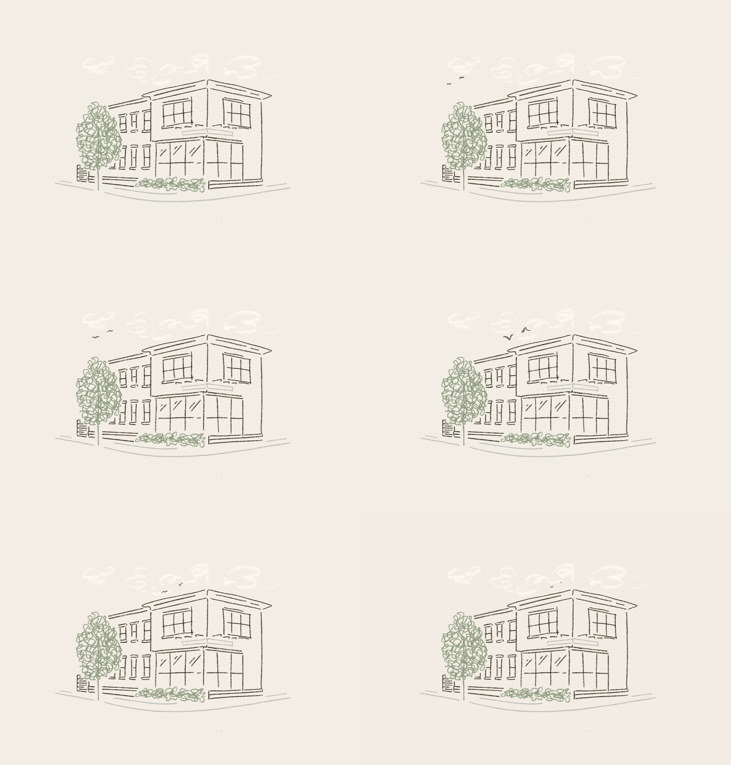
Like many studios over the last ten years, Perky Bros have had to accommodate an increasing requirement, imposed by the priority of an online experience, to introduce motion elements. The online world has a perceptibly high tempo, dictated by the attention economy. However, just like music, there’s a lot of room for communication within motion. Behaviours, pacing, the relationship between that which is in motion and that which is static. Here, illustrated properties with small motion elements produce situations in which to play with time. The passing of clouds, birds and the swaying of plants, these sit comfortably within the dynamic expectations of a digital experience and the general narrative concept. It’s not much, but it’s enough.
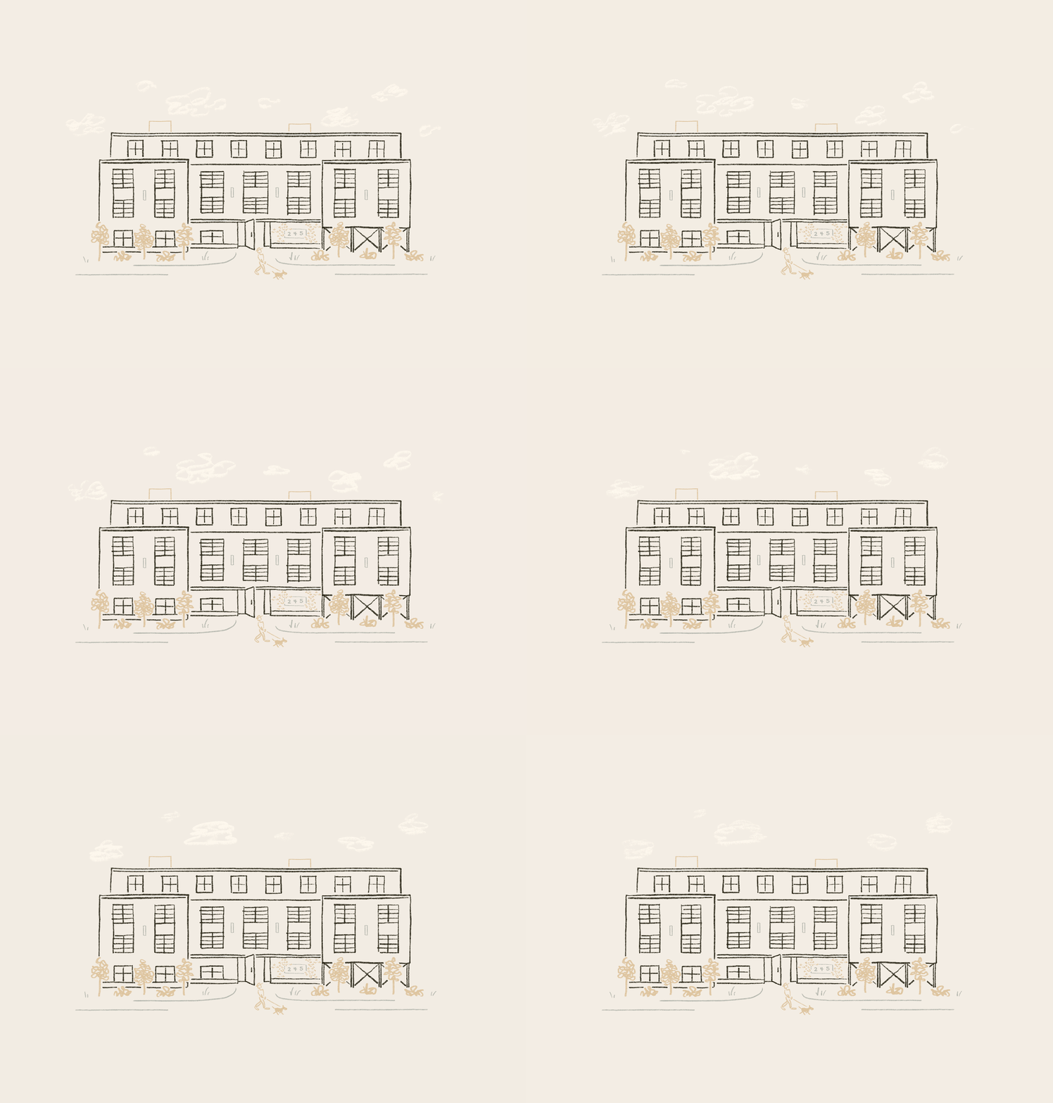
The illustrations are well-realised. Existing somewhere between the architectural and giving an impression; the scenic and the technical. They’re disarming and welcoming. Their consistent illustrative style suggests there’s a story and a point of view but suggested, rather than them being purely informational. This also extends to type which has the structure and geometry you might expect from the property development or architectural space, yet, the serifs, somewhat ground this in the tradition and craft of the stone carving, a wasting technique. While perhaps not explicitly understood by the reader, the choice feels deliberate and careful in its creation and used to develop a lovely set of icons.

Much of Perky Bros work is consistent, not stylistically static, but always thoughtful and constructed from a few carefully chosen elements that tell a story. These are well-weighted, and the effect is a warm and inviting. The material plays a small but valuable roll in supporting the story, even if this is subtle and inferred.
