Goldmine Gummies by Robot Food
Opinion by Emily Gosling Posted 16 May 2023
While cannabis products still make up a sector overmuch in its infancy, it’s one that’s already birthed its fair share of design cliches – from Camden Market-leaning leaf designs to ‘millennial pink’ trendiness to branding that owes way too much to adjacent sectors, like D2C beauty products or ultra-minimal pharmaceuticals.
This recent work from Robot Food, however, manages to demonstrate a brilliantly refreshing take on cannabis branding, straddling the line between playfulness and premium quality; and nostalgia and no-nonsense clarity on exactly what the product does, and what’s in it.
California-based cannabis gummies range Goldmine Gummies launched earlier this year, and the success of Robot Food’s designs for the range are clear: Goldmine is already in the top 20 gummies out of 250 in the state, and the company’s founder says he expects it to break into the top ten this year.
Robot Food was appointed to the project in 2022 by parent company Breez, and was tasked with making the range stand out in an increasingly competitive marketplace. It worked on the project over a period of six months, navigating an eight-hour time difference to collaborate with the Goldmine team.
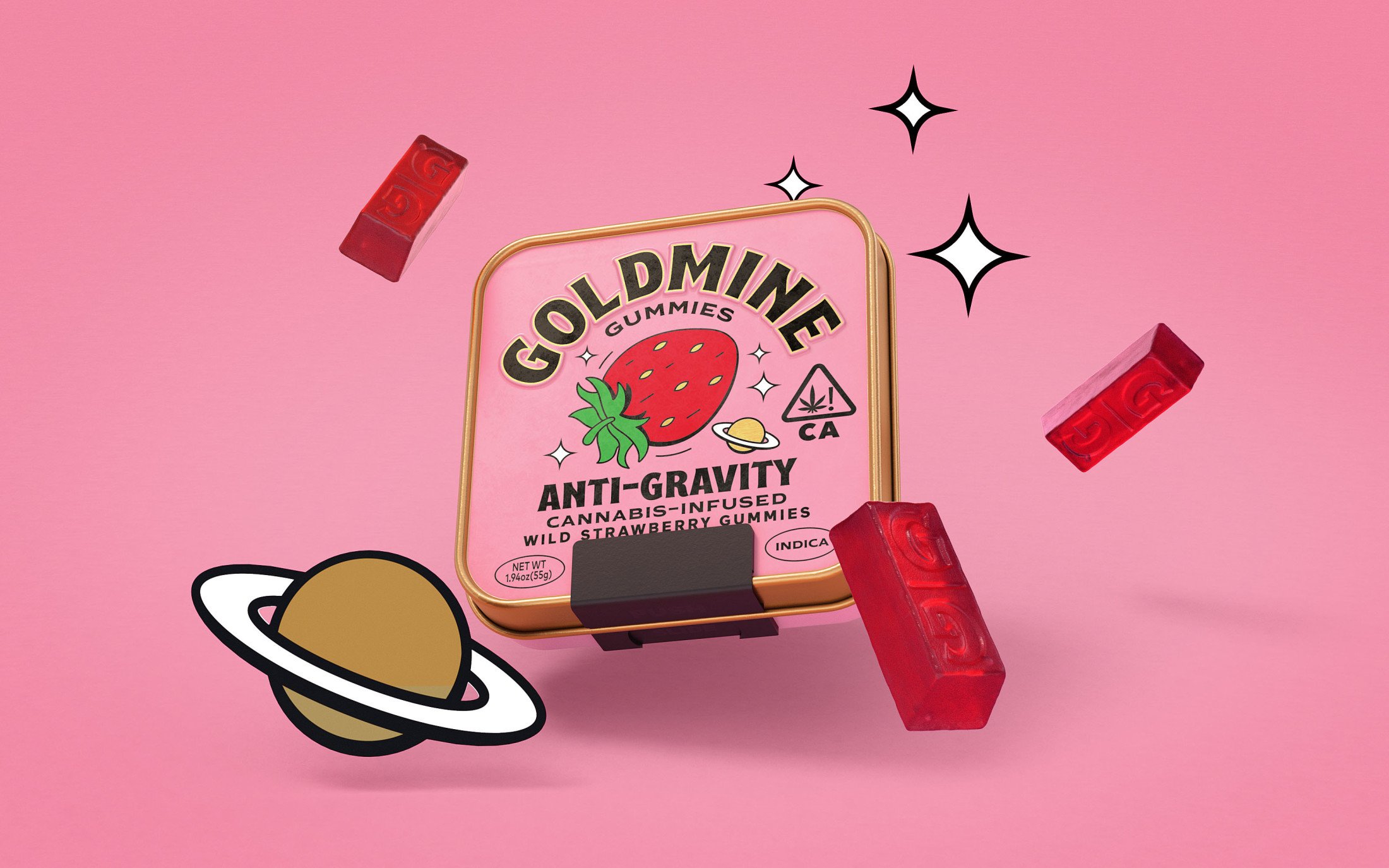
There are ten products in total in the Goldmine Gummies range. Five flavour variants each feature a targeted cannabis formula with different benefits such as sleep, pain relief, and creative energy. These include ‘Slumberjack’ Huckleberry Pie (with CBN for sleep), and ‘Anti-Gravity’ Wild Strawberry (with Indica for relaxation).
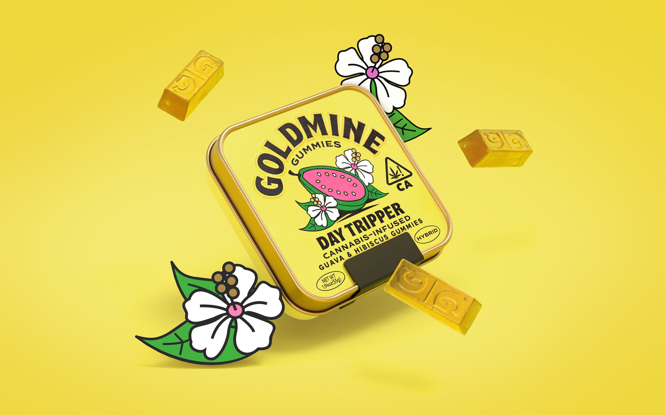
The project began with a deep dive into the cannabis category where Robot Food found that many competitor brands looked dated or niche; many others didn’t make it very clear what usages the products were intended for or what their unique benefits were.
According to Austin Hice, CEO of Goldmine Gummies’ parent company Breez, the attitude in California when the idea for the product was born (‘in the early days of the Government response to COVID with everyone on lockdown, local businesses shuttering, riots around our facilities’) was that ‘nobody needs another gummy and the winners already won.’ As such, Goldmine Gummies had to be ‘something so special that it breaks through the noise’. The brief, therefore, was to ‘spark joy’ for cannabis fans.
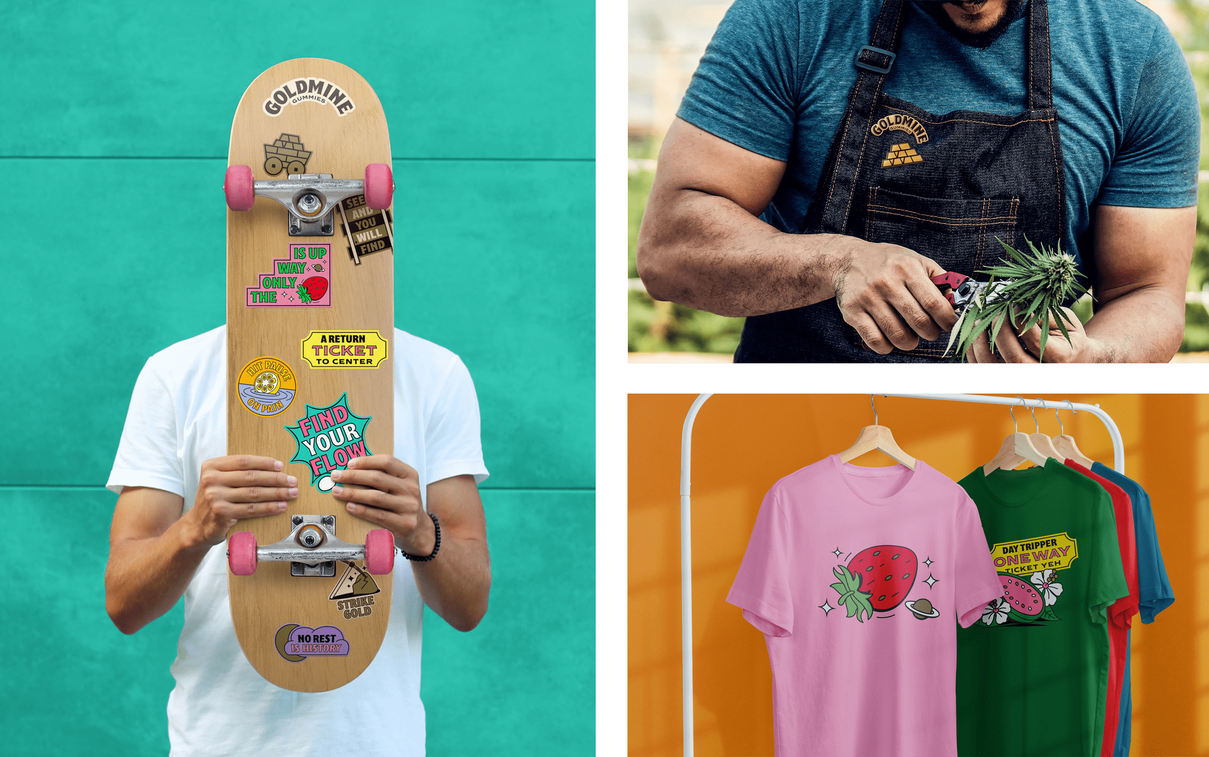
This idea of ‘joy’ is conveyed beautifully with Robot Food’s illustration-led, vibrantly colourful designs. A key challenge was marrying that playful look and feel with designs that concurrently conveyed the premium quality of the products. Traditional ‘luxury’ cues wouldn’t have been a good fit; so much of the quality aspect of the product is conveyed through subtle touches to the structural design of the packaging.
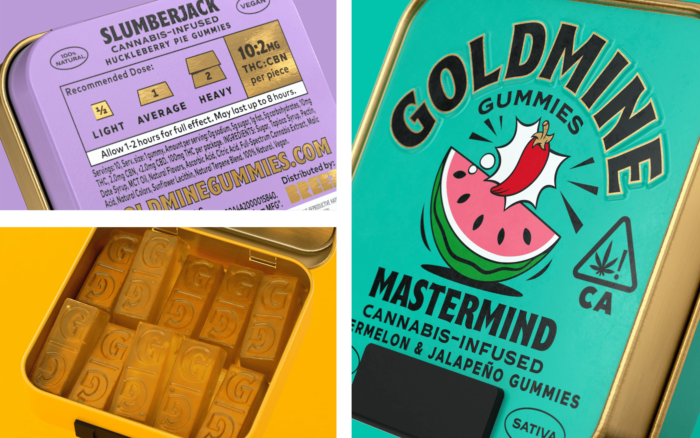
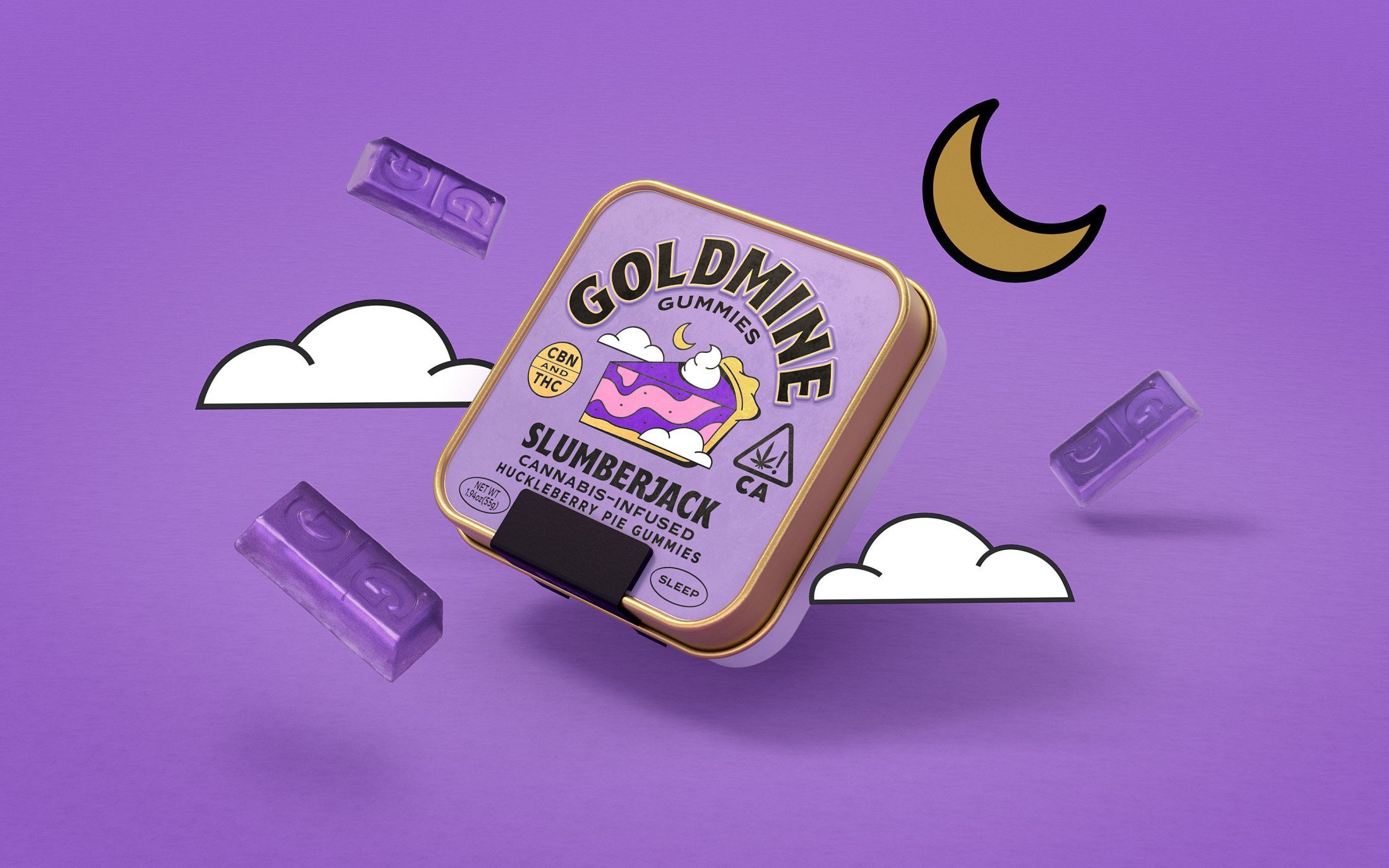
Goldmine Gummies are sold in tin boxes with a unique patented child resistant lock; while details such as gold edging and an embossed wordmark subtly underscore the premium feel of the range. The tactility of the packs plays into Robot Food’s aim to make the tins reusable – ‘cool things to have around, like collectibles,’ as Jess Cook, Robot Food client director, puts it. That idea of a nice-to-have object ties into the overall sense of abstract nostalgia that the Goldmine Gummies look and feel portrays.
The designs use illustrations created in house by Robot Food design director Chris Shuttleworth which serve a dual purpose: on the one hand, they create a brilliantly fun set of versatile icons that are totally ownable to Goldmine and which stand out on shelf; while on the other, they help with a key facet of the designs – to communicate clearly and precisely exactly what each variant is and does in a way that’s accessible and instantly legible.
‘We wanted it to feel like Disneyland for adults’, says Shuttleworth. ‘We tapped into the nostalgia of brands we grew up with and loved as kids and reinvented them to suit adults today, encouraging people to find their Goldmine – whatever that means to them.’
A big challenge with this approach was maintaining a fun and lively vibe without looking like a confectionary brand, targeted at children. Robot Food avoid this with a mature and abstract approach that veers away from conventional character design.
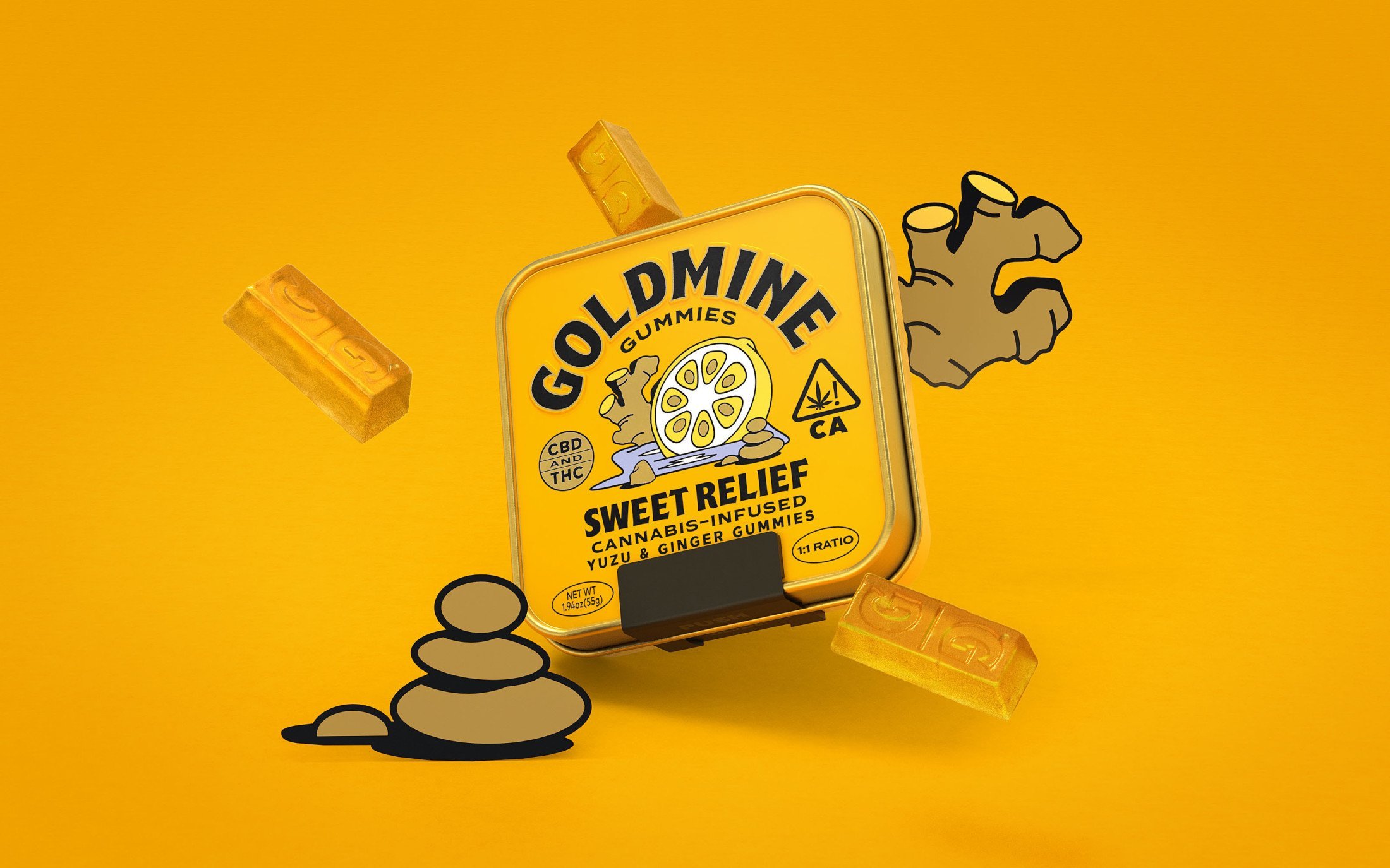
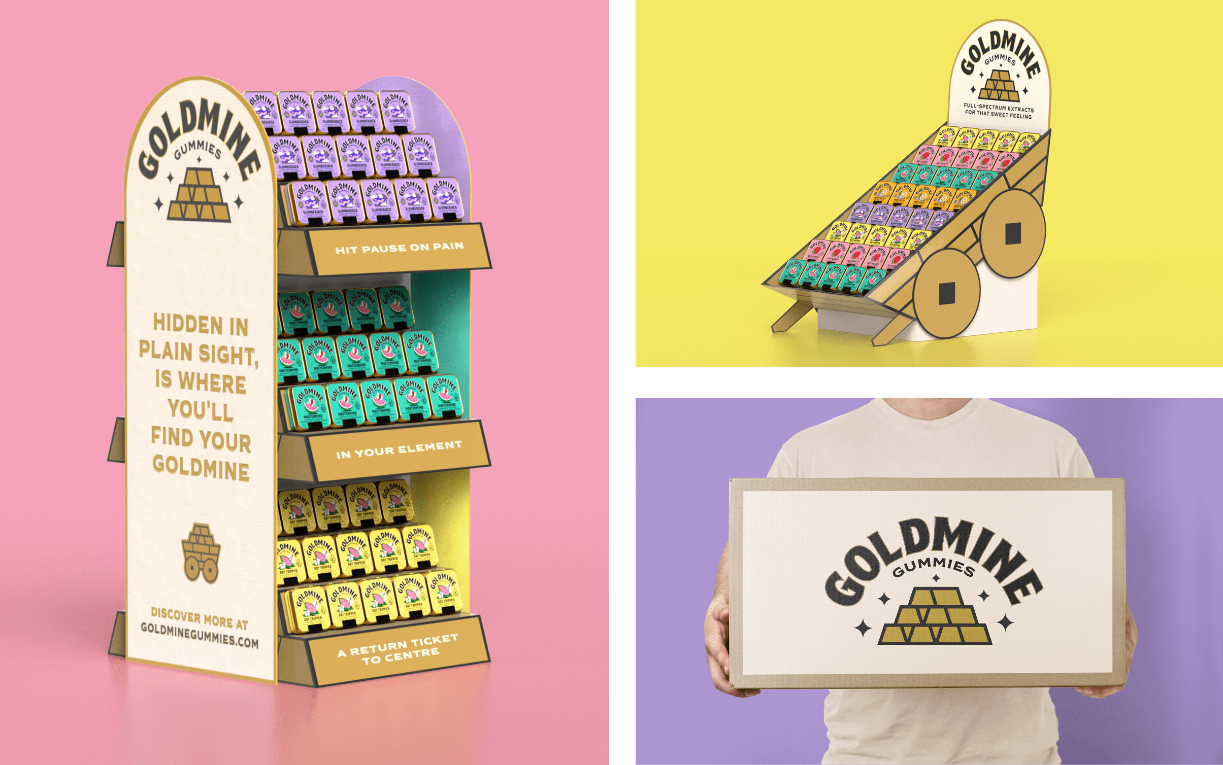
Illustrations on-pack denote the individual products’ flavour cues; while concise graphic and copy-based language and an optimistic tone of voice instantly convey what the key ingredients are and the intended usage and benefits.
The branding is shown across all Goldmine Gummies packaging, as well as on touch points such as in store displays that were largely inspired by the world of cosmetics. Robot Food also worked with fellow Leeds-based creative studio Hungry Sandwich Club to create Goldmine Gummies’ website; which further brings the brand’s sense of high-quality irreverence to life.
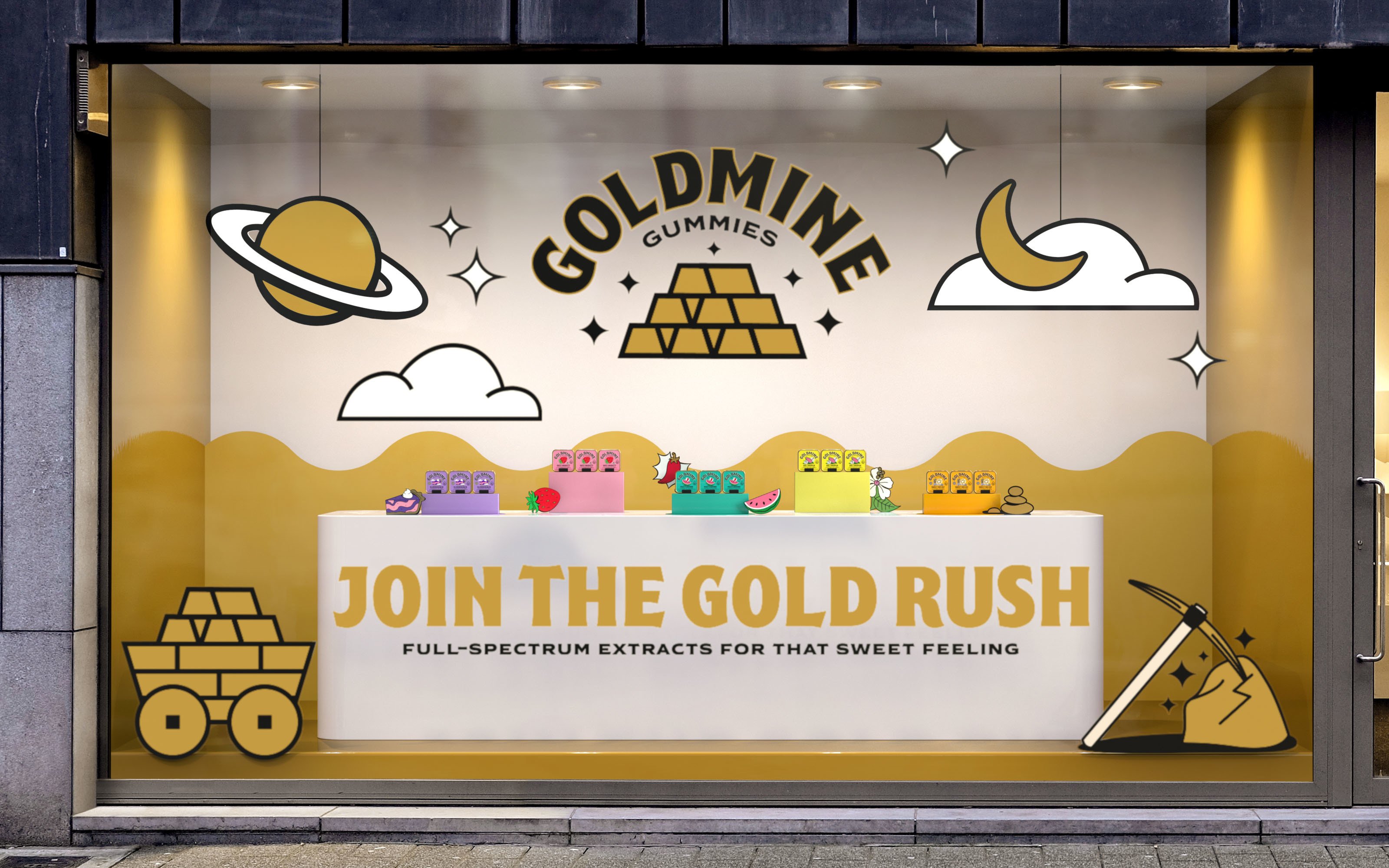
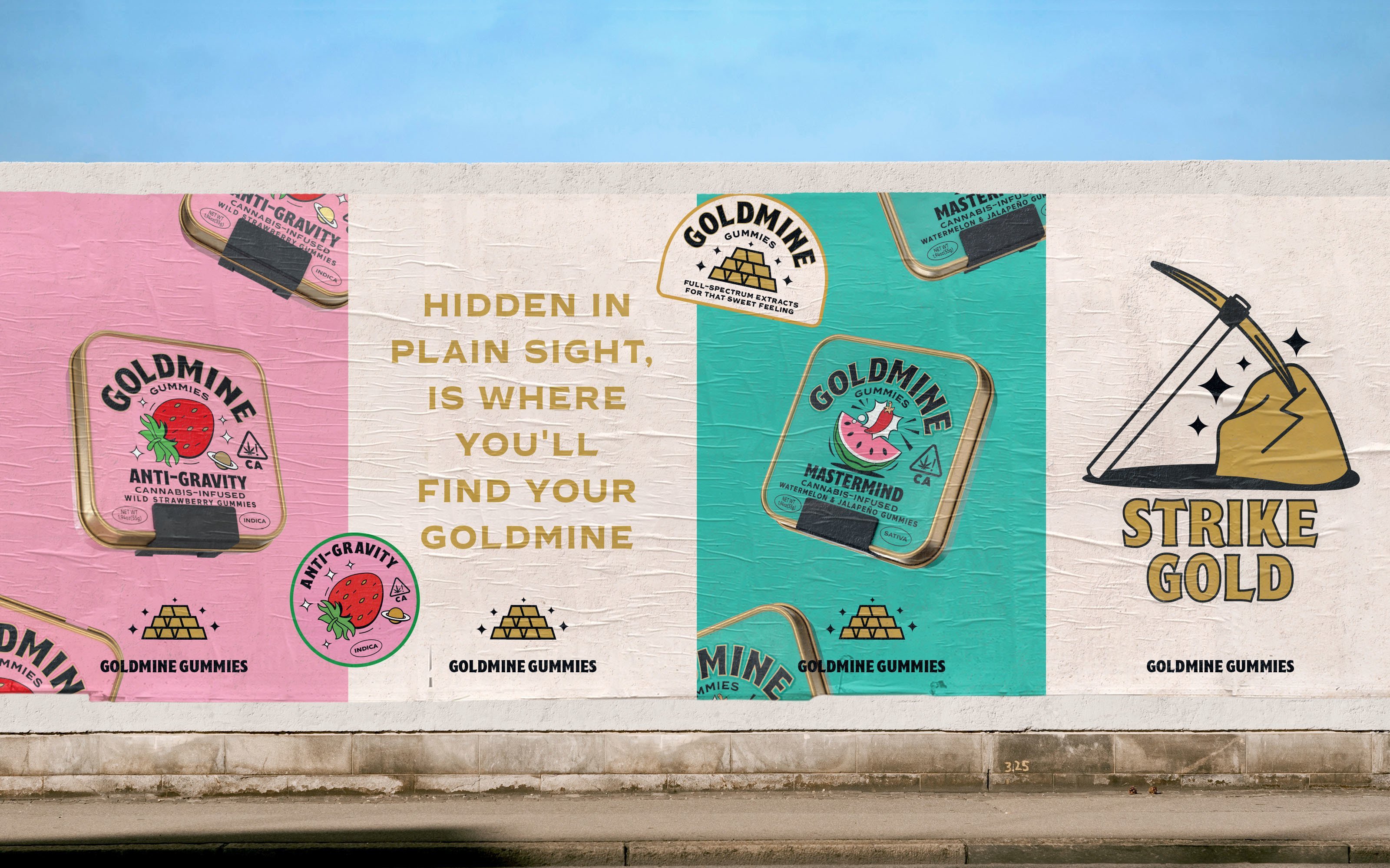
Overall, this is a bold, fun, but very much functional visual language that manages to skew just the right side of ‘18 years and over.’ By mining the idea of nostalgia, and filtering it through a new lens, Robot Food has created a playful narrative that runs through the brand, creating intrigue and conveying a sense of the escapism the product can offer.
