INAX by PAOS, 1984
Written by Richard Baird Posted 6 July 2023
A guest article from Logo Histories, a weekly Substack newsletter from the team behind BP&O. Each week, Logo Histories shares the context, concepts and considerations behind some of the most interesting logos and corporate identity design programmes of the past. Read about FHK Henrion’s work for BEA, Yusaku Kamekura’s proposal for Shell and Paul Rand’s work for Westinghouse. Discover these and a 100+ more here.
The early 1900s saw an increase in foreign visitors to Japan. Seizing the opportunity, the Imperial Hotel commissioned Frank Lloyd Wright to design a striking new building in Tokyo. His design required the moulding and specialist firing of unique terracotta tiles. To handle this project, a factory was established in the city of Tokoname, and Hatsunojo Ina and son Chozaburo were given the roles of technical advisors. When the hotel was completed in 1924, the duo took on the workers and equipment to establish Ina Seito Co., which continued producing tiles for the Japanese market.
Over the following decades, the company grew into an industry leader, and expanded into the sanitary market, manufacturing ceramic plumbing fixtures, wash basins and baths, as well as developing the Japanese ‘shower toilet’.
Ahead of the company’s 60th anniversary in 1984, president Teruzo Ina initiated the development of a new name and corporate identity. This would form part of a larger programme of renewal which would go on to include the creation of a fresh set of corporate principles known as ‘INAX5’, the launch of ‘XSITE’ a showroom concept and ‘XyLIFE’, a new bathroom-interior shop.
The scope of such a project, which included naming, strategy, divisional identities and three dimensional design, required vast cross-disciplinary expertise. PAOS, known for building specialist teams for each of their corporate identity (CI) projects, was given the commission.

By the early 1980s Ina Seito Co., had established itself as a major sanitary brand, and was developing its global image, however, it was felt that its name no longer reflected its ambition.
To find a suitable alternative, over 37,000 ideas were put forward and screened nationally and internationally. From this expansive list the name ‘INAX’ was selected, and the goals of the corporate identity design were defined. These goals were to: respond to expansion and diversification; continue to raise awareness; build a corporate structure (and identity) that flexibly responds to changes in the social and market environment; and actively (rather than reactively) respond to continued internationalisation in the market.

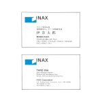
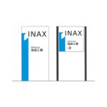
The new INAX logo was a product of these goals and the vast and growing contexts (due to expansion and diversification) in which it needed to operate across. These included indoor and outdoor signage, vehicle liveries (at the time an indispensable mobile advertising medium), ‘special work vehicles’ and an array of packaging formats.
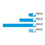
The solution put forward by PAOS, which was selected from a three designs, was a dynamic ‘I’, that responded to the need for flexibility.
The use of positive and negative space and acute angle, which gave the impression of the I lifting from the surface, reflected the spatial nature of the bathroom. This logo became known as the ‘space symbol’ and represented INAX’s efforts to advance aesthetic, environmental and spatial design. Further, it was created to give the feeling of ‘expansive space’ and expansion into the future.

The logo, as envisioned by PAOS and ‘pursuing the merits of standardisation’, would expand and contract along both the vertical and horizontal axis. This would accommodate different lengths of vehicles (from cars to trucks to lorries) and signage which covered the full width of the new show rooms, or the vertical height of shops.

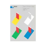
“Amenity Blue” was introduced alongside white and black. This symbolised intelligence, technical accuracy, cleanliness, sincerity, friendliness and a bright future. In promotional use-cases such as brochures, shopping bags and wrapping paper, a more colourful palette was introduced to catch the eye.
In its wide and consistent application, the combined effect of the new corporate identity was that the INAX ‘posture’ was that of a market challenger, and as a way of stressing the official status of the new name.

In 2011 INAX merged with Tostem and a number of other companies to form the Lixil Group. INAX became a subsidiary that then oversaw the group’s development of toilets and plumbing products. The logo continued to be used by the subsidiary in a more compact and modified form, but without much of the dynamic character and flexibility imagined by PAOS. More recently, the symbol was removed entirely, leaving only the letters.
Logo Histories is a weekly Substack newsletter. To instantly access an archive of over 100 Logo Histories, just like this one, and receive weekly stories straight to your inbox, subscribe here.


