Curve Club by Wildish & Co.
Opinion by Emily Gosling Posted 11 July 2023

For a type-nerd (hello!) there are few things more seductive than a beautiful, beguiling letterform. But what makes such shapes even more siren-like is when they leap off the page and come to life, not just in motion, digitally; but in a physical environment. The branding for new private members club Curve Club, then, certainly ticks a lot of boxes for the sort of people that wouldn’t think twice about using ‘phwoar’ as a reaction to a particularly charming piece of font-craft.
London-based creative agency Wildish & Co. is behind the branding for Curve Club, which bills itself as a luxurious clubhouse ‘for people busy turning their dreams into reality’, a place for founders, where digital technologies, physical materials and living things meet. Based in Shoreditch, east London, Curve Club was founded by a fully female team including CEO Rosie Dallas, co-founder of rental platform Fat Llama.

According to Wildish & Co. founder Sam Fresco, ‘Curve Club thinks about tech in the most romantic sense – as a means to connect with one another.’ The agency was briefed to create branding focusing on the idea ‘physical meets digital’. The club itself marries these two worlds through things like NFT artworks and a members-only community-based app, and the look and feel had to also straddle both spaces.

The Curve Club name was already in place, and it’s obvious how much the moniker informed the look and feel; which goes hard on all things curvaceous when it comes to the brand typography, wordmark, bespoke icons, and the interior flourishes directly drawn from the 2D visual identity. Likewise, the animations and digital touchpoints further enhance the sense of fluidity; as shapes pour themselves into one another. It’s a little like watching a very chic, very 21st century version of a lava lamp – both in motion, and somehow, when static.
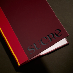
The Curve Club logo uses an all-uppercase, lightly customised version of Taklobo Display by French font foundry Blaze Type, which feels like the perfect fit thanks to the way the letterforms resemble a moving, living, dynamic thing. For Fresco, ‘It perfectly encapsulates the timeless nature of Curve Club – futuristic, yet nostalgic.’ Continuing the idea of retro modernism, headline and body copy uses neat, thoroughly legible Futura Std Light as a contrast to the outré, decadent forms of Taklobo.
Aside from the type, what makes this project stand out is the scope of the branding: rather than existing on all the usual touchpoints (posters, billboards, social, stationery, et al), it manifests in a very literal physical way. The interiors of the club itself are peppered with 3D shapes taken from abstracted versions of certain elements of the Curve Club wordmark. It feels refreshingly non-gimmicky: neither furniture nor pure decoration, it’s an exemplary take on branding that truly exists spatially, as well as in print and digital.


If 2023 is the year of the resurgence of the gradient – which, so far, it certainly seems to be – then the way Curve Club’s branding uses colour loudly chimes with the zeitgeist. Gradients are one of those graphic design trends that rapidly fall in and out of favour: as soon as they’re hip, they’re decried as laughably dated and cheesy. But it seems that they’re very much back, especially in the tech space, as evidenced by Pentagram’s recent work for AI platform Cohere; Channel 4’s reworked identity; Templo’s identity for the 2023 Venice Biennale, and more.
The Curve Club brand colours use gradient pairings of eight different shades of green; pink; purple and blue chosen for their nods to more natural organic tones. Wildish & Co. has said that a key element of the branding was to evoke a sense of the natural in the curves and lines of the patterning: this doesn’t necessarily come across, but arguably it doesn’t need to since the whole fluidity/moving between spaces concept is so strong.

For Curve Club, gradients feel fitting, rather than faddy: the sense of motion and shifting between realms or spaces would make stark, block colours feel out of place or counterintuitive; and if gradients work for anything, it’s for brands looking to marry future-gazing ambition with a twinge of retro-past.
![]()
What with the cost-of-living crisis, widespread redundancies at digital-based brands like Vice and Headspace, and various other swathes of somewhat gloomy news; it’s a weird time to be thinking about private members clubs – and interesting, if perhaps obvious, that there’s still seemingly a burgeoning market for those catering to ‘founders’. Curve Club’s branding works in that it avoids the obvious ‘luxe’ tropes, which would feel especially gauche in economically dicey times. It’s playful but professional; experimental but practical. Thankfully, it looks nothing like what we’d expect from the cliches of ‘tech’ or ‘startups’, and it’ll be interesting to see how both the branding and the club itself (which plans to launch another branch in London’s Soho later this year) stand the test of time.