Partech by Koto
Opinion by Emily Gosling Posted 26 September 2023

Certain sectors lend themselves beautifully to innovative, eye-catching design – things like craft beer, perhaps; or beauty; or small-run editorial publications. Investment firms aren’t traditionally among those sectors that engender more outre, bold design work.
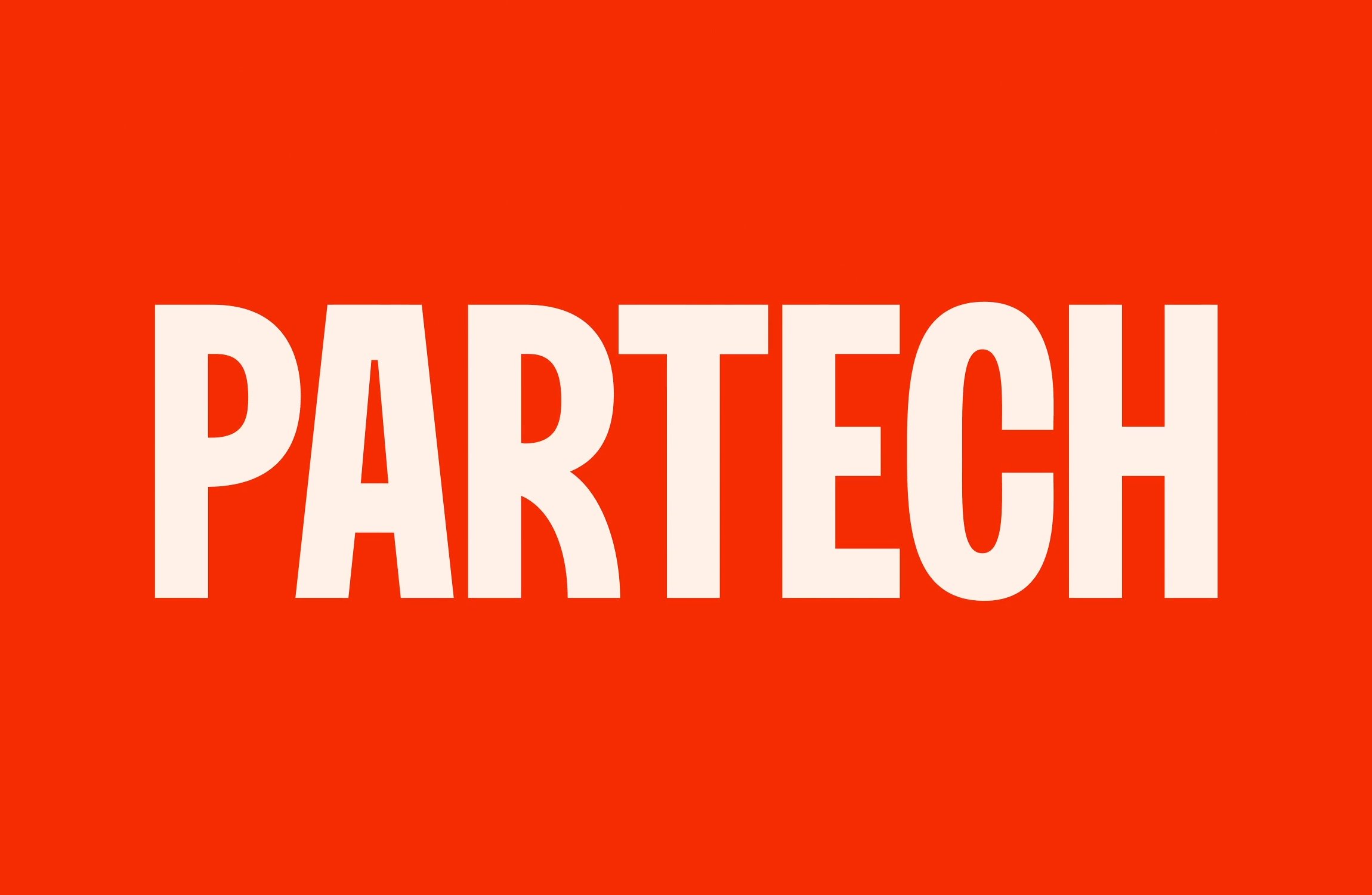
And that’s partly the reason that this work for Partech, a global tech investment firm headquartered in Paris, stands out. Created by brand and digital agency Koto, Partech’s new visual identity is inspired by the world of cinema and firmly sets itself apart in a ‘world where all VCs look and sound the same’.
The agency strived to use an ‘Oscar-worthy approach’ to showcasing the stories of Partech’s founders, and the new designs across the company’s visual identity and website look to position Partech as ‘stalwart storyteller’, standing firmly by the side of their founding teams throughout the highs and lows of the entrepreneur’s journey.
Partech was founded in Silicon Valley more than three decades ago and now has offices across San Francisco, Paris, Berlin, and Dakar. The new branding and tone of voice look to pitch Partech as the ‘reliable narrator’, while also underscoring the idea of storytelling ‘with every investment telling a compelling and captivating story’.
Admittedly, the idea of investments telling any sort of story aside from those in the financial pages – let alone a ‘compelling and captivating one’ does feel like a bit of a stretch. As does the inspiration for much of the design work, cinema, or more specifically, the cinema of the Nouvelle Vague or French New Wave. In simple terms, Nouvelle Vague cinema originated in the 1950s, and looked to take filmmaking in more experimental, radical direction that went against the grain of cinematic tradition. There’s only so far you can take a comparison between such a movement, and the world of investments, but kudos to Koto for giving it a go.
For all that skepticism, though, the new designs do look good – and crucially, give Partech a boldness and clarity that’s surely vital for such a client and its web presence. This boldness largely comes from the use of typography, as well as the use of a vibrant red as the primary brand colour.
The new Partech logotype uses FK Screamer Bold by Czech foundry Florian Karsten Typefaces, which also appears as a headline font across the branding. It’s a nice choice: no nonsense, but slightly playful; punchy but not too shouty, with a subtle softness to some of the letters. Koto says that the font choice was once again inspired by French cinema, drawing on the lettering styles used in title sequences (you can see what they mean in those for Jean Luc Godard’s Bande à Part); as well as paying homage to French cinema, sign-writing, and book covers.
Elsewhere on the Partech website, FK Screamer is supported by a secondary typeface that creates a good contrast, the calligraphy inspired but contemporary feeling serif font Lora by Cyreal.
Koto created a new brand mark in the form of a pilcrow (¶), a lesser-used typographic character also known as the paragraph mark, paraph, or blind P and which denotes the start of a new paragraph. The agency also created a library of original portraiture for the brand in a uniform, editorial-inspired style characterised by high-contrast lighting and dramatic shadows.
The deliberately hand-wrought feel of 60s cinema seems a far cry from the use of modern-day AI technology, but Koto has united these rather disparate worlds in making Partech’s communications assets. They claim that it’s all because of their shared experimental, innovative techniques, but again, that feels like a push. Flimsy associations aside, though, using generative AI and creating a set of prompts to pass to the client is a good idea when it comes to handing over the tools to the company’s internal team to scale the brand in future, all in line with its new identity.
While I’ll still take some convincing that compelling stories and investment firms go hand in hand – and I stand firm on a belief that comparisons to French New Wave cinema can only go so far – Koto has proven that smart, impactful and conceptually driven work needn’t be reserved for only the ‘fun’ clients. It takes a lot to liven up something as complex and potentially dry as investment, but this project shows that thinking outside of the usual constraints of tech and finance and being a little bit daring can certainly liven up the sort of projects that many agencies would shy away from using as standout ‘portfolio pieces’.


