Marshmallow by Ragged Edge
Opinion by Thomas Barnett Posted 19 October 2023
A marshmallow is sweet, soft, pliable. Yet they are also resilient and surprisingly strong – who among us hasn’t enjoyed watching them perform surprisingly well under a hydraulic press compared to substances that much more obviously scream ‘structural integrity’? Perhaps this soft-yet-strong dynamic is why the name works for an insurance company. Or perhaps, more simply, the name works because it is a fact universally acknowledged that (hot take): marshmallows are nice. It is a fact equally universally acknowledged that insurance companies are not. ‘Marshmallow’ is also a quaintly derogatory term for a pushover, so perhaps the name is designed to evoke an insurance company coyly rolling onto its back and inviting you to rub its belly: ‘we’re harmless, no claws, honest’.
Concealed claws or not, Marshmallow has made its name through the laudable innovation of offering insurance tailored for migrants, a strategy that has helped it to attain coveted ‘unicorn’ status in the UK fintech scene. Its founders, Alexander and Oliver Kent-Braham, say that the company was born when they discovered ‘how unfair insurance prices are for people who move to the UK… purely because the industry hasn’t given this huge cohort of people a second thought, and isn’t set up to price them properly.’ Unlike most mainstream providers, Marshmallow can offer affordable insurance to migrants by taking into account their international financial histories. This is an undeniably good thing, so perhaps this is a sweet name for a truly sweet business.
Looking to the future, the company also notes that ‘there are millions of other marginalised customers out there who find themselves on a different path – either by choice or circumstance’, and with this rebrand Marshmallow is poised to branch into accommodating young people and other demographics poorly catered to by mainstream insurance providers.
Ragged Edge’s fresh new rebrand positions Marshmallow to capture these new audiences.
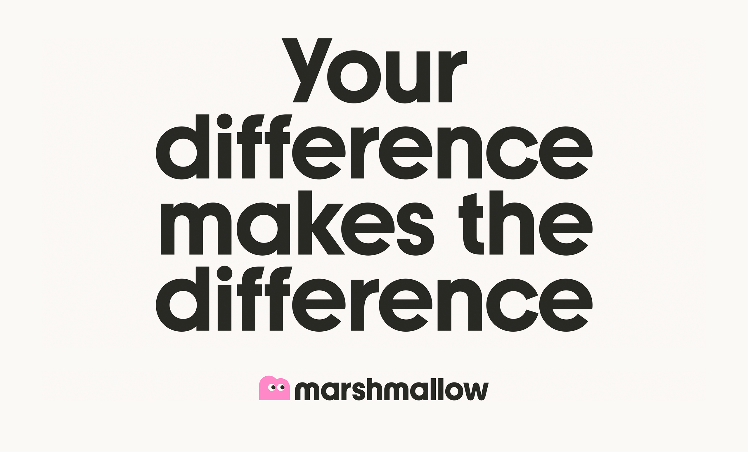
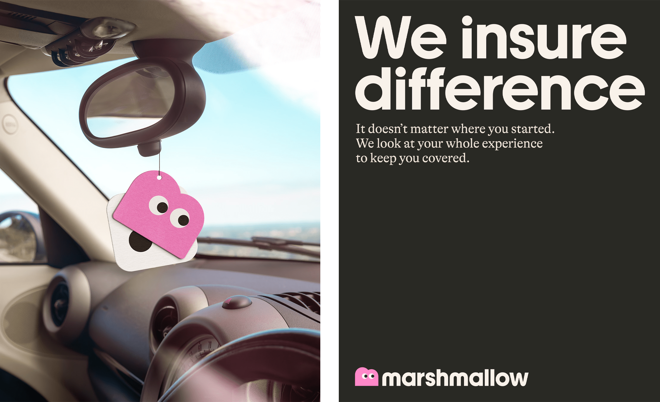
As the studio states in its case study, the mission was ‘to build a brand that speaks to a diverse range of audiences from across the globe. One that stands apart in an industry that embraces average. And makes people feel seen in a category they mostly avoid’. This aim is summarised in the ingenious tagline: Marshmallow is ‘a brand that insures difference’ – a line that should be front and centre on Marshmallow’s website, but is nowhere to be found.
Marshmallow’s previous branding by Output was a decent but rather sparse, conventional affair. As a younger (and perhaps more cautious) startup, the work seemed designed to temper Marshmallow’s radical mission statement rather than accentuate it; and while it did capture some of the light, airy associations of the name it didn’t evoke much else. Whereas the old brand was an absence, Ragged Edge’s work is all about squidgy, squashy, satisfying substance.
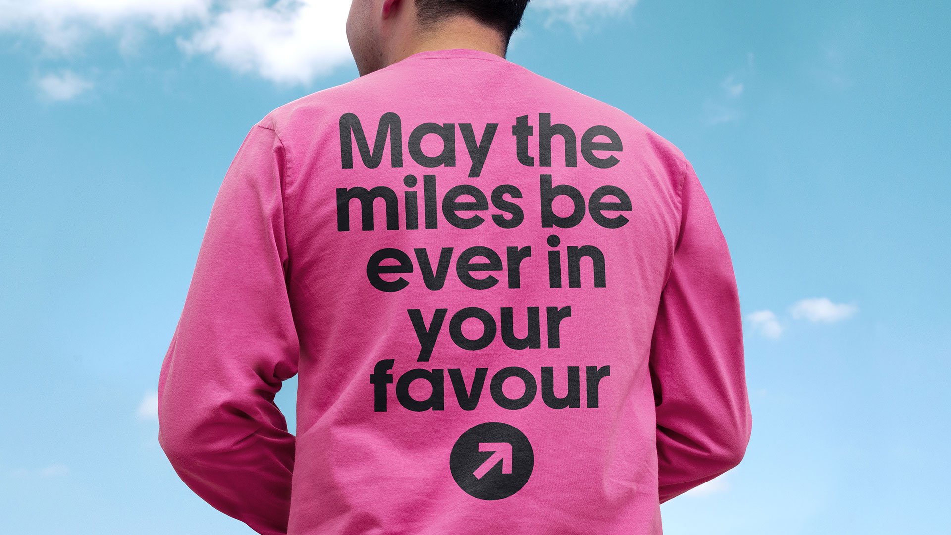
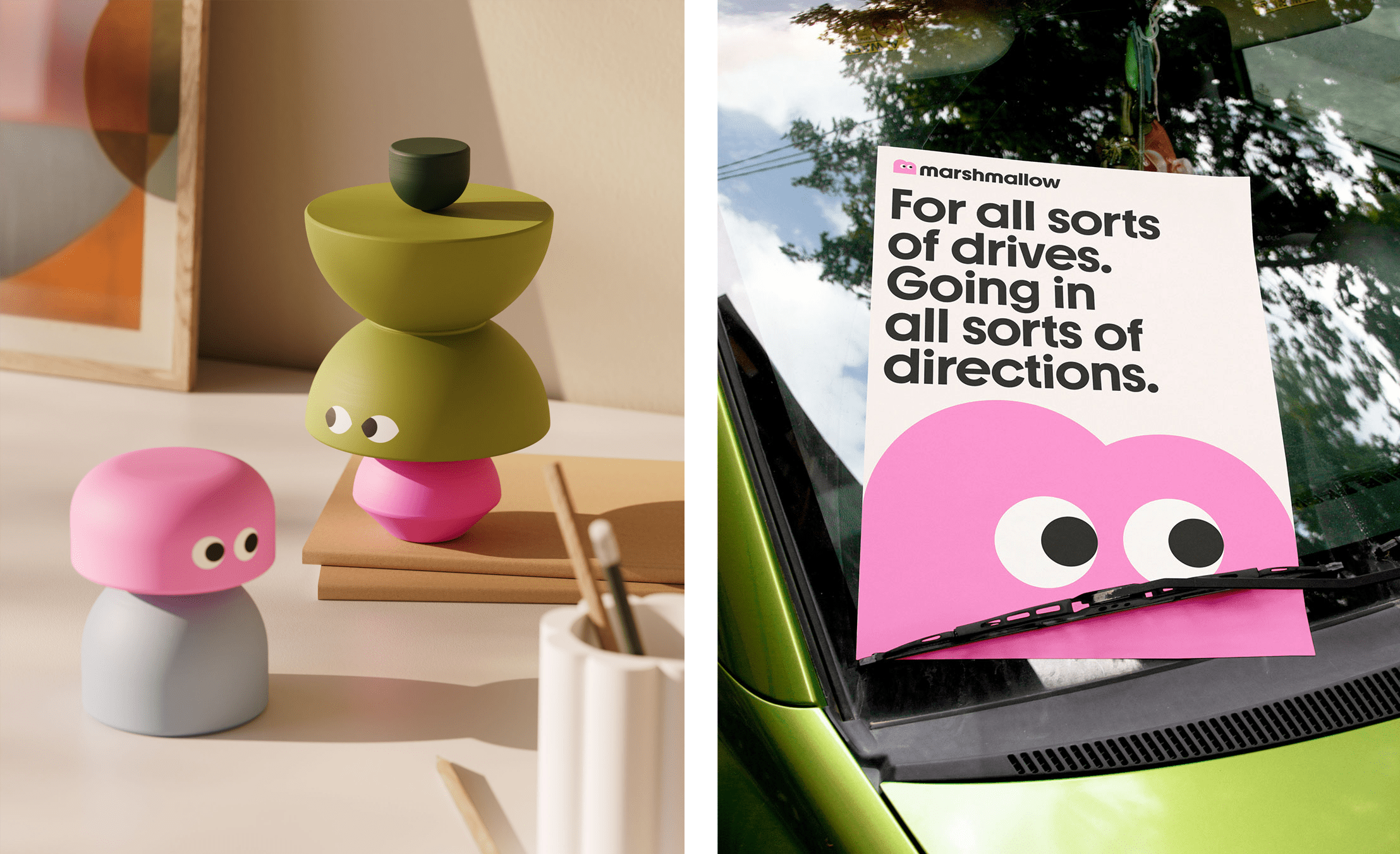
The new logo is a welcome simplification of Output’s earlier work, which tried to conjure the formal qualities of marshmallows with some not-quite-right inktraps designed to mimic pillowy folds and creases. This new iteration does a much better job, deploying a perfectly weighted lowercase geometric sans-serif wordmark, locked up with a googly-eyed, candy-pink, ‘m’-shaped mascot. This adorable little fellow is Marshall (please, Mr. Mallow was his father). Marshall is very cute, and the wide range of different applications in which he appears throughout the brand proves he is remarkably versatile (though frankly he does look more than a little like a bottom, thanks to that callipygean ‘m’ shape).

The logotype has been expanded into a full customised brand typeface (‘Marshmallow Youth’) with a marvellously propulsive rhythm – in certain typographic applications this squidgy dynamism almost makes it feel italic, even though it isn’t. The typeface features lovely quirky details like the wiggly ‘w’ and rounded corners of the uppercase ‘G’. In these rounded shoulders, apexes and vertices the lettering feels soft and jelly-like, but is balanced by the use of squared-off terminals. There are hints of a gently retro 70s vibe that are further enhanced when the custom typeface is paired with secondary font GT Alpina, an expressive serif from Swiss foundry Grilli Type.
The hero brand colour is a quintessential bonbon pink. It is complemented by a mossy green, burnt orange, creamy off-white and mushroom mid grey. This retro palette supercharges the middle-of-the-road 70s vibe subtly evoked by the typography. If the typography coquettishly murmurs ‘groovy’ sotto-voce, the colour palette sings Rod Stewart’s entire discography at you while maintaining disconcertingly unbroken eye-contact. In a nice way.
Strategically, there is something very clever about conjuring this homogenised collective semi-false-memory of what the eternally mid-century world of ‘grown-ups’ looks like – to say with design what could never be explicitly said in writing: You too can be like those fantastical people from the ambiguously-defined olden-days who were able to afford things like car-insurance and mortgages. Those superbeings from the fabled and fading boom-times, who had lots of babies and always felt certain, settled, secure. While all of this exists as a deeply-buried substrata of meaning, the colour palette is also just a fun and well-balanced candy bag. Perhaps more liquorice allsorts than marshmallows, but it’s all sweet.
![]()
The canvases for that sumptuous seventies colour palette (and the structural building blocks of this brand) are a vast array of shapes both simple and composite. The forms are well considered; sometimes irregular (but always balanced), combining rounded and sharp corners, curved and rectilinear forms, and playing with asymmetry. While this is a well-executed example (that has clearly treated the elements with some care), it is a familiar approach – ‘quirky shapes stacked together like toy blocks’ has filtered so far into the mainstream that they are now presets on SquareSpace, Canva, and countless other off-the-shelf design tools.
However, Ragged Edge’s foray into this duplo-block world is substantially more successful – partly because the avatar/mascots created by the shapes are genuinely charming and cute. Perhaps it is because the constituent shapes are combined in an intentional way to create an inherent sense of dynamism; perhaps it is that more attention seems to have been paid to the emotional and expressive potential of these shapes: a character composed of stacked semi-circles has grumpy, lidded eyes that are the same shape; shapes that taper to a point have a springy motion; circles rock from side to side. Thus the entire character is shaped to express a specific idea, rather than just being a random, decorative assemblage of pretty forms with an expression slapped on as an afterthought. Marshmallow’s brand mascots make sense and are convincing expressions of a wide range of moods and behaviours: they will serve the brand well.
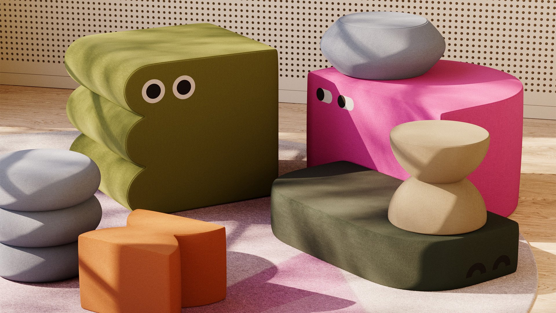
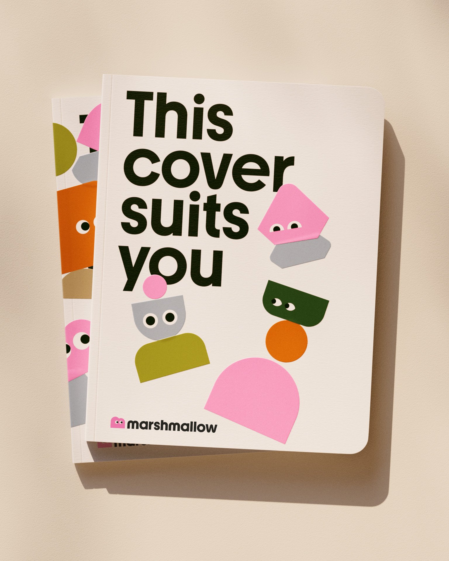
Ragged Edge have capitalised on these successful and equitable brand assets by developing them into some highly covetable brand collateral. Chief among these is a collection of beautifully sewn velvet bean-bags/plushies. I fervently hope that these are real objects, or that (if the case study image is just a very skillful 3D render) they get manufactured at some point in the very near future. If Ragged Edge or Marshmallow would like to send me one (or five) of these pieces of brand collateral to review in effusive detail, I would be happy to oblige. My address is [REDACTED BY EDITOR]. Branded notebooks with covers adorned with Marshall and pals in embossed print are also enticingly tactile. Again, if Ragged Edge or Marshmallow would like to send me one, my address is [STILL REDACTED BY EDITOR].
Typography, colour and graphics are very well suited to a UX environment. The mockups of the app look extremely accessible but still charismatic and distinctive. The website concept shown in the case study is very nice. It is not the one that is actually used by Marshmallow, which is more mundane. See BP&O’s recent review of Wisl by andstudio for a similar anticlimactic execution of a striking vision for a website (clients, why oh why do you insist on shoving these lovely brands into generic looking website templates?)
All in all, Ragged Edge’s work for Marshmallow manages to land that elusive sweet spot of being disruptive in a way that feels youthful, but doesn’t exclusively speak in the design vernacular of the very young – after all, young people don’t buy insurance. When you see it in context alongside the established major players you really see how radical this rebrand is for a particularly drab and unappetising industry sector. Ragged Edge’s work puts Marshmallow decisively ahead of its peers and more than matches the radical mission statement. There are no loose ends with this brand, everything ties together and nothing feels anomalous or incongruous. One does perhaps crave a few rogue details that playfully disrupt that neat and rigorous system, but there is more than enough to enjoy in this sweet but strong work. Marshmallow, anyone?