Pilo by 5.5
Opinion by Emily Gosling Posted 21 December 2023
Youth hostels aren’t exactly associated with luxury – nor great branding. For the most part, they’re deemed the cheap and cheerful option; a trip where home comforts are sacrificed for socially minded living, affordability, and a more adventurous sensibility than the average Travelodge. They’re the sorts of places where creaky bunk beds, shower queues, pillows so thin they’re barely more than sheets, and bathrooms that smell like mould and the spectre of athlete’s foot are the norm – the payoff being a sense of community and instant travel pals, if you’re lucky.
Things are changing, though: recent trips through Alicante, the Canaries, and in particular, Lisbon, have revealed that hostels are definitely stepping up their game – privacy curtains, electronic key cards, WhatsApp groups for guests and WiFi far speedier than east London (well, Leyton) have showed hostels to be really upping their game. And all for less than €30 a night.
However, there’s a new hostel in Lyon that’s shattering the perceptions of what a youth hostel is and looks like. Pilo bills itself as a ‘new generation youth hostel’, located in a 19th century former college building on the slopes of La Croix-Rousse – a hill that shares its name with the bohemian area surrounding it.
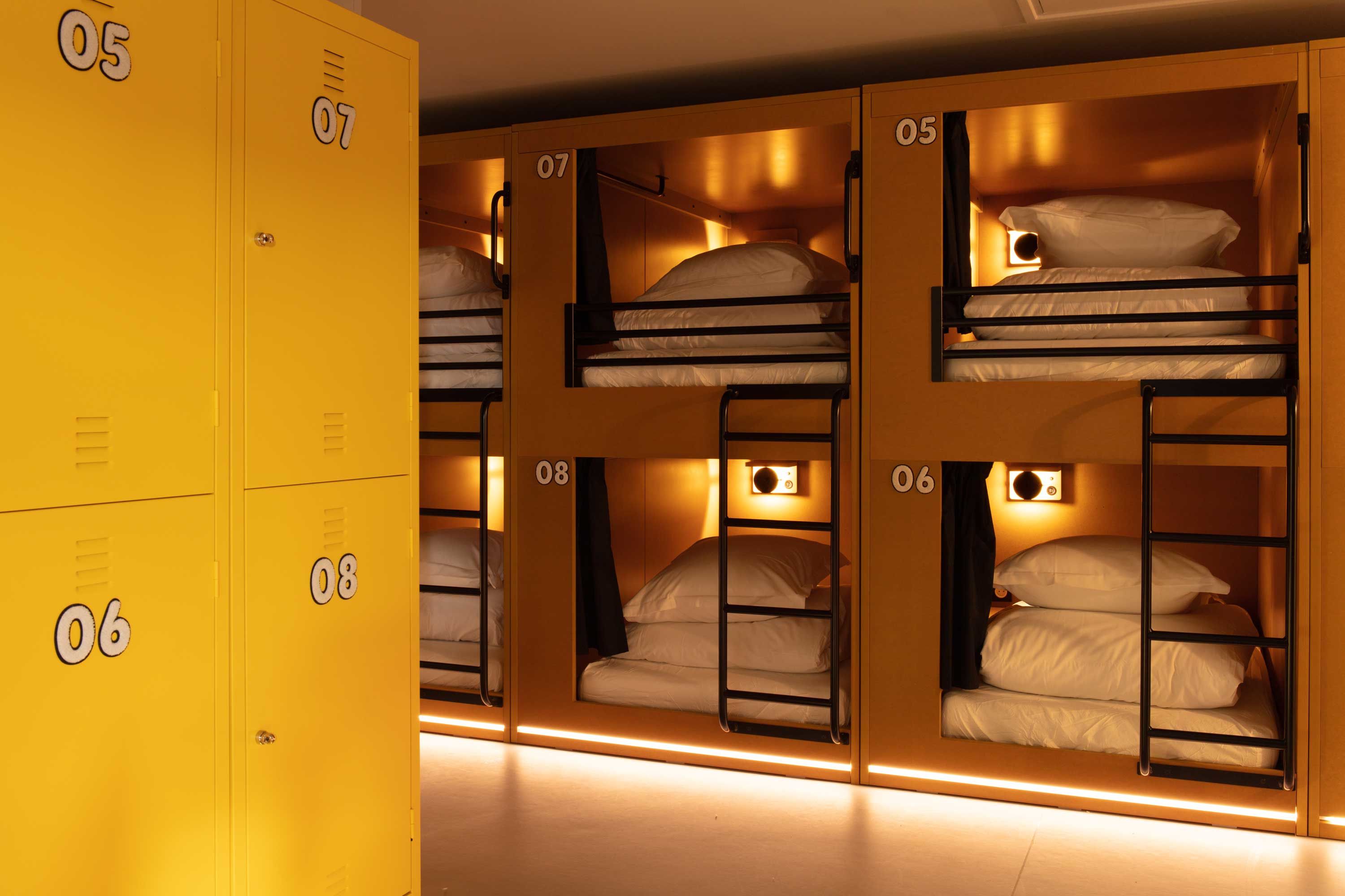
‘Pilo is a hotel where you can work, an office where you can eat, and a restaurant where you can sleep,’ says 5.5, the Paris-based design agency behind Pilo’s striking branding and visual identity. ‘It is the comfort of a hotel combined with the uninhibited state of mind of a youth hostel.’
Indeed, unlike the average hostel, as well as offering mixed and single-sex dorms of up to 18 people, Pilo also has pricier double bedrooms like a standard hotel, topping out at the premium room, which is around €119 per night.
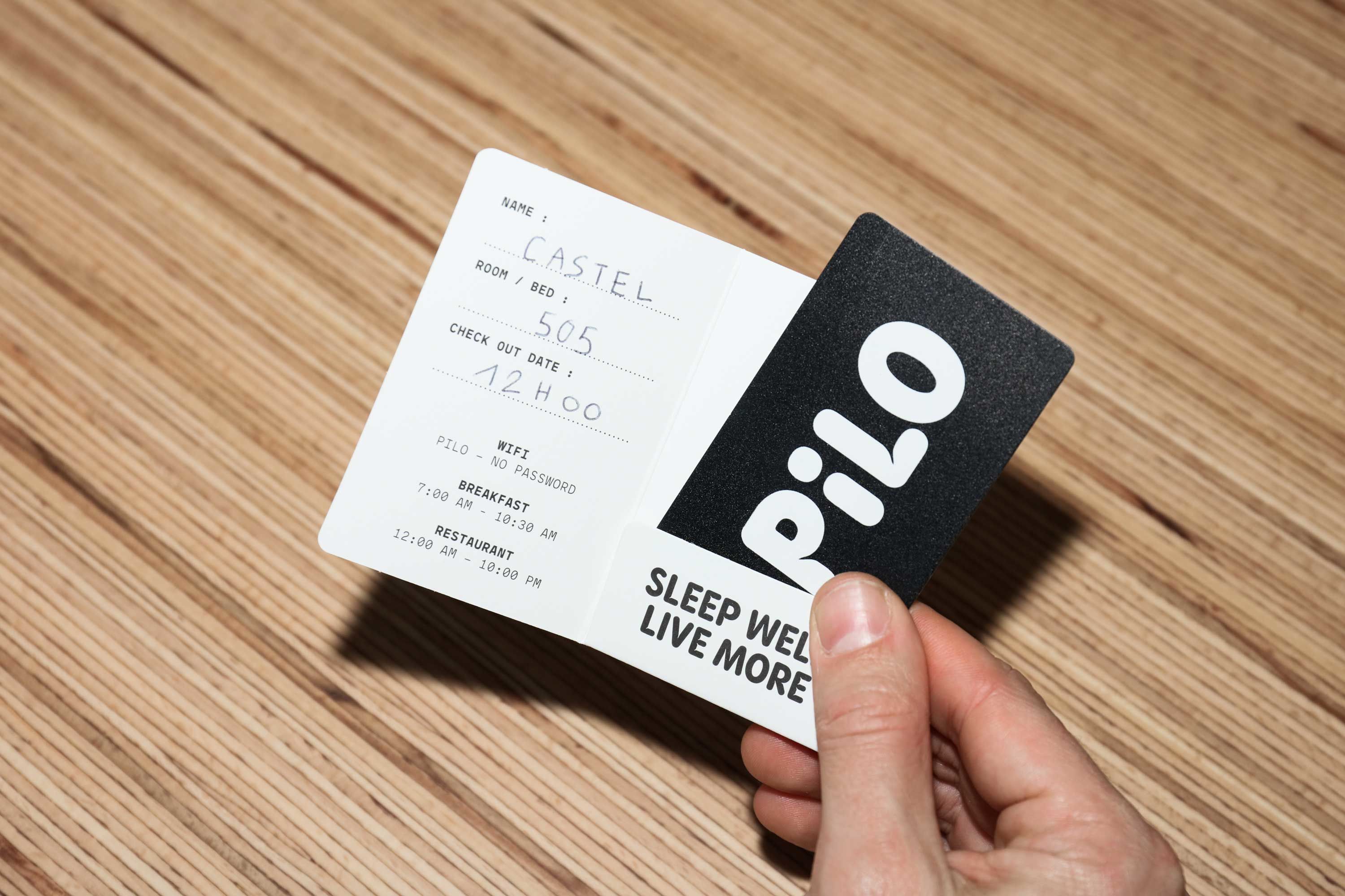
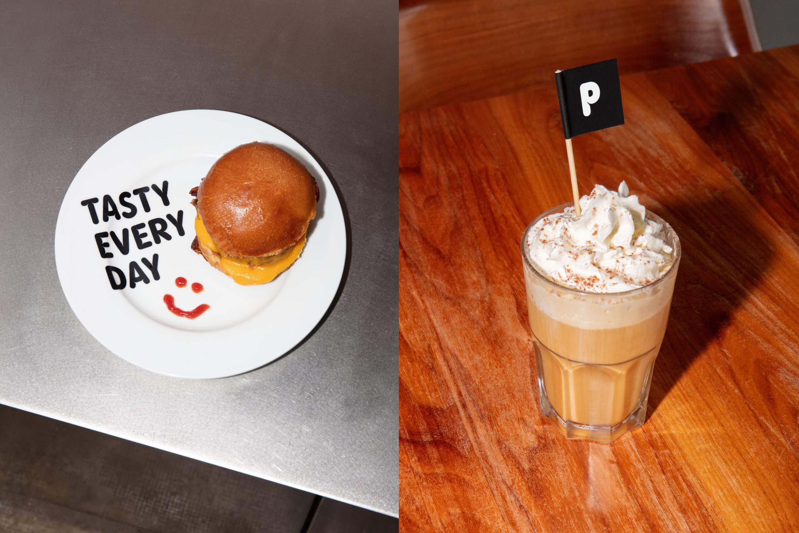
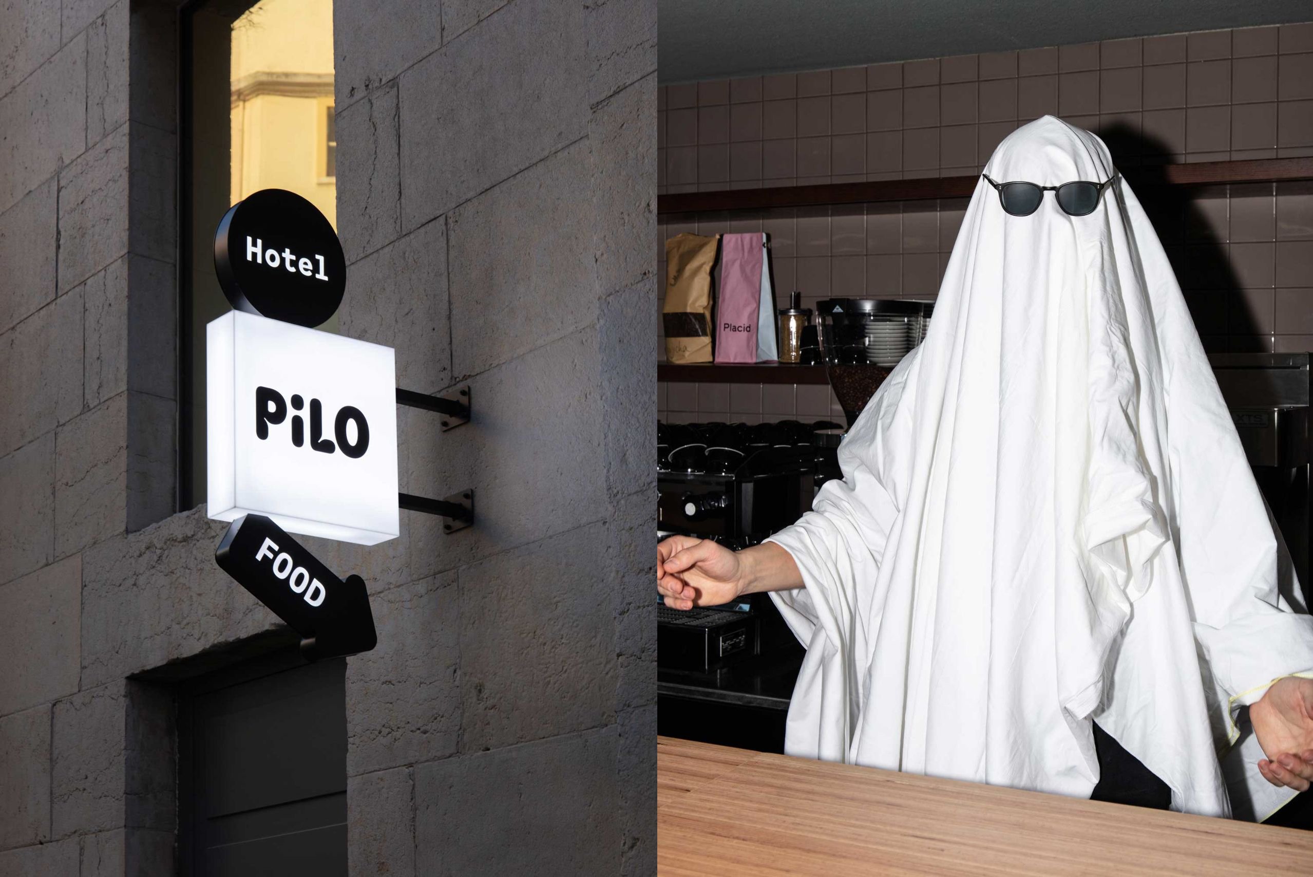
5.5 worked across everything from the name, to digital design identity work, interiors and exterior signage, staff uniforms, merch, key cards and more. It’s really, really strong work, which strikes the perfect balance between the playfulness of hostel travel and the hip minimalism of trendy ‘digital nomad’ hotel living.
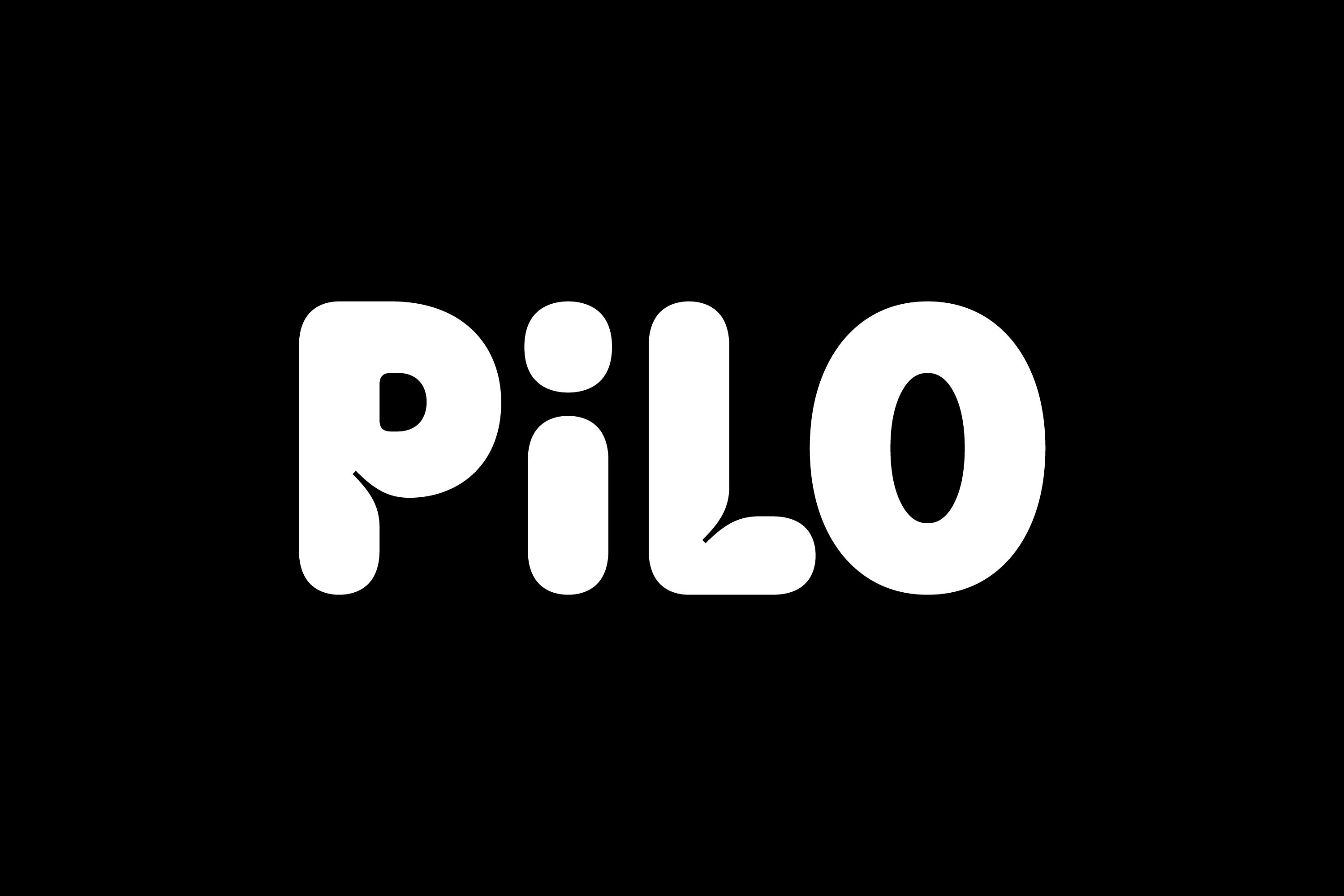
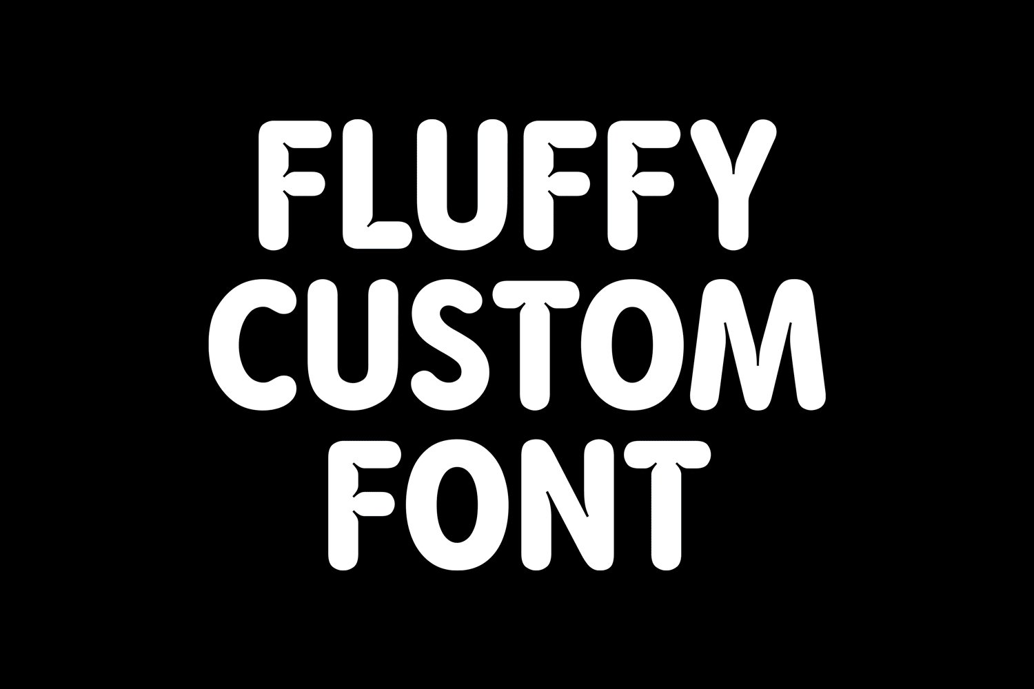
The identity is based around a bespoke wordmark in which the lettering looks like a fluffy, bouncy pillow – all white type and pudgy creases. The way ‘Pilo’ is spelled out in caps, with a lowercase ‘i’ is smart: sometimes this sort of thing looks like an affectation, but here it makes the visual balance of the word itself perfectly formed for a flexible, fun, and very ownable brand mark. In its lowercase form, the ‘i’ even looks a little like a sleeping, pillowy person nestled between the bouncy cushion of the ‘P’ and ‘L’.
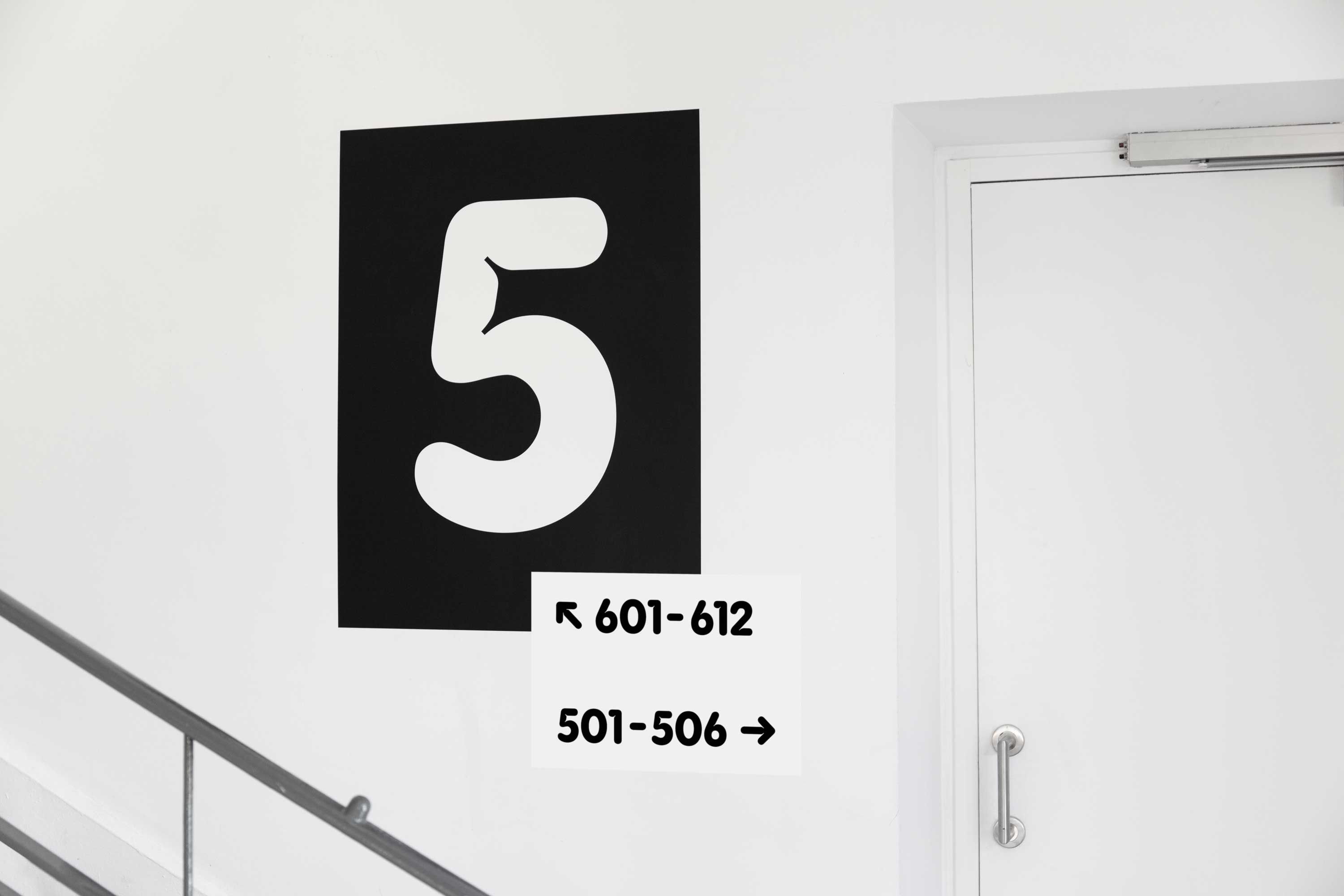
The bespoke lettering of the wordmark is also used as a headline font for certain applications, where it sets itself apart from the logomark by using black instead of white.
On the Pilo website, this type style is used alongside some stylish, more pared back fonts. Helvetica Neue is used on the booking page, which feels like a fitting choice when you consider Lyon’s proximity to Switzerland – the birthplace of the International Typographic Style which prised minimalism, clarity and functionality – just as the Pilo identity seems to.
Elsewhere, such as on the Pilo homepage, the designers opted to use a thin weight of Maax, a striking but spidery stencil-leaning, typewriter-ish font in all caps by foundry 205tf, which is also based in Lyon.
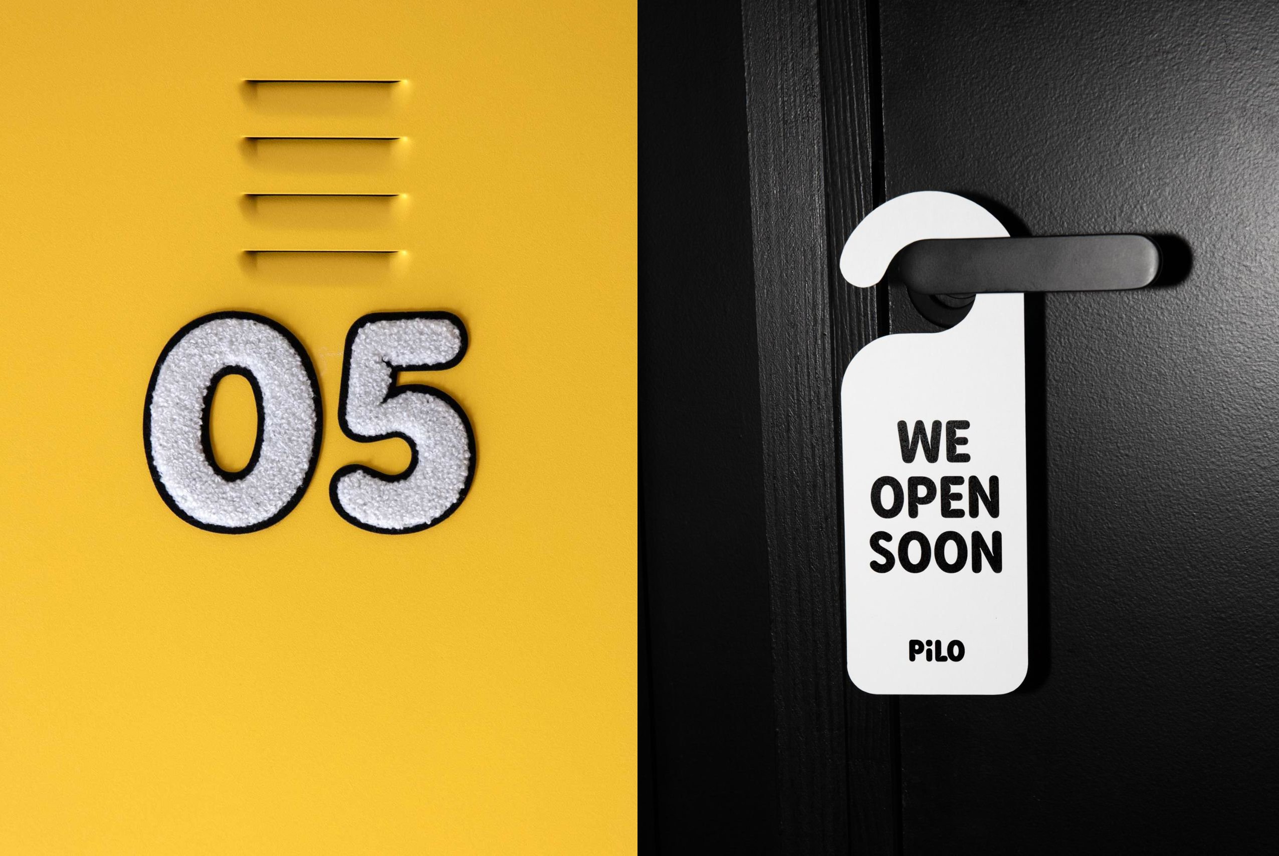
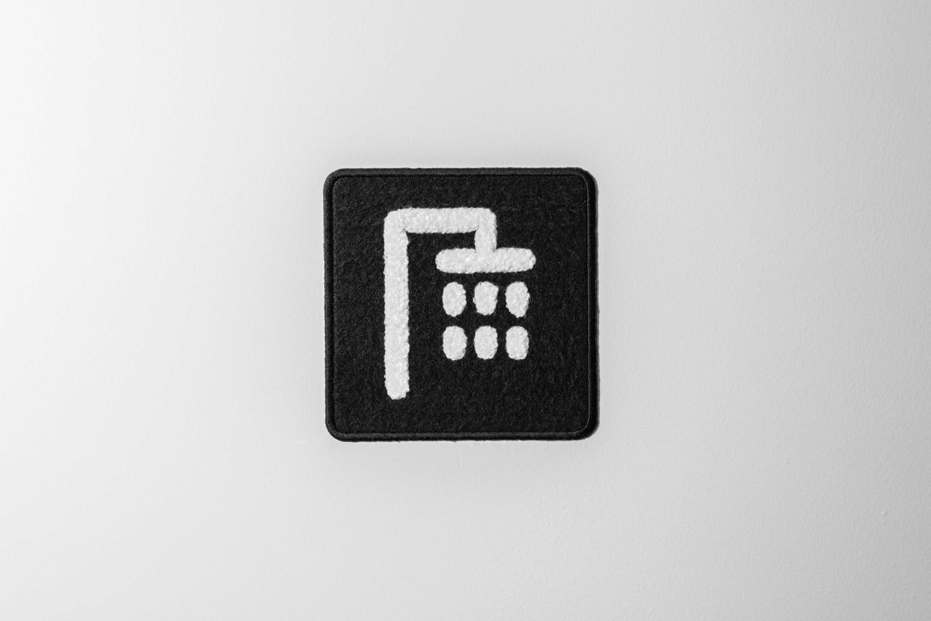
For the most part, the identity is skilfully pared back, using those simple typefaces with a colour palette of black, white, and a rich but not garish shade of yellow. But it’s the merging of three-dimensional objects into what would be traditionally two-dimensional graphics that really make the project stand out – perhaps a testament to 5.5’s background as a product design studio.
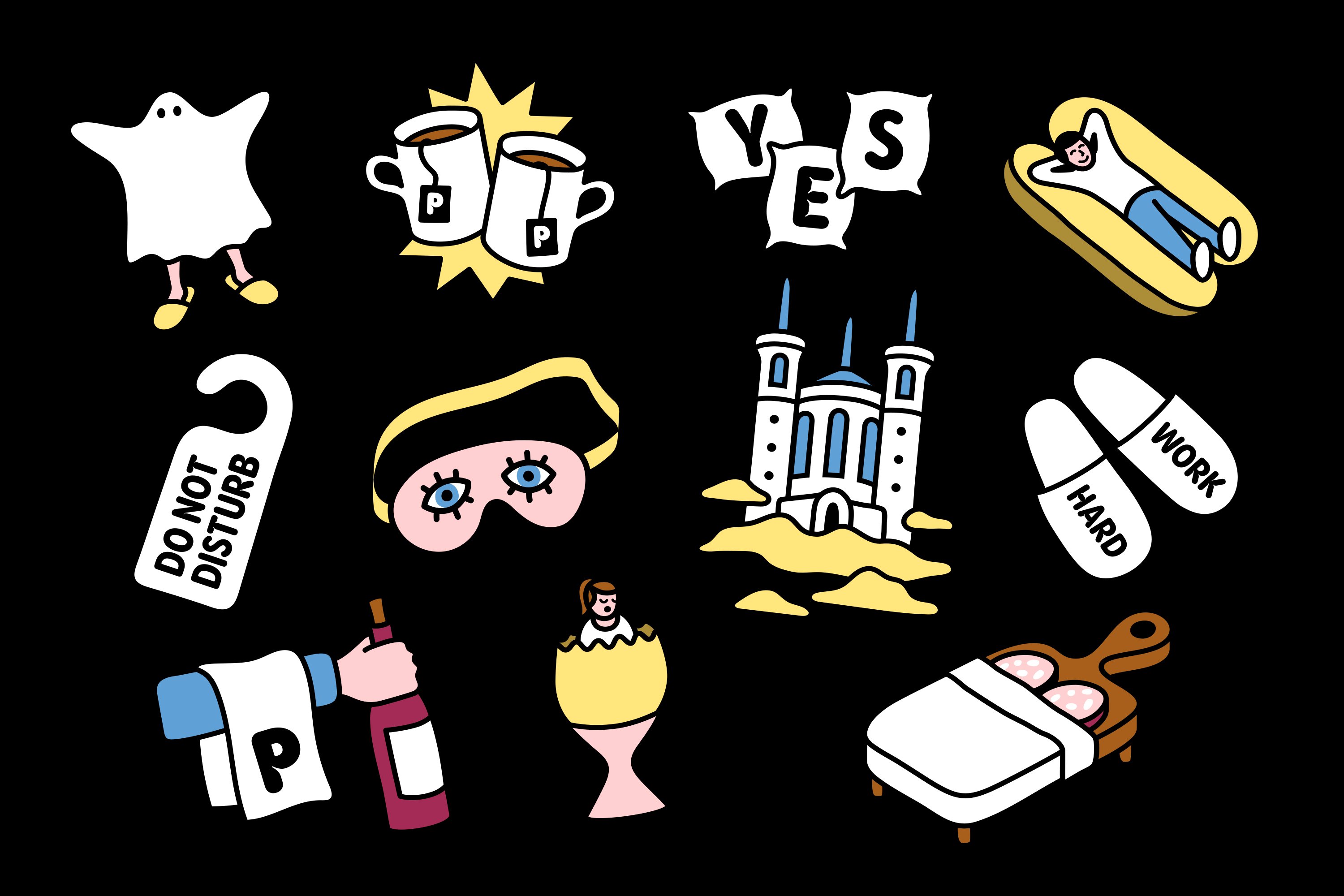
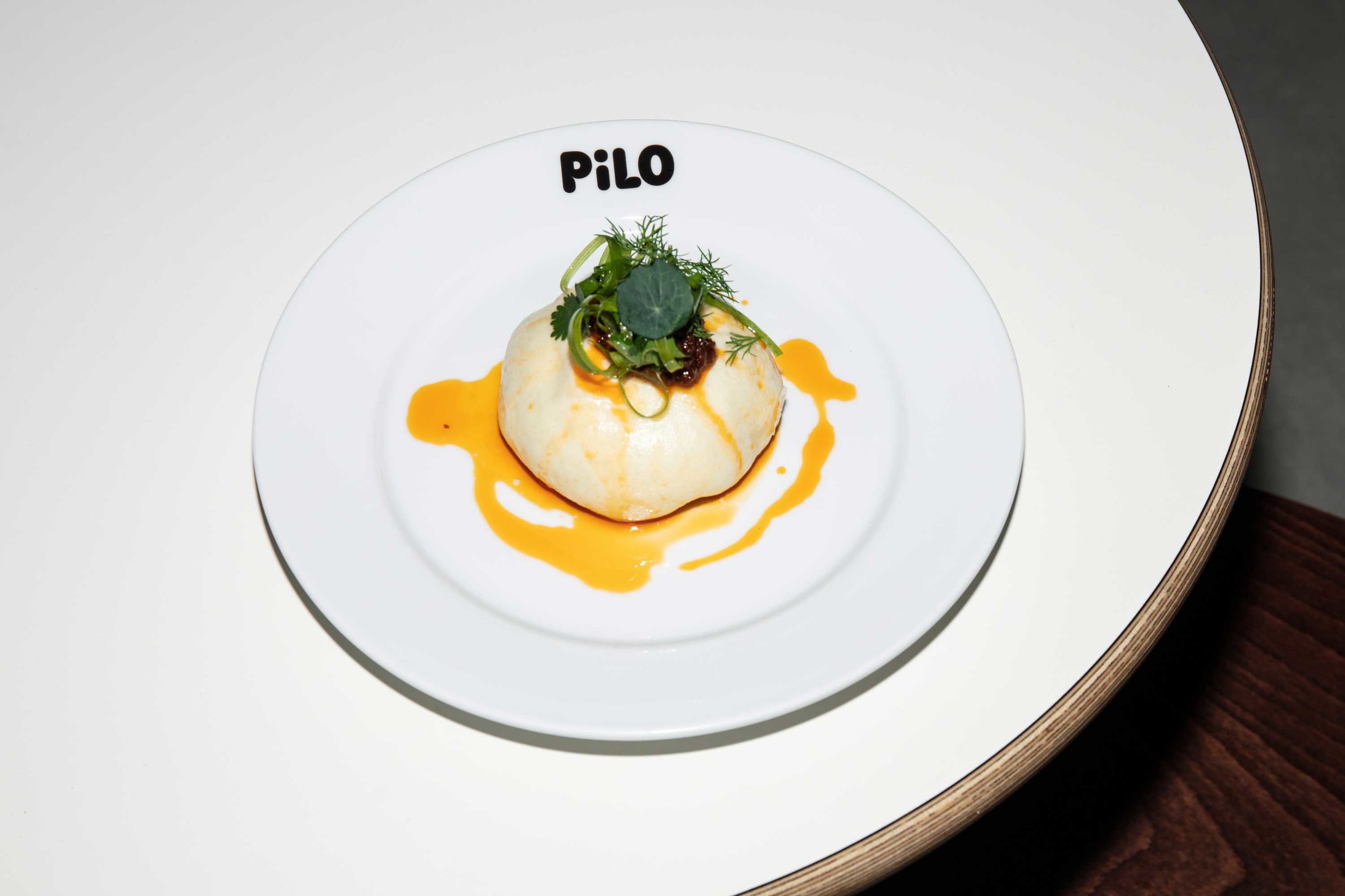
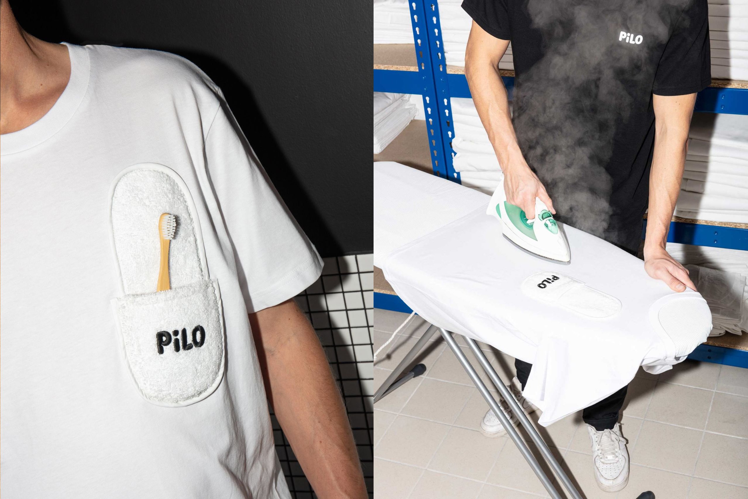
5.5 says it ‘hijacked everything you could find in the laundry room of a good hotel’ to inform the overall identity, in both subtle and very literal ways. The laundry elements are obviously visible in the lettering, which the studio describes as ‘fluffy typography inspired by folding bolster’.
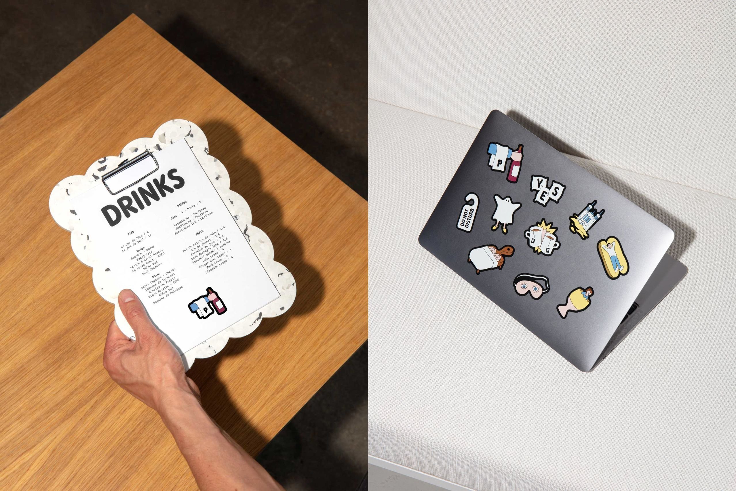
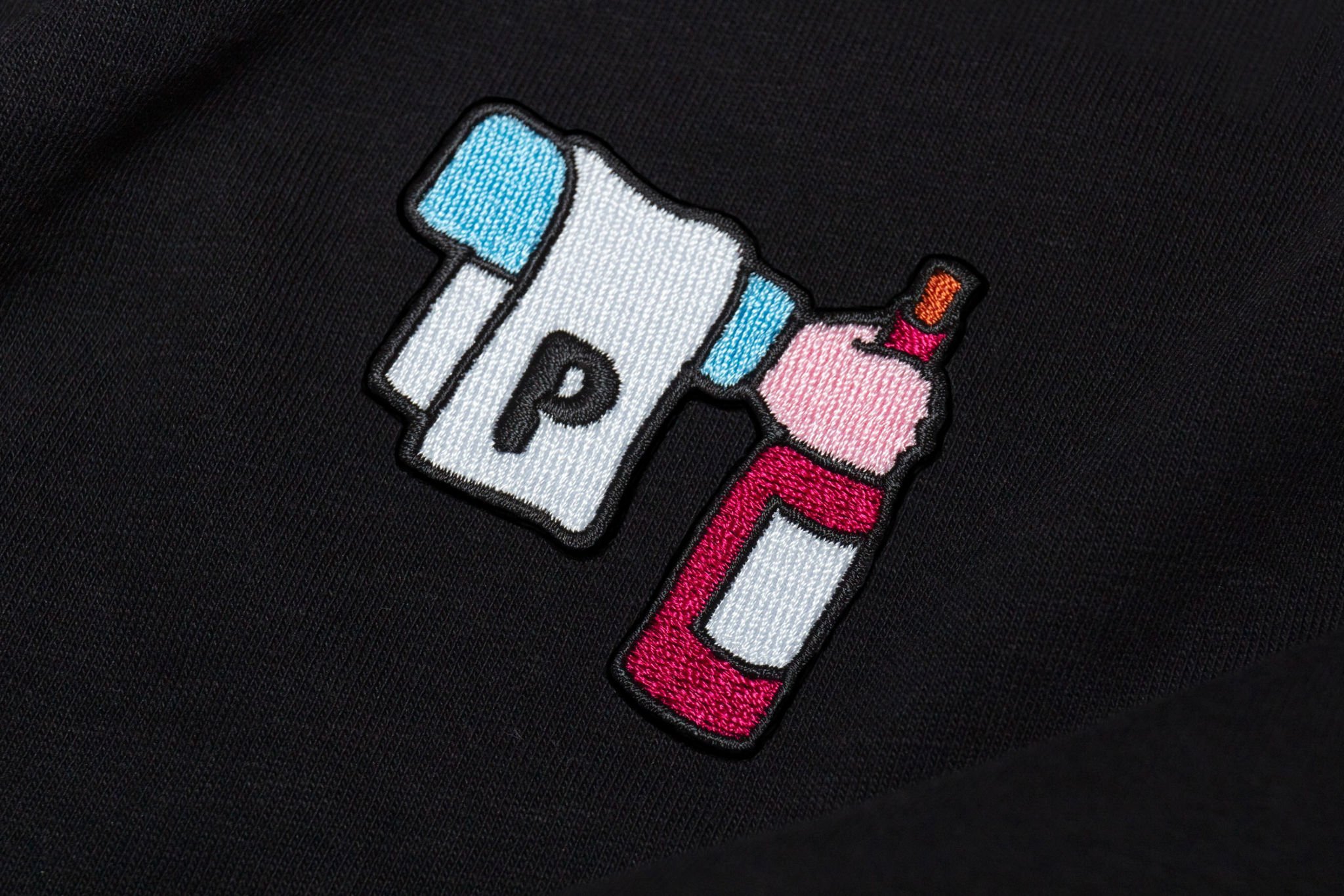
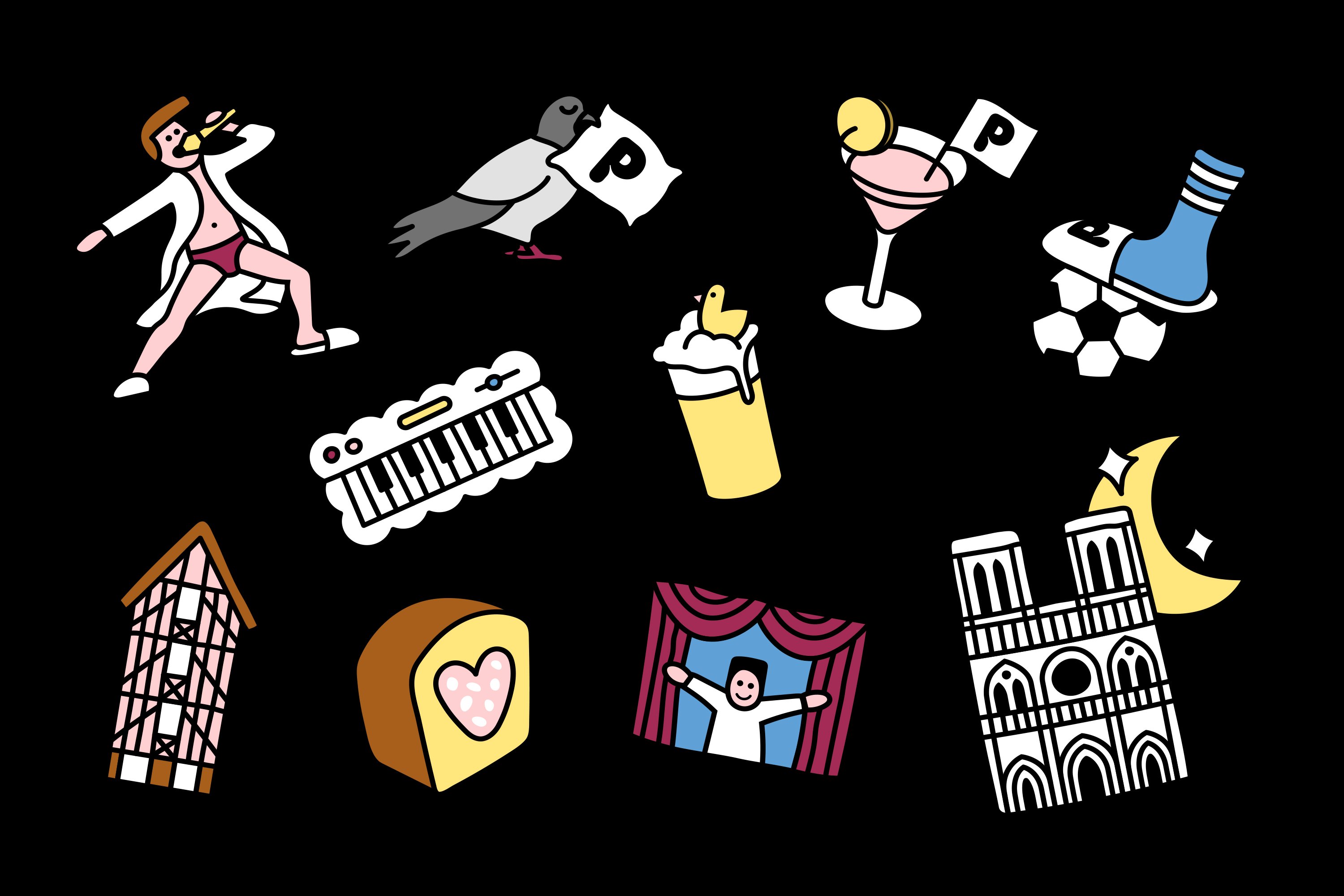
For other applications, various hotel signifiers are plundered in very unusual ways: for staff uniforms, the pockets are created by sewing a slipper onto the chest; and the studio also wrote messages on sheets, and made embroidered badges to indicate the rooms.
‘In short, we used the hotel as a playground,’ 5.5 adds. This much is obvious: for all its simplicity and stylishness, the whole thing radiates joy – it feels as though the designers had as much fun making the work as future guests surely will feel when they encounter it.
