Kettle Kids by Two Times Elliott
Opinion by Thomas Barnett Posted 23 January 2024
The once laudable claim to have started a thriving business with ‘a small loan’ from a doting family member may have been muddied beyond recognition by the truth-stretching of serial tax-offender and part-time Presidential candidate Donald Trump. Despite this, turning ‘one thousand pounds from nan’ into a luxury watch and diamond dealership with a sparkling flagship store in Mayfair remains an undeniably impressive feat. This is precisely what brothers Harvey and Jacob Hutson have done with Kettle Kids, and all in just six short years. To celebrate their stratospheric rise – and to coincide with the opening of the new Maddox Steet site – Kettle Kids has been given a sleek new rebrand by East London studio Two Times Elliott. Donald, if you’re reading: that’s how you do it for real.
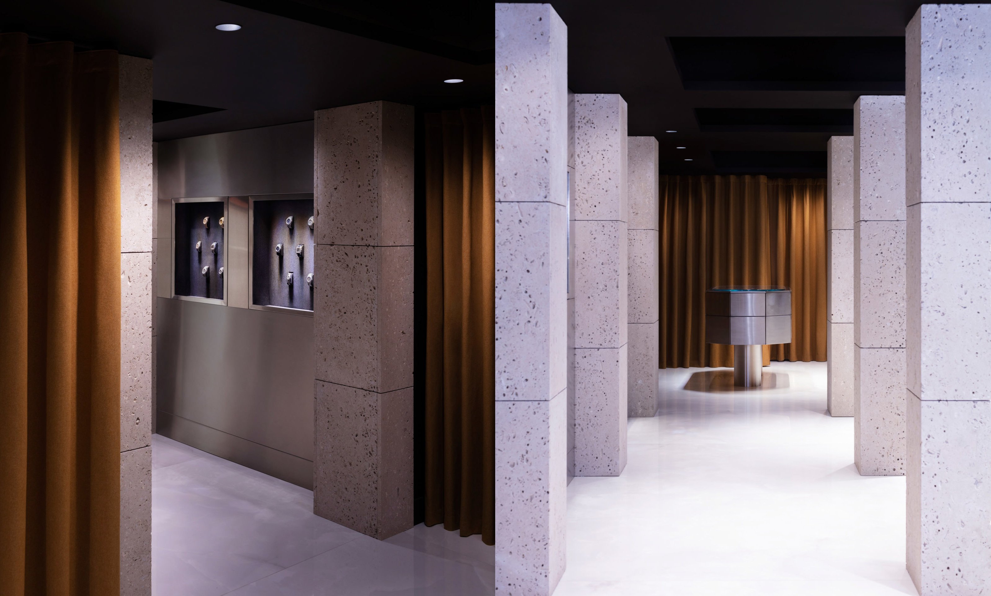
Two Times Elliott describes its approach to the identity as ‘taking cues from…material palettes’, which makes sense as a way of conjuring the tactile luxury of the fine objects handled and sold by the brand. It’s also indicative of the close conceptual collaboration with ‘spatial partner’ Hesselbrand, an architecture studio based in London and Oslo, which was responsible for bringing the brand to life in the physical retail environment.
It is evident that the graphic and spatial identities were developed in tandem, arising from a single coherent and collaboratively developed concept. Hesselbrand states that the spatial identity ‘aims to embody both the traditional high precision craft of fine watches and the fast-moving, youthful energy of the jewellery world’ (where Kettle Kids has a strong cult following).
This identity manages to skilfully balance a series of contradictions: youth and tradition; cool, detached luxury and the pattina of craftsmanship; openness and exclusivity; West London hauteur and plucky underdog charm. None of these ideas is unleashed to run riot; but all are subtly conjured and allowed to swirl, just perceptibly, beneath the implacable surface – just as the sheets of translucent, ice-blue acrylic with which the shop-front is dressed conceal the gradually unfurling richness of the sumptuous interior.
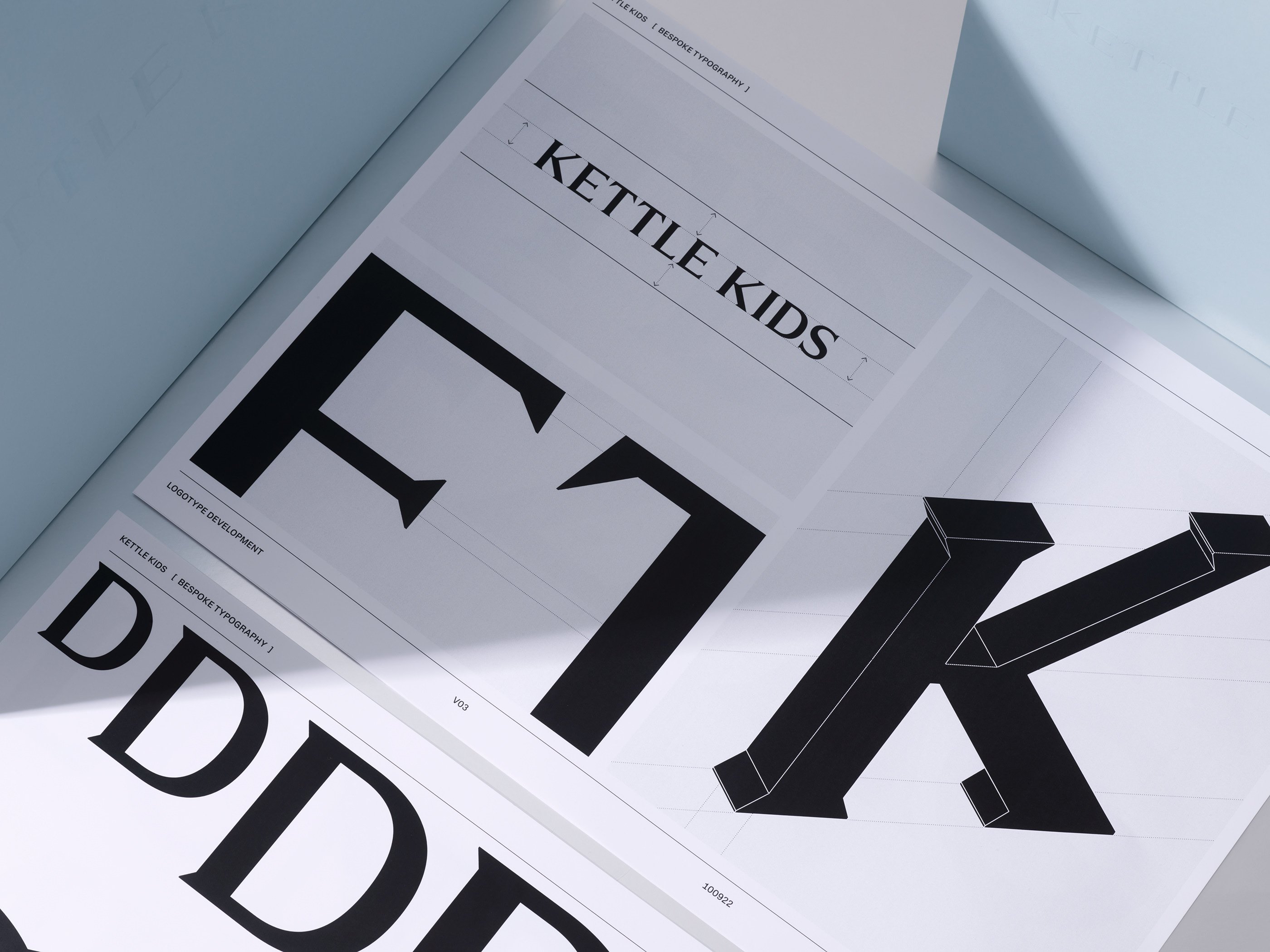
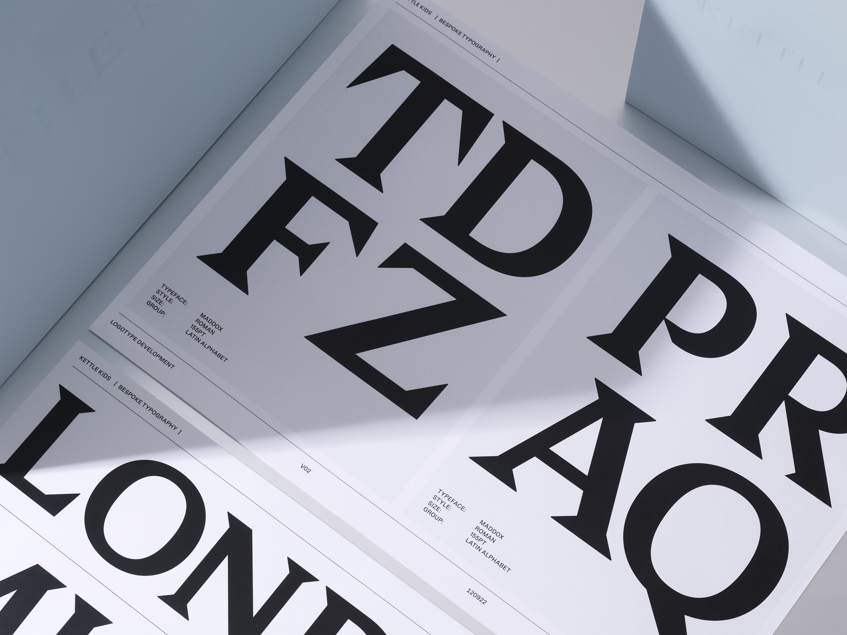
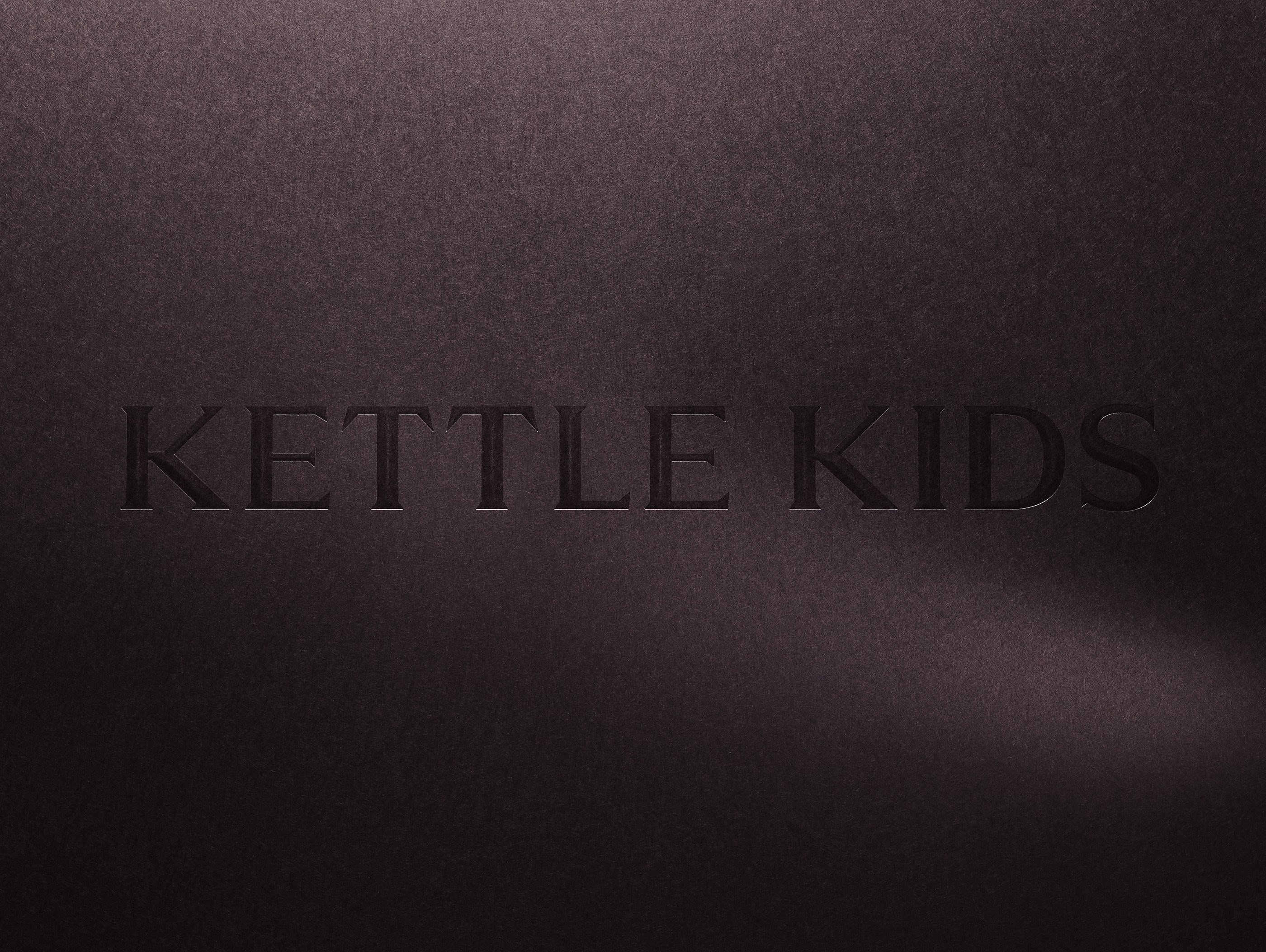
The proud figurehead of both the graphic and spatial identities is a single exquisite piece of typography: an authoritative wordmark set in a bespoke, wedged serif that is designed to look like bevelled metal moveable type. It is a gorgeous and authentic gesture to the world of traditional craftsmanship, that also perfectly positions the Kettle Kids brand among its prestigious new neighbours.
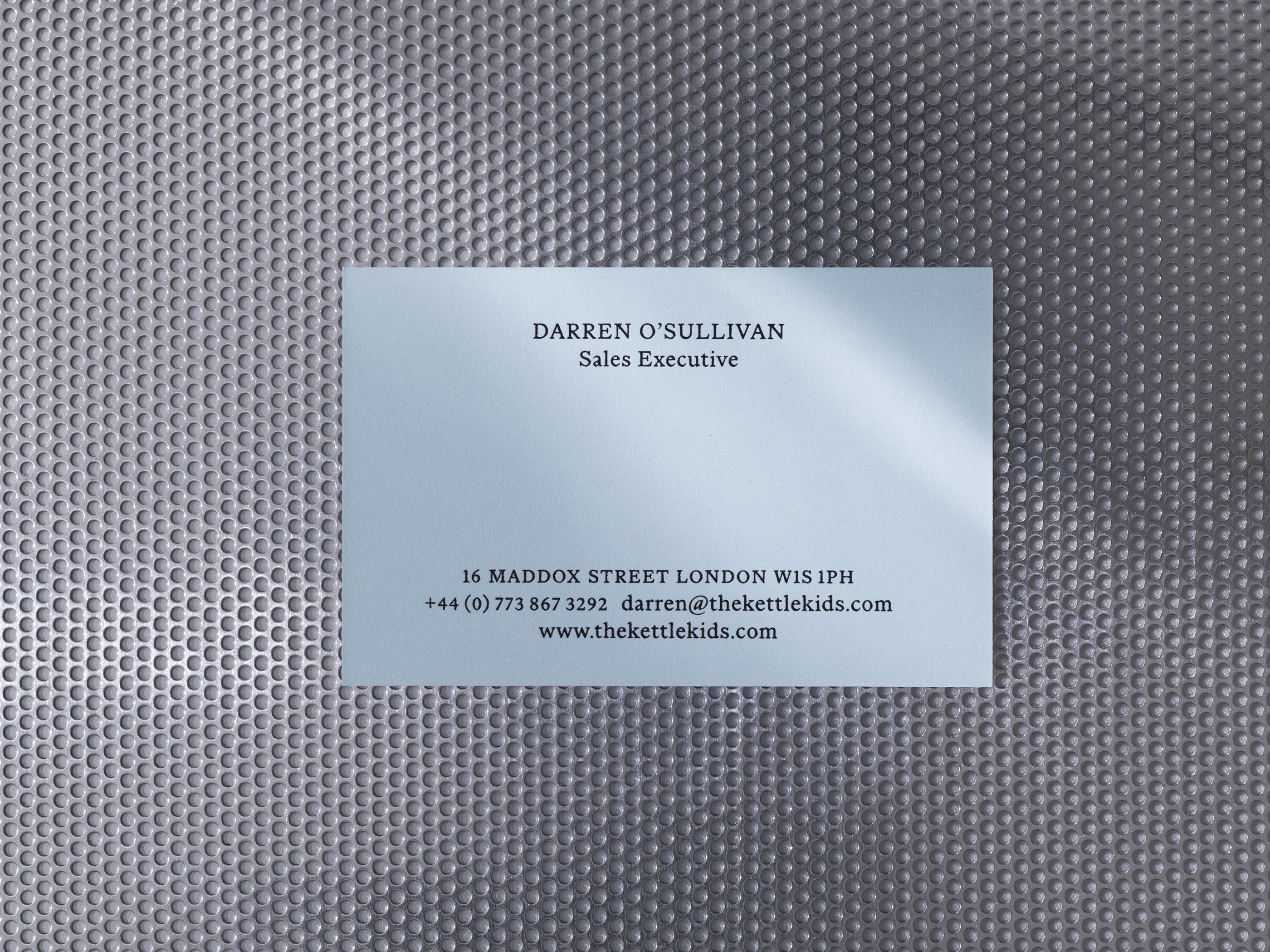
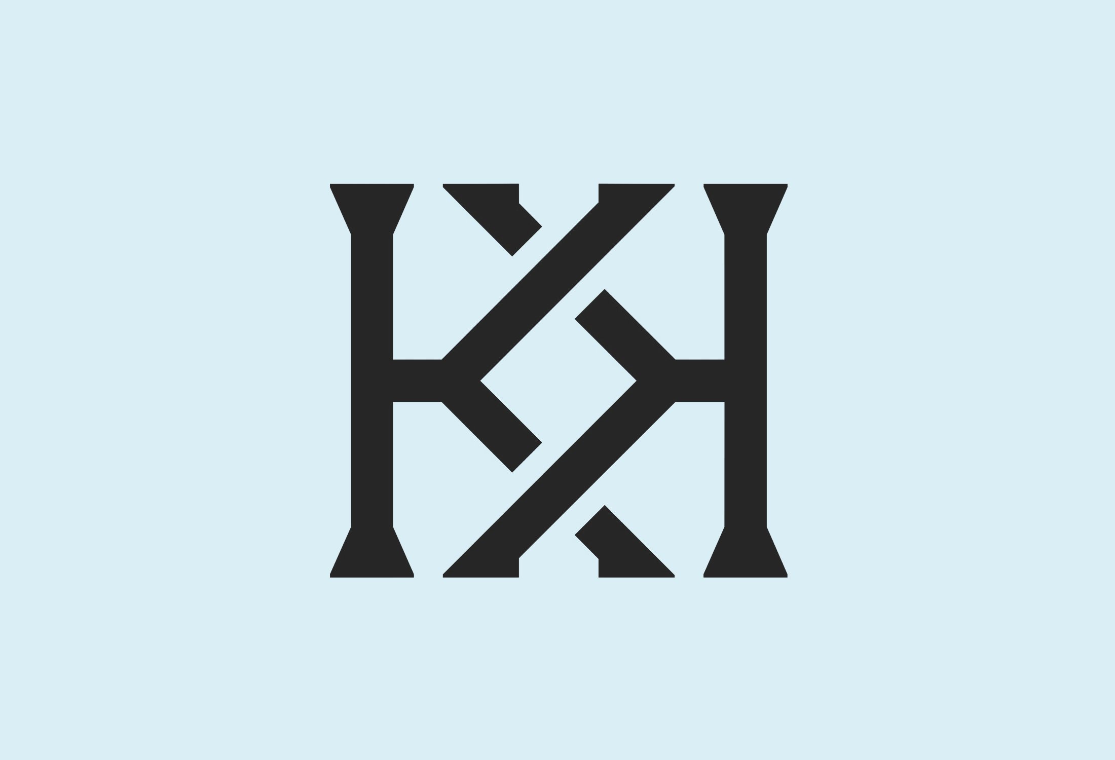
There is also a monogram version that reverses the second K and entwines them together. The lettering used for the monogram is subtly different from that of the primary wordmark, with steeper serifs, a uniform stroke width and adjusted proportions. Even these subtle stylistic deviations feel slightly incongruous in a brand that is otherwise so tight – like an idea from an earlier iteration that slipped back into the final mix. Despite this niggle, the monogram does serve a definite purpose within the brand, allowing greater graphic versatility (particularly across the luxe business cards and other print materials) that keeps this work just the right side of minimalism.
The bevelled form of the lettering is made explicit in 3D animations that show the monogram gracefully rotating in space, prestige-Netflix-drama-titles style, rendered in polished steel. While this will no doubt be useful for a glossy landing page when Kettle Kids gets its full website up and running, the more effective indication of the machine-tooled form of the typography is the specimen of the wordmark embossed into rich black card stock, so deeply imprinted that the inner bevels are visibly sliced into the luxurious paper. Aligning with a recurring theme, this particular finish captures a scintillating dichotomy of softness and hardness, luxury and industry; the outline of a dagger left imprinted in velvet.
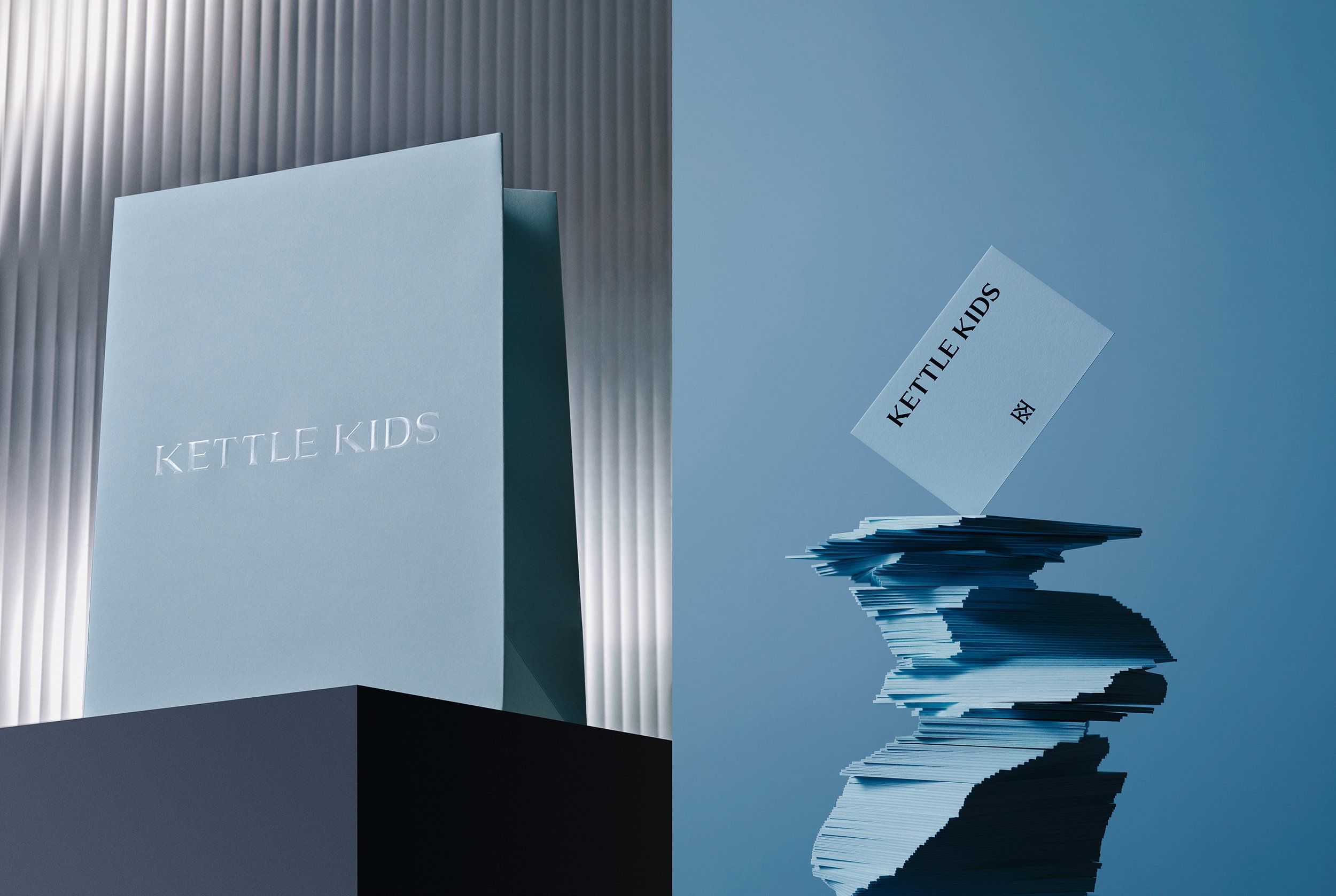
That same sexy juxtaposition is continued in the clever colour palette of icy blue (Hesselbrand calls it ‘soft mint’), rich black and sumptuous tangerine velvet. When paired with surprising kraft paper finishes and interesting metallic textures of brass and copper printing plates, the brand makes a clever point of not just showing the luxurious finished piece, but also elevating the raw materials and tools (and by extension the craftsmanship) that fashioned it.
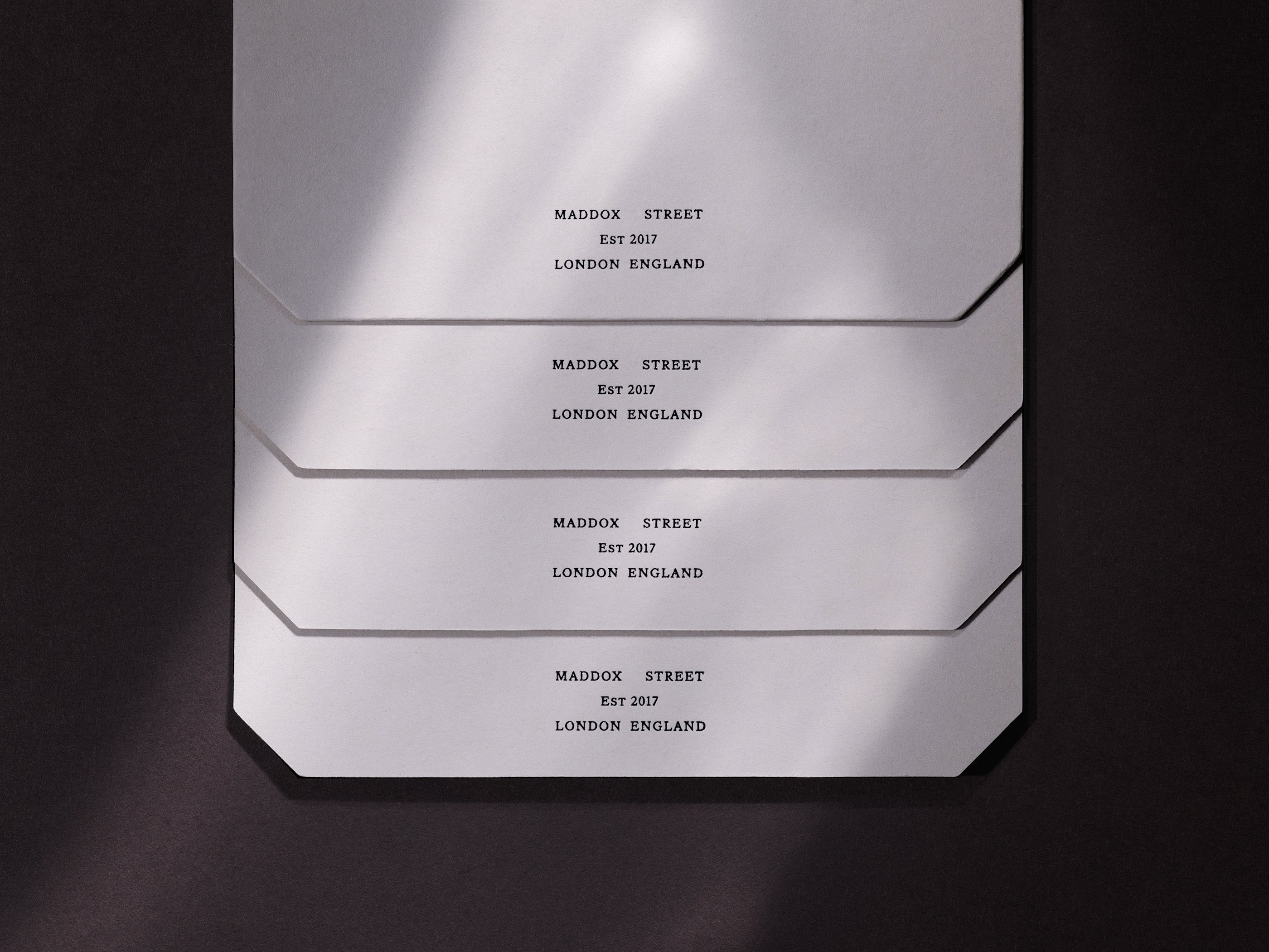
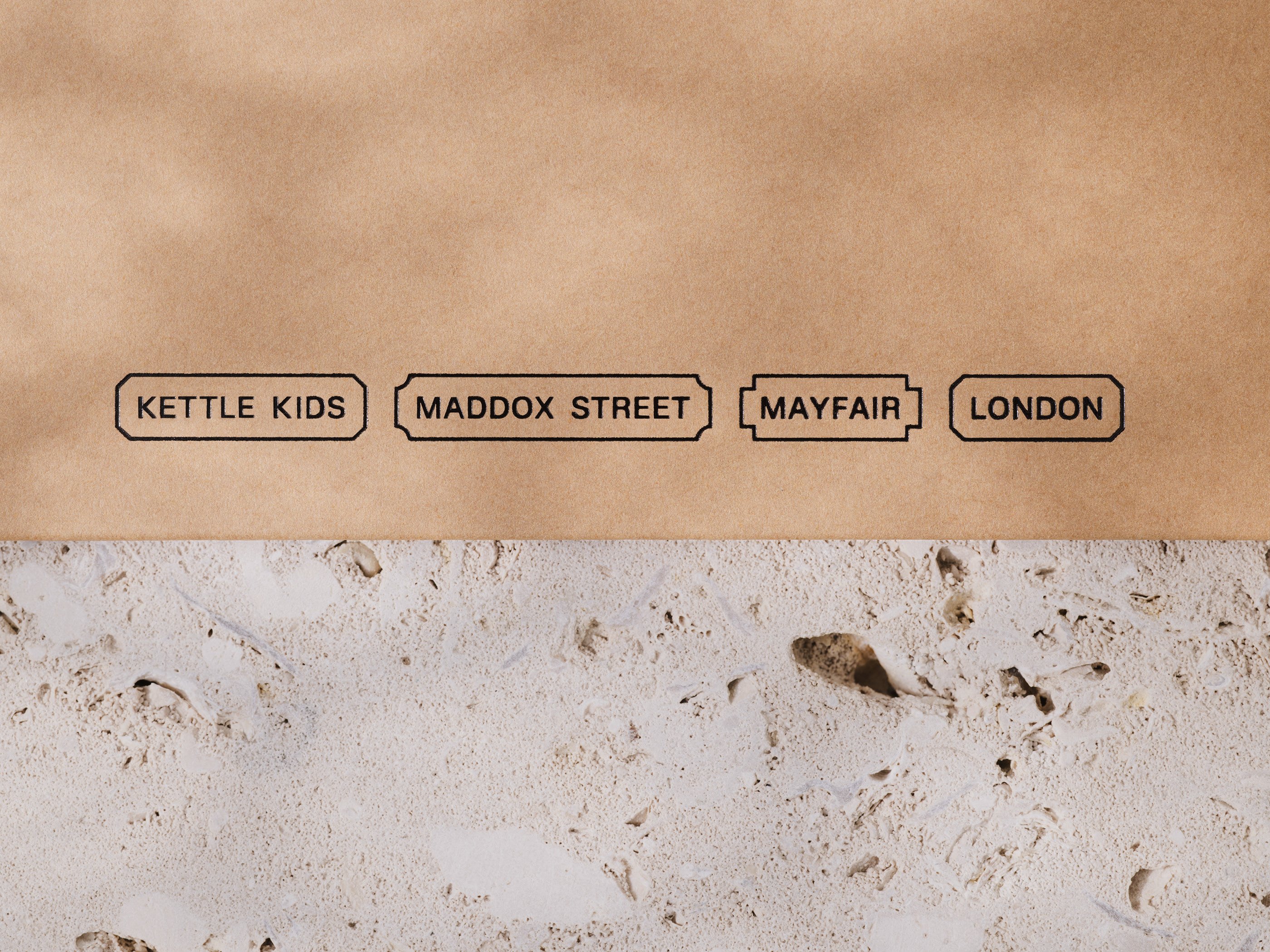
Another neat execution of this central concept is custom corner cut paper, which perfectly mirrors the negative space left by the wedged serifs of the wordmark. The form is further deployed in the text and image containers with bevelled, inset and inverse-rounded corners that are used in print and, more prominently, on social media imagery and other digital assets. These shapes conjure 19th-century shop signage, markets, labels and advertisements.
This subtle evocation of bustling market brings an eclectic and fruity note of tongue-in-cheek Victorian commerciality to the otherwise modern luxuriousness of the Kettle Kids brand. LinkedIn stalking gets boring very quickly, so I have no idea whether Harvey and Jacob Hutson and their beneficent grandmother are East Enders, but if they were, this faint note of Cockney commercial spirit living on in a Mayfair boutique would be yet another perfect juxtaposition swirled into the mix of this beguiling identity.
