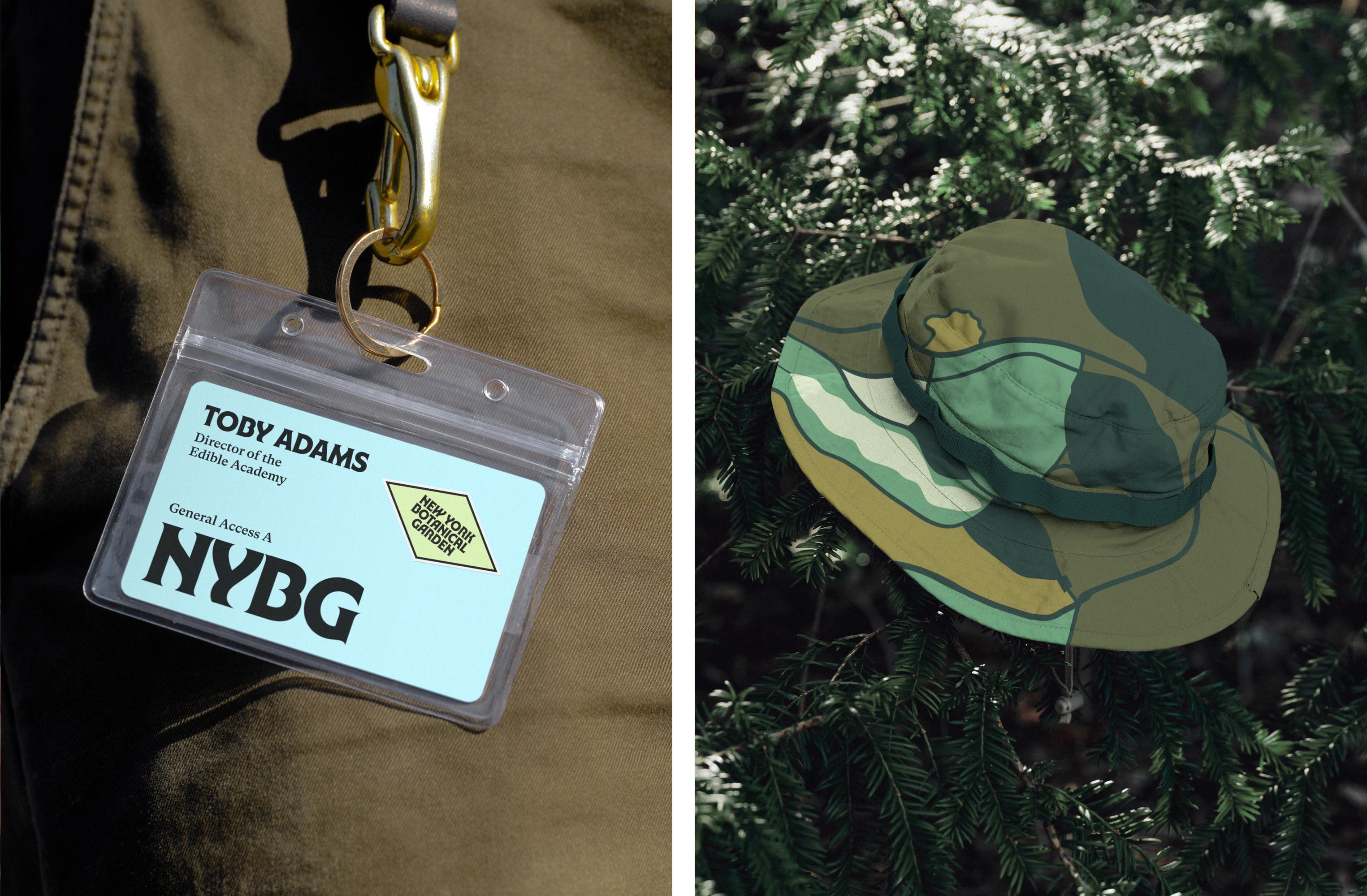
New York Botanical Garden by Wolff Olins
Opinion by Emily Gosling Posted 22 February 2024
It must be something of a dream project when an agency gets commissioned to work on those big-name cultural clients – museums, art galleries, orchestras, theatre companies, et al. You’d expect such projects to be a departure from the constraints and stakeholder-limitations of corporate clients; and perhaps a chance to be more creative than usual, thanks to the nature of collaborating with artistic organisations.
Something like a botanical garden sits in a strange spot between the two worlds of corporate and culture: it’s not art, but it’s not commercial; it’s about nature, yet has many of the same goals as a cultural institution – engaging with the public, education, attracting new audiences, and so on. So it’s interesting to see how branding agency behemoth Wolff Olins has tackled such a brief in its recent work for the Bronx’s New York Botanical Garden (NYBG), for which it created a new brand strategy, visual identity and verbal identity.
The New York Botanical Garden opened in 1891 and according to Wolff Olins, is both a “local treasure” and a “globally significant institution”. The agency continues, “Visitors knew about the vibrancy of the experience of NYBG as a place, and scientists and researchers knew it as an institution of academic, horticultural, and botanic expertise.”
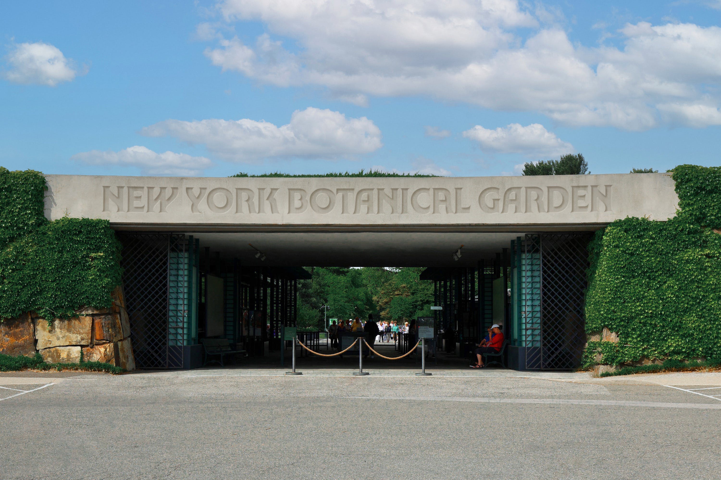
The reason Wolff Olins was brought in was thanks to the new leadership at NYBG, which brought with it a new strategic plan to expand the institution’s impact around the world. In order to do so, it was looking to refresh its branding to “express both the experience and expertise in a way that made all audiences – from their Bronx community to a global public who care about plants, fungi and the planet – want to come to NYBG and care about their work.”
Wolff Olins spent three seasons working closely with the garden to create a new brand that looks to capture the “passion” of NYBG’s people and “the vibrancy of nature itself,” says the agency. “Our work positions them to be known for the organisation of action they are, a place of beauty and contemplation as well as a global leader on environmental action and plant science.”
The agency landed on “do right by nature” as the core idea for the brand, chosen for its multiple possible interpretations that cater for the range of intended NYBG audiences. From there, the agency created a flexible design system that’s rooted in that idea of a “call to action,” balancing “Bronx boldness and organic lushness”.
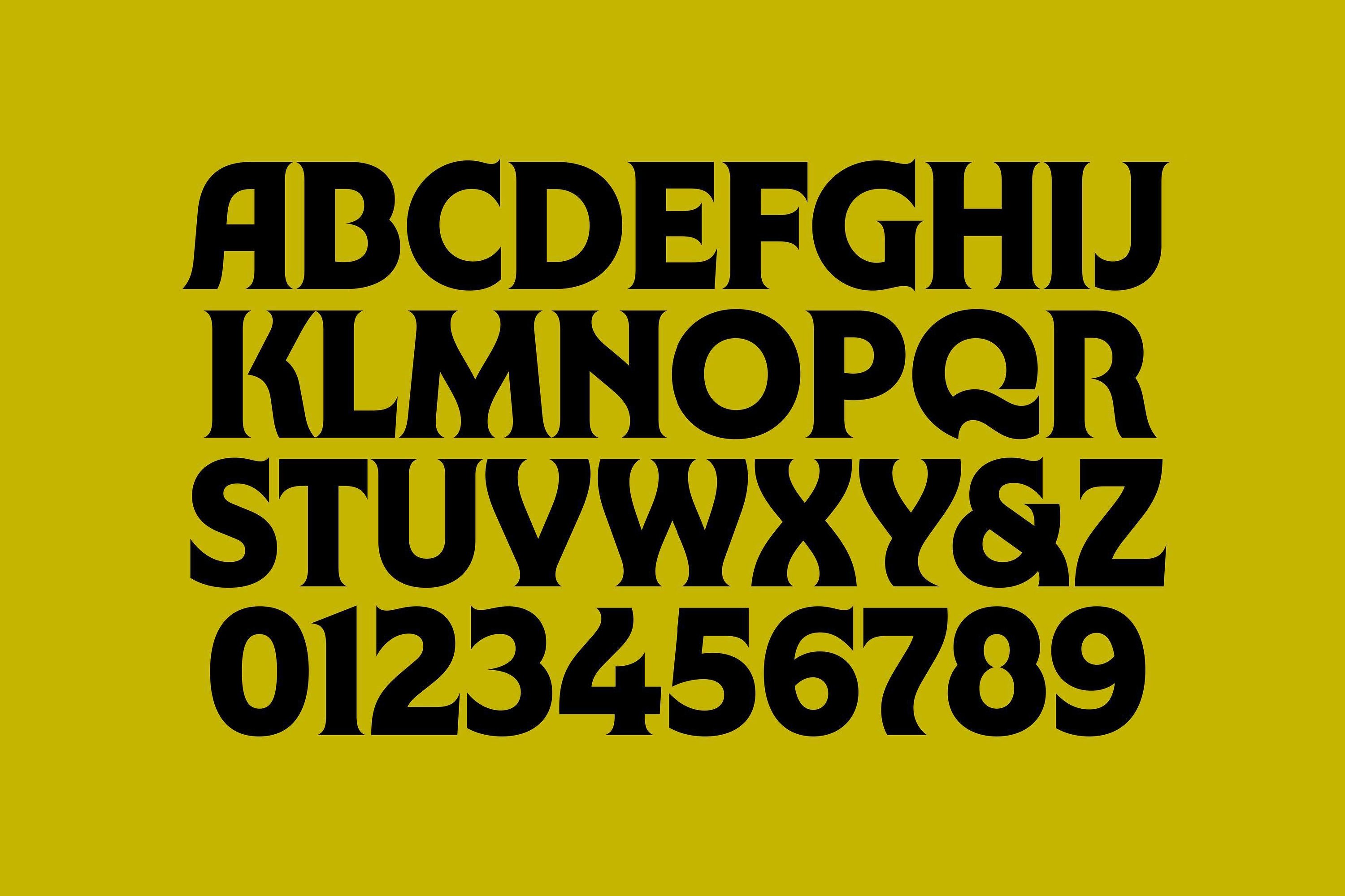
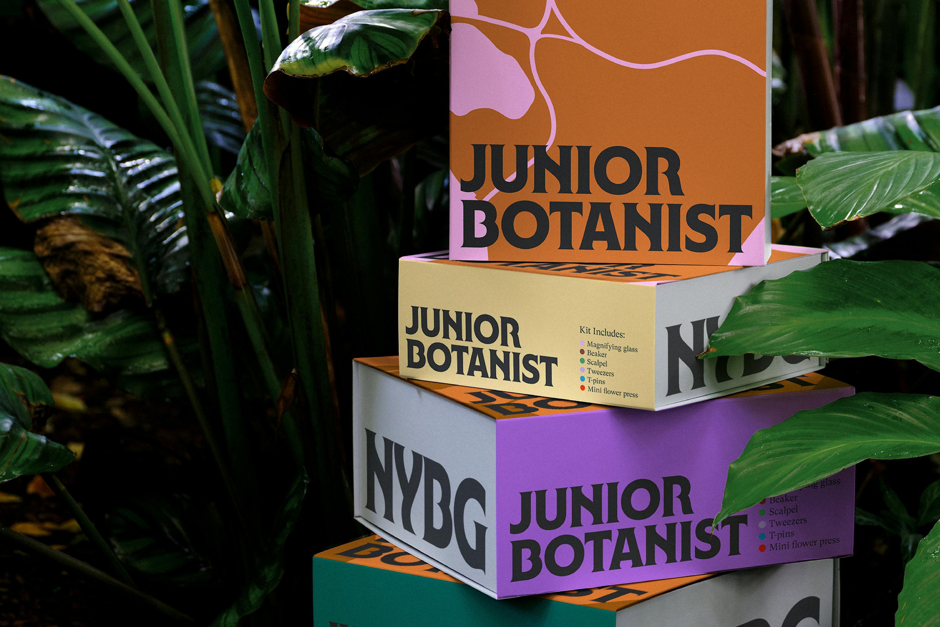
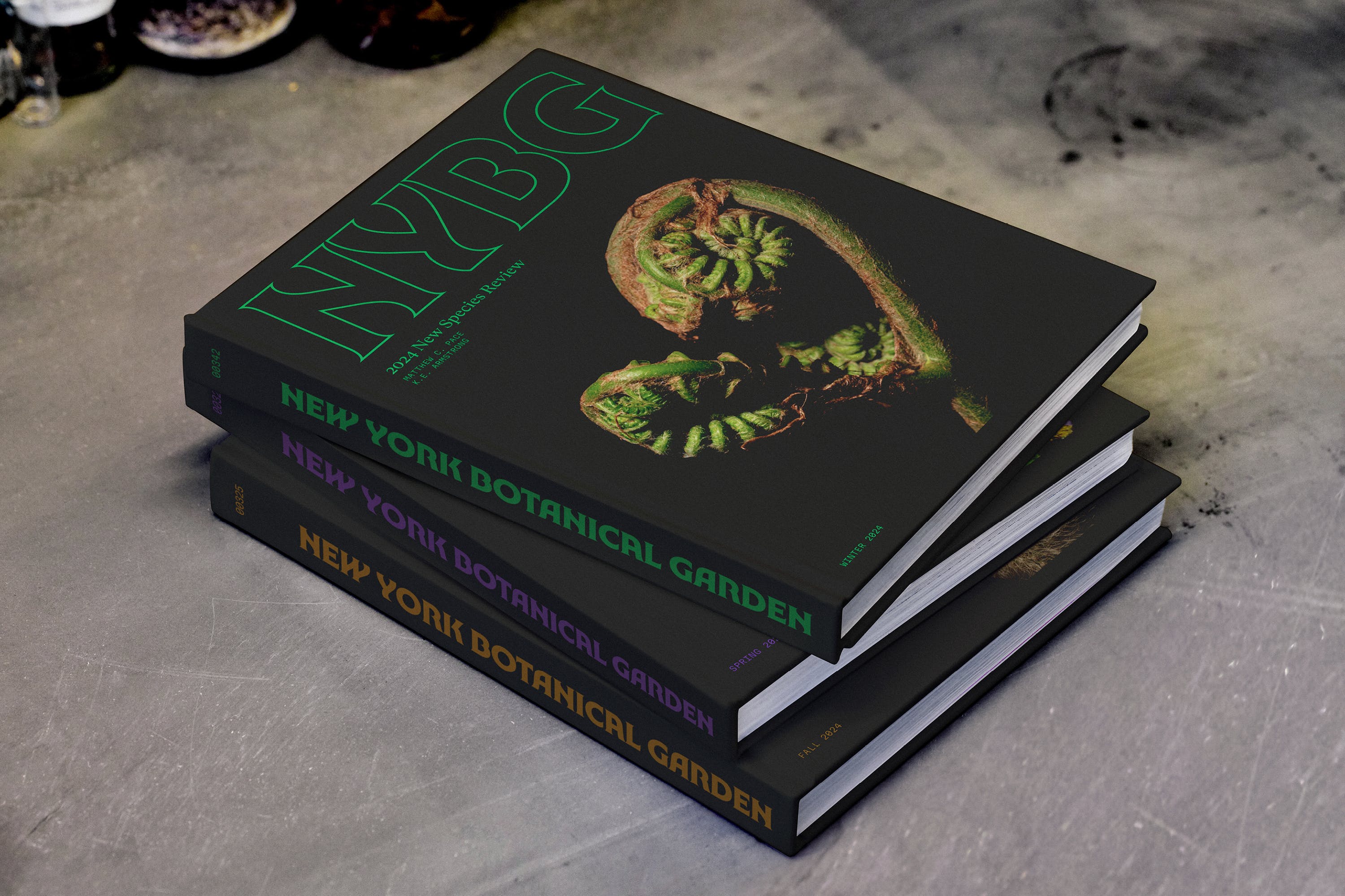
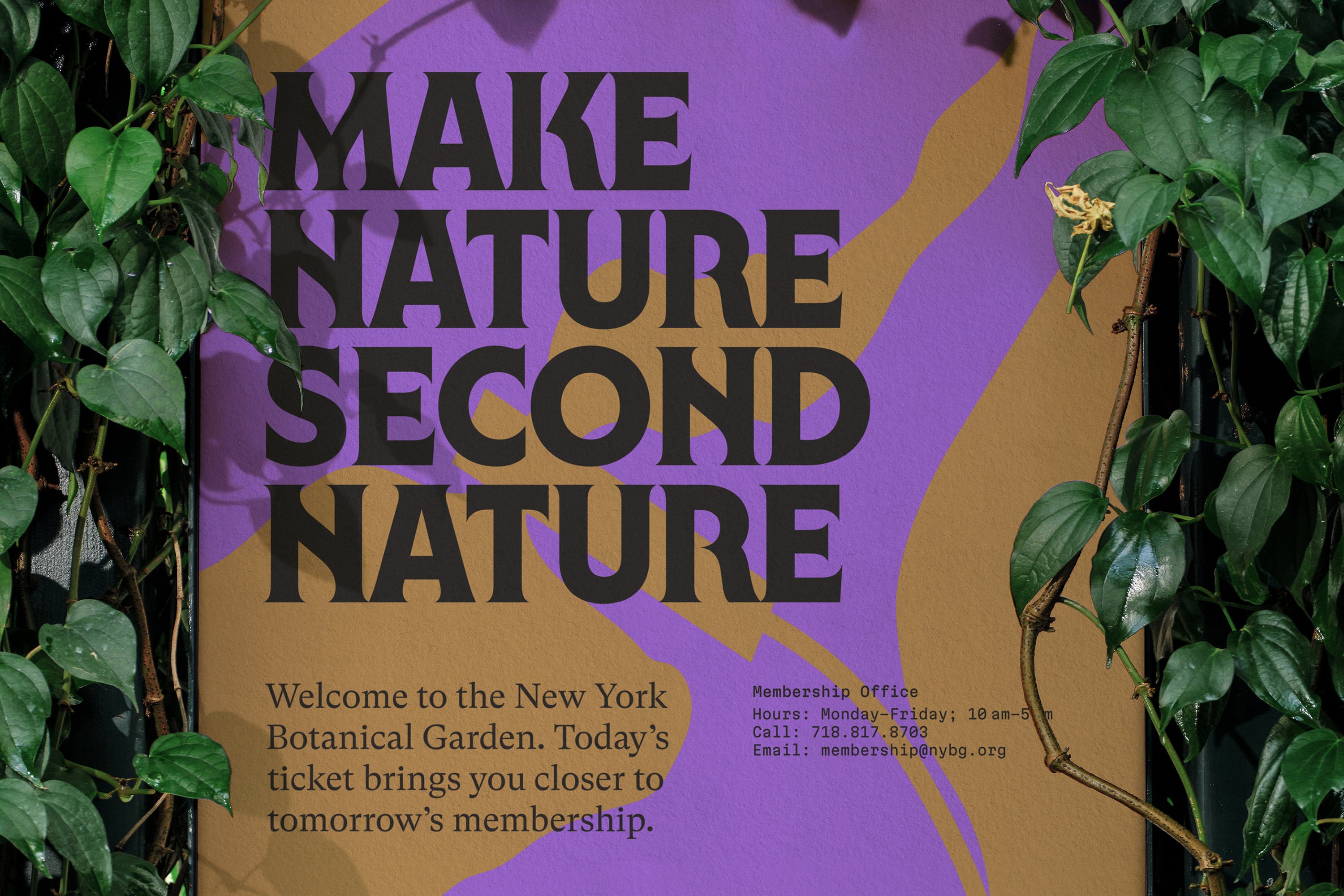
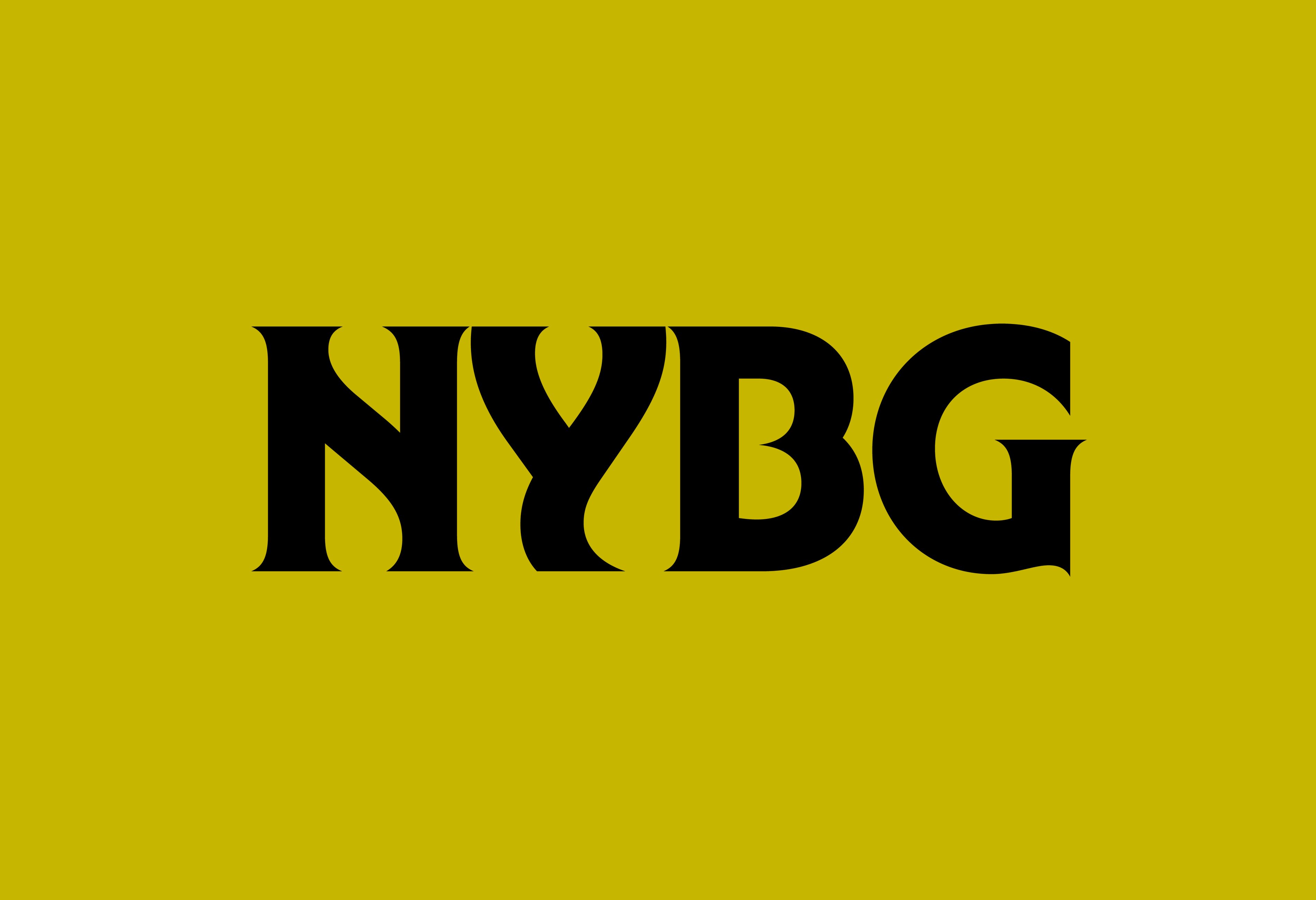
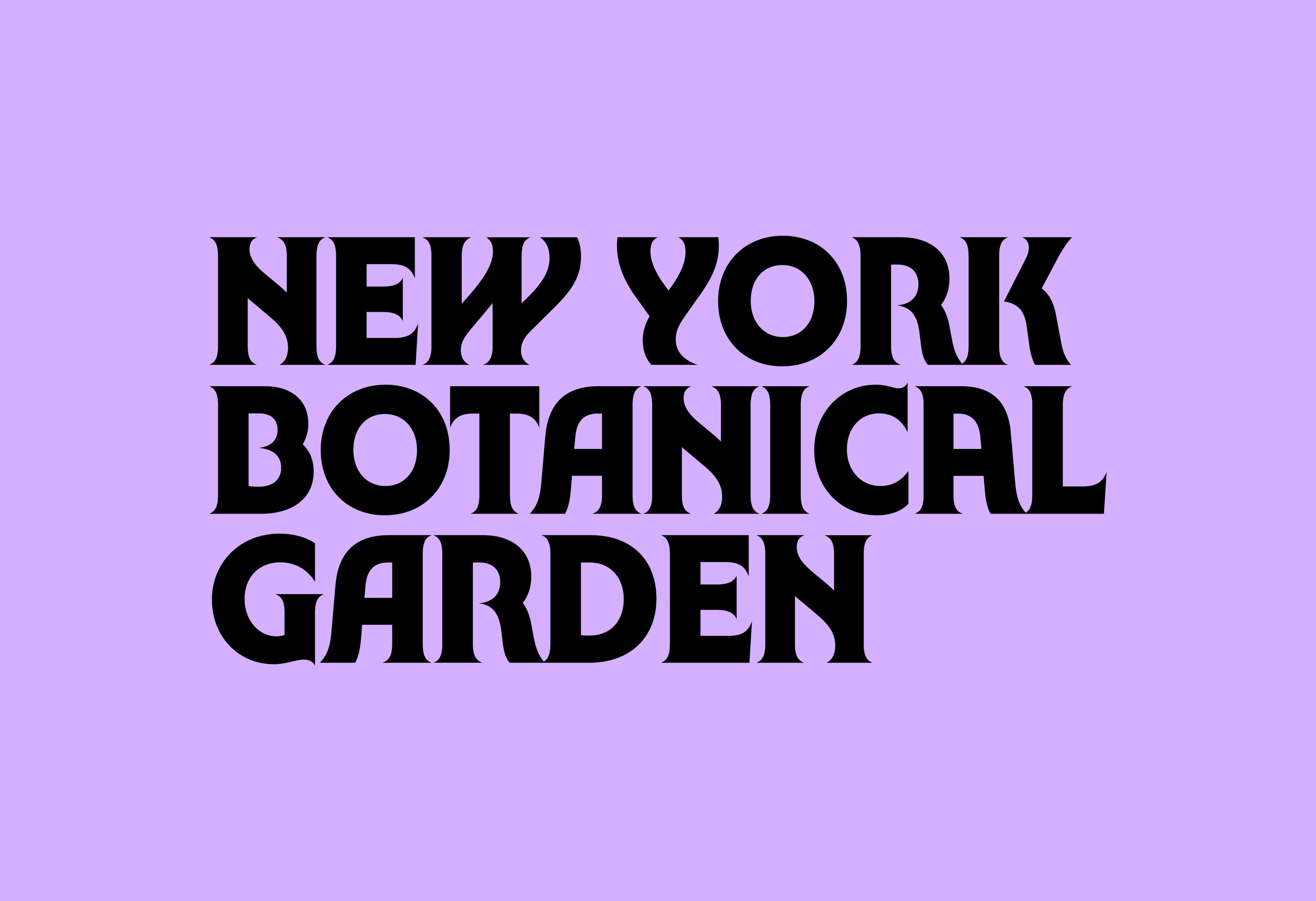
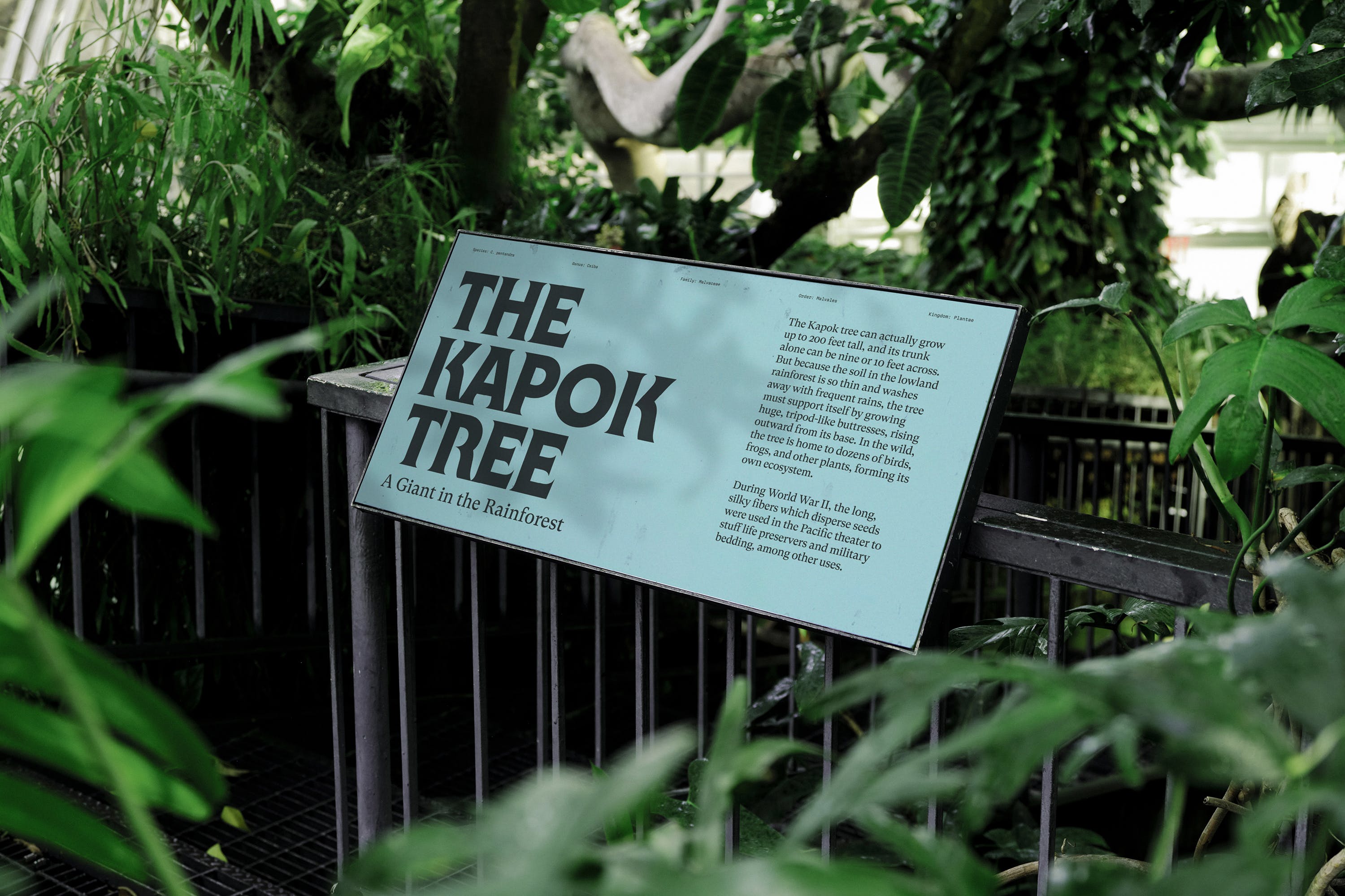
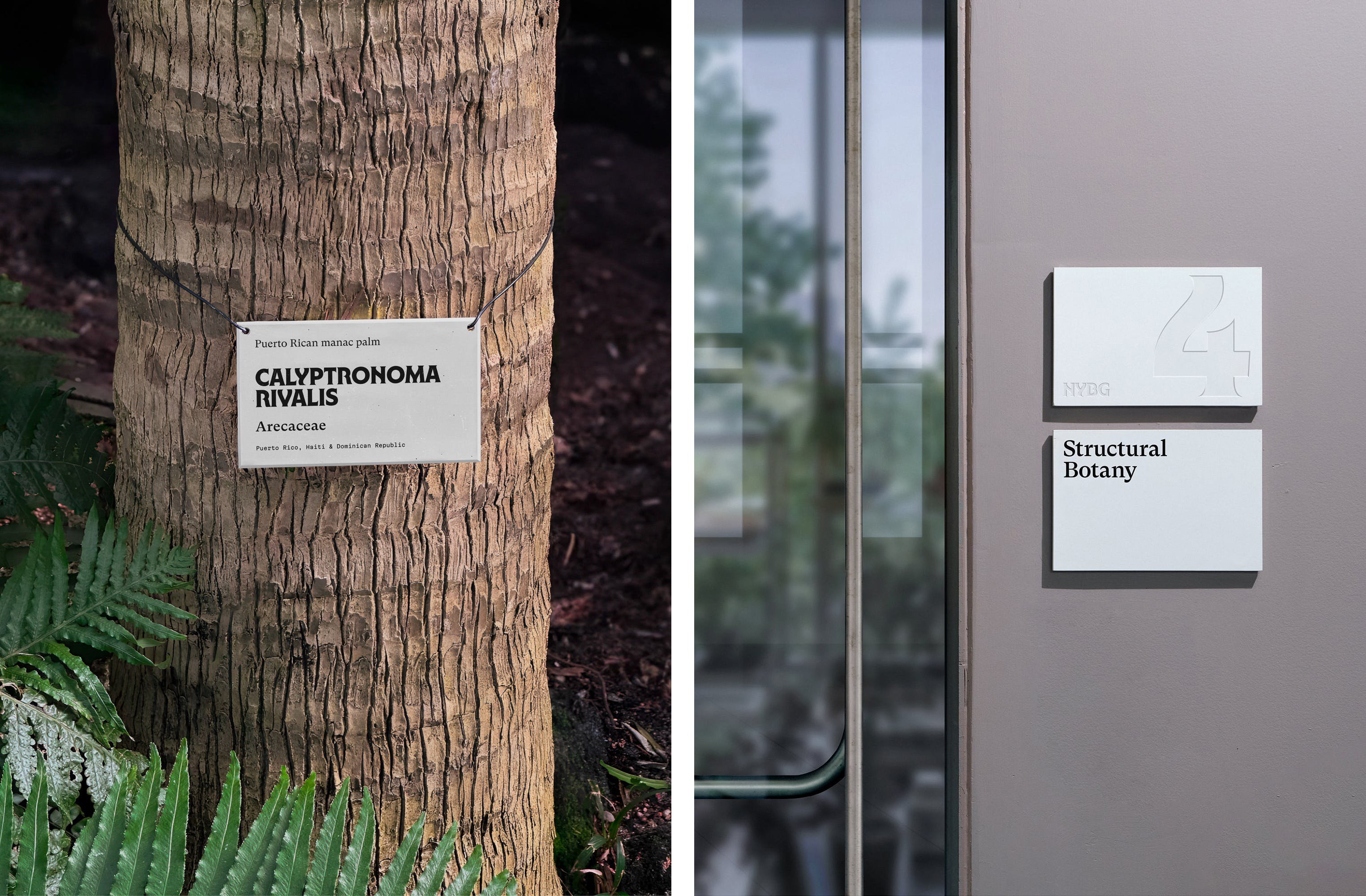
It’s certainly bold: the bespoke type of the wordmark (which appears to have been named NYBG Gothic, and was designed in collaboration with Ryan Bugden) feels fresh and contemporary without being too out-there – after all, this is a botanical garden, not a craft beer pop-up. Some of the strongest applications of the branding are those where a number of different fonts are used together: billboards, for instance, as well as the NYBG website, mix the chunky curves of the wordmark text with a faintly quirky serif font and a typewriter-like typeface – it sounds like it shouldn’t work, but it really does.
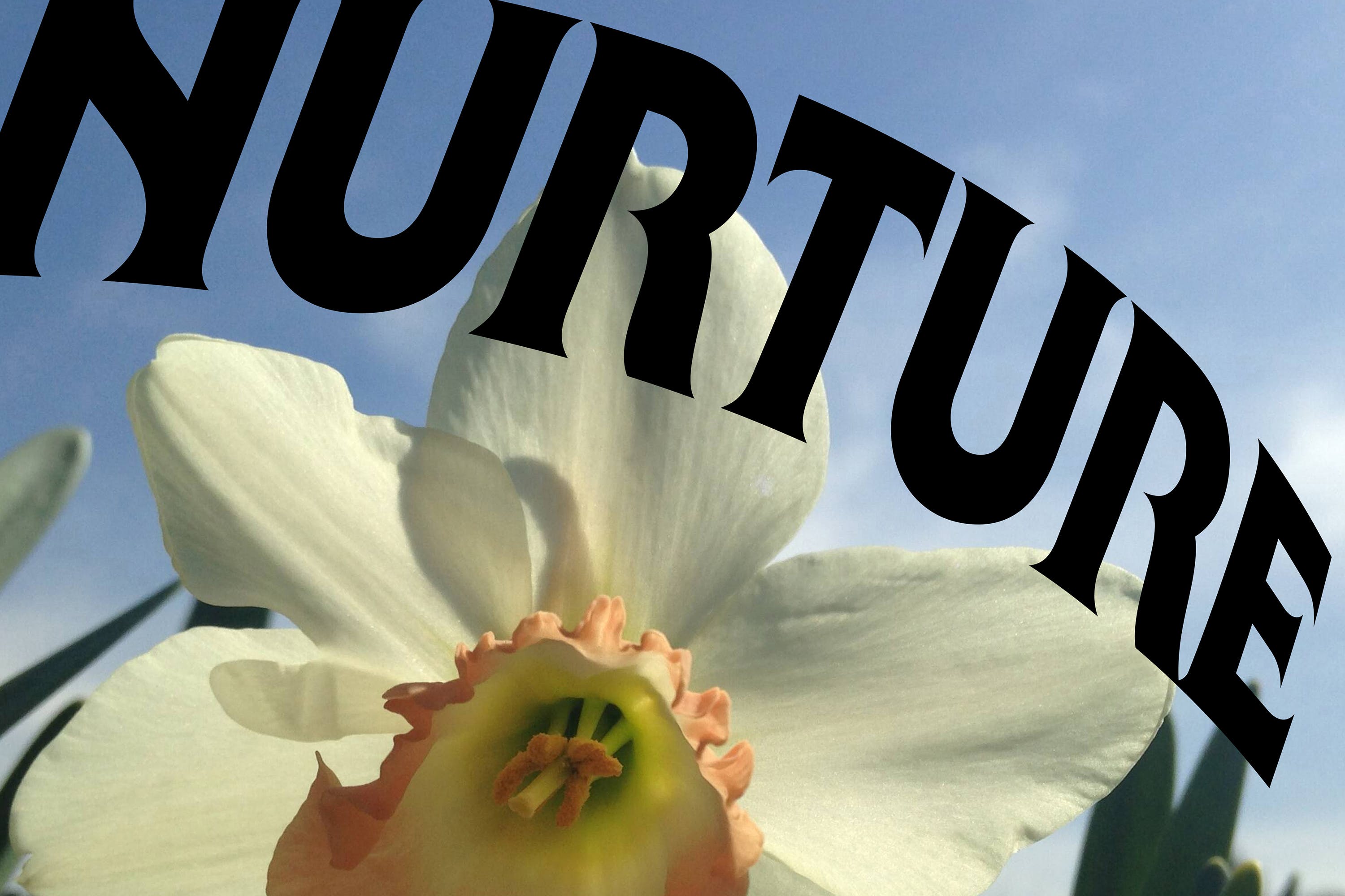
According to Wolff Olins, the type “references forms found in nature and evokes a confidence that speaks to the organisation’s impact”; while for the supporting fonts, it opted for Martian Mono by Brooklyn-, Porto- and Osaka-based type foundry Evil Martians; and GT Super by the ever-excellent Swiss foundry Grilli Type.
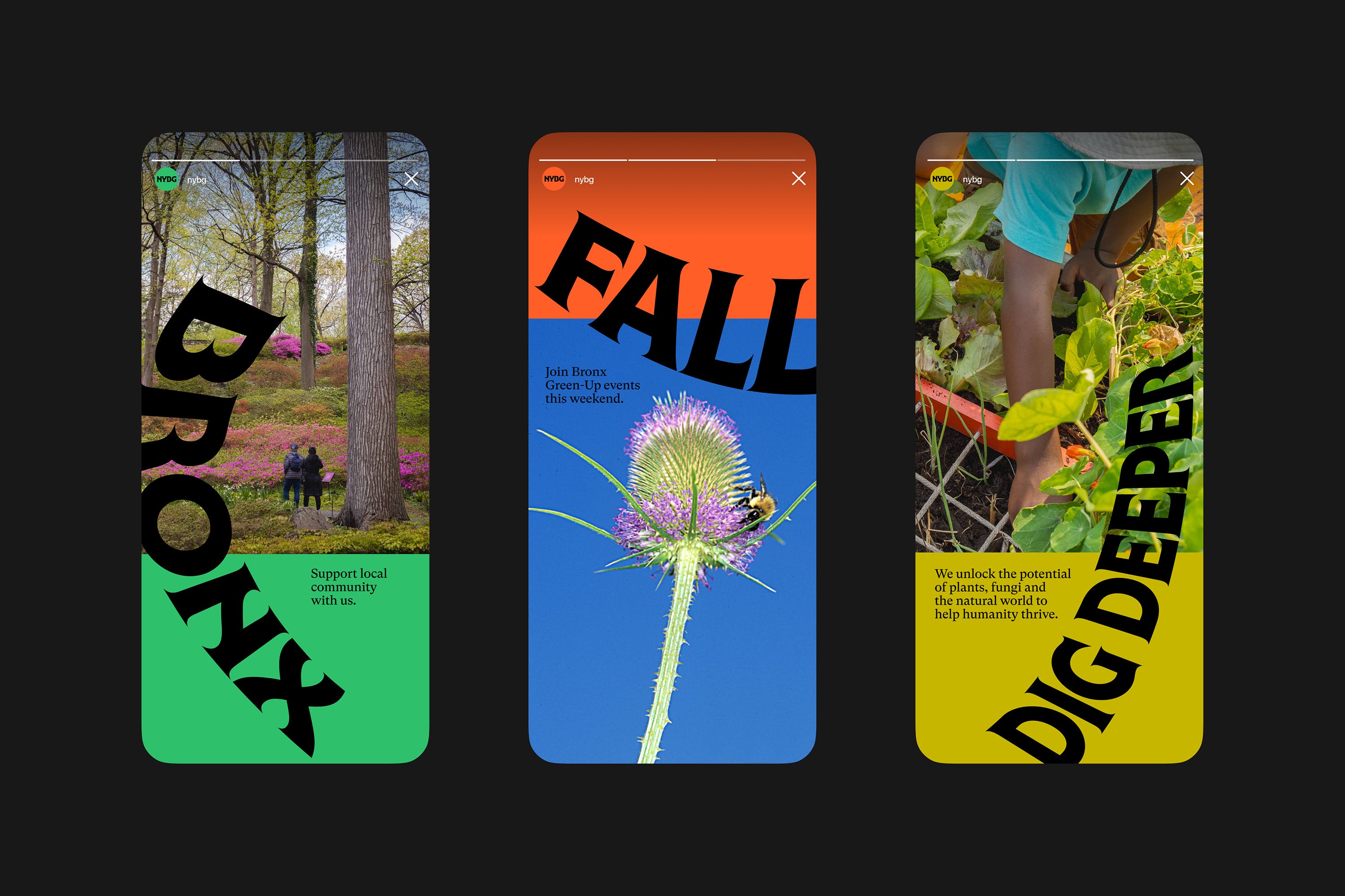
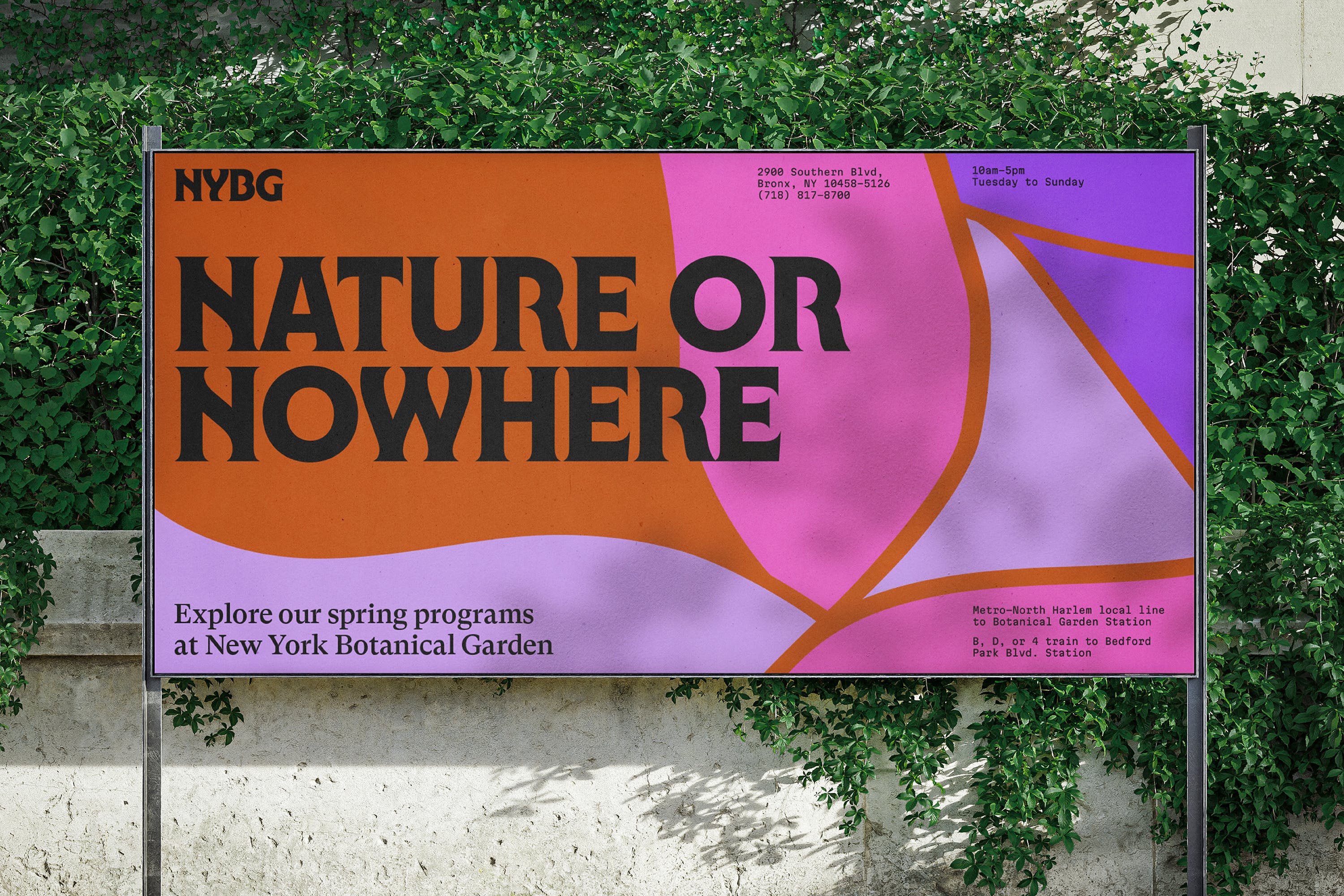
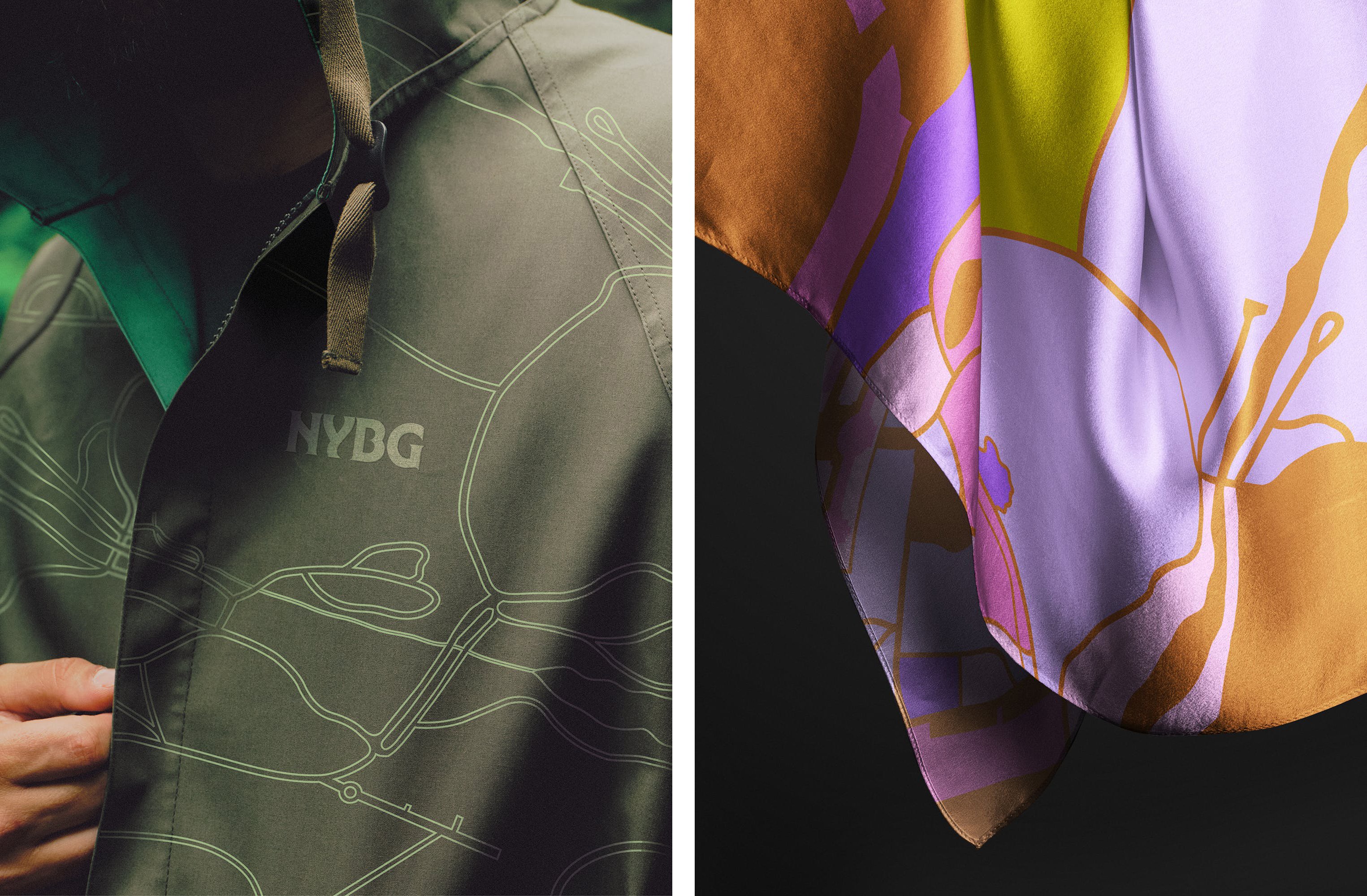
The new colour palette is similarly unapologetic and bold, using vibrant shades of pink, purple, and orange alongside more muted shades of yellow and turquoise. Yes, there’s a few splashes of green, but – and what a relief – the designers have resisted the temptation to go for the obvious palette of ‘organic’ shades and instead looked to some of the other shades the NYBG landscape offers “from trees to fungi to the Bronx River, and meant to be combined in endless, unexpected ways year-round”. It works very well, and doesn’t feel too far on the playful and wacky side, especially when pared back to the secondary palette on applications like signage and navigation at the physical garden site.
The last time NYBG overhauled its visual identity was back in 2014, when it commissioned Pentagram for the job. That identity was rather more serious and formal-looking – all tasteful serifs, pared back layouts, and nice, but somewhat Victorian-looking illustrative graphic elements in nice neat monochrome. Wolff Olins’ identity, on the other hand, feels a lot more daring and alive: it’s dynamic, bold, and contemporary, ushering in a new era for the proudly Bronx-based NYBG and taking it firmly into the 21st century – all while remaining staunchly Nooo Yoik in voice, visuals, and attitude.
