Charity & Noneprofit Logos
RSPCA by JKR
It’s often the launch of major charity rebrands that puts the gulf between how the design world views something, and how the rest of the world might, into sharp relief. Countless headlines abound bemoaning the £££millions ‘spent on a new logo’, as if that’s just about all there is to it, and now the children/animals/elderly etc will directly suffer as...
Barnardo’s by The Clearing
Barnardo’s is the UK’s largest children’s charity, and it undoubtedly does much good in the world. However, its history up to this point is also littered with uncomfortable controversies. Certainly, the most outlandish transgressions are concentrated in the late-19th and early-20th centuries. Founder Thomas John Barnardo was taken to court 88 times for kidnapping children (or ‘philanthropic abductions’, as old...
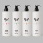
Soap Co. by Paul Belford Ltd
Soap Co. is a UK based social enterprise, luxury soap manufacturer and brand, that provides employment to people who are blind, disabled or disadvantaged. These individuals make up 70% of their team. All profits go back into the business to create and fund further job opportunities. Soap Co. recently launched a range of luxury handmade soaps, hand washes and hand lotions,...
From Babies With Love by Paul Belford Ltd
From Babies With Love is an organisation that sells organic baby clothes, blankets and accessories, as well as a range of greetings cards online. The money raised from the sale of these goes to SOS Children’s Villages, a scheme that supports babies who have lost parents to war, famine, disease or poverty, by placing them with families and within communities that are safe and stable. London based Paul...
Reachin’ by Karoshi
Reachin’ is a regular charity event established in 2012 to engage with a younger demographic and raise awareness and funds for Myeloma UK, an organisation dedicated to finding a cure for Myeloma, a rare cancer of the bone marrow. Money made from each event is complemented by the online sale of branded t-shirts, vests and tote bags. Designed by Karoshi, Reachin’s brand...
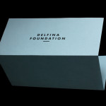
Delfina Foundation by Spin
“Delfina Foundation is an independent, non-profit foundation dedicated to facilitating artistic exchange and developing creative practice through residencies, partnerships and public programming, with a special focus on international collaborations with the greater Middle East & North Africa”. The foundation’s visual identity, developed by London-based design agency Spin, mixes a bold typographic solution and underline detail, a modern take on a...
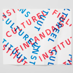
The Finnish Cultural Institute by Kokoro & Moi
The Finnish Cultural Institute for the Benelux (Fins Cultureel Instituut, Institut Culturel Finlandais) is a non-profit organisation that promotes Finnish arts and culture to the Benelux countries of the Netherlands, France and Belgium, with the intention of fostering collaborative opportunities for artists and organisations within the fields of music, literature, design, cinema and the performing and visual arts. The institute’s visual identity,...
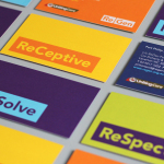
ReGen by Studio Brave
ReGen, formerly known as Uniting Care Moreland Hall, is a not-for-profit drug and alcohol treatment and education agency established in 1970 for the Victoria and Tasmanian regions of Australia. Following the recent name change Studio Brave developed a new visual identity that would better reflect the ReGen’s evidence based practices and the positive, practical outcomes it achieves, through a combination of...
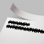
Privacy International by Paul Belford Ltd.
Privacy International is a UK based non-profit organisation established in 1990 to monitor the security intrusions of governments and business, increase the awareness of data protection concerns and establish ‘new forms of privacy advocacy’ at an international level. Made up of computer professionals, academics, lawyers, journalists and human rights campaigners the organisation has worked on initiatives across fifty countries and is...