Ginori 1735 by AUGE
Opinion by Thomas Barnett Posted 14 May 2024
Florentine design studio AUGE has created a sumptuous range of packaging for Italian luxury homeware brand Ginori, which was founded in 1735 as the Manifattura di Doccia by Marquis Carlo Ginori on the grounds of his villa at Doccia. Nearly three hundred years later, the venerable brand finds itself owned by Gucci, following a merger with Società Richard (and subsequent bankruptcy filing in 2013). In its modern incarnation, Ginori has expanded from its porcelain heritage to become a broader luxury homeware brand, offering fine fragrances, candles, statuary and decorative artworks in addition to a dazzling array of porcelain and crystal tabletop wares—from cruet sets to candelabra.
Ginori porcelain is the epitome of chintzy old-world glamour – your snobby great aunt probably lusts after a Ginori pickle dish. Material reality of the wares aside, the brand has decisively reoriented itself towards a more contemporary definition of luxury, borrowing from the perfume/fashion house playbook by featuring Hollywood A-listers such as Jake Gyllenhall and its advertising campaigns.
The long-term aim of a rebrand for this kind of heritage luxury brand is to re-establish the valuable but somewhat moth-eaten name as a recognisable staple of contemporary luxury – for ‘a Ginori teacup’ to become the same shorthand for the epitome of luxury design as ‘a Rolex watch’ or ‘a Birkin bag’. So long, snobby great aunties of Italy and beyond.
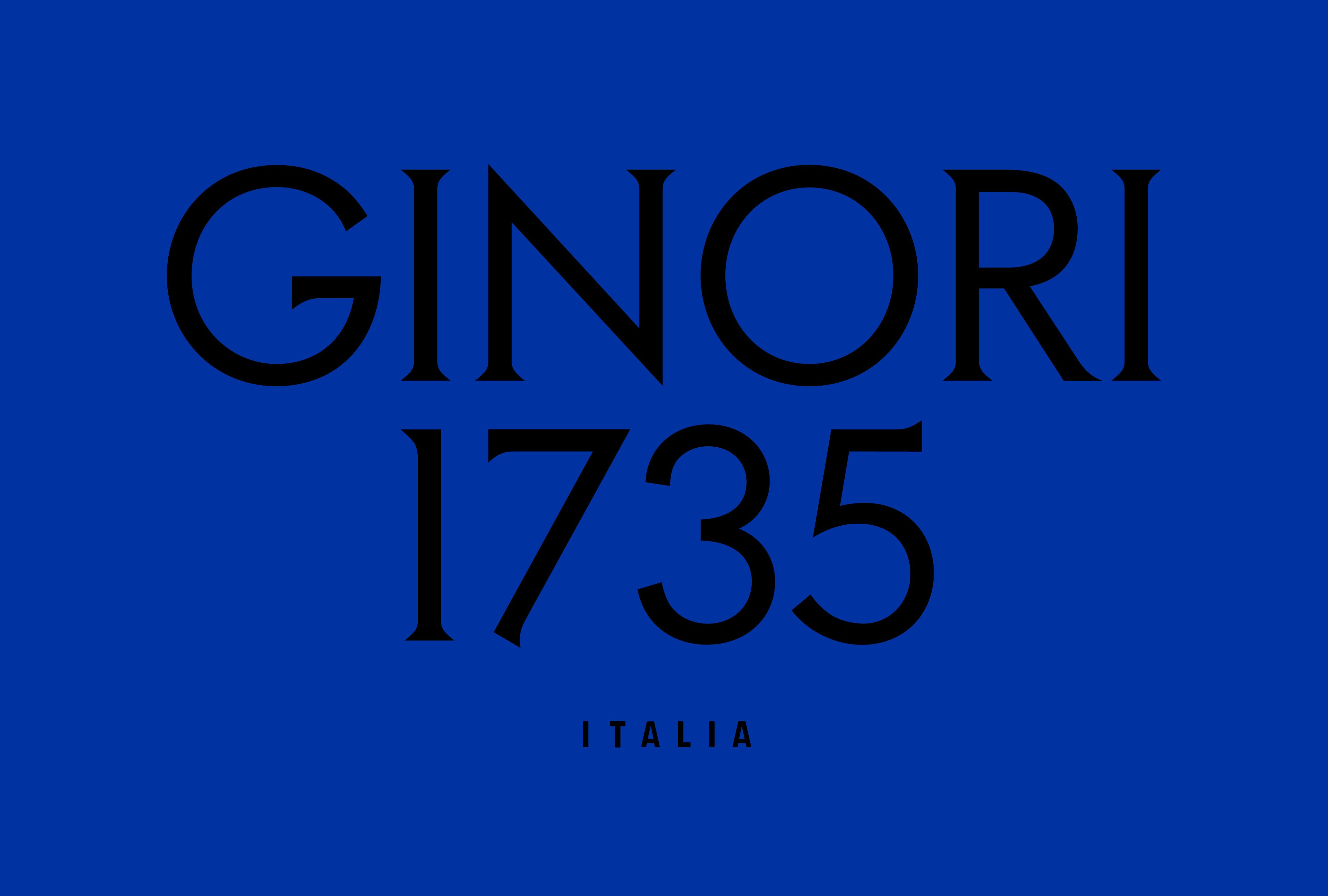
In pursuit of this elevated cultural cachet, in 2020 international design consultancy 2×4 was tasked to create a new brand strategy, name, logo and identity for the dusty old dowager of decadent dinnerware. In a decisive return to the exclusively aristocratic roots of the most reputationally equitable part of the merged brand, ‘Richard’ was unceremoniously dropped from the hybrid name (bad luck to the Piedmontese potter Giulio Richard), and the founding date added to become ‘Ginori 1735’.
While the addition of the founding date to the brand name does slightly rob the brand of the mononymous authority possessed by a single, mellifluous Italian surname (one would have imagined that parent company Gucci would be more aware of this most), it does succeed in recapturing the great age of the brand as an intentionally leveraged asset, rather than as a liability.
However, as this review is primarily concerned with AUGE’s packaging design, we will say no more on the matter of 2×4’s work – other than to remark that the beautifully chiselled Romanesque serif logotype and the intense Yves-Klein blue brand colour formed an excellent foundation for AUGE to build upon.
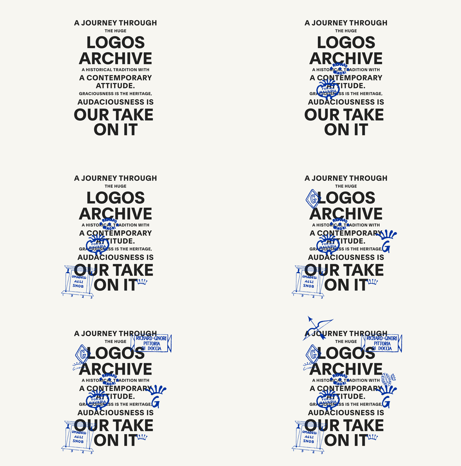
After delineating the standard ‘fusion of heritage and modernity’, AUGE states that its primary challenge was to devise a design system ‘capable of representing Ginori’s essence and being functional for a wide variety of formats’. The solution to this problem lay in an unashamedly kid-in-a-candy-shop delve through Ginori’s own extensive logo archive to ‘rediscover the logos created for all of the brand’s collections since the 1700s’.
And it must truly have been hard to choose. From the little flickering gifs of various archival logo designs, it seems like Ginori has never had a bad logo. All the monograms, marks and wordmarks are beautiful examples of aristocratically assured typography. Through the seismic shifts of three hundred years of European visual design – rises and falls of Baroque, Rococo, Neoclassical, Gothic Revival, Arts and Crafts, Nouveau, Deco, Futurism, Modernism and beyond – the sage overseers of Ginori seem to have possessed an extraordinarily reliable divining rod for beautiful typography and brandmarks. But then, what else would one expect from a brand founded by a Marquis. Forgive me.
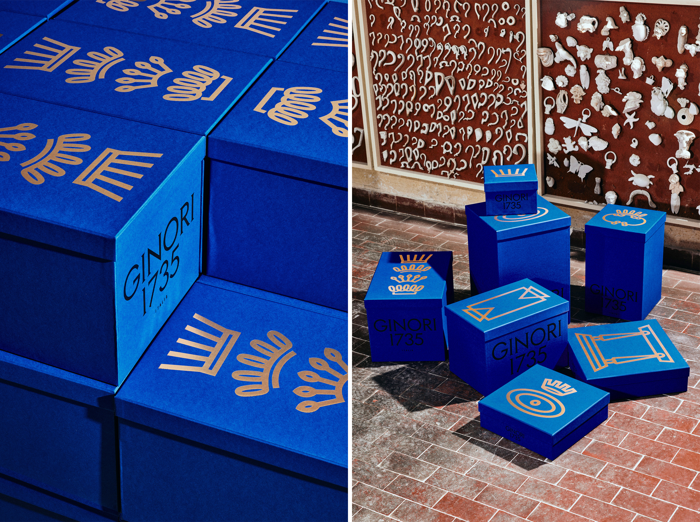
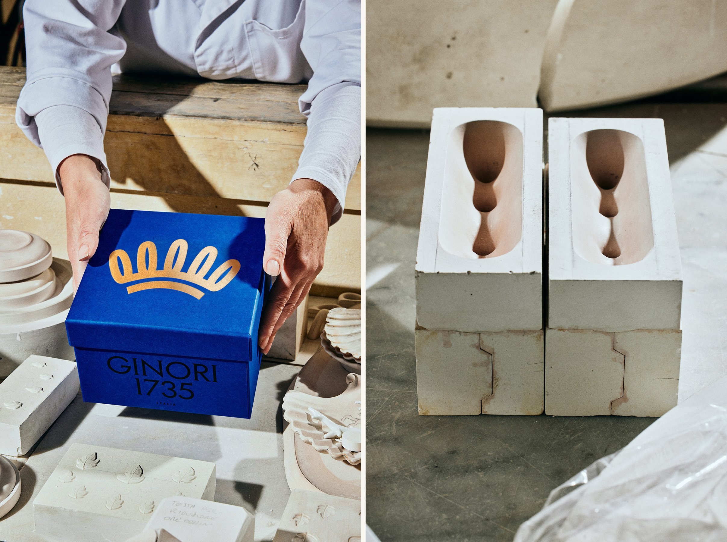
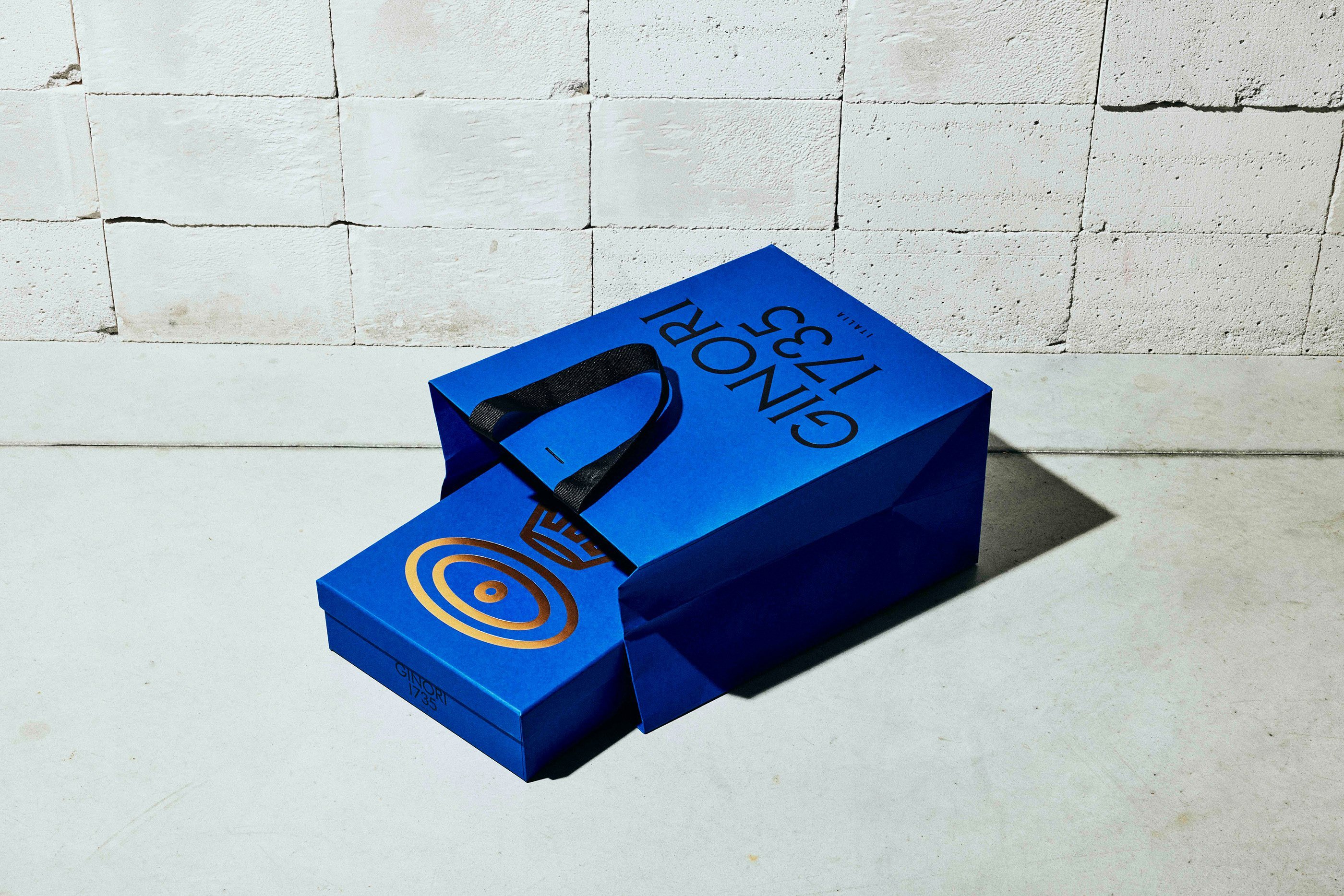
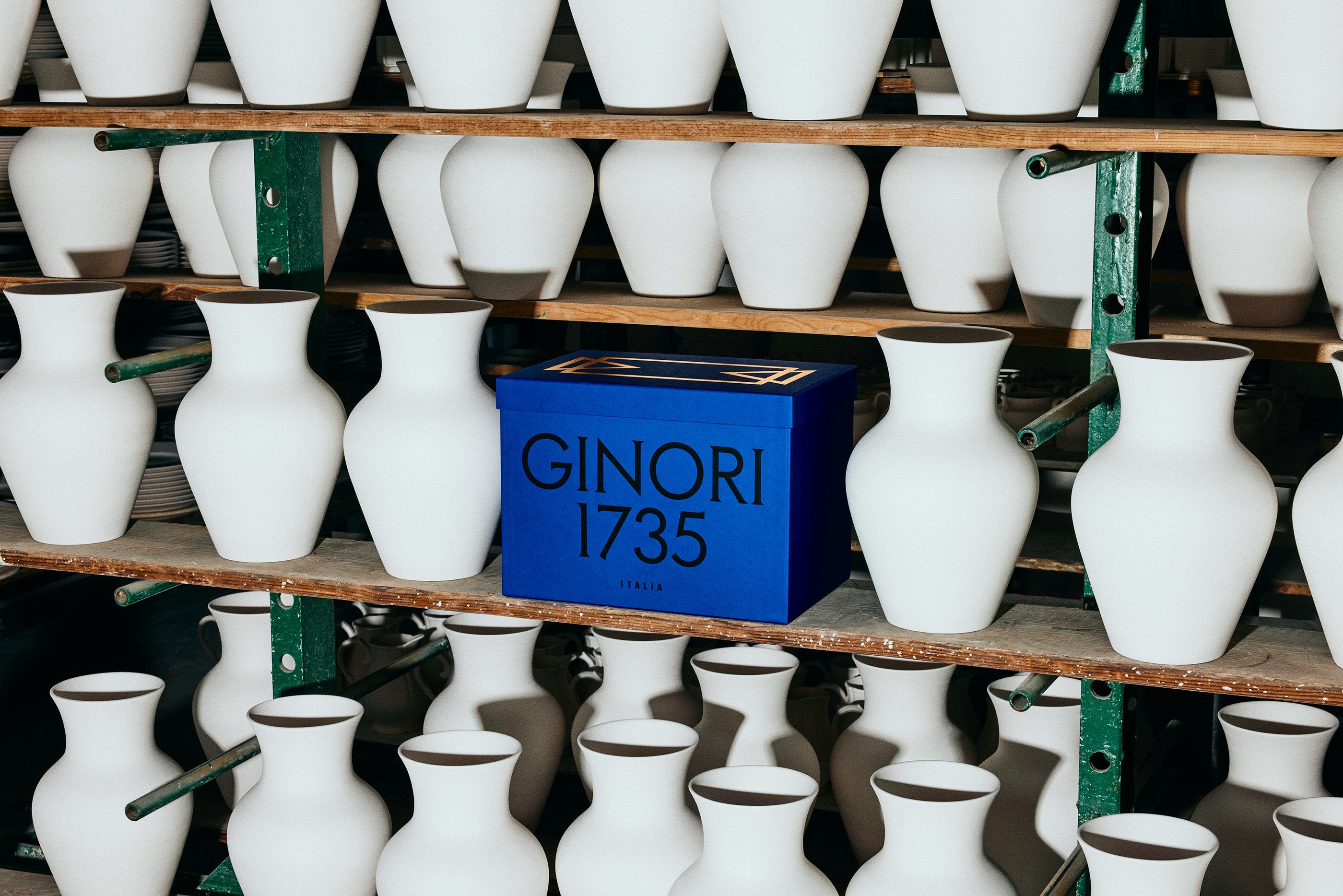
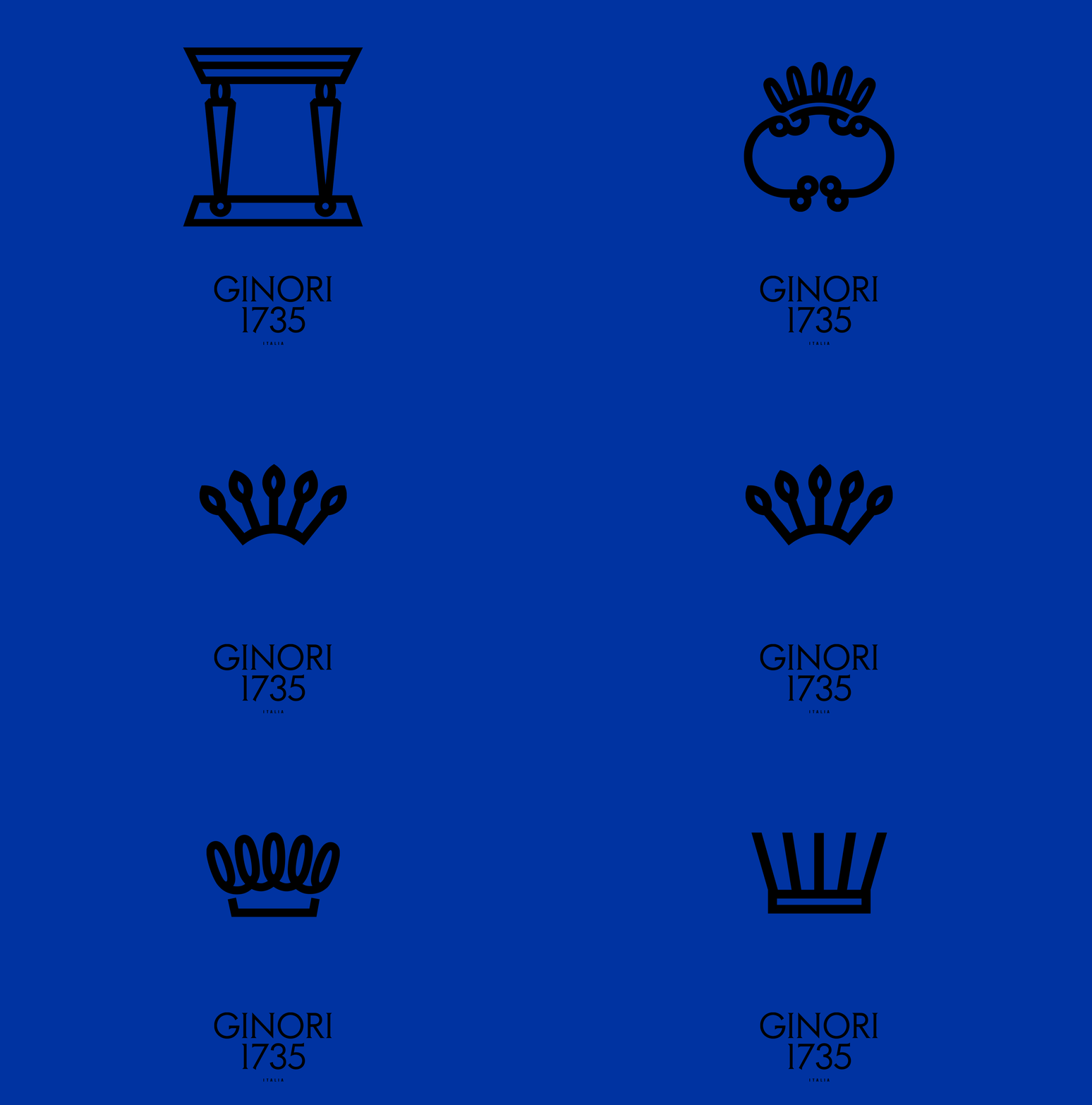
In terms of selection criteria, AUGE simply states that it ‘selected the most iconic ones’, but the choices have also evidently been carefully made to ensure that there is an ideally proportioned motif for every size and shape of box in Ginori’s packaging range. Among the archival marks that have been confidently reimagined in a bold, simplified, geometrically-regularised style is the iconic crown motif that has identified the brand since its inception.
Whereas 2×4 used this coronet in a somewhat underpowered doodle format (presumably a faithful trace of the original drawing of the crown signature), AUGE has, with wise and well-placed confidence, chosen to modernise and embolden the design of the crown and other motifs into a satisfyingly weighty, uniform-stroke-width style. AUGE created four variations of the crown motif, along with a number of other designs inspired by Ginori’s logo archives; a stand-out example is an enigmatic architectural design featuring two stylised tapering columns supporting a pediment, which has an almost hieroglyphic feel.
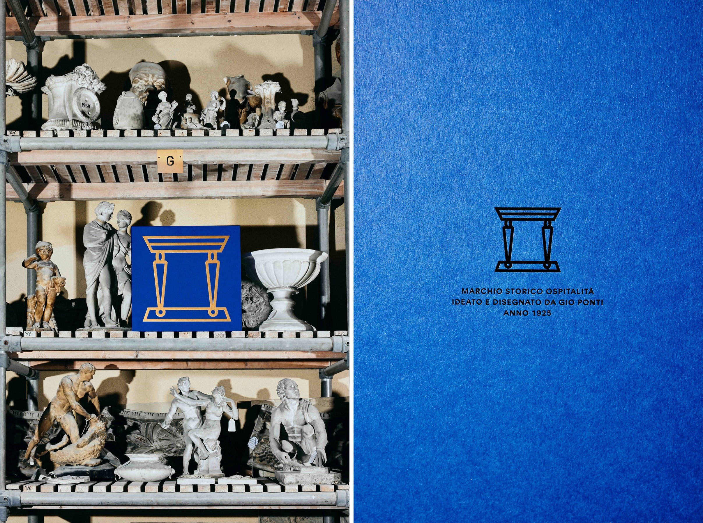
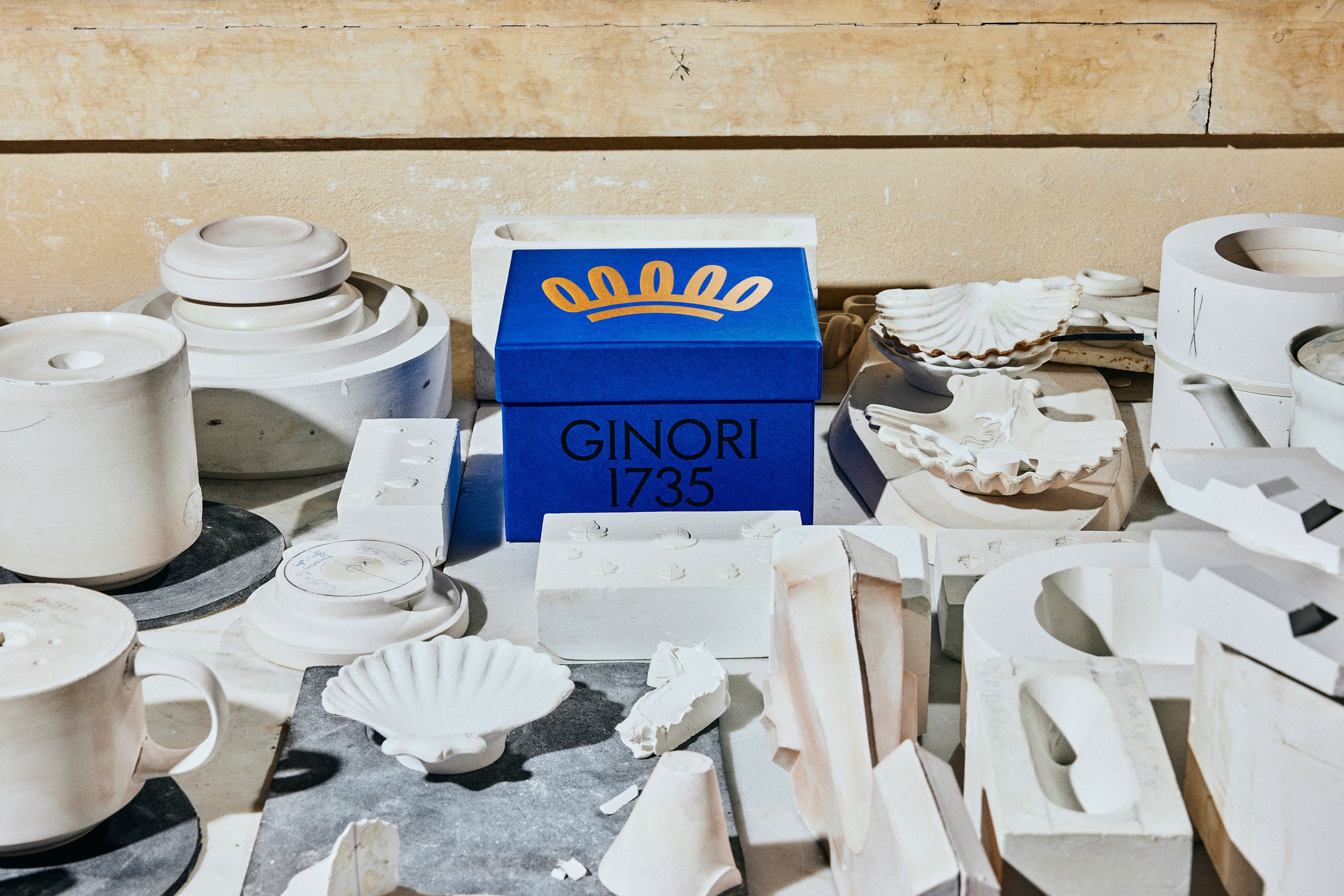
In Ginori’s transition from 2×4 to AUGE, one senses some client feedback along the general lines of ‘the (crown) logo needs to be bigger’, but for once this all-too-familiar instruction seems to have paid dividends. AUGE’s archival motifs have been carefully chosen and sized to perfectly fit the dimensions of different box shapes and sizes. Debossed on the top of the lid in opulent gold foil, the archival logo motifs transform the boxes into intensely desirable and faintly mysterious artefacts in their own right – uncannily antique and futuristic at the same time. In doing so, AUGE has built on (and bettered) its previous work for Ginori 1735: packaging for the LCDC Home Fragrance Collection.
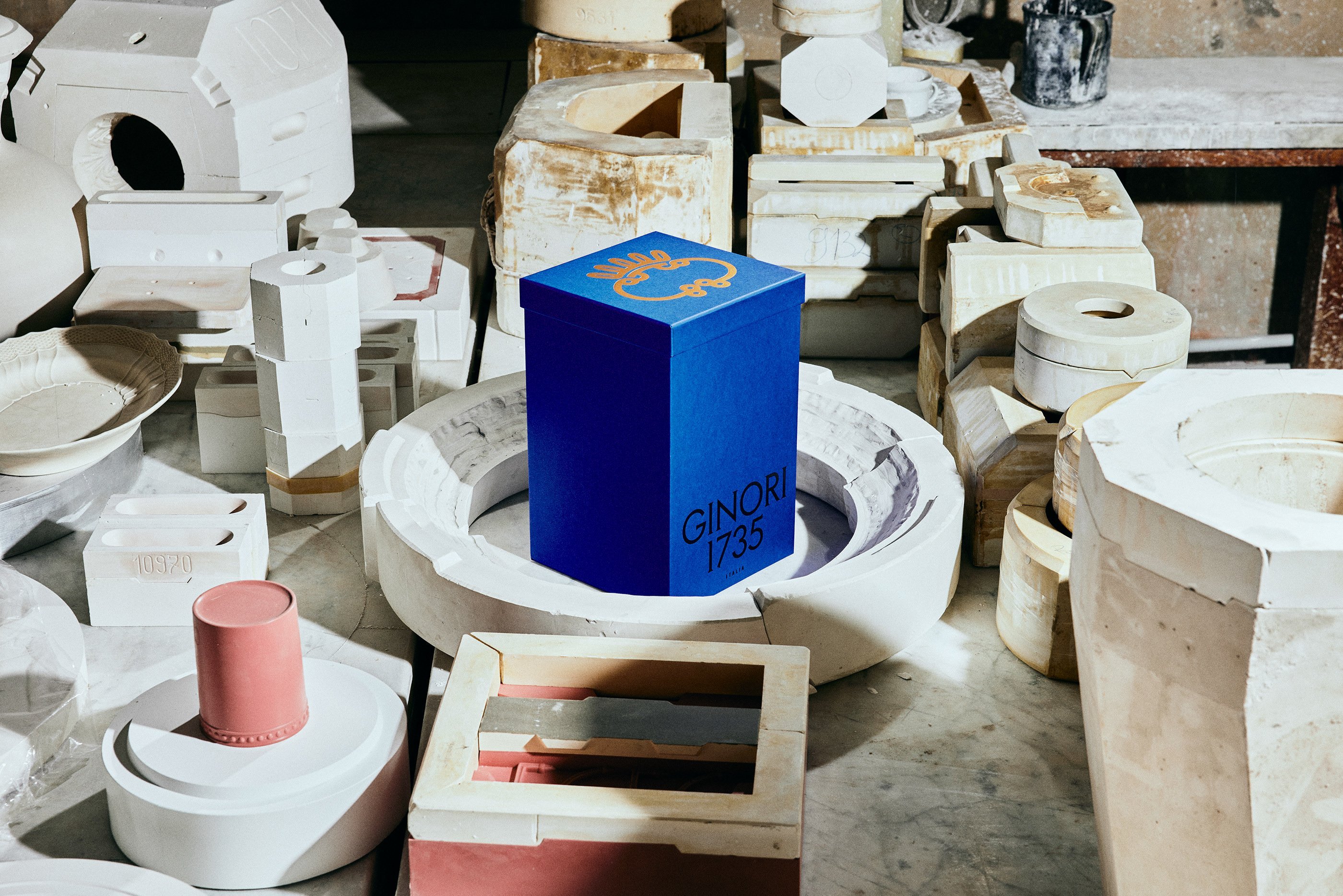
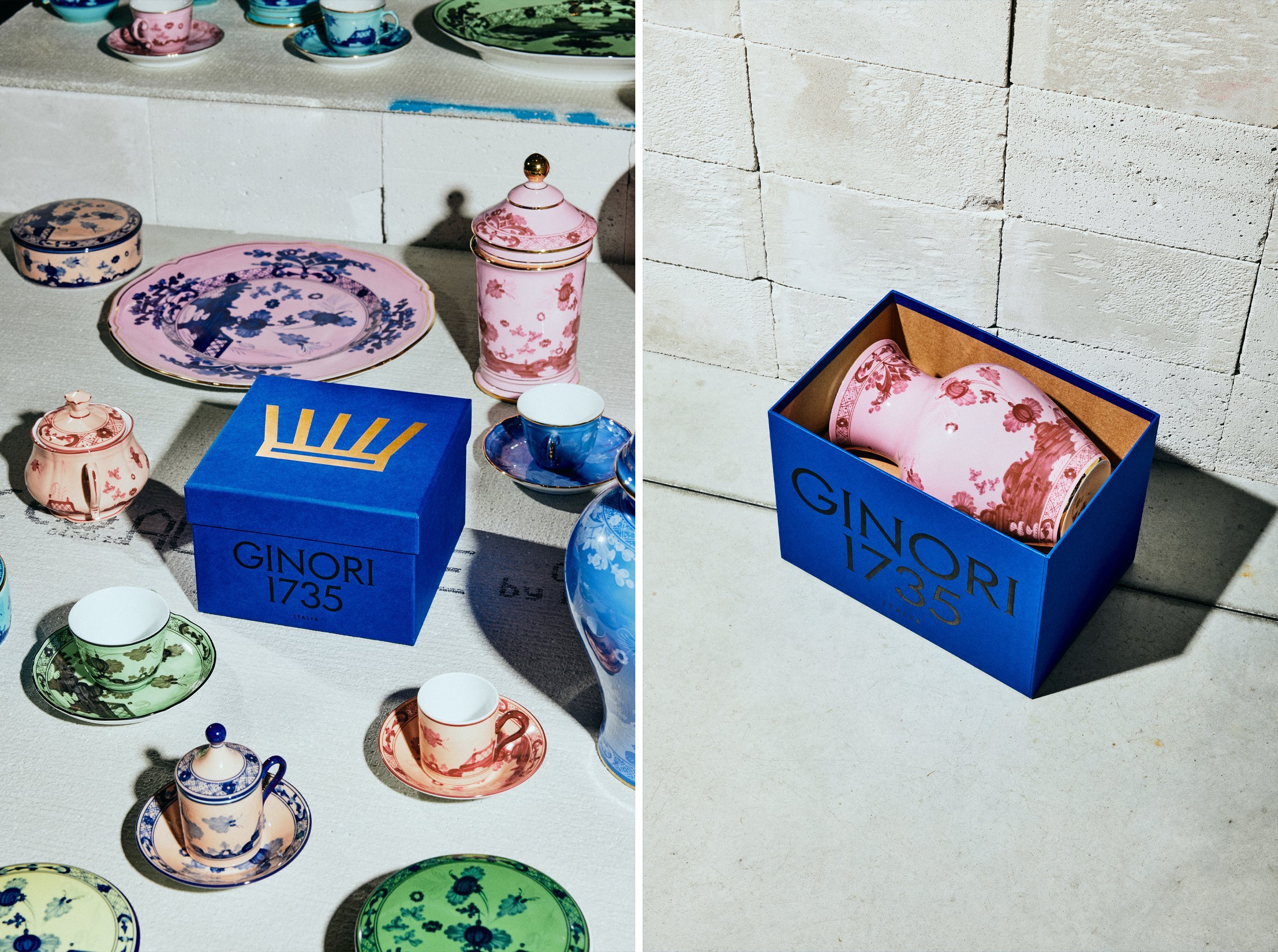
AUGE’s work culminated in ‘a collaboration with Fedrigoni for the production of a Ginori blue pulp paper’ – surely the apogee of a well-funded rebrand. Oh to one day have a client with pockets deep and taste refined enough to insist on bespoke Fedrigoni. Ho hum.
This is delightful work that not only celebrates the deep satisfaction of a properly luxurious box, but also transcends the constraints of packaging design to significantly advance Ginori’s visual identity. Packaging projects where the brand guidelines have already been established (and have existed for a few years) can be a struggle to find the creative opportunity, so AUGE should be applauded in its confident approach and deft touch in pushing this packaging project into such a felicitously uncharted waters. Cover your great-aunt’s ears, but I think I like these boxes more than the porcelain inside them.
