Bikedot by Studio Sutherl&
Opinion by Emily Gosling Posted 27 November 2024

The concept of a brand today rarely has a sense of physicality. The hand (or indeed roller), the mark-maker, usually feels totally absent. It makes sense really, considering our primary interaction with a brand is often online; but when a project comes along that’s so obviously delighting in the possibilities of print processes, inks and paper it feels like a real treat.
As such, it’s perhaps little surprise that Studio Sutherl&’s excellent work for Bikedot has been so celebrated by the design industry, picking up accolades across this year’s D&AD awards and garnering praise for its standout use of typography and tires.
Bikedot – which operates from a London-based showroom and online – builds, sells and ‘curates’ bikes (not sure what that means but we’ll go with it). While it only launched in the last year or so, Bikedot’s founders have 30 years of experience with many of the world’s leading bike builders, and the company prides itself on only recommending quality parts that it has tested. The company also sells individual bike parts and a range of cycling attire, including its own Bikedot brand.
Studio Sutherl& was brought in to create the identity and print campaign materials for Bikedot, including a gorgeous branded newsprint magazine.

The overarching look and feel is unapologetically simple yet brimming with character in the bold, confident use of typography, the stark black and white colour palette and the obvious passion for print that imbues each mark and photographic spread.
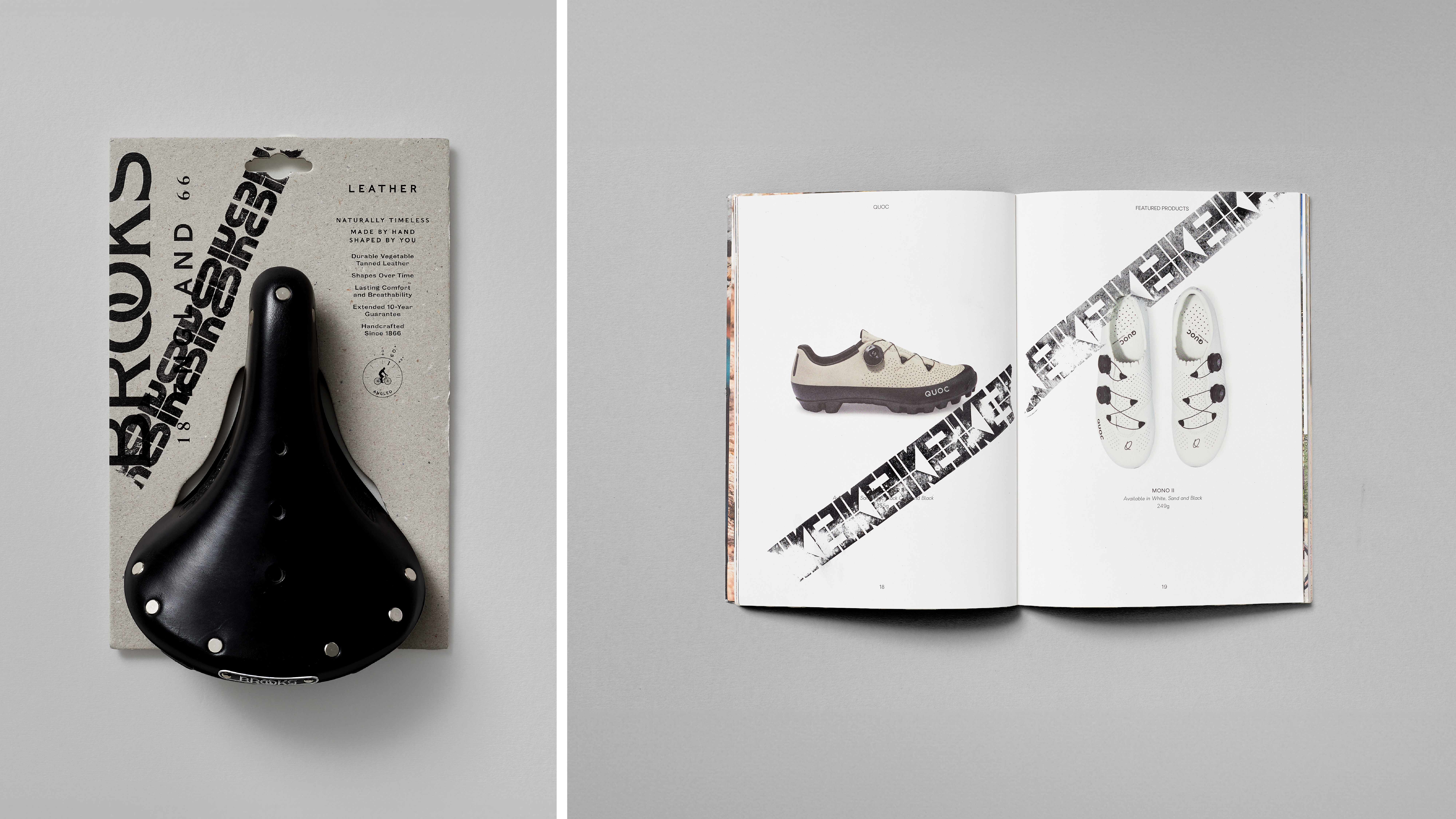
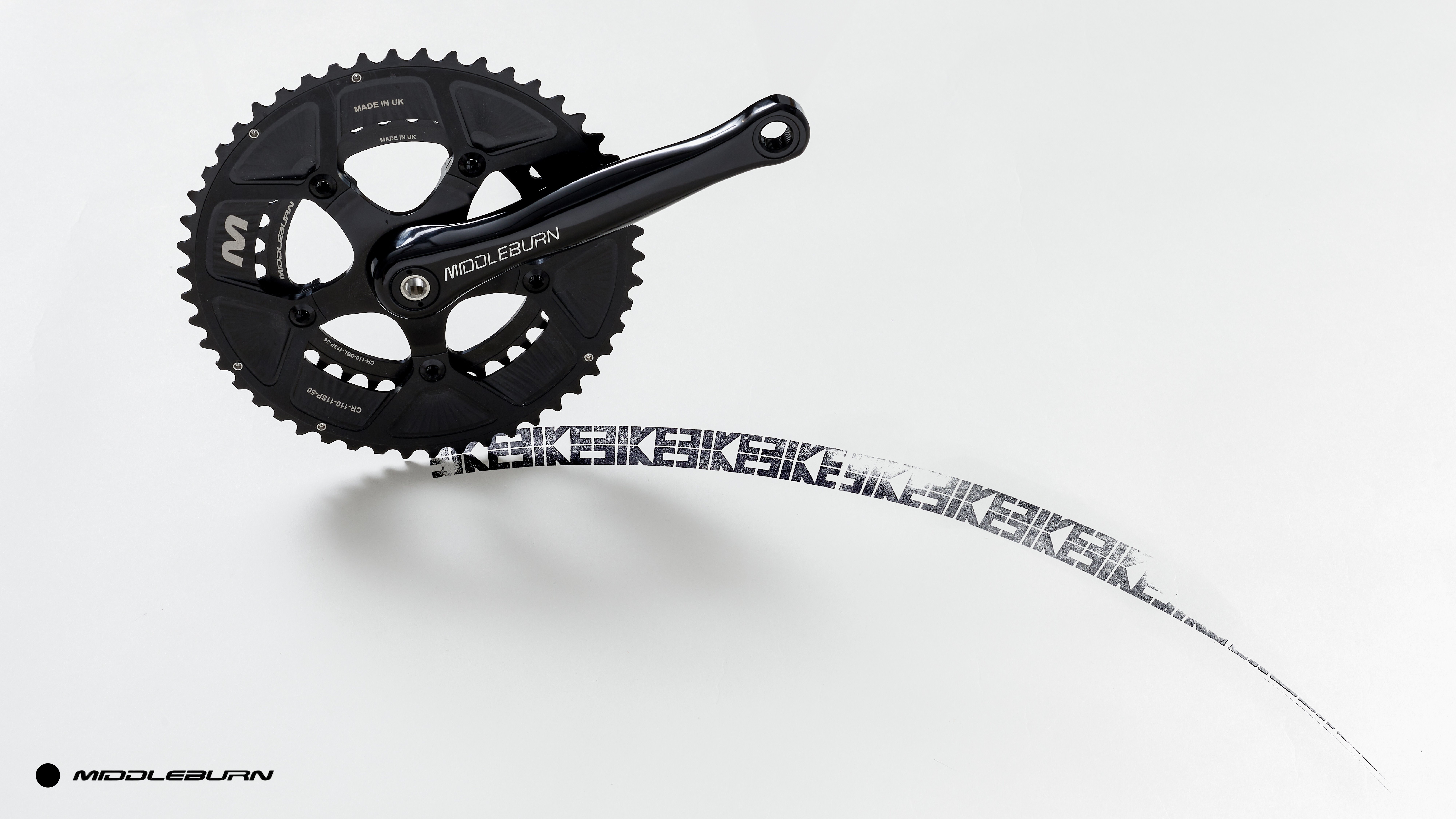
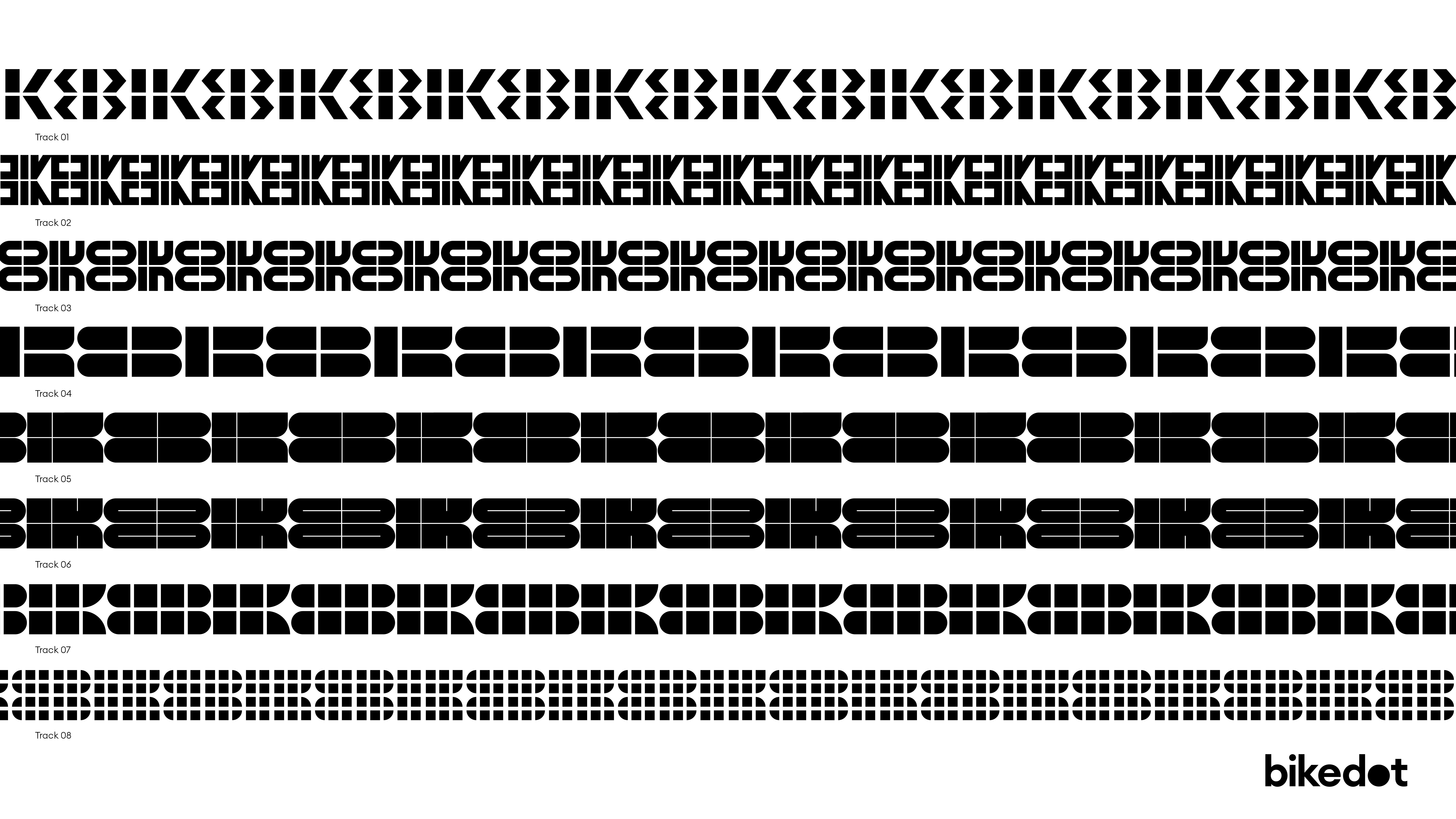
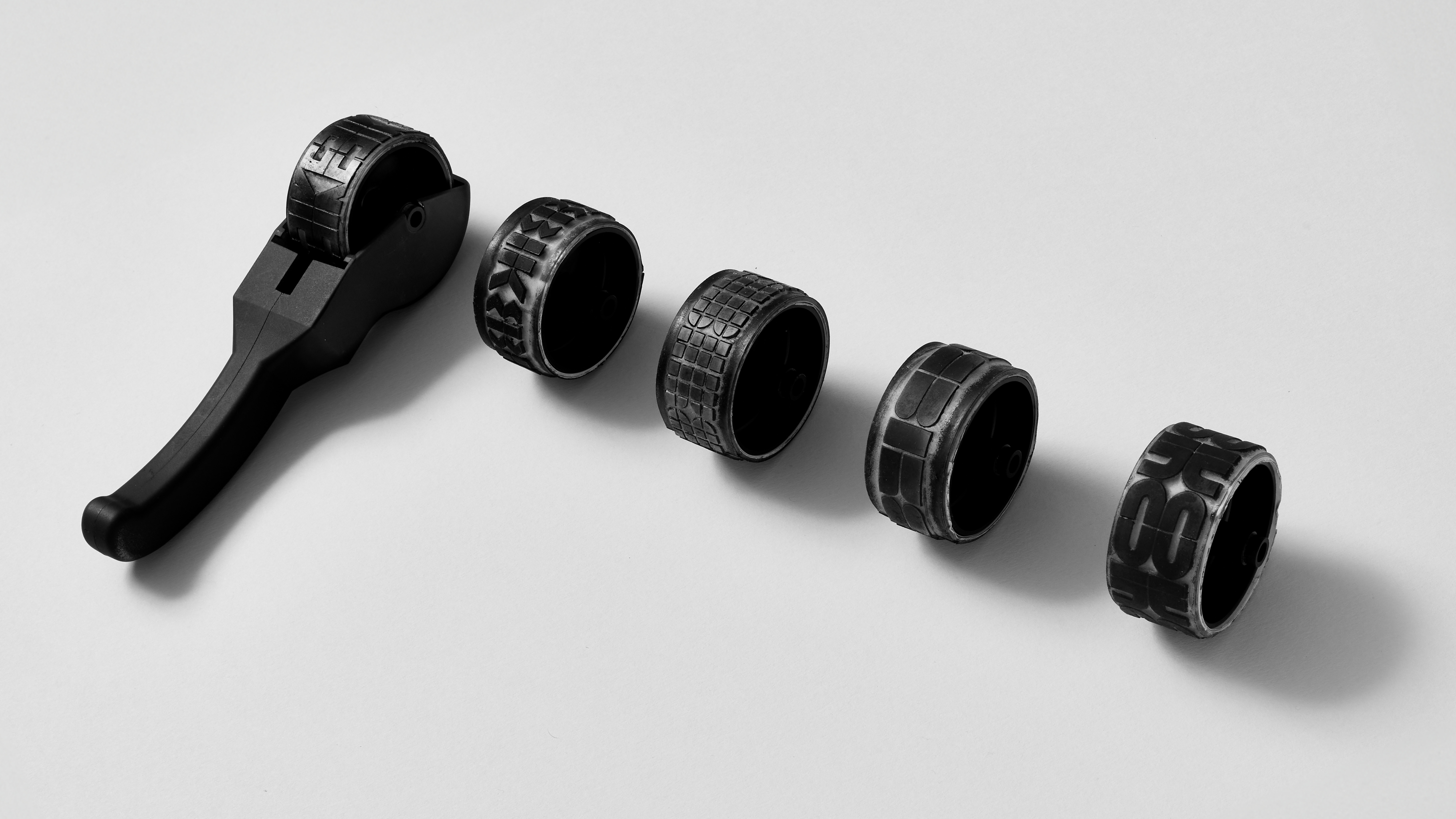
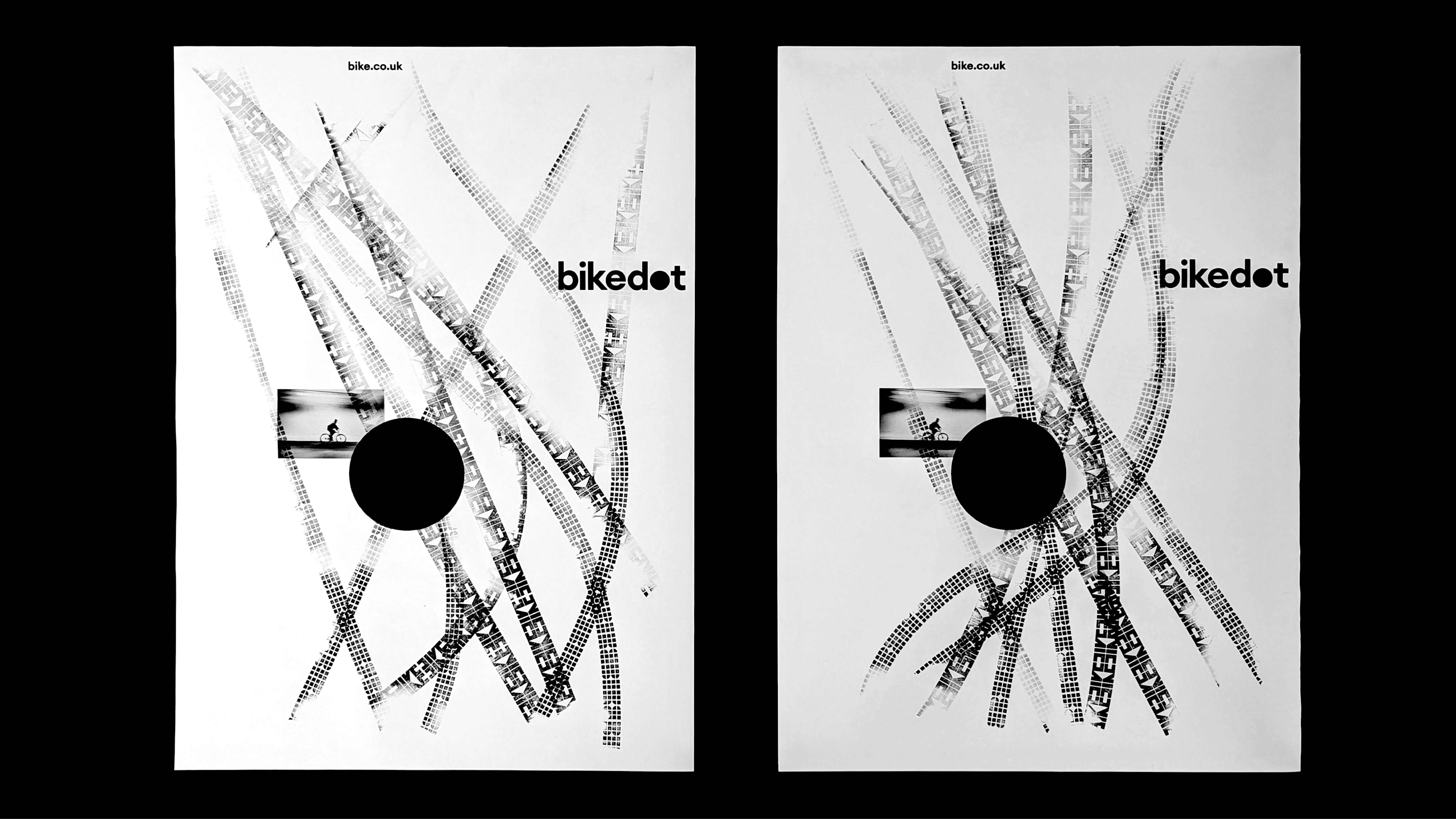
Bespoke typographic ‘BIKE’ track marks form the heart of the identity. These were created in a way that looked to physically embody the freedom of cycling and the precision of its engineering in the most tactile way possible: through rollergraphs prints created by custom-made rollers that bear the bike tyre tracks.
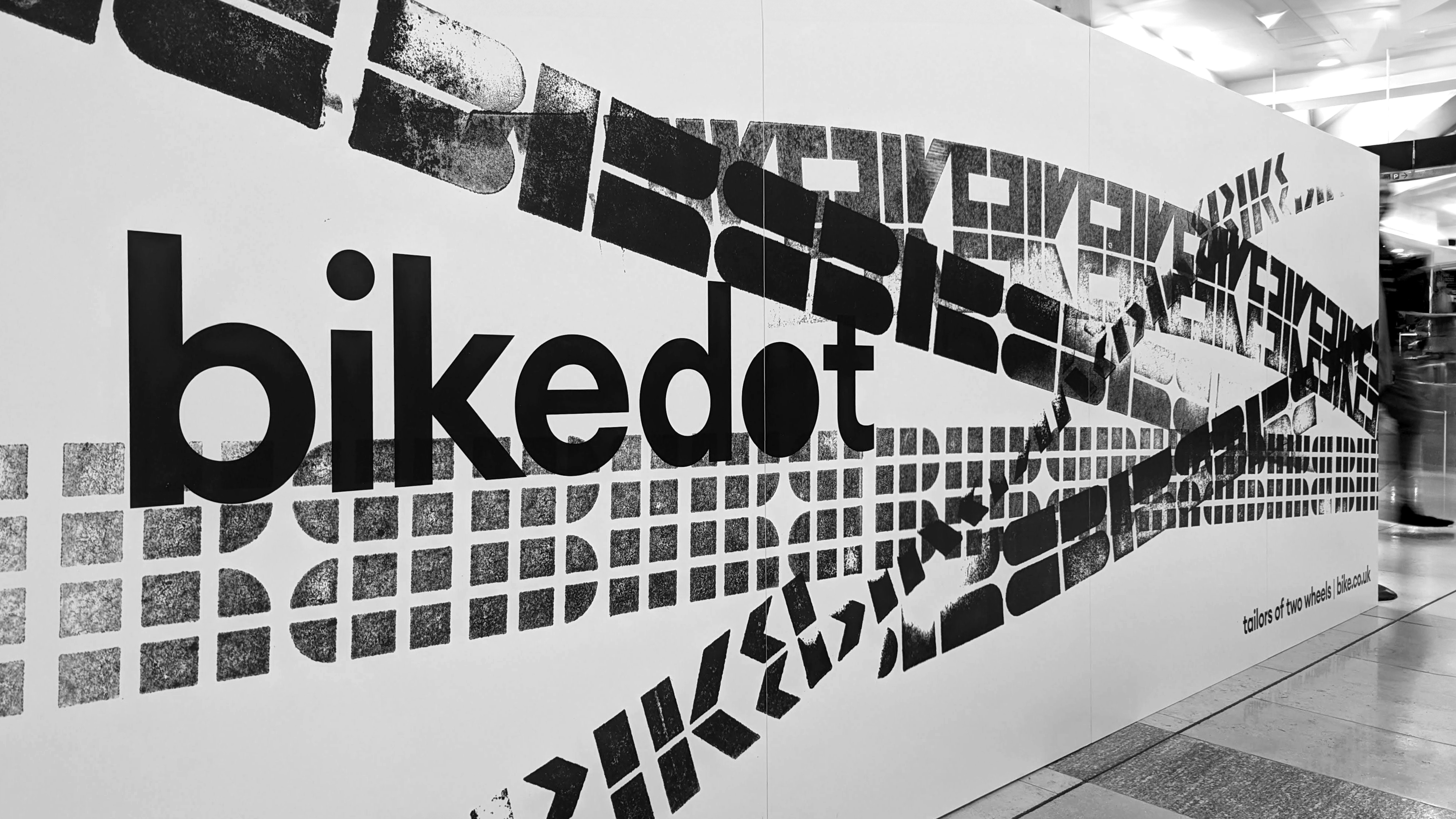
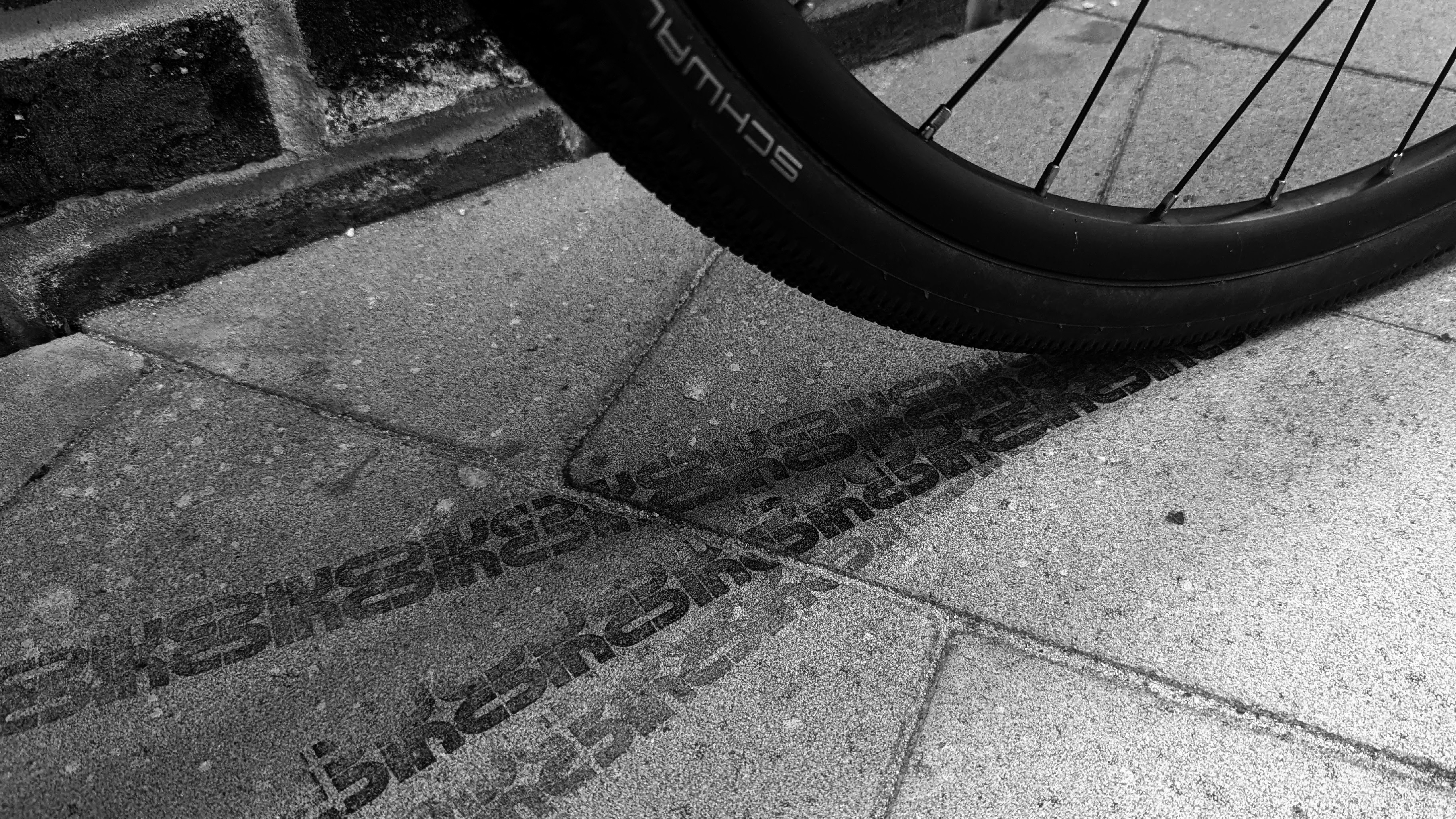
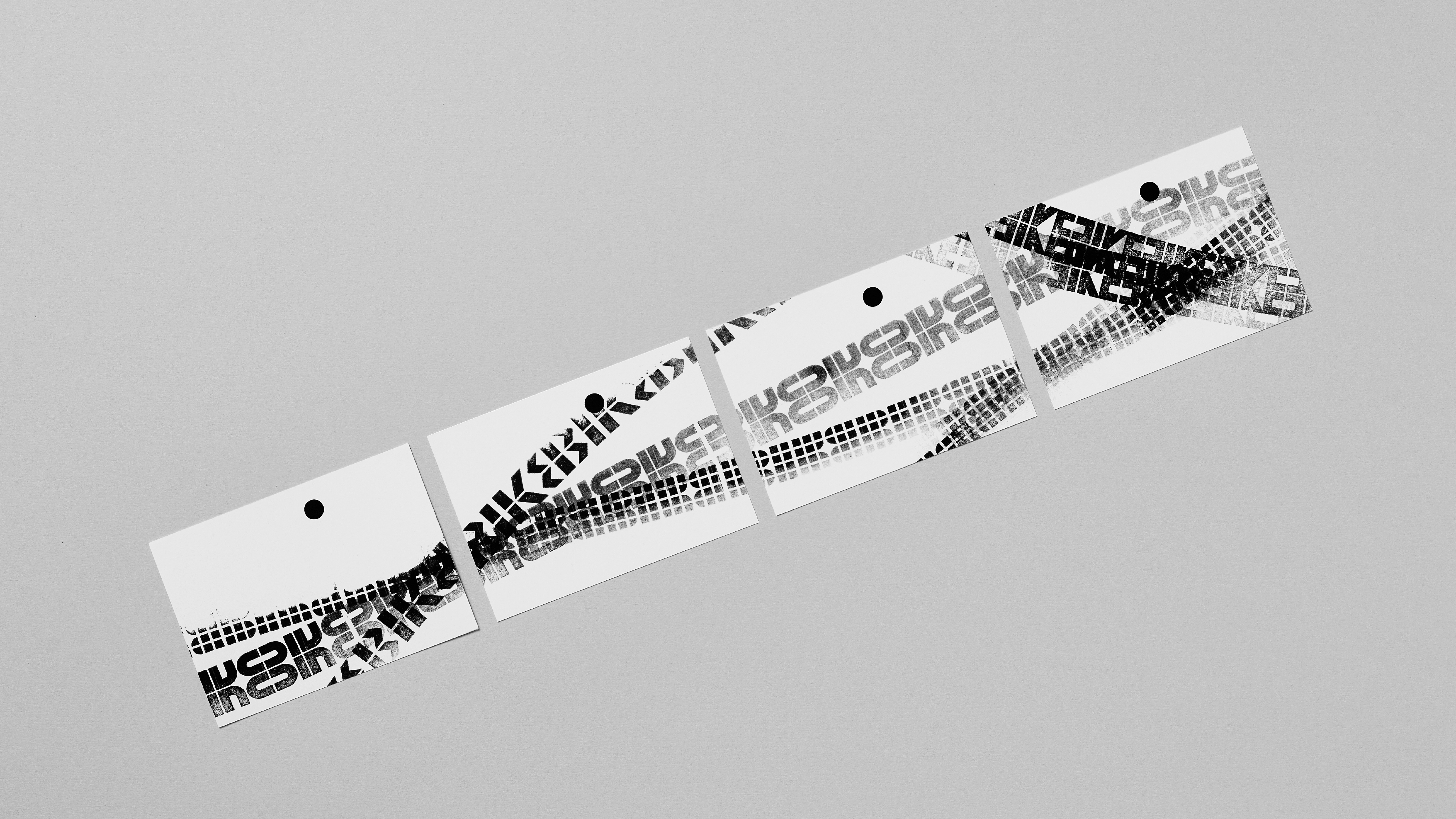
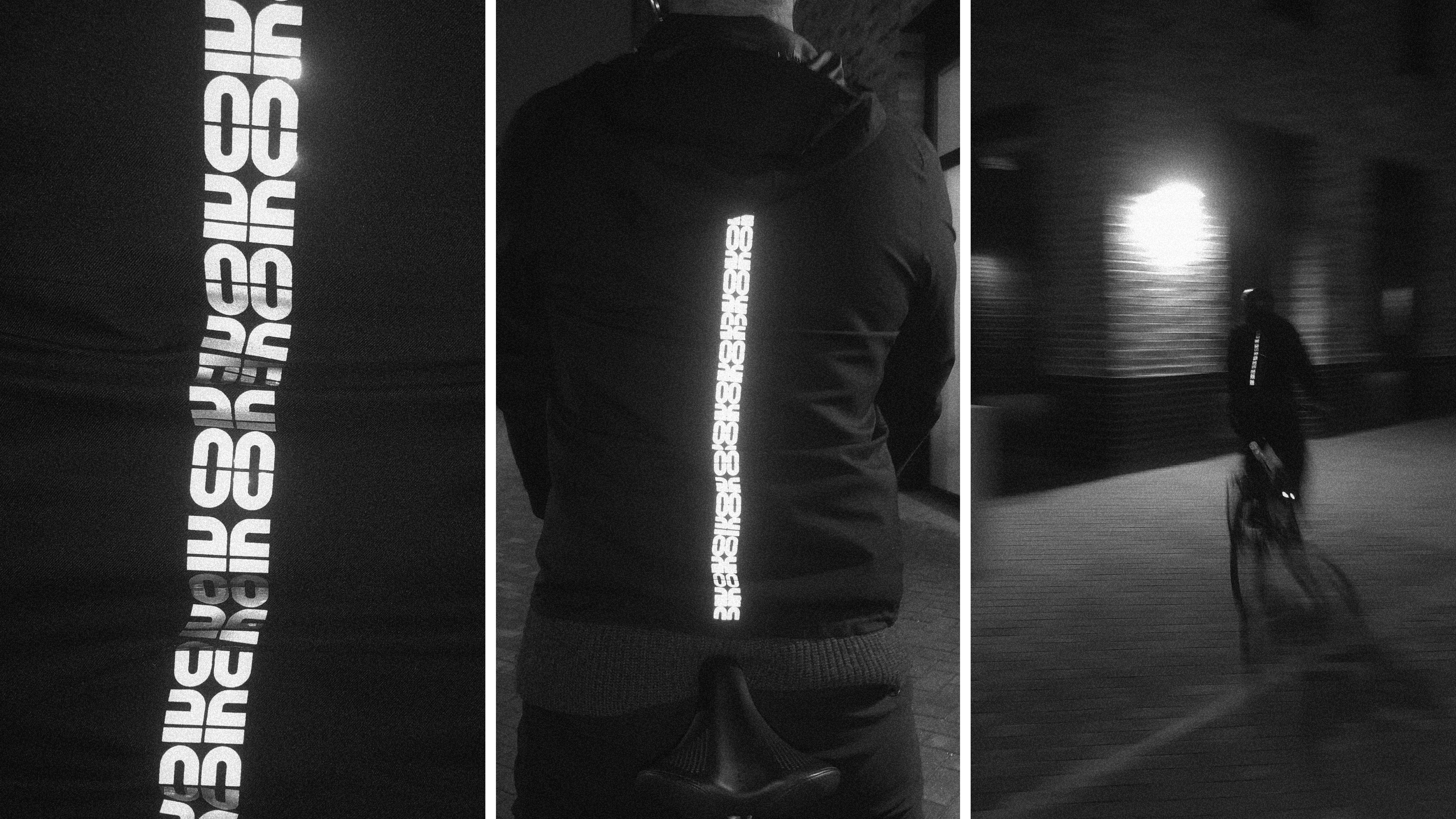
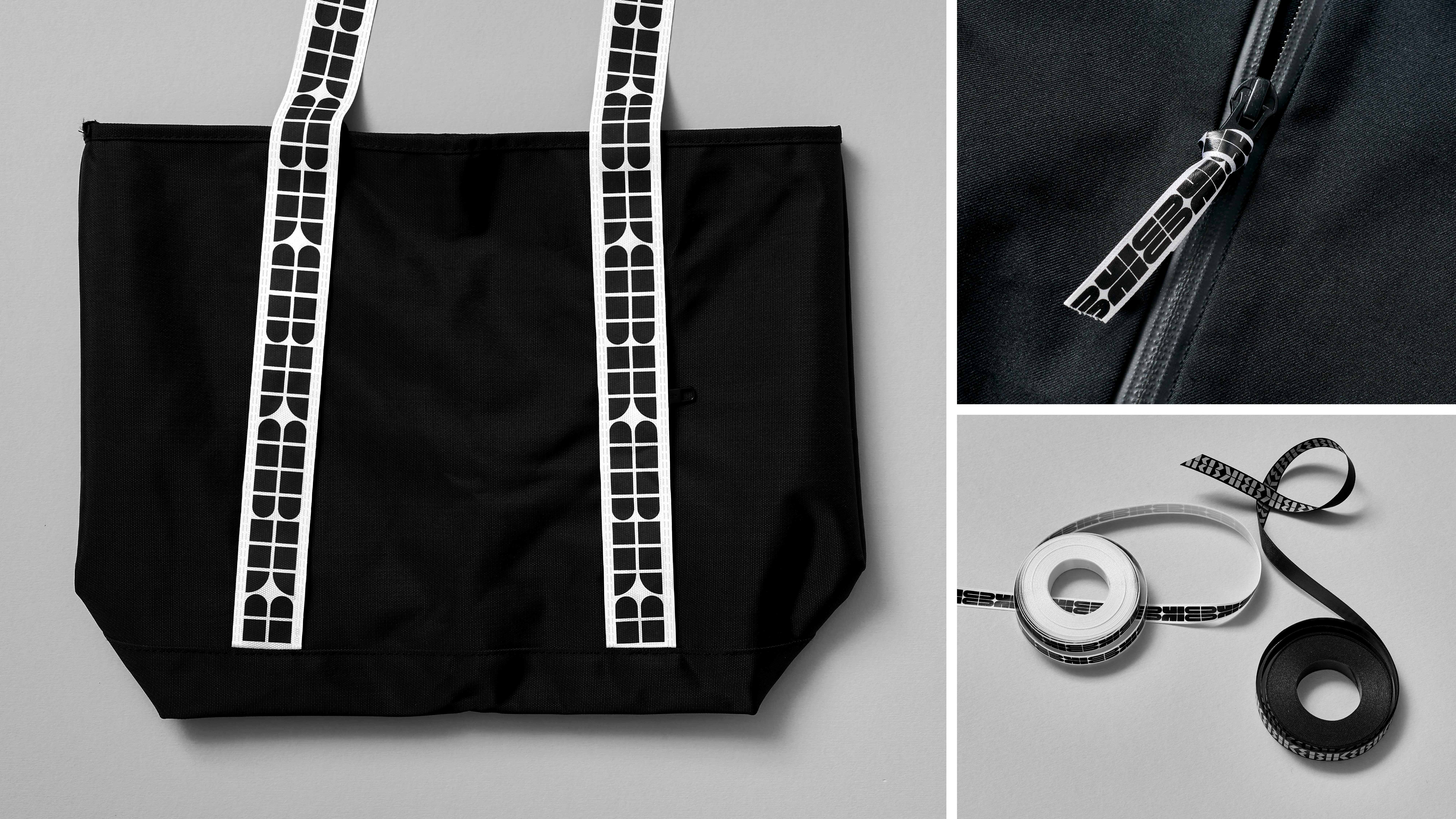
These tracks are used to reflect the diversity of bikes and products Bikedot offers; adoring hand-print newspapers, packaging, and catalogues; as well as appearing directly under parked bikes at the London store. Reflective versions of the marks are also used across bike frames and apparel, serving both as practical visibility tools and smart nods back to the Bikedot brand.
A minimalist graphic dot accompanies the tracks and anchors the system, a sort of stamp of approval symbolising the brand’s ‘standard of excellence’ across its bikes, products and services.
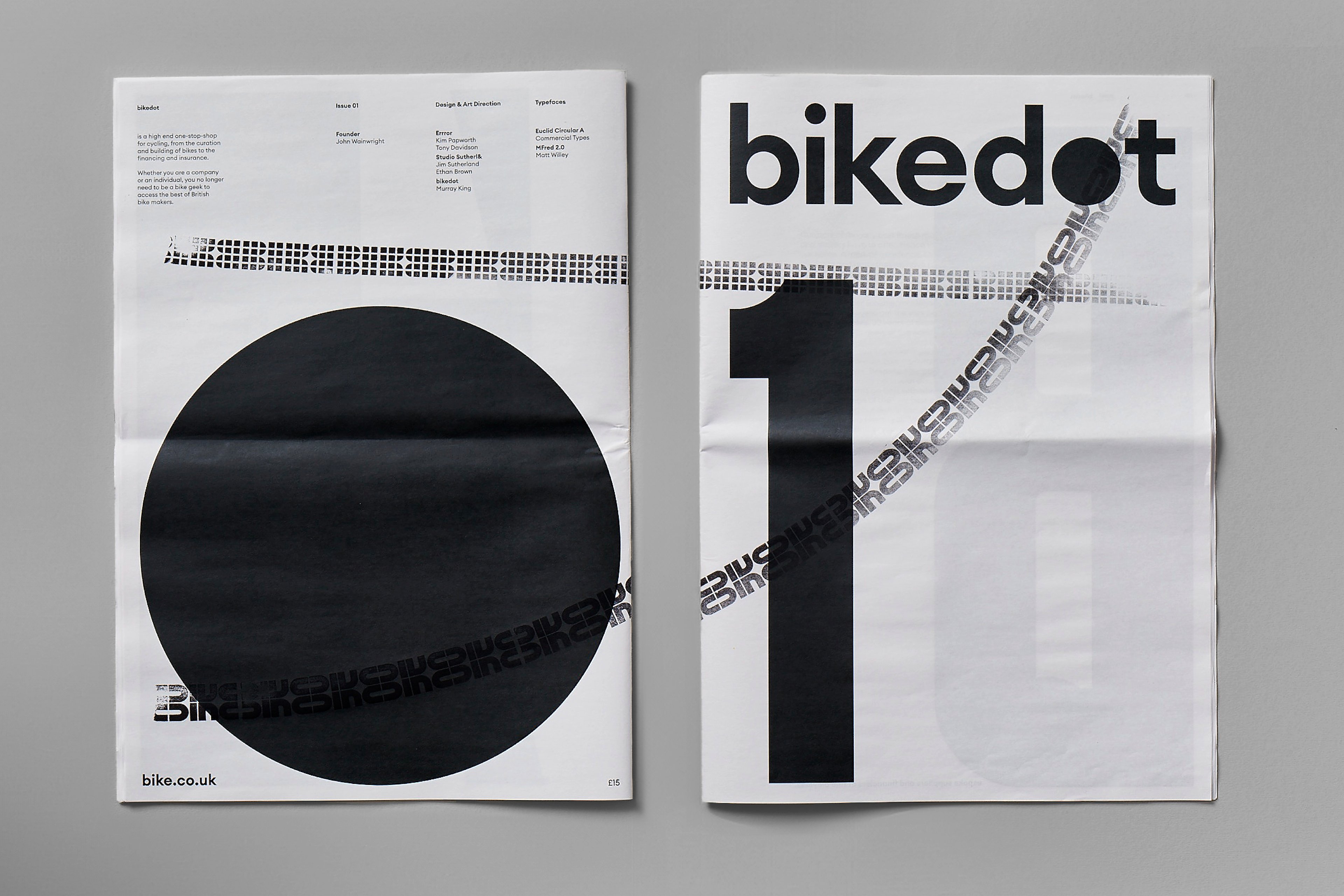
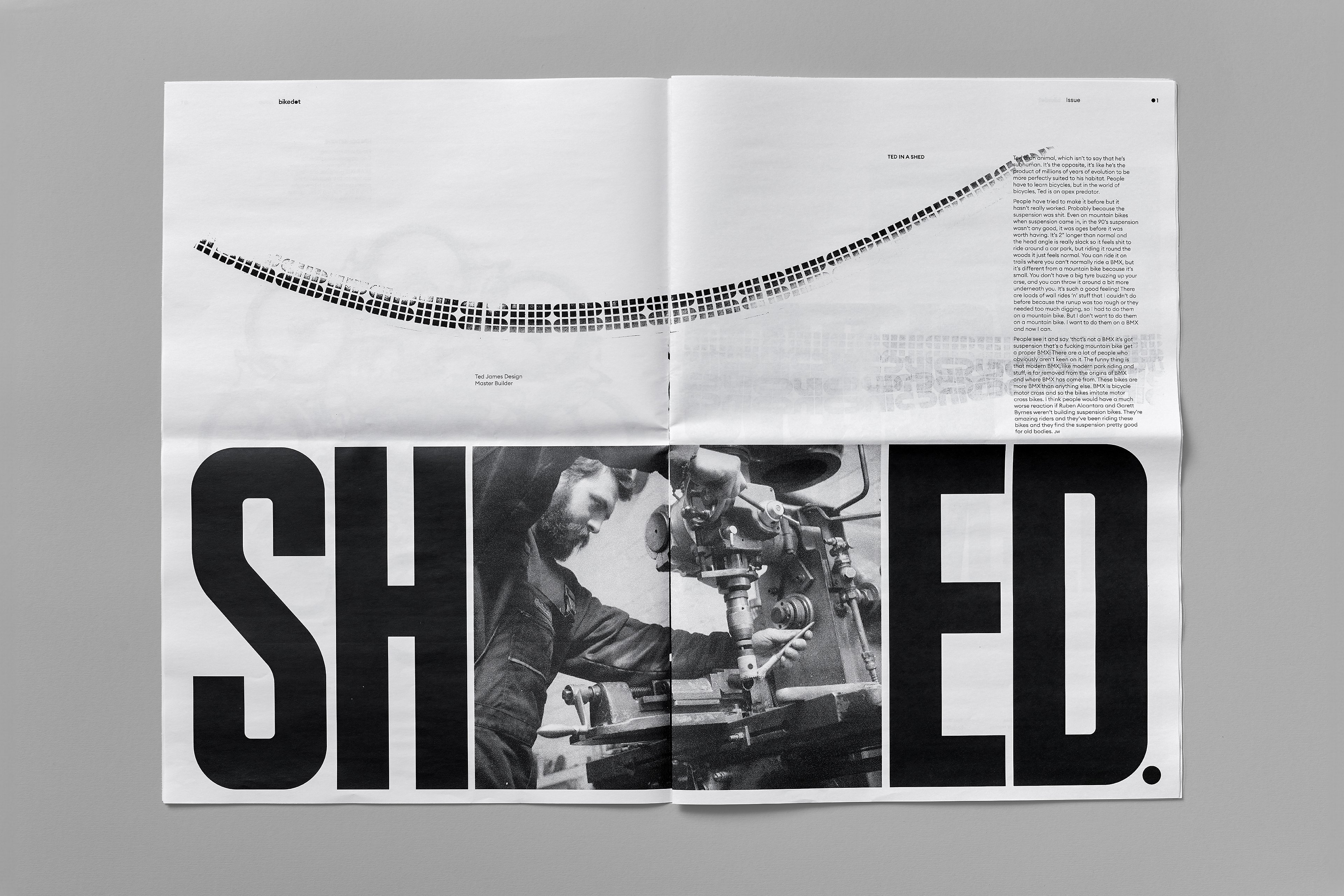
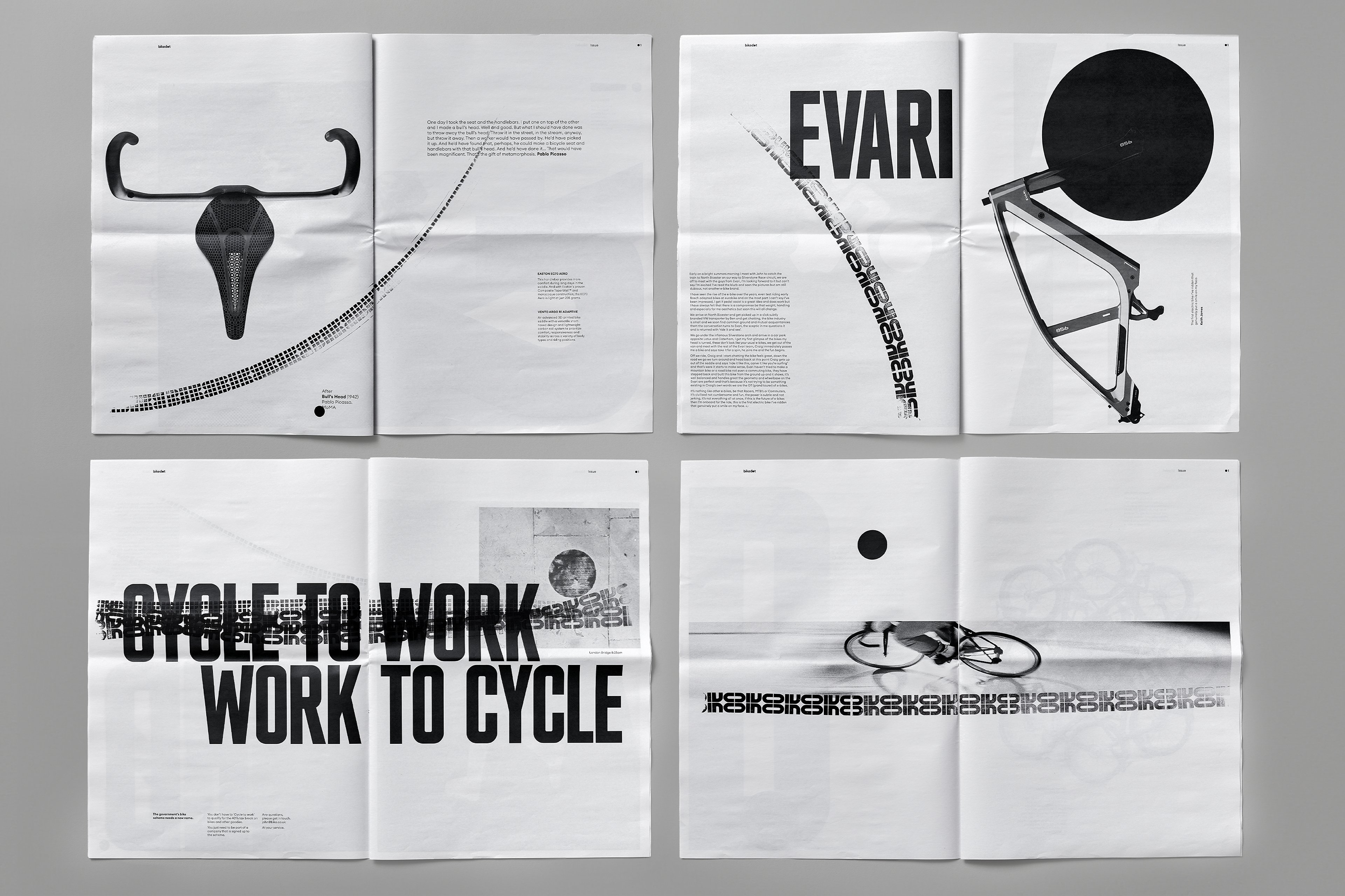
The star of the show, however, is those gorgeous newspapers. Featuring product showcases, interviews, quotes, and cycling culture content; each copy is totally unique thanks to the analogue track printing processes used in the hand rolled track marks. It’s a really smart way of creating branded content that’s both genuinely useful, as well as design-led and beautiful, elevating the editorial into one one-of-a-kind pieces to showcase the Bikedot brand and the enduring power of print.
By pairing a restrained graphic approach with hands-on experimentation, Studio Sutherl& has delivered an identity that feels alive, dynamic, and deeply personal. You can almost feel the delight that the studio expresses in how it all came together: ‘It’s been a wonderful project to work on – and physically printing with the rollers is a joy’, says studio founder Jim Sutherland.
The physicality of the tracks, alongside the playful yet disciplined design language, makes Bikedot feel very different to other cycling companies. In a category that can feel a bit clinical and overtly rugged or macho, it’s nuanced approach that emphasises its point of difference and its exacting, human standards of attention to detail.
It’s playful, but never silly; the whole thing has a rigour and sophistication to it while absolutely revelling in the possibilities of both print, and cycling.
