Ultraderp by Mucho
Opinion by Richard Baird Posted 4 March 2025
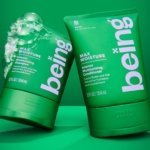
The name Ultraderp seeks to combine all things extreme (think ‘ultrafast’, or ‘ultra marathon’) with ‘derp’, which is, apparently, the face a dog makes when they don’t know what’s happening. The product that bears this name is an ultra-light, easily-packable dog leash that can be worn on the collar and deployed when needed, simply by pulling the tongue-like tab. This becomes the ‘a ha!’ moment behind the creation of the Ultraderp logo and visual identity, devised by Mucho (Antara 128, Ostro & Brewbird), from which many playful articulations are set free across a multitude of contexts.

This ‘U’ as tongue device is a great gift and observation; the kind of witty graphic fodder that books like A Smile in the Mind have been built on, and that designers and design blogs (BP&O included) delight in. Of course, there’s a difference between a witty logo in isolation, and an idea that’s strong enough to form a brand foundation – ‘has legs’, you might say. And here we have a premise with not two legs, but four, and the energy to catch a frisbee and bring it home.
![]()

Highlights include pushing the ‘U’ to its limits by deforming it into the tongue of a windswept puppy; the tongue pull-out on the product itself (lovely); the suggestion of a UV’d slobbery ‘wet’ business card; tongues sticking out of the flaps of envelopes; and the graphic ‘U’ super-imposed over photos of pooches.


This lead device is supported by some informal elements – namely, illustrations and handwritten type that are congruent with one another. These keep things convivial and not too serious, lending the work a bit more range alongside the impactful use of Gill Sans Ultra Bold for logotype and headings. The choice of black and white brings a whole lot of extra emphasis to that tongue, and we like white space – it makes the illustrations sing.


I have no doubt that the designers had fun with this brand in application – I almost feel like I know which of the Mucho’s team played a part – pushing the potential of that graphic gift as far as it could go. Yet, I wonder how many ideas made it to physical execution. In an era of digital mock-ups, why not take advantage of the tools available to get client buy in (‘hey, look at all the stuff you can do with it!’). Blogs and design awards also love this stuff… so win win. But the real world applications fall a bit flat. There’s a visual of a website in the case study, as well as newsletters, all looking tasty, but the real thing doesn’t match up. Let’s get it online when cases launch, please.
Nevertheless, it’s a lovely exercise. A simple idea for a simple product, dramatising the loving connection between dog and dog owner. It’s well executed and has room to run further (chasing that frisbee along a beach, perhaps) as the brand expands to other product ranges, rather than remaining anchored to the first.