Monica Rich Kosann by Here
Opinion by Emily Gosling Posted 9 September 2025
There’s been a fair bit of chatter in recent times in the brand design world about the ‘new codes of luxury’ – how today’s hip young well-to-dos are eschewing the signifiers of yesteryear (ostentation, gold, bling, anything remotely showy) for a more understated aesthetic. Being fabulously rich today, then, is perhaps a little like the whole ‘no makeup’ thing: anyone in their right mind can see that you are very definitely wearing makeup (so in this analogy, have a lorra lorra money), but the whole point is that it’s subtle. And more often than not, it’s expensive.
Another emergent tenet of luxury is prioritising experiences as much as tangible things: sure, said experiences are likely lavishly documented, all soft filters and cinematic mode and lens flare, but this is about doing as much as owning.
For jewellery brands, navigating this new approach to luxury is perhaps a bigger challenge than for most other sectors: after all, its very nature is about being special, valuable, covetable, high-end-gift-worthy. Its core products are made from things like gold and diamonds and all that’s been deemed precious since time began – shiny things, things which form the cornerstones of bling.
How, then, to reinvent tradition, and bring a brand firmly into both the 21st century and the emergent codes of luxe?
Here Design’s (Trulli Ulivi, Piccolo, Kininvie) work for New York-based luxury jewellery house Monica Rich Kosann does this brilliantly. The new brand identity, which is launched to coincide with the company’s 20th birthday, manages to merge tradition and modernity not by eschewing all that’s long been associated with the luxurious and sophisticated, but by updating it in a very smart way – through yet another avenue that’s a buzzy topic in branding circles, personalisation. Or as Here Design puts it, bringing ‘a renewed sense of personal expression to a brand known for storytelling through fine jewellery’.
Here Design creative partner Kate Marlow explains, ‘We saw an opportunity to move beyond tradition, merging heritage aesthetics with digital innovation. By building a living ecosystem around Monica Rich Kosann’s monogram, we created something deeply personal yet inherently recognisable – a signature that evolves with each individual, giving customers a sense of ownership over the brand.’
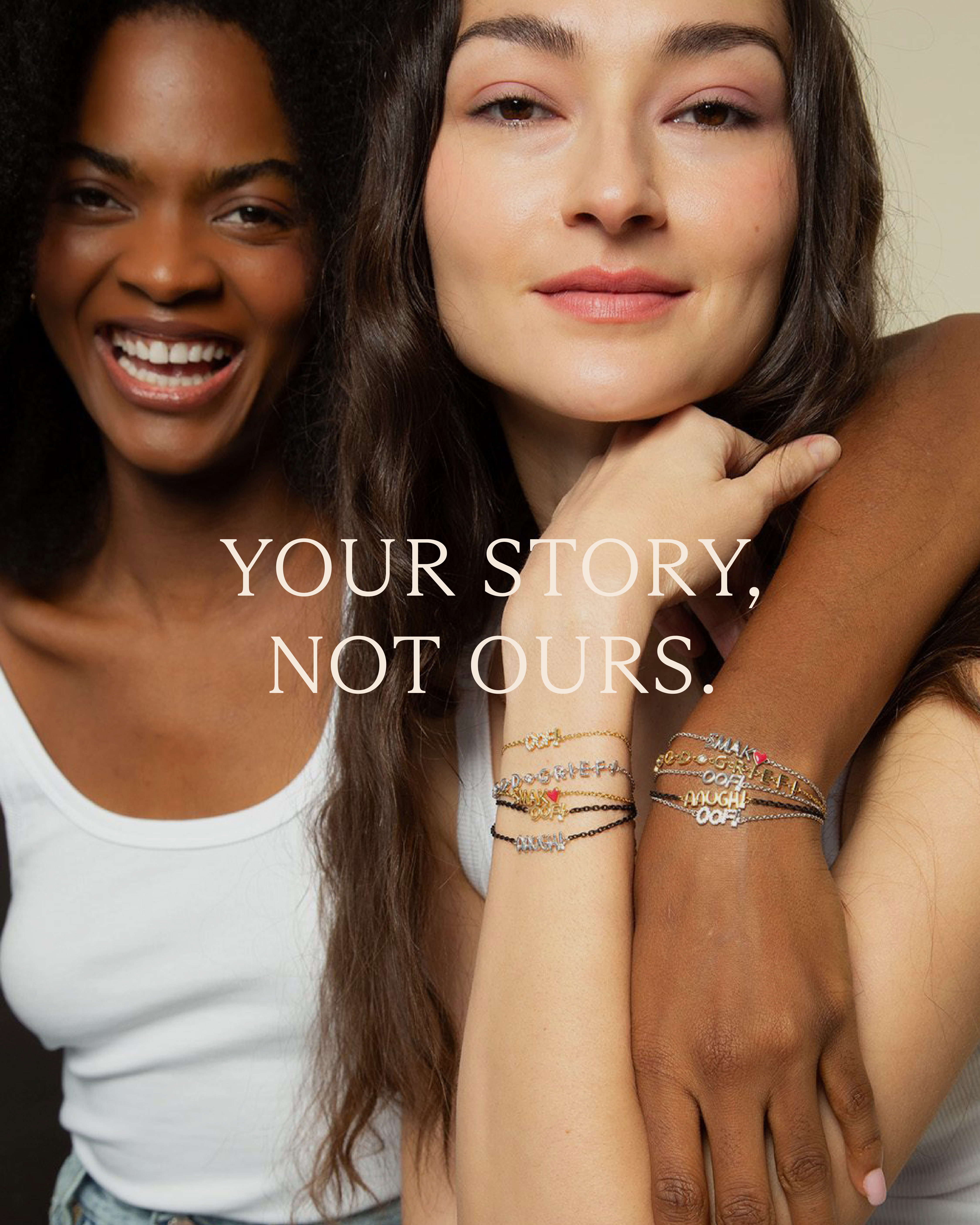
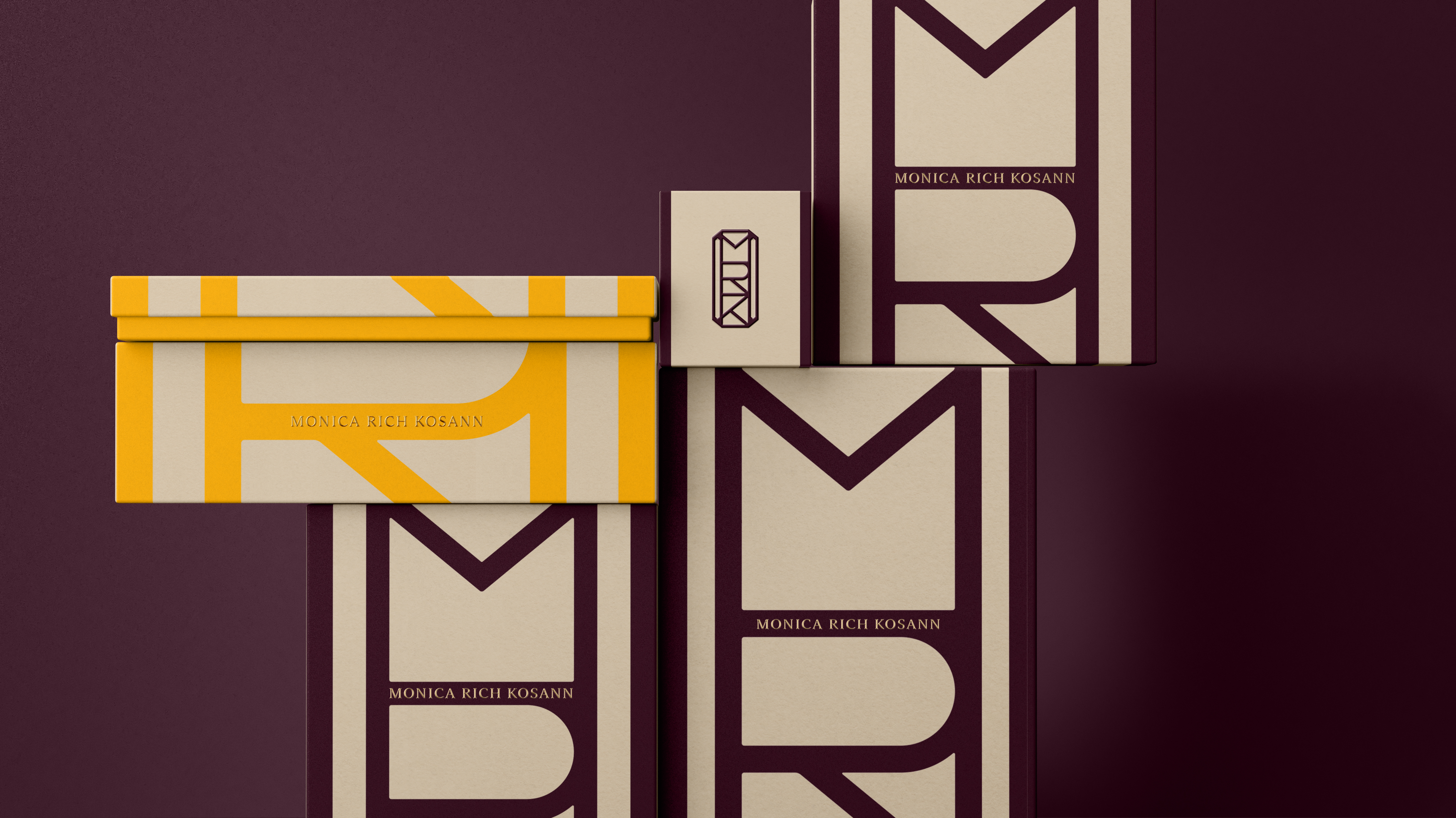
Crucially, the new brand has been created to be digital-first: unlike static systems of yore, at the heart of this redesign is a dynamic monogram. The mark is formed of the Monica Rich Kosann initials – M, R, K – and executed in an Art Deco-influenced style. Its main point of difference, however, is that it’s a sort of living logo that can be reshaped, adapted, and personalised for each customer. It all neatly aligns with the brand’s ethos of ‘Your Story, Not Ours’.
It also chimes with the idea of ‘empowerment’ that Here Design says is at the heart of Monica Rich Kosann: ‘capturing and curating the milestone moments that matter to individuals’ the studio continues. ‘Every piece is imbued with meaning, designed to be worn and chosen with purpose and intent, in line with who the wearer wants to be in the world.’

This idea carries throughout the whole of the new visual and verbal identity, forging a brand that sits perfectly in the slowly morphing positioning of what defines luxury. If today, that’s about experience, self-expression, ‘making memories’, Monica Rich Kosann’s new branding does that and then some.
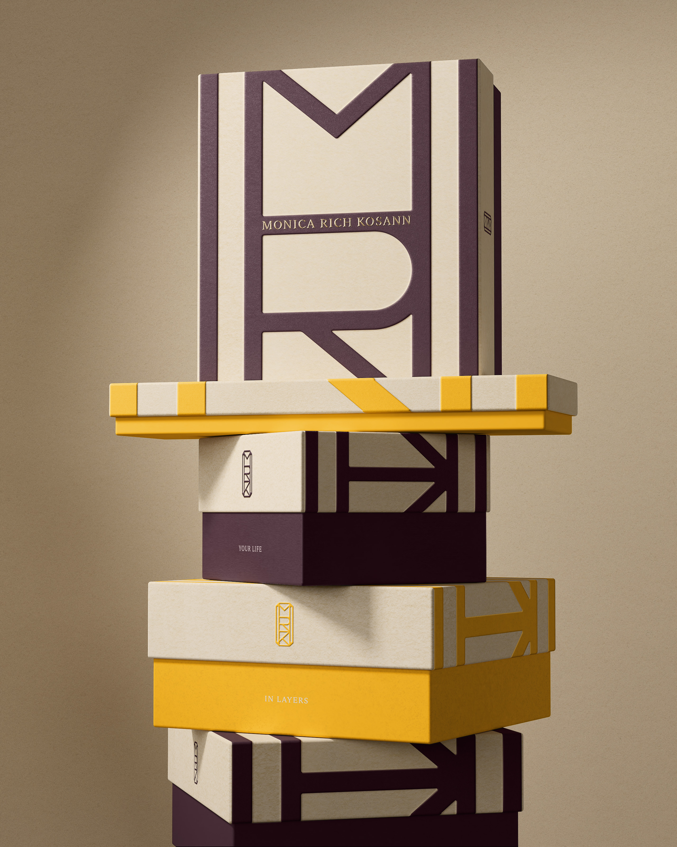
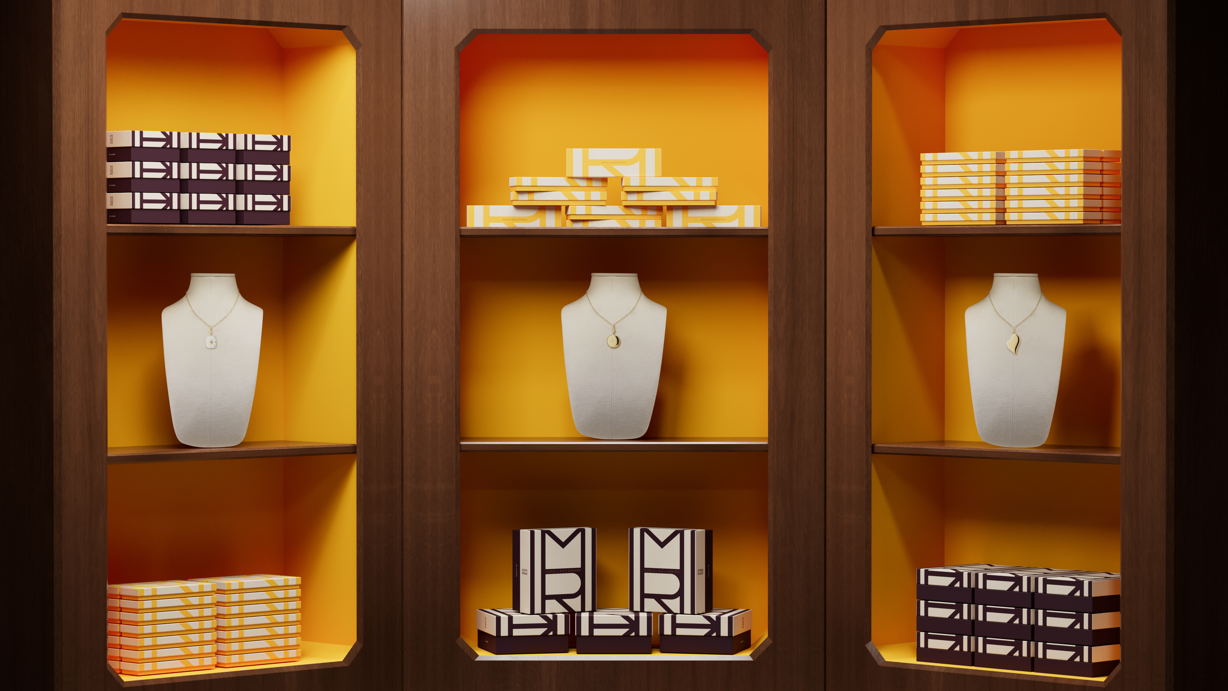
The colour palette is striking but simple, centering on a deep, rich, aubergine-purple and a mustard yellow that do a good job of looking expensive but a bit different. Background tones largely use shades of taupey pale beige and cream, with lettering and the monogram mark picked out in confident, no nonsense black.
Here Design also introduced new bespoke typography for the brand: a serif that’s elegant without feeling aloof, crisp but not clinical. It draws on the same Art Deco cues as the monogram – subtle curves, sharp terminals, and a pleasing balance of thick and thin strokes – resulting in a look and feel that’s timeless, quietly confident, and distinct in a market where serif after serif blurs into one. Crucially, it reads well both on the jewellery box in a bricks-and-mortar boutique and on the glowing screen of a smartphone – that digital-first mindset again.
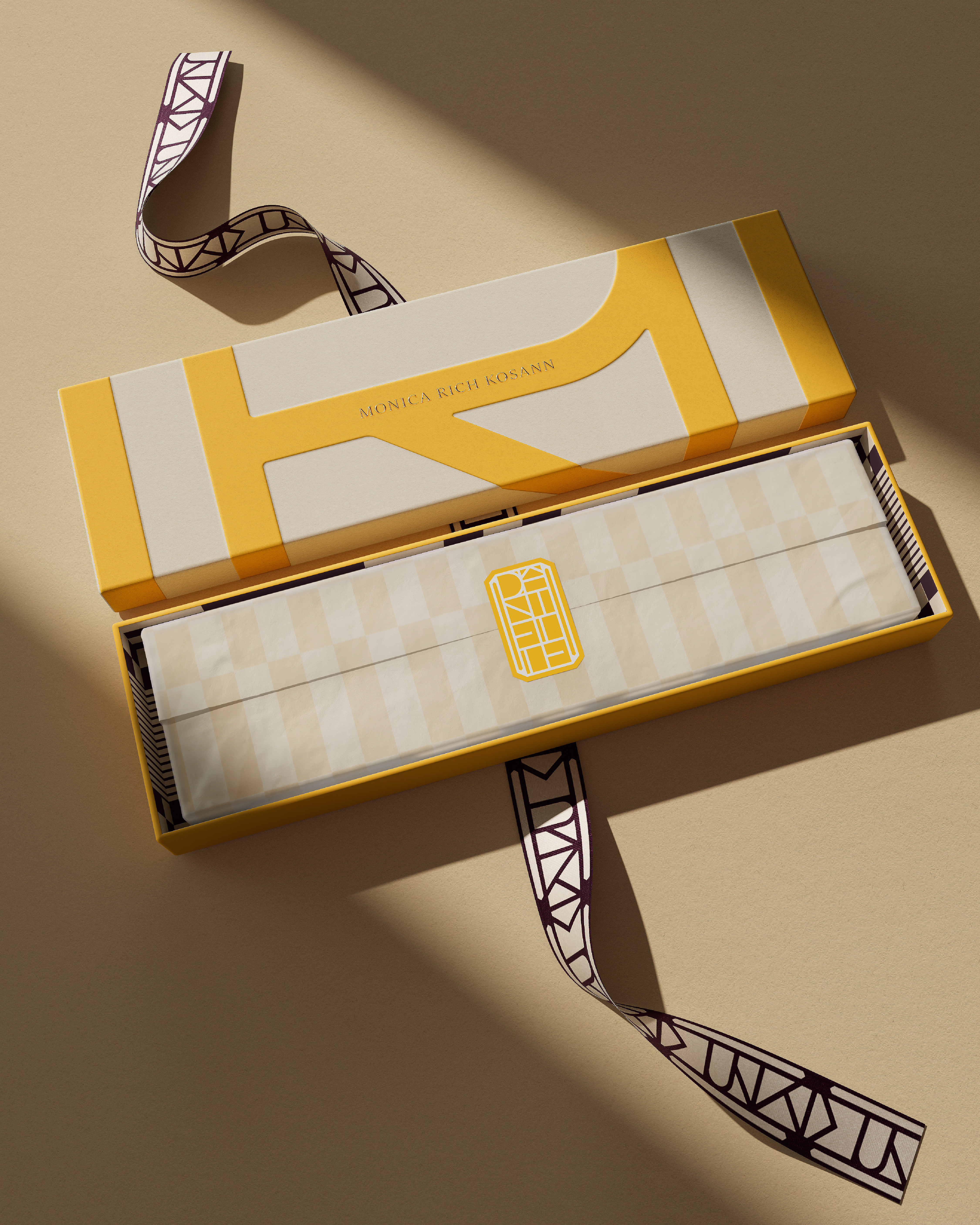
Just as Liberty is as well known for its bags as its interiors, and Tiffany for its turquoise boxes, packaging plays a central role in the new identity. Each box is designed around the monogram, and becomes, as Here Design puts it, ‘a sculptural object in its own right – a tactile, enduring piece that feels both ceremonial and intimate; not just luxurious, but lasting’.
The whole thing really does feel like a hybrid of old and new: a monogram steeped in the geometric rigour of early 20th-century design, yet liberated by contemporary tools. If luxury today is about experience and self-expression, not just ownership, then Here’s monogram becomes a perfect emblem of that shift.
