Bugg by Seachange
Opinion by Emily Gosling Posted 25 November 2025
Bugg is a New Zealand-based gardening brand founded earlier this year as the sibling of garden tools and accessories retailer Gubba. It bills itself as “premium products for people who live in the garden,” but its charming brand design definitely goes harder on the latter half of that clause than the former.
Not that it looks cheap by any means — far from it — but such is the skill of the studio behind it, Seachange, that it shows that ‘premium’ and ‘cute’ need not be mutually exclusive.
Auckland-based Seachange (TWELV., Food Nation, TWYG) worked across the naming, strategy, visual identity, packaging design and more for Bugg, seemingly with an overwhelming focus on taking gardening brands out of the dirt and into far more joyful, playful territory.
Instead of lurking in the shed, this is a gardening label that emerges bright-eyed and lightly eccentric: part high-design lifestyle brand, part imagined ecosystem of garden-dwelling characters, and entirely committed to delighting the design-conscious consumer.
![]()
At the core is the name itself. ‘Bugg’, a gently irreverent nod to both insects and the low-level mania that grips hobbyists across the board, comes alive typographically. The logotype turns the double ‘g’ into the star of the show: the mirrored bowls feel simultaneously like sprouting plants and a beetle’s antennae. This smart, small but hardworking typographic gesture makes for a succinct but personality-packed wordmark that’s expressive but just the right side of cartoonish, fun but still refined.
Alongside the wordmark, the primary brand typeface is Perfektta by Czech Republic-based foundry Displaay. Described by the foundry as “a sans-serif typeface family with narrow proportions and a clearly visible contrast in the stems”, Perfektta’s clean, contemporary geometry brings a crispness that offsets the more characterful illustration and photography.
The colour palette takes its cues from the garden but avoids the expected greens-on-greens. Earthy, mineral-driven tones that recall things like moss, clay, compost, and bark form the main palette, punctuated by vibrant acid pops of brightness that run through accents, labels, trims, and digital UI moments.
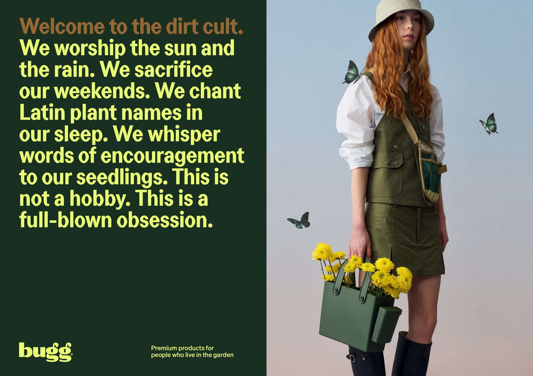
There’s an editorial feel to much of the identity, which uses a series of fashion-like photographic portraits that eschew the usual category conventions for the garden.

These work to form a clearly delineated brand voice that’s witty, self-aware, and unafraid of poking gentle fun at gardening obsession — take lines like “For people who own more secateurs than shoes” as perhaps the most succinct articulation of how Bugg speaks, and who it speaks to.
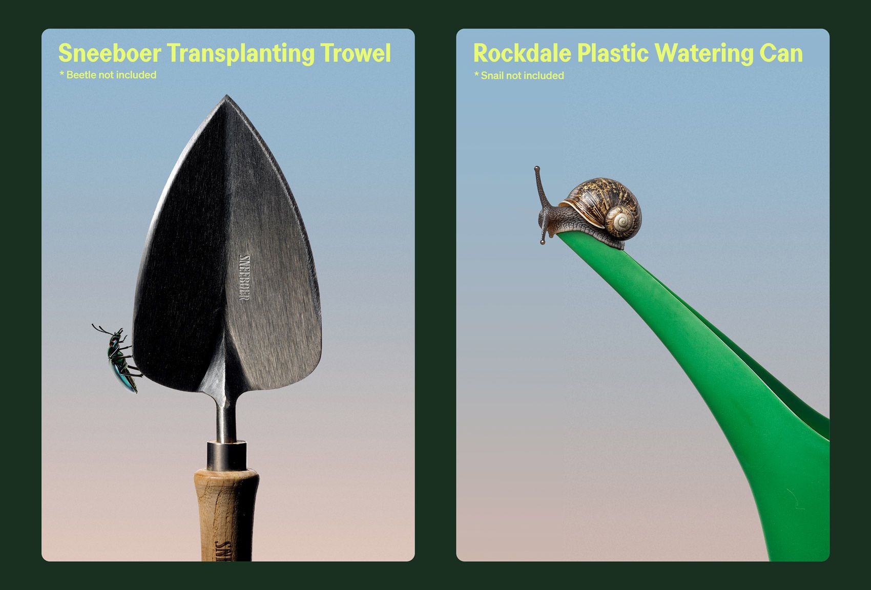
This suite of brand imagery shows gardeners adorned with insects as jewellery, embellishment, or companion; ultimately creating an effect that lands between couture editorial and nature documentary — highly stylised yet endearingly human. It positions gardening as not merely a pastime but a wearable identity, a subculture with its own sartorial codes.
As for the illustrations, imagery of critters is articulated and deployed with restraint, appearing peppered across things like the homepage, as well as packaging edges and product guides. They add a sense of charm and curiosity but never feel too much — decorative but never overwhelming the more subtle, youthful contemporary mode in which the brand presents itself.
Where Seachange’s work excels is in the accumulation of tactile detail. Packaging features beautifully judged material choices: uncoated stocks with a subtle tooth; labels with micro-embossed insect forms; subtle but effective structural decisions.
![]()
Small “easter eggs” are embedded throughout. Swing tags appear to have been nibbled; packing tape is strewn with tiny ants marching in regimented lines; instruction cards include quiet jokes for those who take the time to look.
Bugg ultimately succeeds because it treats gardening not as a wholesome stereotype but as a lifestyle marked by taste, detail, and affection. For design-literate, nature-loving consumers, the brand combines elegance with eccentricity, humour with craft.