Evil Ray by Seachange
Opinion by Emily Gosling Posted 20 January 2026

Until fairly recently, arguably sunscreen brands have had to do little in the way of brand design. Instead, they’ve been able to coast along relying on their credentials alone – and the fact that (in the UK at least) there hasn’t been a ton of competition.
Things have been largely almost medicinal and rigidly adherent to category tropes: orange, yellow, white for the higher SPF variants, blue for aftersun.
![]()

There’s no denying things have gotten a wee bit livelier in the suncare sector in recent years, though: 2022 saw the launch of US-based company Public Pool, which sells a range of sunscreens, towels, and apparel with some rather lovely branding created by Nashville-based design agency Perky Bros (Shy Bird, Tembo, Forgotten Boardwalk).
The biggest name in design-led suncream however is, of course, Vacation sunscreen. The high-camp Miami beach-style high-legged bikini-slathered art direction naturally caused much fanfare within branding and marketing circles, aided by its wildly multisensorial approach (everyone harped on relentlessly about that smell – a surefire win in terms of evoking nostalgia through something as straightforward as a coconut scent).


But it’s interesting that such examples are so few and far between in the world of suncare – it’s a stark contrast to the variety and creativity found across other areas within beauty, which have long had to do a lot more singing for their proverbial supper.
Enter, then, Evil Ray – a total wildcard, but a superb one – with its highly distinctive Tarot-leaning packaging designs by the ever-excellent Seachange (Bugg, TWYG, Food Nation) and a logo design by Reg Mombassa, a celebrated New Zealand-born Australian artist and musician who drew the brand’s cheeky but instantly iconic evil sun logo.
![]()


The brand was created by an Australian agency (or ‘ideas clubhouse’, apparently) called Pembleton, which oversaw everything from Evil Ray’s formulation, manufacturing and operations, sales channel planning, and marketing.
A resolutely Australian brand, the central premise of Evil Ray, according to Pembleton, is to “shake Australians out of their long-held apathy toward sun exposure” through a product line “determined to reframe the sun not as a national icon, but as a genuine threat”.


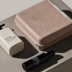
Once again Seachange has proven its ability to take structural packaging into adventurous new realms that are innovative, useful and really quite beautiful, leaning on a sculptural approach that flies in the face of usual category conventions.
The unusual arched bottles use recycled plastics and a number of manufacturing firsts, according to Pembleton, such as innovations in tooling and blow moulds created in Melbourne.
The labels, meanwhile, use UV-reactive designs that signal when users should reapply the suncream – even on cloudy days.

Tech aside, however, the labels look absolutely beautiful, and take an unusually antiquarian aesthetic thanks to both the illustration style and the central brand typeface, Basteleur by Paris-based type foundry Velvetyne. Like the spindly Victorian-esque linework of the illustrations, Basteleur has its roots firmly in the worlds of mysticism and the esoteric – indeed, it was designed specifically with the Tarot de Marseille in mind. The result is a blend of subtle Medieval-ish quirks and Cooper Black-like boldness.
Basteleur is complemented by the secondary typeface Good Sans by Good Type foundry – a contemporary sans serif typeface inspired by mid-century neo-grotesques and a fittingly neutral counterpart to the wilder, more eccentric forms of the main brand font.

The colourways are superb here too: just a rich, velvety purple and lurid greenish yellow; again, a refreshing deviation from the tried, tested and frankly rather boring look and feel we’ve come to expect from suncream ranges.
Evil Ray launches with three products: a face sunscreen and two sizes of a body sunscreen, all promoted through a brand launch that largely centres on an out-of-home campaign and a social launch film, shot by Julian Frost.