Eat Dirt by Cachete Jack and Marta Veludo Studio
Opinion by Emily Gosling Posted 5 February 2026
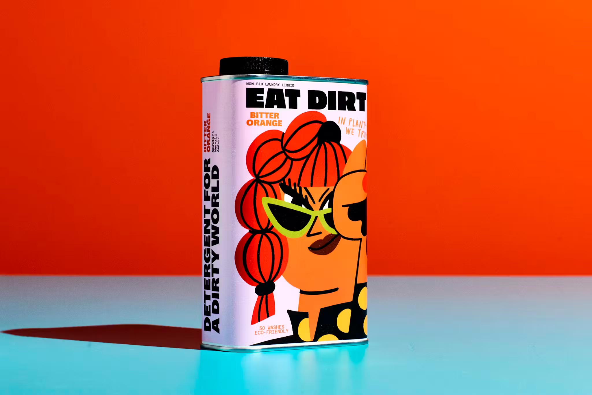
The best branding and packaging projects – or at least the ones that most excite this slightly jaded old design hack – are those that not only take a category and do something genuinely innovative within it, but the ones that rethink structure as much as style. The identity for Eat Dirt does all that and more, and so safe to say, I love it.
Eat Dirt is a new plant-based laundry detergent, entering a category that’s boomed in recent years and is set to continue to do so, as consumer awareness around environmental issues is slowly but surely seeing buyers put their money where their proverbial planet-conscious mouths are.
That’s thanks to not only a desire for products that are less ecologically damaging, but also due to increasing awareness of how certain chemicals in traditional products can wreak havoc when it comes to skin sensitivity. As such, according to its creators, Eat Dirt has both a biodegradable formula and perfume-grade fragrance.
This is a smart brand indeed as it taps into two thoroughly zeitgeisty considerations: one being moving towards more eco-friendly products across the board (here, in cleaning products); and two, a more vanity led but no less valid desire to buy products that warrant being proudly on display, rather than shamefully hidden away in the dank recesses of the cupboard under the sink.
On that second point, there’s been a few brands that have really done that well – i.e. taken something far from glamorous and made it look so – namely toilet paper pioneer Who Gives a Crap, which totally upended the bog roll category by making it look so good you can literally reuse its packs as gift wrap. Likewise, Wedge’s Cocolab and Two Times Elliott’s PAIST managed to make dental care look fun, and very much worthy of bathroom shelf, not bathroom cabinet.
When it comes to environmentally sound cleaning products however, brand design wise they’re still usually languishing in the same territory as vegan food products did 20 or 30 years ago: we know what they are and why we should buy them, but they do little-to-nothing to make us really want them. In short, they’re worthy. They’re boring.
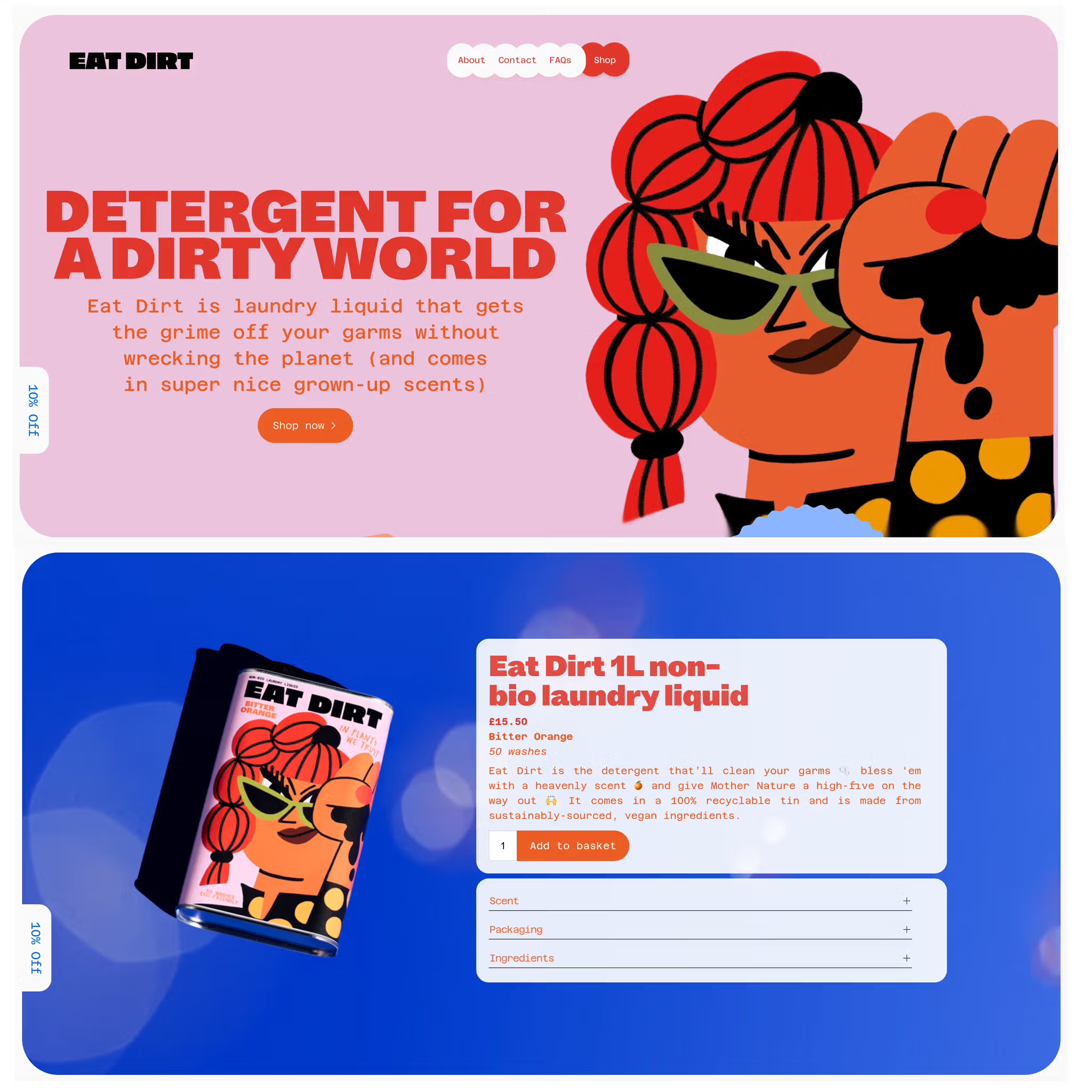
The brand design for Eat Dirt, however, is anything but boring. The product indeed may be worthy, but the identity is anything but: “look!” it screams. “I’m fun!” Its eco-friendliness is embedded in the product, and is communicated for sure, but it’s secondary to a truly eye-catching, joyfully playful and rigorously well-designed aesthetic.
The design work was created by Amsterdam-based Marta Veludo Studio and Spanish illustration duo Cachete Jack; while Eat Dirt itself is the brainchild “transcreation and creative copywriting agency” Franklyfluent. Founded by former ad agency execs Jordan Woolley and Catherine Barr in 2014, Franklyfluent had some experience in the world of environmentally sound cleaning, having formerly worked with possibly the biggest name in that world – Ecover.

Eat Dirt is, in pretty much all senses, worlds apart from the positioning of Ecover and the like. The name alone – Eat Dirt – is cheeky, punchy, provocative; but crucially, not too provocative – it isn’t rebellion for rebellion’s sake, never veering into the territory of Johnny Rotten’s ‘a rude word!’, which would be rather daft for what is, let’s face it, a cleaning product.
It’s the visual identity stuff that really sets it apart from the rather serious competitors like Ecover and Faith in Nature, however. As is de rigueur for Cachete Jack’s output, this is unabashedly loud, playful and bursting with colour. It also centres a gorgeously sassy character – not in a mascot-ish way, more as a sort of de facto poster girl for the brand, and she’s brilliant. She’s absolutely not to be messed with – a beguiling combination of 90s riot grrrl, rallying cry-toting Land Girl, Patricia Arquette’s Alabama in True Romance, and ultimately, woman with no time or patience for dirt. She may be eco-conscious, but she sure as hell means business.
Alongside the illustration, there’s a refreshingly daring and different brand colour palette that single-handedly manages to make Millennial Pink cool again – a sweet relief for this elder millennial and sucker for that saccharine shade – which is used alongside a pillarbox red, a rich darker orange, and a tone I’d describe as sludge green, but which works beautifully as a contrast to the warmer more autumnal shades.
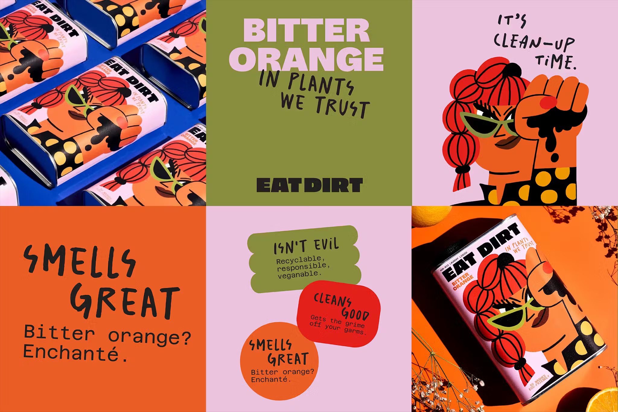
As for the typography, the main wordmark is set in a hefty, thick sans with some deftly inbuilt idiosyncrasies – namely the wide, sprawling ‘A’ next to a more diminutively narrow ‘T’ in ‘DIRT’; the ‘A’ so broad you could use it as a tabletop.
Elsewhere, title text is set in ABC Whyte by Swiss foundry Dinamo, an impactful contemporary grotesque with so many possibilities in its innumerable variations that it could well be the typeface used in the wordmark (I spent the best part of half an hour playing with this font to figure it out and am still not 100% sure, but boy did this nerd have fun in the process).
By contrast, body copy uses Azeret Mono by Prague-based foundry Displaay, a 90s-leaning, almost typewriterish font with little in the way of stroke contrast and a thoroughly legible, hard-working companion to the heft of Whyte. Finally, the lettering with a scrawled, ‘handwritten’ appearance uses Salted, a typeface that just about stays the right side of twee but which has an unmistakably impish quality, a lot like the written aspects of a David Shrigley artwork, or anything you might find at a hip but geeky zine fair somewhere in east London/Brooklyn/Kreuzberg.
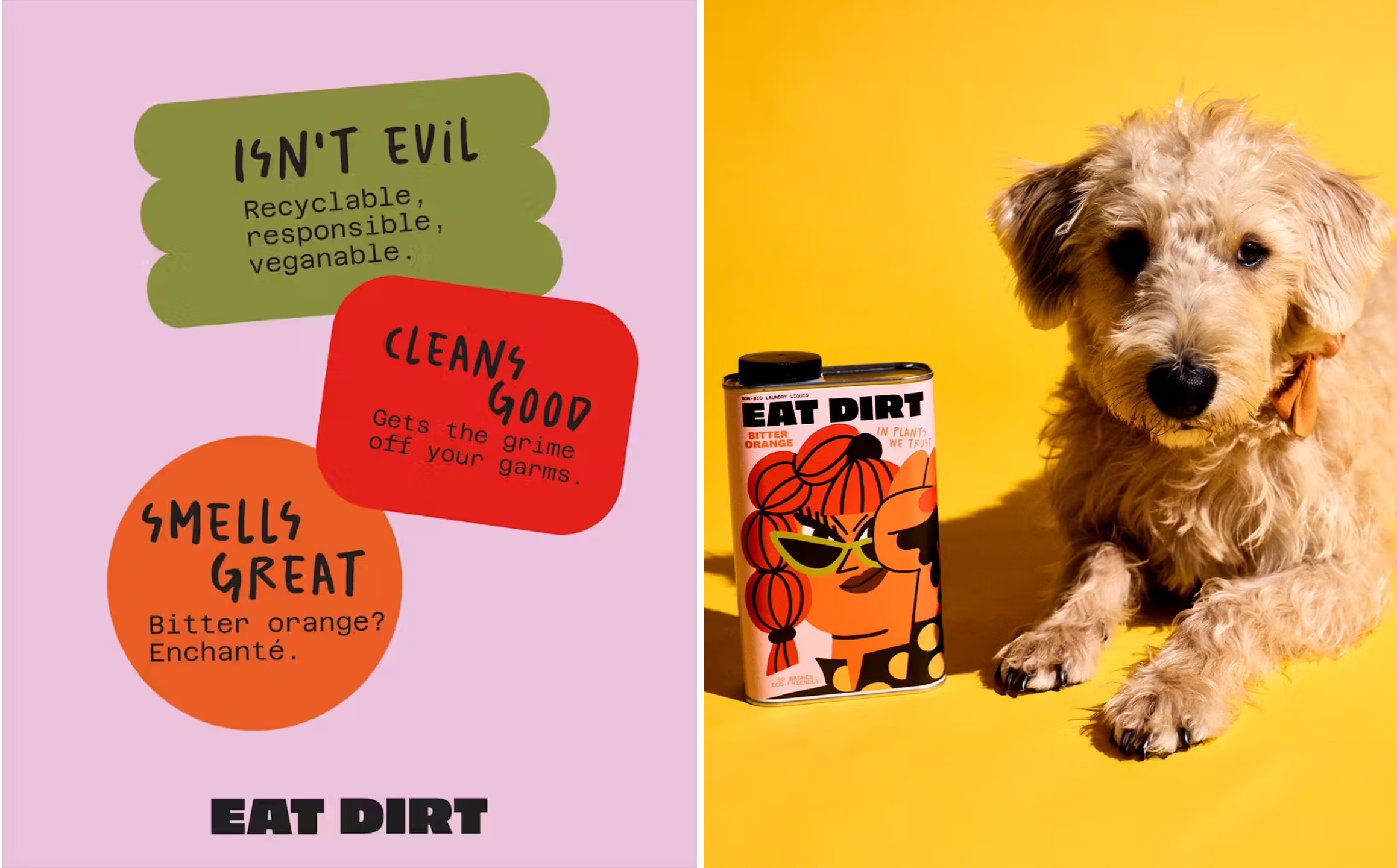
The art direction of the product photography is an absolute masterstroke – not least because one image features a very cute, if also very nonchalant, dog. Elsewhere, the imagery goes hard on refreshing vibes – all bright colours, splashy citrus fruit, hyper-modern bubble motifs and so on.
The real star of the show is the aforementioned structural packs: it seems that brand design wise, you can rarely go wrong with a rectangular tin – so functional, but so stylish; so manly and strong but so ‘interior design editorial’-worthy. It worked wonders for the superlatively excellent Departed Spirits range, and it works wonders here.
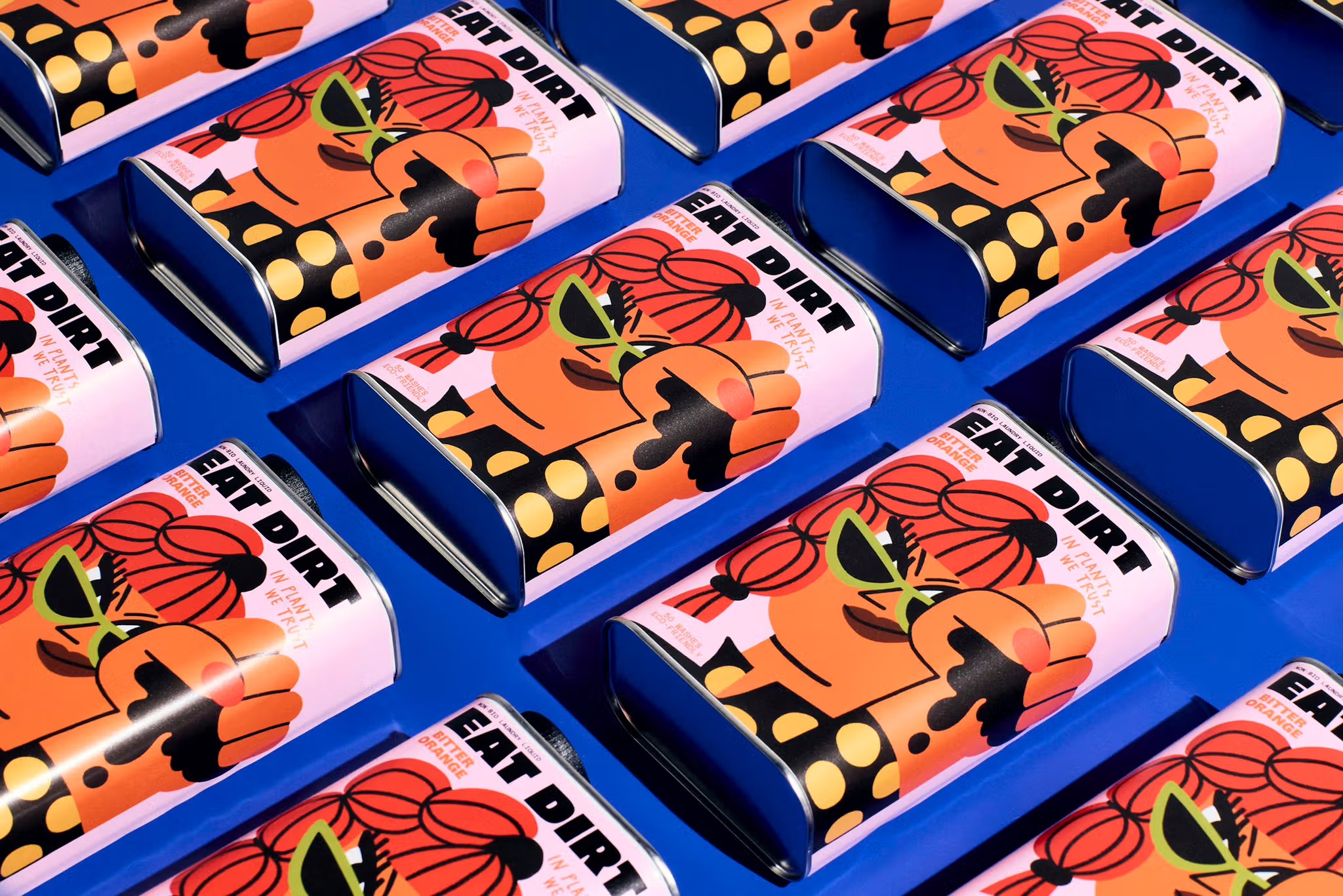
The shape allows for the illustration to be bolder than ever, while also allowing for a graphic layout that never looks too busy or needs to try too hard: it instantly stands out and begs to be shown loud and proud, both on shelf and at home.
You’d want to use these tins again and again, neatly enabling form to follow function to follow ecologically minded brand purpose. If it wasn’t already abundantly clear, I love this project – it does everything it needs to do, and it does it really, really well – all the while eschewing what’s safe, what’s tried and tested, and conventional wisdom in its category. More of this sort of thing, please.
