Mix and Match
Opinion by Emily Gosling Posted 3 March 2026
Ten or so years ago I’d wager that most of us hadn’t even heard of padel, but the tennis-adjacent pursuit has boomed in recent years: there’s reportedly a whopping 30 million padel players worldwide, as of stats from late 2024.
Despite the fact the name sounds somewhat Ye Olde-ish – it wouldn’t be surprising to see a reference or two to padel in a Shakespearean comedy perhaps – the sport was actually only invented in 1969 by a wealthy but bored married couple on holiday in Mexico.
In simple terms, padel is essentially a hybrid of tennis and squash. It’s played on an enclosed court around a third of the size of its Wimbledon-bothering sibling, with a minimum of three players (usually doubles, so four per court). Otherwise, the rules are the same as those of tennis – aside from the fact the ball is allowed to bounce off the glass and mesh walls.
Exactly why padel’s seen such a worldwide boom in the past five or so years, I’m not sure – but many posit that it’s thanks to a combination of the accessible and inherently social nature of the sport, coupled with some pretty starry endorsements from the likes of David Beckham and Serea Williams.
But as yet, it seems there’s been little effort to liven padel up aesthetically, or on a brand level – until Mostai, that is.
Based in Vilnius, Lithuania, Mostai is a new padel club that aims to provide not just a space for sport, but a community-centric hub. As such, as well as offering padel courts it boasts a kids’ academy, physiotherapy sessions, film evenings, and “degustation dinners”, whatever those are. It also looks superb, thanks to a gorgeous brand identity courtesy of andstudio (Wisl, Uoga Uoga Kids), which is also based in Vilnius.
According to andstudio, “Rather than operating as an insular arena for competition”, Mostai “positions itself as an open club – a space for sport, conversation, rest, and shared experiences… The name, taken from a casual Lithuanian expression for a racket swing, reinforces effortlessness and ease, signalling that the club is as much about social connection as sport.”
I don’t speak Lithuanian – nor do I speak racket sports, to be honest – but I really like the name. Mostai just sort of sounds dynamic, playful, fun – and to boot, the letterforms are rather satisfying visually, something that andstudio has certainly made the most of across the whole identity.

Rather than landing on one wordmark as branding tradition/inherited wisdom usually dictates, instead there are two here – one straight-up, classy, white on racing green; the other decidedly more youthful – italicised, fun border, bright pillarbox red and white and black and just the right side of the sort of thing that might be found on the box of a toy monster truck in Toys R Us.
Both share the same typeface and also demonstrate a very satisfying deftness when it comes to conjoining certain letters: even in the more sensible incarnation, the ‘STA’ letterforms are joined in a lovely fluid way. The bolder, more youthful version meanwhile sees the ‘M’ come into play too, linking with the S in a gorgeously kinetic swoop that serves as a partial underline and a definite indication of a brand that’s as dynamic as it is confident.
That’s no accident: andstudio deliberately strived for the M to almost mimic the swing of a padel racket in its sense of “movement and vitality”. The studio looked to padel’s origins for inspiration across the identity – namely the fact it was founded in 1960s Mexico and gained popularity in Spain’s Costa del Sol in the 1970s, and the “leisure-driven, social” nature of the game.
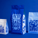
“The creative concept draws on padel’s southern roots,” says andstudio. “Mostai’s identity channels that sunlit history through warm Mediterranean colours, nostalgic two-tone illustrations, and patterns inspired by 1970s leisure culture… Typography recalls vintage sports posters and holiday postcards, balancing energy with a relaxed, welcoming character.”

The two-tone illustrations seem to reinforce the dual nature of the wordmarks – an approach which I’d argue really works. After all, this is a brand that has to communicate a whole lot of different usages, speak to a sprawling breadth of different audiences, and be applied to a tonne of different things – from signage to social to t-shirts, water bottles, own-brand products like orange juice, tiny pin badges and vast billboard ads.
Having two wordmarks that are visibly connected but markedly contrasting in both style and substance makes all that a lot more possible, and just goes to show that just because something has always been done a certain way when it comes to brand design lore, doesn’t mean you can’t successfully challenge those conventions.
Andstudio has taken a similar approach when it comes to colour: seemingly there’s no rules, with a wealth of hues used across everything and anything, though crucially, not together – rarely are more than two tones used on a single application.
That restraint within a broader more maximalist approach makes the whole thing stay seamlessly classy: even when the branding is hyper-bright orange, andstudio makes it all look so clean by relying on things like texture, embossing, and so on to pare things back and ensure the vivid stuff doesn’t shout too loudly.
Throughout the Mostai branding andstudio has opted to use two fonts that work beautifully together – Marlfield by foundry OTT (Ornamental & Title Type) and ABC Solar by Swiss foundry Dinamo.
This mix and match approach to the exaggeratedly editorial-leaning serifs of Marlfield and sans serif Solar – a font so round and soft it almost looks like it’s about to cuddle you – is not a new approach, but it’s one that’s executed perfectly here across posters, merch and more.

![]()
While Mostai’s entire look and feel is always quietly classy, crucially for this particular brand, it never feels exclusive or overly high-brow: “The identity had to communicate openness, warmth, and inclusivity while capturing the sport’s dynamic energy,” says andstudio, adding that the interior design scheme interprets the brand design through “earthy tiles, plants, and southern club motifs… creating a cohesive environment that supports both play and conviviality.”
Play is evident here: everything feels dynamic, fun, lively – never silly or patronising, but genuinely packed with movement and a real sense of joie de vivre that transcends sport and moves Mostai into the realm of future-facing, community centric leader in the possibilities of padel in terms of smart brand design.